60 search results
(0.018 seconds)
- Emma - Unknown license

- The Chatalestick by Almarkha Type,
$25.00 Introducing The Chatalestick - Font Duo is a new Strong Condensed Sans and Classy script font. Elegant and Best Quality script that is written casually and quickly with 65 ligature. The condensed Sans versions are solid and intentionally making strong statements even in small spaces. The Chatalestick also provides the script version which has Natural handwriting with Rough stroke and classy flow. It comes with various opentype 65 ligature to achieve the natural handwriting look. The Chatalestick is perfect for homeware designs,branding projects, Logo, design, Quotes, Product packaging, Photography, Watermark.
 - High Swift by Variatype,
$12.00 ABOUT THIS FONT High swift is a sporty & dynamic style display font that designed for modern corporate branding, copy ads, and much more. Recommended for a high-performance brand. FONT FEATURES - Additional Accents - 65 Languages SOFTWARE RECOMMENDATION - Adobe Photoshop - Adobe Illustrator - Adobe InDesign - Affinity Designer
 - Bit Part JNL by Jeff Levine,
$29.00 Bit Part JNL is an extra condensed monoline sans serif typeface that's well suited for movie credits, disclaimers and other forms of tight-fit word copy. Inspired by just the numbers "65" on the cover of a 1965 high school yearbook, this retro font will fit a lot of copy into a small area. The typeface is available in regular and oblique versions.
 - New Ancient by HIRO.std,
$19.00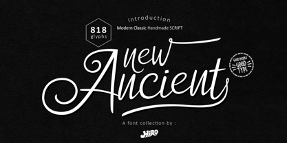 New Ancient is a Modern Classic Handmade Script. New Ancient has more than 818 Glyphs, with (82 Glyphs Uppercase), (427 Glyphs Lowercase and 65 Glyphs Ligatures. This font template contains Modern Classic, Classy, Elegant, readable, stylish, cool, catchy and easy to use. FEATURES - Ligatures - Stylistic Alternates - Stylistic Set - Uppercase and Lowercase letters - Numbering and Punctuations - Multilingual Support - Works on PC or Mac - Simple Installation Hope you like it. thanks. HIRO.std
 - OCR-B BT by Bitstream,
$29.99Adrian Frutiger’s distinguished and successful 1966 design for the European Computer Manufacturers’ Association improving readability of letters for both machines and humans. OCR-B is replacing OCR-A. - Emblema Headline by Corradine Fonts,
$15.00 Based on Corradine Fonts font Emblema 65, Emblema Headline is a powerful tool for modern designers who need a vintage art deco style font with personality and high quality. The Emblema Headline family has four layers, each one with three or four different looks, for a total of thirteen different variations. Non-OT-users can select a font from these thirteen variations, also with specific flavors: Basic, Deco, Swash or Extraswash. Explore the great possibilities of Emblema Headline in your next project.
 - Egyptian 505 by Bitstream,
$29.99This face was designed by Andre Guertler’s class in room 505 at the Kuenstgewerbeschule in Basel. It follows the principles of Frutiger’s Egyptienne, and won the first of the VGC type competitions. - Butterfly Effect by PintassilgoPrints,
$24.90 A swarm of butterflies that automagically turns into stunning patterns. This font counts 65 unique glyphs easily accessed through the keyboard (numerals, upper & lowercase plus some punctuation marks), making it possible to design patterns even in simple text editors. Just make sure to set the leading the same as the font size, as some software may override font settings. Well, in fact some glyphs don't require such accuracy and let you play with leading and letterspacing, resulting in sort of chaotic patterns. Sort of... butterfly effect.
 - Selomita by Thanoestd,
$15.00 Selomita is a magical handwritten font carefully created with a touch of elegance. This is a beautiful combination of timeless elegance and authentic calligraphy. It features an incredibly classic style, while still keeping a friendly feel. This font is the perfect font for making original and outstanding designs. To keep maximum real hand lettered effect, there were created 65 ligatures. Selomita also includes full set of uppercase and lowercase letters, full uppercase alternate and some lowercase alternate letters, swash, numerals, punctuation. I hope you like with this font. Thanks.
 - Closeby by Papanapa,
$30.00 Closeby is friendly, cheerful, and extremely addictive! Closeby is a hand-drawn display font with more than 80 ligatures and a curious personality. Designed for big titles, its ultra-condensed style works as a unicase and fills the spaces with visually unique typographic compositions. Perfect for packaging, posters, food and drink menus, or book covers, its gravitational point varies between cases, and can be used in all uppercase, all lowercase, or mixing the two to obtain restless and sparkling results. Closeby has support for Western Europe and more than 65 languages.
 - Ampmosphere by Joey Maul,
$22.00 Ampmosphere, a picture font, contains instruments and components from a 60's rock and roll band. After a friend's request to create a guitar graphic, I decided to start a set. Over time, more instruments were added along with amps, tubes, lights, etc. The glyphs are great to use individually or combined. 65 detailed glyphs in all... A - Z upper and lower case; 0 - 9; comma, period and forward slash. Upper case A, B, C and D are the separate strings for the stringed instruments a, b, c and d.
 - Frutiger Next Paneuropean by Linotype,
$99.00Frutiger Next is Adrian Frutiger's and Linotype's completely new interpretation of the well known typeface Frutiger released in 2000. For these revised forms, the areas of application are almost limitless. Frutiger Next can be used for anything from office communications to multimedia to complex printed materials. The Frutiger Next family contains small caps, oldstyle figures, and other figure options in every font. Adrian Frutiger's eponymous typeface has been used for decades, everywhere from airport signage to book text to corporate logos to the smallest web graphics. The Italics in the original version of Frutiger were based very closely on the Roman forms; in Frutiger Next, they have been re-designed to be true Italics. - FT Aessthetique by Foxys Forest Foundry,
$24.00 FT Aessthetique is a modern classic serif font that effortlessly combines delicate lines with bold strokes. Its aesthetic captures a beautifully romantic style, blending vintage elements with nostalgia. FT Aessthetique goes beyond being a font; it's a crucial brand element that seamlessly complements other fonts, imparting a sophisticated appearance to any project. Its professional characteristics make it appealing for expressing individuality across various endeavors. The font is perfect for large headlines and titles. FT Aessthetique features 65 ligatures and 35 alternative letters, expanding its versatility and providing creative possibilities. It supports most Latin-based languages and includes an extended set of symbols, punctuation, and diacritical marks.
 - Irvinesa by Shaltype Co,
$12.00 IRVINESA is a hype Font that's well-produced by hand and generated into a pure form, that will be best when used in any placement like logo, poster, t-shirts, or any display. --- Build manually by hand, and reform into a clean Typeface. Natural stroke from original hand-lettering. It can be used for just Titles or even writing. --- In this font, you will get: Over 226 glyphs 19 Ligatures in 7 OpenType features Support for 65 languages. --- Get IRVINESA now! It will be best used for any design requirement, many fonts will come with a unique concept. --- Thank you! Best Regards, PUDJI PANGESTOE STUDIOS
 - Avenir Arabic by Linotype,
$149.00 This Arabic extension to Adrian Frutiger’s Avenir typeface family was created by Nadine Chahine for Monotype. Avenir Arabic proudly incorporates a timeless geometric style with humanistic nuances that made Avenir so famous. Featuring six weights from Light to Black, Avenir Arabic supports OpenType features for Arabic, and includes Windows codepage 1256 Arabic character set support.
 - Meridien by Linotype,
$29.99 Frutiger based the design for his Meridien on the 16th century characters of Jenson, saying: As I designed Meridien, I wanted to avoid stiffness in the forms - I thought they should have a more natural line and flow. My main consideration was in creating a font which was both extremely legible and aesthetically pleasing. Meridien is proof of Frutiger’s success in his endeavor.
 - Elmono Pro by Zanfonts,
$15.00 Elmono Pro is Monolinet font which is make with natural movement, elegant for any other needed Elmono Pro Features: 3 Style (Thin, Light and Regular) 403 glyphs in each style 65 Ligatures 15 Alternates Support for more than 74 languages: extended Latin, extended Cyrillic Belarusian, Bosnian, Bulgarian, Chechen, Macedonian, Russian, Serbian, Afrikaans, Albanian, Asu, Basque, Bemba, Bena, Breton, Catalan, Chiga, Cornish, Danish, Dutch, English, Estonian, Faroese, Filipino, Finnish, French, Friulian, Galician, German, Gusii, Indonesian, Irish, Italian, Kabuverdianu, Kalenjin, Kinyarwanda, Luo, Luxembourgish, Luyia, Machame, Makhuwa-Meetto, Makonde, Malagasy, Manx, Morisyen, North, Ndebele, Norwegian, Bokmål, Norwegian, Nynorsk, Nyankole, Oromo, Portuguese, Quechua, Romansh, Rombo, Rundi, Rwa. Samburu, Sango, Sangu, Scottish, Gaelic, Sena, Shambala, Shona, Soga, Somali, Spanish, Swahili, Swedish, Swiss, German, Taita, Teso, Uzbek (Latin), Volapük, Vunjo, Zulu.
 - Serifa by Bitstream,
$29.99 Developed by Adrian Frutiger for Bauer in 1966, Serifa is a slabserif based on the principles that led to the success of Frutiger’s 1956 sanserif, Univers. Glypha, designed by Frutiger for Stempel in 1979, is a version of Serifa with a moderately larger x-height; Stempel has paid royalties on Glypha to Neufville since 1984. Serifa® font field guide including best practices, font pairings and alternatives.
 - Junius by Eurotypo,
$34.00 Are you looking for a new casual and organic script font? Please take a look at Junius! The Junius font is the perfect combination of sleek and casual that is best used in OpenType compatible software. This font contain 797 glyphs, equipped with plenty of OpenType features. Upper case letters can alternate between at least two different forms. Lowercase letters have at least six more options to avoid repetition. These effects include initial and final forms of lowercase letters. In addition, there is a set of 65 ornaments designed to support the font (accessing the ornaments through the Glyph palette). Some of these ornaments were specially designed to be combined with the letters for a "more calligraphic" effect. Junius font can be the option used to create titles, logos and posters for brand and packaging purposes. I hope you enjoy it.
 - Neela by Bykineks,
$10.00 Neela is an Art Nouveau serif typeface designed for a variety of design needs. With 27 font families consisting of thin, extralight, light, regular, medium, semibold, bold, extrabold, and black, as well as condensed and expanded types, Neela can be used for various sizes and design needs. Neela is characterized by sleek and elegant letters, with typical Art Nouveau elements, such as subtle and elegant decorative flourishes. This font is suitable for various design needs, such as: Book covers, wine labels, wedding invitations, exhibitions, packaging, merchandise, event billboards, posters and many others. Neela also supports 65 Latin alphabet languages, so it can be used for various design needs throughout the world. Characteristics The letters are sleek and elegant Distinctive Art Nouveau elements Suitable for a variety of design needs Neela is the perfect typeface for designers looking for an elegant and versatile Art Nouveau serif typeface. This font can be used for various design needs, from book design, labels, invitations, to graphic design.
 - Smart Bars12 by Postage Saver Software,
$15.00 This is a special font for use creating US Postal Service "Intelligent Mail" barcodes. Those are the barcodes you see on most cards and envelopes. Commercial mailers get the best pricing by printing barcodes when they address the mail, saving the Postal Service a step. The barcodes are also used on reply mail and Share mail, and for "Informed Visibility" tracking. Software to create these barcodes, including the USPS Intelligent Mail Small Business (IMsB) tool, typically provide an output of 65 characters, each character being an A, D, T or F, corresponding to each of the styles of bar. SmartBars 12 replaces those characters with the corresponding bar. When doing a mail merge to print addresses, the user would set the barcode field on their merge template to be printed using SmartBars 12, at 12 point, regular, and the barcode will print with the correct bars and at the required size to meet USPS requirements.
 - Frutiger Serif by Linotype,
$42.99 Frutiger® Serif is a re-envisioning of Meridien,a typeface first released by Deberny & Peignot during the 1950s. Working closely with Adrian Frutiger, Linotype's Type Director Akira Kobayashi expanded the original metal type version of Meridien into a new digital family of 20 variants. Renamed Frutiger Serif, this up-to-date Meridien has new weights, widths, and styles that correspond better with several other of Frutiger's designs. Just as Meridien has always been a fine choice for text settings, Frutiger Serif works brilliantly for large amounts of text & also at small point sizes. With its many weights and styles, this family is strong enough for most typographic projects. However, its added versatility is revealed when used in combination with other fonts. Frutiger Serif works well with the original Frutiger, Frutiger Next, and Univers - just to name a few. Paring these serif and sans serif families together is perfect for creating complex hierarchies and clear information design. Working with complicated typographic systems - involving elements such as headlines, captions, pull quotes, multilingual text, etc - is made easy by selecting Frutiger Serif and another of Frutiger's sans serif families. The designer needs simply to mix and match different weights and styles for the various textual elements to create smart and innovative layouts.
 - You Are Loved Pro by CheapProFonts,
$10.00 Rough. Torn. Shredded. Worn. Weary. Gritty. Uneven. Irregular. Ripped. Scraped. Cracked. Eroded. Deteriorated. And now ready to present your powerful message in 65 languages! ALL fonts from CheapProFonts have very extensive language support: They contain some unusual diacritic letters (some of which are contained in the Latin Extended-B Unicode block) supporting: Cornish, Filipino (Tagalog), Guarani, Luxembourgian, Malagasy, Romanian, Ulithian and Welsh. They also contain all glyphs in the Latin Extended-A Unicode block (which among others cover the Central European and Baltic areas) supporting: Afrikaans, Belarusian (Lacinka), Bosnian, Catalan, Chichewa, Croatian, Czech, Dutch, Esperanto, Greenlandic, Hungarian, Kashubian, Kurdish (Kurmanji), Latvian, Lithuanian, Maltese, Maori, Polish, Saami (Inari), Saami (North), Serbian (latin), Slovak(ian), Slovene, Sorbian (Lower), Sorbian (Upper), Turkish and Turkmen. And they of course contain all the usual "western" glyphs supporting: Albanian, Basque, Breton, Chamorro, Danish, Estonian, Faroese, Finnish, French, Frisian, Galican, German, Icelandic, Indonesian, Irish (Gaelic), Italian, Northern Sotho, Norwegian, Occitan, Portuguese, Rhaeto-Romance, Sami (Lule), Sami (South), Scots (Gaelic), Spanish, Swedish, Tswana, Walloon and Yapese.
 - Frutiger Arabic by Linotype,
$149.00 Neue Frutiger Arabic was created by Nadine Chahine and a team of designers and font engineers from the Monotype Studio, under the direction of Monotype type director Akira Kobayashi. The family is available in 10 weights from Ultra Light to Extra Black. Neue Frutiger Arabic embodies the same warmth and clarity as Adrian Frutiger's original design, but allows brands to maintain their visual identity, and communicate with a consistent tone of voice, regardless of the language. It is part of the Neue Frutiger World collection, offering linguistic versatility across environments – suited to branding and corporate identity, advertising, signage, wayfinding, print, and digital environments.
 - Neue Frutiger Vietnamese by Linotype,
$29.00 Neue Frutiger Vietnamese''' was developed by a team of designers and font engineers from the Monotype Studio under the direction of Monotype type director Akira Kobayashi. The family is available in 10 weights from Ultra Light to Extra Black, with matching italics. Neue Frutiger Vietnamese embodies the same warmth and clarity as Adrian Frutiger's original design, but allows brands to maintain their visual identity, and communicate with a consistent tone of voice, regardless of the language. It is part of the Neue Frutiger World collection, offering linguistic versatility across environments – suited to branding and corporate identity, advertising, signage, wayfinding, print, and digital environments.
 - Neue Frutiger Arabic by Linotype,
$79.00 Neue Frutiger Arabic was created by Nadine Chahine and a team of designers and font engineers from the Monotype Studio, under the direction of Monotype type director Akira Kobayashi. The family is available in 10 weights from Ultra Light to Extra Black. Neue Frutiger Arabic embodies the same warmth and clarity as Adrian Frutiger's original design, but allows brands to maintain their visual identity, and communicate with a consistent tone of voice, regardless of the language. It is part of the Neue Frutiger World collection, offering linguistic versatility across environments – suited to branding and corporate identity, advertising, signage, wayfinding, print, and digital environments.
 - Neue Frutiger Hebrew by Linotype,
$79.00 Neue Frutiger Hebrew was created by Yanek Iontef and a team of designers and font engineers from the Monotype Studio, under the direction of Monotype type director Akira Kobayashi. The family is available in 10 weights from Ultra Light to Extra Black, with matching italics. Neue Frutiger Hebrew embodies the same warmth and clarity as Adrian Frutiger’s original design, but allows brands to maintain their visual identity, and communicate with a consistent tone of voice, regardless of the language. It is part of the Neue Frutiger World collection, offering linguistic versatility across environments – suited to branding and corporate identity, advertising, signage, wayfinding, print, and digital environments.
 - Neue Frutiger Georgian by Linotype,
$39.00 Neue Frutiger Georgian was created by Akaki Razmadze and a team of designers and font engineers from the Monotype Studio, under the direction of Monotype type director Akira Kobayashi. The family is available in 10 weights from Ultra Light to Extra Black, with matching italics. Neue Frutiger Georgian embodies the same warmth and clarity as Adrian Frutiger's original design, but allows brands to maintain their visual identity, and communicate with a consistent tone of voice, regardless of the language. It is part of the Neue Frutiger World collection, offering linguistic versatility across environments – suited to branding and corporate identity, advertising, signage, wayfinding, print, and digital environments.
 - Neue Frutiger Thai by Linotype,
$79.00 Neue Frutiger Thai was created by Anuthin Wongsunkakon and a team of designers and font engineers from the Monotype Studio, under the direction of Monotype type director Akira Kobayashi. The family is available in 10 weights from Ultra Light to Extra Black in both Traditional (loop terminals) and Modern (loop-less terminals) styles. Neue Frutiger Thai embodies the same warmth and clarity as Adrian Frutiger's original design, but allows brands to maintain their visual identity, and communicate with a consistent tone of voice, regardless of the language. It is part of the Neue Frutiger World collection, offering linguistic versatility across environments – suited to branding and corporate identity, advertising, signage, wayfinding, print, and digital environments.
 - Neue Frutiger Devanagari by Linotype,
$99.00 Neue Frutiger Devanagari was created by Mahendra Patel and Kimya Gandhi and a team of designers and font engineers from the Monotype Studio, under the direction of Monotype type director Akira Kobayashi. The family is available in 5 weights from Light to Extra Black, with matching italics to support the Devanagari script and languages such as Hindi. Neue Frutiger Devanagari embodies the same warmth and clarity as Adrian Frutiger's original design, but allows brands to maintain their visual identity, and communicate with a consistent tone of voice, regardless of the language. It is part of the Neue Frutiger World collection, offering linguistic versatility across environments – suited to branding and corporate identity, advertising, signage, wayfinding, print, and digital environments.
 - Aukim by AukimVisuel,
$20.00 Aukim is an exceptional, unique and ligature-rich font that gives a new look to your texts. It is a more text-oriented font and thanks to its OpenType features, it becomes versatile. It is available in 3 sub-families (condensed, normal and extended) for a total of 54 fonts. There are 9 weights with their real italics. It has 886 glyphs, 107 uppercase and 65 lowercase ligatures per font. It also offers a wide range of languages, from Latin to Cyrillic, as well as powerful OpenType features such as meticulously and professionally maintained kerning, stylistic variations, swashes, highly distinctive ligatures, old-fashioned tabular figures, fractions, denominators, superscripts, unlimited subscripts, arrows and much more to satisfy the most demanding professionals. On the one hand, it has rounded curves with very open endings that make this font family noble, friendly and contemporary and on the other hand very useful for writing titles on any medium. Perfectly suitable for graphic design and any display use. It could easily work for web, signage, corporate design as well as editorial design. Aukim is a cool, wonderful, elegant, bold and fun display font. It can easily be paired with an incredibly wide range of projects, so add it to your creative ideas and notice how it makes them stand out!
 - Pompeijana by Linotype,
$29.99Pompeijana is a part of the 1990 collection Type before Gutenberg 2’, which includes twelve contemporary typefaces each representative of a particular era. Pompeijana is Adrian Frutiger’s contribution to the project Type before Gutenberg’. He based the forms of this capital typeface on the writing of the Romans in Pompei. The decorative look of the alphabet is achieved by purely graphic means, placing the emphasis of the top and foot of the letters with heavy horizontals and diamond-shaped serifs. Frutiger completed his typeface with the weight Borders, a font consisting of numerous ornaments true to the style of the alphabet. The ornaments can be combined to form different borders and offer an optimal addition to the elegant Pompeijana. Pompeijana is best combined with modern sans serif typefaces. - Serena by Canada Type,
$24.95The story of Serena is a unique one among revivals. Serena was neither a metal face nor a film one. In fact it never went anywhere beyond Stefan Schlesinger’s 1940-41 initial sketches (which he called Saranna). A year later, while working with Dick Dooijes on the Rondo typeface, Schlesinger was sent to a concentration camp where he died, along with any material prospects for the gorgeous letters he'd drawn. The only sketches left of Schlesinger’s Saranna work are found in the archives of the Drukkerij Trio (the owner of which was Schlesinger’s brother-in-law). The sketches were done in pencil and ink over pencil on four sheets of paper. And now Hans van Maanen revives Schlesinger’s spirit as closely as the drawings permit, and elaborately expands the work to cover a multitude of codepages and languages. It took more than 65 years for Schlesinger’s drawings to see the light, so van Maanen made sure to bring them to life stylishly and respectfully. Serena embodies the peace and calm rarely ever found in mainstream calligraphy or other genres of display type. With upright elegance and a slight Eastern touch, this typeface expertly bridges the gracefully casual with the deeply spiritual. The light and soft letter forms add a pleasant, breezy element to anything they touch. When used sparingly in titling or display, Serena is like a sigh of desire, rare but quite memorable and very appreciated. - Janna by Linotype,
$40.99 Janna is designed by Lebanese designer Nadine Chahine. It is based on the Kufi style but incorporates aspects of Ruqaa and Naskh in the letter form designs. This results in what could be labeled as a humanist Kufi, a Kufi style that refers to handwriting structures and slight modulation to achieve a more informal and friendly version of the otherwise highly structured and geometric Kufi styles. Janna, which means heaven" in Arabic was first designed in 2004 as a signage face for the American University of Beirut. So, the design is targeted towards signage applications but is also quite suited for various applications from low resolution display devices to advertising headlines to corporate identity and branding applications. The Latin companion to Janna is Adrian Frutiger's Avenir which is included also in the font. The font also includes support for Arabic, Persian, and Urdu as well as proportional and tabular numerals for the supported languages."
 - Squad by Fontfabric,
$- Squad is a humanist sans serif with semi condensed proportions. Inspired by Adrian Frutiger’s perfectionist style this typeface is a harmonious breed of humanist heritage and contemporary simplicity. The balanced characteristics, clear and legible silhouette and simultaneously vivid appearance of Squad makes it perfect for any design purpose. The figures are evident — it consists of 18 styles from Thin to Black; covers Extended Latin, Cyrillic and Greek with span for more than 130 languages; flawless functionality and supporting many OpenType features, such as localizations, tabular numerals, inferiors & superiors, numerators & denominators, fractions, discretionary liga- tures, case sensitivity etc. Designers: Svetlin Balezdrov, Svet Simov Features: • Over 780 glyphs in 18 styles (Thin to Black) • Extended Latin, Cyrillic and Greek scripts for more than 130 languages; • High x-height and Semi Condensed proportions; • Moderate contrast and vertical stress; • Humanistic characteristics and open vertical terminals; • True form of italics; • Coverage of multiple OpenType features; • Perfect for text, headlines and web;
 - Kremlin II Pro by CheapProFonts,
$10.00 Most uppercase letters of these constructivist fonts are made to look like cyrillic letters, so by carefully interspersing those you can set your text and headlines with it and make it look Russian! To a native Russian this of course looks very silly indeed, so to make amends for toying with their letters I have also included a full proper and genuine cyrillic character set. So these are the first CheapProFonts fonts to support languages using the cyrillic script in addition to the usual 65 latin-based languages. Check out Kremlin Pro for a version with different designs for these glyphs: ¡ ¿ 0 3 6 9 K k M m N n R r V v X x ? ! ALL fonts from CheapProFonts have very extensive language support: They contain some unusual diacritic letters (some of which are contained in the Latin Extended-B Unicode block) supporting: Cornish, Filipino (Tagalog), Guarani, Luxembourgian, Malagasy, Romanian, Ulithian and Welsh. They also contain all glyphs in the Latin Extended-A Unicode block (which among others cover the Central European and Baltic areas) supporting: Afrikaans, Belarusian (Lacinka), Bosnian, Catalan, Chichewa, Croatian, Czech, Dutch, Esperanto, Greenlandic, Hungarian, Kashubian, Kurdish (Kurmanji), Latvian, Lithuanian, Maltese, Maori, Polish, Saami (Inari), Saami (North), Serbian (latin), Slovak(ian), Slovene, Sorbian (Lower), Sorbian (Upper), Turkish and Turkmen. And they of course contain all the usual "western" glyphs supporting: Albanian, Basque, Breton, Chamorro, Danish, Estonian, Faroese, Finnish, French, Frisian, Galican, German, Icelandic, Indonesian, Irish (Gaelic), Italian, Northern Sotho, Norwegian, Occitan, Portuguese, Rhaeto-Romance, Sami (Lule), Sami (South), Scots (Gaelic), Spanish, Swedish, Tswana, Walloon and Yapese.
 - Kremlin Pro by CheapProFonts,
$10.00 Most uppercase letters of these constructivist fonts are made to look like cyrillic letters, so by carefully interspersing those you can set your text and headlines with it and make it look Russian! To a native Russian this of course looks very silly indeed, so to make amends for toying with their letters I have also included a full proper and genuine cyrillic character set. So these are the first CheapProFonts fonts to support languages using the cyrillic script in addition to the usual 65 latin-based languages. Check out Kremlin II Pro for a version with different designs for these glyphs: ¡ ¿ 0 3 6 9 K k M m N n R r V v X x ? ! ALL fonts from CheapProFonts have very extensive language support: They contain some unusual diacritic letters (some of which are contained in the Latin Extended-B Unicode block) supporting: Cornish, Filipino (Tagalog), Guarani, Luxembourgian, Malagasy, Romanian, Ulithian and Welsh. They also contain all glyphs in the Latin Extended-A Unicode block (which among others cover the Central European and Baltic areas) supporting: Afrikaans, Belarusian (Lacinka), Bosnian, Catalan, Chichewa, Croatian, Czech, Dutch, Esperanto, Greenlandic, Hungarian, Kashubian, Kurdish (Kurmanji), Latvian, Lithuanian, Maltese, Maori, Polish, Saami (Inari), Saami (North), Serbian (latin), Slovak(ian), Slovene, Sorbian (Lower), Sorbian (Upper), Turkish and Turkmen. And they of course contain all the usual "western" glyphs supporting: Albanian, Basque, Breton, Chamorro, Danish, Estonian, Faroese, Finnish, French, Frisian, Galican, German, Icelandic, Indonesian, Irish (Gaelic), Italian, Northern Sotho, Norwegian, Occitan, Portuguese, Rhaeto-Romance, Sami (Lule), Sami (South), Scots (Gaelic), Spanish, Swedish, Tswana, Walloon and Yapese.
 - Iridium by Linotype,
$29.99Iridium™ was designed by Adrian Frutiger in 1972 for Linotype. It is in the modern" style like Bodoni or Didot, in that it has the sparkle created by a high thick/thin contrast and a symmetrical distribution of weight. But the sometimes harsh and rigid texture of the modern style is tempered by Frutiger's graceful interpretation. Iridium itself is a very hard, brittle and strong metal; yet the Latin and Greek roots of the word mean rainbow, or iridescence. And indeed, this font is infused with a more lustrous and complex spirit than the average rather stark modern typeface - note the stems that gently taper from waist to serif, the nicely curved ovals of the round characters, and the slight bracketing of the serifs. Iridium was originally designed for phototypesetting, and Frutiger himself cut the final master photo-mask films by hand. This digital version has all the craftsmanship of that original and includes the roman, a true italic, and the bold weight. Iridium works particularly well for book and magazine text and headlines." - Neue Frutiger Tamil by Linotype,
$99.00 Neue Frutiger Tamil was created by Pria Ravichandran and a team of designers and font engineers from the Monotype Studio, under the direction of Monotype type director Akira Kobayashi. The family is available in 5 weights from Light to Bold to support the Tamil script. The typographic forms of Neue Frutiger Tamil are familiar and friendly. The Tamil shows traces of elements that is reminiscent of the calligraphic influences found in the 20th-century designs. Reflecting the modern typographic needs of the Tamil script, this type family is in the upright style. These two factors ensure that the two scripts, Tamil, and Latin pair elegantly. The result, Neue Frutiger Tamil, is an eclectic contemporary type family that bridges the past and the present. Neue Frutiger Tamil embodies the same warmth and clarity as Adrian Frutiger's original design, but allows brands to maintain their visual identity, and communicate with a consistent tone of voice, regardless of the language. It is part of the Neue Frutiger World collection, offering linguistic versatility across environments – suited to branding and corporate identity, advertising, signage, wayfinding, print, and digital environments.

Page 1 of 2Next page