10,000 search results
(0.044 seconds)
- Aceh Is Great by Shape Studio,
$15.00 Aceh Is Great attracts a typeface that is smooth, clean, unique, elegant, modern, serif, san serif, feminine, sensual, glamorous, simple and very easy to read. Classic style is very suitable to be applied in various formal forms such as invitations, labels, menus, logos, fashion, make up, stationery, letterpress, romantic novels, magazines, books, greeting/wedding cards, packaging, labels.
 - Oration by RagamKata,
$16.00 Orient is a elegant and feminine sans serif with a touch of modern look and feel. This type of font perfectly made to be applied especially in logo, headline, signage and the other various formal forms such as invitations, labels, logos, magazines, books, greeting / wedding cards, packaging, fashion, make up, stationery, novels, labels or any type of advertising purpose.
 - Amelia Rounded by TipoType,
$19.00 Amelia Rounded is a geometric sans that keeps the softness of humanistic strokes. The combination of contrasting styles makes Amelia Rounded an ideal choice for both body and display text. The different styles included in the Amelia Rounded family offer flexibility and variation for your projects, either for a formal or a relaxed look, thanks to the Up version.
 - Ohanlon by Fontdation,
$18.00 Introducing our new release: Ohanlon. Ohanlon is a bold display sans with a subtle hint of reverse-contrast personality which will gives dramatic feel to your design. Packed with lots of stylistic alternate characters to let you play with various letter combinations. Go wild and experimental by combining the sans with the block or script-ish alternate letters to elevate your design game, or you can even go formal with the standard letters. Oh and also, the slanted/faux-italic version is available too. Suits best for logotype/branding, packaging design, and many other designs that need a direct punch to the face. Ohanlon is a versatile font, whether you'll go vintage or modern, this font will got your needs properly covered.
 - ParmaPetit - 100% free

- Space Up Yer Life - Unknown license

- 57 Rodeo by Baseline Fonts,
$24.00A practical yet unique display face designed to offer attention-getting headlines and an alternative to the normal wild west faces. - Luka by Nantia.co,
$12.00 LÜKA HandWritten Multilingual Font, is an elegant display font. Needless to say that the font supports a full set of Greek characters, Cyrillics, and an extended Latin character set with diacritics. In fact, it’s a unique font that has a great variety of applications with multilingual support. A thin, elegant yet crafty looking typeface. Of course, the wide range of language support of the font makes it ideal for international food packaging. In addition, you can use it on organic packaging design, for crafts and wedding invitations and social media content. Also, the font has four weights: thin, normal, bold and heavy.
 - Rabno by Baqoos,
$18.00 Rabo is a modernist duality linear sans apt for headline, editorial, branding, packaging, printed materials and typographic applications. 200+ glyphs with ligatures, fractions and alternatives(supported by Illustrator, Photoshop & InDesign) provided in opentype .otf and .woff format.
 - Praysire by Letterhend,
$19.00 Praysire is a sophisticated sans serif with beautiful swashes. It has many alternates which you can play around to match your project, whether for a standout headline, or for a tagline, you name it. The unique letterform makes this font one of a kind! Perfectly to be applied to the other various formal forms such as invitations, labels, logos, magazines, books, greeting / wedding cards, packaging, fashion, make up, stationery, novels, labels or any type of advertising purpose. Features : uppercase & lowercase numbers and punctuation multilingual alternates & ligatures PUA encoded We highly recommend using a program that supports OpenType features and Glyphs panels like many of Adobe apps and Corel Draw, so you can see and access all Glyph variations.
 - Original Script by Monotype,
$29.99This script collection is used in advertising, invitations, greeting cards, and wherever a formal hand-lettered or engraving look is desired. Original Script has an elegant connecting alphabet based on formal handwriting. The Original Script font is a safe choice for invitations to weddings and formal occasions, and personal stationery. - Fenomen Slab by Signature Type Foundry,
$35.00 The geometrical drawing of Fenomen Slab follows the guidelines set by our other font family Fenomen Sans. It is a perfect companion of Fenomen Sans, as well as being a standalone font family capable of delivering its own expression and aesthetics. The set contains four width proportions – Normal, SemiCondensed, Condensed and ExtraCondensed in eight weights ranging from Hairline to Black. Every font of the family contains four types of numerals, small caps, ligatures and contextual alternates. The typeface was developed between the years 2014–2017 and was subjected to a series of tests for the fluent legibility of all fonts even in extreme conditions. Narrow fonts provide this set with the maximum use including newspaper typesetting. The typeface has an elegant, delicate design in thin fonts and sufficient legibility in bold. Mutual contrast produces great creative tension. Font name acronyms described: SCN = SemiCondensed CN = Condensed XCN = ExtraCondensed
 - Nourishe by Arterfak Project,
$12.00 Nourishe is our our brand new minimalist font, made with the combination of duo-line. A sans serif font which is suitable for branding and editorial design. As we know, sans-serif nowadays becomes a part of the new trending of graphic design in typography. Nourishe is a great choice to make your design more elegant with minimalist strokes and feminine curves. This font family has OpenType features like some alternates to gives you an option. Also complete with some swashes that you can apply to get more beautiful looks. Nourishe has 2 styles : - Inline: Suitable for headline in a poster, flyer or label. the empty space in every stroke give the attractive-typographic taste - Normal: Recommended for an editorial like sub-headline, quotes, and body text. Nourishe includes : - Uppercase - Lowercase - Symbols - Numerals - Punctuation - Multilingual accents - Stylistic Alternates - Swashes Well, thank you for visiting and hope you like it!
 - Royal Stencil JNL by Jeff Levine,
$29.00 An image spotted on the internet of a brass shipping stencil for the Royal Quality Brand (for the John H. Fitch Company of Youngstown, Ohio – a coffee and spice merchant). The lettering style for “Royal Quality” was a hand-cut, condensed, slightly flared sans serif with various character flourishes, giving the letters a stylish, somewhat regal look. Expanding on this idea, a full character set was developed and redrawn digitally as Royal Stencil JNL, which is available in both regular and oblique versions.
 - festus! - Unknown license

- KaratMedium - Unknown license

- Broadster by IKIIKOWRK,
$19.00 Introducing Broadster - Classic Brush Type, created by ikiiko. Broadster is a decorative sans serif typeface, inspired by typography from classic 60s American advertising & automotive visual styles of the time. This typeface is designed to give the appearance of a formal yet expressive style. The Broadster has bold, contrasting strokes. A style commonly used in print, magazine, and sign advertisements of the era. This typeface is perfect for an formal layout, poster, newspaper, magazine ads, and also good for vintage product, food & beverages, quotes, or simply as a stylish text overlay to any background image. What's included? Uppercase & Lowercase Number & Punctuation Multilingual Support Works on PC & Mac
 - Dodgenburn - Unknown license

- NorB Scribe by NorFonts,
$28.00 NorB Scribe is a handwritten text font witch can be used with any word processing program for text and display use, print and web projects, apps and ePub, comic books, graphic identities, branding, editorial, advertising, scrapbooking, cards and invitations and any casual lettering purpose… or even just for fun! It comes with 6 weights featuring Light, Normal, Bold with their Italic version.
 - Varvara by TeGeType,
$19.00 Varvara is a new display typefaces family create as a tribute to the work of Barbara Stepanova (1894-1958). Varvara family has light, medium and bold weights in 6 differents versions (normal, rough, screen, inline, shadow and star), all with alternates letters. All versions are provided in latin, cyrillic and greek alphabets. It can be use for text as for titling applications.
 - Hanifah by OCSstudio,
$14.00 Hanifah is a great script font. wrapped in subtle strokes with a stunning decoration. This font can be changed as needed, whether the script is normal, bounce, casual, or without tail. because there are many alternatives to this font. suitable for wedding invitations, quotes, labels, logos, social media posts, special events like birthdays, valentines, Christmas and anything else you need.
 - Elina by ParaType,
$30.00 Elina continues the series of graceful calligraphic typefaces by Natalia Vasilyeva that partially imitate broad pen drawings. The family consists of two styles -- normal and decorative. Decorative style contains characters ornamented with thin strokes that add a beauty and charm to the design. The fonts can be used in display matters, advertising and celebration texts. Released by ParaType in 2011.
 - Omar by Ahmet Altun,
$- The Omar Font was completely created by graphic tablet. Omar font family comes in two weights; Normal and Italic. They're all capital but lowercase and capital letters are different from each other.It is legible in small type sizes. With its decorative view, you can get matchless products in typographic works, t-shirt prints, posters, logos and every kind of graphic works.
 - Urban Space by Letterhend,
$15.00 Urban Space is a heavy, bold, standout sans serif. This type of font perfectly made to be applied as a headline, logo, title, quotes which is need a standout font, and the other various formal forms such as invitations, labels, logos, magazines, books, greeting / wedding cards, packaging, fashion, make up, stationery, novels, labels or any type of advertising purpose. Features : lowercase and uppercase numbers and punctuation multilingual ligatures PUA encoded We highly recommend using a program that supports OpenType features and Glyphs panels like many of Adobe apps and Corel Draw, so you can see and access all Glyph variations.
 - Billrocks by Letterhend,
$19.00 Introducing, Billrocks - A sans serif display typeface. The condensed style make this font looks great and standout for tittle, headline, logo, etc. Perfectly to be applied to the other various formal forms such as invitations, labels, logos, magazines, books, greeting / wedding cards, packaging, fashion, make up, stationery, novels, labels or any type of advertising purpose. Features : uppercase & lowercase numbers and punctuation multilingual alternates & ligatures PUA encoded We highly recommend using a program that supports OpenType features and Glyphs panels like many of Adobe apps and Corel Draw, so you can see and access all Glyph variations.
 - Kinn by Stawix,
$30.00 Kinn is an industrial san-serif typeface with an essence of squared structure inspired by a futuristic look. Kinn is robust but portray a friendly touch with a little roundness to its shape, it can also be very formal when it needs to but it is flexible and fun to use at the same time. Its wide proportion makes it ideally suited a wide range of modern applications and variety of usage from heavy display, headlines or even text. Kinn comes in 9 consecutive weights, each weight accompany with italics. Equipped with Alternates, Ligatures and 10 Cryptocurrency signs.
 - Pompano by Letterhend,
$17.00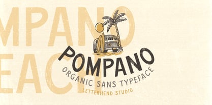 Pompano is an organic sans serif typeface which is purposely made for headline, display or logotype.This type of font perfectly made to be applied especially in logo, and the other various formal forms such as invitations, labels, logos, magazines, books, greeting / wedding cards, packaging, fashion, make up, stationery, novels, labels or any type of advertising purpose. Features : regular & stamp version uppercase & lowercase numbers and punctuation multilingual alternates & ligatures PUA encoded We highly recommend using a program that supports OpenType features and Glyphs panels like many of Adobe apps and Corel Draw, so you can see and access all Glyph variations.
 - Saltburg by Letterhend,
$17.00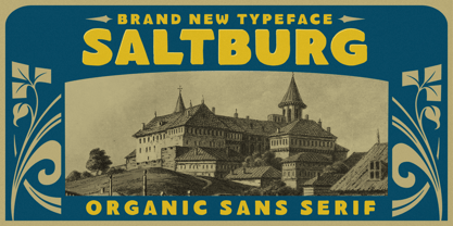 Introducing, Saltburg, an strong and bold sans serif with a touch of vintage look and feel. This type of font perfectly made to be applied especially in logo, headline, signage and the other various formal forms such as invitations, labels, logos, magazines, books, greeting / wedding cards, packaging, fashion, make up, stationery, novels, labels or any type of advertising purpose. Features : uppercase & lowercase numbers and punctuation multilingual alternates swashes and ligatures PUA encoded We highly recommend using a program that supports OpenType features and Glyphs panels like many of Adobe apps and Corel Draw, so you can see and access all Glyph variations.
 - Ganiser by Letterhend,
$17.00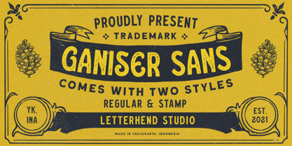 Ganiser Sans is a vintage display typeface with the touch of nostalgic feel. This typeface has unique looks and strong character. This font perfectly made to be applied especially in logo, and the other various formal forms such as invitations, labels, magazines, books, greeting / wedding cards, packaging, fashion, make up, stationery, novels, labels or any type of advertising purpose. Features : Uppercase & lowercase (alternates) Numbers and punctuation Stylistic alternates multilingual PUA encoded We highly recommend using a program that supports OpenType features and Glyphs panels like many of Adobe apps and Corel Draw, so you can see and access all Glyph variations.
 - Madre Rose by Letterhend,
$17.00 Madre Rose is a sophisticated sans serif with 3 weight style to choose from, bold, thin and regular. It has many beautiful ligatures which you can play around to match your project, whether for a standout headline, or for a tagline, you name it. The unique letterform makes this font one of a kind! Perfectly to be applied to the other various formal forms such as invitations, labels, logos, magazines, books, greeting / wedding cards, packaging, fashion, make up, stationery, novels, labels or any type of advertising purpose. Features : 3 weight style uppercase & lowercase numbers and punctuation multilingual alternates & ligatures PUA encoded
 - 1906 Fantasio Auriol by GLC,
$38.00 We have created this family inspired from the set of well known Auriol fonts used by the French popular "cheerful" satirical magazine Fantasio (1906-1948). The present version contains Normal, Italic, Bold and Bold Italic styles, in use for texts, plus narrow titlings and normal outlined with upper and lower case, both in use for titles. This family may be used together with 1906 French News, 1906 Titrage and 1890 Notice.
 - Centric Serif SG by Spiece Graphics,
$39.00 Here is a boxy, extremely squared alternative to display designs like Eden or Glamour. In comparison, Centric Serif does not share the fragile and delicate nature of these old 1930s classics. Instead it is fairly robust with a splayed M and a simple flattop A. It is interesting to note that Centric Serif (unlike Centric Geo) sports serifs in exaggerated and curiously bizarre ways. Centric Serif is now available in the OpenType Std format. Some new stylistic alternates and historical forms have been added to this OpenType version. Advanced features work in current versions of Adobe Creative Suite InDesign, Creative Suite Illustrator, and Quark XPress. Check for OpenType advanced feature support in other applications as it gradually becomes available with upgrades.
 - Centric Geo SG by Spiece Graphics,
$39.00 Here is a boxy, extremely squared alternative to display designs like Eden or Glamour. In comparison, Centric Geo does not share the fragile and delicate nature of these old 1930s classics. Instead it is fairly robust with a splayed M and a simple flattop A. It is interesting to note that Centric Serif (unlike Centric Geo) sports serifs in exaggerated and curiously bizarre ways. Centric Geo is now available in the OpenType Std format. Some new stylistic alternates and historical forms have been added to this OpenType version. Advanced features work in current versions of Adobe Creative Suite InDesign, Creative Suite Illustrator, and Quark XPress. Check for OpenType advanced feature support in other applications as it gradually becomes available with upgrades.
 - Future History by Sarid Ezra,
$17.00 Introducing, Future History, a unique font with sans and serif in one font! Future History is a modern and stylish font that combined sans and serif in one font. With sans as uppercase dan serif as lowercase. You can use the lowercase and uppercase in the same word that will make your text more stand out! And the best of this font is the italic version as the alternates which mean you can combine it all without worrying about the kerning! You can use this font for the magazine, poster, and suitable for headline. This font also support multi language.
 - Valverde by Jehoo Creative,
$20.00 Valverde is a super-serif font family with 2 widths condensed and normal, each width consists of 18 fonts and has a complete weight from thin to black combined with beautiful italic cuts to meet the needs of any design in any format. Inspired by the type of vintage look that has recently become a trend, this letter character has an elegant, sharp impression. Opentype features such as Stylistic Alternate and Ligature on the Valverde family make it look more aesthetic so that it fits in a classy modern look. Stunningly beautiful and modern serifs make them an essential addition to any type of tool kit.
 - Zin Display by CarnokyType,
$46.00 Zin Display is a contemporary typeface designed for various situations of typographic usage. Characteristic feature is a large x-height and balance between neutral construction of letters (strictly vertical axis), dynamic open forms (opened terminals) and sharp instrokes, outstrokes and serifs. Another typical feature is a visually narrower connection between stems and strokes. The complete font family consist of three width proportions (Normal, Condensed and Extended). Every sub-family has 5 weights, ranging from Light to Black with matching Italics. Zin Display can be effectively used especially for display typesetting but works for longer text as well. It can be used especialy in magazine layouts and editorial design, as well in advertising typography, orientation systems, corporate identities and many other situations. Zin Display is a member of the Zin super family, which also includes Zin Sans, Zin Slab and Zin Serif fonts.
 - Richard & Caroline by Silverdav,
$10.00 **Richard & Caroline** is a classic font with a modern style, so it adds a luxurious feel to this font, there are many ligatures and alternates that you can use for your design, and this will make your design more stunning and stand out. This serif font contains a number of ‘lowercase’ (A, E, U, I, O) and Uppercase Alternates characters. this can be accessed by enabling ‘stylistic Alternates’ in any software that supports OpenType. all ligatures and special characters are also accessible via the Glyphs panel. it is available in most Adobe & Affinity Designer software. **NEW UPDATE - RICHARD & CAROLINE FAMILY** what’s included: - Richard & Caroline Thin - Richard & Caroline Extra Light - Richard & Caroline Light - Richard & Caroline Normal - Richard & Caroline Thin Italic - Richard & Caroline Extra Light Italic - Richard & Caroline Light Italic - Richard & Caroline Normal Italic - Added Many Ligatures - Added lots of Uppercase Alternates - Support 75 Languages If you have any questions, please contact us
 - ThamesCondensed - Unknown license

- Textur - Unknown license

- Paulinho Pedra Azul - Unknown license


