10,000 search results
(0.014 seconds)
- Mechanical Stencil JNL by Jeff Levine,
$29.00 For well over a century, stencil machines allowed manufacturers, shippers and even the military to quickly mark and identify objects. Mechanical Stencil JNL was created from examples from one of these machines.
 - Sign Vendor JNL by Jeff Levine,
$29.00 Sign Vendor JNL is a simple sans modeled from hand-lettering with a touch of Art Deco influence. The design is from a 1930s poster promoting winter activities in New York State.
 - Chamferwood JNL by Jeff Levine,
$29.00 Chamferwood JNL is another interpretation of the block lettering style most popular during the late 1800s and the early 1900s. The design was modeled from examples from a set of wood type.
 - Sales Slip JNL by Jeff Levine,
$29.00 Sales Slip JNL is derived from the core lettering of Sales Book JNL, an outline font with a cast shadow; modeled from wood type examples found in an old printer's supply catalog.
 - Charta by Studio K,
$45.00 The Charta family of fonts draws its inspiration from the letter styles used in early manuscripts and printed books. Charta is also remarkably versatile: it’s equally at home in a traditional or modern context and can be used for a wide range of applications from an automobile badge to a newspaper masthead and from a fashion label to a candy bar wrapper.
 - Industrialist JNL by Jeff Levine,
$29.00 The chamfered block style of lettering has been a workhorse for years. From the early signage of the 1800s to military markings to the techno fonts of the 1980s and beyond, its clean and simple look gets the message across easily and boldly. Industrialist JNL and its oblique partner were modeled from the title on a piece of sheet music from the 1940s.
 - Kinkajou Stew NF by Nick's Fonts,
$10.00This exuberant face was suggested by a piece of French sheet music from the 1930s for the song Sur un Air de Shimmy, The name comes from an Australian song from the 1950s about a noncompliant boomerang. Both versions of this font contain the Unicode 1252 (Latin) and Unicode 1250 (Central European) character sets, with localization for Romanian and Moldovan. - Vtg Stencil Marsh by astype,
$36.00 The Vtg Stencil fonts from astype are based on real world stencils from several countries. The Vtg Stencil Marsh design was derived from 1 inch stencils, cut by a Marsh R machine. Marsh produced stencil machines since 1922 and was one of the most important manufacturers for such marking machines. The design is part of the American industrial heritage. PDF Specimen
 - American Pi NF by Nick's Fonts,
$10.00 Here's a handy collection of 72 type adornments gleaned from American Type Foundry catalogs from 1913 to 1934, featuring little treasures from some of the early twentieth century's most respected designers, including Will Bradley, Frederic Goudy and George Trenholm. Among the goodies are fleurons, pilcrows, guidons, bishops fingers, mortised initial frames and several other useful elements to dress up your documents.
 - Vicentina by Eurotypo,
$39.00 Vicentina has been created starting from gothic cursive calligraphy, widely used in Italy during XIV century. The ductus of Vicentina has been derived from the documents redacted by Master Domenico Dominici from Vicenza, while most of the inspiration comes from books preserved in the archives of Orvieto Cathedral (Archivi dell'Opera del Duomo di Orvieto). As a result, Vicentina takes form with an elegant, but fast and simplified ductus respect to gothic graphs, rich in ligatures and with over 400 OpenType glyphs, in perfect harmony with the rules of readability of a modern typeface.
 - American Advertise 005 by Intellecta Design,
$15.90a classic from american heritage - American Advertise 009 by Intellecta Design,
$26.90 from american wood type heritage
 - Habitatus by Bogstav,
$17.00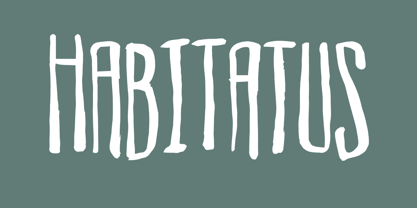 Another handmade font from Bogstav.com
 - Picaflor by RodrigoTypo,
$29.00 Picaflor is a sans typeface family perfect for titles, it contains 6 weights from thin to Black in addition to Greek and cyrillic alphabet with many alternatives from ligatures and letters, enjoy it!
 - Fishhook by Ingrimayne Type,
$14.95 Fishhook is a letterbat font that makes letters from fishhooks and barbs. In the plain version the fishhooks look more realistic, but the bold version may be more satisfying from a typographical perspective.
 - Study Hall JNL by Jeff Levine,
$29.00A cardboard stencil toy for children from the late 1950's or early 1960's was the inspiration for Study Hall JNL, part of a series of stencil revival fonts from Jeff Levine. - Strong Stencil JNL by Jeff Levine,
$29.00 Strong Stencil JNL derives its name from its visual appeal. Strong, rugged, all-purpose; this type design (modeled from a set of brass stencils) can take on the toughest type chores and deliver.
 - Czech Stencil JNL by Jeff Levine,
$29.00 Czech Stencil JNL was modeled from examples of a 1930s-era typeface from Czechoslovokia called "Patrona Grotesk" as seen in the Steven Heller-Louise Fili book "Stencil Type" (published by Thames and Hudson).
 - Sagittarius by Hoefler & Co.,
$51.99 A typeface with lightly-worn futurism, Sagittarius is equally at home among the beauty and wellness aisles, or the coils of the warp core. The Sagittarius typeface was designed by Jonathan Hoefler in 2021. A decorative adaptation of Hoefler’s Peristyle typeface (2017), Sagittarius’s rounded corners and streamlined shapes recall the digital aesthetic of the first alphabets designed for machine reading, a style that survives as a cheeky Space Age invocation of futurism. Sagittarius was created for The Historical Dictionary of Science Fiction, where it first appeared in 2021. From the desk of the designer: Typeface designers spend a lot of time chasing down strange valences. We try to figure out what’s producing that whiff of Art Deco, or that vaguely militaristic air, or what’s making a once solemn typeface suddenly feel tongue-in-cheek. If we can identify the source of these qualities, we can cultivate them, and change the direction of the design; more often, we just extinguish them without mercy. Sometimes, we get the chance to follow a third path, which is how we arrived at Sagittarius. During the development of Peristyle, our family of compact, high-contrast sans serifs, I often found myself unwittingly humming space-age pop songs. Nothing about Peristyle’s chic and elegant letterforms suggested the deadpan romp of “The Planet Plan” by United Future Organization, let alone “Music To Watch Space Girls By” from the ill-advised (but delicious) Leonard Nimoy Presents Mr. Spock’s Music from Outer Space, but there they were. Something in the fonts was provoking an afterimage of the otherworldly, as if the typeface was sliding in and out of a parallel universe of high-tech spycraft and low-tech brawls with rubber-masked aliens. It might have had something to do with a new eyeglass prescription. But I liked the effect, and started thinking about creating an alternate, space-age version of the typeface, one with a little more funk, and a lot more fun. I wondered if softer edges, a measured dose of seventies retrofuturism, and some proper draftsmanship might produce a typeface not only suitable for sci-fi potboilers, but for more serious projects, too: why not a line of skin care products, a fitness system, a high-end digital camera, or a music festival? I put a pin in the idea, wondering if there’d ever be a project that called for equal parts sobriety and fantasy. And almost immediately, exactly such a project appeared. The Historical Dictionary of Science Fiction Jesse Sheidlower is a lexicographer, a former Editor at Large for the Oxford English Dictionary, and a longtime friend. He’s someone who takes equal pleasure in the words ‘usufructuary’ and ‘megaboss,’ and therefore a welcome collaborator for the typeface designer whose love of the Flemish baroque is matched by a fondness for alphabets made of logs. Jesse was preparing to launch The Historical Dictionary of Science Fiction, a comprehensive online resource dedicated to the terminology of the genre, whose combination of scholarship and joy was a perfect fit for the typeface I imagined. For linguists, there’d be well-researched citations to explain how the hitherto uninvented ‘force field’ and ‘warp speed’ came to enter the lexicon. For science fiction fans, there’d be definitive (and sometimes surprising) histories of the argot of Stars both Trek and Wars. And for everyone, there’d be the pleasure of discovering science fiction’s less enduring contributions, from ‘saucerman’ to ‘braintape,’ each ripe for a comeback. A moderated, crowdsourced project, the dictionary is now online and growing every day. You’ll find it dressed in three font families from H&Co: Whitney ScreenSmart for its text, Decimal for its navigational icons, and Sagittarius for its headlines — with some of the font’s more fantastical alternate characters turned on. The New Typeface Sagittarius is a typeface whose rounded corners and streamlined forms give it a romantically scientific voice. In the interest of versatility, its letterforms make only oblique references to specific technologies, helping the typeface remain open to interpretation. But for projects that need the full-throated voice of science fiction, a few sets of digital accessories are included, which designers can introduce at their own discretion. There are alternate letters with futuristic pedigrees, from the barless A popularized by Danne & Blackburn’s 1975 ‘worm’ logo for NASA, to a disconnected K recalling the 1968 RCA logo by Lippincott & Margulies. A collection of digitally-inspired symbols are included for decorative use, from the evocative MICR symbols of electronic banking, to the obligatory barcodes that forever haunt human–machine interactions. More widely applicable are the font’s arrows and manicules, and the automatic substitutions that resolve thirty-four awkward combinations of letters with streamlined ligatures. About the Name Sagittarius is one of thirteen constellations of the zodiac, and home to some of astronomy’s most inspiring discoveries. In 1977, a powerful radio signal originating in the Sagittarius constellation was considered by many to be the most compelling recorded evidence of extraterrestrial life. Thanks to an astronomer’s enthusiastically penned comment, the 72-second transmission became known as the Wow! signal, and it galvanized support for one of science’s most affecting projects, the Search for Extraterrestrial Intelligence (SETI). More recently, Sagittarius has been identified as the location of a staggering celestial discovery: a supermassive black hole, some 44 million kilometers in diameter, in the Galactic Center of the Milky Way. <
 - Steel Grrrder Script by ULGA Type,
$9.00 Steel Grrrder is an industrial-style joining script with a stencil effect, available in six weights ranging from Light to Black. Great for all kinds of display purposes including posters, film titles, book covers, magazines, advertising, signage, packaging, logos and tanks, this is a script with a sharp personality and a steely presence. However, if you’re searching for a “nice” script - sorry, bud - you’re looking in the wrong place. Steel Grrrder Script doesn’t entice the reader with voluptuous curves, flowing swashes or frisky letterforms, instead its sharp chiselled features compel the reader to pay attention. Characters muscle their way along like robotic bulldogs in steel-toe cap boots. Steel Grrrder Script is a veritable slab fest, best categorised as a constructivist joining script. Forged from carbon steel and wrapped in a layer of Graphene, this is a robust display typeface family able to withstand even the most demanding typographical situations. The Steel Grrrrder extended family also includes a six-weight sans-serif with corresponding italics and two display fonts, Groove & Nutjob - all designed to work with each other.
 - Baskerville No. 2 by Bitstream,
$29.99This redesign is made from proofs, rather than the metal, and so is heavier, with particular attention to the Harris and the Monotype revision, which was made from proofs of Baskerville’s Great Primer (16pt). - Curly Q by Outside the Line,
$19.00 CurlyQ new from Rae Kaiser and Outside the Line. A curly, swirly, girly kind of font. A delightful headline font for your next garden party or note to the kids from the tooth fairy.
 - Alpine Script by Borges Lettering,
$42.00 Get creative with the adventurous brush casual Alpine Script from Charles Borges de Oliveira. This stunning typeface contains 29 alternate characters waiting to be explored. Great for anything from signage to culinary packaging. Enjoy!
 - Merden Graffiti by WAP Type,
$20.00 Merden Graffiti is new font from WAP Typefoundry, strong feel character set. To create the beautiful combination, just mix the uppercase and lowercase then mix with the alternative glyphs.Merden Graffitis insfire from graffiti style.
 - Lil' Mug Shots Humanoids by Patricia Lillie,
$25.00From nice ladies to evil clowns. - Helium by Red Rooster Collection,
$45.00 Re-tooled from the QBF Collection.
 - Tarantula Script by Red Rooster Collection,
$45.00Re-tooled from the QBF Collection. - Frenchy by Red Rooster Collection,
$45.00Re-tooled from the QBF Collection. - Eastside by TypeArt Foundry,
$45.00 Printed text from the Old West.
 - American Advertise 006 by Intellecta Design,
$14.90decorative caps from america heritage typography - Lil' Mug Shots Critters by Patricia Lillie,
$25.00Driver's License photos from the zoo. - Glasgow by Red Rooster Collection,
$45.00Re-tooled from the QBF Collection. - Salzburg by Red Rooster Collection,
$45.00Re-tooled from the QBF Collection. - Anglican - Unknown license

- Maeva by Autographis,
$39.50 Maeva is a non-joining wide formal 60s script, directly designed and carefully finished by hand on screen, trying to keep the script alive – preventing it from looking mechanical – by drawing each letter from scratch.
 - Faerie Queen NF by Nick's Fonts,
$10.00Based on a typeface named "Titania" from a 1930s specimen book from the Fundición Richard Gans in Madrid, this exquisite design will add a touch of elegance and nostalgic charm to any project it graces. - Egorycastle by Seventh Imperium,
$40.00 Egory castle was inspired from the history of the medieval age. The idea was to make us interested to explore in the aspect of art and decorative letters forms. Lots of studies that we have learned from history in middle age and inspiration from many different sources make very valuable references for us to develop a new idea in the development of this typeface.
 - Caballero Script by T4 Foundry,
$21.00 Caballero Script is a calligraphic font from from Swedish type designer Bo Berndal and the T4 font foundry. Caballero is inspired by Spanish handwriting from 15th and 16th century, minus the extremely long ascenders. If it would be music or a dance, it would be a Flamenco – there is fire as well as discipline. It is an OpenType creation, for both PC and Mac.
 - Masifa by Hurufatfont,
$19.00 Masifa has compact, simple, functional and neutral body structure. It has 5 widths from Normal to Ultra Condensed. Each width includes 9 weights from Hairline to Black and their matching italics. Also, every weight includes rich OpenType Features like Small Caps and custom number styles. Due to its large family, it is ideal for a wide range of usage from large-scale designs to small product labels.
 - Chill Script by Eclectotype,
$40.00 Looking for a break from modern calligraphy? Tired of skinny scripts? Here's something seriously relaxed. Chill Script is a totally new typeface, it eschews any brush influence, but maintains a warmth that comes from not being rigidly constructed. It's a sans serif script, with a nice top-heaviness that makes it friendly. As you expect from fonts today, it's loaded (but not pointlessly overloaded) with OpenType features.
