10,000 search results
(0.111 seconds)
- Restraining Order AOE by Astigmatic,
$19.95A typeface made from vintage typewriter samples and meticulously compiled into a complete character set. - Bank Statement AOE by Astigmatic,
$19.95A typeface made from vintage typewriter samples and meticulously compiled into a complete character set. - Gampolins by Patria Ari,
$15.00 Inspired from bubble gum shapes, Gampolins come with playful bubble shapes in a fun way.
 - Magneta by Volcano Type,
$19.00One of our first fonts ever. Simply made from some magnets hanging on a refrigerator. - Web-o-Mints GD by Galapagos,
$19.00George Ryan’s font of typographic ornaments and borders, available as a free download from Galápagos. - Big Stuff by ArFF,
$24.95Keep Big Stuff away from toner and ink as it can't resist eating them up. - Radiac by Stereo Type Haus,
$25.00 Radiac is a semi-monospaced unicase design inspired by lettering constructed from pieces of tile.
 - LD Verdant Leaves by Illustration Ink,
$3.00LD Verdant Leaves is a bold font with leafy designs sprouting from the thick lettering. - Overdrawn Account AOE by Astigmatic,
$19.95A typeface made from vintage typewriter samples and meticulously compiled into a complete character set. - Office Memorandum AOE by Astigmatic,
$19.95A typeface made from vintage typewriter samples and meticulously compiled into a complete character set. - Letterhead by Coffee Bin Fonts,
$20.00This font family was inspired by lettering found on old letterheads from the 19th century. - Urgent Telegram AOE by Astigmatic,
$19.95A typeface made from vintage typewriter samples and meticulously compiled into a complete character set. - Military Document AOE by Astigmatic,
$19.95A typeface made from vintage typewriter samples and meticulously compiled into a complete character set. - Affair by Sudtipos,
$99.00 Type designers are crazy people. Not crazy in the sense that they think we are Napoleon, but in the sense that the sky can be falling, wars tearing the world apart, disasters splitting the very ground we walk on, plagues circling continents to pick victims randomly, yet we will still perform our ever optimistic task of making some little spot of the world more appealing to the human eye. We ought to be proud of ourselves, I believe. Optimism is hard to come by these days. Regardless of our own personal reasons for doing what we do, the very thing we do is in itself an act of optimism and belief in the inherent beauty that exists within humanity. As recently as ten years ago, I wouldn't have been able to choose the amazing obscure profession I now have, wouldn't have been able to be humbled by the history that falls into my hands and slides in front of my eyes every day, wouldn't have been able to live and work across previously impenetrable cultural lines as I do now, and wouldn't have been able to raise my glass of Malbeck wine to toast every type designer who was before me, is with me, and will be after me. As recently as ten years ago, I wouldn't have been able to mean these words as I wrote them: It’s a small world. Yes, it is a small world, and a wonderfully complex one too. With so much information drowning our senses by the minute, it has become difficult to find clear meaning in almost anything. Something throughout the day is bound to make us feel even smaller in this small world. Most of us find comfort in a routine. Some of us find extended families. But in the end we are all Eleanor Rigbys, lonely on the inside and waiting for a miracle to come. If a miracle can make the world small, another one can perhaps give us meaning. And sometimes a miracle happens for a split second, then gets buried until a crazy type designer finds it. I was on my honeymoon in New York City when I first stumbled upon the letters that eventually started this Affair. A simple, content tourist walking down the streets formerly unknown to me except through pop music and film references. Browsing the shops of the city that made Bob Dylan, Lou Reed, and a thousand other artists. Trying to chase away the tourist mentality, wondering what it would be like to actually live in the city of a billion tiny lights. Tourists don't go to libraries in foreign cities. So I walked into one. Two hours later I wasn't in New York anymore. I wasn't anywhere substantial. I was the crazy type designer at the apex of insanity. La La Land, alphabet heaven, curves and twirls and loops and swashes, ribbons and bows and naked letters. I'm probably not the very first person on this planet to be seduced into starting an Affair while on his honeymoon, but it is something to tease my better half about once in a while. To this day I can't decide if I actually found the worn book, or if the book itself called for me. Its spine was nothing special, sitting on a shelf, tightly flanked by similar spines on either side. Yet it was the only one I picked off that shelf. And I looked at only one page in it before walking to the photocopier and cheating it with an Argentine coin, since I didn't have the American quarter it wanted. That was the beginning. I am now writing this after the Affair is over. And it was an Affair to remember, to pull a phrase. Right now, long after I have drawn and digitized and tested this alphabet, and long after I saw what some of this generation’s type designers saw in it, I have the luxury to speculate on what Affair really is, what made me begin and finish it, what cultural expressions it has, and so on. But in all honesty it wasn't like that. Much like in my Ministry Script experience, I was a driven man, a lover walking the ledge, an infatuated student following the instructions of his teacher while seeing her as a perfect angel. I am not exaggerating when I say that the letters themselves told me how to extend them. I was exploited by an alphabet, and it felt great. Unlike my experience with Ministry Script, where the objective was to push the technology to its limits, this Affair felt like the most natural and casual sequence of processions in the world – my hand following the grid, the grid following what my hand had already done – a circle of creation contained in one square computer cell, then doing it all over again. By contrast, it was the lousiest feeling in the world when I finally reached the conclusion that the Affair was done. What would I do now? Would any commitment I make from now on constitute a betrayal of these past precious months? I'm largely over all that now, of course. I like to think I'm a better man now because of the experience. Affair is an enormous, intricately calligraphic OpenType font based on a 9x9 photocopy of a page from a 1950s lettering book. In any calligraphic font, the global parameters for developing the characters are usually quite volatile and hard to pin down, but in this case it was particularly difficult because the photocopy was too gray and the letters were of different sizes, very intertwined and scan-impossible. So finishing the first few characters in order to establish the global rhythm was quite a long process, after which the work became a unique soothing, numbing routine by which I will always remember this Affair. The result of all the work, at least to the eyes of this crazy designer, is 1950s American lettering with a very Argentine wrapper. My Affair is infused with the spirit of filete, dulce de leche, yerba mate, and Carlos Gardel. Upon finishing the font I was fortunate enough that a few of my colleagues, great type designers and probably much saner than I am, agreed to show me how they envision my Affair in action. The beauty they showed me makes me feel small and yearn for the world to be even smaller now – at least small enough so that my international colleagues and I can meet and exchange stories over a good parrilla. These people, whose kindness is very deserving of my gratitude, and whose beautiful art is very deserving of your appreciation, are in no particular order: Corey Holms, Mariano Lopez Hiriart, Xavier Dupré, Alejandro Ros, Rebecca Alaccari, Laura Meseguer, Neil Summerour, Eduardo Manso, and the Doma group. You can see how they envisioned using Affair in the section of this booklet entitled A Foreign Affair. The rest of this booklet contains all the obligatory technical details that should come with a font this massive. I hope this Affair can bring you as much peace and satisfaction as it brought me, and I hope it can help your imagination soar like mine did when I was doing my duty for beauty.
 - Symposium Pro by Canada Type,
$49.95 Philip Bouwsma's Symposium Pro is a wide Carolingian script that can be set simply or with a wide range of flourishes. It takes its inspiration from the scriptoria of the twelfth century, particularly in Spain, where Christians, Muslims and Jews lived harmoniously in a brilliant culture for two centuries. As manuscripts were translated and copied to meet the Western demand for classical texts, calligraphic elements from Arabic and Hebrew spread throughout Europe, sparking a proliferation of new styles that brought the simple book hand to a higher level. Symposium Pro spans a broad range of time and space, from the court of Charlemagne to the Arabian nights and Renaissance Florence. Symposium Pro comes in four weights, ranging from Light to Bold, with each font containing over 1200 glyphs. Variations on every letter form, from swashes to subtle alterations, are plenty, with some even having up to 40 alternates. Also plenty are the embedded ornaments and flourishes, over a hundred of them. Keep that glyph palette handy for many pleasant surprises and easy setting solutions.
 - Grunge Formal by Scholtz Fonts,
$15.00 Grunge Formal started out as a more upright, formal version of one of my fonts, Figment. A most versatile contemporary typeface, Grunge Formal works equally well from funky to formal, from giant size headers to pint size body text, from movie posters to wedding invitations. If you've ever needed a font that has a grungy, deconstructed look but works well for all sizes, a font that you can use for funky, gritty designs, and also for formal wedding stationery, Grunge Formal is a perfect choice. From the formal viewpoint, the font presents as a regular serif typeface with deconstructed edges, giving the antique look popular in wedding stationery design. Here it can be used from header to body size. For in-your-face design, Grunge Formal, when oversized, is really powerful and its deconstructed outline provides a raw, rough contrast to your background images. Grunge Formal has all the features usually included in a fully professional font. Language support includes all European character sets, Greek symbols and all punctuation.
 - Stencil Punch JNL by Jeff Levine,
$29.00Stencil Punch JNL is modeled from lettering examples made by a Diagraph stencil cutting machine. Diagraph was the first company to make the stencil punch machines used in industry and by the military. Thanks to Neal Haynes for his kindness and assistance in providing me with sample cuts direct from the company's machine testing department. - Ornata F by Wiescher Design,
$39.50 Ornata F is the sixth of a series of old ornaments that I am trying to save from oblivion. I am completely redesigning the ornaments from scratch. These ornaments have been designed around 1910, I could not find out by whom. This set is perfect to design flowery frames. Your digitizing typedesigning savior, Gert Wiescher
 - ITC Tiepolo by ITC,
$29.99ITC Tiepolo font is from the design team at AlphaOmega Typography and named after Italian artist Dominic Tiepolo. The designers describe it as a sans serif with serifs" and it has also been referred to as a calligraphic design. Similar to Asian calligraphy, ITC Tiepolo font has personality yet does not detract from the text." - Wiggly Wavy by Mvmet,
$14.00 Wiggly Wavy is a whimsical display font that took inspiration from french fries shapes. You can use it for anything ranging from t-shirts, kids’ book designs, restaurant menu, greeting cards, stickers, and posters, or anything that needs a casual touch. Try it to create lovely designs and feel the good vibes with it!
 - Anivers by exljbris,
$- Anivers is robust and rigid, forgiving, flexible and elegant ... and also suitable for a broad use: from a stationery to a poster headline. From an intro in a magazine to a base for a logo. This OpenType font family comes in regular, italic, bold and small caps and offers supports CE languages and even esperanto.
 - Quitong by Arendxstudio,
$14.00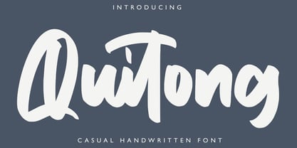 Quitong - Handwritten Font is a handwritten with a natural & stylish flow. This collection of scripts is perfect for personal branding. this works well for many applications. Everything from personal branding & wedding invitations to advertising could benefit from this collection of signature fonts Features : • Character Set A-Z • Numerals & Punctuations (OpenType Standard) • Accents (Multilingual characters) • Ligature
 - Agraham by Hishand Studio,
$15.00 Agraham is aesthetic serif font which the inspiration come from the unique Italy's vibes and some little touch from the beauty of Paris, France. It is so perfect for Logo brand, product packaging, advertisement, social media post, fashion brand, magazine headers and many more complete with ligatures alternates regular italic icon kerning multilingual support
 - Fong Shay Noon JNL by Jeff Levine,
$29.00 Fong Shay Noon JNL is a non-traditional approach to an Oriental-styled font as there are some letter forms with curves and others with straight lines. The name derives from a Chinese restaurant in North Miami Beach, Florida during the 1960s, which in turn took its name from a play on a Yiddish phrase.
 - Pen Nouveau JNL by Jeff Levine,
$29.00 Pen Nouveau JNL is a perfect example of the fluid, free-form pen lettering popularized during the Art Nouveau era of the early 1900s. The type face was modeled from the lettering on the cover of a piece of sheet music from 1911 entitled "If You Talk in Your Sleep, Don't Mention My Name".
 - Kid Captain PB by Pink Broccoli,
$19.00 A spunky slim typeface inspired by a 1958 Dell Comic, The Captain and the Kids featuring the Katzenjammer Kids as a spinoff from the original comic which was in turn inspired by the famous children's story from the 1860's, Max and Moritz. Fun, informal, and retro spunky, all balled up in a single typeface.
 - Easy Tiles by Intellecta Design,
$21.00 A nice mix of 62 decorative tile images. Designs are reminiscent of rubber stamps of architectural tiles found in historical homes and other buildings through the ages and printed devices from old catalogues. Generic enough to add interesting detail to just about any design. From invitations and greeting cards to book jackets, labels or fabric.
 - Buratino by ParaType,
$25.00 Buratino font got its name from a title character of Russian fairy tale — a clone of Pinocchio. Initially font was cut from a log and then scanned and converted into outline format. The font contains just upper case characters. Can be used in advertising and display typography. Designer — Gennady Fridman. Released by ParaType in 2009.
 - Handy Dandies JNL by Jeff Levine,
$29.00 Handy Dandies JNL is a third collection from Jeff Levine Fonts of pointing hands along with a few card holders thrown in for good measure. The images were re-drawn from vintage source material and these embellishments (also known as "Printer's Fists" or "Bishop's Fists") will enhance wood type projects as well as contemporary designs.
 - Reading And Writing Doodles by Outside the Line,
$19.00Reading & Writing Doodles is just that. 27 low-tech illustrations of books, pens, pencils and paper. Along with some hand lettered phrases, "My Book", "Ex Libris" and "From The Desk Of:" A fresh approach for Save a Date Cards and From The Desk Of notepads. An absolute must for bookplates and your book club graphics. - Maverick's Luck by FontMesa,
$20.00 From a few letters found on an old bank document from 1876, Maverick's Luck was born, and born again to give your projects that old western appearance. Maverick's Luck comes with multiple fill fonts, you will need an application that works in layers in order to use the fill fonts that come with FontMesa fonts.
 - Doright Black NF by Nick's Fonts,
$10.00 This typeface takes its design cues from Dudley Upright, a Dan X. Solo find from the sixties. This version is considerably wider than the original, which increases its legibility while retaining its flower-power vibe. Both flavors of this font feature the 1252 Latin, 1250 Central European, 1254 Turkish and 1257 Baltic character sets.
 - Cherkessk by Arendxstudio,
$15.00 Cherkessk - Handwritten Font is a handwritten with a natural & stylish flow. This collection of scripts is perfect for personal branding. this works well for many applications. Everything from personal branding & wedding invitations to advertising could benefit from this collection of signature fonts Features : • Character Set A-Z • Numerals & Punctuations (OpenType Standard) • Accents (Multilingual characters) • Ligature
 - Hurstville by Arendxstudio,
$15.00 Hurstville - Brush Signature Font with a natural & stylish flow. This collection of scripts is perfect for personal branding. this works well for many applications. Everything from personal branding & wedding invitations to advertising could benefit from this collection of signature fonts Features : • Character Set A-Z • Numerals & Punctuations (OpenType Standard) • Accents (Multilingual characters) • Ligature • Swash
 - Benoa by Creativemedialab,
$20.00 Benoa is a versatile font family for your design, consist of 6 weights from thin to black with dozens of alternates. Benoa works well with any style of design concept, from branding to a nice bold modern look! Benoa also available in Variable format, multilingual support, numbers, and currency symbols, and dozens of alternates.
 - Tibet - 100% free

- TT Ricordi Allegria by TypeType,
$29.00 Please note! If you need OTF versions of the fonts, just email us at commercial@typetype.org TT Ricordi Allegria useful links: Specimen | Graphic presentation | Customization options TT Ricordi Allegria is a sleek and intelligent contemporary Florentine grotesque inspired by the half-erased lettering in Basilica di Santa Croce, Florence. TT Ricordi Allegria was drawn by Antonina Zhulkova and reflects in its graphics the transitional stage between the classic serif with varying proportions, gravitating towards the Roman capital type, and the Florentine sans serif. The font is characterized by variability in the proportions of characters, contrast between strokes, wedge-shaped triangular characters, and the absence of traditional serifs. The main visual feature of the typeface is its diversity and the ability, using different stylistic sets, to completely change the character and perception of the typeface. The drawing of the characters from the main set is strict, thanks to which the font looks stern, as if the inscription in the font was really carved out of stone. And with the help of another set, we can add roundness, or even smoothness, to the font. This is due to the fact that the letters (E R K Q J Y in Latin, and Л К Ж Э in Cyrillic) from the second set have either very noticeable "curls" or smooth, rounded "legs". In addition, the typeface includes a set of beautiful ligatures for use in display inscriptions, such as large headlines. An interesting moment when working on the typeface was the creation of the Cyrillic typeset, since the Cyrillic alphabet does not so easily fit into the concept of the Florentine grotesque and stressed semi-serif. The most difficult thing in working on the Cyrillic alphabet was to create a system of spacing for characters, as it was done in the Latin alphabet, and to make sure that when typing in Cyrillic, the drawing of the text remained beautiful. That is why the letters Д Л У Ы appearing in the font family are somewhat unusual to the eye, and the proportions of other characters in Cyrillic are not quite “classic” either. In general, the Cyrillic set looks more display than its Latin prototype, but at the same time it lacks the sense of historicity or legacy of the Soviet past, which often comes to the foreground when working on the design of the Cyrillic alphabet in this type of serifs. TT Ricordi Allegria consists of two weights (Regular and Bold) and one variable font. Each style includes over 750 characters, as well as 19 OpenType features. Interesting features of the typeface include three stylistic sets that greatly change the perception of the font, a set of bright display ligatures, a few neat icons that are suitable for breaking text and will emphasize the visual language of the font. Please note! If you need OTF versions of the fonts, just email us at commercial@typetype.org FOLLOW US: Instagram | Facebook | Website
 - Prillwitz Pro by preussTYPE,
$49.00 Johann Carl Ludwig Prillwitz, the German punch cutter and type founder, cut the first classic Didot letters even earlier than Walbaum. The earliest proof of so-called Prillwitz letters is dated 12 April 1790. Inspired by the big discoveries of archaeology and through the translations of classical authors, the bourgeoisie was enthused about the Greek and Roman ideal of aesthetics. The enthusiasm for the Greek and Roman experienced a revival and was also shared by Goethe and contemporaries. »Seeking the country of Greece with one’s soul«. All Literates who are considered nowadays as German Classics of that time kept coming back to the Greek topics, thinking of Schiller and Wieland. The works of Wieland were published in Leipzig by Göschen. Göschen used typefaces which had been produced by until then unknown punch cutter. This punch cutter from Jena created with these typefaces master works of classicist German typography. They can stand without any exaggeration on the same level as that of Didot and Bodoni. This unknown gentleman was known as Johann Carl Ludwig Prillwitz. Prillwitz published his typefaces on 12th April 1790 for the first time. This date is significant because this happened ten years before Walbaum. Prillwitz was an owner of a very successful foundry. When the last of his 7 children died shortly before reaching adulthood his hope of his works was destroyed, Prillwitz lost his will to live. He died six months later. His wife followed him shortly after. The typeface Prillwitz as a digital font was created in three optical styles (Normal, Book and Display). The typeface Prillwitz Press was created especially for a printing in small sizes for newspapers. »Prillwitz Press« combines aesthetic and functional attributes which make written text highly readable. It was originally designed for a newspaper with medium contrast to withstand harsh printing conditions. Its structure is quite narrow which makes this typeface ideal for body text and headlines where space is at premium. For the Normal – even more for the Book – a soft and reader-friendly outline was created through a so-called »Schmitz« and optimized in numerous test prints. The arris character and the common maximal stroke width contrast of the known classicist typefaces (Didot/Bodoni) were edited by the study of the original prints. This was also done in order to reach a very good readability in small type sizes. This typeface is perfectly suited to scientific and belletristic works. Accordingly it has three styles: Regular, Bold and Italic as Highlighting (1). The typeface Prillwitz is a complete new interpretation and continuing development of the conservated originals from 1790. They have been kept in the German Library in Leipzig. It was always given the priority to keep the strong roughness and at the same time optimizing the readability of this striking font. The type family has all important characters for an efficient and typographic high quality work. ----------- (1) Accentuation of particular words or word orders (e.g. proper names, terms etc.). Typographic means for Highlighting could be Italic, SmallCaps or semi-bold.
 - Heidelbe-Light - Unknown license

- Choc - Unknown license


