10,000 search results
(0.099 seconds)
- Emoticons - Personal use only

- Mexia NF by Nick's Fonts,
$10.00Another addition to the Whiz Bang Woodtype series, this typeface is a double-wide, extrabold version of the so-called Tuscan style of lettering, popular at the end of the nineteenth century. Named after a small town in Texas, which the locals pronounce "meh-HAY-a." Both versions of this font contain the Unicode 1252 Latin and Unicode 1250 Central European character sets, with localization for Romanian and Moldovan. - Packard Patrician NF by Nick's Fonts,
$10.00Here’s a new take on the hand-lettered alphabet Oswald Bruce Cooper used in ads for the Packard Motor Company, later converted into a metal typeface by the Barnhard Brothers & Spindler foundry. This version has smoother outlines and an increased x-height, but retains all of the elegant charm of the original. Both versions of this font include the complete Unicode Latin 1252 and Central European 1250 character sets. - Radio Days NF by Nick's Fonts,
$10.00This Deco delight is based on logotype lettering for Crosley Radios from the 1930s. By aLtErNaTiNg upper and lowercase letters (brackets and braces, too), you can maintain the flow of the lightning bolts through the letters. Additionally, inline hyphens can be found at the ASCII circumflex and ASCII tilde positions. This font contains the complete Latin language character set (Unicode 1252) plus support for Central European (Unicode 1250) languages as well. - Franciscan Caps NF by Nick's Fonts,
$10.00The majority of the letterforms in this mono-case font are based on a little-seen titling typeface designed by Frederic Goudy. The lowercase positions contain alternate letterforms, so you can mix and match to obtain just the right look. Both the OpenType and Truetype versions of this font contain the complete Latin language character set (Unicode 1252) plus support for Central European (Unicode 1250) languages as well. - Nouveau Riche JNL by Jeff Levine,
$29.00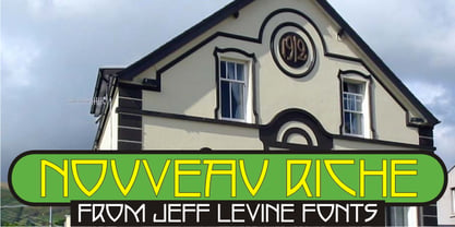 Within the pages of an early-1900s instructional book on show card lettering was found a marvelous example of an alphabet that typifies the Art Nouveau movement of the era and served as the inspiration for Nouveau Riche JNL. Angular, artistic and reminiscent (in some ways) of ancient Greek lettering, this design has many unusual letterforms. Check out the interpretive K and R for the best examples of this art style.
 - LTC Obelysk Grotesk by Lanston Type Co.,
$24.95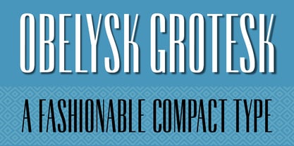 Obelysk Grotesk was designed by the Lanston Drawing Office in the late 1980s. This face is a reconstruction of Spire (1937) drawn by Sol Hess. The skeleton of Spire Roman stands with the serifs removed. Like Spire, this font has no lower case, but does offer alternate cap styles in some of the lower case positions. Spire and Obelysk have both been used prominently in the fashion industry.
 - Starslang by MyAnvil,
$20.00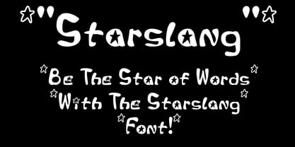 This is the "Starslang" font, that features a star shape embedded within the letters of the vowels. The theme was designed to enlighten the mood and spirit with a fun mood of urban atmosphere.
 - Danah by Eyad Al-Samman,
$35.00 Danah” is the first name of a very close and cherished classmate, friend, and peer. Danah is a Palestinian woman who used to study with me in the same university where I was honorably introduced to her several years ago. In fact, I decided to dedicate this typeface wholly to her in return for all the years of friendship that we had spent together as classmates during the late 1990s. She was—and absolutely still—a source of support and inspiration for me in life due to her brilliant, big-hearted, and philanthropic personality. Danah likes different things in life and among them the sea, horses, reading, and also travelling. She lives and works now in Palestine, and yearns for being granted a new life—like many other free Palestinians—full of freedom, peace, and happyness. Danah® is a handwriting and scribbly Arabic display typeface. The main trait of this typeface is the realistic handwriting design of its letters and ligatures. This feature renders it as one of the stylish typefaces used for headlines and also texts. Among the distinguished letters of Danah® typeface are the “Qaaf”, “Kaaf”, “Meem”, “Noon”, and others. Moreover, Danah® typeface has a character set which supports Arabic, Persian, Urdu, and Latin letters/numerals with a limited range of specific Arabic and Latin ligatures. This font comes in a single weight (i.e., regular) with exactly 639 distinctive glyphs. Due to its free and streamlined design, Danah® typeface is appropriate for heading and text in Arabic, Persian, and Urdu. It can be graphically and visually exploited in magazines, posters, and interfaces of different things such as clothes and equipment. Moreover, it can be pleasingly used in writing personal, friendly, and unofficial letters, messages, documents, invoices, notes, dispatches and menus which require a smoothed handwritten touch and trend. It is also elegantly suitable for signs, books’ covers, advertisement light boards, and titles of flyers, pamphlets, novels, and books of children and adults. In brief, Danah® typeface is one of the new hand-drawn typefaces which can be brought into play efficiently in diverse graphic, typographic, calligraphic, and artistic works in different languages and cultures. 2018-09-13 00:00:00.000 10.0000 F25946-S114426 10913 Timeless URW Type Foundry https://www.myfonts.com/collections/timeless-duplicate-font-urw NULL NULL 2016-01-08 00:00:00.000 89.9900 F10913-S42560 54569 Jellofries Maulana Creative https://www.myfonts.com/collections/jellofries-font-maulana-creative https://cdn.myfonts.net/cdn-cgi/image/width=417,height=208,fit=contain,format=auto/images/pim/10000/JtHgrbkPi7YU282OWix69Tqb_97b690350e4b3ed453d7c27fe0eb6664.png Jellofries is a fancy brush script font. With brush bold contrast stroke, fun character with a bit of ligatures and alternates. To give you an extra creative work. Jellofries font support multilingual more than 100+ language. This font is good for logo design, Social media, Movie Titles, Books Titles, a short text even a long text letter and good for your secondary text font with sans or serif. Make a stunning work with Jellofries font. Cheers, Maulana Creative 2022-05-06 00:00:00.000 12.0000 F54569-S252887 38361 Alt Moav ALT https://www.myfonts.com/collections/alt-moav-font-andreas-leonidou https://cdn.myfonts.net/cdn-cgi/image/width=417,height=208,fit=contain,format=auto/images/pim/10000/70046_aa489c02cd589f8f924b405c901a8014.png Moav is a geometric experimental display typeface for use on logos,posters etc. 2011-12-13 00:00:00.000 15.0000 F38361-S179452 42255 M Elle HK Monotype HK https://www.myfonts.com/collections/m-elle-hk-font-monotype-hk NULL HK series fonts are in Unicode encoding and consists of BIG 5 character set and HKSCS characters. The character glyphs are based on the regular Traditional Chinese writing form and style. It is generally used in Taiwan ROC, Hong Kong and Macau. 2011-05-11 00:00:00.000 523.9900 F42255-S193845 71839 Kaerobi Kulokale https://www.myfonts.com/collections/kaerobi-font-kulokale https://cdn.myfonts.net/cdn-cgi/image/width=417,height=208,fit=contain,format=auto/images/pim/10004/ieVtB18gl4EgKrVVDIPLtX8b_33d93ffd2cd339b2544feb3d7a0a3121.png Kaerobi is an condensed display font, and with a style that is very different from the others. This font comes in four styles, Regular, Oblique, Rough, and Outline Version. Kaerobi is well-suited for posters, social media, headlines, magazine titles, clothing, large print formats - and wherever you want to be seen. Inspired by the style of design that is currently popular, and this is the answer to all the needs of every idea that you will pour in this modern era. We highly recommend using a program that supports OpenType features and Glyphs panels such as Adobe Illustrator, Adobe Photoshop CC, Adobe InDesign, or CorelDraw, so you can see and access all Glyph variations. This font is encoded with Unicode PUA, which allows full access to all additional characters without having special design software. Mac users can use Font Book, and Windows users can use Character Map to view and copy one of the extra characters to paste into your favorite text editor / application. Thank You. 2022-08-16 00:00:00.000 17.0000 F71839-S298671 52588 The Heather Romie Creative https://www.myfonts.com/collections/the-heather-font-romie-creative https://cdn.myfonts.net/cdn-cgi/image/width=417,height=208,fit=contain,format=auto/images/pim/10000/Lc4estBSB0wCiDunz9GNDUcb_097035319875b31f0a18a4bb2e8e675b.png The Heather Script is a formal calligraphy design, including Regular. This font is casual and pretty with a stroke. Can be used for various purposes. such as logos, product packaging, wedding invitations, branding, headlines, signage, labels, signatures, book covers, posters, quotes and much more. Heather Script featuring OpenType style alternatives, ligatures and International support for most Western Languages is included. To enable the OpenType Stylistic alternative, you need a program that supports OpenType features such as Adobe Illustrator CS, Adobe Indesign & CorelDraw X6-X7, Microsoft Word 2010 or a later version. How to access all alternative characters using Adobe Illustrator: *https://www.youtube.com/watch?v=XzwjMkbB-wQ Heather Script is coded with PUA Unicode, which allows full access to all additional characters without having to design special software. Mac users can use Font Book , and Windows users can use Character Map to view and copy any additional characters to paste into your favorite text editor/application. How to access all alternative characters, using the Windows Character Map with Photoshop: *https://www.youtube.com/watch?v=Go9vacoYmBw 2022-02-23 00:00:00.000 19.0000 F52588-S242949 16709 Pastina Lebbad Design https://www.myfonts.com/collections/pastina-font-lebbad-design https://cdn.myfonts.net/cdn-cgi/image/width=417,height=208,fit=contain,format=auto/images/pim/10000/220264_a574aa9e49d2f9f1da3950f1fef09123.png Pastina is an elegant serif font consisting of caps, lower case, and alternate characters. Soft serifs and the graceful flow of each character add to the classic feel of this font. 2008-07-31 00:00:00.000 24.9500 F16709-S66588 2367 Munira Script Picatype https://www.myfonts.com/collections/munira-script-font-picatype https://cdn.myfonts.net/cdn-cgi/image/width=417,height=208,fit=contain,format=auto/images/pim/10000/309621_5c93006e7517281c082dc7c75bfd1c2b.png Munira Script is a modern calligraphy design. This font is casual and pretty with swashes. It can be used for various purposes. such as logos, product packaging, wedding invitations, branding, headlines, signage, labels, signature, book covers, posters, quotes and more. Munira Script features OpenType stylistic alternates, ligatures and International support for most Western Languages. To enable the OpenType Stylistic alternates, you need a program that supports OpenType features such as Adobe Illustrator CS, Adobe Indesign & CorelDraw X6-X7, Microsoft Word 2010 or later versions. How to access all alternative characters using Adobe Illustrator: https://www.youtube.com/watch?v=XzwjMkbB-wQ How to access all alternative characters, using Windows Character Map with Photoshop: https://www.youtube.com/watch?v=Go9vacoYmBw Munira Script is coded with PUA Unicode, which allows full access to all the extra characters without having special designing software. Mac users can use Font Book , and Windows users can use Character Map to view and copy any of the extra characters to paste into your favourite text editor/app. If you need help or have any questions, please let me know. I'm happy to help :) Thanks & Happy Designing! 2019-07-05 00:00:00.000 10.0000 F2367-S10062 27004 Ketimun Hanoded https://www.myfonts.com/collections/ketimun-font-hanoded https://cdn.myfonts.net/cdn-cgi/image/width=417,height=208,fit=contain,format=auto/images/pim/10000/306179_8517cd9a57ccc15cff68737e17de4e85.png Ketimun means ‘cucumber’ in Bahasa Indonesia. At home we eat a lot (A LOT) of Indonesian food, which often includes Acar Ketimun (Sweet/sour cucumber salad). I usually make the simple version, but sometimes I go for the more elaborate cucumber salad (the recipe of which you’ll find on poster 2). Ketimun font is a rather delicious script font; uneven, organic and full of life. Comes with a fresh taste and lots of diacritics. 2019-06-06 00:00:00.000 15.0000 F27004-S120951 38675 Psalterium Alter Littera https://www.myfonts.com/collections/psalterium-font-alter-littera https://cdn.myfonts.net/cdn-cgi/image/width=417,height=208,fit=contain,format=auto/images/pim/10000/204202_94b78204200645ccd1daa5d5f1a63916.png A clean, smooth adaptation of the magnificent gothic types used by Johann Fust and Peter Schöffer in their famous Mainz Psalter (Psalterium Moguntinum) of 1457, also used in their Canon of the Mass (Canon Missae) of 1458, and in their Benedictine Psalter (Psalterium Benedictinum) of 1459. [Although these works were published after Gutenberg’s break with Fust, it is generally agreed that Gutenberg was working along with Fust and Schöffer on the Mainz Psalter while the 42-line Bible was still being printed.] In addition to the usual standard characters for typesetting modern texts, the font includes a comprehensive set of special characters, uncial initials (adapted from both the Mainz Psalter and early sixteenth-century Dutch types by Henric Pieterszoon), alternates and ligatures, plus Opentype features, that can be used for typesetting (almost) exactly as in the Mainz Psalter and later incunabula. The main historical sources used during the font design process were high-resolution scans from the copy of the Mainz Psalter preserved at the Österreichische Nationalbibliothek, Vienna (the only copy whose colophon includes the famous printer’s mark of Fust and Schöffer). Other sources were as follows: Masson, I. (1954), The Mainz Psalters and Canon Missae, 1457-59, London: Printed for the Bibliographical Society; Kapr, A. (1996), Johann Gutenberg - The Man and his Invention, Aldershot: Scolar Press (ch. 8); Füssel, S. (2005), Gutenberg and the impact of printing, Burlington: Ashgate (ch. 1); and Man, J. (2009), The Gutenberg Revolution, London: Bantam (ch. 8). Specimen, detailed character map, OpenType features, and font samples available at Alter Littera’s The Oldtype “Psalterium” Font Page. Note: Several uncial initials in The Oldtype “Psalterium” Font have been derived from corresponding characters in The Initials “Gothic C” Font, adjusting them to cope with the special (large) x-height and letter spacing of the Psalterium font (so the two sets of initials are not directly interchangeable). 2012-07-06 00:00:00.000 25.0000 F38675-S178340 23791 VLNL Donuts VetteLetters https://www.myfonts.com/collections/vlnl-donuts-font-vetteletters https://cdn.myfonts.net/cdn-cgi/image/width=417,height=208,fit=contain,format=auto/images/pim/10001/190114_ca5047d6d6754375933067862f9328a8.png VLNL Donuts’ first incarnation was designed already in 2005 by DBXL as a logo for Dutch funky house music outfit Hardsoul, and since then has been used for lots of music related projects. Donuts is heavily infused by hip 1970s geometric fonts like Blippo, Pump and ITC Bauhaus, but nonetheless has both feet in this modern day and age. Meticulously designed and tightly spaced, VLNL Donuts is very suitable for logos, headlines and music artwork. We especially recommend using it on big 12 album covers. Oh, and it got its name for obvious reasons (“the O looks like one...’) VLNL Donuts is deep fried, glazed and can be covered in a variety of sweetness: sprinkles, cinnamon, coconut, chopped peanuts, powdered sugar or maple syrup. They also can be filled with cream, custard or jam. As a very sweet and saturated snack should, VLNL Donuts is fitted with a full set of alternate swoosh caps that can be deployed to liven up your already ‘out there’ designs.
 - Medieval Borders by Aah Yes,
$5.00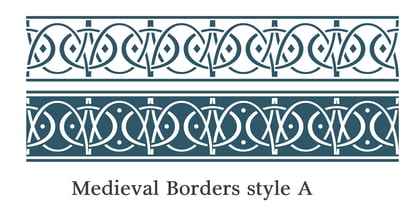 This is a large group of typefaces inspired by those borders and patterns you see going across documents from the Middle Ages and Medieval times, eventually becoming this collection of fonts where you can scroll various repeating patterns across a page, for example. You can get a repeating pattern that scrolls seamlessly by repeating the same letter. The default text displaying on the web-page is bbbbbbbb, for example. There's over 2 dozen basic styles, and each style has 52 designs within it, using the characters Upper Case A - Z and lower case a - z, with the lower case being the negative/reverse colour of the Upper Case version, it will be the corresponding design just reverse coloured and with an edging strip. There's also a space - but nothing else. The styles in these fonts usually have groups of six characters (A to F, G to L, M to R, S to X), and where the second group is a variation on the first - usually thicker lines - and the third grouping is another variation on that, usually thicker lines again, making the first 24 letters. (Sometimes there's three groups of eight characters). The pattern within a group normally starts off plain then gets busier as it progresses - such as there'd be a more complex pattern of circles and diamonds as you go through the letters. Then the letters Y & Z are somewhat different to the rest. There's four versions starting with Z, and they're a little bit different, and they're grouped in fives - getting bolder as you progress through the letters, but with similar patterns within each group of 5, and that makes the first 25 characters. The letter Z character is extra busy. Again, lower case is the reverse colour of the Upper Case. Mostly you can get patterns and borders that combine seamlessly by using letters within the same group of 6 or 8 (like maybe abdcedcb). There are a few occasions when that doesn't work out, because there may be circles or diamonds at the sides of the letters that don't match up with another letter that has a different pattern at the side. But you can create a pattern with the exact level of complexity you want perfectly easily. You can see examples of this in the poster images. Neighbouring letters without embellishments at the sides of the letters will usually fit together. Have fun with it, that's what it's there for. aah yes fonts
 - Anfalas - 100% free

- Lemon Smash by Bogstav,
$18.00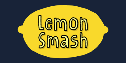 Lemons here and lemons there - I really love lemons! I use them in foods, deserts and drinks. I even eat them just for the taste of it! And, I name a lot of my fonts something with lemon! This Lemon font has 3 different versions of each lowercase letter and comes in both Regular, Outside and Inside versions - use them as single fonts, or mix them for nice results! Go go Lemon Smash!
 - Heathen by Canada Type,
$24.95A few emails sent to Canada Type have asked for more “bad scripts”. A few others asked for "more Mascara-like treatments". And some asked for more fonts of “distressed elegance”. Whatever you like to call this style of doubled-script font, sightings of designs using it have become common within the last few years. Such fonts have become the standard in expressing elegant confusion, old chaos in modern settings, recycled histories, and rebellious ideas. This style is quite often seen on chic clothing, music packaging, some sports paraphernalia, surfer and skateboarder gear, even book covers. That said, the Heathen font was made to include an advantageous feature that other distressed scripts do not normally have: More intertwined over-swashing in the majuscules. This over-swashing is quite useful in settings where the stroke and fill colors differ, or complement each other. It is also quite the point of emphasis where the idea is to show elegance gone ancient, old thoughts in a modern wrapper, rust never sleeping, or the very basic limits of the world’s nature. The original Heathen was made by redrawing Phil Martin’s Polonaise majuscules and superposing them over the majuscules of Scroll, another Canada Type font. The lowercase is a superposition of Scroll’s lowercase atop a pre-release version of Sterling Script, yet another Canada Type font. Heathen Two was made in a similar way, by combining two pre-release Canada Type scripts. - Mightiest Autograph by Din Studio,
$29.00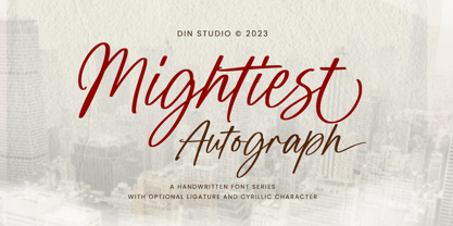 Digital designs seldom show personal touches to make them stand out and to give unique displays. Generic fonts are no longer enough to do so. You need something special to make great impacts on your work. Therefore, a handwritten font can be the perfect solution to such a necessity. This is the Mightiest Autograph. Mightiest Autograph is a handwritten font in a signature looking style to add elegant, personal nuances on your designs. The curves and wipes in the swinging ends of the letters are the main characters. Like the other cursive fonts, each letter is connected to one another to make the font legible. The letters’ proportions are made different for a more artistic looking style applicable for such romantic texts. You can apply this font for any text sizes due to its great legibility. Additionally, you can enjoy the available features here. Features: Alternates Ligatures Multilingual Supports PUA Encoded Numerals and Punctuations Mightiest Autograph fits best for various design projects, such as brandings, posters, banners, invitations, greeting cards, magazine covers, quotes, printed products, merchandise, logos, social media, etc. Find out more ways to use this font by taking a look at the font preview. Thanks for purchasing our fonts. Hopefully, you have a great time using our font. Feel free to contact us anytime for further information or when you have trouble with the font. Thanks a lot and happy designing.
 - Ginchiest by 38-lineart,
$15.00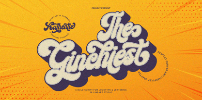 We introduce our new font named Ginchiest. According to its name, the word ‘Ginchiest’ is slang for something interesting, the coolest, the hippest, the prettiest, the smartest, the most fun to be around. You’re the ginchiest! Maybe this is slang you have heard about; it represents Ginchiest font perfectly. The Ginchiest is a bold script font with retro vintage style. This font is perfect for you lettering lovers because we prepared lots of alternates and ligatures that are very eye-catching. And of course we also designate this font for branding; it's great in logos and logotypes. Bold style make your product look very confident to appear in the public market. For shadow effect, just relax, we have prepared it for free for you, so you don’t need waste time making shadow effects. For the tutorial how to make shadow effect please see this link: https://youtu.be/Bt_DqE0TQjc No doubt - its great choice for lettering and logotype. You’re the Ginchiest!
 - Gilman by Miller Type Foundry,
$29.00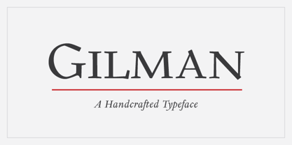 The idea for Gilman started simple enough, a serif typeface that works well for large amounts of text. However, after many struggles creating a quality typeface digitally, I decided to first draw the complete alphabet by hand on paper, and then trace that digitally. The result is a unique workhorse typeface with a subtle “human touch” that is very rare in this modern technological age. Gilman has extensive language support and comes with many opentype features like true small caps, tabular lining figures, stylistic alternates, ligatures and more. Gilman Sans (derived from the serif) is an excellent compliment and works together harmoniously with Gilman on the page.
 - Xaloc by Vanarchiv,
$20.50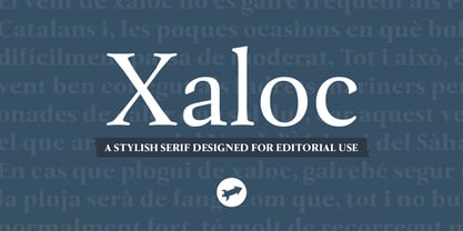 Xaloc was designed for editorial use in books, magazines and newspapers. This typeface family contains different font versions for different optical sizes; Caption, Text, Subhead and Display, all of them with different x-height proportions and contrast. Its serifs are asymmetrical and its letterforms have geometric modulated strokes that emulate the calligraphic variations. Its design approach enhances text flow and continuous reading. Xaloc was based on Ricado Santos’ Tramuntana, which has the same skeleton, proportions and serifs with a more mechanical design. Xaloc is the Catalonian name from the Mediterranean wind that comes from the Sahara and reaches hurricane speeds in North Africa and Southern Europe.
 - Omniscient by Comicraft,
$19.00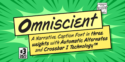 Omniscient is a narrative font that sees all… it’s everywhere and nowhere, the storyteller and the story, upper and lower case. This godlike font can be first person AND third person, friendly or serious, personable AND impersonal. It knows all the details but will only reveal them when it serves the narrative. The classical characters in Omniscient are all knowing, all seeing, and can even be all singing, all dancing on occasion. Even gods like to let their hair down and have fun. Features three weights with upper & lowercase alphabets, language support for Western & Central Europe, Automatic alternates, Stylistic Alternates & Crossbar I Technology™.
 - Albia Nova by Greater Albion Typefounders,
$9.50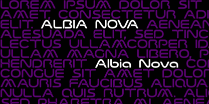 Albia Nova is a bit of a new departure for Greater Albion-an unashamedly futuristic typeface. It was originally developed for a friend of ours-a set designer who needed some lettering on props for a science fiction play-the brief was to evolve conventional letter forms and speculate as to what they may look like in the future. As released Albia Nova is a more refined version of this idea, placing a bit more emphasis on readability (today) over evolution of the letterforms. The result is good for giving design projects a futuristic feel, but also has something of the 1970s and 1980s about it.
 - Nantua Flava by Characters Font Foundry,
$25.00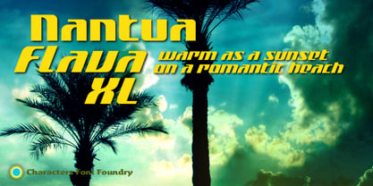 Nantua Flava XL is a display font by heart. It's preferably seen on posters or flyers. It's inspired by the Op Art style of lettering in the USA from the 1960s and 70s. But it holds also very futuristic elements so it work very well on futuristic techno party flyers and posters. Nantua Flava XLi speeds up your design. It's powerful as a Ferrari engine, strong as a steam locomotive. The very close innerforms and low contract make it perfectly suited for background patterns as well as big headline texts. The stiff little brother of this is simply called Nantua. They are a happy family.
 - Hebrew Amanda Std by Samtype,
$59.00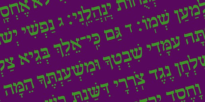 This is a modern, wonderful, and beautiful font. This font is super readable and can be used from Posters to books. The readability of this font is amazing. This font has the modern Hebrew punctuation: Shevana, Kamatz Katan, Dagesh Hazak, and Cholam Chaser.
 - 1066 Hastings by GLC,
$38.00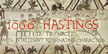 In 1066, William, duke of Normandy, was invading England. He was demanding the crown for himself, against King Harold the Saxon. He killed Harold and reached the crown at Hastings, the well-known battlefield. A few years later, in Bayeux (Normandy, French)was displayed a large tapestry (almost 70 m long) who was telling the story of the conquest. Along the tapestry was written a comment in Latin, using Roman capitals influenced a little by English or Scandinavian style (as it is visible in the Eth character). We have created the font, inspired from this design, adapted for contemporary users, making difference between U and V, I and J, which has not any relevance for ancient Latin scribes, and naturally with Thorn, Oslash, Lslash... and usual accented characters did not exist at the time. We also have reconstructed the K, German double s and Z, always using patterns of the time. We have scrupulously respected the poetic irregular and distressed original forms with two or three alternate for each characters, including reconstructed numerals.
 - Bloco Pro by CheapProFonts,
$10.00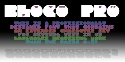 Geometric elements combined to create solid square letters. Makes for interesting blocks of text - and headings. All the diacritical letters have the diacritic embedded into the base letter, so every glyph in this font is within a square. Start stacking your text! ALL fonts from CheapProFonts have very extensive language support: They contain some unusual diacritic letters (some of which are contained in the Latin Extended-B Unicode block) supporting: Cornish, Filipino (Tagalog), Guarani, Luxembourgian, Malagasy, Romanian, Ulithian and Welsh. They also contain all glyphs in the Latin Extended-A Unicode block (which among others cover the Central European and Baltic areas) supporting: Afrikaans, Belarusian (Lacinka), Bosnian, Catalan, Chichewa, Croatian, Czech, Dutch, Esperanto, Greenlandic, Hungarian, Kashubian, Kurdish (Kurmanji), Latvian, Lithuanian, Maltese, Maori, Polish, Saami (Inari), Saami (North), Serbian (latin), Slovak(ian), Slovene, Sorbian (Lower), Sorbian (Upper), Turkish and Turkmen. And they of course contain all the usual "western" glyphs supporting: Albanian, Basque, Breton, Chamorro, Danish, Estonian, Faroese, Finnish, French, Frisian, Galican, German, Icelandic, Indonesian, Irish (Gaelic), Italian, Northern Sotho, Norwegian, Occitan, Portuguese, Rhaeto-Romance, Sami (Lule), Sami (South), Scots (Gaelic), Spanish, Swedish, Tswana, Walloon and Yapese.
 - Almoneda by Sudtipos,
$49.00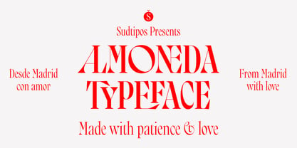 Almoneda: Sale at public auction of movable goods, generally used. And also: private and voluntary sale of jewelry and junk that is made without the intervention of justice. Formerly, it was nothing more than the market or sale of things and spoils won from the enemy in war. Nowadays, the almoneda is practically associated with spaces where the sale of "old things" takes place and, in Madrid, they are usually concentrated in the area of El Rastro, an open-air market that is set up on Sundays and some holidays in the center of Madrid. There, you can find everything and, if you walk around a lot and look hard enough, great typographic finds. It is there where I find a large number of elements (usually from the late nineteenth and early twentieth century) such as boxes, posters, books, etc.. in which appear uppercase letters with a variety of shapes, letters embedded, rare ligatures ... In addition, many elements extracted from street signs, tiles from bars and commemorative elements of Madrid have been used to complete this font design made with care and patience. Thus was born Almoneda, a modern typeface with a marked axis and great contrast, and an uppercase with several sets of characters to play with and enjoy. It also includes a large number of ligatures and discretionary ligatures. A Variable font is included with the full package license. Almoneda, a typeface that will not leave you indifferent. They take it out of my hands, hey!
 - FS Lucas by Fontsmith,
$80.00 Pure and not-so-simple Maybe it’s the air of purity, openness and transparency that they transmit, but geometric typefaces are more popular than ever among leading brands. Based on near-perfect circles, triangles and squares, geometric letterforms look uncomplicated, even though making them readable is anything but – something the designers of the first wave of geometric fonts discovered nearly a century ago. Many of the world’s most recognisable brands in technology, retail, travel, food, manufacturing and other industries continue to be drawn to the straightforward, honest character that geometric fonts convey. Fontsmith set out in 2015 to develop a typeface in the same tradition, but optimised for the demands of modern brands – online and offline usage, readability and accessibility. And, of course, with the all-important Fontsmith x-factor built in. FS Lucas is the bold and deceptively simple result. Handle with care The letterforms of FS Lucas are round and generous, along the lines of Trajan Column lettering stripped of its serifs. But beware their thorns. Their designer, Stuart de Rozario, who also crafted the award-winning FS Millbank, wanted a contrast between spiky and soft, giving sharp apexes to the more angular letterforms, such as A, M, N, v, w and z. Among his inspirations were the colourful, geometric compositions of Frank Stella, the 1920s art deco poster designs of AM Cassandre, and the triangular cosmic element symbol, which led him to tackle the capital A first, instead of the usual H. The proportions and angles of the triangular form would set the template for many of the other characters. It was this form, and the light-scattering effects of triangular prisms, that lit the path to a name for the typeface: Lucas is derived from lux, the Latin word for light. Recommended reading Early geometric typefaces were accused of putting mathematical integrity before readability. FS Lucas achieves the trick of appearing geometric, while taking the edge off elements that make reading difficult. Perfectly circlular shapes don’t read well. The way around that is to slightly thicken the vertical strokes, and pull out the curves at the corners to compensate; the O and o of FS Lucas are optical illusions. Pointed apexes aren’t as sharp as they look; the flattened tips are an essential design feature. And distinctive details such as the open terminals of the c, e, f, g, j, r and s, and the x-height bar on the i and j, aid legibility, especially on-screen. These and many other features, the product of sketching the letterforms in the first instance by hand rather than mapping them out mechanically by computer, give FS Lucas the built-in humanity and character that make it a better, easier read all-round. Marks of distinction Unlike some of its more buttoned-up geometric bedfellows, FS Lucas can’t contain its natural personality and quirks: the flick of the foot of the l, for example, and the flattish tail on the g and j. The unusual bar on the J improves character recognition, and the G is circular, without a straight stem. There’s a touch of Fontsmith about the t, too, with the curve across the left cross section in the lighter weights, and the ampersand is one of a kind. There’s a lot to like about Lucas. With its 9 weights, perfect proportions and soft but spiky take on the classic geometric font, it’s a typeface that could light up any brand.
 - FS Lucas Paneureopean by Fontsmith,
$90.00Pure and not-so-simple Maybe it’s the air of purity, openness and transparency that they transmit, but geometric typefaces are more popular than ever among leading brands. Based on near-perfect circles, triangles and squares, geometric letterforms look uncomplicated, even though making them readable is anything but – something the designers of the first wave of geometric fonts discovered nearly a century ago. Many of the world’s most recognisable brands in technology, retail, travel, food, manufacturing and other industries continue to be drawn to the straightforward, honest character that geometric fonts convey. Fontsmith set out in 2015 to develop a typeface in the same tradition, but optimised for the demands of modern brands – online and offline usage, readability and accessibility. And, of course, with the all-important Fontsmith x-factor built in. FS Lucas is the bold and deceptively simple result. Handle with care The letterforms of FS Lucas are round and generous, along the lines of Trajan Column lettering stripped of its serifs. But beware their thorns. Their designer, Stuart de Rozario, who also crafted the award-winning FS Millbank, wanted a contrast between spiky and soft, giving sharp apexes to the more angular letterforms, such as A, M, N, v, w and z. Among his inspirations were the colourful, geometric compositions of Frank Stella, the 1920s art deco poster designs of AM Cassandre, and the triangular cosmic element symbol, which led him to tackle the capital A first, instead of the usual H. The proportions and angles of the triangular form would set the template for many of the other characters. It was this form, and the light-scattering effects of triangular prisms, that lit the path to a name for the typeface: Lucas is derived from lux, the Latin word for light. Recommended reading Early geometric typefaces were accused of putting mathematical integrity before readability. FS Lucas achieves the trick of appearing geometric, while taking the edge off elements that make reading difficult. Perfectly circlular shapes don’t read well. The way around that is to slightly thicken the vertical strokes, and pull out the curves at the corners to compensate; the O and o of FS Lucas are optical illusions. Pointed apexes aren’t as sharp as they look; the flattened tips are an essential design feature. And distinctive details such as the open terminals of the c, e, f, g, j, r and s, and the x-height bar on the i and j, aid legibility, especially on-screen. These and many other features, the product of sketching the letterforms in the first instance by hand rather than mapping them out mechanically by computer, give FS Lucas the built-in humanity and character that make it a better, easier read all-round. Marks of distinction Unlike some of its more buttoned-up geometric bedfellows, FS Lucas can’t contain its natural personality and quirks: the flick of the foot of the l, for example, and the flattish tail on the g and j. The unusual bar on the J improves character recognition, and the G is circular, without a straight stem. There’s a touch of Fontsmith about the t, too, with the curve across the left cross section in the lighter weights, and the ampersand is one of a kind. There’s a lot to like about Lucas. With its 9 weights, perfect proportions and soft but spiky take on the classic geometric font, it’s a typeface that could light up any brand. - Wade Sans Light by ITC,
$29.99Wade Sans Light was designed by Paul Hickson and Key Characters and appeared in the ITC library in 1990. The basic forms of the font are those of a constructed sans serif, as seen in the circular O and triangular A. The low x-height of the lower case letters make this font particularly reserved and graceful and the high ascenders give it a certain elegance. The high, wide capitals need a lot of space and dominate the overall look of this font. Wade Sans Light is reminiscent of the elegant cabarets of the 1920s and 30s. - Challah Display by Typophobia,
$25.00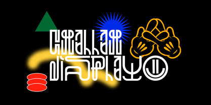 Challah is a display font containing 295 glyphs. Letters are very diverse, but because they contain several shapes characteristic for each other - they retain a certain coherence. When creating the font, the main inspiration was to take from the Brazilian graffiti trend - Pichação and Korean typography. Most of the letters are the same size and width, however, when designing, we also tried to include at certain moments small "surprises" that will surely interest and surprise the user of the above-mentioned typeface. The font fits very well into the urban structure, therefore it perfectly matches the art on the walls with the art on the billboards, creating a kind of dialogue.
 - Stratic Script by Nootype,
$35.00Stratic Script is an elegant family of seven fonts, all based on handwriting. The main idea was to create a script font with almost no contrast, easy to use and quite legible. The design is flawless, every letter is carefuly connected to another, in all fonts. The 6 weights, which are very close to each other, allow the designer to choose precisely the weight he needs. It’s an ideal font for fashion magazines, posters, book covers, etc… This family contains OpenType features, such as Proportional Figure, Tabular Figures, Standard & Discretional ligatures. - ITC Matisse by ITC,
$40.99ITC Matisse was designed by Gregory Gray while he was designing an editorial layout for Madame Figaro, a supplement to the Paris newspaper Figaro. While working on a feature on the work of Henri Matisse, Gray created a typeface with paper and an X-Acto knife, and then scanned the cutouts into a computer. The style of the design comes in part from Gray's passion for African art, with its contrasts between flat areas and protruding surfaces. ITC Matisse is ideal for offbeat display applications and initial capitals. - Architype Vierkant by The Foundry,
$50.00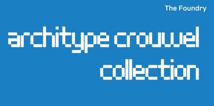 Architype Crouwel is a collection of typefaces created in collaboration with Wim Crouwel, following his agreement with The Foundry, to recreate his experimental alphabets as digital fonts. Crouwel's most recognized work was for the Van Abbe and Stedelijk museums (1954 –72) where he established his reputation for radical, grid-based design. Architype Vierkant was developed from the few letterforms that Crouwel created for an opening spread in a 1972 Drupa catalogue, on the theme ‘typo vision international’ – this single reference showed an interesting interplay of the experimental ideas underpinning his controversial ‘new alphabet’ and Fodor.
 - ITC Johnston by ITC,
$29.00ITC Johnston is the result of the combined talents of Dave Farey and Richard Dawson, based on the work of Edward Johnston. In developing ITC Johnston, says London type designer Dave Farey, he did “lots of research on not only the face but the man.” Edward Johnston was something of an eccentric, “famous for sitting in a deck chair and carrying toast in his pockets.” (The deck chair was his preferred furniture in his own living room; the toast was so that he’d always have sustenance near at hand.) Johnston was also almost single-handedly responsible, early in this century, for the revival in Britain of the Renaissance calligraphic tradition of the chancery italic. His book Writing & Illuminating, & Lettering (with its peculiar extraneous comma in the title) is a classic on its subject, and his influence on his contemporaries was tremendous. He is perhaps best remembered, however, for the alphabet that he designed in 1916 for the London Underground Railway (now London Transport), which was based on his original “block letter” model. Johnston’s letters were constructed very carefully, based on his study of historical writing techniques at the British Museum. His capital letters took their form from the best classical Roman inscriptions. “He had serious rules for his sans serif style,” says Farey, “particularly the height-to-weight ratio of 1:7 for the construction of line weight, and therefore horizontals and verticals were to be the same thickness. Johnston’s O’s and C’s and G’s and even his S’s were constructions of perfect circles. This was a bit of a problem as far as text sizes were concerned, or in reality sizes smaller than half an inch. It also precluded any other weight but medium ‘ any weight lighter or heavier than his 1:7 relationship.” Johnston was famously slow at any project he undertook, says Farey. “He did eventually, under protest, create a bolder weight, in capitals only ‘ which took twenty years to complete.” Farey and his colleague Richard Dawson have based ITC Johnston on Edward Johnston’s original block letters, expanding them into a three-weight type family. Johnston himself never called his Underground lettering a typeface, according to Farey. It was an alphabet meant for signage and other display purposes, designed to be legible at a glance rather than readable in passages of text. Farey and Dawson’s adaptation retains the sparkling starkness of Johnston’s letters while combining comfortably into text. Johnston’s block letter bears an obvious resemblance to Gill Sans, the highly successful type family developed by Monotype in the 1920s. The young Eric Gill had studied under Johnston at the London College of Printing, worked on the Underground project with him, and followed many of the same principles in developing his own sans serif typeface. The Johnston letters gave a characteristic look to London’s transport system after the First World War, but it was Gill Sans that became the emblematic letter form of British graphic design for decades. (Johnston’s sans serif continued in use in the Underground until the early ‘80s, when a revised and modernized version, with a tighter fit and a larger x-height, was designed by the London design firm Banks and Miles.) Farey and Dawson, working from their studio in London’s Clerkenwell, wanted to create a type family that was neither a museum piece nor a bastardization, and that would “provide an alternative of the same school” to the omnipresent Gill Sans. “These alphabets,” says Farey, referring to the Johnston letters, “have never been developed as contemporary styles.” He and Dawson not only devised three weights of ITC Johnston but gave it a full set of small capitals in each weight ‘ something that neither the original Johnston face nor the Gill faces have ‘ as well as old-style figures and several alternate characters. - Babes In Toyland NF by Nick's Fonts,
$10.00Handlettering on a piece of sheet music from 1903 was the inspiration for this little whimsical wonder. The font features a very sinuous S and teddy-bear bookends in the {brace} positions. This font contains the complete Latin language character set (Unicode 1252) plus support for Central European (Unicode 1250) languages as well. - Grand Rapids NF by Nick's Fonts,
$10.00This disarming beauty is based on a typeface named "Archer" from the 1905 specimen book from Barnhart Brothers & Spindler. The original was a rather light face; this beefed-up version highlights the face’s charming quirks quite nicely. Both versions of the font include 1252 Latin, 1250 CE (with localization for Romanian and Moldovan). - Gutknecht by Proportional Lime,
$9.99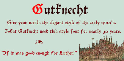 Jobst Gutknecht was a highly successful printer in the city of Nuremburg from 1514 to 1542. He published the "Achtliederbuch" (the first Lutheran hymnal, with a whole 4 tunes) and many works by Martin Luther. This font is an accurate "recutting" of the font face Gutknecht used for the body text in his printed works. It has been extended to over 900 glyphs adding hundreds for modern use. It also presents many ancient things like old ligatures such as "tz", a hedera, and alternate style pilcrow for visual interest. And for those conservative types the modern lower case "k" is also available.
 - HS Al Basim A by Hiba Studio,
$59.00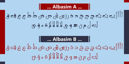 HS Albasim A is an Arabic display typeface. It is useful for headlines, books covers and other graphic projects. It is a collaborative effort, as "HS Albasim A" first letters were designed and drawn by Basim Salem Al Mahdi from Iraq and then developed and digitalized as a typeface by Hasan AbuAfash from Palestine. The font is based on the simple lines of Fatmic Kufi but was it distinguished by two main ideas: First, it contains a nice serf in the vertical strokes of its letters. The second, some of storks in its letter differ in the thickness instead of being similar, as it is in the Fatmic Kufi style. The font contains only two weights: regular and bold. Both of them support the OpenType features of Arabic, Persian and Urdu.
 - P22 Underground by P22 Type Foundry,
$24.95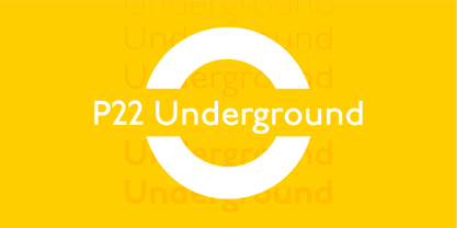 Underground Pro expands on the historical design by Edward Johnston, licensed exclusively to P22 from the London Transport Museum. The overall design of Underground Pro is kept as intended by Johnston and remains within his system of proportions. Additional OpenType features, such as Small Caps and Petite Caps, are included in all 6 weights. A Titling option that mimics London Transport signage is offered in the medium weight. The addition of many Unicode ranges for unprecedented language support makes this the most expansive P22 font family ever. Each Pro font weight collectively contains over 5000 glyphs, covering most Latin based languages, with separate Greek (polytonic) and Cyrillic versions. The outlines of the original Regular and Bold have been subtly redrawn and expanded, they are now available as Medium and Heavy respectively.
 - Narrow Way by Ingrimayne Type,
$9.00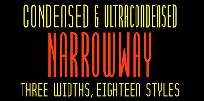 NarrowWay is a family of 18 condensed and ultra-condensed sans-serif typefaces. The family started with the ultra-condensed widths, then the condensed and regular widths (the regular is still quite condensed) were added. All widths have three weights and each weight has an italics style. These 18 styles lack a true lowercase but rather have a set of alternative characters, some based on lower-case forms, on the lower-case keys. Some alternative letters can be reached with the OpenType feature of stylistic sets. The character spacing in most of the styles is quite loose and it can be tightened with an application's character spacing if needed. These typefaces are display faces that can be useful for squeezing tall lettering into tight spaces. They are not readable at small point sizes.
 - Legan by PeGGO Fonts,
$39.00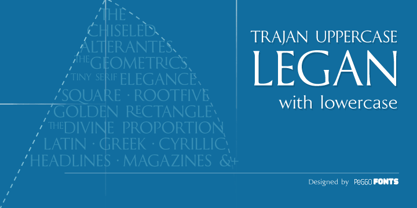 Legan, created by PeGGO Fonts, is a typeface with a large number of glyphs. The uppercase letters follow the classical Trajan pattern. It is designed with several geometrical proportions such as root five, divine proportion (Golden Ratio), regular square, and others, just like the Greek Trajan letters used on Trajan’s Column. The major innovation is a lowercase that is designed in accordance with the same Trajan rules. My concern for the global community is reflected by the large number of diacritics I have provided, first on the basic alphabet, then on extended latin languages, as well as ones for Cyrillic and Greek. Because it is OpenType, there are various setup possibilities including traditional ligatures, as well as various alternates. Altogether you will find this a very playful, fashionable, and elegant typeface.
 - Suited Horse PB by Pink Broccoli,
$19.00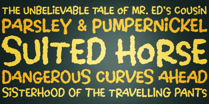 An offbeat alternate caps typestyle inspired by the title screen of a 1968 Walt Disney film titled, The Horse in the Gray Flannel Suit. This playful and childish font comes with an extensive language set, a stylistic alternates feature that auto-alternates between capitals & lowercase (alt caps), as well as a contextual alternates feature that auto-alternates between sets only where double characters are typed like SS, TT, etc. The contextual alternate feature also enables a few titling word options like " the " " in " and " in the ". As noted in the quotes, when these word sets are typed with a space before and after them, it will trigger the swap when contextual alternates is on. Switching on Contextual Alternates enables automatic alternations between caps and alt caps like AlTeRnAtIoNs to create a more randomized look.

