10,000 search results
(0.074 seconds)
- Birthstone by TypeSETit,
$80.00 The Birthstone Family is a set of fonts that are not only diverse but perfectly compatible to interchange styles in a single block of text. There are 3 precious gems: Script, Casual, and Formal. Plus for added luster, there's Bounce (both Medium and Light weights) plus a Titling font— A truncated version that includes caps and ending swashed forms. You won't believe your eyes. All 4 styles are uniquely compatible to one another, but distinctly different. See how easily the fonts may change according to the needs of the look. The Pro version contains the three main styles: Script, Casual and Formal plus the lighter weight version of Bounce. You will also have lots of Opentype feature options.
 - Solpera by Storm Type Foundry,
$32.00This type face fills one of the gaps between the world of Roman alphabets and that of linear alphabets. The first to be designed was the set of upper-case letters. The expression of these characters cannot conceal that they were originally intended only for the sculptor's use, as a type face for three-dimensional inscriptions. Their width proportions reflect a dialogue between the contemporary feeling and the legacy of classical Roman inscriptions. The type face was later complemented with a set of lower-case letters and elaborated into further designs. Its clear, concise letter forms end with small serifs which not only make the type face more refined, but above all anchor the individual letter signs visually to the horizontal of the text line. The austere construction of the majority of the letters is balanced by the more exuberant, humanizing forms of the most frequently used letters "a"; "e". (The three variants of the lower-case "e" enable to create rhythmically differentiated texts.) The letters in which a straight stroke is connected with an arch are designed in two ways. That means that the letters "n", "h","m" and the group of letters "b","d","p","q" are conceived in a different way. Thus an interesting tension is created in the structure of the text, which, however, does not endanger legibility. The economizing, slightly narrowed design of this type face predetermines its use for the setting of usual texts. In larger sizes, however, it produces a rather serious, even solemn, impression. - As of my last update in early 2023, there is no widely recognized or established font known as "Chlorix." However, let's create an imaginative description based on the name itself. The font Chlorix...
- Elipses by Lián Types,
$30.00 It all began with an ellipse. Like an artist who goes from a pictorical logic to a more abstract one, in Elipses geometry is stripped of any distractive or ornamental detail. The font is naked and it shows that it does not need complex shapes or decisions in order to be very attractive. The font is a compendium of ellipses and stems, with a didone 'pensiero'. It also gets some inspiration from the art-deco letters and architecture, due to obvious reasons. Geometry at its best. Elipses will be useful for magazines, books, ads, or any piece of design that needs elegant letters. Note about the styles The styles named "Alt" (from Alternative) have their swashes with less loops. Use them if you are more into naked geometry. Apart from many alternates and ligatures, I've included some different sized glyphs in all the styles so you can also play on the rhythm! Have fun!
 - Sathseed by Zamjump,
$17.00 Sathseed is a fun, lively, handwritten brush script created with the utmost care, love, and attention to detail. It's ideal for logos, titles, product packaging, merchandise, quotes... Try it for yourself in the preview section - what you see is what you get! To achieve an authentic handwritten feel, Sathseed comes with a full set of lowercase substitutions and ligatures to play with, giving you lots of variety. If you use software that supports OpenType, they are included in the main font that will be active as you type. If not, I've also included Alternate and Ligature as separate fonts for you to use. Your download will include the following files in TTF & OTF format. Litagure as well as alternate and extra swash. For web font use, a web font kit consisting of Awesomespill Regular fonts in WOFF, WOFF2 formats is also provided. Any question? Drop me a line and I'll be happy to answer!
 - Nosara by Never Better,
$9.00 Inspired by a trip to Costa Rica and named after its famous beach town, Nosara is a layered vector font that's perfect for projects that require a realistic, hand-painted desert-island look. It comes in three styles: Regular, Outline, and Fill. The styles can be layered to create authentic-looking hand-painted letters and icons—in vector! You can create outlines from this font in order to customize to your heart's desire. Millions of bespoke combinations are possible. This typeface was made by hand, meaning each letter was painted with real paint and digitized, not created on an iPad, which is why this font looks great and has a warm natural quality even at large sizes. Nosara is perfect for packaging, parties, signage, and even looks great in long-form text! Nosara Xtra is a set of pictograms, also in 3 styles that can be layered for the same effect, evoking the imagery and happy vibes of a sunny tropical vacation.
 - Kuenstler 480 by ParaType,
$30.00 The Bitstream version of Trump Mediaeval of Linotype, 1954-60, by Georg Trump, a prolific German type designer. It seems to be his best typeface. It has a vigorous and assumed oldstyle roman and italic that is the sloped roman, except for the letters a, e, f. With its crisp angularity and wedge-shapes serifs, Trump Mediaeval appears carved in stone. It is a strong text typeface that is highly legible and especially useful for low-resolution output. It is useful in display work too. Cyrillic version developed for ParaType by Vladimir Yefimov and Isabella Chaeva and released in 2010. Cyrillic italics maintain the main feature of Trump Mediaeval to be the sloped roman, except for the letters г, д, и, й, n, т. There are old style figures, additional ligatures and fractions available at all styles and small caps at the Roman 55. Black style was added in 2011 by Vladimir Yefimov.
 - Aviano Flare by insigne,
$24.99 The Aviano series returns with a flared semi-serif. Aviano Flare's subtly curved forms lend refinement and luxurious elegance to your designs. Aviano's foundational extended classical forms give the face strength and power. Aviano Flare is a versatile new addition to the Aviano titling series. Aviano Flare comes in six different weights and is packed with OpenType features. Want to get rid of the serifs for that logotype or headline? Need swash forms? Art Deco alternates? Aviano Flare includes 74 alternate characters. Two style sets are available, two sets of art deco inspired alternates, small forms, swash, titling and stylistic alternates. Aviano Flare also includes 40 discretionary ligatures for artistic typographic compositions. Please see the informative .pdf brochure to see these features in action. Be sure to check out the rest of the Aviano series which can be used as complementary faces, including Aviano, Aviano Serif, Aviano Sans, Aviano Didone and Aviano Slab.
 - Airates Script by Maculinc,
$20.00 Airates, this is my first font, as the name suggests and because this is my first font that I introduced to the world. Inspired by a film where someone who loses all and returns to struggle to find meaning in life that actually clings to the edge of the world and that's where the beginning of a story seems to be reborn. Airates Script Fonts is a typeface thick and easy to read so comfortable to wear .You can use it as a logo, badge, insignia, packaging, headline, poster, t-shirt/apparel, greeting card, business card, and wedding invitation and more. The flowing characters are ideal to make an attractive messages to your taste. mix and match with a bunch of alternative characters to fit your project.It will be more interesting if you add swash / alternative swash. The alternative characters in this font were divided into several OpenType features such as Stylistic Alternates, Ligature and Ligature Alternates. Mail support : maculinc@gmail.com Thank you! Maculinc
 - OCR B by Linotype,
$40.99OCR A and OCR B are standardized, monospaced fonts designed for Optical Character Recognition" on electronic devices. OCR A was developed to meet the standards set by the American National Standards Institute in 1966 for the processing of documents by banks, credit card companies and similar businesses. This font was intended to be "read" by scanning devices, and not necessarily by humans. However, because of its "techno" look, it has been re-discovered for advertising and display graphics. OCR B was designed in 1968 by Adrian Frutiger to meet the standards of the European Computer Manufacturer's Association. It was intended for use on products that were to be scanned by electronic devices as well as read by humans. OCR B was made a world standard in 1973, and is more legible to human eyes than most other OCR fonts. Though less appealingly geeky than OCR A, the OCR B version also has a distinctive technical appearance that makes it a hit with graphic designers. - JAF Facit by Just Another Foundry,
$42.00 Facit is a contemporary sans serif text face. It is designed to be a highly legible and flexible font that does not draw the attention to itself. Instead of being original by itself it is the result of a careful examination of ancient as well as modern formal concepts. “It is by definition impossible to design an un-conventional typeface. Type is pure convention, this is why we can read each other’s written words”, says its designer Tim Ahrens. However, rather than generating an average, existing principles were consciously combined into a unique design solution: The word ‘Facit’, in its German version, means ‘conclusion’. The fonts are provided in OpenType format. Each font contains 720 glyphs. Technically, they follow the Adobe Pro fonts and provide the same glyph set and OpenType functionality. OpenType features include ligatures, true small capitals, superiors, inferiors, numerators and denominators. Every font contains old style and lining figures, both in a proportional and a tabular design. For some letters there alternate characters.
 - Black Quality by Alit Design,
$14.00 Black Quality is an elegant and certainly cool Black Letter styled font family. The process of making this font from sketching to the final file takes up to 5 months. Black Quality can be used as a font layer but can also be used alone without a layer, many styles that you can combine from the outline to the Rough style. Black Quality is perfect for Victorian, Classic, Elegant and vintage designs. This font is very well used for design wine, packaging, beer logos, tattoo studios, and more. Besides you get letter fonts you also get "BONUS" ornament sets in the form of font formats. You can combine all ornament elements as in the Black Quality font display. For those of you who like to collect or have design projects that are victorian, black letter or awesome designs, you must and must have a Black Quality font on your device. Best regards Alit
 - Alumni by TypeSETit,
$29.00 At first glance, there is something familiar about this font, but one may not be sure... “Where have I seen this font before?” Known for his diverse portfolio of script style display fonts, typographic designer and lettering artist Rob Leuschke has taken a step back in time with Alumni™. A true departure from present trends, this font resurrects the clean and simple forms made popular in the 1950s. Originally inspired by the black face Impact™, it soon evolved to include numerous weights from the Black flavor of its progenitor to a super thin Pinstripe. The extreme weights (Pinstripe, Hairline and Black) are designed for display situations while the remaining weights may be used for more traditional textual design applications. The Inline and Collegiate flavors offer added display options. Alumni™ is available in Roman and Italic versions of each weight. Extensive kerning and OpenType programming have been applied to give it optimal functionality.
 - OCR A Extended by Monotype,
$40.99OCR A and OCR B are standardized, monospaced fonts designed for Optical Character Recognition" on electronic devices. OCR A was developed to meet the standards set by the American National Standards Institute in 1966 for the processing of documents by banks, credit card companies and similar businesses. This font was intended to be "read" by scanning devices, and not necessarily by humans. However, because of its "techno" look, it has been re-discovered for advertising and display graphics. OCR B was designed in 1968 by Adrian Frutiger to meet the standards of the European Computer Manufacturer's Association. It was intended for use on products that were to be scanned by electronic devices as well as read by humans. OCR B was made a world standard in 1973, and is more legible to human eyes than most other OCR fonts. Though less appealingly geeky than OCR A, the OCR B version also has a distinctive technical appearance that makes it a hit with graphic designers. - ITC Belter by ITC,
$29.99ITC Belter was designed by Andreu Balius in 1996. Out of a purposely limited form repertoire Balius created a constructed typeface with a cool and technical character. A distinguishing characteristic of this font is the cross at the ends of many strokes. The figures seem to be products of mass production, which heightens the mechanical feel of the font. Belter is meant for point sizes of 10 and larger in headlines and shorter texts and must be set with generous spacing. - Cover Sans by Latinotype,
$26.00 Cover Sans is a humanist geometric typeface with an orthogonal structure, which provides stability when composing a text. Open shapes and low x-height give this font balance and makes it an air-breathing typeface. Cover Sans is a stable and strong condensed font that works well for magazines and publishing. The strong personality of its alternative characters gives the font a modern and elegant style, which makes it ideal for use on annual reports as well as on business logotypes.
 - Solaris by Ultramarin,
$40.00 Solaris is a sans serif or a grotesque as we still call it where I come from. (it is an old term which means strange compared with Roman which was the normal font) The face is an open sans, which means that the round signs take the air into the form, minuscule d is drawn kind of backwards like in Gill Sans, which sets off on minuskel a. Here is the Regular version, with a slightly difference between stems and hairlines.
 - Buche by Factory738,
$15.00 Buche - a brief introduction Buche is a contemporary serif font designed for logo and brand design. It exudes an air of affluence and sophistication, despite its curvy appearance. The ligature fonts will come in handy for whatever your imagination can think up! 6 Weights & 2 Styles (Regular & Italic) Basic Latin A-Z and a-z Numerals & Punctuation Stylistic Ligatures Multilingual Support for ä ö ü Ä Ö Ü ... Free updates and feature additions Thanks for looking, and I hope you enjoy it.
 - Love Potion by HVD Fonts,
$30.00 Hannes von Döhren created Love Potion. Three fonts (Regular/Bold/Ornaments) that include extravagant Ligatures, Swash Letters, Catchwords, Arrows, Borders and other little specials. The hand drawn serif type family is intended to be used in applications like: Food, Clothes, Living, Wedding stationery or basically everywhere where love is in the air… Love Potion is equipped for professional typography. As an exclusively OpenType release, these fonts have an extended character set to support Central and Eastern European as well as Western European languages. In addition to that the fonts contain Standard ligatures, Swash Letters, Catchwords, Arrows, Borders and much more.
 - Pastiche Brush by Eclectotype,
$40.00 This handmade looking brush font is inspired by the titles of the 1959 movie, Imitation of Life, by prolific film titles artist, Wayne Fitzgerald. The 'pastiche' of the font's name derives from the 'imitation' of the film's title, and from the imitation of the brush. OpenType enabled software can make Pastiche Brush feel even more handmade. There are alternates for every letter and number, and most punctation marks and symbols. Every letter has at least one alternate glyph, and more commonly used (in English at least) letters have up to three, so when contextual alternates are enabled, the font automatically cycles through glyphs in a pseudo-random manner. This means no double letter combination will ever contain two identical glyphs. Not only this, but it's highly likely the same word will look different elsewhere in the sentence. The contextual alternates feature also takes care of start and end forms of letters, for an even more handmade feel. This is a great font for headlines in fashion glossies, food packaging where an organic look is desirable, posters, perfume bottles, wine bottles... the list goes on. And with extensive language support, it's going to be a very usable addition to your display font repertoire.
 - Megre by JAB,
$16.00The courageous Russian author of the best seller Anastasia, Vladimir Megre, once said that this remarkable woman would inspire creative people around the world to produce their best work. Since I consider myself a creative person who has been deeply touched by her story, I sincerely hope that this will be true for me also. Anastasia talks a lot about God, the wonders of the natural world and how all things have been created so perfectly. This belief in universal perfection, however, is not confined to mystics alone. Many great mathematicians and scientists, including Albert Einstein, were of the same opinion. Having read Dan Brown’s The Da Vinci Code, I became quite fascinated with the so-called Fibonacci series; "a sequence of integers in which each integer (Fibonacci number) after the second is the sum of the two preceding integers; specif., the series 1, 1, 2, 3, 5, 8, 13, . . ." (Webster’s Dictionary). These mysterious numbers, which are said to give divine proportions, are found throughout nature in everything from a rose to a spiral galaxy. Many believe that this reinforces the argument that there is a divine intelligence back of creation. With that in mind, I thought it would be interesting to see if I could somehow create a font using these numbers in the design process. If I have succeeded - even partially - in attaining these mystical proportions, it will definitely have been worth all the hard work. And, I sincerely hope that many will enjoy using this font in producing their own best work. - Klainy by Identity Letters,
$29.00 An unadorned Grotesque with a refreshingly personal touch. If “Grotesque” mainly means “industrial, mechanical, anonymous typeface” to you, Klainy might redefine your image of the genre. Yes, it’s a Grotesque—but with a contemporary look and a lot of personality. Klainy’s apertures are more closed at the top and more open at the bottom, creating an informal rhythm that sets Klainy apart: a confident, optimistic voice with a clean appearance. Terminals are subtly back-bent: these quaint “hooks” make Klainy a bit more personal, a bit friendlier. (You can find them in the a, c, f, and r.) Just like its old-style Grotesque ancestors, Klainy is optimized for display sizes and short texts. There, its unobtrusive quirks can be wholly appreciated. However, the familiar Grotesque appearance makes sure that the typeface is comfortable to read in smaller sizes, as well. Use Klainy whenever a basically classic sans-serif typeface with a modern and individual twist is called for. This font family comes in eight weights ranging from Thin to Black, each with a matching italic style. More than 500 glyphs and a bunch of Open Type Features make it a reliable companion for all of your projects. You can fine-tune the flavor of Klainy with Stylistic Alternates such as a one-story a and a two-story g. Their simple construction blends perfectly with the design concept of this typeface. Klainy is a seasoned blue-collar worker that surprises you with wit and team spirit. It’ll be a great addition to your font library.
 - P22 Vale by IHOF,
$24.95 The Vale Press was a contemporary of Willam Morris's Kelmscott Press. The types used by the Vale Press were designed by artist Charles Ricketts, who also supervised the design and printing of Vale Press books. The main type used, Vale, was based on the Jenson 15th century roman type style. The King's Fount was an experimental semi-uncial font based on the Vale type. The King's Fount was designed in 1903 for the Vale edition of the 15h century poem "The Kingis Quair". This semi-uncial font evokes old English and Anglo-Saxon lettering. P22 Vale Pro combines the two fonts P22 Vale Roman and P22 Vale King's Fount into one "Pro" font. This pro font also includes a Central European character set, old style figures, fractions, ornaments and a special faux "Middle English" feature to make "anee text appeer Olde." This feature is not known to exist in any other font.
 - Glory Signature by Din Studio,
$29.00 Is your branding missing something that makes people amaze? Have you thought about how you can add that touch of magic to your branding and projects? What if we told you, you only need to change one element to engage and convert your clients? Introducing Glory Signature-A Modern Script Font Giving you a simple, yet gorgeous solution to your branding. This font is more than just another script font. It encapsulates the essence of elegance and modernity. With its clean script-type design and curved indentations, this font will take your projects to the next level! Use it for headings, logos, business cards, printed quotes, invitations of all sorts, cards, packaging, and your website or social media branding. Glory Signature includes Multilingual Options to make your branding globally acceptable. Features: Standard Ligatures Stylistic Sets Swashes Multilingual Support PUA Encoded Numerals and Punctuation Thank you for downloading premium fonts from Din Studio
 - Mirfak by Herofonts,
$25.00 Mirfak™ is a new take on a work from Adrian Frutiger made in 1964. In the first place, it was a specific alphabet made for only one book. Only lowercases, capitals, numbers and a few mathematical signs where created. Covering only English language, used only once and unknown by most, we considered this Slab Serif as an hidden gem that needed a modernization. Mirfak™ is a result of a project whose goal was to take a beautifully designed Slab Serif and update it so that its technical standards surpass the status quo, leaving us with a truly superior slab serif family. Entirely coded from scratch with Metafont™, this family is not only an update but an expansion of the original concept, covering now most used languages on earth. Modernized and unique, Mirfak’s 3 weights, light to bold, can give a full range of expression for interfaces and corporate design; in print, on screen and in multiple languages.
 - Al Ghazalia by Nathatype,
$29.00 Al-Ghazalia is an exquisite font meticulously crafted to capture the essence of Arabic calligraphy. Al-Ghazalia is not just a font; it's a bridge between tradition and modernity. The characters in Al-Ghazalia embrace the rich tradition of Arabic lettering, featuring graceful, curvaceous lines and a stunning high-contrast design. Each letter is thoughtfully shaped, exhibiting the intricate beauty of Arabic calligraphy while adding a contemporary touch. In addition, you can also enjoy the features here. Features: Alternates Swashes Multilingual Supports PUA Encoded Numerals and Punctuations Al-Ghazalia fits in headlines, logos, posters, flyers, branding materials, greeting cards, print media, editorial layouts, and many more designs. Find out more ways to use this font by taking a look at the font preview. Thanks for purchasing our fonts. Hopefully, you have a great time using our font. Feel free to contact us anytime for further information or when you have trouble with the font. Thanks a lot and happy designing.
 - Monograf by Milan Pleva,
$10.00 Monograf was originally designed as fixed-width monospaced font which has 2 weights (Regular and Bold). Monograf Text is a derived style of Monograf with proportional spacing and well-balanced kerning to make the text easier to read and look optically balanced. So in the total bundle you get 4 pieces of this font: Monograf Regular, Monograf Bold, Monograf Text Regular and Monograf Text Bold. This versatile font with clean geometry and slightly rounded corner elements works great in digital space, as well in print. It also retains its legibility at smaller sizes. Typographic features include old-style figures, directional arrows and four types of asterisks. The entire font is suitable for purposes such as tabular layout, coding, website, but also for magazines, logos, signs, products, and others. Features: Basic latin alphabet A-Z 116 Accented characters Numbers, Punctuation, Currency, Symbols, Math symbols & Diacritics Old style figures, Directional arrows and 4 asterisks
 - 1863 Gettysburg by GLC,
$38.00 This script font was inspired by a lot of autographs, notes and drafts, written by President Abraham Lincoln, mainly the Gettysburg address, first draft and copies, but also the emancipation proclamation. It is an attempt to offer a typical manual script from this American period, not to propose the exact writing from A. Lincoln himself. This font is a little fat and monotone, maybe Abraham Lincoln used a smooth or rounded pen, but some letters I have consulted were written obviously with a sharp one, so, in the future, I will certainly produce a slim version of this font. It is used as variously as web-site titles, posters and fliers design or greeting cards, all various sorts of presentations, menus, certificates, letters. This font supports enlargement as well as small size, though the original size was about 18 to 24 pts. When printed, it remain perfectly legible from 10 to 12 pts.
 - Easttalia by Garisman Studio,
$15.00 Easttalia is a brush script font with a brushes style and based on hand-lettering script. This font is great for your next creative project such as logos, printed quotes, invitations, cards, product packaging, headers, Logotype, Letterhead, Poster, Apparel Design, Label, and etc. Easttalia comes with included uppercase, lowercase, numerals, punctuations, common ligatures and also additional swash to let you customize your designs. It includes a large number of beautiful brush swashes. And this font has support for 26 languages, open PUA encoded (no need additional software) Also, the advantages of Easttalia is: - Simple for installation - Work on PC or MAC - Friendly for Adobe Illustrator, Corel Draw, Adobe Photoshop, In-Design and also like Microsoft Word - Lots of different Swashes - Opentype Ligature - Detailed brushes script - Support 26 Language: Afrikaans Albanian Catalan Croatian Czech Danish Dutch English Estonian Finnish French German Hungarian Icelandic Italian Lithuanian Norwegian Polish Portuguese Romanian Slovak Slovenian Spanish Swedish Turkish Zulu And get the amazing work with Easttalia Kind regards Garisman Studio
 - VTF Justina by Variable Type Foundry,
$22.99 VTF Justina is a different typeface with a sans serif style that is inspired by geometric typographies to seek functionality and simple quality in any type of project. This very personal character of its forms together with the variety of eighteen weights with their respective italics (Thin, Extra Light, Ultra Light, Light, Regular, Semi Bold, Bold, Ultra Bold, and Black) it has makes it perfect to combine with the VTF Rozanova in digital projects (for example, web or applications) or printed (for example, corporate identity or packaging). Becoming a very interesting option for both large and small bodies without losing legibility in any weight. Justina has Opentype functions (Case sensitive forms, ordinals, scientific inferiors, denominators, superscripts, subscripts, numerators, fractions) designed exclusively for its design. Supports the following languages: Afrikaans, Albanian, Catalan, Croatian, Czech, Danish, Dutch, English, Estonian, Finnish, French, German, Hungarian, Icelandic, Italian, Latvian, Lithuanian, Maltese, Norwegian, Polish, Portuguese, Romanian, Slovak, Slovenian, Spanish, Swedish, Turkish and Zulu.
 - Bernadion by IbraCreative,
$17.00 Bernadion – A Modern Serif Typeface Bernadion, a modern serif typeface, seamlessly merges sophistication with contemporary design elements, creating a harmonious balance of timeless elegance and sleek aesthetics. With its refined letterforms and subtle geometric influences, Bernadion captures attention with a crisp and professional demeanor. The font’s balanced proportions and meticulous detailing ensure clarity and readability across various platforms, making it versatile for both print and digital applications. Whether employed in editorial design, branding, or web interfaces, Bernadion stands as a testament to the marriage of classic serif traditions and the demands of modern design, elevating any project with its distinctive and polished appeal. Bernadion is perfect for branding projects, logo, wedding designs, social media posts, advertisements, product packaging, product designs, label, photography, watermark, invitation, stationery, game, fashion and any projects. Fonts include multilingual support for; Afrikaans, Albanian, Czech, Danish, Dutch, English, Estonian, Finnish, French, German, Hungarian, Italian, Latvian, Lithuanian, Norwegian, Polish, Portuguese, Slovak, Slovenian, Spanish, Swedish.
 - Tatty by Scrowleyfonts,
$- Tatty is a sans serif, monoline font that is distinguished by the gentle, rounded, backward curves on the ascenders. I created it because I had a picture in my mind of a font that I wanted to use when designing images and logos for clients' websites but I could never find one that was just exactly right. Many years ago I worked for a sign-writing company. My job was to copy and enlarge letter sets from printed copy and then cut masks for airbrushing. One morning I arrived at my desk to find that the airbrush artist had written on a rough, rubbed out, scribbled on drawing of the letter ‘a’ - “make a letter happy, make it beautiful”. That was the brief I set myself in the design of Tatty - to make every letter happy and beautiful. The result is a flowing, elegant yet simple type which I believe works particularly well for poetry.
 - Halogen Slab by Positype,
$29.00 When I released Halogen, I asked ‘Who doesn't want or need an expansive contemporary extended sans that has a sense of style and swagger… what if it had a lowercase, small caps and various numeral options… how could you say no?’ Go, click on the Halogen link and read on, if you're interested. Halogen was well-received, so I decided to take it further with Halogen Slab (the name kinda tips you off as to what kind of typeface it is, don't ya think?). As always, I prefer not to take short cuts and provide an anemic offering of glyphs — a modern typeface offered today must provide more than just the basics and this one does — lowercase, smallcaps, old style numerals, tabular forms, stylistic and titling alternates, fractions, case-sensitive features, and even an alternate uppercase ordinal set is included. Now go make cool print and digital things with it, and share them with me.
 - Shorthalt by Brittney Murphy Design,
$8.00 Shorthalt is a dashingly handsome upright script- all dressed up, but not too stuffy, with lots of ligatures and contextual alternates. Shorthalt works great for headlines or bylines paired with a nice simple sans or serif.
 - Bloesbury by Attract Studio,
$14.00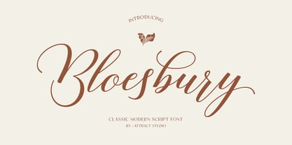 Bloesbury is a modern style script font inspired by handwriting. This font is suitable for your design needs and can be combined with other fonts. Which is perfect for your design needs such as branding, logo design, wedding invitations, decorations, and more. Font Pairing : Kegina Including: Alternates & Ligatures OpenType support Multilingual PUA encoded.
 - Hebrew Modern by Samtype,
$49.00 This is a classic design from the beginning of the 20th century. This font can be used in many kinds of books
 - Mastadoni by Eclectotype,
$40.00 Mastadoni is a bold headliner/masthead typeface, with high vertical contrast in a Didone style. That's the starting point at least. There's much more to this font than another modern clone. It is a specialized (only one weight) typeface that comes in five optical grades. Use G1 at very large sizes and G5 at smaller sizes. The grades can be combined so that the thins of type set at different point sizes appear the same thickness - a very useful feature for magazine layouts. Optical grades could also be used in circumstances where a logo needs to be size-specific; the text on your bistro sign can afford to be more delicate than that on your coffee cups. This is a typeface with a big x-height, small cap-height and stubby ascenders and descenders, which contribute to an overall appearance somewhat different from must Didones, and make for some interesting layout possibilities in tight spaces. Mastadoni features a number of useful OpenType features. All fonts include standard ligatures and automatic fractions. In the discretionary ligature feature, you'll find the esoteric "percent off" glyph. Just type '%ff' with dlig engaged and there it is! Case-sensitive forms are available in all the fonts. The contextual alternates feature performs a subtle trick that resolves an optical illusion whereby two ascenders next to each other appear to be different heights. The Roman and Italic styles have a different group of stylistic sets as follows: Roman: SS01 substitutes a less decorative 4; SS02 is a different eszett; SS03 substitues the # with an attractive numero glyph; and SS04 gives an alternate K. Italic: SS01 and SS03 are the same as in the Romans; SS02 gives you more bulbous variants of v, w, and y letters; SS04 is a single storey g; SS05 changes C, G and S to non-ball-terminal varieties; and SS06 changes the swash versions of E, L, N and Q (when the swash feature is engaged). Speaking of the swash feature, the italic fonts feature swash capitals from A to Z, and swash variations for lower case h k m n v w and z. Lastly, the discretionary ligature feature in the italic fonts has vi, wi, KA and RA ligatures. Mastadoni is a typeface that would find itself immediately at home in glossy magazines, while offering a different aesthetic palette from the more standard choices of Didones.
 - Kolkata Hotelroom by Hanoded,
$10.00 Hotel rooms in Kolkata don't top the list of 'luxurious habitations'. They are dingy, fly-ridden, dirty and noisy. But if you look really hard, you will find traces of long gone grandeur. This font is all of the above and more: it is sloppy and messy, it spikes and sags, but it does give your designs that extra oomph you are looking for.
 - Murisa Baby Fish by Murisa Studio,
$10.00 Murisa BabyFish is our next font in early 2022. This font is inspired by the joy of children playing. Their joy is reflected in the creation of this font. Cheerful, joyful and colorful, are the strengths of this font. This font is perfect for use in your products that are targeting children and teenagers. Babyfish will lead your product to success. Get it right now.
 - Monmica by Aga Silva,
$59.99 This is my latest release : monmica family - a set of three multilingual, handwritten stylish copperplate calligraphy fonts. The files listed here are containing 1118, 1229 and 2018, glyphs respectively. There are many open type features: fancy swashes, alternates, ligatures, contextual alternates, fractions etc. - all easily available at the click of a mouse. Those fonts allow for creating text in majority of languages where Latin script is used.