10,000 search results
(0.099 seconds)
- Montas by Nasir Udin,
$25.00 Montas is an elegant display serif with high contrast. Designed to be fit on a vintage-themed design project or the modern one. Its bolder weights are suitable for a striking headline, while the lighter weights are suitable for a short paragraph as well.
 - Blog Script by Sudtipos,
$39.00 Technology is making it so that we’re all connected without the need for the physical-presence kind of being connected. That is strange, fascinating, and has a certain magnetism that is very difficult to resist. What’s at stake is no less than the transformation of centuries of human behaviour, and that’s part of the fascination. But while our existence morphs and we rush headlong into our socially minimalist future, we use our present culture to helplessly signal our nostalgia about our past. We know what our future will be missing, and we’re already full of nostalgia about it, but we know that what little we can do about isn’t going to affect the outcome that much. So, almost in full hindsight now, the DIY implosion of the past few years must have really been a reaction to our technological dis/connection. In typography, the minimalist future is already here, with something as austere as the sans serif having become the preferred expression of progress and fortune, both part of the connected isolation we are undergoing. But when physical interaction must take place, like coffee shops and gin joints, our organic alphabets ride high and mighty. That sense of human heritage — elegance and exuberance in our writing, the use of flaws to charmingly brand our own individualism — keeps turning up in all kinds of places, most unexpected of which is the digital world. The overall message seems to be that we’re still creative, imaginative, and unique. In the digital world, on blogs where we write about our puny music and fashion preferences, we’re just articulating this individualism of ours, this third domain of existence our future seems eager to dismiss. These were the thoughts behind Blog Script, the second collaboration between Carolina Marando and Alejandro Paul, after their successful stint with the Distillery set of fonts. This typeface comes in two weights, alternates for most letters, and a strong aesthetic rooted in individuality and freedom of spirit. Use it to be alone together, to tell the world that we’re still human, for now.
 - Go by Canada Type,
$24.95 Five years into the 21st century and the promise of nanotechnology, high-end popular culture design seems to thrive on combining opposites and drawing a fine line between traditionally contradictory ideas. This is seen in modern society's usual cultural frontrunners - like consumer electronics, fashion items, music packaging and publications, where it is evident that traditionally complex marketing statements of fashionability and lifestyle are attempted with simple minimalism. But at the typographic end of this realm, the creative majority still uses old faces that help the modern statement only in passing. Some of the more adventurous creative professionals actively seek new elements to emphasize contemporary impact in their modern design. To those adventurous types (pun intended), Canada Type presents this new face called Go. It is very much a child of the new millennium, inspired by the unmistakable minimalist style of modern 21st century corporate logos, recent design shifts in electronic music and club-marketing collateral, and disc jockeys who have enthusiasm, energy, precision and total control of each and every vibration traveling from mixer to speakers. Go is an original modern techno-lounge face that offers the eyes pleasing collages of friendly minimal forms that give the words an impression of simplicity and depth at once. This is a font that prides itself on its precise grouping of elements and just enough original creativity in combining those elements. The precision builds the sharp edge sought for modern statements, while the creativity keeps the message rejuvenated, clear and interesting. Go's character set consists of a versatile and unexpected, yet mild mix of the uppercase and lowercase forms, with multiple variations on the majority of the letters. The e being a vertical mirror of G is only the first of the pleasant surprises. More than 30 alternates are inside the font. All the accented characters in Go have been meticulously (perhaps obsessively) drawn to be unusual for logos and short statements. Take a look at the character map and be ready for a space-age surprise. To borrow a Star Trek cliché, this font can Go where no font has gone before.
 - PKG Roman Capitals by Posterizer KG,
$19.00 PKG Roman Capitals is one more of Posterizer KG calligraphic fonts, based on Roman Square Capitals letterforms, also called Capitalis Monumentalis, Inscriptional Capitals, Elegant Capitals and Capitalis Quadrata from (about) 2nd century A.D. All graphemes are taken from calligraphic pages written with brush on traditional calligraphic stile, inspired by epigraphic monuments from the Roman Pantheon, Trajan’s Column, and the Arch of Titus. PKG Roman Capitals font is good guides for any who want to study the beautiful proportions of Roman Capitals. In practice, it can be useful for calligraphic sketches and imitation of Roman (European) historical manuscripts. Font contains good stylistic, morphological and metrical balanced Capitals, Small Caps and all the Latin and Cyrillic glyphs.
 - Aquus by phospho,
$39.00 Aquus is a contemporary all-caps display font that refines the elegance of a classic Didone with experimental interventions. Geometric elements and subtle details are found in its letters, many of which connect to ligatures. Most alternate glyphs can be switched automatically by use of the Stylistic Set function in OpenType-supporting applications, others you can access manually via the glyphs palette. You may try Aquus Linearis as a fashionable outline variant, which reveals its beauty especially when combined with imagery. Use them best for concise strings of characters, such as logotypes, packaging or magazine titles. Aquus Simplex is their sober companion, based on the same letterforms, minus the geometric ornaments and conjunctions.
 - F2F Simbolico by Linotype,
$29.99The techno sound of the 1990s, a personal computer, font creation software, and some inspiration all came together to inspire the F2F (Face2Face) font series. Alessio Leonardi and his friends had the demand to create new unusual typefaces, which would be used in the leading German techno magazine of the day, Frontpage. Even typeset as small as 6-points, in nearly undecipherable layouts, it was a pleasure for the kids to read and try to decrypt the messages. Hearts, candles, bombs, and peace signs are just some of the great elements you'll find in F2F Simbolico. This collection of ruggedly drawn symbols is meant to bring a smile to the reader's face. - Horesport by Mightyfire,
$15.00 Horesport is a bold sport font is a typographic style that exudes strength, dynamism, and a sense of action. Characterized by thick, robust letterforms, this font is designed to make a powerful visual impact, capturing the essence of athleticism and energy. The letters are crafted with strong, confident strokes, creating a bold and assertive appearance. Whether used on jerseys, banners, posters, or digital displays, a bold sport font commands attention and reinforces the spirit of competition. Its high-impact design ensures visibility from a distance, making it ideal for conveying a team's identity or promoting sporting events with flair and vigor. We're proud and honored if Horesport can be the part of your special projects. Thank you :)
 - Videomax by PizzaDude.dk,
$16.00 Videomax looks like something from the future - perhaps even something from a future where the world lies in ruins and is about to be taken over by hostile aliens. The worn letters represent the decades of war against the computers...or the aliens...or maybe the letters comes from a sign of a computer company from the eighties, which was recently found in an abandoned place. The speculations are many, but one thing is definitely true: Videomax got that grungy / computer / worldwar feeling! Write your text, and watch how the randomness of letters make your text look really good. I've put it 4 different versions of each letter, which makes it look really nice and worn!
 - Meloneads 2 by PizzaDude.dk,
$20.00Although being made of geometric shapes, Meloneads 2 is a playful and funny set of drawings. - Swanville by Ingrimayne Type,
$5.00 Swanville developed as part of a train font that eventually became LetterTrain. The letters of Swanville are bold, have a funny “serif” on the top but not on the bottom, and when the letters have interiors, the interior has the shape of the letter. Lower-case letters are smaller versions of the upper-case letters. Because development of this face stopped long ago, it has a limited character set.
 - Sidewalker by FSD,
$50.00In Sidewalker we can see pieces of OCR-A, letters and of other fonts; letters pressed over metallic supports with too much ink and then redesigned on a computer. Reminiscent of how different materials in Burri or Rauchenberg's paintings are used. Some numbers have the same shape of some letters (J=2, 6=G=9, I=1=l ...) and many pieces of letters are copied into others. Very experimental... - VLNL Gindicate by VetteLetters,
$30.00 The alcoholic beverage Gin is drunk around the world, as far back as the 13th century. Originally distilled as a medicine, it draws its main flavour from juniper berries. Gin is colourless itself but – due to its smooth taste – a major ingredient in a long list of famous colourful cocktails. Gimlet, Singapore Sling, Negroni, Charlie Chaplin, French 75, Vesper, Tom Collins, White Lady, Aviation, Monkey Gland, Southside, Gin Gin Mule and New Orleans Fizz are but a few of them. That made us decide it simply cannot be missing from the Vette Letters font collection. Vette Letters designer Henning Brehm originally designed VLNL Gindicate for the 2015 action movie Hitman: Agent 47. It was specifically used for the logo and signage of the maverick ‘Syndicate International’ organisation in the film. It lay dormant in a folder for a while, when it was reworked into this flashy 5 weight family. VLNL Gindicate is a rounded modern sans serif family, suitable for a multitide of applications, corporate or otherwise. It has somewhat of a warm sci-fy feel, without being overtly techno-ish. In the family are 3 regular weights (Light - Regular - Bold), but also an Inline and Multiline weight for extra design possibilities. Company logos, brand identities, music flyers or posters, you name it. VLNL Gindicate will spice up any design. Bottom’s up!
 - LiebeLotte Swell by LiebeFonts,
$29.90 Have you heard? It’s in the stars: next July we collide with Mars! But until then, there are plenty of good reasons to treat yourself to this swell typeface. LiebeLotte Swell is a great investment for letter lovers who design beautiful things for their friends and family and also for designers who love their clients: Your next birthday invitation? Check. That photo album you’re making for your mom? Check. The business cards you’re designing for your friend who runs a deli? Check. There are so many nice things that want to be designed, and LiebeLotte Swell wants to be your assistant in the old-fashioned way: polite and friendly. Just like her monolinear siblings in the LiebeLotte family, charming LiebeLotte Swell knows how to impress with her perfectly drawn curves and her perfectly connected loopy letterforms. Of course LiebeLotte Swell comes with a state-of-the-art character set. She also sports a variety of ligatures and alternative forms, available through OpenType features. (Please make sure your software supports ligatures for the letter connections and OpenType if you wish to use the advanced features.) Advanced designers, check out the complete LiebeLotte family with six weights of monolinear loopiness. You may also want to take a look at our best-sellers LiebeErika and LiebeKlara, they get along great with LiebeLotte Swell.
 - Jackalope LP by LetterPerfect,
$39.00 Jackalope is a new original script font from LetterPerfect Fonts. The design is a hybrid of pressure-pen calligraphy infused with whimsy and curlicue terminals. Letterforms are free-spirited and edges are rough, simulating spontaneous writing on rough paper. In addition to the full ANSI western character set, Jackalope includes a full set of small capitals, both lining and old-style numbers, and swash lowercase alternate characters that can be used as terminal letters at the ends of words for additional flourish. The genesis and realization of Jackalope was also a hybrid process. In 1996, LetterPerfect commissioned type designer Kathy Schinhofen to provide pen-written source material based on her commercial handwriting style and specifically on a logo she had designed for its "Viva la Fonts" line of script fonts. This work was digitized by LetterPerfect’s Garrett Boge and later fonticized by former Hallmark Cards type maven Myron McVay who unified the design and contributed additional characters. The design sat unfinished for over 12 years until Garrett Boge revived the project in 2010 filling out the extended character set. Jackalope is released in two versions: Jackalope LP Regular, which is the base font for continuous text setting; and Jackalope LP Expert, which includes swash variants, small capitals, and old-style numerals which can be swapped into text for extra flourish and effect.
 - Disco Rendezvous by Wing's Art Studio,
$20.00 Disco Rendezvous: An Adaptive Font Pair Inspired by Neon Soaked Club Culture Combining an elegant script and a tall sans serif font, Disco Rendezvous is a perfectly contrasted design that evokes the golden-age of disco, inspired by neon soaked night clubs and epic dance floor hits. The superstar of this show is the highly customisable script that takes full advantage of OpenType features to offer countless creative options via alternative characters and automatic ligatures, giving your headers and title designs an authentically hand-made look. It features a complete set of uppercase and lowercase characters, along with numerals, punctuation and language support, and used with the included Sans Serif font pair you have a perfectly matched type treatment.
 - Bonyad by Naghi Naghachian,
$98.00 The Bonyad font family, designed by Naghi Naghashian, was developed considering specific research and analysis on Arabic characters and definition of their structure. Bonyad is a modern Sans Serif font family.The Bonyad innovation is a contribution to modernisation of Arabic typography; gives the Arabic font letters real typographic arrangement and provides for more typographic flexibility. Bonyad supports Arabic, Persian, and Urdu and includes proportional and tabular numerals for the supported languages. The Bonyad Font family is available in six weights; Thin, Light, Regular, Demi Bold, Bold and Heavy. Its intuitive design arrangement fulfills the following needs: It is precisely crafted for use in electronic and print media. Bonyad is not based on any pre-digital typefaces and it is not a revival. Rather, its forms were created with today’s ever-changing technology in mind. Bonyad is suitable for multiple applications, and gives the widest potential for acceptability. It is extremely legible not only in its small sizes, but also when the type is filtered or skewed, e.g., in Photoshop or Illustrator. Bonyad's simplified forms may be artificially oblique with InDesign or Illustrator, without any degradation of its quality for the effected text. Bonyad is an eye-catching and classy typographic image that developed for multiple languages and writing conventions. Bonyad uses the very highest degree of geometric clarity along with the necessary amount of calligraphic references. The Bonyad typeface is of a high vibration that is finely balance between calligraphic tradition and the contemporary sans serif aesthetic commonly seen in Latin typography.
 - Millenium Pro by TypoStudio Pro,
$29.00 In designing the Millenium® typeface, Patrice Provost was inspired by great typographers in the great French typographic tradition to create a unique and modern variable font. His goal was to reinterpret the mid-20th century sans serif style in a variable typeface that will conform to the need of the 21st century. He succeeded with mastery in drawing large characters. In doing so, patrice provost added an exceptional dimension to the design of this typeface, a graphic personality that evolves over the styles. The attention to detail brought to each letter, each accent, each diacritic, make this font a solid tool for all Western graphic designers and layout artists. With more than 1000 glyphs per style, Millenium® can be used in more than 210 countries. With its 13 styles drawn in Classical Roman style, in Italics and in condensed Millenium® provides designers from all walks of life with a fantastic tool to bring novelty and class to your creations. Ideal for signage, Millenium, thanks to its "wide case", is also widely used for posters. It is also a gold mine for creating logos for dynamic tech start-ups. The Millenium family is made up of designs with progressive weight changes. it is very extensive. It ranges from "Super Thin" to "Extra Black". Unique in the world, its thinness makes it possible to design a very light style even to print on posters and other large formats. Designed from the outset as a variable typeface, Millenium offers a range of 900 possible variations and an infinity of creations...
 - Aspen by Ludwig Type,
$39.00 Aspen is a refreshing and resilient typeface for text of any kind. Functional but not faceless, Aspen derives a very distinctive character from an unusual pedigree. It is loosely influenced by early American and European grotesques, but with more warmth and improved legibility. And where these historical models were rigid and bulky, Aspen’s curves have a gentle sway that makes for very comfortable reading. Relatively generous ascenders and descenders allow the typeface to feel spacious even when set with tight leading. These amiable qualities are matched with a lively italic based on cursive writing. The family consists of nine weights, and is intended for both text and display usage. Visit this minisite to see Aspen in action.
 - Calafati Soft by Wannatype,
$24.00 Basilio Calafati (1800–1878) worked as a magician under the name of Salamucci in the Wiener Prater. Later he obtained the license for a roundabout and other amusement facilities in the Wiener Prater. Calafati typeface family is characterised by little contrast and strong emphasis on the horizontals. It is a robust font that has many applications. Its character shapes are simple and relatively unembellished. With regard to metrics and proportions it combines perfectly with the Wien Pro and the Liebelei Pro. Calafati is available in weights light, regular, medium, bold and black. In 2022, Calafati received a major update. The recent family, Calafati Soft, is an 100% offspring of sharp-edged Original Calafati.
 - Mudstone by PintassilgoPrints,
$20.00 The cool, the sans and the light: Mudstone fonts are proudly packed with nice oddities and quirks. These are definitely fonts for getting noticed, in an affirmative, authentic way. Mudstone fonts are all caps, each with at least 2 sets of uppercase letters that will cycle at the command of the contextual alternates feature. There are also stylistic alternates in each font, for that extra something. Critically cool, seriously creative, dangerously unique. Definitely trying? Cool!!
 - Cooked by Sudtipos,
$79.00 Koziupa and Paul are just as good in the kitchen as they are on the drawing board. Cooked is their choice offering of stir-fried and juicy alphabet ready to complement any visual stew you can put together. This meaty course, with even meatier OpenType programming, was designed to crank up the volume on the viewer's senses of smell and taste, and induce drooling at a mere glance. Cooked is just as suitable in packaging as it is on posters, books or music stressing the wild, adventurous and extremely pleasurable side of life. Lot of alternates of each letter are included. Enjoy!
 - Two Sugars by Set Sail Studios,
$16.00 Introducing the Two Sugars Script Font! Two Sugars is a playful yet striking clean monoline script font, available in 2 weights and includes bonus extra stars & underlines. It's chunky, hand-drawn letterforms are guaranteed to stand out whether that be on light hearted merchandise designs or more impactful quote designs. The Two Sugars family consists of; Two Sugars Regular • A clean, connecting script font containing upper & lowercase characters, numerals, and a large range of punctuation. Two Sugars Extras • A set of 26 hand-drawn stars & underlines designed to compliment your Two Sugars script fonts. Simply install this as it's own separate font, and type any A-Z character to generate one of the extras. Two Sugars Bold & Two Sugars Extras Bold • If you're looking for a chunkier version of the Two Sugars & Two Sugars Extras fonts, simply switch to the bold versions! Alternates • Are available for lowercase descenders g, j, z, & y. These have elongated tails to add some extra flair to your text, and are accessible by switching on 'Stylistic Alternates' or via a Glyphs panel. Language Support • Two Sugars supports the following languages; English, French, Italian, Spanish, Portuguese, German, Swedish, Norwegian, Danish, Dutch, Finnish, Indonesian, Malay, Hungarian, Polish, Croatian, Turkish, Romanian, Czech, Latvian, Lithuanian, Slovak, Slovenian
 - Aukim by AukimVisuel,
$20.00 Aukim is an exceptional, unique and ligature-rich font that gives a new look to your texts. It is a more text-oriented font and thanks to its OpenType features, it becomes versatile. It is available in 3 sub-families (condensed, normal and extended) for a total of 54 fonts. There are 9 weights with their real italics. It has 886 glyphs, 107 uppercase and 65 lowercase ligatures per font. It also offers a wide range of languages, from Latin to Cyrillic, as well as powerful OpenType features such as meticulously and professionally maintained kerning, stylistic variations, swashes, highly distinctive ligatures, old-fashioned tabular figures, fractions, denominators, superscripts, unlimited subscripts, arrows and much more to satisfy the most demanding professionals. On the one hand, it has rounded curves with very open endings that make this font family noble, friendly and contemporary and on the other hand very useful for writing titles on any medium. Perfectly suitable for graphic design and any display use. It could easily work for web, signage, corporate design as well as editorial design. Aukim is a cool, wonderful, elegant, bold and fun display font. It can easily be paired with an incredibly wide range of projects, so add it to your creative ideas and notice how it makes them stand out!
 - Micro Fleurons by Intellecta Design,
$13.90 Micro Fleurons has small decorative motifs to use in small and soft design projects. Works great when flourish and ornament like assets are needed. Micro Fleurons are a family of 17 fonts (and growing up) with thousands of ornaments to your choice.
 - Trollslayer by Hanoded,
$20.00 Picture this: you are in the woods, hunting for Elk, when all of a sudden you hear the sound of battle horns coming from the village. Troll attack! Thank Wodan you are armed with this brand new font: Trollslayer. Let the fight begin!!
 - Printers Parts JNL by Jeff Levine,
$29.00 The thirty images contained in Printers Parts JNL are another assortment of wonderful dingbats from various vintage sources. Brackets, ornaments, end caps, arrows, pointing hands and advertising phrases are part of the wide and various choices and styles found within this font.
 - CS Fuzzy Logic by URW Type Foundry,
$39.99 CS are the initials of Carsten Strinkau, a young German graphic and type designer who studied in Hamburg. CS Fuzzy Logic combines coincidence and logic. The individual glyphs of Fuzzy Logic are almost dissolved but keep its sharpness and readability in texts.
 - Scarab - Unknown license

- Tyneside by Trequartista Studio,
$25.00 created in 2023, Tyneside is corporate and not too eccentric, but still has a strong character that makes it a the perfect starting point for the new Tyneside text font family. Clarity is very important when displaying a lot of information on the screen. The ranking table is full of names and times and while the display typeface should stand out, the text pieces should be eye-catching and very legitimate. We sharpened the corners, made some shapes easier to read and more modular, clean and sporty overall. We are very satisfied that Tyneside managed to capture the “spirit of sporting enthusiasm” in the personality of the typeface. We hope to create a growing family of typefaces in the future and maintain our partnership
 - Linotype Startec by Linotype,
$29.99Linotype Startec, from Jan Tomás, is part of the TakeType Library, chosen from the entries of the Linotype-sponsored International Digital Type Design Contest 1999 for inclusion on the TakeType 3 CD. This is another fun font from Tomás, who also designed Alphabat, and the two share some characteristics. Linotype Startec is an outline font whose unique forms are reminiscent of futuristic dreams and space adventures. It should be used in point sizes of at least 18, but the phrase 'the bigger the better' fits this font well. The careful details and figures of the alphabet turn into UFOs and space ships from another world when set in very large point sizes. Linotype Startc is best for very short texts and headlines. - Rare Bird Specimen IV by Rare Bird Font Foundry,
$50.00 This unassuming sans serif, lettered by Toronto based artist Lisa Mavian of Post Calligraphy, is loaded with robust and charming features and illustrations. OBSERVATIONS Specimen IV is a clean, hand-lettered sans with a quirky personality that does not take itself too seriously. These humble and winsome characters are sure to be a winning addition to your flock of fonts! DEFINING CHARACTERISTICS OpenType programming, formal title & preposition word art, Roman numerals, old-style numerals, realistic double-letter ligatures, complete set of swashed uppercase alternates, select swashed lowercase alternates, complete set of swashed numerals, select swooping descender alternates, 7 complete sets of alternate uppercase letters, 52 graphic iconography alternates. POTENTIAL SIGHTINGS Wedding menus, signage, logo design, chocolate packaging, children's literature, mobile apps.
 - Rotulo Variable by Huy!Fonts,
$195.00 Rotulo Variable is a contrasted sans family which combines the Thick & Thin signpainter's style and some 70s feeling in a huge font family with three axis: Width, Weight and Slant. A visit to an exhibition of Spanish movie posters by Jano was the beginning of Rótulo (Spanish for Sign) project. Classic thick & thin signpainter style was featured in many letterings of those posters, as it was a very common style in 60s and 70s Spanish design. Unfortunately, today very few Contrasted Sans are seen, something that was quite common years ago has fallen into disuse in favor of Helvetic monotony. Rótulo recapture all that personality, with an extense range of weights and widths to be used in striking headlines and short texts.
 - AJ Quadrata by Adam Jagosz,
$25.00 Once, Blackletter was a calligraphy style. Full of ligatures, with letters bumping into each other to create an unapologetic picket-fence pattern. Some even claimed that the regularity improved legibility! But then Blackletter was cast into metal, and only a handful of established ligatures survived, while most interletter connections were disentangled. Everyone since followed suit, and hundreds of years later, digital Blackletter fonts were modelled mostly on the metal fonts that prevailed rather than the original handwriting. Up until now! AJ Quadrata is an authentic revival of the textura quadrata hand, and its major inspiration is a 15th-century Latin manuscript of the Bible from Zwolle, the Netherlands. The typeface is delivered in two flavors. The default cut is a modern take on textura quadrata that can be useful for today and tomorrow. The standard ligatures feature employs nearly all letters. The tittle of i retains its original, hasty squiggle form (except for the Turkish localization). Discretionary ligatures include medieval ligatures da, de, do, pa, pe, po (and their mixed-case counterparts!). Stylistic sets allow to use historic letter variants such as long s and rotunda r, closed-counter a, and alternate capitals. AJ Quadrata Medieval is perfect for setting Latin. Default forms of capital F, H and O are swapped with the alternates. The squiggles above i only appear for disamibiguation nearby m, n or u, as in original manuscripts. Discretionary ligatures and historic variants are promoted to the standard ligatures feature to make room in the discretionary ligatures feature for a variety of scribal abbreviations. Dedicated stylistic sets include medieval punctuation and justification alternates — glyphs with elongated terminals used for lengthening lines that end up too short. The Rubrum styles can be layered and colored to create the illuminated effect on the capital letters. Besides a faithful rendition of extended Latin including Vietnamese, numerous synthetic additions are included: polytonic Greek, Armenian, and Cyrillic (with Bulgarian and Serbian/Macedonian localizations). Both flavors of the typeface can be considered a starting point that can be further customized using OpenType features, including Stylistic Sets (some features differ between AJ Quadrata and AJ Quadrata Medieval): ss01 Alt E ss02 Descending F / Roman F ss03 Uncial H / Roman H ss04 Angular O / Round O ss05 Contextual closed-counter a ss06 Diamond-dot i j / Always dotted i, j ss07 Contextual rotunda r / No r rotunda ss08 Contextual long s / No long s ss09 Dotless y ss10 Serbian Cyrillic ss11 Alt Cyrillic de ss12 Alt Cyrillic zhe ss13 Alt Cyrillic sha ss14-ss17 [reserved for future use] ss18 Scribal punctuation ss19 Alt linking hyphen ss20 Justification alternates
 - Brightlight by Mercurial,
$10.00 Dazzling Brightlight family typeface is a versatile, modern and classy display serif font with oblique and script also. Gives a wow effect to big titles, headlines. Use it big to enjoy it’s full potential.This font is ideal for design, logo design, blog graphics, stylizing quotes, wedding stationery, art prints, collateral design, packaging, social media, magazine, fashion, creative branding, editorial design and web design. come with elegant style but still has a modern feel, with features an extended latin character set of glyphs by covering various languages in Europe and others, and includes advanced open type features like standard and discretionary ligatures, positional numerals and so on. The Open Type features can be accessed by using Open Type savvy programs such as Adobe Illustrator, Adobe InDesign, Adobe Photoshop Corel Draw X version, And Microsoft Word. And this has given PUA Unicode Font (specially coded fonts). so that all the alternate characters Easily can be accessed in full by a craftsman or designer. Don't forget to check out other cool fonts on our store and wait for new fonts. Follow our shop for upcoming updates including additional glyphs and language support. feel free to send me a message, I would like to update it.
 - DB Just For U by Illustration Ink,
$3.00DB Just for U is designed to be used just for u! Use this DoodleBat to show someone just how special you know they are. - Cardin by Flavortype,
$19.00 We're introducing Cardin, A Big, Bold, Juicy script paired with bold serif. A captivating duo that effortlessly combines the bold playfulness of script with the timeless elegance of serif. With two distinct styles, this font set offers the perfect blend of contemporary trends and a touch of vintage allure, resulting in a harmonious balance that is both visually striking and versatile.
 - RM Smoothsans by Ray Meadows,
$19.00 A family of soft, rounded, yet bold display faces which can successfully be used in conjunction with one another. Due to the modular nature of this design there may be a very slight lack of smoothness to the curves at extremely large point sizes (around 200 pt and above).
 - Orbi by ParaType,
$30.00 The Orbi type system is a low contrast antiqua of elegant design with a well developed set of members. It consists of 10 roman and italic faces of different proportions and weights and 3 decorative calligraphic fonts. It also contains 3 additional fonts with various decorated initials. The roman includes small capitals. Thanks to its variety of styles the font is suitable for a wide range of applications - the basic styles are good for books and periodicals; the narrow styles work well in the columns and tables of business papers; the decorative styles are ideal for ceremonial typography where swashes, calligraphy and initials are usual. The fonts were designed by Natalia Vasilyeva. Released by ParaType in 2010.
 - Roylands Font Duo by Panatype Studio,
$9.00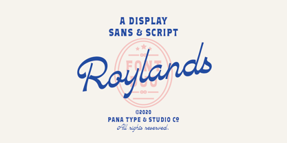 Royland Font Duo is a mathing pair of fonts, inspired by a simple yet elegant vintage graphic design, carefully crafted, and opentype features to support is perfect for graphic design needs.
 - Atria by AVP,
$29.00 A modern sans-serif, Atria is pinched at the junction of certain strokes, providing a distinctive appearance and aiding screen definition at small sizes. The glyphs cover Baltic languages and Cyrillic.
