10,000 search results
(0.076 seconds)
- Kanetin by Din Studio,
$29.00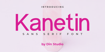 Kanetin is a elegant sans serif font. Made for any professional project branding. It is perfect for printing, branding and quotes. Every letter has a unique and beautiful touch. Includes: Kanetin (OTF) Features: PUA Encoded Multilingual Support Numerals and Punctuation Thank you for downloading premium fonts from Din Studio
 - Chewatext Rounded by Jipatype,
$17.00 Chewatext Rounded, developed from Chewatext, is a rounded sans-serif typeface that exudes minimalism and a geometric look. This versatile font family offers 18 styles, supporting Latin-1 and Thai Unicode characters. It is suitable for contemporary design projects, whether for various printed works or online and offline
 - Dotoria Slant by Gassstype,
$19.00 Hello Everyone, Introduce our new collection Dotoria is a Handwritten Brush font with comical type. Crafted manually with love and passion, This font is great for your next creative project such as logos, printed quotes, invitations, cards, product packaging, headers, Logotype, Letterhead, Poster, Label, Game project and etc.
 - Arthura by Seniors Studio,
$15.00 Arthura is a sans serif font family with subtle reverse contrast, particularly visible in its ultra bold ‘Black’ style. Six weights plus matching italics. Simple geometry and with humanist nuance that adds warmth. It’s a perfect choice for branding, magazines, posters, advertising, packaging, headlines, logos, web, print etc.
 - SdrawkcabJJ by Ingrimayne Type,
$9.95 SdrawkcabJJ allows one to create mirror writing, that is, writing which looks correct when viewed in a mirror. To understand why it is named as it is, print out the name “Sdrawkcab” using the typeface and hold it up to a mirror. It is derived from the font JetJane.
 - Jimmy Jamets by Gassstype,
$29.00 Hello Everyone, introduce our new product Font Jimmy Jamets This Is Hand Drawn Font.This is a Textured Natural Style and classy style with a clear style and dramatic movement. This font Jimmy Jamets is great for your next creative project such as logos, printed quotes, invitations, cards, product packaging,
 - Brush Besh by Gassstype,
$25.00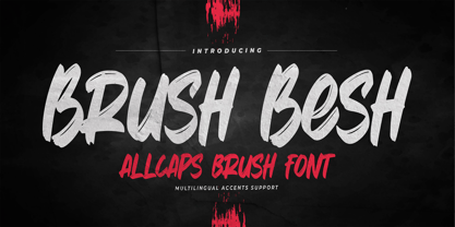 Hello Everyone, introduce our new product Font Brush Besh is AllCaps Brush Font.This is a Textured Natural Style and classy style with a clear style and dramatic movement. This font Brush Besh is great for your next creative project such as logos, printed quotes, invitations, cards, product packaging, headers.
 - Wilder by Great Scott,
$12.00 Wilder is a condensed handwritten sans serif with both uppercase and lowercase characters. It has a generous x-height with big elongated counters and low set bars which gives Wilder a unique look. Great for packaging, print, and display use. You can also use it in shorter paragraph texts.
 - Christ Moon by Illushvara,
$14.00 Introducing a new font Christ Moon is a cute, quirky and chunky lettered handwritten font. Fall in love with its incredibly versatile style and use it to create spectacular designs special for Christmas Season! Like a logotype, social media promotion, merchandise, packaging, cut and print sticker, quotes and more.
 - Pixel_Block by fontkingz,
$19.00The Pixel_Block font-family is specially designed for use with Flash so that it doesn't blur or fill. In contrast to most other pixelfonts Pixel_Block also works well in dynamic and input text fields. Pixel_Block fonts include a full character set and also contain outlines for any print application. - The Pursuits by Gassstype,
$27.00 Hello Everyone, introduce our new product Font THE PURSUITS This Is All Caps Sporty Font.This is a Textured Natural Style and classy style with a clear style and dramatic movement. This font THE PURSUITS is great for your next creative project such as logos, printed quotes, and invitations.
 - Bella Vista by Din Studio,
$22.00 Bella Vista is a monoline script and is suitable for any design like branding, fashion, print template, quotes, weddings and more. Features : 121 Beautiful Alternates 6 Beautiful Ligatures PUA encoded Multilingual Support Numerals and Punctuation (OpenType Standard) Thanks for visiting and purchasing my font Donis M Din Studio
 - NeueType by NicolassFonts,
$- NeueType is a modern sans serif font family. This family is ideally suited for web and print use. It comes in 16 weights, 8 uprights, matching Italics, and Variable font. Each weight includes 549 glyphs and 22 OpenType features (including Ligatures, Case Sensitive Forms, Tabular Figures, and Typographic Variants).
 - Techno Cowboy by Hipfonts,
$22.00 Introducing Techno Cowboy, a modern techno display font with multilingual support. Techno Cowboy is great for creating eye-catching logos, headlines, ads, posters, web design, print, motion graphics, apparel and much more. If you're looking for a futuristic font that packs a punch, then Techno Cowboy is for you.
 - Radical Outcast by Joanne Marie,
$12.00 This brand new signature font is so versatile that you can use it for just about anything. Its big, bold caps are perfect for logos and icons, giving off a genuine and unique handwriting feel to your designs. Other uses for this casual font could be on apparel such as bags, t-shirts, bottles, etc. I see it being used in taglines on a range of products such as sport & fitness products, tattoo branding, soft drinks (energy drinks). I'm sure you'll find a use for it!
 - Santika Script by Pista Mova,
$12.00 Santika Script with 172+ glyphs. Alternative characters are divided into several Open Type features such as Swash, Stylistic Sets, Stylistic Alternates, Contextual Alternates. The Open Type feature can be accessed using Open Type savvy programs such as Adobe Illustrator, Adobe InDesign, Adobe Photoshop version of Corel Draw X, and Microsoft Word. And this Font has provided PUA unicode (custom coded font). so that all alternative characters can be easily accessed in full by a craftsman or designer. Santika Script Santika Script Italic Happy Designing
 - Impetus by Device,
$39.00 Impetus is a powerful capitals-only geometric sans in a solid and inline variant. Built around a framework of a circle and square, it echoes angular Deco or Italian Futurist "moderne” forms, and is about as heavy as it is possible for a font to be. Alternate forms are provided in the lower-case keystrokes for the S, G, J and W, and there is also an alternate 1. The two styles can be combined in one setting for effect. Use Impetus where maximum impact is required.
 - Plants by Artisan Studio,
$15.00 Plants Clean & Rough is 2-style family. The brush script is beautiful and unique; it is a model of modern calligraphy typefaces, in combination with a calligraphy writing style. Can be used for various purposes.such as headings, logos, wedding invitation, t-shirt, letterhead, labels, news, posters, badges etc. This font's features are: - Contextual Alternates - Standard ligatures - Discretionary ligatures - Stylistic Alternates - Stylistic sets OpenType features can be accessed by using OpenType smart programs such as Adobe Illustrator and Adobe InDesign, Adobe Illustrator CS, CorelDraw X6-X7.
 - New September by Nk Studio,
$19.00 New September is a whimsical and fun display font. Looks great on a variety of design ideas that need a trendy touch. Whatever the topic, New September will be a great asset to your font library, as it has the potential to enhance any creation. The New September is also made with the crafter in mind: there are no closed counters in either type, meaning they can easily be used for stencils and electronic cutters like the Cricut and Silhouette lines. Enjoy and thank you.
 - Spiralis by Lorenzo Vecchiotti,
$17.00 Spiralis is a font that wants to maximize the spiral by including at least one in each letter of the alphabet. It is a font that lends itself to being used for headlines or otherwise in large sizes in order to be best appreciated. It is based on the golden spiral, Archimedes' spiral, the golden rectangle and the square from which the construction grids are derived. 2 styles 179 glyphs for each style 6 ligatures Italian, english, french, spanish, german, danish https://www.behance.net/gallery/147197043/Spiralis
 - Astrid Grotesk by Eclectotype,
$40.00 Astrid Grotesk is a normalized version of Schizotype Grotesk. Normalized; not neutralized. Where many neo-grotesks appear cold with their harsh neutrality, Astrid has a warmth, eminating from its (for want of a better word) clunkiness. With the latest update, it becomes a true workhorse, with a range of widths and italics for the normal widths. Astrid Grotesk, while being clearly a neo-grotesk in appearance, has a personality all of its own. Standout characters include the f and t, and the default binocular g, unusual in neo-grotesks. And the right angled terminals on c, e and s. Stylistic sets offer up alternate forms of a, g, y, I, @, dutch IJ, german eszett and l. A full complement of numerals is included: proportional and tabular, lining and oldstyle, plus fractions, subscript and superscript. Note also that the tabular figures are duplexed across weights - very useful when highlighting specific entries in tables. The tabular figures feature also substitutes in fixed width (across all weights) comma and period, so your decimals line up perfectly always. Lastly, case sensitive forms of certain glyphs are included for all-cap settings. This typeface will be useful for corporate identities and branding work. It’s spaced more for text settings in the normal width, and gets more display-optimized as the width decreases, but with careful tracking, all styles can sing at display sizes. Bored of those other Swiss style typefaces? Astrid Grotesk could be the face you need to breathe new life into your designs. Coupled with Schizotype Grotesk, its more eccentric cousin, you've got an unorthodox branding system ready to use straight out of the box.
 - Jessen-Schrift by profonts,
$41.99 The original Jessen typeface, named in reminiscence of the great supporter of the printing art at the end of the 19th century, Peter Jessen, was designed in the years of 1924 until 1930. Bible Gothic was created by the famous German designer Rudolf Koch. Ralph M. Unger digitized this font exclusively for profonts in 2005, keeping his digitization as close as possible to the original design of Koch in order to preserve the distinguished character and the partly unconventional, original forms. The concept of a Bible Gothic was developing for years in Koch's mind and drove the direction of his work, but only after the experience with his Neuland design could he start the creation of his Peter Jessen typeface. Produced quite like Neuland, Jessen, however, is much more refined and more accurate in detail than Neuland. At first glance, it seems to look plain and simple, but if you look closer, the richness of its distinguished upper case forms unfold to a perfectly clear flow of text
 - HWT Unit Gothic by Hamilton Wood Type Collection,
$39.95 The Unit Gothic series was released by Hamilton Manufacturing Co. in 1907. This sans serif family features one of the first multi width/weight type 'systems' anticipating the Univers font system by 50 years. This set of 7 fonts was designed to aid in press room efficiency and with its incremental variation in widths gave poster printers unprecedented flexibility in fitting copy while using consistently harmonious fonts. This HWT release is the first ever digital version of these fonts. Each font contains 600 glyphs including Greek and Cyrillic character sets as well as alternate characters which are based on the actual special character production patterns from the Hamilton Wood Type Museum collection. HWT Unit Gothic system features: •HWT Unit Gothic 716 - 50% wider •HWT Unit Gothic 717 - 25% wider •HWT Unit Gothic 718 - (Standard width which others are based on) •HWT Unit Gothic 719 - 25% narrower •HWT Unit Gothic 720 - 50% narrower •HWT Unit Gothic 721 - 62.5% narrower •HWT Unit Gothic 722 - 75% narrower
 - Size by SD Fonts,
$34.00 Retro style is hip, so are early 20th century poster fonts. Size is based on these extra condensed letter forms. In the 19th century the need to communicate commercial messages on limited poster space brought up extremely condensed fonts creating a new typographical look. Since not really legible in small sizes these fonts nearly disappeared with the change in the commercial communication in the 20th century. For a couple of years now, these extra condensed fonts have a revival copying the exact historical appearance of its predecessors. Size, though also seeking the inspiration in the historical draft, furthermore aims to interpret this compressed look in a more vivid way by not closing in on the open counters of the round letters, but having its stroke endings slightly curved. Since other characters are defined by straight strokes, Size displays a look more vital and candid, but still distinct, compared to its historical predecessors.
 - Bartosh by jpFonts,
$19.90 Bartosh is the American short form for Bartholomew. Although I chose this font name because of its sound and its short conciseness, I also liked the fact that Bartholomew had been one of the 12 apostles who had worked in India and Iran and the idea that his spirit could be the inspiration for my work.Bartosh was designed for display on the screen: the large x-height and the clear, open shapes facilitate readability. As a result, it develops a strong expression of character and makes it ideal for headings or highlighting individual text passages – it is ideal for captions of any kind. In each of the six weights, it unfolds its own and special charm. The extra-bold version is particularly noteworthy because fonts in this stroke width are rare and it is precisely these extreme bolds that give them a special graphic appeal.For all fonts there are matching italics in a well-developed set of 677 characters. In addition, it is possible to change the digits and currency characters from proportional to tabular or OldStyle via the OpenType feature, and small caps are also available in all fonts.
 - Kontext H by Elster Fonts,
$20.00 Imagine a font that is easier to read the smaller it is – or the further away the text is. There are already many line screen fonts, I wanted to take it to the extreme and use as few lines as possible, while keeping the grid of the fonts metrics. The result is a typeface that lives up to its name. Each individual line makes no sense on its own; individual letters are only recognisable in the context of all associated lines, individual letters are most likely to be recognised in the context of whole words. Attached to a building wall, text would be readable from a great distance and become increasingly difficult to decipher the closer you get to the building. Placed on the ground or on a large flat roof, text would only be readable from an aeroplane or - depending on the size - in Google Earth. Kontext has old style figures, superscript numerals, case-sensitive questiondown and exclamdown and an alternative ampersand, 390 glyphs at all. Use the same value for font size and line spacing to keep the lines in the grid, or change the line spacing in 10% steps. Change the spacing in 100-unit or 25-percent increments increments to keep the grid. The »H« in the font name stands for horizontal (lines). The numbers in the font name refer to the brightness of the background and letters themselves, with the first number describing the background and the second the letters. Starting with »00« (white) to »200« (dark) See also my Family Kontext Dot
 - Kontext V by Elster Fonts,
$20.00 Imagine a font that is easier to read the smaller it is – or the further away the text is. There are already many line screen fonts, I wanted to take it to the extreme and use as few lines as possible, while keeping the grid of the fonts metrics. The result is a typeface that lives up to its name. Each individual line makes no sense on its own; individual letters are only recognisable in the context of all associated lines, individual letters are most likely to be recognised in the context of whole words. Attached to a building wall, text would be readable from a great distance and become increasingly difficult to decipher the closer you get to the building. Placed on the ground or on a large flat roof, text would only be readable from an aeroplane or - depending on the size - in Google Earth. Kontext has old style figures, superscript numerals, case-sensitive questiondown and exclamdown and an alternative ampersand, 390 glyphs at all. Use the same value for font size and line spacing to keep the lines in the grid, or change the line spacing in 10% steps. Change the spacing in 50-unit or 25-percent increments to keep the grid. The »V« in the font name stands for vertical (lines). The numbers in the font name refer to the brightness of the background and letters themselves, with the first number describing the background and the second the letters. Starting with »00« (white) to »200« (dark) See also my family Kontext Dot
 - Ambassador Plus by Juraj Chrastina,
$39.00 Hairline display fonts are elegant and subtle with touch of luxury. They are the Champagne of type. Ambassador Plus Family represents a set of classy typefaces best suitable for magazines, cosmetics packaging, advertising or any kind of fine and sensitive design. The quality of spacing and kerning ensured by Igino Marini.
 - Indigo Antiqua 2 by Fontanova,
$36.00 Indigo Antiqua 2 is an old-style humanist serif typeface primarily based on personal studies of a typeface by Francesco Griffo (1450–1518) Italian punchcutter. But it is not a revival of the so called original Bembo (1496) or any other typeface. My Inspirations are of various kinds, but some outstanding old typeface masters like Guillaume le Bé, Miklós Kis, Peter de Walpergen and Christoffel van Dijck are important. Indigo Antiqua 2 is most commonly used for body text were legibility / readability matters – and is a reliable multi-purpose typeface. It has been applied for thousands of book titles and between the book covers made reading comfortable. By using Indigo Antiqua 2 with OpenType features You can reach additional ligatures, various figure sets, small caps, stylistic options and a lot of other typographical choices. Multi-Lingual support: Central European languages and many others. | See www.fontanova.se
 - Patent Reclame by HiH,
$10.00 Patent Reclame manages to be light-hearted, while clearly showing its blackletter roots both in the shape of the individual letters and the rhythm of text on a page. The designer is unknown. Schriftgeisserei Flinsch of Frankfurt a.M. cast the face around 1895. Nicolete Gray shows a quite similar face called “Graphic,” from Stephenson Blake in 1896. Personally, I don't think that Patent Reclame looks like an English design, but I do not have any proof one way or the other. The numbers are proportional, intended for posters, not spreadsheets. Two ornaments are included, an art nouveau rose at #172 and a lilypad with long tendril at #177. Great for invitations, posters and flyers announcing fun events. Do not use for obituaries. Quite readable in smaller sizes for short blocks of text. I really like the buoyant quality -- a nice combination of discipline and enthusiasm.
 - UniOpt by ParaType,
$25.00 An experimental font designed by Viktor Kharyk in Op Art style. UniOpt is based on free brush technique similar to experimental lettering of the early decades of the 20th century; for instance to ‘Graficheskaya Azbuka’ (‘Graphic ABC’) by Peter Miturich and works by Victor Vasareli. The face is legible even at small sizes and quite useful to an original display matter, initials and logos. The rigid double-wide structure allows to create complicated decorative works using vertical composition. Interesting that diacritical marks are also placed inside of character square fields and don’t destroy geometrical order. The decorative abilities of the font are increased by inverted versions of characters that may be used in different combinations including in color. The character set contains expanded Latin, Greek and Cyrillic ranges. UniOpt was awarded for type design excellence at TypeArt’05 Contest in Moscow. Licensed by ParaType in 2006.
 - Glass Water by Heyfonts,
$18.00 Glass Water - Tropical fonts often incorporate organic and flowing design elements, mimicking the curves and shapes found in nature, such as palm fronds, waves, or exotic flowers. These elements can add a sense of fluidity and movement to the typography. if you are looking for a font that embodies a tropical or exotic aesthetic, you may be interested in fonts that are inspired by or commonly associated with tropical themes. Such fonts often feature characteristics that evoke feelings of warmth, relaxation, and the natural beauty of tropical environments. Here's a general description of what you might expect from a font with a tropical theme: Organic and Flowing: Tropical fonts often incorporate organic and flowing design elements, mimicking the curves and shapes found in nature, such as palm fronds, waves, or exotic flowers. These elements can add a sense of fluidity and movement to the typography.
 - Apologetic by Heyfonts,
$18.00 Anglepoise Typeface Anglepoise - Tropical often incorporate organic and flowing design elements, mimicking the curves and shapes found in nature, such as palm fronds, waves, or exotic flowers. These elements can add a sense of fluidity and movement to the typography. if you are looking for a font that embodies a tropical or exotic aesthetic, you may be interested in fonts that are inspired by or commonly associated with tropical themes. Such fonts often feature characteristics that evoke feelings of warmth, relaxation, and the natural beauty of tropical environments. Here's a general description of what you might expect from a font with a tropical theme: Organic and Flowing: Tropical fonts often incorporate organic and flowing design elements, mimicking the curves and shapes found in nature, such as palm fronds, waves, or exotic flowers. These elements can add a sense of fluidity and movement to the typography.
 - Fissue by Heyfonts,
$18.00 Fissue – Tropical Font often incorporate organic and flowing design elements, mimicking the curves and shapes found in nature, such as palm fronds, waves, or exotic flowers. These elements can add a sense of fluidity and movement to the typography. if you are looking for a font that embodies a tropical or exotic aesthetic, you may be interested in fonts that are inspired by or commonly associated with tropical themes. Such fonts often feature characteristics that evoke feelings of warmth, relaxation, and the natural beauty of tropical environments. Here’s a general description of what you might expect from a font with a tropical theme: Organic and Flowing: Tropical fonts often incorporate organic and flowing design elements, mimicking the curves and shapes found in nature, such as palm fronds, waves, or exotic flowers. These elements can add a sense of fluidity and movement to the typography.
 - Noble Serenity by Hipfonts,
$9.00 Introducing Noble Serenity, where timeless beauty meets serene elegance. This exquisite serif font is a harmonious blend of sophistication and tranquility, designed to elevate your designs with a touch of refined grace. With its clean lines, delicate curves, and perfectly balanced proportions, Noble Serenity exudes an aura of understated charm and sophistication. Each letter is meticulously crafted, reflecting the meticulous attention to detail and craftsmanship of a bygone era. Whether you're designing wedding invitations, luxury branding, or editorial layouts, Noble Serenity brings an air of refined beauty to your projects. Discover the captivating allure of Noble Serenity and let your designs embrace the essence of timeless elegance. Elevate your typography to new heights with this font that whispers of tranquility and commands attention with its noble presence.
 - Barryone by Awan Senja,
$14.00 Barryone results out of a stunning pairing of a brush pen and pencil that makes it look incredibly endearing and authentic. Use this gorgeous and unique handwritten font to bring any DIY project to life!
 - Chlorophyll by Alit Design,
$18.00 Introducing "Chlorophyll" - A Sans Serif Font with a Refreshing Natural Elegance Unveil the beauty of nature in your design projects with "Chlorophyll," a stunning sans serif font that combines modern simplicity with the organic charm of leaf illustrations. This elegant typeface is designed to infuse your creations with a sense of natural harmony, making it perfect for a wide range of applications, from branding to packaging and beyond. Key Features: Sans Serif Sophistication: "Chlorophyll" boasts a clean and versatile sans serif style, making it ideal for both display and body text. Its balanced letterforms exude a sense of modern sophistication, ensuring legibility and impact in all your design endeavors. Leafy Delight: With meticulously crafted leaf illustrations integrated into the font's characters, "Chlorophyll" embodies the spirit of the great outdoors. Each letter and symbol subtly incorporates the elegance of leaves, creating a seamless connection to the natural world. Elegance in Simplicity: "Chlorophyll" captures the essence of natural beauty through its simplicity. This font is a testament to the idea that less is more, allowing your content to shine while adding a touch of eco-friendly charm. Versatile Usage: Whether you're designing a logo for an eco-conscious brand, creating invitations for a garden wedding, or crafting a menu for a farm-to-table restaurant, "Chlorophyll" adapts effortlessly to diverse design projects. It's a versatile tool that can evoke a sense of elegance and sustainability in any context. Extensive Character Set: "Chlorophyll" includes an extensive character set, encompassing uppercase and lowercase letters, numerals, punctuation, and a wide range of special characters. This ensures compatibility with multiple languages and enables you to express your message with clarity and grace. Digital and Print Ready: "Chlorophyll" is delivered in multiple formats, making it ready for both digital and print applications. Its high-quality vectors ensure crisp and sharp rendering in any size or medium. Embrace the allure of nature and elevate your design projects with "Chlorophyll." This sans serif font, inspired by the beauty of leaves and the elegance of simplicity, brings a touch of the natural world to your creative endeavors. Elevate your designs, evoke a sense of harmony, and make a lasting impression with "Chlorophyll" today.
 - Quayside by Eclectotype,
$40.00 Quayside is a deliciously thick and bulbous baseball script, with a wealth of OpenType features. Features include: Contextual alternates - I would suggest having these on by default; they make letters connect more smoothly (uppercase letters like M and H, which are normally non-connecting for all-caps purposes, connect to lowercase letters. The swash variant of J, and all o and b characters connect to any e character at a lower junction for a smoother join). Contextual alternates also make sure special end-forms of lowercase letters are used at the ends of words. Ligatures - A nice collection of useful ligatures which make the text flow smoother. Swash - Gives you more exuberant capitals. Not recommended for all-caps usage! The swash function also gives a variation of the ampersand and turns # into a nice numero symbol. Oldstyle Figures - lining figures are default but with the flick of a switch in OpenType savvy applications, you get expressive oldstyle figures. Quayside is a versatile typeface. Depending on the mood you're after, it can easily be retro or modern, fun or (fairly) serious. I'm often pleasantly surprised by the wide variety of uses my fonts get put to, and I can't wait to see what you do with this one!
 - Musical Comedy JNL by Jeff Levine,
$29.00 The hand lettered show card brush lettering in the trailer for the 1960 musical comedy “Bells are Ringing” (starring Dean Martin and Judy Holliday) inspired Musical Comedy JNL, which is available in both regular and oblique versions.
 - Preto Sans OT Std by DizajnDesign,
$50.00 Preto is an extensive type family, which explores the function of serifs on readability and legibility. Preto consist of three subfamilies: Sans, Semi and Serif. Preto is designed for multilingual typesetting. All of the subfamilies have equal gray value but different texture which can be use to differentiate languages. Preto subfamilies have two text weights and two bold styles (Regular --> Bold, Medium --> Black). Every weight has a companion Italic style as well. Preto Sans OT Std The Sans version of Preto forms the basic skeleton of the family, it is decidedly simpler than the other styles (Semi and Serif). Although you can find many distinctive and unique elements in the details. The most visible elements are the tapered upper part of the letters. The capital letters have uniform widths achieving very different texture than traditional roman proportions. There are two different options for ligatures and alternative characters (J, Q, g, &) gives more variability for different languages.