10,000 search results
(0.038 seconds)
- Catetin by DYSA Studio,
$18.00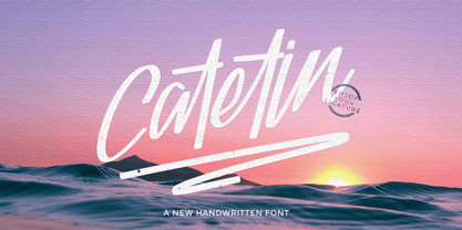 Catetin is handwritten signature font. This another collection of script is perfect for your branding project, excellent for your business. Catetin have a smooth edges, so this font gives an authentic handcrafted feel style. Catetin is perfect choice for people looking for clean, modern, minimalist, elegant, beauty design styles. Suitable for almost any graphic designs such as logo, branding materials, business cards, gift cards, t-shirt, cover, thumbnail, print, poster, photography, quotes .etc
 - Vailery Wedding by HansCo,
$15.00 Vailery Serif Font is a elegant display serif font with modern look that is perfect for multipurpose projects. I made Vailery Serif Font inspired by the concept of romantic vibes and made it into a unique yet luxury style. This font is also looks fabulous and will fit well in any design and very recommended for logo, crafts, posters, books, branding, quotes, print templates, packaging, invitations, product labels, advertising, wedding project and more. Enjoy!
 - Castya by DYSA Studio,
$18.00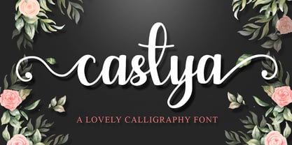 Castya is calligraphy font. This another collection of script is perfect for your branding project, excellent for your business. Castya have a smooth edges, so this font gives an authentic handcrafted feel style. Castya is perfect choice for people looking for clean, modern, minimalist, elegant, beauty design styles. Suitable for almost any graphic designs such as logo, branding materials, business cards, gift cards, t-shirt, cover, thumbnail, print, poster, photography, quotes .etc
 - Siga Mono by Greentrik6789,
$21.00 Elevate your design game with Siga Mono, the ultimate font family for all your creative needs. Transform your digital and print projects into masterpieces with its remarkable monospace layout and distinctive style. The multiweight options of Siga Mono allow you to experiment with various typographic hierarchies, ensuring that your design stands out from the competition. Don't miss the opportunity to try Siga Mono's extraordinary capabilities – download our variable demo and witness its magic firsthand!
 - NS Bullsmith by Novi Souldado,
$35.00 Bullsmith font collection, inspired by old style letterhead print, beer label, certificate, billhead, lithographic design and sign store. This font came with 3 styles, script, decorative and serif. With the combination from 3 fonts this is perfect to create label design, headline, logo types, signage, poster, certificate, all types of merchandise, book cover and many more application. what you get : 130+ Stylistic Alternate Standard & Discretionary Ligatures Uppercase & Lowercase Numerals & Punctuation OTF file
 - Exorts Compressed by Seventh Imperium,
$15.00 Exorts Compressed is a display font family. This square condensed sans is designed with an increased cap character and tight kerning to give the ability create the large and bold typography. It is made specifically for editorial design, headlines, posters, magazines, clothing and other purpose printed material. The family comes in weight from extra light to extra bold and have italic version of each weight. Features include: OpenType stylistic sets, ligature, and Multiple Language Support.
 - Wolves Gothic by Chank,
$39.00 Make a little extra impact with this strong athletic font with big geometric muscles, clean lines and sharp teeth, too. Originally created for a local pro basketball team in Minnesota, this sporty and big-shoulder poster font is now available directly to you for the first time ever to add some punch to your printed or web designs. Crisp and clear and ready for action a concise variety of weights and styles!
 - Diilgant by Piece of Cake Typework,
$19.00 Hello World, Introducing, Diilgant is a textured script font suitable for your design project needs, such as; social media posts, quotes, overlays on images, taglines, logos, posters, print needs, website banners, and more. Features * A set of uppercase and lowercase glyphs * Number, symbol, and punctuation * Multilingual Support * Alternates, ligatures, and swashes Thank you a million times for downloading and using this font for your projects. Enjoy this font and happy creating! Thank You
 - Berlys Pretty by HansCo,
$15.00 Berlys Serif Font is a elegant display serif font with modern look that is perfect for multipurpose projects. I made Berlys Serif Font inspired by the concept of romantic vibes and made it into a unique yet luxury style. This font is also looks fabulous and will fit well in any design and very recommended for logo, crafts, posters, books, branding, quotes, print templates, packaging, invitations, product labels, advertising, wedding project and more.
 - Eckhardt Signwriter JNL by Jeff Levine,
$29.00Eckhardt Signwriter JNL is based on a casual display lettering face popular with many sign painters and show card writers of yesteryear, best suited for large print projects. Jeff Levine has named this font (along with others in a series) after the late Albert Eckhardt, Jr. (1929-2005) who had owned Allied Signs in Miami, Florida from 1959 until his passing. Al was a talented lettering artist and a good friend to Jeff. - Hola Witch by Piece of Cake Typework,
$19.00 Hello World, Introducing, Hola Witch is a display font suitable for your design project needs, such as; Halloween themes, social media posts, quotes, overlays on images, tagline logos, posters, print needs, website banners, and more. Features * A set of uppercase and lowercase glyphs * Number, symbol, and punctuation * Multilingual Support * Some Swashes and alternates Thank you a million times for downloading and using this font for your projects. Enjoy this font and happy creating! Thank You
 - Good Friend by Senekaligrafika,
$12.00 “Good Friend” has hard strokes and signature style that speak to instant unique sensation. Take your creative projects to the highest level with this font. “Good Friend” will help you to create special and touching typographical design for your projects, for every day or the happiest day in life, greeting card, headings, flyer, product packaging, book cover, printed quotes, logos, and many more. It is really universal and modern font. The owner of endless possibilities!
 - Stoilen by Mercurial,
$22.00 Stoilen is font duo family serif typeface made with the desire for a quality, elegant, classy font that can still be used for all design needs. Wrapped with a modern yet unique character with a style. with so many alternate variations that are so unique but still elegant, it will add to the impression that this font is so luxurious for your design. Stoilen is ideal for design, logo design, blog graphics, style quotes, wedding stationery, art prints, additional design, packaging, social media, magazines, fashion, creative branding, editorial design and web designing. Features a Latin character set of more than 500 glyphs covering various languages, and includes advanced open type features such as standard and discretionary ligatures, positional numbers, style alternatives, and so on. The Open Type features can be accessed by using Open Type savvy programs such as Adobe Illustrator, Adobe InDesign, Adobe Photoshop Corel Draw X version, and Microsoft Word. And this has given PUA Unicode Fonts (specially coded fonts). so that all the alternate characters can easily be accessed in full by a craftsman or designer. Features : Lowercase and Uppercase Stylistic Alternates & Discretionary Ligatures Numerals & Punctuations Accented characters Multilingual support Don't forget to check out other cool fonts in our store and wait for new fonts. Follow our shop for upcoming updates including additional glyphs and language support. feel free to send me a message, comment, like and share. Thanks
 - Supra Compressed by Wiescher Design,
$29.00 Supra-compressed – designed by Gert Wiescher in 2013 – is the extreme version of this family. But despite it being very slim it is still – because of its openness – a very readable font. The light and normal weights and the dominant x-height with its high ascenders make for easy reading of long copy. The heavy and x-light weights are great for elegant headlines. Supra is a versatile OpenType family with lots of different weights.
 - Tenez by Plau,
$30.00 Big News! Tenez has been selected for the Tipos Latinos Biennial 2016 and Typographica’s Favorite Typefaces of 2015! Tenez is a Grand Slam display didone typeface from Plau. We designed it for a branding project, further developing the resulting logotype into a typeface we felt could solve many designers’ needs. Its origins are rooted in pointed nib calligraphy which can be seen in contemporary Didot and Bodoni inspired typefaces. But Tenez’s shapes are organic (these modern typefaces were originally cut by hand after all) – in fact that was the challenge we set from the start: to make a typeface as organic in construction as possible. This echoes some of late 19th century typefaces and advertising, yet we thought of it for contemporary uses. One of the several unique features of Tenez is its unusual Thin weight, in which the contrast between thin strokes and the black area left by the serifs makes for a typewriter-like personality. The italics provide a perfect counterpoint to the roman weights. Tenez was unapologetically conceived as a display typeface meant to be used large as in magazine openings, drop caps or everywhere there’s a need for elegant impact. The family includes support for almost all Latin languages available, figure sets for almost every conceivable occasion (tables, text, you name it), alternates for the quirky beautiful R (sometimes simpler is better, but not always!) and Q (with a nice big tail for that article opener). Tenez pairs really well with our no-frills sans-serif Motiva Sans and our cute vertical connected script Primot.
 - Gameness by Typodermic,
$11.95 Step back into the 1990s with Gameness, the font that embodies the spirit of the era’s gaming culture. Inspired by the Game Boy box art for Final Fantasy Adventure, Gameness evokes a sense of nostalgia while still looking fresh and modern. But this isn’t just any retro font. Gameness is sleek and sophisticated, with a narrow elegance that sets it apart from other throwback designs. Its tall letters are perfect for headlines, logos, and branding materials, giving your projects a bold, confident look. For clients who demand only the best, Gameness comes with an alternate barred “A”, adding even more versatility to your designs. And in OpenType-enabled applications, the “S” shape subtly alters to match the adjacent letters, ensuring a smooth, harmonious look every time. So why settle for ordinary fonts when you can make a statement with Gameness? Download it now and bring a touch of retro cool to your next project. Most Latin-based European writing systems are supported, including the following languages. Afaan Oromo, Afar, Afrikaans, Albanian, Alsatian, Aromanian, Aymara, Bashkir (Latin), Basque, Belarusian (Latin), Bemba, Bikol, Bosnian, Breton, Cape Verdean, Creole, Catalan, Cebuano, Chamorro, Chavacano, Chichewa, Crimean Tatar (Latin), Croatian, Czech, Danish, Dawan, Dholuo, Dutch, English, Estonian, Faroese, Fijian, Filipino, Finnish, French, Frisian, Friulian, Gagauz (Latin), Galician, Ganda, Genoese, German, Greenlandic, Guadeloupean Creole, Haitian Creole, Hawaiian, Hiligaynon, Hungarian, Icelandic, Ilocano, Indonesian, Irish, Italian, Jamaican, Kaqchikel, Karakalpak (Latin), Kashubian, Kikongo, Kinyarwanda, Kirundi, Kurdish (Latin), Latvian, Lithuanian, Lombard, Low Saxon, Luxembourgish, Maasai, Makhuwa, Malay, Maltese, Māori, Moldovan, Montenegrin, Ndebele, Neapolitan, Norwegian, Novial, Occitan, Ossetian (Latin), Papiamento, Piedmontese, Polish, Portuguese, Quechua, Rarotongan, Romanian, Romansh, Sami, Sango, Saramaccan, Sardinian, Scottish Gaelic, Serbian (Latin), Shona, Sicilian, Silesian, Slovak, Slovenian, Somali, Sorbian, Sotho, Spanish, Swahili, Swazi, Swedish, Tagalog, Tahitian, Tetum, Tongan, Tshiluba, Tsonga, Tswana, Tumbuka, Turkish, Turkmen (Latin), Tuvaluan, Uzbek (Latin), Venetian, Vepsian, Võro, Walloon, Waray-Waray, Wayuu, Welsh, Wolof, Xhosa, Yapese, Zapotec Zulu and Zuni.
 - Linotype Bariton by Linotype,
$29.00Linotype Bariton is part of the Take Type Library, chosen from contestants of Linotype’s International Digital Type Design Contests of 1994 and 1997. Designer Alexej Chekoulaev designed his font in one weight to mirror the Zeitgeist of the early 1930s. The characters of this extremely bold font are based on the form of a rectangle though its rounded edges soften its look a bit. Linotype Bariton should be used only in larger point sizes in headlines which should really catch the eye. - Linotype Bariton Paneuropean by Linotype,
$92.99Linotype Bariton is part of the Take Type Library, chosen from contestants of Linotype's International Digital Type Design Contests of 1994 and 1997. Designer Alexei Chekulayev designed his font in one weight to mirror the Zeitgeist of the early 1930s. The characters of this extremely bold font are based on the form of a rectangle though its rounded edges soften its look a bit. Linotype Bariton should be used only in larger point sizes in headlines which should really catch the eye. - ZF Ydor by The Zyme,
$23.50 ZF Ydor font family has been created to give a crafty, hand drawn look to your project. Its characters have been drawn by hand to give them a warm and authentic look. It was designed as a generic handwritten font; almost a mild handwritten font. The creation of ZF Ydor started for a specific work of our design firm, for which we needed a font that was handwritten, easy to read, and did not seem to be childish or comic, as several handwritten fonts do. ZF Ydor comes in five basic weights, is intended to work best in print materials as well as websites and digital apps, for small family companies, organic products and others. It also feels comfortable with short or large texts, in small and large sizes, due to clear and rounded characters. It supports all Latin language and the Greek too.
 - Salty Milky by Yumna Type,
$15.00 Salty Milky is a display font in thick weights to be your best choice for showing casual, charming, fun expressions. The uneven proportions and forms of the artistic letters add more attractiveness to this font. Furthermore, Salty Milky gives you a special bonus called the clipart. Use this font for big text sizes for a legibility reason and you can make use of the interesting features available here as well. Features: Multilingual Supports PUA Encoded Numerals and Punctuations Salty Milky fits for various design projects, such as posters, banners, logos, magazine covers, quotes, headings, printed products, merchandise, social media, etc. Find out more ways to use this font by taking a look at the font preview. Thanks for purchasing our fonts. Hopefully, you have a great experience using our font. Feel free to contact us for further information when you have a problem using the font. Thank you. Happy designing.
 - Cloudy Arolse by Rhd Studio,
$20.00 Is your branding missing something that makes people going WOW? Have you thought about how you can add that touch of magic to your branding and projects? What if we told you that we have solution to maximize your designs? Cloudy Arolse - A Sans Serif Font Family This font is more than just another sans serif font. Cloudy Arolse is a package that will delight you. With elegance, passion, and dreamy look you’ll be sure to boost your sales and make best impressions. This font become more special with many weights option. You will get so many alternatives to maximize your design. Use it for headings, logos, business cards, printed quotes, invitations of all sorts, cards, packaging, and your website or social media branding. Our font always includes Multilingual Options to make your branding globally acceptable. Features: PUA Encoded Numerals and Punctuation Thank you for downloading premium fonts from Rhd Studio
 - Mezalia Sans by Arrière-garde,
$9.00 Mezalia Sans is a logical continuation of the Mezalia family. Its shapes are based on medieval calligraphic style: the Bastarda. This time the evolution is taken a step further, as these classic shapes are merged with the straightforwardness of a modern sans-serif. This results in an original, strong yet very much usable typeface, that can hold its own in a wide range of applications. Mezalia Sans has two distinct styles: straight and cursive (true italic if you will, although the word is not really correct here), which come in ten weights, from thin to black. This wide range ensures that whether you are looking for delicate or bold strokes (or a combination of both) you will be satisfied. Every style also contains a set of small caps (with matching punctuation). Old-style, proportional and tabular numerals are included too, along with ligatures, symbols and language support in Adobe Latin 3 range.
 - Paralucent by Device,
$39.00 Paralucent is versatile all-purpose modern sans. Available in seven weights, from Thin to Heavy, and in two widths each with corresponding italics, it avoids some of the more eccentric calligraphic quirks of Akzidenz or Helvetica or the cool precision of Univers for an elegant, functional, yet warm design. There are two additions to the core 28-weight family: a three-weight stencil set, and a four weight text family. The text weights have been adjusted for use at small point sizes, and feature more open character shapes, looser inter-letter spacing for improved readability, and lining numerals for use in listings and tables. Several core ideas inform Paralucent’s design. Prime attention has given to the negative space between characters, giving a more even “colour”, especially in text. For example, the J, L and T have shorter arms than comparable sans typefaces, while the M and W are wider. The A has a lower bar, opening up the interior counter. An unusually high lower-case x-height again helps to give a more even colour and improve legibility. Care has been taken to rationalise repeated elements like the tails on lower-case letters, or the Q and the “ear” of the g. Typographic design solutions that are consistent across all these features add more stylistic cohesion. ‘Ink traps’ are exaggerated incisions used to open up a letter's narrower internal angles, which can become clogged with ink, especially in small point sizes. Now largely redundant due to the high quality of modern print, they are still sometimes used as a stylistic quirk or design feature. Now that digital fonts are often reversed or outlined, or enlarged to enormous sizes, these can also lead to unexpected or obtrusive results. Paralucent takes these inevitable digital manipulations into account, and adds optical corrections without resort to ink traps. The family has been picked up by many UK and US publishers, featuring heavily in magazines like Loaded, Heat and TV Quick, as well as high-end coffee-table photography books and gallery websites. A perennial Device bestseller.
 - Ragazza Script by Latinotype,
$79.00 Ragazza Script isn’t just another display typeface. It honors the greatest handwriting skills but in a different way. Although It doesn't represent any traditional calligraphy style, it is still part of that expressive world. With more than 1000 glyphs, and taking advantage of the Opentype features, Ragazza is full of personality. When in use, it gives a feel very close to ornamental Copperplate mixed with some kind of modern 'high-contrast' typeface. Lots of alternates, swashes and initial capitals are the spine of this face, assuring almost infinite combination possibilities. The early forms that would eventually lead to what Ragazza is today, began as a college project –around 2006– in the context of the 'Hyperfuente' exercise developed during Typography 2, chair E. Longinotti, at the University of Buenos Aires. But that seed would never stop growing. Since then a lot of work had been made to take that initial project to a professional quality level. Ragazza Script is perfect for headlines and short phrases. It is the brand new modern script, designed by Guille Vizzari and published by Latinotype.
 - 1514 Paris Verand by GLC,
$20.00 This set of initial decorated letters was inspired by a font in use in the beginning of 1500s in Paris. Exactly, we have used the set that Barthélémy Verand employed for the printing of Triumphus translatez de langage Tuscan en François, (from “Triumph” of Petrarque) in the year 1514. Some letters, lacked, have been reconstructed to propose a complete alphabet. It appears that the printer used some letters to replace others, as V, turned over to make a A, or D to make a Q. The original font’s letters were drawn in white on a black background only, but it was tempting to propose a negative version in black on white. It is used as variously as web-site titles, posters and flyers design, publishing texts looking like ancient ones, or greeting cards, all various sorts of presentations, as a very decorative, elegant and luxurious additional font. This font supports strong enlargements remaining very smart and fine. It’s original medieval hight is about one inch equivalent to about four lines of characters. This font may be used with all blackletter fonts, but works particularly well with 1543 Humane Jenson, 1557 Italic and 1742 Civilite, without any anachronism.
 - De Fonte Plus by Ingo,
$39.00 A variation of ”Helvetica according to the blur principle.“ The underlying typeface is ”Helvetica“, the only true ”run-of-the-mill“ typeface of the twentieth century. The distortion principle used simulates the photographic effect of halation and/or overexposure. The light weight, »DeFonte Léger«, nearly breaks on the thin points, whereas on those points where the lines meet or cross, dark spots remain. The characters are ”nibbled at“ from the inner and outer brightness. On the normal and semibold typestyles, »DeFonte Normale« and »DeFonte Demi Gras«, the effect is limited almost exclusively to the end strokes and corners, which appears to be strongly rounded off. The bold version »DeFonte Gros« is especially attractive. As a result of ”overexposure“, counters (internal spaces) are closed in, while characters become blurred and turn into spots; new characteristic forms are created which are astoundingly legible. The fat version »DeFonte Gros« is particularly appealing. “Overexposure” leads to drifted counters, letters blur into spots; new characteristic forms emerge, which are surprisingly easy to read.
 - John Sans by Storm Type Foundry,
$49.00 The idea of a brand-new grotesk is certainly rather foolish – there are already lots of these typefaces in the world and, quite simply, nothing is more beautiful than the original Gill. The sans-serif chapter of typography is now closed by hundreds of technically perfect imitations of Syntax and Frutiger, which are, however, for the most part based on the cool din-aesthetics. The only chance, when looking for inspiration, is to go very far... A grotesk does not afford such a variety as a serif typeface, it is dull and can soon tire the eye. This is why books are not set in sans serif faces. A grotesk is, however, always welcome for expressing different degrees of emphasis, for headings, marginal notes, captions, registers, in short for any service accompaniment of a book, including its titlings. We also often come across a text in which we want to distinguish the individual speaking or writing persons by the use of different typefaces. The condition is that such grotesk should blend in perfectly with the proportions, colour and above all with the expression of the basic, serif typeface. In the area of non-fiction typography, what we appreciate in sans-serif typefaces is that they are clamorous in inscriptions and economic in the setting. John Sans is to be a modest servant and at the same time an original loudspeaker; it wishes to inhabit libraries of educated persons and to shout from billboards. A year ago we completed the transcription of the typefaces of John Baskerville, whose heritage still stands out vividly in our memory. Baskerville cleverly incorporated certain constructional elements in the design of the individual letters of his typeface. These elements include above all the alternation of softand sharp stroke endings. The frequency of these endings in the text and their rhythm produce a balanced impression. The anchoring of the letters on the surface varies and they do not look monotonous when they are read. We attempted to use these tricks also in the creation of a sans-serif typeface. Except that, if we wished to create a genuine “Baroque grotesk”, all the decorativeness of the original would have to be repeated, which would result in a parody. On the contrary, to achieve a mere contrast with the soft Baskerville it is sufficient to choose any other hard grotesk and not to take a great deal of time over designing a new one. Between these two extremes, we chose a path starting with the construction of an almost monolinear skeleton, to which the elements of Baskerville were carefully attached. After many tests of the text, however, some of the flourishes had to be removed again. Anything that is superfluous or ornamental is against the substance of a grotesk typeface. The monolinear character can be impinged upon in those places where any consistency would become a burden. The fine shading and softening is for the benefit of both legibility and aesthetics. The more marked incisions of all crotches are a characteristic feature of this typeface, especially in the bold designs. The colour of the Text, Medium and Bold designs is commensurate with their serif counterparts. The White and X-Black designs already exceed the framework of book graphics and are suitable for use in advertisements and magazines. The original concept of the italics copying faithfully Baskerville’s morphology turned out to be a blind alley. This design would restrict the independent use of the grotesk typeface. We, therefore, began to model the new italics only after the completion of the upright designs. The features which these new italics and Baskerville have in common are the angle of the slope and the softened sloped strokes of the lower case letters. There are also certain reminiscences in the details (K, k). More complicated are the signs & and @, in the case of which regard is paid to distinguishing, in the design, the upright, sloped @ small caps forms. The one-storey lower-case g and the absence of a descender in the lower-case f contributes to the open and simple expression of the design. Also the inclusion of non-aligning figures in the basic designs and of aligning figures in small caps serves the purpose of harmonization of the sans-serif families with the serif families. Non-aligning figures link up better with lower-case letters in the text. If John Sans looks like many other modern typefaces, it is just as well. It certainly is not to the detriment of a Latin typeface as a means of communication, if different typographers in different places of the world arrive in different ways at a similar result.
 - Decorata by Positype,
$29.00 How many times have you seen lettering on a book cover, poster, or card and wanted to make something similar? Decorata’s eight intertwining weights finally make that possible in an intelligent way. The first major collaboration of its kind, Decorata pairs the talents of supreme lettering artist Martina Flor and masterful type designer Neil Summerour. Lettering was traditionally understood as using words in an artistic way, while type design created written language for easy reading, the one overlapping the other in several ways. For this unique project, Martina created several versions of the alphabet and its decorative layers in her eye-catching style. Neil then took those designs and created an enormous eight-style font family that respects the designer’s need for control and capitalizes on the artist’s expressiveness. Each style can work separately but, on top of the foundational styles, try placing the Lace, then Filigree in contrasting colors. Use any OpenType-capable program to turn headlines from blasé to wowza, make posters with some pow, and design your own cards with that just-right level of detail. Whatever idea you can imagine with the Decorata family, it promises to be a playful and precise wordsmith where the words themselves are the art. Decorata’s glyphs are bifurcated, have medium contrast to showcase their intricate interactions, and include Shadow, Regular, Outline, Filigree, Lace, Fancy, Intricate, and Dingbat styles — eight in all. The Regular style sets the word or phrase to begin the design, Shadow ensures it lifts off the background, and Outline attempts to restrain its ornate flair. Think of those as the foundation and use the rest of the styles for flamboyance. The Intricate and Filigree styles vary only in the thickness of the glyphs, with Filigree being thinner. Lace removes the external curls around each letter but keeps the internal negative space from those decorative lines. The Fancy style is a solid lettershape that includes its attendant elements, and the Dingbats are exactly as expected: borders, manicules, patterns, frames, and many stylized items to bring designs to life.
 - Beralin by Alterspieler,
$15.00 Beralin is a calligraphy script font that comes with lovely alternates characters. a mixture of from copperplate calligraphy with handlettering style. Beralin is attractive like a smooth, sensual, glamorous, clean, feminine, simple and highly legible typeface. Its classic style is perfect to be applied in any type of formal pieces such labels, menus, make up, Logos, fashion, stationery, letterpress, romantic novels, magazines, books, packaging, labels. OpenType features with stylistic alternates, ligatures and swash characters, including multiple language support. that allows you to mix and match pairs of letters to fit your design.
 - Faber Gotic by Ingo,
$21.00 A ”modern“ Gothic – designed according to principles of modern form in three variations Faber Gotik is a reminiscence of Gutenberg’s first script from around 1450. The heavily broken forms allow further development in the direction of a modern, strongly geometric and less formal type. It should be possible to push the principle of design so far to the limit that a type is created which, from the very start, extinguishes reminders of a dark past. The characters are composed of squares which are lined up straight or in a more or less slanted manner. The resulting corners similar to serifs were removed so that a sans serif type in the true sense without up and down strokes was created. The principle of ”breaking“ was applied according to the historical model. Even the form of the characters is based on the model from the Middle Ages. Only the characters which cannot be created with the principle described were modeled on today's forms. Faber Gotik includes three variations: - Faber Gotik Text — most similar to the historical model - Faber Gotik Gothic — pushes the applied principle of form the furthest - Faber Gotik Capitals —; a Gothic upper case font, contrary to tradition. 555 years after Gutenberg, interest in black-letter typefaces is nearly extinct. They are especially looked down upon in German-speaking countries because they are still associated with ”Nazi“ scripts. But yet, the very forms of blackletter, Gothic, Schwabacher and especially cursive have enormous potential with regard to the development of new advanced font forms.
 - DIN Next Stencil by Monotype,
$56.99 The DIN Next™ Stencil suite of designs is DIN with an attitude. It’s even more industrial strength than the original. DIN Next Stencil’s seven roman weights are perfect for projects that require a mechanized, military, or commercial vibe. If you’re looking to create commanding display typography, be it in advertising, apparel, packaging, posters, signage, wayfinding – or crash dummy name tags, DIN Next Stencil can be the perfect typographic enhancement. Based on Akira Kobayshi’s DIN Next with stenciling by Sabina Chipară, the wide range of weights and large complement of diacritical and international characters – including those for Cyrillic and Greek – further expand the design’s capabilities. The DIN Next Stencil fonts are powerful tools in their own right – and provide a distinctive supplement to the DIN Next typographic palette.
 - Tessie Dingies by Ingrimayne Type,
$9.95 A tessellation is a shape that can be used to completely fill the plane--simple examples are isosceles triangles, squares, and hexagons. The TessieDingie fonts contain tessellation shapes that can be used to construct tessellation patterns. The repeating unit, which may contain only one of the shapes or a several of the shapes, is on one key so making patterns is trivial with these fonts. TessieDingieAbstract contains abstract shapes that tessellate. TessieDingiePictures contains shapes that resemble real world objects, such as birds, animals, tools, and vehicles. Make sure the leading is the same as font size or the rows will not line up. Tessellation patterns are eye-catching and visually appealing, which is the reason that they have long been popular in a variety of decorative situations, such as quilting.
 - Speech Bubbles by Harald Geisler,
$68.00 The font Speech Bubbles offers a convenient way to integrate text and image. While the font can be used to design comics, it also gives the typographer a tool to make text speak – to give words conversational dynamics and to emphasize visually the sound of the message. The font includes a total of seventy outlines and seventy bubble backgrounds selected from a survey of historic forms. What follows is a discussion of my process researching and developing the font, as well as a few user suggestions. My work on the Speech Bubbles font began with historic research. My first resource was a close friend who is a successful German comic artist. I had previously worked with him to transform his lettering art into an OpenType font. This allowed his publishing house to easily translate cartoons from German to other languages without the need to use another font, like Helvetica rounded. My friend showed me the most exciting, outstanding and graphically appealing speech bubbles from his library. I looked at early strips from Schulz (Peanuts), Bill Waterson (Calvin & Hobes), Hergé (TinTin), Franquin, as well as Walt Disney. The most inspiring was the early Krazy Kat and Ignatz (around 1915) from George Herriman. I also studied 1980’s classics Dave Gibbon’s Watchmen, Frank Miller’s Ronin and Alan Moore and David Lloyd’s V for Vandetta. Contemporary work was also a part of my research—like Liniers from Macanudo and work of Ralf König. With this overview in mind I began to work from scratch. I tried to distill the typical essence of each author’s or era’s speech bubbles style into my font. In the end I limited my work down to the seventy strongest images. An important aspect of the design process was examining each artist’s speech bubble outlines. In some cases they are carefully inked, as in most of the 80’s work. In others, such as with Herriman, they are fast drawn with a rough impetus. The form can be dynamic and round (Schultz) with a variable stroke width, or straight inked with no form contrast (Hergé). Since most outlines also carry the character of the tool that they are made with, I chose to separate the outline from the speech bubble fill-in or background. This technical decision offers interesting creative possibilities. For example, the font user can apply a slight offset from fill-in to outline, as it is typical to early comic strips, in which there are often print misalignments. Also, rather than work in the classic white background with black outline, one can work with colors. Many tonal outcomes are possible by contrasting the fill-in and outline color. The Speech Bubbles font offers a dynamic and quick way to flavor information while conveying a message. How is something said? Loudly? With a tint of shyness? Does a rather small message take up a lot of space? The font’s extensive survey of historic comic designs in an assembly that is useful for both pure comic purposes or more complex typographic projects. Use Speech Bubbles to give your message the right impact in your poster, ad or composition.
 - Samo Sans by CarnokyType,
$- Samo Sans is a modern sans-serif typeface with low contrast strokes and is balanced between technical shapes and dynamic feeling. The primary type family is consisted of complete set of Latin glyphs for lower and upper case. It also supports diacritics of all European languages including lining numerals, standard ligatures and other characters sufficient for regular typesetting. Characteristic features are lower spurs (a, b, d, u), and upper spurs (m, n, p, q, r) with distinctive wedge-shaped cuts. These parts are complemented by homogeneously designed diacritics, which is not disturbing and harmonizing with the whole unit. Another very strong feature of the type drawing are lower terminals of the round glyphs, which are finished by moderate narrowing. The type has got decreased caps height, also decreased numerals and optimal x-height, which makes it suitable for more extensive text typesetting. It can be effectively applied in corporate identities or in display typesetting. The narrowness of the basic set of Samo Sans typeface is supplemented by extended type family Samo Sans Pro .
 - Cozy Sweater by Larry Nickname,
$9.00 It was originally inspired by my winter scarf knitting exploits. I discovered that making wool scarves was generating beautiful patterns and I wanted them to become a source of inspiration for a style. I made a few collages, and they became letters. Other characters came up with ease. It is readable, but long essays are not its main purpose. It is decorative and will look casual and very attractive on any ad as a title or a short phrase. It also demonstrates very good performance in automatic 3D generators, like Xara 3D maker, used in making examples of how this font can be utilised. It was designed to be thin, soft, with the capacity to cover empty space and to create a vibrant environment. Small characters are different from capital letters, they are stylistic alternates. Some letters are slightly ominous or dynamic, others create a soothing feeling. Using several colors make it shine, but it is complex, it looks good in monochromatic compositions as well.
 - Redwinger by Ditatype,
$29.00 Redwinger is a captivating display font designed with a games theme, featuring different proportions of letters and sharp, uneven borders. This font showcases different proportions in its letterforms, adding a sense of variety and excitement to the font. Each uppercase letter has its own distinct width and height, creating a visually engaging composition. This design choice adds a playful and dynamic element to the font, reflecting the diversity and unpredictability of the gaming world. The sharp and uneven borders of Redwinger enhance its edgy and adventurous aesthetic. The jagged edges and irregular shapes give the font a distinctive and daring look, evoking a sense of action and intensity. This unique feature adds a touch of excitement and captures the spirit of gaming. For the best legibility you can use it in the bigger text. Enjoy the available features here. Features: Stylistic Sets Multilingual Supports PUA Encoded Numerals and Punctuations Redwinger fits in headlines, logos, posters, titles, branding materials, print media, editorial layouts, website headers, and any other projects that aim to transport players into thrilling virtual worlds. Find out more ways to use this font by taking a look at the font preview. Thanks for purchasing our fonts. Hopefully, you have a great time using our font. Feel free to contact us anytime for further information or when you have trouble with the font. Thanks a lot and happy designing.
 - MyCRFT by DM Founts,
$28.00 MyCRFT was designed as a custom heading typeface for Drew Maughan's IhNohMinecraft project. ABOUT THE PROJECT Beginning life in 2015 under the name Mascoteers, the project was an ensemble of small-scale characters built from LEGO elements. The challenge was in creating the different figures with the restrictions of existing LEGO elements, while being recognisable as individual characters. The project was initially well received within the LEGO community and with the general public, but was eventually ignored and even ridiculed in favour of LEGO's own BrickHeadz theme, launched in late 2016. It was rebranded IhNohMinecraft as a response to the deliberate cries of "Ih dih Minecraft?" since BrickHeadz' launch. The project has no relation to the popular game. ABOUT THE TYPEFACE The motivation to create MyCRFT was as part of establishing IhNohMinecraft as its own project, by giving it a new visual identity. The typeface could be described as a cross between the ones used for Gears Of War and Overwatch. I liked the boldness of the former, and the italicized straight edges of the latter. MyCRFT was intended to be used in its Black Italic form from the beginning, and was designed around the letters from the word MINECRAFT. Where I couldn't decide on specific characters, I've included the designs as alternative glyphs. I've also included the old "square" Mascoteers logo and the newer "head" IhNohMinecraft logo. MyCRFT is paired with Kanit on the official IhNohMinecraft web site. Let me know if you discover a better pairing! PROJECT LINKS View the IhNohMinecraft "reveal" playlist on YouTube. The official Mascoteers/IhNohMinecraft web site.
 - Malisia Script by Genesislab,
$15.00 NEW UPDATES MORE THAN 80 CHARACTER SWASH & CONTEXTUAL ALTERNATES Hi ... Introducing the latest styles Malisia Script with the kind of modern hand scratches, I hope you are interested in this font, if you want to use for your work this font can be used easily and simply because there are a lot of features in it to contain a complete set of letters lower and uppercase letters, assorted punctuation, numbers, and multilingual support. font also contains several ligatures and alternate style Stylistic Sets for those of you who have software that is able to work OpenType (Photoshop / Illustrator / InDesign). Malisia Script is suitable use for market design developed at this time, this font has a model Trendy, natural and gentle, with this font you can take advantage of the opportunity in every moment of one wonderful way to highlight the celebration of the feast of your best, because this font will be advocates for purposes such as wedding invitations, party, graduation, birthday, gathering, etc. This Font has given PUA unicode (specially coded fonts). if you have a problem? Contact me: genesislabstudio@gmail.com
 - Allysa Daguise by Natural Ink,
$12.00 Introducing the latest styles Allysa Daguise Script with the kind of modern calligraphy font, I hope you are interested in this font, if you want to use for your work this font can be used easily and simply because there are a lot of features in it to contain a complete set of letters lower and uppercase letters, assorted punctuation, numbers, and multilingual support. font also contains several ligatures and alternate style Stylistic Sets for those of you who have software that is able to work OpenType (Photoshop / Illustrator / InDesign). Allysa Daguise Script is suitable use for market design developed at this time, this font has a model Trendy, natural and gentle, with this font you can take advantage of the opportunity in every moment of one wonderful way to highlight the celebration of the feast of your best, because this font will be advocates for purposes such as wedding invitations, party, graduation, birthday, gathering, etc. If you need help or have questions, please let me know. I am happy to help :) Thank you & Congratulations on Designing! Thank you,
 - Sintesi Sans by FSdesign-Salmina,
$39.00 Sintesi Sans. Sans meets serif. Are you looking for a robust, contemporary but nonetheless an elegant font? Sintesi Sans might be exactly what you are looking for. Sintesi Sans builds together with Sintesi (SemiSerif) and Sintesi Semi an extended family. However each of the three member of the Sintesi-family accomplish the «synthesis» between Sans and Serif on its own way. Sintesi Sans scores because of its readability, robustness and contemporary style. It is a true Sans Serif and therefore really flexible, universally applicable especially as a body text font and in a broad number of other applications. Worth mentioning is the particularly slim «Extrathin» style, which elegance is not to be outbalanced. Thanks to the good readability and the wide set of styles and glyphs, Sintesi Sans suits to a wide spectrum of applications. Download a free trial package of the extended family with a reduced character set – check it out! Download a free trial version of Sintesi Sans with a reduced character set. Check it out!