3,705 search results
(0.011 seconds)
- Song Stylist JNL by Jeff Levine,
$29.00 The 1907 novelty song "Since Arrah Wanna Married Barney Carney" (about an Irishman taking an Indian maiden as his bride) had its title hand-lettered in a sans serif style that reflected both the Art Nouveau flavor of the time and a hint of what was to come during the Art Deco movement. This is now Song Stylist JNL and it's oblique counterpart.
 - Mood by Device,
$39.00 A sleek and elegant high-contrast sans with a hint of high fashion and a touch of tomorrow. Available in two versions that can be freely mixed for effect, each with alternatives for the M, P, Q, R and W that are available via the Stylistic Alternates feature in Adobe Illustrator, as a Stylistic Set in Indesign, or direct from the Glyphs palette
 - Anchor by Etewut,
$20.00 I glad to introduce to you my new display font Anchor. I was inspired by Russian fairy tales with cyrillic lettering. So I hope you'll keep a bit of fairy in you upcoming products using my font. Please, mind a spirit! It perfectly fits to making design from corporative identity to Xmas cards. And it has extra symbols for european languages.
 - Prince Frog by Hanoded,
$15.00 Prince Frog started out as an attempt to 'pimp' Rabbit On The Moon font. It quickly evolved into an entirely different typeface with just a hint of 'Rabbit' in it. Prince Frog is a very happy, very legible font and would be ideal for children's book covers, posters and packaging. It comes with enough diacritics to keep even the most spoiled princess happy.
 - Howdy by Ben Buysse,
$45.00 Howdy is a modern French Clarendon revival typeface inspired by late 19th-century woodblock type and sign painting. Its ties to the American West evoke a distinctive western and retro flair. It was designed with flexibility in mind. Intended for use as a display type, its reverse contrast forms make an impact from tall or wide headlines and anything in between.
 - Kong Gulerod by PizzaDude.dk,
$16.00 Kong Gulerod is handmade, yet digitally remastered. I did my best to keep the whimsical and childlike looks, and keep the legibility. Use Kong Gulerod for massive amounts of text or for product labelling, maybe even educational materials for kids or creative minds. I have added 4 different versions of each lowercase letter, and they automatically change as you type!
 - Xaver Grotesk by Xaver Design Studio,
$25.00 Xaver Grotesk Variable, a font that emerged in the creative landscape of 2023, stands as a testament to contemporary typographic innovation. This font is not just a mere collection of characters but a meticulously crafted expression of modernity and sophistication. Its genesis was driven by a desire to infuse the typographic realm with a fresh take on the classic grotesque style while embodying a technical allure that whispers of a slightly futuristic essence. At its core, Xaver Grotesk is a testament to the marriage of form and function. The deliberate choice of monospacing adds a unique rhythm and structure to the font, instilling it with a sense of order and balance. The low capital height introduces a distinctive visual characteristic, creating an unconventional yet captivating silhouette that stands out in various design contexts. One of the font's most striking features lies in its letter design. Each character is meticulously sculpted, bearing angular and horizontal traits that not only convey a sense of modernity but also evoke a hint of technological precision. These angular and horizontal elements work in tandem, shaping the font's overall personality and lending it a forward-thinking edge. The fusion of these elements—monospacing, low capital height, and angular/horizontal letter design—creates a harmonious interplay that sets Xaver Grotesk apart. It's not merely a collection of letters; it's an experience, a visual journey that captivates and engages the viewer. Whether used in digital interfaces, printed materials, or other design mediums, this font transcends its utilitarian purpose to become an artistic statement in itself.
 - Steak by Sudtipos,
$59.00 Here I am, once again digging up 60-year sign lettering and trying to reconcile it with the typography of my own time. The truth is I've had this particular Alf Becker alphabet in my sights for a few years now. But in the typical way chaos shuffles the days, Buffet Script and Whomp won the battle for my attentions way back when, then Storefront beat the odds by a nose a couple of years ago. Nevertheless, revisiting Alf Becker’s work is always a breath of fresh air for me, not to mention the ego boost I get from confirming that I can still hack my way through the challenges, which is something I think people ask themselves about more often as they get older. You can never tell what may influence your work, or in this case remind you to dig it out of dust drawers and finally mould it into one of your own experiences. On my recent visits to the States and Canada, I noticed that quite a few high-end steak houses try their best to recreate an urban American 1930s atmosphere. This is quite evident in their menus, wall art, lighting, music, and so on. The ambience says your money is well spent here, because your food was originally choice-cut by a butcher who wears a suit, cooked by a chef who may be your neighbour 20 minutes from downtown, and delivered by a waitress who can do the Charleston when the lights dim and who just wouldn't mind laughing with you over drinks at the bar later. So Steak is just that, a face for menus and wall art in those places that see themselves in the kind of jazzy, noirish world where one-liners rule and exclamation points are part of a foreign language. As is usual with my lettering-inspired faces, there is very little left of the original Alf Becker alphabet. Of course, the challenges present in bringing typographic functionality to what is essentially pure hand lettering gives the spirit of the original art a hell of a rollercoaster ride. But I think that spirit survived the adventure, and may in fact be even somewhat magnified here. This font is over 850 glyphs. It’s loaded with ligatures, swashes, ending forms, alternates, ascender and descender variations, and extended Latin language support. Steak comes in 3 versions. According to your taste you can choose Barbecue, Braised or Smoked. It’s up to you!
 - Frescito by Mans Greback,
$49.00 Frescito is a modern sans-serif typeface that embodies a fresh, cool, and street-smart aesthetic. Designed to be both balanced and versatile, its clear and legible monoline style is designed for branding and advertising in editorial and digital design. The Frescito font family comes in the five classic weights: Thin, Light, Medium, Bold, and Black, along with a Variable font for ultimate flexibility and customization, as well as Italics. Inspired by the energetic spirit of the city and its vibration, Mans Greback set out to create a typeface that would stand out against vivid moment; a type that would work in a traditional café just as well as for contemporary merchandise. The result is a font that combines the best of both worlds: an air of freshness and modernity with an unpretentious, timeless and classy appeal. The font is built with advanced OpenType functionality and has a guaranteed top-notch quality, containing stylistic and contextual alternates, ligatures, and more features; all to give you full control and customizability. It has extensive lingual support, covering all Latin-based languages, from Northern Europe to South Africa, from America to South-East Asia. It contains all characters and symbols you'll ever need, including all punctuation and numbers.
 - Verdana by Microsoft Corporation,
$49.00The Verdana™ Family of fonts was created specifically to address the challenges of on-screen display. Designed by world renowned type designer Matthew Carter, and hand-hinted by leading hinting expert, Tom Rickner, these sans serif fonts are unique examples of type design for the computer screen. The generous width and spacing of Verdana's characters is key to the legibility of these fonts on the screen. Despite the quality of the Verdana font family at small sizes it is at higher resolutions that the fonts are best appreciated. In the words of Tom Rickner, ‘My hope now is that these faces will be enjoyed beyond just the computer screen. Although the screen size bitmaps were the most crucial in the production of these fonts [their] uses should not be limited to on screen typography. Character Set: Latin-1, WGL Pan-European (Eastern Europe, Cyrillic, Greek and Turkish). - Pluto Sans by HVD Fonts,
$40.00 Pluto Sans - the straight companion of the Pluto Family - was designed by Hannes von Döhren in 2012. This clear Sans Serif family is based on the Pluto architecture and it still has a hint of the friendly feeling the quirky Pluto conveys. With its geometric forms and its large x-height it is perfect for long texts in small sizes and usage in print & on screens. Both Pluto Sans and Pluto have the same range of weights and styles and can perfectly be used together. Pluto Sans is equipped for complex, professional typography. The OpenType fonts have an extended character set to support Central and Eastern European as well as Western European languages. Each font includes alternate letters, fractions, lining-, tabular numbers, scientific superior/inferior figures and a set of arrows. The fonts are manually hinted to deliver the best performance on all screens.
 - Verdana Ref by Microsoft Corporation,
$29.00The Verdana™ Family of fonts was created specifically to address the challenges of on-screen display. Designed by world renowned type designer Matthew Carter, and hand-hinted by leading hinting expert, Tom Rickner, these sans serif fonts are unique examples of type design for the computer screen. The generous width and spacing of Verdana's characters is key to the legibility of these fonts on the screen. Despite the quality of the Verdana font family at small sizes it is at higher resolutions that the fonts are best appreciated. In the words of Tom Rickner, ‘My hope now is that these faces will be enjoyed beyond just the computer screen. Although the screen size bitmaps were the most crucial in the production of these fonts [their] uses should not be limited to on screen typography. Character Set: Latin-1, WGL Pan-European (Eastern Europe, Cyrillic, Greek and Turkish). - Kaybuts by sugargliderz,
$44.00 Kaybuts consists of three styles: sans-serif, serif, and semi-serif, each of which includes italic typefaces. Thinner and thicker weights look best when handled in relatively large font sizes, such as eye catchers and headlines. The middle weight is best suited for smaller text. Incidentally, this typeface was designed under the influence of, or with Mary Shelley's novel Frankenstein: or The Modern Prometheus in mind.
 - Lovato by Philatype,
$35.00 Lovato is a family of five fonts, perfect for branding applications, books, or poster designs that require a clear, sharp, stylish tone. The styles range from an elegant, delicate light weight up to a brazen, commanding black weight. This original Latin-serif family, designed by Kosal Sen, has primarily a geometric construction, with hints of details inspired by inscriptional lettering, all coalescing to fit a contemporary palette.
 - Caballero Script by T4 Foundry,
$21.00 Caballero Script is a calligraphic font from from Swedish type designer Bo Berndal and the T4 font foundry. Caballero is inspired by Spanish handwriting from 15th and 16th century, minus the extremely long ascenders. If it would be music or a dance, it would be a Flamenco – there is fire as well as discipline. It is an OpenType creation, for both PC and Mac.
 - Foundry Origin by The Foundry,
$90.00 Foundry Origin has an elemental quality hinting at its ‘Egyptian’ roots. Developed out of the desire to create a serif typeface with a difference, Foundry Origin's elegant design and versatile family of weights, with lyrical cursive italic, generous x-height and classical proportions, make it ideal for editorial and information design. A quiet design with a big presence, tipped to become a modern classic.
 - Thursday Afternoon by Bogstav,
$15.00 Nothing is as it really should be with Thursday Afternoon. The x-height is jumpy, letters are not in their right places, lines are crunchy, serifs are uneven...the list goes on...but in the end, Thursday Afternoon turns out as a legible and functional font. It has most of the moves from classic serif fonts, but then again it has a mind of its own!
 - Superfan by Bogstav,
$17.00 Superfan has mouth-watering soft curves that sets your mind on candy, or something soft and round-edged. Superfan like to be seen in large scales, for the slight roughness to appear, but has it's moments in small scales as well. Superfan has a different upper- and lowercase set of letters, and an extra set of alternate letters to choose from if that is needed!
 - Zappaloosa by Bogstav,
$18.00 Zappaloosa is a wordplay, and the name came to me while listening to the radio while making this font. At a point I must have misheard something, but the name Zappaloosa popped up in my mind. The letters of Zappaloosa are playful and easy to use for serious or more loose use. I've added 3 different versions of each lowercase letter and multilingual support
 - Airy by ParaType,
$25.00Airy is in fact a very light-minded summer font without any serious design concept. It is a collection of hand-drawn letters that with the help of OpenType features allow you to get a lace texture with mutable structure. Together with the font you also get a bonus — a set of naive pictures that you normally draw on the margins of your sketchbook. - Pagoda by Studio K,
$45.00 This display font has an oriental character reminiscent of brush stroke calligraphy and all things Japanese. My original working title for this font was ‘Spanner’, because the lower case ‘c’, with which the design began, looked rather like the head of a spanner. I originally had in mind something more mechanical, but as it evolved and developed the font itself obviously had other ideas!
 - Restoe Bumi by HansCo,
$15.00 Restoe Bumi is a Luxury Handwriten that is luxurious in a casual and distinctive style that is perfect for your branding design, and will also be very beautiful in your wedding invitations and business cards and especially for your brand name logotype. This one should make your designs instantly professional and amazingly! Be a perfect professional in a minute and start creating with this font today! Enjoy
 - Ironwood by Adobe,
$29.00Ironwood is an Adobe Originals typeface designed by Joy Redick in 1990. Ironwood font is a homage to the old woodtypes made popular by the wanted posters in Western films. Adrian Frutiger designed his typeface Westside with the same idea in mind. Ironwood font is reminiscent of the Wild West and its shoot-out heroes, and its robust figures are particularly good for headlines. - Halima Sofira by HansCo,
$15.00 Halima Sofira is a Luxury Handwriten that is luxurious in a casual and distinctive style that is perfect for your branding design, and will also be very beautiful in your wedding invitations and business cards and especially for your brand name logotype. This one should make your designs instantly professional and amazingly! Be a perfect professional in a minute and start creating with this font today! Enjoy
 - Alma by Sudtipos,
$69.00 From the technical hand of Alejandro Paul and the creative jungle in the mind of Angel Koziupa, comes a wild-natured script. Alma may appear slightly weathered, but still maintains a sharp and determined face. The casual strokes are at times pointed, yet ultimately playful. Released in OpenType format to expand possibilities of use with lots of alternates when used with OpenType-aware applications such as AdobeCS.
 - BR Hendrix by Brink,
$30.00 A modern geometric grotesque type family of 16 styles. BR Hendrix is a fine balance of functionality and contemporary characteristics. Precisely drawn with a modern aesthetic in mind, Hendrix has familiar qualities associated with the classic grotesques, but combines them with a stronger geometric flavour. BR Hendrix provides advanced typographic support with features such as case sensitive forms, fractions, slashed zeros and multiple figure sets.
 - R-Flex by VType,
$25.00 A modern sans serif font with a geometric and a bit of a grotesque touch. It comes in 12 weights, 6 straights and matching italics. Each weight includes extended language support (+ Cyrillic), fractions, tabular figures, ligatures and more. It has been designed with powerful OpenType features in mind. Perfectly suited for graphic design and display use. It could work seamlessly for web, signage, corporate and editorial design.
 - Qanelas by Radomir Tinkov,
$29.00 Qanelas is a modern sans serif with a geometric touch. It comes in 20 weights, 10 uprights and its matching italics. Designed with powerful opentype features in mind. Each weight includes alternate characters, fractions, extended language support (+ Cyrillic), arrows, ligatures and more. Perfectly suited for graphic design and any display use. It could easily work for web, signage, corporate as well as for editorial design.
 - All for you by HOHOHtype,
$28.00 ‘Allforyou’ is an elegant serif type family. The family has 3 different weights. It was designed to have the flexibility of italics in the form of serifs. It has a feminine and elegant feeling due to its smooth curves. It was designed with applications such as advertising and packaging, editorial and publishing, logo, branding and creative industries, poster and social media, and marketing in mind.
 - Cafela by Look Minus Today,
$14.00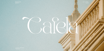 Introducing Cafela - A Elegant Modern Font With A Ligatures & Alternates by Rijesain x Look minus today Cafela - is a modern and elegant serif font that is perfect for adding a touch of sophistication to your designs. Its sleek and stylish look makes it suitable for a variety of applications, including branding, advertising, and editorial design. Features: Uppercase Lowercase Ligatures & Alternates Numerals & Punctuation Multilingual Thanks & Happy Designing!
 - Merry Melody by Comicraft,
$19.00 Sufferin' Succotash, was that five minutes already?! Seemed to us like that lunatic cartoon went by faster than a roadrunner being pursued by a wily coyote or a hare brained bunny dodging short sighted hunters during wabbit season. Adorn your favorite duck, pig, cat, tweeting bird or skunk with the warming strains of our merry melody font or it'll be all over for all you folks.
 - Popty Ping by Hanoded,
$15.00 Popty Ping is Welsh slang for microwave oven. It literally means ‘oven that goes ping’. Popty Ping was sort of based on an older font of mine called Jambo. It is a very happy cartoon font, ideal for children’s book covers, ice cream packaging and microwave popcorn (preferably the non GM kind). Comes in two great styles and more diacritics than you can pop in an oven!
 - Toyster by Sharkshock,
$115.00 Toyster is an all caps display font designed with playfulness in mind. The childlike characters are defined by their rounded corners, low contrast, and pudgy weight. Smooth contours ensure this will look great for large print projects. Use it for a children's' book, toy packaging, cartoon, or store signage. With 3 different versions Toyster is sure to resonate with kids and the young at heart.
 - Bronzino by Greater Albion Typefounders,
$8.95 Bronzino’s roots lie in the Arts and Crafts movement, and in the traditions of letterpress printed fine quality books. It’s ideal for legible headings which have just that hint of charm and difference outside of the normal and mundane. It’s formal enough to go anywhere yet it has a spirit of fun, it brings a world of bygone care and quality to the modern age.
 - DF A Bit by Dutchfonts,
$33.00 DF A Bit is made for screen display which is the final form of a lot of information nowadays. But there is more in this BIT... in display sizes it unfolds it’s skin, a beautiful ink on paper structure caused by the letterpress printing of copper lines. Analogue BITS indeed. With all the wealth of the ‘non perfect’, to please the eye and to satisfy the mind.
 - Bedford by Stereo Type Haus,
$25.00 Inspired by mosaic lettering by Heins & LaFarge, architects of the IRT (Interborough Rapid Transit) in New York City. Bedford hints at the station names on platform walls which date back to 1904 but modernize it through a rigid grid system and rounded corners. The family consists of two styles, Bitmap for web usage with a perfect pixel snap, and Rounded for a softer and bolder look.
 - Zenga by The Northern Block,
$29.99 Zenga is a contemporary typeface that fuses precise geometry with subtle hints of blackletter forms. The concept was to adapt core values from the gothic style and develop a design suitable for grid and pixel based platforms. Details include five distinctive weights with italics, over 500 characters, five variations of numerals with stylistic zero's, ten alternative characters, extended symbols including chess pieces and OpenType features.
 - Corpulent by Suitcase Type Foundry,
$85.00Corpulent is a display font whose forms are extremely thick, up to the extent of being nearly illegible. In the 1980s, these construction principles were explored to their very limit. So if the lyrics of Eyes Without a Face resonate in your mind, the feet turn numb in super-tight trousers, and you fancy a big hair style, this font is the one for you. - Fogie by Din Studio,
$22.00 Fogie is a modern serif family font. Features with 10 fonts. This family also featured with many ligatures and alternates. Designed with powerful OpenType features in mind and perfectly suited for graphic design and any display use. It could easily work for web, signage, corporate as well as for editorial design. The Thin style is free so you can try this for your content.
 - Love Struck by Letterhend,
$14.00 Combining handcraft serif and simple script, Love Struck is an authentic typeface that gracefully marries a delicate and refined aesthetic with a hint of rustic charm. Features : Uppercase & lowercase Numbers and punctuation Multilingual PUA encoded We highly recommend using a program that supports OpenType features and Glyphs panels like many of Adobe apps and Corel Draw, so you can see and access all Glyph variations.