10,000 search results
(0.025 seconds)
- Kyrial Sans Pro by Mostardesign,
$- Designed in 2011 by Olivier Gourvat, this font family has generous proportions with a range of weights make it a versatile family for print, text, signage, branding and web design work. Kyrial Sans Pro offers lots of OpenType goodness and broad language support.
 - Slope Sans Pro by URW Type Foundry,
$39.99 Slope Sans is an original design that combines a technological shape model borrowed from the early Macintosh system fonts with organic, open elements looking futuristic in a retrospective manner. Designed as part of a font family without different weights, Slope Sans Pro provides OpenType features for alternate letter forms in two stylistic sets. The basic version works similar to a stencil font, an alternative set has consistently closed shapes and a more rigid appearance, while the second stylistic set offers some alternative letter forms. Headlines and shorter texts set in Slope Sans provide a variable, modern appearance. Slope Slab Pro goes very well with Slope Sans Pro and can be used as style variant or display.
 - Sweet Sans Pro by Sweet,
$79.00 The engraver’s sans serif—strikingly similar to drafting alphabets of the early 1900s—has been one of the most widely used stationer’s lettering styles since about 1900. Its open, simple forms offer legibility at very small sizes. While there are digital fonts based on this style (such as Burin Sans™ and Sackers Gothic™, among others), few offer the range of styles and weights possible, with the versatility designers perhaps expect from digital type families. Sweet Sans fills that void. The family is based on antique engraver’s lettering templates called “masterplates.” Professional stationers use a pantograph to manually transfer letters from these masterplates to a piece of copper or steel that is then etched to serve as a plate or die. This demanding technique is rare today given that most engravers now use a photographic process to make plates, where just about any font will do. But the lettering styles engravers popularized during the first half of the twentieth century—especially the engraver’s sans—are still quite familiar and appealing. Referencing various masterplates—which typically offer the alphabet, figures, an ampersand, and little else—Mark van Bronkhorst has drawn a comprehensive toolkit of nine weights, each offering upper- and lowercase forms, small caps, true italics, arbitrary fractions, and various figure sets designed to harmonize with text, small caps, and all-caps. The fonts are available as basic, Standard character sets, and as Pro character sets offering a variety of typographic features and full support for Western and Central European languages. Though rich in history, Sweet Sans is made for contemporary use. It is a handsome and functional tribute to the spirit of unsung craftsmanship. Burin Sans and Sackers Gothic are trademarks of Monotype Imaging.
 - Elemental Sans Pro by Latinotype,
$39.00 Elemental is a font created in 1997 and launched in 2001. It is a Sans Serif of humanist type and its principal characteristic is a hybrid between different form of calligraphic outlines. In 2010 it was redesigned for Chile’s bicentenary in Opentype version and an improved italic. It is offered in eight weights: Light, Regular, Bold and Extrabold and small capitals for each one of them.
 - Charpentier Sans Pro by Ingo,
$41.00 A humanistic sans serif The first version of this font was created in 1994 within the framework of the bid placed by the city of Graz to become the location for the Winter Olympics in 2006. Appropriately, its original name was ”Olympia.“ The font is intended to embody classic ideals as well as to meet modern demands. The proportions of Charpentier Sans are directly derived from Roman capitals and the humanistic book-face. The contrast between strokes and thin strokes is based on medieval uncial script. And thus, a modern serif sans was created emphasizing thick and thin strokes together. Thanks to its traditional form language, Charpentier Sans is very legible, adapts to various forms of content and expresses a kind of calmness and certainty. Details resulting from writing with the quill guarantee that the font doesn’t appear too rough and unemotional. Even the tiny, pointed mini serifs contribute to the unmistakable appearance of the font. They create an exciting contrast to the soft flowing forms of the letters and are, to a great extent, conducive to the legibility. Consequently Charpentier Sans always appears with an extremely sharp and clear outline. Charpentier Sans Italique has an even more distinct ductus derived from writing. Especially the rounded forms from a, e, f, g and y reflect the handwritten humanistic cursive. Charpentier Sans is comprised of many ligatures, including discretional ones, plus proportional medieval and capital figures for the normal type as well as disproportional tabular figures with a consistent width. Above and beyond the ”normal“ Latin typeface system, small caps are available as an especially elegant form of distinction.
 - Vin Sans Pro by Mint Type,
$35.00 Vin (translated from Ukrainian as “he”) is a superfamily consisting of three robust typefaces with pronounced vertical stems and rounded corners. All three typefaces feature very large x-height for even more expression and assertiveness. Vin Sans Pro is a quite narrow rigid sans-serif typeface with extra-large x-height and rounded corners. It is perfect for any kind of short copy with lots of attention guaranteed. Be sure to check other two typefaces of Vin superfamily: Vin Slab Pro and Vin Mono Pro .
 - European Sans Pro by Bülent Yüksel,
$19.00 EUROPEAN SANS PRO ABOUT FAMILY: What makes "European Sans Pro" elegant, friendly and contemporary is its very rounded curves with very open terminals. "European Sans Pro" has been designed with a higher "x-height" than other fonts in its class to make tiny readability more obvious in any use situation. It will be ideal for use in small sizes such as business cards or mobile applications. This typeface is also equipped with powerful OpenType features to satisfy the most demanding professionals. It has solid features like case sensitivity, small, true capitals, full ligatures, tabular figures for tables, old style figures to elegantly insert numbers into your sentences and more alternative characters to give personality to your projects. The extended, "European Sans Pro" supports around 85 languages in the Latin, Cyrillic and Greek scripts, and its non-Latin components were developed with native consultants. With over 1200+ glyphs per style, "European Sans Pro" cares about localised letterforms and has the OpenType features to match. FEATURE SUMMARY: - 9 weights: Thin, ExtraLight, Light, Book, Regular, Medium, Bold, ExtraBold, and Black. - 4 widths: Normal, Narrow, Condensed, and Extra Condensed. - Matching italics (12º) for all weights and widths . - Matching small caps for all weights and widths. - Lining and old style figures (proportional and tabular). - Alternate characters (A, G, M, N, R, U, a, g, l, m, n, u, y). - Unlimeted fractions. - Automatic ordinals (1st, 2nd, 3rd, etc.). - 24 Dingbats + 19 Social Media and Block Chain icons. - Extended language support: Most Latin-based scripts (including Vietnamese), Cyrillic, and Greek. - Extended currency support. You can contact me at buyuksel@hotmail.com, pre-purchase and post-purchase with questions and for technical support. You can enjoy using it.
 - Malmo Sans Pro by Martin Lexelius Core,
$33.00 Malmö Sans was born from the preconception that geometry is neutral, and neutral fonts have a wide application window. No ornaments, no quirks – just clean. Design process: establishing the main proportions, grids and library of geometric shapes. However, people are not math, people are not built from grids. We are irregular, not always logical, and, foremost, we are human. So: humanisation – define parts and areas, and make the needed adjustments to shapes and forms, although being mathematically correct. Basically, changing it into something that pleases the eye. Much effort has been made to achieve equal parts minimalism, aesthetics and legibility.
 - Soin Sans Pro by Stawix,
$40.00
- Freight Sans Pro by Freight Collection,
$39.00 A clean, well-lit design, Freight Sans proves that even a workhorse can be a breath of fresh air while remaining invitingly readable. Ideal for boundless headlines and text, the power and detail of this design also serves well in way-finding and display environs. From web to print to apps, it’s hard to imagine a project where Freight Sans wouldn’t do the job with aplomb. When you need a sans serif–you need Freight Sans.
 - Magnum Sans Pro by FontMesa,
$39.00 Magnum Sans Pro is a strong neutral sans serif consisting of eleven weights with true Italic, Oblique and an alt upright set called Alfa. The definition of Magnum is a large wine bottle that's twice the capacity of one 750ml bottle, today the name is used in any product offering double the capacity, Magnum Sans achieves this by offering two slanted and two upright versions plus a standard and pro set. Designed to be highly readable, Magnum Sans Pro is ideal for text, signage, headlines and media broadcasting or anywhere else quick readable lettering is needed. With the stylistic alternates and swash caps you can expand your creativity in logo designing. Sprinkle in an alternate letter or two makes for a dynamic appeal that's sure to get attention in advertising. This Pro set includes additional language support for Vietnamese, Pin Yin and Greek. Opentype features in the Pro set include, Alternate Fractions, Case Sensitive Forms, Denominators, Numerators, Discretionary Ligatures, Standard Ligatures, Old-style Figures, Tabular Figures, Proportional Figures, Ordinals, Scientific Inferiors, Superscript, Subscript, Stylistic Alternates, Swash Caps, Arrows and Enclosed Alphanumerics.
 - French Stencil Sans JNL by Jeff Levine,
$29.00 French Stencil Sans JNL is another typeface based on vintage French tin/zinc stencils. Slightly rounded corners and a "hand-cut" look add an interesting and charming variation that breaks away from the "standard" design of other metal stencil sets.
 - 1920 French Script Pro by GLC,
$42.00 This font was inspired by one of a standard French manual styles in use from the beginning of 1900s to the end of World War II, when people were writing most often with pen holders and metal nibs. This typeface is easily legible as it was used for the lithographic printing of university textbooks. All lower cases from a to z and numerals from 0 to 9 are doubled by a slightly different one to allow a varying manual aspect in texts. We have added a lot of diacritic characters, covering West (including Celtic) and North European, Icelandic, Baltic, Eastern European and Turkish language. A few special glyphs allows to make final loops or underlining.
 - Freska by ActiveSphere,
$30.00 Freska is a custom font which is applicable for any type of graphic design - print, web, motion graphics etc.
 - Freshy by Katatrad,
$19.00 Freshy is friendly, artistic typeface that is clean enough to use for longer text. It is a complete family with 6 weights and there italic. It has an amazing character set and some of ornaments for your design. Freshy is perfect to use in any friendly situation such as a lovely packaging, restaurant menu, children's book and etc.
 - Fresty by Blankids,
$22.00 Fresty is awesome for branding and logotype, Fresty has the impression of modern, trendy and elegant. Fresty has 376 Glyphs with PUA encoded and many alternative character & OpenType features so you can mix and match to create the look you want. Fresty includes 22 Multilingual Support (Afrikaans , Albanian , Catalan , Czech , Danish , Dutch , English , Estonian , Finnish , French , German , Hungarian , Icelandic , Italian , Norwegian , Polish , Portugese , Slovak , Slovenian , Spanish , Swedish , Zulu)
 - Floresco by Intellecta Design,
$21.90Note: The Lined style is no longer available due its complexity and the resulting memory and performance issues. - Frescito by Mans Greback,
$49.00 Frescito is a modern sans-serif typeface that embodies a fresh, cool, and street-smart aesthetic. Designed to be both balanced and versatile, its clear and legible monoline style is designed for branding and advertising in editorial and digital design. The Frescito font family comes in the five classic weights: Thin, Light, Medium, Bold, and Black, along with a Variable font for ultimate flexibility and customization, as well as Italics. Inspired by the energetic spirit of the city and its vibration, Mans Greback set out to create a typeface that would stand out against vivid moment; a type that would work in a traditional café just as well as for contemporary merchandise. The result is a font that combines the best of both worlds: an air of freshness and modernity with an unpretentious, timeless and classy appeal. The font is built with advanced OpenType functionality and has a guaranteed top-notch quality, containing stylistic and contextual alternates, ligatures, and more features; all to give you full control and customizability. It has extensive lingual support, covering all Latin-based languages, from Northern Europe to South Africa, from America to South-East Asia. It contains all characters and symbols you'll ever need, including all punctuation and numbers.
 - Turesco by Letterhend,
$17.00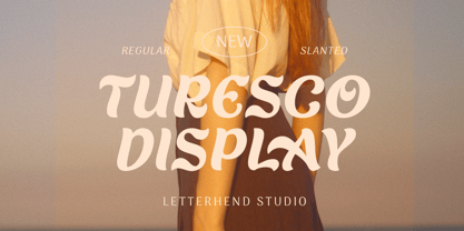 Turesco Display is a display typeface with unique letterform. It looks great to be used for modern and minimalistic yet still playful and fun theme. This font perfectly made to be applied especially in logo, and the other various formal forms such as invitations, labels, logos, magazines, books, greeting / wedding cards, packaging, fashion, make up, stationery, novels, labels or any type of advertising purpose. Features : uppercase & lowercase numbers and punctuation multilingual alternates & ligatures PUA encoded We highly recommend using a program that supports OpenType features and Glyphs panels like many of Adobe apps and Corel Draw, so you can see and access all Glyph variations. How to access opentype feature : letterhend.com/tutorials/using-opentype-feature-in-any-software/
 - Freggo by Baqoos,
$18.00 Freggo is a beauteous kooky handwritten typeface apt for headline, editorial, branding, packaging, printed materials and typographic applications. 200+ glyphs including punctuation and numerical.
 - Fiasco by ChibaChiba,
$24.95 Extremely influenced by the new rave trend, Fiasco is a reflex of it's excesses. Way too many elements, bright neon colors, and that not-knowing-when-to-stop sort of behavior. Acid House aesthetic remixed by the nu school DJs. Neon Flamboyant.
 - Freich by Nasir Udin,
$15.00 Freich is a mighty bold typeface with a vintage vibe and rebellious feeling. Perfect choice for posters with super hero or propaganda themes. Its sharp and strong letter forms will make any statements more powerful.
 - Aguas Frescas by Chank,
$99.00 The Aguas Frescas font family is an outline, hand-drawn display typestyle that reflects script handwriting with a lively, whimsical twist. It is a flowery little font that dances across headlines with a happy and likable good-natured attitude and a lyrical lilt. For extra OpenType tastiness, there are alternate versions of all the lowercase glyphs and a Contextual Alternates feature to make the letters flow together more smoothly and look more natural and handmade. And if you want to kick it up one notch further, you can combine the outline font Horchata with its “aguas frescas” companion font Tamarindo which is the solid, filled-in version of this font. Duplicate your text in overlapping layers of the two fonts for an brighter multi-color effect.
 - Frencos Olstd by Olexstudio,
$19.00 FRENCOS Olstd - Comic Font will look gorgeous on all your designs, kids invitation, kids poster design, kids book design, branding materials, kids logo's, and all project design other. WHAT'S INCLUDED FRENCOS Olstd - Comic Font contains standard characters, Uppercase, Uppercase Alternates, Lowercase, Lowercase Alternates, numbers, punctuation and international glyphs.
 - Pesto Fresco Italic by Resistenza,
$29.00 Pesto Fresco Italic is a new version of Pesto Fresco handwritten lettering system, a font family built of 27 styles. Overlapping Pesto Fresco Italic Regular with any of the other decorative styles you will get different graphic effects, so just choose the one that fits best with your layout. This font can be used for different purposes from packaging design to web design.
 - PF Bague Sans Pro by Parachute,
$79.00 PF Bague Sans Pro is a versatile monoline typeface with a distinct and eye-catching personality. Despite its inspiration from early 20th century geometrics, it diverts from the mechanical rigidity of those typefaces by incorporating humanist characteristics, such as subtle variations in stroke width and open counter shapes with vertical endings. This is a very clean and legible typeface with a warm and well-balanced texture which is ideal for intense editorial use in magazines and newspapers. Bague Sans’ most remarkable feature is its vast array of uppercase alternates and ligatures which truly shine when set at display sizes. This typeface is automatically transformed into a flexible, charming and stylish typeface with strong modern aesthetics. From classic to modern, from excessive to neutral. Bague Sans Pro is a multipurpose typeface which offers enormous possibilities and variations for editorial design, branding and corporate identity. Bague Sans Pro signifies freedom and personal style. This superfamily includes 18 weights from Hairline to Ultra Black with a consistent and well-refined structure. Each style consists of 1063 glyphs with more that 330 alternates and ligatures and an extended set of characters which support simultaneously Latin, Cyrillic and Greek. Download the complehensive PDF Specimen Manual to explore the unlimited text variations of Bague Sans Pro.
 - Body Copy Sans Pro by Hackberry Font Foundry,
$24.95This new OpenType pro family has four members so far with 473 characters and glyphs each. It is a redrawing of Albe Sans, which has been found to be very readable, elegant, and extremely useful for books, newsletters, or anything you need. It is a humanist sans that works well for body copy or headlines. A black version is in the works. - PF Beau Sans Pro by Parachute,
$79.00 The design of Beau Sans was inspired by Bernhard Gothic which is considered one of the first contemporary American sans serifs and was designed by Lucian Bernhard in the late 1920s. Panos Vassiliou came across this font while attempting to reduce the design elements of a text typeface, by introducing Bauhaus-like minimal forms to the characters. The first version was completed back in 2002 and introduced one year later in Parachute’s 3rd catalog, under the name PF Traffic. Some time later it was decided to make a few improvements but the project was so carried away that the new typeface which emerged needed urgently a new name. Beau Sans Pro is a modern sans-serif family of 16 fonts which includes true-italics. Just like all other Parachute fonts, it covers a broad range of languages by incorporating 3 major scripts i.e. Latin, Greek and Cyrillic in one font. Furthermore, every font in this family has been completed with 270 copyright-free symbols, some of which have been proposed by several international organizations for packaging, public areas, environment, transportation, computers, fabric care and urban life. This typeface is totally recommended for titles and/or body text when you want to give a distinct and contemporary identity to a product or service.
 - Novel Sans Rounded Pro by Atlas Font Foundry,
$50.00 Novel Sans Rounded Pro is the humanist grotesque typeface family within the largely extended award winning Novel Collection], also containing Novel Pro, Novel Sans Pro, Novel Sans Hair Pro, Novel Sans Condensed Pro, Novel Mono Pro, Novel Sans Rounded Pro and Novel Sans Office Pro. Novel Sans Rounded Pro has a carefully attuned character design and a well balanced weight contrast. Classic proportions and the almost upright italic makes Novel Sans Pro being a modern humanist. Many similarities with the other typeface families within the Novel Collection enable designers to combine the families and reach highest quality in typography. Novel Sans Rounded Pro [1020 glyphs] comes in 6 styles and contains small caps, an extra set of alternate glyphs, many ligatures, lining figures [proportionally spaced and monospaced], hanging figures [proportionally spaced and monospaced], small caps figures [proportionally spaced and monospaced], positive and negative circled figures for upper and lower case, superior and inferior figures, fractions, extensive language support, arrows for uppercase and lowercase and many more OpenType™ features.
 - PF Fusion Sans Pro by Parachute,
$79.00 Fusion Sans is an amalgamation of traditional early nineteenth-century sans-serif letters. Despite its monotone structure it retains certain features common to roman. For instance lowercase ‘a’ and the two-storey ‘g’ are normal roman characters, while most letters are designed with a thinning of stroke at the junction of rounds to stems. Other letters are borrowed from earlier gothics, like lowercase ‘t’ which was first seen on a typeface that was developed by Paul Rand for Westinghouse in 1960. Fusion Sans is a tall family of 4 weights which is suitable for long headlines. The new ‘Pro’ version developed in 2006, provides support for all European languages including Greek and Cyrillic while it comes loaded with 19 special OpenType features.
 - PF Encore Sans Pro by Parachute,
$79.00 Encore Sans Pro is a sans serif which projects an image of reliability, authority and competence making it ideal for corporate applications. A functional typeface which combines utility with style. It’s subtle round characteristics such as the slightly curved-in edges, create a distinctly contemporary look, blending effectively traditional with modern details. Encore Sans Pro has received 3 international awards and distinctions including a Silver at the european ED Awards 2010. This is a contemporary typeface which may function as the perfect alternative to several overused classic sans. Encore Sans Pro does not pretend being different but it does claim its own personality. It is simple and stylish. Furthermore, it is extremely versatile. It comes with 22 weights and supports simultaneously Latin, Greek and Cyrillic. Each font contains 1535 glyphs and is loaded with 22 advanced OpenType features. Extreme weights, such as the elegant hairline, are carefully designed to establish an even color throughout, while ultra black despite its heavy characteristics is quite legible and powerful. Other intermediate weights such as light and book are ideal as body text for magazines and catalogs. Every font in this series has been completed with 270 copyright-free symbols, for packaging, public areas, environment, transportation, computers, fabric care and urban life.
 - Novel Sans Condensed Pro by Atlas Font Foundry,
$50.00 Novel Sans Condensed Pro is the humanist grotesque typeface family within the largely extended award winning Novel Collection, containing Novel Pro, Novel Sans Pro, Novel Sans Hair Pro, Novel Sans Condensed Pro, Novel Mono Pro, Novel Sans Rounded Pro and Novel Sans Office Pro. Novel Sans Condensed Pro has a carefully attuned character design and a well balanced weight contrast. Classic proportions and the almost upright italic makes Novel Sans Condensed Pro being a space saving, modern humanist with the calligraphic warmth of a real italic. Many similarities with the other typeface families within the Novel Collection enable designers to combine the families and reach highest quality in typography. Novel Sans Condensed Pro [1020 glyphs] comes in 6 weights and contains small caps, an extra set of alternate glyphs, many ligatures, lining figures [proportionally spaced and monospaced], hanging figures [proportionally spaced and monospaced], small caps figures [proportionally spaced and monospaced], positive and negative circled figures for upper and lower case, superior and inferior figures, fractions, extensive language support, arrows for uppercase and lowercase and many more OpenType™ features.
 - Novel Sans Office Pro by Atlas Font Foundry,
$50.00 Novel Sans Office Pro is the humanist grotesque typeface family optimized for office environments within the largely extended award winning Novel Collection, also containing Novel Pro, Novel Sans Pro, Novel Sans Condensed Pro, Novel Mono Pro and Novel Sans Rounded Pro. Novel Sans Office Pro has a carefully attuned character design and a well balanced weight contrast. Classic proportions and the almost upright italic makes Novel Sans Office Pro being a modern humanist with the calligraphic warmth of a real italic. Many similarities with the other typeface families within the Novel Collection enable designers to combine the families and reach highest quality in typography. Novel Sans Office Pro [1020 glyphs] comes in 6 weights and contains small caps, an extra set of alternate glyphs, many ligatures, lining figures [proportionally spaced and monospaced], hanging figures [proportionally spaced and monospaced], small caps figures [proportionally spaced and monospaced], positive and negative circled figures for upper and lower case, superior and inferior figures, fractions, extensive language support, arrows for uppercase and lowercase and many more OpenType™ features.
 - PF Centro Sans Pro by Parachute,
$79.00 Centro Sans Pro is an award-winning typeface. It received a Gold Award from the European Design Awards 2008 and an Excellence Award from the International Type Design Competition 2009 as part of the Centro Pro type system. This large series of 40 fonts with 1519 glyphs each is composed of three superfamilies (serif, sans and slab), includes true italics and supports Latin, Greek and Cyrillic. According to the jury of the European Design Awards “...Centro Pro is an almost ‘invisible’ typeface with distinct personality, it has legibility as its main attribute and is ideal for a wide range of design works. It does not attract any unnecessary attention, but rather serves its purpose. A rare case of contemporary type family working across three alphabets. Centro Pro meets an ever-growing demand for such typefaces among pan-European companies and institutions”. Centro Pro has become very popular among printed media and is ideal choice for newspapers, magazines and corporate applications. Furthermore every font in this series has been completed with 270 copyright-free symbols, some of which have been proposed by several international organizations for packaging, public areas, environment, transportation, computers, fabric care and urban life.
 - PF Adamant Sans Pro by Parachute,
$45.00 Adamant Sans on Behance. Adamant Sans: Specimen Manual PDF. Adamant Sans is a contemporary and very functional typeface. It stands out from the crowd with its uniquely designed rounded corners and beautiful italics. This carefully designed family consists of 18 fonts, including true italics. Its extreme weights, such as hairline and black are ideal for setting big and powerful headlines, while intermediate weights work very well in long texts at small point sizes. Weights are finely balanced so that they can be easily combined, depending on the type of paper and other conditions. Thanks to its proportions, high x-height and wide apertures, this typeface is very legible and suitable for setting books, magazines, newspapers, but is also valuable for use in large sizes, as well as for complex corporate projects. It supports advanced typographic features such as small caps, lining and oldstyle figures in proportional and tabular widths, fractions, ligatures, etc., and provides simultaneous support for Latin and Cyrillic as well as kerning for these languages. Adamant Sans is the ideal companion of the Adamant serif version.
 - PF Bulletin Sans Pro by Parachute,
$79.00 This is a grotesque typeface which was derived from an older more simple version designed back in 2000. Bulletin Sans Pro is distinguished by its selective deep cuts which give this typeface a robust and contemporary look. These cuts become more apparent at larger sizes while they create a more subtle effect at smaller sizes. For intense titles try the black version. When space and legibility for long texts are critical, use the lighter versions. The family consists of 10 fonts—from black to light—including true italics. It supports 20 special OpenType features like small caps, fractions, ordinals, etc. and offers multilingual support for all European languages including Greek and Cyrillic. Finally, every font in this family has been completed with 270 copyright-free symbols, some of which have been proposed by several international organizations for packaging, public areas, environment, transportation, computers, fabric care and urban lifestyle.
 - Grafia Sans 1 Pro by Vanarchiv,
$35.00
- PF Square Sans Pro by Parachute,
$79.00 Designer Panos Vassiliou created Square Sans Pro in his quest for a true square-like text typeface which could balance simplicity with vitality and enhance with its subtle power the identity of any product or service, without compromising its characteristics as a text typeface. The family consists of 12 fonts—from extrablack to thin—including true italics. It supports 19 special OpenType features like small caps, fractions, ordinals, etc. and offers multilingual support for all European languages including Greek and Cyrillic. Finally, every font in this family has been completed with 270 copyright-free symbols, some of which have been proposed by several international organizations for packaging, public areas, environment, transportation, computers, fabric care and urban life.
 - European Sans Pro Variable by Bülent Yüksel,
$99.00 EUROPEAN SANS PRO VARIABLE ABOUT FAMILY: What makes "European Sans Pro Variable" elegant, friendly and contemporary is its very rounded curves with very open terminals. "European Sans Pro Variable" has been designed with a higher "x-height" than other fonts in its class to make tiny readability more obvious in any use situation. It will be ideal for use in small sizes such as business cards or mobile applications. This typeface is also equipped with powerful OpenType features to satisfy the most demanding professionals. It has solid features like case sensitivity, small, true capitals, full ligatures, tabular figures for tables, old style figures to elegantly insert numbers into your sentences and more alternative characters to give personality to your projects. The extended, "European Sans Pro Variable" supports around 85 languages in the Latin, Cyrillic and Greek scripts, and its non-Latin components were developed with native consultants. With over 1200+ glyphs per style, "European Sans Pro" cares about localised letterforms and has the OpenType features to match. FEATURE SUMMARY: - 9 weights: Thin, ExtraLight, Light, Book, Regular, Medium, Bold, ExtraBold, and Black. - 4 widths: Normal, Narrow, Condensed, and Extra Condensed. - Matching italics (12º) for all weights and widths . - Matching small caps for all weights and widths. - Lining and old style figures (proportional and tabular). - Alternate characters (A, G, M, N, R, U, a, g, l, m, n, u, y). - Unlimeted fractions. - Automatic ordinals (1st, 2nd, 3rd, etc.). - 24 Dingbats + 19 Social Media and Block Chain icons. - Extended language support: Most Latin-based scripts (including Vietnamese), Cyrillic, and Greek. - Extended currency support. You can contact me at buyuksel@hotmail.com, pre-purchase and post-purchase with questions and for technical support. You can enjoy using it.
 - FM Bolyar Sans Pro by The Fontmaker,
$29.00 This is Bolyar Sans font family. For us it is a dream-come-true. It took more than 1 year hard work to transform the existing Bolyar Pro from Serif to Sans Serif version. The result really surprised even us from The Fontmaker and we decided to develop it in 9 instead of 7 weights. So at the end we created 7 different styles of Bolyar sans each consisting from 9 precise weights. Bolyar Sans is not just another font family in our portfolio - it is the essence from all our efforts thru the past 5 years to create a powerful type tool that could easily meet very diverse and complex demands of modern design. Furthermore, like all its predecessors, Bolyar Sans is a type concept created by Designers for Designers. If you are in wine and spirits industry, packaging design, or you just love to work with strong headlines that effortlessly could turn into brand logos, then you should definitely try our Bolyar Sans. It is designed for this. Of course there are plenty of different features like multilingual support, ligatures, alternates, we even added adaptive over- and underlining to make it even more complex in its use. Bolyar Sans pairs perfectly with other members of Bolyar Family - Pro , Ornate and Typecraft . So as you see Bolyar is developed as a type platform with own character and style. By using it you could be vintage, classic, modern, soft, even bold, rough and ornate. It is a visual bridge between different typographic periods united under Bolyar name. With our Sans version we aim to be contemporary and to provide powerful type tool to those designers who often love to swim between past and modernity.