10,000 search results
(0.047 seconds)
- Identikal Sans by Identikal Collection,
$23.00 - Spiegel Sans by LucasFonts,
$49.00 Spiegel Sans combines the shapes and proportions of an American-style gothic – the ultimate industrial typeface – with subtle diagonal stress and almost imperceptible traces of handwriting.
 - Quodlibet Sans by Signature Type Foundry,
$43.00 The new typeface system is based on legibility of Renaissance and Baroque Antiqua. It maintains the quality of drawings without an overpowering historical legacy. The current concept makes the system a universal whole. Abrading of sharp edges which could catch one’s attention leads to a fine rounding of details. In this way, a sans drawing does not look hard and sterile unlike most of its contemporaries. Special attention was paid to every detail of each letter. The professional question of how to incorporate brightening wedges into the dark places of individual strokes’ onsets was resolved by rounded shapes that have their graphic response in the detail of the serifs. Particularly in larger sizes the typeface offers drawing sophistication and dimensional interconnection. Apart from Cyrillic alphabet, the alphabet design includes Vietnamese accents.
 - Agrea Sans by Koray Özbey,
$12.00 Agrea is a sans serif typeface with 9 weights and italics and variable versions. It’s a typeface that combines the elegance of calligraphy with a modern twist. One of Agrea's defining features is its fluid strokes and deep ink traps, which add a touch of sophistication and uniqueness to your projects. Whether you're designing for natural, organic, or ecological content, Agrea is a nice choice.
 - S6 Sans by S6 Foundry,
$29.00 S6 sans is a contemporary neo-grotesque sans serif typeface with strong stylistic geometric contrasts. Its distinctive wide-open stance was designed to give the right visual consistency for branding and communications.
 - Accia Sans by Mint Type,
$39.00 Accia Sans is a humanist sans-serif typeface with character. Its strong features make an outstanding performance in branding applications, as well as in editorial designs. The font family contains 8 weights from Thin to Extra Bold, with matching true italics. It supports extensive language support including Cyrillic, as well as numerous OpenType features such as small caps, ligatures, several sets of figures, case-sensitive punctuation, ordinals. Accia Sans is a member of Accia Type System. It encompasses five typefaces ranging from sans-serif to expressive serif, giving you the possibility to create sophisticated cohesive designs. Accia Type system consists of Accia Sans, Accia Flare, Accia Piano, Accia Moderato, and Accia Forte.
 - Sassoon Sans by Sassoon-Williams,
$48.00 A more mature font retaining the clarity of the Sassoon typefaces that accentuate word shape, while omitting the exit strokes. A more legible alternative to standard Sans serif typefaces - superb on the screen. Many alternative letters are included in each font. A typeface designed with the computer screen in mind. It retains maximum legibility even in the most unusual layout - ideal for multi media uses and giving unimagined clarity to menus and navigational aids. Avoid eyestrain with a typeface that accentuates word shape as well as the identity of individual letters. Legible in print at tiny point sizes so ideal for captions. Ideal for older pupils, perhaps at Secondary school, or adults, who no longer require ‘exit strokes’ to clump the letters together. Free to download resources: How to access Stylistic Sets of alternative letters in these fonts
 - Arum Sans by Australian Type Foundry,
$40.00 A humanist sans-serif family which displays subtle influences of the edged writing tool. Inspired by modern faces such as Chaparral and Enigma, Arum Sans is versatile enough to be used for high-end text setting as well as display purposes. A full international glyph set, extended for European use, allows Arum Sans to play on the field with the big boys.
 - Morris Sans by Linotype,
$40.99 Morris Sans is a newly revised and extended version of a small geometric family of typefaces originally produced by Morris Fuller Benton in 1930 for ATF. His initial design consisted of an alphabet of squared capital letters with a unique twist that characterized its appearance: corners with rounded exteriors and right-angle interiors. The types were intended for use in the fine print found on business cards, banking or financial forms, and contracts. But over the ensuing decades, this design became a popular element in all sorts of design environments, and several foundries revived the typeface in digital form. Since digital fonts are bicameral, with slots for both upper and lowercase letters, new cuts of the type opted filled the lowercase slots with small caps. In 2006, Linotype commissioned its own version of the typeface-an extension for 21st century use. Under the advisement of Linotype's type director Akira Kobayashi, Dan Reynolds redrew the uppercase and added an original lowercase for the first time. Additionally, a number of extras were brought into the fonts, including six figure styles (tabular and proportional lining figures, tabular and proportional oldstyle figures, and special tabular and proportional small cap" figures). Small caps, which have become an iconic element over time, are accessible in each font as an OpenType feature. To differentiate this version from the original, Linotype's new family is named Morris Sans, in honor of Morris Fuller Benton. All fonts in the Morris Sans family are OpenType Com fonts; they include a character set capable of setting 48 European languages that employ the Roman alphabet, including all Central and Eastern Europe languages, those from the Baltics, and Turkish. This glyph coverage extends to the small caps as well. Morris Sans is a wide typeface, especially in its regular widths; the condensed faces set a more conventional line of text. The new lowercase letters are less geometric than the uppercase, except for those that share the same basic forms (e.g., c, o, and s). Instead of following this geometric trend, the new lowercase tends to strengthen the humanist elements that were present in several characters from the original type, including the uppercase D and the figures 5, 6, and 9. Morris Sans also sports a number of glyphic flares, like the stroke found on the original uppercase Q. Morris Sans is a clean, modern design best suited for headlines, advertising, posters, expressive signage (especially on storefronts), and corporate identity work."
 - Atto Sans by Wilton Foundry,
$29.00I set out to design a contemporary font that is condensed with thick and thin strokes. The highly structured forms of this condensed font was made more interesting and softer by giving it a slightly calligraphic tone and by adding round corners. Atto's express purpose is to be both utilitarian, compact and technical but with a friendly face. The name "atto" was adopted since it refers to the measurement of "smallness" or detail. You will no doubt discover all the many pleasant nuances within Atto. Adopted in 1964, "atto" comes from the Danish "atten", meaning eighteen. Atto - (symbol a) a SI prefix to an unit and means that it is 10 to the power- 18 times this unit. Examples are one attosecond or one attometer/attometre. Atto is available in for Mac and Windows in Postscript, Truetype and Opentype. - Seven Sans by Image Club,
$29.99 - Gelato Sans by Stolat Studio,
$29.00 Gelato is the Italian word for ice cream, commonly used in English for ice cream made in an Italian style. Gelato Sans designed by Ania Wieluńska is a humanistic typeface with geometric construction. It is characterised by a lot of details, which gives it a friendly and warm character. Scalable and large x height, sharp cuts makes Gelato good choice for many purposes from textes to display usage. All family consist 18 styles with italics from hairline to black. Ania was awarded a TDC Beatrice Warde Scholarship for this type family.
 - Bartholeme Sans by Galapagos,
$39.00 - Pentay Sans by deFharo,
$10.50 Pentay is a Sans Serif typefaces family with 10 styles designed especially for editorial design and publications in general. The proportions of the font as well as the metrics and the kerning have been carefully calculated to obtain maximum readability. The fonts also have a complete set of lowercase alternatives and advanced OpenType features. Pentay fonts are also available in Slab Serif versions that complete a typographic system for editorial and corporate design.
 - Penumbra Sans by Adobe,
$29.00Penumbra is a capitals only design. Based on inscriptional capitals, the style progresses from a sans serif to a serifed design. The Penumbra font family is useful for posters, book jackets and labels. - Randu Sans by Yukita Creative,
$14.00 Randu Sans Serif Display Font Family is a sleek, modern font family with an elegant typography style. Created with clarity and boldness in mind, this font offers a variety of bold and italic styles, providing flexibility in its use. Whether used for titles, headings, or poster designs, the Candied Sans Serif Display Font Family provides the clarity and appeal needed to hold an audience's attention.
 - Orcin Sans by Fontmill Foundry,
$20.00Orcin Sans is a functional well crafted sans serif typeface available in 6 styles. - Andale Sans by Monotype,
$155.99 - Cabrito Sans by insigne,
$24.99 It's time to kick off your shoes and feel the "sans" between your toes. Like Cabrito Inverto , its stress-reversing cousin, the new Cabrito Sans serves up something nice and cool in the heat of the project. A quick recap: the original Cabrito is an insigne Design slab serif produced for the kid's book The Clothes Letters Wear. It's been pretty well-received--even more than I expected. I promised to grow the family with a free-standing inverted style that could pair well with Cabrito. (See Cabrito Inverto.) Now, I'm rounding out the family with this well-crafted sans. And so now, Sans is where it's at. Strip away the serifs of Cabrito, and you have a laid back, rounded sans serif alternative served up over easy. This handwriting-inspired creation--like its relatives--is definitely not uptight about its forms (though not afraid to show them off a little). Cabrito Sans' whole pack of alternates is accessible in any OpenType-enabled program. This kiddo consists of a workforce of alternates, swashes, and alternate titling caps to give the font a little extra sweetener to its flavor. Also bundled are swash alternates, old style figures, and compact caps. Check out the interactive PDF brochure to test out each these options. This font family members also consists of the glyphs for 72 various languages. Cabrito Inverto and Cabrito do pair nicely with Cabrito Sans (in case you doubted). Use Sans--or all three of these amigos--to express friendliness on just about anything: food, candy, toys, cars (if you're feeling bold). Don't wait, though. Purchase Cabrito Sans today, and bring a one-of-a-kind look to whatever your computer's next design party is.
 - Nomos Sans by Identity Letters,
$45.00 What is a brutalist typeface? The exact definition is anyone’s guess. Regardless, the Nomos superfamily is our take on the genre. Like the eponymous architectural style, Nomos is raw, direct, and honest. Its unrefined aesthetics reveal an orderly construction that is as firmly rooted in classic modernism as in the internet age—with simple, functional letterforms and the blunt convergence of diagonal and vertical stems. The Nomos Sans subfamily is a low-contrast neogrotesk with 18 styles and a set of 1000+ characters. A confident choice for fashion and finance, for apps and advertising: humble and expedient in body text, vigorous in display sizes. Has extra poise when paired with Nomos Slab.
 - Garota Sans - Personal use only

- Frisco Antique Display SG by Spiece Graphics,
$39.00 Here is a decorative condensed antique design that is sure to fit a variety of contemporary situations. The Bruce Type Foundry (later acquired by V. B. Munson) developed this wonderfully shaded Tuscan in the 1880s - or possibly earlier. It was known back then as Style No. 1050 and carried a pronounced three-dimensional look with a thin hairline at the bottom and right of each stroke. It is best to use Frisco Antique in large display sizes because it is easy to lose these delicate hairlines. A lowercase and several alternate characters have been provided for your convenience. Frisco Antique Display is also available in the OpenType Std format. Some new characters have been added to this OpenType version. Advanced features currently work in Adobe Creative Suite InDesign, Creative Suite Illustrator, and Quark XPress. Check for OpenType advanced feature support in other applications as it gradually becomes available with upgrades.
 - Zan Zan by Pitt's Hand,
$20.00 A fun font to create pop and young graphics, with a non-obvious font created starting from a handcrafted line. For an urban, snappy and fresh result.
 - French Deco JNL by Jeff Levine,
$29.00 A wide and thin hand lettered Art Deco design from the vintage French lettering book "L'Art du Tracé Rationnel de la Lettre" was the inspiration for French Deco JNL; available in both regular and oblique versions.
 - Old French School by JBFoundry,
$20.00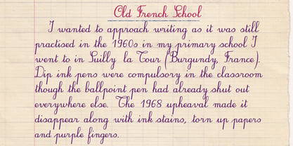
- Fiasco Cursive Font by BeckMcCormick,
$14.00 Introducing Fiasco Script, a bouncy modern calligraphy font. Fiasco is a clean cursive font with a feminine aesthetic, making it a perfect choice for designing feminine logos & branding, cute paper products like wedding invitation suites, or for displaying headlines on your website. Fiasco can also be used for other print design like magazines and flyers or printed marketing materials. This font can also be used for digital marketing materials and social media items! Fiasco Script’s clean edge makes it a great candidate for craft projects on your Cricut or Silhouette machine; it cuts beautifully! Fiasco Script includes: - full upper + lowercase characters - numbers + punctuation - 2 ligatures — ox, tt - PUA-encoding Extensive Language Support: Western European, Central European, South Eastern European, South American, Oceanian, Vietnamese, Esperanto Fiasco Script can be used with graphic design programs such as Illustrator or Photoshop, word processing programs like Pages or Word, Design Space for Cricut, Silhouette, Procreate, Canva Pro, Glowforge, GoodNotes, & more. This font is an installable for desktop & laptop machines, as well as iPads or iPhones. See below for links to help with installation.
 - French Wine JNL by Jeff Levine,
$29.00 French Wine JNL is an Art Deco thick-and-thin type design based on the hand lettering from a vintage poster for Monarch Cabernet Sauvignon wine. The typeface is available in both regular and oblique versions.
 - French Geometric JNL by Jeff Levine,
$29.00 An Art Deco geometric alphabet found within the pages of the 1939 French lettering book "Modèles de lettres modernes par Georges Léculier" ("Models of Modern Letters by Georges Léculier") is the basis for French Geometric JNL; available in both regular and oblique versions.
 - FHA Condensed French by Fontry West,
$25.00 FHA Condensed French One could speculate that FHA Condensed French probably started life as wood type for displays, headlines and posters. The exaggerated sharp serifs and condensed forms were not uncommon for that period. At some point, sign painters picked up Condensed French added their own character. At the end of the nineteenth century, Frank H. Atkinson included Condensed French in his samples of lettering for his book, ”Sign Painting, A Complete Manual.” This book became one of the definitive guides for signwriting and hand lettering. In 1999, Mike Adkins digitized Condensed to add to our Atkinson collection. For its re-release, Condensed French has been updated with more language support, ligatures, and OpenType alternates. It has true vintage character but still plays well in more modern designs. A font for all seasons, the condensed forms and sharp serifs fit in every layout from wildwest days posters and creepy film credits to Christmas ads and Mother’s Day cards. While I can’t really see FHA Condensed French as the font for phone aps or video game text, it will provide impact to logos, branding, and product labeling.
 - French Song JNL by Jeff Levine,
$29.00 From the titles and credits of the 1952 British comedy “Song of Paris” comes this whimsical, hand lettered type design that’s casual, playful and charming. The digital version is called French Song JNL, and is available in both regular and oblique versions. This font release is the 1800th type design Jeff Levine Fonts has issued since its inception in January, 2006.
 - French Nouveau JNL by Jeff Levine,
$29.00 The hand lettering on a World War I recruitment poster for the French Air Service inspired French Nouveau JNL, which is available in both regular and oblique versions.
 - Cresci Exemplar Pro by California Type Foundry,
$47.00 Cresci Exemplar™ was originally designed by Giovanni Francesco Cresci, the 16th century Milanese writing master. These letters from his book Essemplare are some of the most elegant capitalis monumentalis ever produced and served as a model for later inscriptions on statues and monuments all throughout Italy. Painstakingly made from multiple high-resolution references, Cresci Exemplar™ Pro, accurately matches the master’s original lines. It can be used at large sizes without sacrificing elegance. Cresci’s attention to detail and delicate curves allow his titling capitals to stand out and elevate text. The numbers of Cresci Exemplar™ Pro have been professionally designed to match and complement the letterforms of Cresci’s original alphabet. Symbols have either been faithfully transcribed or thoughtfully designed both to be pleasing to today’s reader and congruent with classic lines. Released for the 450th anniversary of Cresci’s Il Perfetto Scrittore.
 - French Stencil JNL by Jeff Levine,
$29.00 French Stencil JNL was inspired by images of a set of metal stencils from France that were offered for sale in an online auction.
 - FHA Nicholson French by The Fontry,
$25.00 An Art Nouveau alphabet that has stood the test of time, Nicholson French, by legendary sign-painter Frank H. Atkinson, is over 100 years old and going strong. In modern typographic trim, it comes with OpenType feature replacement options and multi-language support, from standard Latin-1 to Latin Extended-A, Greek and Cyrillic.
 - French Cinema JNL by Jeff Levine,
$29.00 The hand lettered title credits for the 1950 French film “Lady Paname” inspired French Cinema JNL, which is available in both regular and oblique versions.
 - French Lettering JNL by Jeff Levine,
$29.00 An example from the vintage lettering book "100 Alphabets Publicitaire" ("100 Advertising Alphabets") provided the inspiration for French Lettering JNL. This stylized Victorian [or Western] type face evokes the era of fanciful lettering design from the late 1800s. Available in both regular and oblique versions.
 - French Film JNL by Jeff Levine,
$29.00 Hand lettering found in the September, 1936 issue of the French film publication “La Cinématographie Française” is rendered in a lovely Art Nouveau serif type style. This is now available digitally as French Film JNL, in both regular and oblique versions.
 - French Clarendon Expanded by Wooden Type Fonts,
$20.00 French Clarendon Expanded, a display text type.
 - Archive French Script by Archive Type,
$19.95Script display typeface. - French Calligraphic JNL by Jeff Levine,
$29.00 French Calligraphic JNL is actually more semi-calligraphic in nature. Its name takes a descriptive liberty because of the sharp, angled pen strokes of the original hand lettered example found in the 1930s publication "100 Alphabets Publicitaires" by M. Moullet. The design is available in both regular and oblique versions.
