10,000 search results
(0.039 seconds)
- Das Reicht Gut Regular - Unknown license

- Bubbleboy - Unknown license

- Imperfect font - Unknown license

- Tank Junior - Unknown license

- Lakmus - Unknown license

- RaveParty Offset - Unknown license

- Folk Solid - 100% free

- SF Espionage Light - Unknown license

- Street Humouresque - Personal use only

- Big Fat Ugly Cow - Unknown license

- OXIDO ExtBd ExtCond - Personal use only

- Oxona Caps - Personal use only

- Auberge Script by Sudtipos,
$79.00 It took me a long time, but I think I now understand why people of my generation and older feel the need to frame current events in an historical context or precedents, while most of the young couldn't care less about what happened ten years ago, let alone centuries back. After living for a few decades, you get to a point when time seems to be moving quite fast, and it’s humbling to see that your entire existence so far can be summed up in a paragraph or two which may or may not be useful to whoever ends up reading the stuff anyhow. I suppose one way to cope with the serenity of aging is trying to convince yourself that your life and work are really an extension of millenia of a species striving to accept, adapt to, and improve the human condition through advancing the many facets of civilization -- basically making things more understandable and comfortable for ourselves and each other while we go about doing whatever it is we are trying to do. And when you do finally convince yourself of that, history becomes a source of much solace and even a little premonition, so you end up spending more time there. Going far back into the history of what I do, one can easily see that for the most part it was ruled by the quill. Western civilization’s writing was done with quill pens for more than thirteen centuries and with newer instruments for about two. By the mid-18th century, the height of the quill experience, various calligraphy techniques could be discerned and writing styles were arranged in distinct categories. There are many old books that showcase the history of it all. I recommend looking at some whenever the urge comes calling and you have to get away from backlit worlds. Multiple sources usually help me get a better perspective on the range of a specific script genre, so many books served as reference to this quill font of mine. Late 17th century French and Spanish professional calligraphy guides were great aides in understanding the ornamental scope of what the scribes were doing back then. The French books, with their showings of the Ronde, Bâtarde and Coulée alphabets, were the ones I referenced the most. So I decided to name the font Auberge, a French word for hotel or inn, because I really felt like a guest in different French locales (and times) when I going through all that stuff. Because it is multi-sourced, Auberge does not strictly fit in a distinct quill pen category. Instead, it shows strong hints of both Bâtarde and Coulée alphabets. And like most of my fonts, it is an exercise in going overboard with alternates, swashes, and ornamental devices. Having worked with it for a while, I find it most suitable for display calligraphic setting in general, but it works especially well for things like wine labels and event invitations. It also shines in the original quill pen application purpose, which of course was stationery. Also, as it just occurred to me, if you find yourself in a situation where you have to describe your entire life in 50 words or less, you may as well make it look good and swashy, so Auberge would probably be a good fit there as well. This is one quill script that no large bird had to die for. A few technical notes The Auberge Script Pro version includes 1800 glyphs, everything is included there. Also latin language support. We recommend you to use the latest design application to have full access to alternates, swashes, small caps, ornaments, etc. The images from the gallery uses this version. For better results use the fonts with “liga” feature on. Awards During 2014 the early develop of Auberge Script was chosen to be part of Tipos Latinos, the most important type exhibition in South America.
 - Guzzo by Monotype,
$50.99 A playful caricature of a midcentury grotesque, Guzzo is a fresh addition to the Monotype Library. Somewhat eccentric and full of surprises, its unmistakable quirk can be found on closer inspection, stemming from details proudly borrowed from brush lettering and calligraphy. The wide range of weights and style can take you through any design space, from the condensed weights squeezing in larger headlines or dense blocks of text with the condensed range, to experimenting with small point sizes, labels or packaging with the extended cut. However, Guzzo’s real charm is probably best expressed through its wonderfully playful shapes, its unusual 'laid-back italics' feature cursive forms and a backslant. The different stylistic sets allow you to decide what you make of Guzzo, with several sets of alternate glyphs steering it in any direction you want. Guzzo is a happy-go-lucky character, and has a warm, humble and painterly quality that - at a glance - may be unrecognizable as a typeface. It can almost pass for hand-lettering. Guzzo pairs exceptionally well with scripts and slab typefaces, and feels most at home in situ with toys, packaging, menus, broadcasting, cartoons and merchandising! Guzzo encourages you to turn up the silliness and is for designers who want to emulate hand-painted and casual motifs. Taking its name from American artist Jeremy Pinc, aka the painter Guzzo Pinc, the typeface channels the quirky, funny and poignant qualities of his paintings - with wacky characters, loosely painted geometric forms and bright colors. For this mid century, authentic, nostalgic typeface - the story is really what you make of it.
 - Bohemio by Wiescher Design,
$39.50 Bohemio was designed in memory of Gunter Böhmer, an artist famous for his many book covers of the 1950s in Germany. The cover I took as an inspiration for this font is that of a book called Stiller (by Max Frisch). Bohemio sounds similar to "Böhmer" (which means the one from Bohemia) and it is also an alliteration to artisty. I thought "Bohemio" to be a nice name for this very strong, almost expressionist design. Yours very artsy craftsy Gert Wiescher
 - Lets Hoop by Epiclinez,
$18.00 Let's Hoop is a simple, bold, and fun display font. Its informal style and casual vibe will make this font a go-to choice for each of the creations that require a relaxed touch. This font contains 194 glyphs, supporting 66 languages, which include: Afrikaans Albanian Catalan Danish Dutch English Estonian Finnish French German Italian Norwegian Portuguese Spanish Swedish Zulu, and more. So what's included: Basic Latin A-Z & a-z. Numbers, symbols, and punctuations Multilingual Support. Accented Characters : ÀÁÂÃÄÅÆÇÈÉÊËÌÍÎÏÑÒÓÔÕÖØŒŠÙÚÛÜŸÝŽàáâãäåæçèéêëìíîïñòóôõöøœšùúûüýÿžß Thank You
 - Atwin by Cubic Type,
$14.00Atwin is a modern remake of Franco Grignani’s Gemini. It is inspired by the unusual forms of the MICR numbers on bank cheques. Strangely rounded rectangles make the glyphs appear unfamiliar; an angular but also blobby design that disrupts and breaks away from tradition. Good in display sizes. You should use Atwin to add flair and confidence to sci-fi, futurist, outré, or just plain unusual materials. 13 additional alts are supplied in the A to Z alphabet. Kerned to perfection. Tight. - Slowly by PaulaType,
$10.00 Slowly - A Classy Handwritten font perfect for high impact headlines Every single letter has been creative carefully and Perfectly Playful new font pair. This font is a perfect script designed for making your set of invitations, Brand, blog posts, and more completely beautiful multilingual support for the following languages: Cornish, Danish, Dutch, English, Estonian, Faroese, Filipino, Finnish, French, Galician, German, Icelandic, Indonesian, Irish, Italian, Norwegian Bokmål, Norwegian Nynorsk, Portuguese, Spanish, Swahili, Swedish, Swiss German. Thank you for purchasing our product again Paula Type :)
 - Streamline Moderne by Cotbada Studio,
$10.00 Streamline Moderne is a gorgeous serif typeface that is both classically elegant and modern. Create beautiful wedding invitations, use it as an elegant solution for your next magazine layout,logo, powerpoint templates design , quotes teks or choose Streamline Moderne for any graphics that require a sleek look with a vintage flair. Create something beautiful today with Streamline Moderne. What's included? - Uppercase Characters - Lowercase Characters - Multilingual support for various languages including: French, German, Spanish, Portuguese, Italian, Dutch, Finnish, Swedish, and more.
 - LTC Goudy Modern by Lanston Type Co.,
$39.95Goudy Modern/Open was designed by Frederic Goudy, who was inspired by the caption of a French engraving. It is Goudy's first attempt at a "modern" face, but with less contrast and rigidity normally found in Bodoni style Modern faces. Goudy Modern was designed later in 1918 after viewing a proof of Goudy Open with the line filled in. Not a true modern face, but still a Goudy classic. The Pro versions include ligatures, varieties of numerals and Central European character sets. - QB One by BoxTube Labs,
$19.00 Introducing QB One - A variable block font with a unique style that stands out from the crowd. QB One was designed to be your favorite versatile and powerful communications tool. It's perfect for logotypes, sports branding, posters, apparel design, magazine headlines, labels and much more. The font family features support for most Western- and Central European languages including: Afrikaants, Basque, Breton, Catalan, Danish, Dutch, English, Finnish, French, Gaelic, German, Icelandic, Indonesian, Irish, Italian, Norwegian, Portuguese, Sami, Spanish, Swahili and Swedish.
 - Stilla by Linotype,
$29.99 François Boltana was a French prolific lettering artist during the late 20th Century. He created the Stilla typeface in 1973. Stilla is a cursive “Fat Face”-style design, reminiscent of the first large advertising and display types produced in the wake of the successful Bodoni, Didot, and Walbaum text faces. Because of this pedigree, Stilla is the perfect headline choice for applications that look back to the 19th century. Stilla could also be used for very short headlines or big logos.
 - LTC Goudy Open by Lanston Type Co.,
$39.95Goudy Modern/Open was designed by Frederic Goudy, who was inspired by the caption of a French engraving. It is Goudy's first attempt at a "modern" face, but with less contrast and rigidity normally found in Bodoni style Modern faces. Goudy Modern was designed later in 1918 after viewing a proof of Goudy Open with the line filled in. Not a true modern face, but still a Goudy classic. The Pro versions include ligatures, varieties of numerals and Central European character sets. - Chalk And Cheese NF by Nick's Fonts,
$10.00The name comes from a British expression about two things that couldn't be more different, and it suits this offering to a tee. The uppercase of this typeface is based on 1930s lettering by French poster artist Charles Loupot, and the lowercase is based on 1910s lettering by German plakatmeister Ludwig Hohlwein. Oddly, the two seem to play together well. Both versions of the font include the 1252 Latin and 1250 CE character sets (with localization for Romanian and Moldovan). - Gilbertino by Keristyper Studio,
$14.00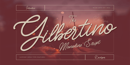 Gilbertino is casual script font With a clean stroke, super slanted, and fun character. This font is great for vintage designs, logos, labels, badges, posters, and more. Multilingual support: Afrikaans, Albanian, Catalan, Danish, Dutch, English, Estonian, French, Finnish, German, Icelandic, Indonesian, Italian, Malay, Norwegian, Portuguese, Spanish, Swedish, Zulu, and many more. What’s Included : Standard & Multilingual glyphs Ligature Works on PC & Mac Simple installations Accessible in Adobe Illustrator, Adobe Photoshop, Adobe InDesign, and even work on Microsoft Word. Hope you enjoy our font!
 - Mariken by Hanoded,
$15.00 Mariken van Nieumeghen is a late medieval Dutch text from the early 16th century. The protagonist of the play (a young maid called Mariken) spends seven years with the devil (called Moenen), after which she is miraculously released. Mariken is a handmade font, which was based on the works of Robert Granjon (1545-1588), a French type designer and printer. Use it for product packaging, books and posters. Comes in 3 weights (with italics) and a hellish amount of diacritics.
 - FF Tibere by FontFont,
$41.99 French type designer Albert Boton created this serif FontFont in 2003. The family has 7 weights, ranging from Light to Bold (including italics) and is ideally suited for book text, film and tv, editorial and publishing as well as small text. FF Tibere provides advanced typographical support with features such as swashes, ligatures, small capitals, petite capitals, alternate characters, and case-sensitive forms. It comes with a complete range of figure set options – oldstyle and lining figures, each in tabular and proportional widths.
 - Monotype Goudy Modern by Monotype,
$29.99First cut by Lanston Monotype, the Goudy Modern font family was based on designs used by French engravers during the eighteenth century. Although called a modern it possesses a number of old style characteristics. Capitals are much shorter than the ascenders, serifs are fully bracketed and round shapes have a slight stress. The overall weight of Monotype Goudy Modern is on the heavy side, giving good emphasis in display sizes but it is not too heavy for use in text. - Werdet Script by Tipo Pèpel,
$26.00 Werdet Script is a calligraphic typeface, inspired by the samples of the calligraphy “Batarde” created the first half of the 19th century by the French calligrapher Père Werdet. It has expanded on the original samples, creating a complete typographic family with five weights. The typeface explores the power of Opentype to simulate a manual writing. Thanks to the "contextual alternates” function, ligatures, alternate figures, initials and final forms, are automatically configured to offer an aspect with human decisions to mechanically written texts.
 - Hollow Mummy by Attype Studio,
$10.00 Hollow Mummy is a bold and authentic display font. Add this font to your creative and spooky ideas and notice how it will make them stand out! Hollow Mummy is perfect for branding, logo, invitation, stationery, social media post, product packaging, merchandise, blog design, game titles, cute style design, Book/Cover Title and more. What's Included : - hollow mummy (.otf) - hollow mummy display (.otf) - Multilingual Support (Afrikaans, Albanian, Catalan, Danish, Dutch, English, Estonian, Finnish, French, German, Icelandic, Italian, Norwegian, Portugese, Spanisch, Swedish, Zulu)
 - Lowkey by Olivetype,
$17.00 Lowkey is a cool and quirky looking display font. Its informal style and casual vibe will make this font a go-to choice for each of the creations that require a relaxed touch. Lowkey is supporting more than 66 languages, which include: Afrikaans Albanian Catalan Danish Dutch English Estonian Finnish French German Italian Norwegian Portuguese Spanish Swedish Zulu, and more. So what’s included: Basic Latin A-Z & a-z. Numbers, symbols, and punctuations Multilingual Support. Accented Characters : ÀÁÂÃÄÅÆÇÈÉÊËÌÍÎÏÑÒÓÔÕÖØŒŠÙÚÛÜŸÝŽàáâãäåæçèéêëìíîïñòóôõöøœšùúûüýÿžß Thank you
 - Orange Leafy by Attype Studio,
$12.00 Orange Leafy is an Autumn font duo with maple leaf display, Fall in love with it and bring your projects to the highest levels! Orange Leafy is perfect for Autumn branding, logo, invitation, stationery, social media post, product packaging, merchandise, blog design, game titles, cute style design, Book/Cover Title and more. What's Included : - Ligatures - Multilingual Support (Afrikaans, Albanian, Catalan, Danish, Dutch, English, Estonian, Finnish, French, German, Icelandic, Italian, Norwegian, Portugese, Spanisch, Swedish, Zulu) Hope you enjoy with our font! Attype Studio
 - Lust Text by Positype,
$29.00 Yes, finally. This one took the most time and the most restarting. Years went into imagining what Lust Text should look like and how it should structurally behave in order to truly improve upon a setting that includes any of the Lust typefaces. I approached it as much from the side of the type designer, as I did a potential user. The flow, the warmth, the personality needed to be there, but all of the excess had to be removed responsibly. In the process, and in need of inspiration, I looked backward to historical artifacts and precedent. In each early Lust Text approach, the solution was lackluster and/or vanilla and not actually a ‘Lust’ typeface. The exercise was not in vain though. By exploring past examples, I found my footing drawing for media now and how it might be used later—all the while, producing seamless, elegant curves and restrained indulgence (that sounds almost silly to say, but I like it). The Lust Collection is the culmination of 5 years of exploration and development, and I am very excited to share it with everyone. When the original Lust was first conceived in 2010 and released a year and half later, I had planned for a Script and a Sans to accompany it. The Script was released about a year later, but I paused the Sans. The primary reason was the amount of feedback and requests I was receiving for alternate versions, expansions, and ‘hey, have you considered making?’ and so on. I listen to my customers and what they are needing… and besides, I was stalling with the Sans. Like Optima and other earlier high-contrast sans, they are difficult to deliver responsibly without suffering from ill-conceived excess or timidity. The new Lust Collection aggregates all of that past customer feedback and distills it into 6 separate families, each adhering to the original Lust precept of exercises in indulgence and each based in large part on the original 2010 exemplars produced for Lust. I just hate that it took so long to deliver, but better right, than rushed, I imagine.
 - Gemini Type Fontpack by Chank,
$49.00 INTRODUCING THE GEMINI TYPE FONTPACK, an industrial-strength OpenType font bundle inspired by and optimized for dimensional type. Chank Co is proud to introduce the new “Gemini Type Fontpack,” a collection of ten fonts available for use on your desktop computer or web pages, but also optimized for use as exterior cast-metal signage in bronze or aluminum in collaboration with Gemini, a family-owned industry leader in the wholesale manufacture of dimensional letters, logo and plaques based in Cannon Falls, MN. Gemini collaborated with Chank Co to assemble a line of fonts that would work well as dimensional, cast-letter signage for use on the sides of buildings, in stores, and other public spaces. The fonts included in the “Gemini Type Fontpack” are reinterpretations of previous Chank Fonts, now optimized for dimensional signage display, but then also repackaged and presented for your use as an OpenType desktop computer font collection: GT-Adrianna DemiBold GT-Adrianna Bold GT-Adrianna ExtraBold GT-Fairbanks GT-Forward Thinking GT-Hydropower ExtraCondensed GT-Kegger GT-Shopaganda GT-Shopaganda Condensed GT-Timeless Geometric. This is a multi-purpose collection of heavy-lifting fonts to convey your message strong and clearly, full of legibility and clarity, but also displaying personality and distinction. You can purchase and download these fonts in OpenType format for your desktop computer right now via MyFonts. Get it today and you'll also get a great introductory special sale price. These exclusive typefaces are also available as dimensional letters, manufactured by Gemini in bronze or aluminum, from 6" tall up to 18" tall, with a variety of finish options, for use in public signage and wayfinding systems. Gemini manufacture their products in 20 plants through out the US, Canada and Mexico, and all their products are backed by a lifetime guarantee. Chank Co is excited to offer these ten strong, industrial font designs in durable cast metal format via Gemini. ----- More about the fonts in the Gemini Type Fontpack: GT-Adrianna DemiBold, Bold, and Adrianna ExtraBold Clear, invisible, no-nonsense, multi-purpose. A versatile sans-serif heavy-lifting font family. GT-Fairbanks Vintage, silent film, speedball, old-timey, old-fashioned, retro. Based upon the lettering in the 1914 silent film, “The Good Bad Man.” GT-Forward Thinking Futuristic, semi-serif, clean, distinctive, contemporary, idiosyncratic. A font for tomorrow and the future. GT-Hydropower ExtraCondensed Extra-condensed, compressed, strong, rigid and concise. GT-Kegger Strong, sporty, collegiate, athletic. Nothing says “GO TEAM” quite like a big, bold slab-serif font. GT-Shopaganda and GT-Shopaganda Condensed Industrial, geometric, constructivist, propaganda, oh there’s so much to love about the strength and clarity of these two fonts. Based on Chank’s Liquorstore and Nicotine fonts, which have been married and unified here, with a few new twists and turns to their letterforms. GT-Timeless Geometric Bauhaus, anyone? The geometric and minimalist alphabet here is about as clean and straight-forward as a semi-condensed sans can get. ----- All of the fonts in this package are available individually, or save money when you purchase all ten of them as a collection. Download this digital font package from MyFonts today and you'll receive both OpenType and TrueType formats in your download for your desktop computer. Webfont format is also available. (If you'd like to use these fonts as cast-metal letters for exterior, architectural purposes, visit the Gemini website to learn more about how you can find a signage retailer near you.)
 - Garino Variable by Julien Fincker,
$185.00 About Garino: Garino is a modern sans-serif typeface family. It gains its expressive character from a dynamic sweep in the curves and high-contrast transitions. The thinner and thicker weights are particularly suitable for strong headlines, while the middle weights can be used for typographic challenges and body text. As a result, it can be used in a reserved as well as an expressive way. Thanks to an extensive character collection, it becomes a real workhorse. A versatile allrounder that is up to all challenges – for Corporate Identity, Editorial, Branding, Orientation and Guidance systems and much more. Variable Font The Variable font contains 2 axes: weight and oblique – all in just one file. Features: With over 1165 characters, it covers over 200 Latin-based languages. It has an extended set of currency symbols and a whole range of Open Type Features. There are alternative characters as stylistic sets, small caps, automatic fractions – just to name a few. Arrows and numbers: In particular, the extensive range of arrows and numbers should be highlighted, which are perfectly suited for use in orientation and guidance systems. Thanks to Open Type Features and an easy system, the various designs of arrows and numbers can also be simply "written" without first having to select them in a glyph palette. Get the static version of the Garino family here: https://www.myfonts.com/fonts/julien-fincker/garino/
 - Garino by Julien Fincker,
$34.99 About Garino: Garino is a modern sans-serif typeface family. It gains its expressive character from a dynamic sweep in the curves and high-contrast transitions. The thinner and thicker weights are particularly suitable for strong headlines, while the middle weights can be used for typographic challenges and body text. As a result, it can be used in a reserved as well as an expressive way. Thanks to an extensive character collection, it becomes a real workhorse. A versatile allrounder that is up to all challenges – for Corporate Identity, Editorial, Branding, Orientation and Guidance systems and much more. Features: The Garino family has a total of 20 styles, from thin to heavy with matching italics. With over 1165 characters, it covers over 200 Latin-based languages. It has an extended set of currency symbols and a whole range of Open Type Features. There are alternative characters as stylistic sets, small caps, automatic fractions – just to name a few. Arrows and numbers: In particular, the extensive range of arrows and numbers should be highlighted, which are perfectly suited for use in orientation and guidance systems. Thanks to Open Type Features and an easy system, the various designs of arrows and numbers can also be simply "written" without first having to select them in a glyph palette. Get the Variable Font here: https://www.myfonts.com/fonts/julien-fincker/garino-variable/
 - Our Infinity Love by Putracetol,
$28.00 Our Infinity Love - Monoline Wedding Font. Our Infinity Love wedding script fresh & modern script with handmade calligraphy style. This font is inspired by monoline the character's style which shows the romance of a relationship through hand strokes with the added "love" symbol at the end of the line. This font is perfect for a professional touch making this font more elegant and suitable for all types of projects you are working on, especially for romantic-themed work. But this font is also suitable for logos, branding, greeting cards, invitation cards, advertisements, titles, healines, book titles, stickers, packaging, quotes, posters, t-shirts/apparel, billboards and others. The alternative characters were divided into several Open Type features such as Swash, Stylistic Sets, Stylistic Alternates, Contextual Alternates, and Ligature. The Open Type features can be accessed by using Open Type savvy programs such as Adobe Illustrator, Adobe InDesign, Adobe Photoshop Corel Draw X version, And Microsoft Word. This font is also support multi language.
 - Apparel by Latinotype,
$35.00 Inspired by the MacFarland series in the 1912 ATF catalog, Apparel is a typeface that shares similar functional characteristics with Times New Roman and Caslon fonts yet it has its own personality: A great choice for high-impact design. Apparel is a contemporary, classy and fresh serif typeface with a laid-back attitude that best suits your design needs. Its medium-large x-height makes it ideal for headlines and brand identity design. Apparel also includes a version, with a greater contrast between thick and thin strokes, for use in even larger sizes. The font comes with italic styles which can be used individually or in combination with the upright variant. Moderately slanted italics are also available as OpenType Stylistic Alternates. Each font style supports more than 200 Latin-based languages, as you would expect from Latinotype fonts. Apparel also includes a basic Cyrillic set, old style & lining figures, fractions and alternates, among other OpenType features.
 - Amigie by Craft Supply Co,
$20.00 Introduction to Amigie – Display Serif Amigie – Display Serif is a unique display font that stands out with its distinctive serif design. Its bold and innovative shape makes it perfect for eye-catching displays and powerful branding. This font captures attention, offering a fresh take on traditional serif styles. Design and Innovation Each character in Amigie – Display Serif boasts a unique serif shape, blending classic elegance with modern creativity. The font features sharp, clean lines, and its unique serifs add a touch of sophistication. Furthermore, its balanced proportion ensures that each letter is clear and impactful, perfect for making a statement. Versatility and Functionality Amigie – Display Serif is not just visually striking but also highly versatile. It’s ideal for a wide range of applications, from editorial designs to bold advertising. Additionally, it works exceptionally well for headlines, logos, and packaging, where its unique character can shine. This font is also highly legible, making it suitable for both digital and print media.
 - Bothering Script by Mans Greback,
$69.00 Bothering Script is a high-quality calligraphy typeface. This brush font's energetic style and vivid movements instantly gets the attention of its spectator, and the flow has an harmonic rhythm while maintaining activity, sharpness and clarity. Drawn and created by Mans Greback and Toni Studio in 2022, this handwritten lettering has a wild appearance and a strong personality. Use it for a youthful product layout or a fresh logotype. Use underscore _ to make a swash. Example: Wonder_woman Use multiple underscores for different swashes. Example: Cool___ness (Download required.) The font is built with advanced OpenType functionality and has a guaranteed top-notch quality, containing stylistic and contextual alternates, ligatures and more features; all to give you full control and customizability. It has extensive lingual support, covering all Latin-based languages, from Northern Europe to South Africa, from America to South-East Asia. It contains all characters and symbols you'll ever need, including all punctuation and numbers.


