5,752 search results
(0.021 seconds)
- Cruisader by ARToni,
$14.00 Cruisader is a cool, fresh and modern display font. This font would be ideal for writing web designs, business cards, or pretty much anything else that requires a unique touch.
 - Crimestopper JNL by Jeff Levine,
$29.00Crimestopper JNL is the aptly-named font fresh out the era of film noir and clever private detectives who always seemed to have the right answer to the question "Whodunit?" - Listingloves by Sulthan Studio,
$14.00 Listingloves - new, fresh, funny, interesting, cute calligraphy font with two cute hearts that can be connected. It is suitable for greeting cards, branding materials, business cards, quotes, posters and more!
 - Santarino by Rockboys Studio,
$16.00 Santarino is a modern and fresh brush font, right in time for summer! This font has a breezy, summery feel that will give all your designs a completely contemporary vibe.
 - Zayne by HandletterYean,
$12.00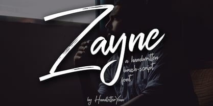 Zayne is a fresh, urban and unique handwritten script font that includes ligatures and swashes. With its funky, elegant, and handmade feel, it will add uniqueness to your creative designs.
 - Arco by Nicolas Massi,
$30.00 Arco is a brand new fat-face with some geometrical tweaks grabbing fresh and ideal for fashion editorial headlines. Arco also combines elegant symbols to sweet contrast. Normal & Outline version.
 - Winter Heart by Realtype,
$12.00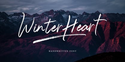 Winter Heart, a handwriting brush with awesome character. Winter Heart is a natural, smooth and stylish brush font. This font will give you a design that looks fresh and modern.
 - Bevelle by Gerald Gallo,
$20.00 Bevelle is a serif font with characters that have beveled corners. It is ideal for headlines, titles, branding, small blocks of text or wherever a clean, fresh look is desired.
 - DF Tapa by Dutchfonts,
$39.00 DF Tapa is a typeface based on the vernacular, popular graphics used in Spain. They proudly announce the daily fresh snacks which are homemade and served in every proper bar.
 - Amelyan by Aqeela Studio,
$20.00 Amelyan is a sweet and friendly calligraphy font. Fresh and neat, this font is ideal for writing wedding invitations, cards, or any other design that might need a fun touch!
 - Mario by Tipo Pèpel,
$22.00 Once upon a time, Mestre Patau, the «Black» magician, concerned about children´s typefaces historical ugliness, decided to settle the matter and using his vector powers, made letters embellished to be used in that stories so that they were according with the great genius all children have inside. Well done face but happy, goodness is not incompatible with joy. A solid construction, smooth, rounded, vibrant, generous curves and even more generous x-height and general proportions, give to the letter the vitality and freshness needed for use in projects where formality is not a requirement. Naughty but welldone, although not heeding the overshoots or the formal alignments, no symmetry in the horns is, despite this, or because of it, a fresh, cheerful but perfectly legible type. A full menu of freshness in your tales and stories!
 - Market Square by Hanoded,
$12.00 I love markets, especially the farmer’s markets with fresh produce and home made cheese. Too bad I need to travel a long way to get to one, as there is only a ‘regular’ market in my hometown - you know, with cheap duvets, ‘local’ fruit like bananas and a guy selling books about the end of times. I thought it would be great to create a font family you could actually use on a market. Hence Market Square. Market Square consists of 4 different fonts (each with its own Italic style), ranging from a fat marker font to a thin, squarish font. Each of them oozes freshness and authenticity and they were designed to complement each other. The cherry on top is the cute doodle font, loaded with fresh produce and seafood - just like you’d see on a Market Square.
 - PS Fournier Std by Typofonderie,
$59.00 Style and elegance in 14 styles PS Fournier, created by Stéphane Elbaz, is designed in tribute to Pierre Simon Fournier. Fournier was the prolific Parisian type designer whose work is best known for its iconic representation of French transitional style. PS Fournier elegantly represents the transition to the modern era of typography. Featuring three optical sizes, PS Fournier is designed to perform in any context. The Pierre Simon Fournier heritage Pierre Simon Fournier (1712—1768) was a leading innovative type designer of the mid-18th century. Early in his career, the young Pierre Simon developed a strong aesthetic that he cultivated throughout his life. His art is representative of the pre-revolutionary “Age of Enlightenment” (Siècle des Lumières). Precursor of the Modern style, Fournier’s body of work deeply influenced his times, and created the fertile ground from which the Didot family and Giambattista Bodoni developed their own styles. During the historical period of the 18th century, Fournier exemplified the intellectual pursuits of the times with his own research on type, documenting in detail the typefounding process. He also offered a unique vision: he is the first to clearly comprehend the concept of “type family,” sorting a set of similarly styled alphabets by sizes, width, and by x-heights. In addition, Fournier is one of the earliest advocates of the point system to organize the practice of typography, the point system that contemporary typographers continue to use to this day. The refined and discreet elegance of PS Fournier With a close look at the family, one finds you’ll find that the difference between the optical sizes (Petit, standard and Grand) is more than a contrast variation between the thin and the thick; the eye can also denote a palette of distinct tones: More streamlined and robust in the smaller sizes (Petit), more refined and detailed in the larger sizes (Grand). The PS Fournier standard family is designed to adapt to any situation with its intermediate optical size, from body copy to headlines. With a bit of tracking, PS Fournier Petit will make the smallest captions perfectly readable. However, Petit family is not limited to body and captions — its “slabby robustness” will make a relevant headline choice as well. PS Fournier Grand presents a higher contrast adapted to large text sizes, displays or banners. Its refined elegance makes it a perfect choice for Design, Fashion or Luxury publications. As a “modern” type PS Fournier Grand features a larger x-height than the preexistent old style typefaces such as Garamond or Jenson. These proportions provide any basic text set in PS Fournier Grand a strong typographic texture. As a result, the PS Fournier global family is a versatile alternative to the Modern typefaces commonly used in the publishing industry. The optical sizes, the large range of weights, and the design variations make this family adaptable to captions, paragraphs, and pages, as well as to large texts and displays. A leading-edge typography in the 18th century In the spirit of modernity, Pierre Simon Fournier did not find any use for the conventional swashes still produced by peers such as Caslon or Baskerville. Nevertheless the French designer created many inventive elements to decorate the page and set delightful variations in the text itself. To this regard PS Fournier includes a large set of glyphs variations, ligatures and more than one hundred glyphs for borders, rules and ornaments or — as called in French — “vignettes.” PS Fournier: A tribute to the French modern typography era by Stéphane Elbaz
 - The Beatrix by Shakira Studio,
$17.00 Say hello to new serif font, The Beatrix! The Beatrix is a serif font that offers the perfect combination of modern and retro feel to each letter. Bold and well-contoured in character, The Beatrix embodies a boldness and charm that cannot be overlooked. The design exudes classic serif elegance but with a touch of fresh, up-to-date style. The Beatrix accentuates uniqueness with a variety of stylish alternatives. Each character alternative provides an interesting creative dimension, presenting a fun combination of modern and retro styles. You as a designer have the freedom to explore and express your unique ideas through captivating typography. The Beatrix is an ideal choice for a variety of design projects. With a modern and retro feel, this font is suitable for use in headlines, logos, branding, marketing materials, posters, and many more. Whether it's a project that wants to convey a contemporary feel or explore the charm of the retro era, The Beatrix has the flexibility to adapt and deliver a strong message. Here's what you get: The Beatrix Regular All Multilingual symbol Opentype features ( ligature, alternate ) Accessible in the Adobe Illustrator, Adobe Photoshop, Adobe InDesign, even work on Microsoft Word. PUA Encoded Characters - Fully accessible without additional design software. Multilingual character supports : (Afrikaans, Albanian, Catalan, Croatian, Czech, Danish, Dutch, English, Estonian, Finnish, French, German, Hungarian, Icelandic, Italian, Lithuanian, Maltese, Norwegian, Polish, Portuguese, Slovenian, Spanish, Swedish, Turkish, Zulu) Follow my shop for upcoming updates, and for more of my work, Thank you!
 - TOMO Pillo by TOMO Fonts,
$15.00 TOMO Pillo! a blocky style fat face with attitude. Bold, heavy and fun! all at the same time! You will only need this font to make your designs stand out fresh!
 - Bluegrass by Scrowleyfonts,
$14.00 Bluegrass is a smart, fresh font loosely influenced by brush stroke writing. The font includes complementary borders and ornaments accessible as alternates to the standard character keys in Opentype aware applications.
 - Jully Julia by Romie Creative,
$12.00 Jully Julia ! Fresh modern handwritten font with decorative characters and dancing baseline. So beautiful on invitations such as crafts, greeting cards, branding materials, business cards, quotes, posters and other design concepts.
 - Liliming by Cubo Fonts,
$25.00 That font was designed for Liliming, a famous Shanghainese feminine fashion brand. As the brand itself, it shows a solid background - a former typewriter machine feeling - and a fresh creative touch.
 - Sheppaloe by Khurasan,
$8.00 Sheppaloe is a fresh handwritten font with an elegant and vintage feeling. Sheppaloe includes a full set capital and lowercase letters, as well as multi-lingual support, currency figures, numerals, & punctuation.
 - Amiable Forsythia by Letterhanna Studio,
$19.00 Amiable Forsythia Script Font – a new modern, clean & fresh script with a lot of swashes and stylistic alternate, make this font looks elegant, natural, stylish and perfect for any awesome projects
 - Arbor Brush by GroupType,
$29.00 Arbor Brush is a fresh and lively brush script from the FontHaus design studio. The design is organic, strong, painterly, and anything but tentative. Great for advertising, menus, signage, or display.
 - Acta Variable by DSType,
$350.00 Acta Variable is a clean and fresh type system that remains conservative enough for newspaper setting. The complete Acta Variable allows the possibility to modify the Weight and Optical size axis.
 - Gundrada ML by HiH,
$12.00 Gundrada ML was inspired by the lettering on the tomb of Gundrada de Warenne. She was buried at Southover Church at Lewes, Sussex, in the south of England in 1085. The Latin inscription on her tomb, STIRPS GUNDRADA DUCUM, meaning “Gundrada, descendant of the Duke” may have led to the speculation that she was the daughter of William, Duke of Normandy and bastard son of Robert the Devil of Normandy and Arletta, daughter of a tanner in Falaise. In 1066 William defeated Harold at the Battle of Hastings and was crowned William I of England. More commonly known as William the Conquerer, he commissioned a string of forts around the kingdom and charged trusted Norman Barons to control the contentious Anglo-Saxon population. William de Warenne, husband of Gundrada, was one of these Barons. There has also been the suggestion that Gundrada may have been the daughter of William’s wife, Matilda of Flanders, by a previous marriage. According to the Dictionary of National Biography (Oxford University Press, Oxford, England 1921-22), both of these contentions are in dispute. Searching the past of a thousand years ago is like wandering in a heavy fog: facts are only dimly in view. Regardless, I know that I found these letterforms immediately engaging in their simplicity. Unadorned and unsophisticated, they have a direct honesty that rests well in the company of humanistic sans serifs like Franklin Gothic or Gill Sans, appealing to a contemporary sensibility. The lettering on the tomb is in upper case only. Although Gundrada does not sound Norman French to me, her husband certainly and her father probably were Norman French. Nonetheless, the man that carved her tombstone was probably Anglo-Saxon, like most of the people. For that reason, we are quite comfortable with a fairly generic lower case from an Anglo-Saxon document of the time. The time was a time of transition, of contending language influences. This font reflects some of that tension. Features 1. Multi-Lingual Font with 389 glyphs and 698 Kerning Pairs. 2. OpenType GSUB layout features: onum, dlig, liga, salt & hist. 3. Tabular Figures and Alternate Old-Style Figures. 4. Alternate Ruled Caps (line above and below, matching to brackets). 5. Central Europe, Western Europe, Turkish and Baltic Code Pages. 6. Additional accents for Cornish and Old Gaelic. 7. Stylistic alternates A, E, y and #. 8. Ligatures ST, Th, fi and fl. 9. Historic alternate longs. The zip package includes two versions of the font at no extra charge. There is an OTF version which is in Open PS (Post Script Type 1) format and a TTF version which is in Open TT (True Type)format. Use whichever works best for your applications.
 - Telegrafico - Unknown license

- Mesquite by Adobe,
$29.00Mesquite is a narrow Tuscan-style typeface designed at Adobe in 1990. Like older Tuscans from the 19th Century, Mesquite has elaborate, creative serif treatments-although the serifs are so unique that it is difficult to call them serifs anymore, they are more like pointy finials. A convex-concave-convex ornamental feature appears on the middle of each vertical and diagonal stroke. Together with the serifs" at the tops and bottoms of each stroke, this feature creates a "tri-band" pattern over text set in Mesquite. Mesquite is not a text face. Aside from its narrowness and decorative qualities, Mesquite has no lowercase. The font's uppercase glyphs have been directly copied and placed in the lowercase range." - Aureata by preussTYPE,
$30.00 Whenever I've stayed in Munich my friend Michael Bundscherer and I go on a typographical expedition. When we talk about that, we remember the bygone world of sign painter. On one of the facades of a furniture shop in Munich, you can discover the lettering of the name in golden letters. This one convinced us because of the simple elegance Art Deco. These letters on the facade are in any case the character set, which forms the basis of this document. The missing (especially the lowercase letters and the numbers) were modeled. The "OPEN" called version tries to replicate the 3-D effect. The font is particularly suitable for shorter texts and headlines.
 - Starsigns by Tarallo Design,
$9.99 Starsigns is a unique set of zodiac symbols with a handmade feel. This font includes twelve astrology symbols: Aquarius, Pisces, Aries, Taurus, Gemini, Cancer, Leo, Virgo, Libra, Scorpio, Sagittarius, and Capricorn. Additionally, it features a moon and a sun symbol. The symbols were created from watercolor originals, giving them a warm and fluid quality. To utilize Starsigns, simply install it as a regular font. As you type, instead of letters, you will see the corresponding zodiac symbols. For accessing the symbols, type any lowercase letter on your keyboard between 'a' and 'm'. Most design software, such as Illustrator, InDesign, and Photoshop, provide a glyphs palette where you can select the desired symbol precisely.
 - Catchphrase by Mix Fonts,
$13.00 Mix Catchphrase is a fun and playful handwritten font that tries its best to be a serious serif (although it fails at being serious, in case you were wondering). With its clean handwriting style and serif details, this font is perfect for adding a quirky, DIY feel to your projects. Use Mix Catchphrase to give your designs a creepy edge, perfect for Halloween or any other ghoulish occasion. With the right styling and color palette, this rough and rugged font is sure to bring personality and character to all of your projects. Add some fun to your designs with Mix Catchphrase. MIX CATCHPHRASE includes the following characters: ABCDEFGHIJKLMNOPQRSTUVWXYZ abcdefghijklmnopqrstuvwxyz 0123456789 !@$#%^&*()`~♥✿•· ÷×+−±≈=≠≥≤[]<>‹›:;'”,.|/?{}<>“”‘’-–—_ …©®™<>«»°¹²³ªº¡¿₱¢€£¥¶§№† ÁÀÂÄÃÅĂĀĄÆĆĈČÇÐĐÉÈÊËĖĒĘĜĤIÍÌÎÏĪĮĴŁŃÑŇ ÓÒÔÖÕØŌŐŒŔŘŚŜŠȘŤȚÚÙÛÜŮŰŪŲẂẀŴÝŶŸŹẐŽŻÞ áàâäãåăāąæćĉčçðđéèêëėēęĝĥıíìîïīįĵłńñň óòôöõøōőœŕřśŝšșťțúùûüůűūųẃẁŵýŷÿźẑžżþß
 - GoGipsy by Latinotype,
$32.00 GoGipsy is a script font based on Coto Mendoza's modern calligraphy works created with the technical assistance of Luciano Vergara. GoGipsy is inspired by a magical journey—full of love, art and nature—through the Mexican Caribbean. GoGipsy tries to capture such incredible blend through gestures and calligraphy strokes, conveying freedom, expressiveness, strength and spontaneity. The family consists of four versions: regular, italic, drop and italic drop plus a set of ornaments based on the visual appealing Mexican textile art and embroidery full of colour and beauty. GoGipsy's baseline emphasises movement and rhythm. Have fun with OpenType features, swashes, ligatures and a wide array of initials. Go Gipsy! Each journey, new inspiration...
 - Torjus by Brenners Template,
$19.00 Torjus is so rigid and stiff typeface. While designing a more dry and stiff handwriting typeface, I tried to remove the Bezier curves. Rhythms were also created by dramatically simplifying the paths used in the Glyphs and emphasizing individual contrasts. 60 predefined Ligatures to bring your passion and inspire you to wonder. Ligatures : Ba, Be, Bo, Ca, Ce, Co, Da, De, Do, Ea, Fa, Fe, Fo, Ga, Ge, Go, Ha, He, Ho, Ja, Je, Jo, Ka, Ke, Ko, La, Le, Lo, Ma, Me, Mo, Na, Ne, No, Oa, Pa, Pe, Po, Ra, Re, Ro, Sa, Se, So, Ta, Te, To, Va, Ve, Vo, Wa, We, Wo, Ye, Yo, ee, ff, ll, oo, rr.
 - Alfa Script by Gian Studio,
$10.00 Alfa Script is a modern calligraphy font with the current handwriting style, this font is perfect for branding, wedding invites, magazines, mugs, business cards, quotes, posters, and more, you can try first if you want to buy this font. To use a variety of flying machines, you need a program that supports OpenType features such as Adobe Photoshop Cs / Adobe Photoshop CC, Adobe Illustrator CS / Adobe Illustrator CC, Adobe Indesign and Corel Draw and many more programs that support OpenType. If you do not have a program that supports OpenType, you can access all the alternate glyphs using Font Book (Mac) or Character Map (Windows) Thanks and happy designing :-) Thank You for purchase! Designers: Afri Giani Publisher: Gian Studio
 - Josephine by Scholtz Fonts,
$25.00Josephine, named for Josephine Baker, the legendary dancer of the 1930s, is a twenty first century sans serif typeface that harks back to the earlier part of last century. Although very modern, it has been greatly influenced by the many art deco fonts produced during the twenties and thirties of the twentieth century.In it I have tried to capture the art deco spirit in a modern humanist font. Josephine is exceptionally readable and yet completely characteristic of the Art Deco period. It can be used for text passages as well as display in posters, advertising, labels and packaging. It is professionally finished and contains all upper and lower case characters as well as all special characters, punctuation and symbols. - Edito by Wiescher Design,
$39.50 Edito is a completely new bodycopy font. The special thing about this font is, that all serifs have the same height. So no matter if you take the thinnest cut (A) or the fattest (F), you will always have aligning serifs. I started Edito as an experiment. I tried to enhance the classic and sturdy Times font. But I soon dicovered, that it would be more efficient to take only the basic idea behind Times (the robust design) and start from scratch. It turned out a real solid and useful typeface for everyday use. In due time I will add a couple of extra cuts. Yours in a journalistic mood Gert Wiescher
 - Feeling by Haksen,
$16.00 For the long time I tried all new something related with handwritten. Something that can't be calculated, can't be estimated, can't be make sure the finished. Feeling is an elegant script that designed many character of each font and ligature that will show elegant taste when You use this font. Feeling can be use in many function for your requirement brands, for logo, blog, website, and all everything that related with letters.With more than 50 glyps of ligatures in this font, I’m sure You will more love with this font. How Feeling will show You like handwritten and looks natural but elegant in taste. Feeling also complete with language support for your requirement.
 - 1610 Cancellaresca by GLC,
$38.00 This font was inspired by the “Cancellaresca moderna ” type, which was calligraphed by Francesco Periccioli (published in 1610 in Siena, Italy). It was entirely handwritten by the designer for each circumstance, using quill pen and medieval ink on a rough paper, with added characters as accented ones and a lot of ligatures with respect for the original design. This font includes “long s” and also a lot of ligatures as “ff”, “ffi” “fij” “pp”... It can be used for web-site titles, posters and flier designs, editing ancient texts or greeting cards, or as a very decorative and elegant font. This font retains its qualities and beauty over a wide range of sizes.
 - Dry Erase by Zap Studio,
$20.00 This font is my first attempt at typeface design. It is based on my own handwriting and I tried to maintain the natural quality, where the letters are quite loose, some going in different directions, thickness and position. It has Open Type features including contextual alternatives, stylistic sets and ligatures. Trying to maintain natural quality of handwriting each glyph has four styles which randomly appear when you type. For example, when there are double letters, the two letters are slightly different. You may also switch off the random feature and use the four styles on their own. The many alternates are best activated in OpenType-aware programs, such as Word 2010, Illustrator CS4+, InDesign CS4+ and QuarkXpress 7+.
 - Krimhilde by FDI,
$25.00 Krimhilde was originally designed by Albert Auspurg and released in 1933 with the type foundry Ludwig & Mayer. The design mixes elements of German blackletter typefaces and geometric sans-serif designs, which became popular in the 1920s in the movement known as New Typography. The FDI version of Krimhilde offers both original styles (regular and bold) as “version A” with a full Latin 1 character set. “Version B” has alternative shapes for some letters to make the design more legible for people who are not familiar with the German blackletter shapes. In addition, there are optional display styles available (outline, shadow and fill), which can be used separately or together to create a chromatic layout.
 - Aeronic by Hanoded,
$15.00 Aeronic is a work of love. I stumbled upon a fantastic Japanese poster for Nikke Coat by Gihachiro Okuyama (1907 - 1981). Gihachiro Okuyama (also: Okayama) was a very prolific Japanese print artist who started his career making woodblock prints, but later moved on to posters and advertisements. I tried to recreate the hand lettering in the original 1937 Nikke Coat poster, but since I had to work with a few glyphs only, I designed the remaining ones myself. The outline of Aeronic is rather thin, with thicker bits in some glyphs. It is quite rough in places, but it all adds to its unique look. Aeronic comes with a bonanza of diacritics.
 - Cornhusker by Section Type,
$22.00 Standing tall as an Illinois cornfield in September, Cornhusker Regular is a strapping condensed sans designed by a champion cornhusker. Inspired by 1940s Midwestern signage, it's warm & charming characters are perfectly at home in logos, beverage bottles and food packaging, restaurant menus, travel advertisements, websites, stationery, handmade product packaging and so much more. If you're looking for a hand-crafted typeface with punch (who can fit into tight spaces!) then Cornhusker Regular is the font for you. This inspired revival excels in both retro & modern designs. Cornhusker Regular includes capital letters, small caps, and alternate cuts (with diacritics) of A, E, F, J, X, Y, ᴀ, ᴇ, ғ, ᴊ, x, ʏ, 0, 1, 2, 3, 4, 5, 7 and a sharp German double s in both cap and smallcap. This font is not affiliated with or endorsed by the University of Nebraska. WHAT'S INCLUDED Cornhusker Regular includes an installable digital Opentype Font file in a single weight. This file contains a basic Latin character set with a full set of uppercase and small caps, multilingual diacritics, numbers, international currency figures, punctuation and pagination symbols. The font also includes alternate cuts for select uppercase and smallcap letters (located in stylistic sets). It is compatible with Adobe CS and CC, Microsoft Word and other type editing apps. SUPPORTED LANGUAGES Afrikaans, Alsatian, Basque, Bislama, Breton, Catalan, Chamorro, Danish, Dutch, English, Faroese, Finnish, Flemish, Franco-Provencal, French, Frisian, Friulian, Galician, German, Greenlandic, Icelandic, Indonesian, Irish, Italian, Ladin, Latin, Luxembourgish, Malay, Manx Gaelic, Northern Sotho, Norwegian (Bokmål), Norwegian (Nynorsk), Occitan, Portuguese, Rhaeto-Romance, Romansh, Sami (Inari), Sami (Lule), Sami (Northern), Sami (Skolt), Sami (Southern), Scottish Gaelic, Spanish, Swahili, Swedish, Tagalog, Walloon and Welsh.
 - BENS ALIENS - Personal use only


