5,078 search results
(0.018 seconds)
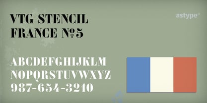
- Vtg Stencil France No5 by astype,
$28.00 - JI Picket Fence - Unknown license
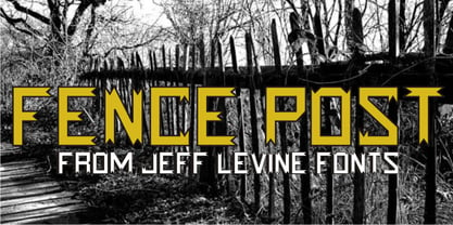
- Fence Post JNL by Jeff Levine,
$29.00 - Ecolier - Unknown license
- KING ARTHUR - Personal use only
- Georges - Personal use only
- ALPHA - Unknown license
- Bodie MF - Unknown license
- PIXymbols Flagman by Page Studio Graphics,
$40.00The numerals and alphabet of the Semaphore Flagging Code, as well as black and white version of the flags and pennants of the International Code of Signals. - SkinArt by Graffiti Fonts,
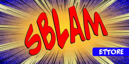
$14.99SkinArt has a hand-made appearance. The style is similar to vintage Tattoo lettering. The caps are in an outline style and the lowercase keys give you a flat, solid style, numbers, punctuation and flourishes are included in this typeface. This typeface includes 2 full tattoo style alphabets that can each be used alone or you can combine the 2 fonts to create fill and gradient effects. Add the included banner pieces or use this font along with your own banner and flag graphics to create realistic body art and classic tattoo style lettering. - Ettore by Comics Font Store,
$9.00ETTORE is a font for onomatopoeia. Friendly-looking, it is inspired by the lettering of the classic French comics with an adventurous and humorous font-style. It is chunky, marked, with low contrast. The kerning is perfectly balanced. It is made with a chisel-tipped marker determining its thick, square, flat stroke. - Colorado by Juliasys,
$-Nature is fond of stripes. Animals have them, plants have them and the rainbow has them. Besides being beautiful, stripes in nature have various origins and functions. But only Homo sapiens gave them symbolic meaning. In the American flag, the 13 stripes symbolize the 13 colonies that declared independence from Britain. In the French “Tricolour” flag, they represent Paris and the king of France. And in Russia’s “Georgiyevskaya lenta,” they symbolize the death and resurrection of St. George, the dragon-slayer. The font family COLORADO , named after the beautifully striped Colorado potato beetle, can be used to construct all kinds of symbolic or just beautiful messages. And thankfully, you need no OpenType diploma to do this. To get your texts multi-striped and multicolored, follow this simple procedure: Write the message with one of the COLORADO fonts and apply a color. Then copy and paste in place, and apply a second font and color. Repeat this again if wanted – and the masterpiece is done. COLORADO ’s language support covers about 100 languages. It has a Western European, a Central European and an Extended Cyrillic character set. - Flagstaff JNL by Jeff Levine,
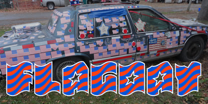
$29.00Flagstaff JNL takes the lettering from Roma Initial Caps JNL and gives them the movement of an unfurled banner. For added effect, there are flagpoles facing in either direction on the lesser and greater keys. Left and right flag ends are placed on the parenthesis keys; a wide blank flag panel is on the left brace key and a narrow blank flag panel is on the right brace key. Letters only; no punctuation or extended characters. - Pirates De Luxe by Intellecta Design,
$22.90 - Rougon by VanderKeur,
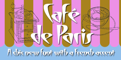
$30.00The reason for Nicolien van der Keur to design the Rougon font was the translation of twenty novels written by Emile Zola, a French writer, and translated by Martine Delfos. It follows the lives of the members of the two titular branches of a fictional family living during the Second French Empire (1852–1870) and is one of the most prominent works of the French naturalism literary movement. This series deserved a font with French roots and corresponded to the period in which Zola’s books were written and published, the period between 1870 and 1893, the end of the nineteenth century. Extensive research into French historical typefaces has led to a type specimen from the French type foundry Deberny et Cie in Paris around 1907. It turned out to be good and helpful source as it contained a sample of a typeface that reflected the content and style of the novels, but also represented the period in which the books were written in France. A large part of the novels are about the generations of Rougon, so it seemed a natural choice to give the font that name. It is available in one weight and contains stylized portraits of Emile Zola and the French Marianne. This font also contains various ornaments. - Cafe De Paris by Studio K,
$45.00Café de Paris is, clearly, inspired by all things French, especially the quirky typefaces that adorn French shopfronts from cafes to charcuteries and bistros to boulangeries. My intention was a fresh, crisp, modern take on a classic theme, with just a soupcon of Art Nouveau, which is characteristic of so much of French typography (See also Studio K’s Paris Metro font) C'est chic - n'est-ce pas? - American Spirit STF by Altered Ego,
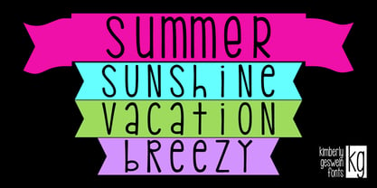
$30.00American Spirit STF is a glorious collection of contemporary patriotic symbols: US Flags (traditional and contemporary), a variety of stars, eagles, torches, and combinations of them all. Designed for print and web, this collection is useful for embellishing your designs with a subtle (or not-so-subtle) patriotic touch. The flags have been designed for easy ungrouping in a drawing program, in order to colorize the union and stripes. And as a special feature, American Spirit™ splits the flags into two characters (the union and the stripes) that can be separately colored and will kern together based on the character chosen. Suggestions for doing this are included in every package. This versatile collection also contains a special contemporary version of the US Flag, with rounded corners on the union and stripes, and a five-pointed asterisk-like shape as the stars. (This allows the stars to appear as stars at smaller sizes.) Show your American Spirit! Sign up today for this contemporary collection of patriotic symbols! - KG PDX Blocks by Kimberly Geswein,
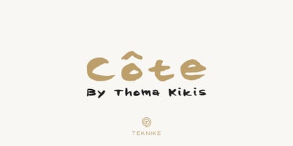
$5.00 - Côte by TEKNIKE,
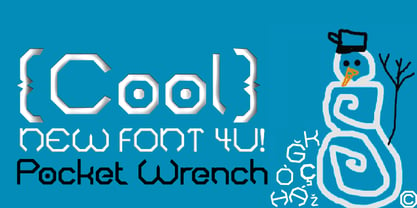
$45.00Côte is a display monospace handwriting font. The typeface is a distinct hand drawn font using a felt marker. The Côte name is derived from the French word meaning "coast" and is also used to describe winemaking vineyards and regions throughout France. One of the most popular regions in the south of France is the French Riviera also known as the Côte d'Azur. Côte is great for display work, invitations, writing, architecture, posters, wine labels and headings. - PocketWrench by Deniart Systems,
$20.00Make a bold statement with this modern, angular design - go wild and use it together with it's partner font, PolkaDot Wrench. This typeface features over 90 extended characters for setting European languages such as Czech, Danish, Dutch, Esperanto, Finnish, French, German, Italian, Hungarian, Polish, Portuguese, Romanian, Spanish, Swedish, Turkish & Welsh. - Coney Island by Solotype,
$19.95This is based on a mid-Victorian Connor's foundry font originally known as Manhattan. One of several old faces known in America as "French Clarendons", in Europe as "Italians", and, wait for it, in France as "American". - Birthday Doodles by Outside the Line,
$19.00 - 1859 Solferino by GLC,
$38.00This font is a late 19th Century French script overview inspired by numerous French letters, from around years 1850-1860, during the second French empire, under Napoleon the third. Most of them were written with very tiny characters on light sheets of paper, as postage prices were calculated from the letter's weight. The TTF and OTF versions are enriched with more than 50 ligatures and/or alternate characters. We also offer a choice of two sorts of Capitals. Why "1859 Solferino"? It was the last battle of the Italian independence war, opposing the victorious Franco-Italian army to Austria in June 24, 1859. The Red Cross was inspired directly from the carnage remaining on the battle field. - Banzai Bros by Fenotype,
$20.00 - Banco by Linotype,
$40.99Designed for Linotype Library GMBH and the International Typeface Corporation in 1997 by Phil Grimshaw. Based on bold script Banco designed by French graphic and poster designer Roger Excoffon and released in 1952 by the Fonderie Olive. Originally Banco was an all-caps bold typeface, and the lower case and the corresponding light weight were created for ITC. The tapering slightly slanted strokes of Banco made by sharp-edged flat brush. The face has the effect of being quickly sketched by a powerful hand. For use in advertising and display typography. Cyrillic version developed for ParaType in 2000 by Tagir Safayev. - Orbita by Resistenza,
$39.00Orbita is a new playful display font. Based on our popular ‘Stencil Creek’ skeleton and keeping its freshness and grace. The aim was to create a new version, dynamic and full of movement, so we came along with this idea of adding a pop up effect which creates a visual illusion of strokes moving in different directions. The family includes 4 versions of this font. It’s perfect to create headlines, posters, book covers, cards, wrapping paper, invitations, T-shirts, labels, packaging and an endless array of options for your projects. In these flags is also featured one of our popular font, ‘Nautica’ - Stencil Product JNL by Jeff Levine,
$29.00 - Mistral by URW Type Foundry,
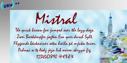
$89.99Named after the strong cold winds on Southern France, the Mistral font family is another original creation displaying the panache of the French graphic artist Roger Excoffon. Mistral is an informal script in which all letters link up in vigorous strokes. First issued in 1953, its brush-like stems look spontaneous and fresh. The descenders are fairly long and the whole alphabet has a distinctive and unforgettable effect on the page. Mistral is a good complement to sans serif typefaces. Mistral is a trademark of Heidelberger Druckmaschinen AG, which may be registered in certain jurisdictions, exclusively licensed through Linotype Library GmbH, a wholly owned subsidiary of Heidelberger Druckmaschinen AG. - 1820 Modern by GLC,
$38.00This family was inspired mainly (Normal and Italic style ) by a Didot pattern font used in Rennes (France, Britanny) by Cousin-Danelle, printers, for Antiquités historiques et monumentales ‡ visiter de Montfort ‡ Corseul, par Dinan... Saint Malo... etc. an historic guidebook for a journey through a part of (French) Brittany in 1820, and many other books. The present version contains 1820 Modern Normal and Italic, 1820 Modern Large Normal and 1820 Modern Narrow Normal, each style with small caps. This font may be used together with 1906 French News and/or 1906 Titrage. - Note by Little Fonts,
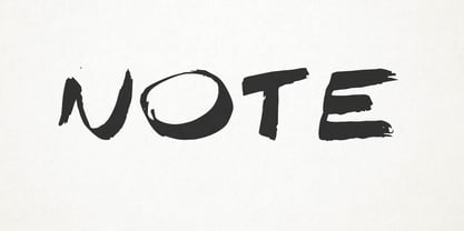
$15.00Note is a fresh and dynamic hand writing font. Inspired by graffitti and street style writing, executed using a flat tip calligraphy pen. The typeface is hand drawn on paper, then the resulting alphabets and punctuation scanned in and rendered to create the font. The resulting characters are bold yet energetic with an obvious human touch creating an interesting and original hand drawn typeface. - Jeu De Mots NF by Nick's Fonts,
$10.00A 1970s Photolettering catalog indentified the pattern for this typeface as "Exotique" ...from France, no less. Named for a French expression meaning “pun,” this face is, indeed, witty and playful, with nary a groan in sight. Both versions of this font include the complete Unicode 1252 Latin and Unicode 1250 Central European character sets. - Colmar JNL by Jeff Levine,
$29.00French Art Deco lettering found within the pages of the 1934 publication L'Art du Tracé Rationnel de la Lettre (roughly translated to “The Rational Path Art of the Letter”) have provided a number of designs well-suited for digital revival. A hand lettered sans with varying character widths was the basis for Colmar JNL, which is available in both regular and oblique versions. As the source of the lettering design was a French publication, the typeface is named for the city of Colmar, which (according to Wikipedia) is the third-largest commune of the Alsace region in north-eastern France. - FlagDay by Ingrimayne Type,
$8.00 - Broxa by BRtype,
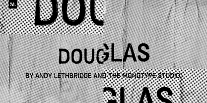
$19.00 - Douglas by Monotype,
$15.99An upstanding, dark horse of a font, Douglas comes in two sets of all capitals and is authoritarian while flying the flag for idiosyncrasies. The font was created using a loose brush and rough paper, and the authentic textures of the lettering indicates these rough and ready roots. Perfect for rustic signage. - Unava by Myristica,
$15.00The font is inspired by the history of the native land - a city that blossoms on a high mountain, surrounded by the blue ribbon of the Unava River. The swift rapidity of the river, the important slow flow of its reservoirs, golden beaches and steep banks of which remember the glorious times of Cossack glory. Times when bright flags flew over the Cossack army, which swiftly swept the green meadows with lightning cavalry, and dusty paths under the scorching sun. To go out to defend their homes, to cross the cold steel of ringing sabers with the enemy, and, bravely going into battle, to fight back the invaders. The font combines the straight lines of sharp steel sweeps, the broken lines of jousting blows, and the refinement of the accent of undulating flag lines. - Blackberry by Los Andes,
$25.00Blackberry is a display typographical family inspired on the design of vintage packaging, old fashion ads and show business marketing campaigns. This font brings back Woodtype characteristics such as angular serifs, and light and diagonal curves, which make it a fresh and current proposal for contemporary design needs. Blackberry has a dynamic system of layers that include 3D extrusions, shadows, outline and inline graphics, as well as a series of dingbats and flags. The system is supported for over 200 Latin-based languages. In total, the 10 Blackberry fonts provide a wide array of combinations and possibilities for high impact graphics, such as labels, packaging, posters, branding, record and movie covers, among others. - London Doodles by Outside the Line,
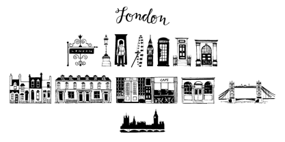
$19.00London is always hip. With William and Kate and the 2012 Summer Olympics it made sense that London Doodles would be second in the City Series following Paris Doodles. 29 illustrations and a script word London. Kate’s ring, the Queen’s carriage, crown, skyline, cityscapes, cars, double-decker bus, castles, bridge, tea items, flag and more. - KG Defying Gravity by Kimberly Geswein,
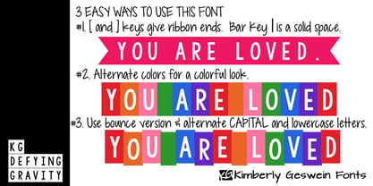
$5.00Use the [ and ] key to create a unique flag ending on your words. Use alternating lowercase and uppercase with the Bounce version to create a bouncy look. To create a solid space instead of an empty space, use the bar key | which shares a key with the \ backslash on my keyboard. Your keyboard may vary. - Coquillage by Hanoded,
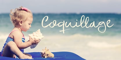
$15.00Coquillage is French for seashell or shellfish. Since I’m going to France this year for a camping holiday with my family, I thought it was a good idea to give this charming connected script a ‘holiday name’! Coquillage was handmade with a Japanese pen. It is a lovely connected script and comes with double-letter ligatures and a full range of diacritics.
