9,502 search results
(0.146 seconds)
- Canadia by BonjourType,
$15.00 Canadia is a cursive and lovely handwritten font. This versatile script font has a wide spectrum of applications ranging from greeting cards to headlines and is guaranteed to add a romantic feel to your next project.
 - Rutherford by Device,
$39.00 Rutherford is clear, robust and authoritative, and reads well at small text sizes while also having the required heft for larger headlines. A wide range of weights makes it a versatile choice for magazines, branding, brochures and advertising. A slightly condensed obround serif with squared stroke terminals. The t, j and f curve around to harmonize with the terminals on the a and g, as does the tail of the Q. The italic incorporates cursive forms on the ends of the lower right and upper left strokes, and uses a single-story a. Includes full European Latin support and alternate designs for the Q and g in all weights.
 - Square Dance by Solotype,
$19.95Animated types like this one have been around for fifty or more years. They certainly add a sense of liveliness to a headline. This one trades upon the "wrong way weights" of the old French Clarendon. Think of it as Barnum with Bounce. - Dijon Stencil JNL by Jeff Levine,
$29.00 A vintage French metal marking stencil for Comandon and Company was the inspiration for the 1400th type design from Jeff Levine Fonts. Dijon Stencil JNL is a condensed serif design with thin stroke weights and is available in both regular and oblique versions.
 - Off Duty JNL by Jeff Levine,
$29.00 The free form hand lettering from the titles and credits of the 1964 French film comedy “Le Gendarme de Saint-Tropez” [“The Policeman from Saint-Tropez”] was the basis for Off Duty JNL – which is available in both regular and oblique versions.
 - Abi Nouveau JNL by Jeff Levine,
$29.00Inspired by the images on some EBay auctions, Jeff Levine sketched out and revived this early 1900s serif design used on some French sign letters. Named for a friend in the graphics industry, this font captures the charm of the Art Nouveau period. - Brossard by Greater Albion Typefounders,
$13.95 Brossard is a slab serif face redolent of French atmosphere and the design ethos of the 1920s. Use it for headines and posters that need that distinctive élan or where a Continental feel is called for. Regular and outline faces are offered.
 - Tender Veronica by STARSsoft,
$10.00 An elegant font that is suitable for all types of printing. Latin font support for these languages: English, Danish, Spanish, German, Norwegian, Polish, Portuguese, French, Swedish Also support for a large number of languages in Cyrillic:Russian, Belarusian, Bulgarian, Macedonian, Serbian, Ukrainian, Kazakh, Kyrgyz
 - First Prize by Letterhead Studio-VG,
$45.00 First Prize typeface has simple shapes. It is a narrow, heavy sans serif typeface with geometrical logic and quite predictable constructions of characters. The idea behind it was to combine constructed structure of the skeleton and some calligraphic ideas, swashes and cursiveness. At the moment First Prize typeface consists of three narrow styles: bold, upright italic and italic. Cursive weights have beautiful ending swashes and initials. There are few alternative shapes for A&N. As a Display typeface First Prize will work very well with any other typefaces for the good of any project in print or online.
 - Good Song by Ocha Puyaber,
$10.00 Good Song is a cursive font based on the USA's teaching script. It can be written in Carolinian, Sioux, Oʼodham, Southern Athabaskan, Hawaiian, and Samoan from USA. It can also be written in Dutch, Maltese, Aymara, Mapuche, Rapa Nui, and other languages. This font family is cute. The style is wide and rounded. It has wide and open loops. The strokes are drawn with a round cap tool, with no contrast. It is cursive and connected. The form is upright. It is easy to read in the USA. Part H has capitals with High starts. Part L has capitals with low starts.
 - Dear Penpal Script by Giaimefontz,
$6.00 This is a fully connected script font, not calligraphic, but entirely designed to follow handwritten cursive ligatures rules as teached in schools. In order to correctly visualize it, you have to enable OpenType features (Contextual Alternates, Discretionary Ligatures, Standard Ligatues and Kerning). Trying to write All Capitals will generate Block Letters writings, since cursive style doesn't allow more than the first uppercase per word, however this font is not meant to be a Block Letters font. Using specific type combinations will generate special glyphs. All of these features are intended to reproduce a classic schoolboy or schoolgirl notebook.
 - Jungle Land by Garisman Studio,
$20.00 Jungle Land combines attractive curves with a fresh urban edge; delivering a stylish display script which is guaranteed to add an eye-catching appeal to your logo designs, brand imagery, quotes, product packaging, merchandise & social media posts. Features: - Uppercase & Lowercase letters - Numbers & Punctuation - Ligature - Simple installation Work for PC and MAC - PUA Encoded Open
 - 1484 Bastarde Loudeac by GLC,
$38.00 Font designed after that used in Brehan-Loudeac (Britanny, France) by Robin Fouquet and Jean Crès in years 1480s to print a lot of texts and books. This font include “long s”, naturally, as typically medieval, and a few special characters and abreviations, also some variants, like for “d”, “r” or “v”. The small “y” is accented, just like in British alphabet of the time, though the texts were printed in French. Added, a lot of accented characters no longer existing on this time. A render sheet, in the font file, makes it more easy to identify on a keyboard. This font is used as variously as web-site titles, posters and flier designs, editing ancient texts... all you need. This font supports easily as large than small size, remaining readable, original and pretty.
 - JH Mabel by JH Fonts,
$40.00 JH Mabel is a modern cursive typeface; it has three weights: light, medium and bold. It is a smart type and consists of extra characters to simulate real handwriting. Typical use: branding, greeting cards, long runing text.
 - Arabellia Signature by MJB Letters,
$17.00 Arabellia Signature is a lovely and cursive handwritten font. It is the best choice for creating eye catching logos, branding and quotes. Every letter has a unique and beautiful touch, which will make your design come alive!
 - Fallen Angels by Set Sail Studios,
$19.00 Fallen Angels Is a modern take on a classic serif style. The stylised capitals add romantic curves and a rebellious elegance to the strong standard character set. It's a bold choice of typography for logo designs, product packaging, album artwork, quotes, posters, apparel & more. Accessing Extra Characters • Alternate characters are available for E, F, r & k. These can be accessed by switching on 'Stylistic Alternates' or via a Glyphs panel. 6 icons are also included within the font (3 halo's and 3 stars) which can be accessed via a Glyphs panel. Language Support • English, French, Italian, Spanish, Portuguese, German, Swedish, Norwegian, Danish, Dutch, Finnish, Indonesian, Malay, Hungarian, Polish, Croatian, Turkish, Romanian, Czech, Latvian, Lithuanian, Slovak, Slovenian
 - Mulier Moderne by HiH,
$8.00 Even though the phrase Art Nouveau originated in Paris at the shop of Siegfried Bing, the French preferred to call it Le style moderne. This very sinuous, very Art Nouveau typeface was designed by an E. Mulier around 1894, probably also in Paris. The organic, vine-like curve forms are frequently seen in the art of the period. Examples include the architecture of Victor Horta, the furniture of Henry van de Velde and the jewelry of Max Gradl. Mulier Moderne is an all-cap font with a full Western European character set plus ST and TH ligatures, an alternate ‘E’ and two glyphs of period printer’s cuts. Warning: do not use for extended text. Duh!
 - Shelpay by Keristyper Studio,
$14.00 Salzburg Script Inspired by Retro Vintage style and combination with Brush Hand Lettering. I'm made with a personality that touch every single curve. I hope this can make inspire you with your work. and a very bouncy baseline It has a perfectly paired complimentary marker font. Good for logos, handwritten quotes, product packaging, header, poster, merchandise, social media & greeting cards. Salzburg Font multilingual support: Afrikaans, Albanian, Catalan, Danish, Dutch, English, Estonian, French, Finnish, German, Icelandic, Indonesian, Italian, Malay, Norwegian, Portuguese, Spanish, Swedish, Zulu, and many more. What’s Included : Web Fonts Standard & Multilingual glyphs Ligature Works on PC & Mac Simple installations Accessible in Adobe Illustrator, Adobe Photoshop, Adobe InDesign, and even work on Microsoft Word. Hope you enjoy our font!
 - P22 Virginian by IHOF,
$24.95 P22 Virginian is an historic script font designed by Ted Staunton for his historic novel centered around a family bible and the handwritten annotation through 7 generations. The Virginian font is strongly influenced by classic “Chancery cursive” script.
 - Ridinger Pro by RMU,
$30.00 Based upon Riedingerschrift, cut by Franz Riedinger for Benj. Krebs Succ. in Frankfurt am Main in 1906, here come Ridinger Std and its extended version, Ridinger Pro. An elegant cursive font which also includes various adorning swash strokes.
 - Ridinger by RMU,
$30.00Based upon Riedingerschrift, cut by Franz Riedinger for Benj. Krebs Succ. in Frankfurt am Main in 1906, here come Ridinger Std and its extended version, Ridinger Pro. An elegant cursive font which also includes various adorning swash strokes. - Tolkien Tengwanda Namarie by Deniart Systems,
$15.00A cursive style script based on a writing system devised by J.R.R. Tolkien, also known as the Tengwar of Feanor, used for many languages in Middle-earth. NOTE: this font comes with an interpretation guide in pdf format. - DG Zanardini by DubbioGusto,
$35.00 Zanardini it’s a bold serif display font with a high contrast between the stem width and between sharp and curvy terminals and slab / egyptian serifs. All the glyphs was freehand drawn so the curves are strong and they create more interesting shapes in the negative space between the letters. Use it irresponsibly!
 - Deco Wide JNL by Jeff Levine,
$29.00 A unique and stylized type design with Art Deco influence was found within the French publication “Modèles de lettres modernes par Georges Léculier” (“Models of Modern Letters by Léculier”). This lettering is now digitally available as Deco Wide JNL in both regular and oblique versions.
 - Fort Courage JNL by Jeff Levine,
$29.00 Fort Courage JNL is a bold slab serif wood type in the French Clarendon genre, taking its name as a tongue-in-cheek reference to the cavalry fort populated by a number of post-Civil War misfits in the 1960s television comedy "F Troop".
 - Volage Display by Cecilia Gérard Type,
$16.00 Introducing Volage, a clean, elegant yet flighty display serif. Inspired by french literature masterpiece "Dangerous Liaisons" by Pierre Choderlos de Laclos, Volage is a drama typeface with stunning alternates. Sharp shapes marry tails and ligatures, which are chasing each other without never really meeting...
 - Stage Show JNL by Jeff Levine,
$29.00 “9 Garcons...Un Cœur” (“9 Boys...One Heart”) is a 1948 French musical starring Edith Piaf. The hand lettered credits for the film are done in a condensed Art Deco sans alphabet, now available digitally as Stage Show JNL in both regular and oblique versions.
 - Retrorocket NF by Nick's Fonts,
$10.00 A French lettering chapbook from the 1920s, entitled "Art du Tracé Rationnel de la Lettre," provided the inspiration for this decidedly Deco exercise in alternative letterforms. Both flavors of this font feature the 1252 Latin, 1250 Central European, 1254 Turkish and 1257 Baltic character sets.
 - Arta by Olivier Blanc,
$34.00 ARTA is an ArtDeco style font, inspired by classic font like Newport Classic with elongated typeface with high waisted uppercase letters which curve in an geometric and elegant way. It consisted of really condensed lettering which had little space available. It's a well complet font with 315 Glyphs for most latin languages as "English, French, Spanish, German, Icelandic, Afrikaans, Catalan, Czech, Esperanto, Hungarian, Latin, Latvian, Lithuanian, Maltese, Northern Sami, Polish, Serbo-Croatian, Slovak, Slovene, Sorbian, Turkish and Welsh". ARTA will give to your design an chic presentation, you will be able to generate beautiful writings,thanks to 3 differents type "Light, Regular & Bold". It can be used for Shop, Restaurant, Jewelry, Cosmetic, Press identity & more. I started to work on this typeface at the creation of a logo in 2017 for the butcher shop of my uncle in Luchon in France named "Le Louchébem". I always had in mind to complete & share it. So after some years, I decided that it was time to finish it. This was my first Typography creation and I wanted to make it as an Art Deco typeface. I really love this elegant, high & classy lettering style. I want to bring this 1910's vibes back to be more use in our days.
 - Rezpector by Garisman Studio,
$5.00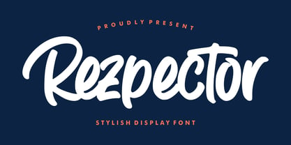 Introducing Rezpector - Stylish Display Font Rezpector combines attractive curves with a fresh urban edge; delivering a stylish script which is guaranteed to add an eye-catching appeal to your logo designs, brand imagery, quotes, product packaging, merchandise, social media posts and more. Uppercase & Lowercase letters Numbers & Punctuation Ligature Simple installation Work for PC and MAC PUA Encoded Open
 - ND Kapitel by NeueDeutsche,
$17.50 Experience the evolution of the humanist sans-serif style with this contemporary and classic font. Designed with a modern sensibility and clean, spurless letterforms, this font offers a fresh take on a time-honored tradition. Its refined curves and harmonious proportions create a sophisticated look that is perfect for branding, editorial design, and other professional projects.
 - Saveur Sans by Arkitype,
$10.00 Saveur Sans is inspired by art deco and French cafes. This display family has clean, simple letterforms that feel modern but at the same time have a retro, art-deco styling. This family can add a sophistication to any layout whether it be print or online. Saveur Sans is a great selection for headlines, logotypes and branding. it is an all-caps display family with some neat alternates including an alternate O and E that instantly give your copy that retro-deco look. The promos have been inspired by french food and design. This family is perfect for use in packaging and branding of food products as well as menus and restaurant or cafe branding.
 - Machin by Hanoded,
$15.00 Machin is a French word meaning 'thing'. Apparently, it is also a species of macaque from the Philippines, but I named this font after the French word! Machin is based on a really old font I made back in the day. It was called Whynot and (because I didn't know a thing about making fonts at the time) I could not get it to work properly, so it had its 15 minutes of fame before it was pulled off of the internet. Machin was made using the recycled glyphs from Whynot and it does work. It comes with extensive language support (yes, Vietnamese and Sami too), some handy ligatures and a lot of scribbly panache.
 - Tendria by Linotype,
$29.99Patricia Pothin-Roesch's Tendria typeface bases its letterforms on the logo for the French “Tendriade” mark. Clearly inspired by writing and hand lettering, Patricia Pothin-Roesch began her work on Tendria in Adobe Illustrator. After a few letters, she went back to designing the old-fashioned way: drawing by hand on layers of tracing paper. Tendria is a sturdy upright script face with a warm, childlike feeling. Its letters are like the typefaces often used in primary schools; the counterforms are large and open. The name Tendria is reminiscent of the French word for tender, “tendre.” Designers who set Tendria lovingly will reap rewards; this is an excellent addition to a display heading toolkit. - Bely by TypeTogether,
$49.00 Bely is the first design by French newcomer Roxane Gataud. Too many typefaces are either governed by fear and never accomplish what they could, or are unrestrained which results in their frenetic dangling like a leaf caught in a spider’s web. Bely’s strength is that it has both restraint and freedom throughout the text weights and into the unique display weight. There is no fear in this type family, but only great respect for both the tradition of reading and the opportunity to make an impression. Bely is a high-class throwback containing four text weights which were built upon classical proportions to capitalise on reading familiarity. Bely Text features balanced capitals and a play between large, triangular serifs at the top and thick, bracketed, rectangular serifs at the bottom. The family is capped by a radical, expressive French-style display weight which pushes the rules of the text weights to their logical extreme. Bely Display, truly daring with its monstrous and angled contrast, exploits the features which make an impression at larger sizes. In the end, Bely Display is adventurous when used in packaging, identities, and headlines with attitude, while Bely Text’s calm baseline and piercing ascenders give paragraphs texture and familiarity. Bely covers the Latin A Extended glyph set and brings its sense of confidence to your projects with its two text weights, matching italics, and unique display style. Bely’s satisfying OpenType features allow for the implementation of typographic niceties such as small caps, both tabular and proportional lining and oldstyle figures, ligatures, alternate characters, case-sensitive variants, and fractions. The complete Bely family, along with our entire catalogue, has been optimised for today’s varied screen uses. Awards – Selected for TypeTogether’s Typeface Publishing Incentive Programme scholarship in 2014. – Selected by French magazine Étapes for the 2014 Diploma Issue. – Selected for the 2014 exhibition “TransFormations” at Centre Pompidou. — Received the SOTA catalyst Award 2016
 - Artist Hand by K-Type,
$20.00 ARTIST HAND is a bold, informal script inspired by artistic handwriting. The font radiates confidence, is largely cursive, and contains glyphs that are friendly, familiar and highly legible. Artist Hand contains a full complement of Latin Extended-A characters.
 - Boomtown by PleasureFonts,
$22.00 Boomtown is a bold, slightly cursive font for advertising, headlines, packaging design, signposts or posters. Although it is highly constructed, it has some handwriting attributes, too. An italic font is in my planning and maybe a light style, too.
 - Write by Aah Yes,
$12.00Write is a handwriting font, more like neat print than a flowing cursive script, which renders it highly readable and almost like a formal font, but still retaining the informality of handwriting. Also there are some "special effects" varieties. - Amsterdam Belmonteria by Letterena Studios,
$9.00 Amsterdam Belmonteria is a delicate and cursive handwritten font. This gentle font will look gorgeous on a variety of design ideas. This font is PUA encoded which means you can access all of the glyphs and swashes with ease!
 - Thermal by TipoType,
$35.00 Thermal is an exploration of balance and contrast. Combining the elegance of classical typography with the sharpness of contemporary design. It was conceived to be a variable font with two axes: weight & optical size, providing a wide range of options for texts & display applications. The regular and italic text weights breathe a warm atmosphere, their design inspiration is a relaxed interpretation of the work of 16th-century French type designer Robert Granjon, evoking a comforting rhythm and a sense of familiarity that makes reading enjoyable. On the other end of Thermal's design spectrum lie the extreme weights – thin and heavy –, specifically designed for larger sizes. These weights borrow stylistic cues from several distinct influences: the characteristic woodtype from the 19th century, the sharp lettering styles from the 70s, and the bold work of Oscar Ogg. One of Thermal's disctint features is its italic's 20° inclination, an significant inclination by all standards, this design choice finds its roots in the "Ascendonica Cursive" of 1571, but is a contemporary interpretation that generates a captivating contrast with the regular version. Thermal studies the past and analyzes the present to create a unique blend, bringing a dictint dichotomic identity.