9,502 search results
(0.032 seconds)
- Sirkle by Invasi Studio,
$19.00 Sirkle is a semi-serif typeface for display, constructed with sharp and curvy characters. All Letters are handcrafted and made to fit each other perfectly without exception, with a modern and edgy style that gives them a unique look. Sirkle comes with ligatures, alternates, and supports 60+ Latin-based languages. The Sirkle is ideal for logotype, signage, posters, packaging, and much more! Features: Uppercase & Lowercase Numerals & Punctuation Alternates and Ligatures Multilanguage Supports 60+ Latin based languages
 - MVB Greymantle by MVB,
$39.00Kanna Aoki had fairy tales in mind when she designed MVB Greymantle. She drew dots with a felt pen to build up the forms, giving them their particular rough character. The “Extras” font contains a set of whimsical illustrations, including a portrait of Greymantle—her 18-pound cat, a set of curly initial caps, and border parts. MVB Greymantle has been spotted on numerous children's books, in magazines, in salad dressing advertisements, and on food packaging. - Neo Phalanx by Zenmurai,
$18.00 Neo Phalanx is a rectangular, circular & curvy modern display sans inspired by Ancient Greek mass military formation. The difficulty of make this font is balancing rounded corner & sharp edge. There are letters like "M W A H R N K S Z" provides a unique personality in the title display. Numbering and punctuations also designed in unique styles to deliver different visual language. This font is suited for variety of applications from poster to branding, advertising, digital.
 - Fortunelimes by Maulana Creative,
$13.00 Fortunelimes is curvy casual script font, with felt-tip stroke, slant and fun character. It has Opentype features ligatures of character, To give you an extra creative work. Fortunelimes script font support multilingual more than 100+ language. This font is good for logo design, Social media, Movie Titles, Books Titles, a short text even a long text letter and good for your secondary text font with sans or serif. Make a stunning work with Fortunelimes font. Cheers, MaulanaCreative
 - Morge Knight by TypeClassHeroes,
$14.00 Morge Knight is a retro font come with curly and rounded old 80's retro style serif. You can explore and combine creating rhythm for comfortable reading. Vintage and refined use this font for any branding, product packaging, invitation, quotes, headline, label, poster, logo etc. Feature Uppercase & Lowercase Number & Symbol International Glyphs Multilingual support Alternative Ligature Feel free to drop us a message any time and follow my shop for upcoming updates Hope you enjoy it.
 - Reverb by Carmel Type Co.,
$15.00 Designed with the gig poster in mind, Reverb is a throwback to the Fillmore West golden age of psychedelic rock and summertime fun. With 5 distinct weights, this workhorse of a display face has you covered from light and airy to bold and curvy. Concave stems. short descenders with a tall x-height, and a generous helping of stroke contrast define this humanist sans face that's built to shine as a headliner or to spice up some secondary copy.
 - Cliquelly by Maulana Creative,
$12.00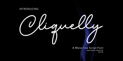 Cliquelly is a curvy script font, with a clean mono-line stroke, slanted and fun character. It has Opentype features ligatures of character, To give you an extra creative work. Cliquelly font support multilingual more than 100+ language. This font is good for logo design, Social media, Movie Titles, Books Titles, a short text even a long text letter and good for your secondary text font with sans or serif. Make a stunning work with Cliquelly font. Cheers, MaulanaCreative
 - House Soft by TypeUnion,
$30.00 House Soft is the curvy, fun little brother of House Sans. Its exaggerated rounded corners give it a playful feel that will bring happiness and joy wherever it’s used. Like its big brother, House Soft is also made up of 100 weights in 5 useful widths (Compressed to extended) that make it a versatile font. From big bold headlines to playful brands House Soft offers the flexibility and uniqueness you and your project deserve. Go soft or go home.
 - Rimba Andalas by Arterfak Project,
$14.00 Introducing Rimba Andalas, a playful ethnic font with extra ornaments. This experimental font inspired by the shapes of tree branches and combined with rough strokes such as ancient symbols found inscribed in caves. Perfect for the natural theme, traditional, cultural, folk, tribal, children, adventures and social movement. Rimba Andalas is a display font, suitable for the headline, logo, apparel, books, poster, signage, and more. You can mix and match the uppercase and lowercase to get more unique tribal handwritten, also equipped with swashes as the decoration. Fonts featured : - Uppercase - Lowercase - Numbers & symbols - Ligatures - Accents Hope you like it! Thank you for your support and happy designing!
 - XXII Gory Bastard by Doubletwo Studios,
$25.99The Bastard is the cheap alternative for you to easily create a logo for your band or whatever. It comes with a basic characterset and a little bunch of symbols and signs often used in the extreme music sector. Some classical stuff from Death- and Blackmetal like pentagrams and crosses, roots and branches and lots of other things. With all of these you’ll be able to customise your logo to the look of your interest. Open it up in your graphic-editing-application and be creative, play with it and find out what’s possible. Check out the PDF in the Gallery for detailed information. Or on behance.net . - Memento by Linotype,
$29.99Memento is a 1993 design of the type artist Franco Luin, the creative mind behind a variety of types, for instance, Venus and Griffo Classico. Memento's high x-height allows it to be legible even in small point sizes. It is distinguished by its tiny triangular serifs, a characteristic reminiscent of the Dutch types of the 17th century. Memento is an extremely legible typeface with a classical touch. It is available in four different weights with corresponding italics and small caps. This range of weights along with its classic, neutral look makes it a versatile typeface which can be used in anything from books to corporate design to magazine typography. - Burowai by Arterfak Project,
$18.00 Burowai is an ancient font style. Inspired by the ancient greek letters and the tribal ornaments. This ethnic font inspired by the shapes of tree branches and combined with rough strokes such as ancient symbols found inscribed in caves. Perfect for the natural theme, folk, tribal, children, adventures, and social movement. Burowai is a display font, that represents brave, spirits, natural, and tradition. Perfect for the headline, logo, books, poster, signage, and more. You can mix and match the alternates characters to get more unique tribal handwritten. Fonts featured: Uppercase Allcaps Numbers & symbols Accents Alternates Hope you like it! Thank you for your support and happy designing!
 - Aphrodite Slim by Typesenses,
$57.00 Aphrodite Slim Pro is not just a lighter version of its sister Aphrodite Pro. Aphrodite Slim Pro has duplicated the quantity of characters of its partner, and that means more than 500 new glyphs, reaching a total of more than 1000. More delicate and meticulous, Aphrodite Slim Pro is once more a new typography with deep calligraphic ideals: We immersed ourselves into the world of each calligraphy ductus and each calligraphy masters by studying from decoration to lettering books. This was the key for the logic of Aphrodite Slim’s behavior. The new concept of Aphrodite Slim Pro was to join diverse styles of calligraphy in one in order to achieve an autonomous expressiveness, in fact, this is what calligraphy aims to, and we agreed to bring those ideals to the world of typography: It is justifiable to be inspired in hundred-year-old calligraphies, but it is even better if the results you obtain have a plus. A personal plus. During the creation process we were wondering whether it was possible to mix certain strokes of such rigid styles as uncial, (Li·n’s favourite style), with strokes of the copperplate, (Sav’s favourite style), and also to take and mix cualities of cancelleresca cursiva, formata and moderna; finally giving our creation a roman-transition italic look. So Aphrodite Slim takes ideals and aspects from those formal styles, following its own logic though, and emphasizing the fact of being a decorative typography. Calligraphy masters of our past are who we are in debt with. They are the cause we have lovely letters now. They have been spontaneous at the moment of creation, what differs from the type-designers of nowadays, whose spontaneity is more limited. Digital faces that we are used to see these days are a result of long hours of optical adjustments, grids, macros and inspirations of other existing typography, but without personal contributions. Aphrodite Slim wants to refute this. Its mission is to rescue de spontaneity of the artesanal lettering in order to obtain unique words; those which only calligraphy masters of our past or lettering artists of our present could give us. We have worked hard to achieve this, making Aphrodite the most universal font we could: It was necessary to study the most common words, focalizing more in the ones referring to “sensitivity”, of four of the most spoken languages in the world. Aphrodite Slim has an enormous quantity of decorative characters and special ligatures for phrases and words in English, French, Spanish and German. (See English, Français, Español, Deutsch PDF in the gallery section). We promise there is no existing type that decorates/ligates glyphs and words like Aphrodite Slim does: It is the first time a font like this really considers its purpose. -The way glyphs are ligated is insane- : Aphrodite Slim rescues some ideals of persons like Jan van den Velde (Italian cancilleresca writing of XVI Century) who understands ascenders and descenders as possibilities to beautify the lines of writing with curved strokes that seem to be dancing above and below of the words. This master also creates ascenders and descenders even where they are not necessary, on letters that do not actually need them: Aphrodite Slim takes this ideal. The font counts with a wide range of glyphs that seem not to be satisfied with its more primitive form and prefer to extreme their parts to be decorative. It also existed masters of calligraphy like José de Casanova of XVII Century, who, with a magnificant skill and a really personal mark, had the particularity of ligating words that were actually separated with spaces. This is another innovative feature in Aphrodite Slim. An investigation of the most common beginnings and endings words of the English language was done. Having that feature activated (discretionary ligatures), common words will start to ligate or to be decorated even when they are separated by spaces. Impossible to forget Francesco Periccioli of XVII Century and our experience us designers to face with works of him: His letters, that today are included in the group of cancellerescas modernas, have been a direct inspiration to the oldstyle figures and historical forms variables in Aphrodite Slim. Giovanni Antonio Tagliente (XVI Century) and his particular way of making tails and diagonals longer than usual, qualities that our creation reflects too. Finally, our adventures in Biblioteca Nacional and Barrio San Telmo, Buenos Aires, were essential for us to make Aphrodite Slim more complete and interesting: Sav did an excellent work when studying how the decorative miscellanea and swirls of early XX century were. She also investigated what particularities made those roman titling characters look antique so she could rescue some ideals for the oldstyle figures and historical forms variables. This also leaded her to create the ornaments variable in Aphrodite Slim. We are really proud of presenting Aphrodite Slim Pro, a typography that was the result of days and nights of working hard, because we do love what we do; and we are glad we are living in a present that gives us the possibility to spread this kind of art, because that is the way we consider our job: Aphrodite Slim Pro is Art. Hope you can appreciate the enormous work this type has. Features. Aphrodite Slim Pro is the most complete variable. It includes more than 1000 glyphs. Thanks to the Open-Type programming, it counts with a easy way to change/alternate glyphs if the application in which the font is used supports this. The variables contained in Aphrodite Slim Pro are also offered separately. Aphrodite Slim Text: It is the variable for lines and paragraphs. Thus it is the least ornamental and the most accurate to achieve a satisfying legibility. It has the Standard Ligatures feature in order to improve the possible conflicts some glyphs could have by others. Aphrodite Slim Contextual: It is the one that makes emphasis in decorating. It has the particularity of ligating/decorating words of common use in English, French, Spanish and German. It also has the quality of ligating common beginnings and endings of the common words in English. Aphrodite Slim Stylistic: With similar features of Slim Contextual. It includes a set of decorative numbers for a display use. Aphrodite Slim Swash: This one has special beginnings and endings to decorate words. Aphrodite Slim Endings: It makes words look as a signature. Aphrodite Slim Historical: It adds an antique look to the written word. It also has the special historical ligature function. Aphrodite Slim Titling: This one is the most decorative. Its copperplate inspired ornaments give words a special color, in order to handle the quantity of decoration, it comes with the standard ligature feature, which has the most common ligatures plus others that make decorative swirls not to be conflictive. Aphrodite Slim Ornaments: A set of 52 ornaments. Aphrodite Slim Pro includes all this features plus the Stylistic Set 1; Stylistic Set 2 and the possibility of Slashed Zero. We recommend you to check out the gallery in order to see all these features in action.
 - Breadcrumbs by Hanoded,
$15.00 Every morning, after the kids have gone to school, I vacuum the floor and remove about half a kilo of breadcrumbs… No, not really have a kilo, but any given bird could probably survive on the leftovers. When it was time to name this font, Breadcrumbs was all I could think of! Breadcrumbs and children seem to go together well, as they are featured in Hansel & Gretel and Hop-o'-My-Thumb. Breadcrumbs font is a happy, sloppy fairytale font, which you can use for your book covers, your party posters and maybe crumbly bread packaging. But that is entirely up to you.
 - Peronas by Keristyper Studio,
$14.00 Proudly present Peronas a new display font Inspired by American circus and carnival typography. This font is good for logo design, Social media, Movie Titles, Books Titles, short text even long text letters, and good for your secondary text font with the script, sans, or serif. Featured: Standard Uppercase & Lowercase Numeral & Punctuation Multilingual : ä ö ü Ä Ö Ü ß ¿ ¡ Alternate & Ligature PUA encoded We recommend programs that support the OpenType feature and the Glyphs panel such as Adobe applications or Corel Draw. so you can use all the variations of the glyphs. Hope you enjoy our fonts!
 - Etoxina by FSdesign-Salmina,
$39.00 Etoxina is designed especially for the burgeoning market of starships and other space cruisers. Etoxina has been developed with the contribution of experts in navigation through space and time. The fonts are ideal for internal and external use (including zero-g and occasional bursts of cosmic rays), and with their simplified forms are expected to survive well in non-linear galaxies. With their unusual diagonal half-pixels the fonts are striking as abstract designs at astronomical sizes, where small text may be placed within the black holes formed inside the letters. On explicit suggestion of Mr. Spock true capital letters have been added.
 - Itoxina by FSdesign-Salmina,
$39.00 Itoxina is designed especially for the burgeoning market of starships and other space cruisers. Itoxina has been developed with the contribution of experts in navigation through space and time. The fonts are ideal for internal and external use (including zero-g and occasional bursts of cosmic rays), and with their simplified forms are expected to survive well in non-linear galaxies. With their unusual diagonal half-pixels the fonts are striking as abstract designs at astronomical sizes, where small text may be placed within the black holes formed inside the letters. On explicit suggestion of Mr. Spock true capital letters have been added.
 - Baskerville by Bitstream,
$29.99 John Baskerville spared no effort to create the ultimate typographic book. He prepared deep black inks and smoothed paper to show to full effect the letters that he had John Handy cut from his own brilliant designs, based on a lifetime of calligraphy and stonecutting. Punches and matrices survive at the Cambridge University Press. The present design is an accurate recutting, with particular attention to George W. Jones’ revision from the metal of Baskerville’s English (14pt) roman and italic in 1929 for Linotype & Machinery Ltd; Mergenthaler Linotype imported this design to the USA two years later.
 - Piccadilly Circus by Type Innovations,
$39.00 Piccadilly Circus is an original design by Alex Kaczun. Piccadilly Circus takes you back to Old London and is reminiscent of billboards and neon signs which made the area famous. It's a busy spot, and it is said that a person who stays long enough at Piccadilly Circus will eventually bump into everyone they know. So, take a stroll down the historic downtown shopping district and enjoy the shops, boutiques and pubs. This whimsical font is great for display posters, banners and carnival signs and is sure to captivate your audience. A decorative and cute alternative to any advertisement.
 - Azuza by Parkinson,
$20.00 In the 1990s I drew a text face for the San Francisco Chronicle. It was based on W. A. Dwiggins’ Electra and incorporated many features of the Linotype Legibility Series: More compact, with a taller lowercase X-height, etc. That type was called Electric and it was the Chronicle’s text face for nearly a decade, surviving several redesigns. From that, I made Azuza, a more detailed and sensitive style. Azuza was recognized in the TDC2 type competition in 2001. Then it went into hibernation as a Type 1 font family. Today it is back. Six fonts. Open Type.
 - Afiga by Degarism Studio,
$30.00 Afiga is a is humanist sans-serif a modern type family inspired form British typography of the early 20th century, Simple and fresh typeface for visual identities, book covers, magazines, and advertisement. Afiga typeface consists of 7 style plus “true italic” set. All of the styles together have over 700 characters, supports more than 50 languages – in Latin based languages Afiga supports OpenType features for fine typography, including Alternate characters, old style figures, Tabular Numbers, proportional figures, ligatures, superscript and subscript figures and support for fractions.
 - Beagle Boyz NF by Nick's Fonts,
$10.00Whoever knew the Red Menace could be such fun? This bold and bouncy face is based on a Cyrillic alphabet presented in the book Schrifti Alphabeti, published in the Soviet Union in 1979. It rollicks and frolicks, and might even fetch your slippers. Special thanks to Charles Barsotti for permission to use The Pup to promote this doggone-good product. The Postscript and Truetype versions contain a complete Latin language character set (Unicode 1252); in addition, the Opentype version supports Unicode 1250 (Central European) languages as well. - Traveller by Holland Fonts,
$30.00A geometric design, published in Rick Poynor’s Typography Now 1 (Booth-Clibborn Editions, London UK,1991). Discussing these kinds of angular styles, the critic Rick Poynor noted that "fate has overtaken the angular post-constructivist type design of Neville Brody, Zuzana Licko and Max Kisman". Poynor described a process by which typefaces, once “fresh, unexpected, precisely attuned to the moment”, get used increasingly often in less and less appropriate contexts and end up looking "irredeemably passé". (Poynor, Rick, ‘American Gothic’ in Eye Magazine, 6/1992) - Bomber Dreams by Din Studio,
$29.00 Looking for a fun and bold font to captivate your audience, clients or guests? Then we’ve got the font for you! Introducing Bomber Dreams- A Grafiti Font Use this cool and modern graffiti font to breathe a street life vibe into your projects. This font is perfect for logos, printed quotes, cards, packaging, website or social media branding, and many more! Our font always includes Multilingual Support to make your branding reach a global audience. Features: Standart Ligatures Stylistic Set Multilingual Support PUA Encoded Numerals and Punctuation
 - Approach by Emtype Foundry,
$69.00 Approach is a modern approximation to the early grotesques. An utilitarian low contrast font, a bit mechanic but plenty of character. One of its characteristic elements is a kind of ‘elbow pipe’ shape that is present in many letters like the tail of the a, f, j, t, R, Q or 1 among others. Besides, the synthetic punctuation and quotes give it a more contemporary appearance. Approach tries to feel fresh against all odds, being familiar but different. For more details see the PDF.
 - Orgon by Hoftype,
$49.00 Orgon, a new linear typeface family, fresh and easy but with a warm touch. It appears uncomplicated, unpretentious, but still distinctive. Its quiet text flow allows smooth reading even for longer texts. The Orgon family comprises 16 styles and is well suited for ambitious typography. It comes in OpenType format with extended language support. All weights contain ligatures, small caps, superior characters, proportional lining figures, tabular lining figures, proportional old style figures, lining old style figures, matching currency symbols, fraction- and scientific numerals and matching arrows.
 - Faithful Fly by ITC,
$29.00Faithful Fly is an alphabet of capital letters designed by David Sagorski in 1994. Vital and dynamic, the figures of Faithful Fly dance across the base line. Zigzag strokes and energetic forms define this frolicsome font. Little ovals decorate the figures in different places. A marked contrast between finer and stronger strokes can be seen in all characters and builds the foundation of the unmistakable image of this font. Faithful Fly's fresh, young look makes this font perfect for comics, cartoons and trend magazines. - Felipe by Sudtipos,
$49.00 As a follow-up to his popular Chocolate font, Angel Koziupa softens his brush again to produce Felipe, a font made in the memory of his brother. As packaging-friendly and versatile as any Koziupa font, Felipe contains fresh perspectives on old characters. Some of the majuscules and figures show characteristics normally reserved for minuscules. The overall color of the font is somewhat bittersweet, which adds to its ability to capture the attention in display settings. Felipe is ideal for packaging, signs, culinary-related designs, and posters.
 - Quanty by Slava Antipov,
$29.00 Quanty is a new modern sans serif with a geometric touch and with some special, display forms. This modern font has unique fresh features. It is versatile in its use: suitable for headings and typing large amounts of text. Quanty has great uses in advertising, packaging, branding, posters, magazines, logos, web sites. Will go well with the Phonk typeface. OpenType features: Access All Alternates, Glyph Composition / Decomposition, Discretionary Ligatures, Denominators, Fractions, Standard Ligatures, Localized Forms, Numerators, Ordinals, Proportional Figures, Scientific Inferiors, Superscript, Tabular Figures
 - Fairweather by Dharma Type,
$19.99 Fairweather is a fresh air. Clear, transparent, and lucid as if it is the spring and autumn sky. By designed condensed, legible and perspicuous, Fairweather is perfect for titles and captions. But "Title and Captions" are the just examples. Very neutral and plain letter forms make the font versatile. The condensed forms can be very effective for body text in narrow space and the clean and clear letterform doesn't intrude your art works. Consists of nine weights and their matching italics. Supporting almost all latin languages.
 - Walpurga by Julia Bausenhardt,
$28.00 Walpurga is a witchy display font that comes in two variants - regular & bold - and with four glyphs for each letter. There is a set of ornaments and the in-built open type features produce a random, natural looking effect when activated through the "contextual alternates" feature. Walpurga was created with stylized brush ends that become visible at larger font sizes. A fresh, versatile font that is usable for a wide range of design applications. Please activate Open Type Features to get the most out of this font.
 - Burlington by ITC,
$29.00Burlington was designed by Alan Meeks in 1985 and is a decorative typeface in the neoclassical style of the middle of the 19th century. Characteristic of faces from this time is the low x-height, which makes the font look as though it is reaching upward. This combined with the white areas in the strokes give Burlington a light, airy feel. The elegant Burlington is particularly good for headlines and can also be used for short texts in point sizes of 12 or larger. - Freight Text Pro by Freight Collection,
$39.00 Fresh yet at the same time projecting a familiar feeling, Freight Text provides the stable foundation on which all other Freight serif families were built. As its name implies, it was designed to handle standard text sizes for large and small quantities of copy. Unique enough to catch the eyes but comfortable enough keep them from bleeding, Freight Text is a workhorse intended for magazines, newspapers, cookbooks, data-intensive technical documents and collateral. What more could you ask for from such a humble family?
 - Spacia by Designova,
$15.00 Spacia is a unique & modern Sans-Serif typeface specially designed for headlines, big text, branding, logotypes & display usage. The typeface could be the perfect choice for logo/logotype design, branding, marketing graphics, banners, posters, signage, corporate identities as well as for editorial design that can bring freshness and professionalism. Please see the examples shown above to get an idea of the capability of this typeface. Handcrafted and designed with powerful OpenType features in mind, each weight includes extended language support including Western European & Central European sets.
 - ITC Serengetti by ITC,
$29.99ITC Serengeti is a font of narrow, high reaching capital letters designed by Bob Alonso in 1996. In the form of small caps, the letters combine to make words. This font is at the same time modern and nostalgic, with letters like N and M being reminiscent of those on posters in the 1920s. One can also interpret this small caps alphabet as one influenced by the Jugendstil. ITC Serengeti should be used only for headlines and display in point sizes of 18 or larger. - Adventuros by Abo Daniel,
$21.00 introducing ADVENTUROS - a fresh dry brush font - This font is great for branding, packaging, logos, cards, apparel, quotes, banner, social media, and another project that needs urban style. Adventuros is All Capital fonts, but the uppercase and lowercase characters are totally different. You can combine them as you like. I also created 52 swash to complete this product. They will be a perfect combination. Features: Uppercase Lowercase Number & Punctuations International language Swash PUA Encoded Hope you love it. Grab it fast! regards, Abo Daniel Studio
 - Bullish by Gerald Gallo,
$20.00 Bullish is a clean, contemporary, geometric font family. There are 12 fonts in the Bullish family, Light, Medium and Bold. Each with a lower case, small caps, lower case oblique and small caps oblique. The small caps versions have small caps in place of the lower case alphabets. The lower case and small caps versions have the same uppercase alphabet, numbers, punctuation, symbols and miscellaneous characters. The Bullish fonts are ideal for headlines, titles, branding, small blocks of text or wherever a fresh font is desirable.
 - South Route by Nicky Laatz,
$15.00 Introducing South Route Font Duo and Extras - a handsome new font duo with tons of versatility.South Route consists of two fonts , A textured casual script and a bold & hearty sans-script titling font.To make your designs more authentic, South Route Script font has a set of lowercase alternate letters and ligatures included.South Route also has a handy set of 26 extra dry marker swashes and grit dingbats . Fantastically versatile, South Route lends itself to both retro hipster style designs and fresh bold modern designs.
 - Piccata by Illunatic,
$8.50 Piccata is a hand-drawn font family consisting of 2 weights with 4 styles each. Piccata has been built up from straight brush strokes arranged in a geometric grid. It is intended to work best in small and medium sized texts, but will also make a perfect logo for your next beer label, coffee packaging or shirt design. Combine the 8 styles to create interesting contrasts and rhythms. Piccata will spice up your artworks and is a new fresh approach to the handmade look in type design.
 - Tangent by Hoftype,
$49.00 Tangent provides a fresh new look on serif dominant typefaces. Its strict graphic outline makes it appear crisp, lively and unsentimental; and at the same time humanistic virtues have also been well taken into account. Tangentd consists of 18 styles. It comes in OpenType format and provides an extended language support. All weights contain standard and discretionary ligatures, proportional lining figures, tabular lining figures, proportional old style figures, lining old style figures, matching currency symbols, fraction- and scientific numerals, matching arrows and alternative characters.