9,304 search results
(0.5 seconds)
- 1550 Arabesques by GLC,
$15.00 Font inspired by the decorative elements and opening capitals frequently in use in the early 1500s, under Geoffroy Tory’s book “Champfleury” influence, especially in Lyon (France). It is an entirely original design. It is used to embellish texts, such as posters, greetings, invitations, gastronomic menus and much more... This font easily supports enlargement to 48, 60, 72 points and more, as it is made for those sizes!
 - East India Company NF by Nick's Fonts,
$10.00Put the kettle on and break out the biscuits. This no-nonsense stencil face is a faithful recreation of Tea Chest, released by the Stephenson Blake Type Foundry in 1939. Its bold strokes and slender profile retain their freshness, even seventy-plus years on. Both versions include the complete Latin 1252, Central European 1250 and Turkish 1254 character sets, as well as localization for Moldovan and Romanian. - Nobodi by Wilton Foundry,
$29.00This Bodoni-like font sets out to slightly square off rounded shapes, adding a very slight curve to the join from the square serif and stem, and minimizing and softening the pronounced bulbs found in Bodoni. There are hints of Walbaum and Melior but the overall effect is a more subtle, and interesting letterform that is friendly, fresh and contemporary. Ideal for corporate communications, ads and magazines. - Aubergine by Fridaytype,
$17.00 Introducing, new bold serif, Aubergine - Modern Bold Serif Aubergine - Modern Bold Serif is a bold serif font that has a refreshing feel. The existence of various alternatives using swash will create a modern and fresh feel that is suitable for your design. Perfect for cute quotes, packaging, branding, invitations, greeting cards and more. Features: Uppercase & Lowercase Numbers & punctuation Multilingual Ligature Alternative Thanks and have a wonderful day
 - King and Queen by Fype Co,
$21.00 King and Queen is a contemporary, classy and fresh serif typeface that best suits your design needs. Its ideal for headlines and brand identity design. King and Queen also includes a version, with a greater contrast between thick and thin strokes, for use in even larger sizes. The font comes with italic styles which can be used individually or in combination with the upright variant.
 - Honolulu by Ana's Fonts,
$12.00 Honolulu is a cute hand-drawn font with four variations: - Regular, filled, sans and sans filled - Plus jumpy versions of each font (accessed by activating contextual alternates). Each font includes: - Two sets of caps - Numbers and punctuation - Multilingual support Fresh and perfect for the summer, in any design that needs a bold hand-drawn feel, such as postcards, notes and quotes, logos and branding.
 - Emfatick NF by Nick's Fonts,
$10.00 Here’s a fresh take on a classic, Caslon Black Swash by Ed Benguiat. Big, bold and beautiful, it’s a natural choice for distinctive and attractive headlines. Several alternate lowercase characters are included in the font, in place of some math operators. The PC Postscript, Truetype and Opentype versions contain the complete Latin language character set (Unicode 1252) plus support for Central European (Unicode 1250) languages as well.
 - Monique Sans BF by Bomparte's Fonts,
$40.00 Monique Sans features an unconventional thick/thin stroke weight pattern, that creates a fresh, unique appearance throughout. Aside from being a superb choice for a diverse variety of applications in headline and display, Monique Sans is remarkably legible and distinctive in short passages of mid-range text (10 pt to 14 pt). Wherever your design project requires a stylish, sophisticated look, Monique Sans is sure to shine!
 - Highest by Jos Gandos,
$15.00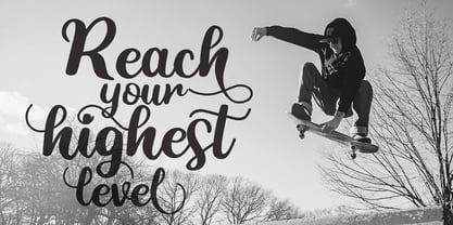 Highest Script Style - a new modern & fresh script with a handwritten and natural script style. This font will make your design look elegant, natural and stylish. Highest Font is perfect for any awesome projects such as photography, watermark, quote design, social media posts, poster, advertisements, logos & branding, invitation, product designs, label, stationery, wedding designs, product packaging, special events or any project that need handwriting taste.
 - Schreibmeister by RMU,
$30.00 Schreibmeister is my interpretation of Arno Drescher’s design for Ludwig Wagner, Leipzig, completed in 1958. The letters X and x were improved as well as some ligatures. The letter E has an alternative, and the small d comes with two alternatives, of which one form can be reached by typing the partial different key. Generally it is recommended to activate both Standard and Discretionary ligatures.
 - Quickbrush by Trial by Cupcakes,
$29.00 Like its cousin Quickpen, Quickbrush is an unfussy, confidently jotted script, with lots of rich texture to recreate the skips and jumps that appear in brush pen lettering. Contextual alternates for lowercase letters mimic starting and ending marks, to make each word look truly written by hand. It’s a typeface you’ll reach for again and again, for any project that needs a casual, handwritten touch.
 - Roxton by Surplus Type Co,
$16.00 Roxton is a feature-filled elegant display serif that you'll be reaching for over & over again! This typeface includes a massive selection of ligatures, making it perfect for a variety of creative projects such as logo design, content creation, packaging designs, stationery & so much more. Add Roxton to your font library today! Feel free to try out the basic version of this font in personal projects only.
 - Declaration Of Love by Letterara,
$14.00 Declaration of love is a beautiful and flowing script font. It is PUA encoded which means you can access all of the glyphs and swashes with ease! It features a varying baseline, smooth lines, gorgeous glyphs, and stunning alternates. It maintains its classy calligraphic influences while feeling contemporary and fresh. Fall in love with its incredibly distinct and timeless style and use it to create spectacular designs!
 - Note by Little Fonts,
$15.00 Note is a fresh and dynamic hand writing font. Inspired by graffitti and street style writing, executed using a flat tip calligraphy pen. The typeface is hand drawn on paper, then the resulting alphabets and punctuation scanned in and rendered to create the font. The resulting characters are bold yet energetic with an obvious human touch creating an interesting and original hand drawn typeface.
 - Seeking Brush by Java Pep,
$15.00 Introducing Fresh from the Oven, a casual handwritten brush font with a signature style called Seeking font. This font comes with ligature and swash, Seeking font is perfect for logotype, display text, headline, branding, advertising, social media posts, etc. Seeking font available for multilingual support that more than 25 languages. What's include Seeking font Seeking Swash PUA encoded Multilingual Support Thanks, and have a nice day
 - Agharti by That That Creative,
$15.00 Agharti is a bold condensed display font perfect for headlines with a punch. The lowercase glyphs reach as high as the capitals so even if you are not typing in all caps you will have a solid impactful block of text. These extra tall lowercase letters will be sure to catch attention from any viewer and add some playful delight to any design project.
 - Easter Risen by Letterara,
$14.00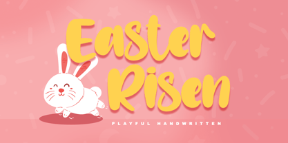 Easter Risen is a new, fresh, sweet, and unique handcrafted font. It's ideal for branding and decorate your projects. Easter Risen font has a classy and modern look that can be used for logos, branding, easter, invitations, posters, advertisements, stationery, animated films, social media posts, youtube channel, and much more! It is PUA coded which means you can access all the glyphs and sweeps easily!
 - Stylish Garden by Balpirick,
$15.00 Stylish Garden is a Modern Handwritten Font. Stylish Garden is an exquisite handwritten font, masterfully designed to become a true favorite. It maintains its classy calligraphic influences while feeling contemporary and fresh. Fall in love with it and bring your projects to the highest levels! Stylish Garden also multilingual support. Enjoy the font, feel free to comment or feedback, send me PM or email. Thank you!
 - Hoyer Script by RMU,
$30.00 Hoyer Script™ is a fresh redesign of Hans Hoyer’s Schoenschrift, a slender vintage italic with a calligraphic touch. This font should be used like my blackletter fonts. It means that the s-key is occupied by the long s, and the round s lies on the #-key. By typing N, o, and period plus activating Ordinals feature you will get an old-style number sign.
 - Morton by Deltatype,
$59.00 Morton, another modern grotesque typeface which deliver a extraordinary unique within typeface with the style of condensed let you create more impact with your design. Morton Type Family available in nine weights, the Thin weight deliver you a simple hair line stem until you reach the bold weight, you will get more dynamic with three stem weights which give you a modern, old school look and feel.
 - Role Model by Ef Studio,
$10.00 Role Model is basic contemporary serif that have clean edges to reach modern feel. Designed to be versatile, this font seamlessly fits into diverse design applications, from digital platforms to print materials. It works harmoniously for both body text and headings, making it a versatile choice for modern design projects. Role Model font has a rich ligatures and created in Regular and Oblique styles.
 - Cambalache by JVB Fonts,
$35.00 The idea for Cambalache was conceived back in 2008 and was to create a geometrical font based on tangential modules into structure. The serif would be arranged, looking to approach to the lettering shapes. The creative concept has a feel from the mid-30s of last century, reaching a taste of retro and vintage style. Includes oldstyle numbers, slashed zero, standard and discretional ligatures.
 - Berliana Elemixia by BlackLotus,
$10.00 Berliana Elemixia is a type of display font with nuances of beauty, class, freshness, and softness that best suits your design needs. This font is ideal for headlines and brand identities. Berliana Elemixia also includes a script version, a bold script, and an ExtraBold script. This font is great when you combine your display and script fonts. This font also have interesting alternate features.
 - Black Blocker by Sign Studio,
$10.00 This is Black Blocker, a font that can make contrast to the text. Having a corner of the box on the inside that becomes unique. It is suitable for posters, titles,banding, tags, quotes and more. Developed from the sans-syerif family makes it easy to apply to designs. Reach many languages with Adobe CE standards (over 331 characters). Take it to make your design be different.
 - Hey Girl by Angele Kamp,
$26.00 Hey Girl is a fun, brush font with a a bouncy baseline. This playful font will give your designs that fresh, modern feel to it and will look lovely on quotes, cards, logo's and all your other lovely projects. Hey Girl has nice smooth lines which makes it perfect for crafters and cutting machines. Hey Girl contains standard characters, lowercase, uppercase, numbers, punctuation, ligatures, and international characters.
 - Garnet by Ksenia Belobrova,
$19.00 Garnet as a modern font kit inspired by fonts and calligraphy of XX centure. It includes Capitals (6 Styles) and Script so you can combine them as you like. Geometric Sans + Handwritten Script is a modern and fresh looking combination which can be used for many tasks. Garnet is good for headlines, posters, packaging, book covers, cards and as a starting point for logotypes.
 - Velveteen Round NF by Nick's Fonts,
$10.00This fresh face takes a number of design cues from Tomás Vellvé Mengual's eponymous design for Barcelona's Neufville Type Foundry in 1971. This version softens many of the lines of the original, and warms the design up overall with rounded terminals. Available in three weights, this font contains the complete Latin language character set (Unicode 1252) plus support for Central European (Unicode 1250) languages as well. - Milla Grace by LABFcreations,
$12.00 Milla Grace is a modern & classic font. This font is ideal for creating logos and branding. With original ligatures. It works perfect for creating sites, logos, striking editorials, invitations, graphic quotes, and more. Uppercase Characters & Discretionary Ligatures. Multilingual support for various languages. For presentation image, pairing script font: Carphe | Modern Luxury Duo font Follow me by Instagram: @labfcreations Made in France with LOVE. © LABFcreations
 - SugarBoo by Inumocca,
$20.00 SugarBoo is A Reverse-Contrast letterform , Modern look, Fresh, eyecatching, strong character and power full. The Typeface comes with Stylistic Set Combinations Exellent typeface to use for covering your Project, like Branding, Movie Title, Headline Letter, Bookcover or Book Content, Magazine cover, Poster, Quotes Lettering, Logos, and more your project design. - Unique glyphs - Multilingual Characters Support - UPPERCASE - Lowercase - Numeric - Symbol - Punctuation Character - Stylistic Set inumocca type Studio
 - Monallesia Script by AEN Creative Studio,
$12.00 Monallesia Script is an elegant and flowing handwritten font. It is PUA encoded which means you can access all of the glyphs and swashes with ease! It features a varying baseline, smooth lines, gorgeous glyphs and stunning alternates. It maintains its classy calligraphic influences while feeling contemporary and fresh. Fall in love with its incredibly versatile style and use it to create spectacular designs!
 - Wild Autumn by Epiclinez,
$18.00 Wild Autumn is a fun and fancy handwritten font, designed to become a true favorite. It maintains its classy calligraphic influences while feeling contemporary and fresh. Fall in love with it and bring your projects to a new height. So what’s included: Basic Latin A-Z & a-z. Numbers, symbols, and punctuations Multilingual Support. Accented Characters : ÀÁÂÃÄÅÆÇÈÉÊËÌÍÎÏÑÒÓÔÕÖØŒŠÙÚÛÜŸÝŽàáâãäåæçèéêëìíîïñòóôõöøœšùúûüýÿžß Thank you. We hope you enjoy the font.
 - Gradl Initialen ML by HiH,
$12.00 Max Joseph Gradl designed Art Nouveau jewelry in Germany. At least some of his designs were produced by Theodor Fahrner of Pforzheim, Germany -- one of the leading manufacturers of fine art jewelry on the Continent from 1855 to 1979. I don't know if he designed for Fahrner exclusively, but every example I found was produced by that firm. I assume it was also the same M.J, who edited a book, Authentic Art Nouveau Stained Glass which was reissued by Dover and is still available. For an artist as accomplished as Gradl was, he is very tough to research. There just does not seem to have been much written about him. The jeweler is visible in most of his typeface designs. They exhibit a sculptural quality as if they were modeled in clay (or gold) rather than drawn on paper. His monograms, especially, reflect that quality. Those shown in plates 112 through 116 in Petzendorfer actually appear to have been designed specifically for fabricating in the form of gold or silver pendents. Of the initial letters that came out of Germany during this period, these by Gradl seem unusually open and lyrical. They seem to be dancing on the page, rather than sitting. Please note that Gradl designed only the decorated initials. All other characters supplied were extrapolated by HiH, including the accented initials. Orn.1 (unicode E004) is based on a jeweled gold clasp designed by Gradl (please check out Gallery Image on Myfonts.com). Also included are an art nouveau girl’s face, a swan and the face from Munch’s “Scream”, from scans of old printer’s ornaments. Gradl Initialen M represents a major extension of the original release, with the following changes: 1. Added glyphs for the 1250 Central Europe, the 1252 Turkish and the 1257 Baltic Code Pages. Added glyphs to complete standard 1252 Western Europe Code Page. Special glyphs relocated and assigned Unicode codepoints, some in Private Use area. Total of 341 glyphs. Both upper & lower case provided with appropriate accents. 2. 558 Kerning Pairs. 3. Added OpenType GSUB layout features: salt, dlig, ornm and kern. 4. Revised vertical metrics for improved cross-platform line spacing. 5. Refined various glyph outlines. 6. Alternative characters: 16 upper case letters (with gaps in surrounding decorations for accents above letter). 8. Four Ornaments: face1, face2, swan and orn1 (silhouette of Gradl clasp) The zip package includes two versions of the font at no extra charge. There is an OTF version which is in Open PS (Post Script Type 1) format and a TTF version which is in Open TT (True Type)format. Use whichever works best for your applications.
 - Kaeswaii by insigne,
$29.99 Introducing Kaeswaii, a font that is ideal for anyone wishing to infuse their creations with a dash of inspiration and delight. It's ideal for producing fresh designs that will stand out thanks to its unique contrast and rounded serifs. It has a joyful feel because of its high x-height, and its playful serifs give it a funky touch. Kaeswaii has enough variety to help your project look better than the rest with forty-eight different styles. Select from nine weights and italics for the standard, condensed, and extended styles. It has rounded corners and a luscious texture and a squishy, gloopy vibe. Atarimae, the hint is to use Kaeswaii when you want to infuse your products with a dash of inspiration and delight. It has a happy feel with its high x-height and rounded serifs. It's ideal for producing fresh designs. Put a playful spin on your work with the unique personality of Kaeswaii's rounded terminals. Let Kaeswaii bring life to your ideas!
 - Madrea by Craft Supply Co,
$20.00 Introducing Madrea – Friendly Sans Serif Unconventional Charm Madrea – Friendly Sans Serif is anything but conventional; it introduces a unique and friendly twist to your designs. Irregular Shapes What sets Madrea apart is its irregular shapes, which establish a welcoming and friendly atmosphere. This makes it the perfect choice for designs seeking to break free from formality and monotony. A Breath of Fresh Air In the realm of sans serif fonts, Madrea is indeed a breath of fresh air. Its non-uniformity and organic feel breathe personality and approachability into your projects. Breaking Formality Madrea excels at breaking the chains of formality. It’s an ideal choice for design projects that demand a friendly and informal touch, effortlessly transforming the mundane into something captivating. In Conclusion In summary, Madrea – Friendly Sans Serif is your gateway to a non-uniform, friendly design experience. Its irregular shapes infuse character, warmth, and a refreshing departure from conventional design, ensuring that your creations are brimming with life and far from monotonous.
 - Espinosa Nova by Estudio CH,
$- Espinosa Nova is a revival based on the types used by Antonio de Espinosa, the most important Mexican printer of the sixteenth century and very probably the first punchcutter anywhere in the American continent (1551). In 2010, its main fonts were awarded two certificates of excellence: one by TDC2 (Type Directors Club Typeface Design Competition), one by Tipos Latinos (Biennial of Latin American Typography). According to Robert Bringhurst, it is “an unusually intelligent family of type, reaching back to one of the most exciting moments in typographic history and reaching forward to the typographic future”. All of the fonts intended for setting text include small caps, five sets of figures (oldstyle and lining, both proportional and tabular, plus tabular small caps), many f and long s ligatures, and capital sharp S (U+1E9E). In addition, the Capitular fonts allow to create interesting effects by overlapping layers. This family feels very comfortable in books, but it can be used everywhere a touch of classic & elegance is required.
 - TT Milks by TypeType,
$29.00 TT Milks useful links: Specimen | Graphic presentation | Customization options About TT Milks: The collection of scripts and wonderful decorative typefaces. Initially the idea for TT Milks was to create a collection of fonts to be used for packaging and branding of dairy products. While working on the initial idea, we've tested all possible glyph variations, which resulted in a large decorative designer font family. Thanks to a variety of elements, TT Milks collection has exceeded its initial idea and now offers an unlimited application range. TT Milks type collection includes several subfamilies and consists of 26 typefaces: TT Milks Script subfamily is a satellite to the basic typefaces and features 5 weights. Every typeface of the TT Milks Script subfamily consists of 801 glyphs and supports a lot of OT features: ordn, frac, case, sups, sinf, numr, dnom, tnum, onum, pnum, liga, calt. TT Milks Casual Script consists of two script faces with a different degree of roughness. In TT Milks Casual we've collected 6 typefaces—the unique Black called 900 in three degrees of roughness, and the Bold called 700 featuring three degrees of roughness as well. TT Milks Casual Shadow is a version with broader letter setting and shadow effects. There's a clean shadowed version, three variants of rough typefaces with shadows, and a rough shadowed inline typeface—5 typefaces in total. TT Milks Casual Pie is a special set of typefaces which can be easily combined with each other using different layers. The set of the subfamily includes two basic typefaces—black and inline, and also features a typeface with a clean shadow, a shadowed inline typeface and line typeface. TT Milks Outline completes the collection. It consists of a total of 3 amusing super-display typefaces—outline, outline shadow, and a cow pelt patterned typeface. All typefaces belonging to TT Milks Casual and TT Milks Outline subfamilies contain uppercase letters only, and support tabular numbers and case sensitivity. TT Milks language support: Acehnese, Afar, Albanian, Alsatian, Aragonese, Arumanian, Asu, Aymara, Banjar, Basque, Belarusian (cyr), Bemba, Bena, Betawi, Bislama, Boholano, Bosnian (cyr), Bosnian (lat), Breton, Bulgarian (cyr), Cebuano, Chamorro, Chiga, Colognian, Cornish, Corsican, Cree, Croatian, Czech, Danish, Embu, English, Erzya, Estonian, Faroese, Fijian, Filipino, Finnish, French, Friulian, Gaelic, Gagauz (lat), Galician, German, Gusii, Haitian Creole, Hawaiian, Hiri Motu, Hungarian, Icelandic, Ilocano, Indonesian, Innu-aimun, Interlingua, Irish, Italian, Javanese, Judaeo-Spanish, Judaeo-Spanish, Kalenjin, Karachay-Balkar (lat), Karaim (lat), Karakalpak (lat), Kashubian, Khasi, Khvarshi, Kinyarwanda, Kirundi, Kongo, Kumyk, Kurdish (lat), Ladin, Latvian, Laz, Leonese, Lithuanian, Luganda, Luo, Luxembourgish, Luyia, Macedonian, Machame, Makhuwa-Meetto, Makonde, Malay, Manx, Maori, Mauritian Creole, Minangkabau, Moldavian (lat), Montenegrin (lat), Mordvin-moksha, Morisyen, Nahuatl, Nauruan, Ndebele, Nias, Nogai, Norwegian, Nyankole, Occitan, Oromo, Palauan, Polish, Portuguese, Quechua, Rheto-Romance, Rohingya, Romanian, Romansh, Rombo, Rundi, Russian, Rusyn, Rwa, Salar, Samburu, Samoan, Sango, Sangu, Scots, Sena, Serbian (cyr), Serbian (lat), Seychellois Creole, Shambala, Shona, Slovak, Slovenian, Soga, Somali, Sorbian, Sotho, Spanish, Sundanese, Swahili, Swazi, Swedish, Swiss German, Swiss German, Tagalog, Tahitian, Taita, Tatar, Tetum, Tok Pisin, Tongan, Tsonga, Tswana, Turkish, Turkmen (lat), Ukrainian, Uyghur, Vepsian, Volapük, Võro, Vunjo, Xhosa, Zaza, Zulu.
 - FF Signa Round by FontFont,
$72.99 FF Signa Rounded is a natural complement to the rest of the FF Signa super family – and can stand on its own in a variety of print and on-screen applications. The design is Ole Søndergaard’s rounded branch in his FF Signa family three. In it, he took the distinctive shapes and proportions of FF Signa Sans and created a warm, inviting design for text and display copy. Like its parent design, FF Signa Round is not a humanistic sans, nor is it based on 19th-century grotesques. Its characters are minimalist interpretations of letterforms – distinctive, yet easy to read. Thanks to FF Signa Round’s large x-height, open counters and simple character shapes, the design does not overpower the message – and draws the reader in. At substantial sizes, especially in the bolder weights, the design communicates with amiable conviction. At text sizes, FF Signa Round remains inviting and legible. It can be used as a companion to the rest of the FF Signa family, providing depth of style and breadth of reach. The collection of designs can also be used on their own for brand, brochure, publication, and way-finding design in digital and hard copy environments. Like the rest of the FF Signa family, OpenType® Pro fonts of FF Signa Round provide for the automatic insertion of ligatures and alternate characters, and also offer an extended character set supporting over 100 languages, including most Central European and many Eastern European – in addition to Cyrillic and Greek.
 - FS Brabo Paneuropean by Fontsmith,
$90.00Worldly Even though it’s a new arrival, FS Brabo has seen the world. Designed by a Brazilian working in London and studying in Belgium under a Dutchman, it’s certainly well-travelled. And it was inspired by the extraordinary archive of early book typefaces at the world-renowned Plantin-Moretus Museum in Antwerp, while Fernando Mello was attending Frank Blokland’s Expert class Type Design course at the Plantin Institute of Typography. It was there that Fernando became engrossed in the collection of early metal type, matrices, punches and type samples by figures such as Garamond and Granjon. So much so that he took on the mighty task of developing ‘a beautiful, functional, serifed text font’ of his own. Heroic FS Brabo’s journey from sketch to font family took an epic three years, starting in Antwerp, continuing at Fontsmith in London, and reaching its conclusion back in Fernando’s home city of São Paulo. No wonder Fernando was reminded of another titanic face-off: that of Antwerp’s Roman hero of legend, Silvius Brabo, and the evil ogre, Antigoon. Brabo came to the town’s rescue after the tyrannical giant had been charging ships’ captains extortionate taxes and chopping off the hands of those who refused to pay up. Having finally downed Antigoon after a long and terrible duel, Brabo cut off the giant’s own hand and threw it into the river Scheldt, unwittingly giving the town its name: the Dutch for ‘hand-throw’ is hand werpen. What better way for Fernando to name his literary typeface than after the hero of Antwerp’s oldest tale? The garalde factor FS Brabo is not a revival, but a very much a contemporary, personal interpretation of a garalde – a class of typeface originating in the 16th century that includes Bembo, Garamond and Plantin, with characteristically rounded serifs and moderate contrast between strokes. Brabo’s ‘ct’ and ‘st’ ligatures, upper-case italic swashes and contextual ending ligatures – ‘as’, ‘is’, ‘us’ – all preserve the beauty and character of traditional typefaces, but its serifs are chunkier than a garalde. Their sharp cuts and squared edges give them a crispness at text sizes, helping to bring a beautifully bookish personality to hardworking modern applications. A workhorse with pedigree It may give the appearance of a simple, four-weight typeface, but FS Brabo has hidden depths beneath its simplicity and beauty. OpenType features such as cap italic swashes, contextual ending swashes – programmed only to appear at the end of words – and stylistic alternatives make this a complete and well-equipped typeface. Comprehensive testing was carried out at text and display sizes, too, to prevent counters from filling in. All of which makes FS Brabo a very modern take on a traditional workhorse serif typeface: colourful and versatile enough to adorn not just editorial projects but also signage, advertising and logotypes. - FS Brabo by Fontsmith,
$80.00 Worldly Even though it’s a new arrival, FS Brabo has seen the world. Designed by a Brazilian working in London and studying in Belgium under a Dutchman, it’s certainly well-travelled. And it was inspired by the extraordinary archive of early book typefaces at the world-renowned Plantin-Moretus Museum in Antwerp, while Fernando Mello was attending Frank Blokland’s Expert class Type Design course at the Plantin Institute of Typography. It was there that Fernando became engrossed in the collection of early metal type, matrices, punches and type samples by figures such as Garamond and Granjon. So much so that he took on the mighty task of developing ‘a beautiful, functional, serifed text font’ of his own. Heroic FS Brabo’s journey from sketch to font family took an epic three years, starting in Antwerp, continuing at Fontsmith in London, and reaching its conclusion back in Fernando’s home city of São Paulo. No wonder Fernando was reminded of another titanic face-off: that of Antwerp’s Roman hero of legend, Silvius Brabo, and the evil ogre, Antigoon. Brabo came to the town’s rescue after the tyrannical giant had been charging ships’ captains extortionate taxes and chopping off the hands of those who refused to pay up. Having finally downed Antigoon after a long and terrible duel, Brabo cut off the giant’s own hand and threw it into the river Scheldt, unwittingly giving the town its name: the Dutch for ‘hand-throw’ is hand werpen. What better way for Fernando to name his literary typeface than after the hero of Antwerp’s oldest tale? The garalde factor FS Brabo is not a revival, but a very much a contemporary, personal interpretation of a garalde – a class of typeface originating in the 16th century that includes Bembo, Garamond and Plantin, with characteristically rounded serifs and moderate contrast between strokes. Brabo’s ‘ct’ and ‘st’ ligatures, upper-case italic swashes and contextual ending ligatures – ‘as’, ‘is’, ‘us’ – all preserve the beauty and character of traditional typefaces, but its serifs are chunkier than a garalde. Their sharp cuts and squared edges give them a crispness at text sizes, helping to bring a beautifully bookish personality to hardworking modern applications. A workhorse with pedigree It may give the appearance of a simple, four-weight typeface, but FS Brabo has hidden depths beneath its simplicity and beauty. OpenType features such as cap italic swashes, contextual ending swashes – programmed only to appear at the end of words – and stylistic alternatives make this a complete and well-equipped typeface. Comprehensive testing was carried out at text and display sizes, too, to prevent counters from filling in. All of which makes FS Brabo a very modern take on a traditional workhorse serif typeface: colourful and versatile enough to adorn not just editorial projects but also signage, advertising and logotypes.
 - Fried Chicken by FontMesa,
$25.00 The name of this font brings back memories of an old fried chicken restaurant in Willow Springs Illinois circa 1960’s and 1970’s, my family would all get in the car and take a long drive down to an old country road Illionis Rt 171 through a forest preserve where we’d come upon the old Willowbrook motel with a bar and restaurant next door. The restaurant was called Kegal’s, when you entered the building you had to walk through the smoky bar first to get to the restaurant, I can still see the hard wood floors with all the finish worn off from decades of foot traffic. Up until the mid 1960’s Kegal’s used to raise their own chickens behind the restaurant, back then fried chicken in the Midwest was either coated in flour or bread crumbs, Kegal’s was covered in a beautiful layer of golden bread crumbs. Before your meal arrived they’d bring a basket of dinner rolls along with crackers, bread sticks and country butter, on the side they’d serve coleslaw with a vinegar sauce, which is very common in the Midwest, the first time you try it your face puckers up like you just sucked on a lemon but you get used it over time. After waiting for what seemed like forever to a child the waitress comes out of the kitchen with a huge tray of that golden deliciousness and your mouth begins to water, in her other hand was another tray filled to overflowing with crinkle cut french fries all made by hand, I’d eat a hole handful of those french fries first then take a bite of that tender juicy farm raised chicken. Today a fine Italian restaurant occupies the old Kegal’s building and the motel is long gone, only my fond memories remain. Fast forward to 2020 and FontMesa has just made some Fried Chicken as an eight weight type font family with alternates. With the Fried Chicken slab serif font family we’ve broken some rules by removing a few of the slabs on certain letters for a unique homemade look. Fried Chicken is perfect for your next product label, t-shirt design, logo, headline or cookbook cover. Treat yourself to some good ol’ Fried Chicken today.