10,000 search results
(0.089 seconds)
- Bottuckey by Alit Design,
$20.00 Presenting the Bottucke Signature Script font by alitdesign. The Bottucke Signature Script font is inspired by spontaneous and dynamic signature strokes with an ink texture that makes the Bottucke Signature Script look real. The Bottucke Signature Script font looks unique and charming which makes designs using the Bottucke Signature Script look more prominent and cool. The Bottucke Signature Script font is perfect for a collection of new fonts on your computer, tablet and smartphone for making unique designs or lettering. The Bottucke Signature Script font is perfect for magazine cover designs, brochures, flyers. Instagram ads, Canva Design and so on with unique and modern concepts. besides that this font is very easy to use both in design and non-design programs because everything changes and glyphs are supported by Unicode (PUA). The Bottucke Signature Script contains 648 glyphs with many unique and interesting alternative options. Language Support : Latin, Basic, Western European, Central European, South European,Vietnamese. In order to use the beautiful swashes, you need a program that supports OpenType features such as Adobe Illustrator CS, Adobe Photoshop CC, Adobe Indesign and Corel Draw. but if your software doesn't have Glyphs panel, you can install additional swashes font files.
 - Mrattoos by Alit Design,
$22.00 Presenting the Mrattoos Signature Script font by alitdesign. The Mrattoos Signature Script font is inspired by spontaneous and dynamic signature strokes with an ink texture that makes the Mrattoos Signature Script look real. The Mrattoos Signature Script font looks unique and charming which makes designs using the Mrattoos Signature Script look more prominent and cool. The Mrattoos Signature Script font is perfect for a collection of new fonts on your computer, tablet and smartphone for making unique designs or lettering. The Mrattoos Signature Script font is perfect for magazine cover designs, brochures, flyers. Instagram ads, Canva Design and so on with unique and modern concepts. besides that this font is very easy to use both in design and non-design programs because everything changes and glyphs are supported by Unicode (PUA). The Mrattoos Signature Script contains 700 glyphs with many unique and interesting alternative options. Language Support : Latin, Basic, Western European, Central European, South European,Vietnamese. In order to use the beautiful swashes, you need a program that supports OpenType features such as Adobe Illustrator CS, Adobe Photoshop CC, Adobe Indesign and Corel Draw. but if your software doesn't have Glyphs panel, you can install additional swashes font files.
 - Backstage Pass NF by Nick's Fonts,
$10.00Turn on the mirrored ball, and haul out the gold chains and white suits! This Disco dazzler is a new take on Bass Rainbow, designed by Saul Bass in the 1970s. Hip, hot and heavy, this typeface is ready to get down. This font contains the complete Latin language character set (Unicode 1252) plus support for Central European (Unicode 1250) languages as well. - Sunshine Delivery by Hanoded,
$15.00 After a long period of wind, rain and cold, summer has finally arrived. It almost felt as if the sunny weather came as a special delivery! Sunshine Delivery is a handmade display font. It comes in a regular, angular version and a rounded one. Need Vietnamese support? Check! Want some Sami? Got it! Feel like a bit of Greek? Dive right in!
 - ND Nudel by NeueDeutsche,
$15.00 I've been really tryin', baby, tryin' to hold back this Rounded Sans for so long. ND Nudel is the food-positive typeface you have been (secretly or not so secretly) waiting for! Stop beatin' 'round the bush and get into all the (20) tasty, yummy, and shameless zesty stylistic variations. Vanilla or with as many tangy alternates as you could imagine.
 - Giacinta by Okaycat,
$29.50Giacinta is developed as a fresh alternate take on the traditional black-letter style. Rather than simply reproducing the standard uncial or Old English style, Luke William Turvey followed the tradition of Bastarda, making up his own scripted style with the Latin standards in mind. This style was conjured purely from imagination, so while it bares a resemblance to the standards, keeps its own original flavor. Giacinta is extended, containing the full West European diacritics & a full set of ligatures, making it suitable for multilingual environments & publications. Use Giacinta for medieval themed projects, certificates, awards, diplomas, anything that you want to look old fashioned and stately. - Bernhardt Standard by Linotype,
$40.99Bernhardt Standard, which was designed in 2003 by Julius de Goede, is a flowing Bastarde script. Bastarde is one of the sub-categories of Blackletter typefaces. The term Blackletter refers to typefaces that have evolved out of Northern Europe’s medieval manuscript tradition. Often called gothic, or Old English, these letters are identifiable by the traces of the wide-nibbed pen stroke within their forms. Of all of the various sorts of Blackletter styles, Bastarde scripts are the most flowing, or Italic. The first Bastarde typefaces, cut in the late 1400s, were based on French handwriting styles, especially those styles popular in Burgundy. The flowing nature of Bernhardt Standard makes it similar to some other sorts of Blackletter typefaces as well. Bernhardt Standard, because of its handwritten roots, is also similar to Kurrent, a style of handwriting that was popular in Germany prior the 20th Century. Bernhardt Standard is a very calligraphic face, suitable for formal applications. This typeface would be an excellent choice for certificates or awards. The old style figures in the font allow for nice short settings of text as well. - Corinth by Albatross,
$19.00 Do you need that perfectly-imperfect yet highly legible font to pair with a script or supplement a logo? Corinth is a hand drawn geo sans with 4 styles plus ornaments that pairs well with scripts, is readable at small sizes and still achieves the retro, or hand made feel. The classic geometric letterforms in combination with the imperfections of being hand drawn give Corinth a unique personality without sacrificing legibility. Corinth is a small caps family with comprehensive language support, uppercase and lowercase alternates, double-letter ligatures for added realism, and over 100 ornaments and symbols. Corinth's legibility and classic style makes it very handy for any designer's arsenal and comes in useful for almost any subject matter.
 - Moku Brush by Deltatype,
$49.00 Moku Brush is a structural brush script inspired from handwriting with brush, with straight letterform you will get less formal but more sweet! Moku Brush come with nine weights, so you can use as body text or even better with headline. With nine variations, you can use this font in different sizes with different weights, you will get better balance when do type setup.
 - Origami Incised by ArtyType,
$29.00 Once I set on the concept for this ‘Origami’ inspired font, I used an imaginary strip of folded paper as the basis for each character, the folded effect being realized fully by incorporating an incised line. Of course the folded paper aspect is just a two dimensional illusion but subconsciously, will automatically be interpreted three dimensionally. There are numerous options for creating alternative characters following this logic, as the centuries-old Origami tradition itself illustrates quite clearly, but I wanted to maintain an ordered sense of style and balance throughout the full character set, so avoided any unnecessary flourishes, staying true to the Japanese ethos and spirit.
 - Sequence by Prototype Fonts,
$20.00Experimental script font. - SassyFrass ROB by TypeSETit,
$24.95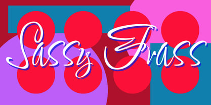 Fun, handlettered script.
 - Falcon Brushscript by TypeArt Foundry,
$45.00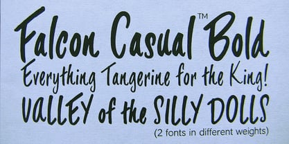 A casual script.
 - Another Shabby by Zetafonts,
$39.00 Another Shabby is a script typeface family. Its shapes are defined by rough, wide brushstrokes, slightly rounded in corners to mimic the feel of a real handwritten casual script.
 - Paula by Autographis,
$39.50 Paula is a non-joining rough brush script with traces of the brush's backstroke that give it that typical look. Paula is an open script with very good readability.
 - Quire Sans by Monotype,
$155.99 My goal was to make a design that might fit in anywhere,” says Jim Ford about his Quire Sans™ typeface. “I wanted it to be highly functional and sexy at the same time.” With one foot comfortably in the realm of oldstyle design and traditional book typography, and the other in evolving electronic media, the Quire Sans family does, indeed, fit in just about anywhere. As for sexy, someone once quotably wrote, “A great figure or physique is nice, but it's self-confidence that makes someone really sexy.” Yes, Quire Sans is sexy, performing confidently in virtually any setting. 2014-06-26 00:00:00.000 57.9900 F43063-S193385 42831 Neue Frutiger World Monotype https://www.myfonts.com/collections/neue-frutiger-world-font-monotype-imaging https://cdn.myfonts.net/cdn-cgi/image/width=417,height=208,fit=contain,format=auto/images/pim/10000/279026_ed8c8093fe1ac59ebe9e3ee1d9262c8e.png Neue Frutiger World is designed for global use with an impressive range of 10 weights, from Ultra Light to Extra Black, with matching italics. It embodies the same warmth and clarity as Adrian Frutiger’s original design, but allows brands to maintain their visual identity, and communicate with a consistent tone of voice, regardless of the language. Neue Frutiger World supports more than 150 languages and scripts including Latin, Greek, Cyrillic, Georgian, Armenian, Hebrew, Arabic, Thai and Vietnamese. “Before Neue Frutiger World it was not an easy task for western brands to find families in Arabic, Hebrew, Thai and Vietnamese which match with their Latin,” says Monotype type director Akira Kobayashi, who led the Neue Frutiger World project. “They may find a type with closer expression, but there was no guarantee if the bold version in the non-Latin family matches the bold in their Latin. Neue Frutiger World offers a better solution.” In addition to Neue Frutiger World’s linguistic versatility, it works hard across environments – suited to branding and corporate identity, advertising, signage, wayfinding, print, and digital environments. The Neue Frutiger World fonts can be paired with Monotype’s CJK fonts: M XiangHe Hei (Chinese), Tazugane Gothic (Japanese), Tazugane Info (Japanese), and Seol Sans (Korean). These were all designed to address brands’ needs to expand into Asian cultures and solve for global typographic challenges.
 - Abesif by Twinletter,
$12.00 Introducing Abesif sans serif font. This font is stretched from the normal theme, it is boring, while different, it seems strange. from there we design the appearance of this font that is not normal so that it is not boring and we display it differently but not look strange. so if you use this font it will look different from the others but it doesn't look strange because it has a normal design. so that it creates an impression that is easy for each of your audience to remember when they first see your project. This font is very suitable as text with displays for various kinds of branding, advertisements, posters, banners, packaging, news headlines, magazines, websites, logo design, banners, social media design and of course you can use a lot more.
 - Debaya by Sensatype Studio,
$15.00 Debaya is an Old Retro Vintage Font An Old Retro Vintage font that special created with Display style for Headline Vintage Retro Project, Unique branding needs, with extra alternates in unique style that ready to add value of your brand. Debay Old Retro Vintage Font ready with: Lowercase and Uppercase characters Numbers and Punctuations Preview as a inspirations that you can do with Montainous font Available for PC and Mac Wish you enjoy our font.
 - ABTS Day Of The Dead by Albatross,
$19.95 ABTS day of the dead is a highly detailed and meticulously designed symbol font. It’s design is inspired by the Day of the Dead celebration, honoring the deceased. I think The Day of the Dead is one of the greatest reasons anyone should celebrate life, so I decided to make a font honoring that tradition. I'm not even sure If I got all of it right, (traditional symbols and such) but it was a joy to create. There are 2 fonts. The first is the Skulls. This includes uppercase and lowercase A-Z, a-z. There you will find the decorated skulls, blank skulls, and negatives. The second font is the symbols. If you wish to design your own Day of the Dead skull, you should purchase the symbols, as they are designed specifically for adorning the blanks. Purchasing both fonts will give you a discount. Please note, the symbol font will show up in your application of choice as “ABTS Day of the Dead Bold.” This is to avoid software problems with naming the font itself "Symbols." Skulls are awesome!!!
 - DearJohn by Ingrimayne Type,
$14.95 Originally I called this font YearInYearOutYoureInUrine, but I was told that that name was too long and maybe not in good taste. I settled for WaterCloset when it was first released, but then renamed it with a more appropriate title. It is caps only but the letters on the lower-case keys differ from those on the upper-case keys. It comes with a large assortment of accented letters to support most European languages. Although you certainly would not want to use it for formal invitations, when bad taste is called for, it might be ideal.
 - DejaVu Sans Mono - Unknown license

- DejaVu Serif Condensed - Unknown license

- Times Eighteen by Linotype,
$29.00In 1931, The Times of London commissioned a new text type design from Stanley Morison and the Monotype Corporation, after Morison had written an article criticizing The Times for being badly printed and typographically behind the times. The new design was supervised by Stanley Morison and drawn by Victor Lardent, an artist from the advertising department of The Times. Morison used an older typeface, Plantin, as the basis for his design, but made revisions for legibility and economy of space (always important concerns for newspapers). As the old type used by the newspaper had been called Times Old Roman," Morison's revision became "Times New Roman." The Times of London debuted the new typeface in October 1932, and after one year the design was released for commercial sale. The Linotype version, called simply "Times," was optimized for line-casting technology, though the differences in the basic design are subtle. The typeface was very successful for the Times of London, which used a higher grade of newsprint than most newspapers. The better, whiter paper enhanced the new typeface's high degree of contrast and sharp serifs, and created a sparkling, modern look. In 1972, Walter Tracy designed Times Europa for The Times of London. This was a sturdier version, and it was needed to hold up to the newest demands of newspaper printing: faster presses and cheaper paper. In the United States, the Times font family has enjoyed popularity as a magazine and book type since the 1940s. Times continues to be very popular around the world because of its versatility and readability. And because it is a standard font on most computers and digital printers, it has become universally familiar as the office workhorse. Times™, Times™ Europa, and Times New Roman™ are sure bets for proposals, annual reports, office correspondence, magazines, and newspapers. Linotype offers many versions of this font: Times™ is the universal version of Times, used formerly as the matrices for the Linotype hot metal line-casting machines. The basic four weights of roman, italic, bold and bold italic are standard fonts on most printers. There are also small caps, Old style Figures, phonetic characters, and Central European characters. Times™ Ten is the version specially designed for smaller text (12 point and below); its characters are wider and the hairlines are a little stronger. Times Ten has many weights for Latin typography, as well as several weights for Central European, Cyrillic, and Greek typesetting. Times™ Eighteen is the headline version, ideal for point sizes of 18 and larger. The characters are subtly condensed and the hairlines are finer. Times™ Europa is the Walter Tracy re-design of 1972, its sturdier characters and open counterspaces maintain readability in rougher printing conditions. Times New Roman™ is the historic font version first drawn by Victor Lardent and Stanley Morison for the Monotype hot metal caster." - Times Europa LT by Linotype,
$29.99In 1931, The Times of London commissioned a new text type design from Stanley Morison and the Monotype Corporation, after Morison had written an article criticizing The Times for being badly printed and typographically behind the times. The new design was supervised by Stanley Morison and drawn by Victor Lardent, an artist from the advertising department of The Times. Morison used an older typeface, Plantin, as the basis for his design, but made revisions for legibility and economy of space (always important concerns for newspapers). As the old type used by the newspaper had been called Times Old Roman," Morison's revision became "Times New Roman." The Times of London debuted the new typeface in October 1932, and after one year the design was released for commercial sale. The Linotype version, called simply "Times," was optimized for line-casting technology, though the differences in the basic design are subtle. The typeface was very successful for the Times of London, which used a higher grade of newsprint than most newspapers. The better, whiter paper enhanced the new typeface's high degree of contrast and sharp serifs, and created a sparkling, modern look. In 1972, Walter Tracy designed Times Europa for The Times of London. This was a sturdier version, and it was needed to hold up to the newest demands of newspaper printing: faster presses and cheaper paper. In the United States, the Times font family has enjoyed popularity as a magazine and book type since the 1940s. Times continues to be very popular around the world because of its versatility and readability. And because it is a standard font on most computers and digital printers, it has become universally familiar as the office workhorse. Times™, Times™ Europa, and Times New Roman™ are sure bets for proposals, annual reports, office correspondence, magazines, and newspapers. Linotype offers many versions of this font: Times™ is the universal version of Times, used formerly as the matrices for the Linotype hot metal line-casting machines. The basic four weights of roman, italic, bold and bold italic are standard fonts on most printers. There are also small caps, Old style Figures, phonetic characters, and Central European characters. Times™ Ten is the version specially designed for smaller text (12 point and below); its characters are wider and the hairlines are a little stronger. Times Ten has many weights for Latin typography, as well as several weights for Central European, Cyrillic, and Greek typesetting. Times™ Eighteen is the headline version, ideal for point sizes of 18 and larger. The characters are subtly condensed and the hairlines are finer. Times™ Europa is the Walter Tracy re-design of 1972, its sturdier characters and open counterspaces maintain readability in rougher printing conditions. Times New Roman™ is the historic font version first drawn by Victor Lardent and Stanley Morison for the Monotype hot metal caster." - Times Ten by Linotype,
$40.99In 1931, The Times of London commissioned a new text type design from Stanley Morison and the Monotype Corporation, after Morison had written an article criticizing The Times for being badly printed and typographically behind the times. The new design was supervised by Stanley Morison and drawn by Victor Lardent, an artist from the advertising department of The Times. Morison used an older typeface, Plantin, as the basis for his design, but made revisions for legibility and economy of space (always important concerns for newspapers). As the old type used by the newspaper had been called Times Old Roman," Morison's revision became "Times New Roman." The Times of London debuted the new typeface in October 1932, and after one year the design was released for commercial sale. The Linotype version, called simply "Times," was optimized for line-casting technology, though the differences in the basic design are subtle. The typeface was very successful for the Times of London, which used a higher grade of newsprint than most newspapers. The better, whiter paper enhanced the new typeface's high degree of contrast and sharp serifs, and created a sparkling, modern look. In 1972, Walter Tracy designed Times Europa for The Times of London. This was a sturdier version, and it was needed to hold up to the newest demands of newspaper printing: faster presses and cheaper paper. In the United States, the Times font family has enjoyed popularity as a magazine and book type since the 1940s. Times continues to be very popular around the world because of its versatility and readability. And because it is a standard font on most computers and digital printers, it has become universally familiar as the office workhorse. Times™, Times™ Europa, and Times New Roman™ are sure bets for proposals, annual reports, office correspondence, magazines, and newspapers. Linotype offers many versions of this font: Times™ is the universal version of Times, used formerly as the matrices for the Linotype hot metal line-casting machines. The basic four weights of roman, italic, bold and bold italic are standard fonts on most printers. There are also small caps, Old style Figures, phonetic characters, and Central European characters. Times™ Ten is the version specially designed for smaller text (12 point and below); its characters are wider and the hairlines are a little stronger. Times Ten has many weights for Latin typography, as well as several weights for Central European, Cyrillic, and Greek typesetting. Times™ Eighteen is the headline version, ideal for point sizes of 18 and larger. The characters are subtly condensed and the hairlines are finer. Times™ Europa is the Walter Tracy re-design of 1972, its sturdier characters and open counterspaces maintain readability in rougher printing conditions. Times New Roman™ is the historic font version first drawn by Victor Lardent and Stanley Morison for the Monotype hot metal caster." - Times Ten Paneuropean by Linotype,
$92.99In 1931, The Times of London commissioned a new text type design from Stanley Morison and the Monotype Corporation, after Morison had written an article criticizing The Times for being badly printed and typographically behind the times. The new design was supervised by Stanley Morison and drawn by Victor Lardent, an artist from the advertising department of The Times. Morison used an older typeface, Plantin, as the basis for his design, but made revisions for legibility and economy of space (always important concerns for newspapers). As the old type used by the newspaper had been called Times Old Roman," Morison's revision became "Times New Roman." The Times of London debuted the new typeface in October 1932, and after one year the design was released for commercial sale. The Linotype version, called simply "Times," was optimized for line-casting technology, though the differences in the basic design are subtle. The typeface was very successful for the Times of London, which used a higher grade of newsprint than most newspapers. The better, whiter paper enhanced the new typeface's high degree of contrast and sharp serifs, and created a sparkling, modern look. In 1972, Walter Tracy designed Times Europa for The Times of London. This was a sturdier version, and it was needed to hold up to the newest demands of newspaper printing: faster presses and cheaper paper. In the United States, the Times font family has enjoyed popularity as a magazine and book type since the 1940s. Times continues to be very popular around the world because of its versatility and readability. And because it is a standard font on most computers and digital printers, it has become universally familiar as the office workhorse. Times™, Times™ Europa, and Times New Roman™ are sure bets for proposals, annual reports, office correspondence, magazines, and newspapers. Linotype offers many versions of this font: Times™ is the universal version of Times, used formerly as the matrices for the Linotype hot metal line-casting machines. The basic four weights of roman, italic, bold and bold italic are standard fonts on most printers. There are also small caps, Old style Figures, phonetic characters, and Central European characters. Times™ Ten is the version specially designed for smaller text (12 point and below); its characters are wider and the hairlines are a little stronger. Times Ten has many weights for Latin typography, as well as several weights for Central European, Cyrillic, and Greek typesetting. Times™ Eighteen is the headline version, ideal for point sizes of 18 and larger. The characters are subtly condensed and the hairlines are finer. Times™ Europa is the Walter Tracy re-design of 1972, its sturdier characters and open counterspaces maintain readability in rougher printing conditions. Times New Roman™ is the historic font version first drawn by Victor Lardent and Stanley Morison for the Monotype hot metal caster." - Times by Linotype,
$40.99In 1931, The Times of London commissioned a new text type design from Stanley Morison and the Monotype Corporation, after Morison had written an article criticizing The Times for being badly printed and typographically behind the times. The new design was supervised by Stanley Morison and drawn by Victor Lardent, an artist from the advertising department of The Times. Morison used an older typeface, Plantin, as the basis for his design, but made revisions for legibility and economy of space (always important concerns for newspapers). As the old type used by the newspaper had been called Times Old Roman," Morison's revision became "Times New Roman." The Times of London debuted the new typeface in October 1932, and after one year the design was released for commercial sale. The Linotype version, called simply "Times," was optimized for line-casting technology, though the differences in the basic design are subtle. The typeface was very successful for the Times of London, which used a higher grade of newsprint than most newspapers. The better, whiter paper enhanced the new typeface's high degree of contrast and sharp serifs, and created a sparkling, modern look. In 1972, Walter Tracy designed Times Europa for The Times of London. This was a sturdier version, and it was needed to hold up to the newest demands of newspaper printing: faster presses and cheaper paper. In the United States, the Times font family has enjoyed popularity as a magazine and book type since the 1940s. Times continues to be very popular around the world because of its versatility and readability. And because it is a standard font on most computers and digital printers, it has become universally familiar as the office workhorse. Times™, Times™ Europa, and Times New Roman™ are sure bets for proposals, annual reports, office correspondence, magazines, and newspapers. Linotype offers many versions of this font: Times™ is the universal version of Times, used formerly as the matrices for the Linotype hot metal line-casting machines. The basic four weights of roman, italic, bold and bold italic are standard fonts on most printers. There are also small caps, Old style Figures, phonetic characters, and Central European characters. Times™ Ten is the version specially designed for smaller text (12 point and below); its characters are wider and the hairlines are a little stronger. Times Ten has many weights for Latin typography, as well as several weights for Central European, Cyrillic, and Greek typesetting. Times™ Eighteen is the headline version, ideal for point sizes of 18 and larger. The characters are subtly condensed and the hairlines are finer. Times™ Europa is the Walter Tracy re-design of 1972, its sturdier characters and open counterspaces maintain readability in rougher printing conditions. Times New Roman™ is the historic font version first drawn by Victor Lardent and Stanley Morison for the Monotype hot metal caster." - Gogo Latin by Bogusky 2,
$25.00Ultra Bold Condensed Latin Serif - Top Secret - 100% free

- Our Sacred Rights - Unknown license

- Velourist by Fargun Studio,
$15.00 Velourist is a bold display type that’s absolutely perfect for editorial headlines with retro looks. It’s unique, bold, and slim figure make it a great fit for t-shirts, posters, and magazine covers.
 - ITC Panache by ITC,
$29.99Typefaces, like most other works of art, provide a small window into the personalities and sensibilities of the artists who create them. ITC Panache not only provides this window, it is also aptly named. Mr. Edward Benguiat the dreator of ITC Panache, has all the dash, verve (and panache) hinted at in the design, Creative, capable and prolific, Ed Benguiat has drawn hundreds of exciting and popular typeface designs. Benguiat's design goal was to create a sans serif typestyle that is versatile, utilitarian - and distinctive. We think he has succeeded admirably. ITC Panache's three weights mix exceptionally well to complement each other or provide emphasis where necessary. Extensive testing at text sizes and design fine-tuning has produced a typeface family which is remarkably homogenous and consistent in color. Text set in ITC Panache is inviting without dissapointment. It is exceptionally easy to read, even in long text blocks of copy or small point sizes. When set in larger sizes or used for headlines, ITC Panache's character traits becomes more apparent and pronounced to the reader. They help to create graphics with distinction and style. Big or small. a little or a lot. it's hard not to use ITC Panache well. If you could pigeonhole ITC Panache, it would probably be classified as a stressed sans", but this would not completely describe, or do justiceto, the design. There is a slight contrast in stroke weight, which becomes more pronounced as the familiy weight increases; but there is a more to distinguish ITC Panache from ather sans serifs. Perhaps most obvious is its high waist and correspondingly slight condensation of the top half of the "round" capitals. Both of these traits link ITC Panache with the sensuous forms of art nouveau creations. In contrast are the typicall old style "e" found in designs like Cloister and ITC Berkeley Old Style, and the two storied "g" common to the early 20th century sans serif designs. The capital "A" even has the cupped top found in Caslon designs. Part of the beauty of ITC Panache is that all of these seemingly unrelated desig traits are melded into a design of exceptional continuity." - Bordonaro Spur by Estudio Calderon,
$35.00 Bordonaro Spur - Bordonaro Script’s partner - is a typography strongly influenced by old beer labels and includes some serifs based on Frederic W. Goudy’s Copperplate, but with some softened spurs adding an elegant and soft texture to the text. It is ideal to be used on large bodies and has a set of special ligatures ideal to be used in branding. Psss...Check out the NEW Bordonaro Spur with Rounded corners , same version but soft! FEATURES Co = company1 Co = company2 Estd = established Inc = incorporated Ltd = limited Mc = mac Rd = Road St = street And also from Adobe CC you can activate Style Sets (SS) and get ideal ligatures for ordinal numbers: 1st = st 2nd = nd 3rd = rd 4th = th Bordonaro Script and Bordonaro Spur are two typographic styles that were designed under the same characteristic features with the idea of combining them to obtain better results, for that reason, we recommend merging them in a creative way and you will realize everything you can design with them. The banners designs are based on old brands of beer labels, coffee packaging, sports logos and in some cases we use Copperplate Gothic but only as a complementary font in order to harmonize the layout of the elements in each banner.
 - Patent Reclame by HiH,
$10.00 Patent Reclame manages to be light-hearted, while clearly showing its blackletter roots both in the shape of the individual letters and the rhythm of text on a page. The designer is unknown. Schriftgeisserei Flinsch of Frankfurt a.M. cast the face around 1895. Nicolete Gray shows a quite similar face called “Graphic,” from Stephenson Blake in 1896. Personally, I don't think that Patent Reclame looks like an English design, but I do not have any proof one way or the other. The numbers are proportional, intended for posters, not spreadsheets. Two ornaments are included, an art nouveau rose at #172 and a lilypad with long tendril at #177. Great for invitations, posters and flyers announcing fun events. Do not use for obituaries. Quite readable in smaller sizes for short blocks of text. I really like the buoyant quality -- a nice combination of discipline and enthusiasm.
 - TT Polls by TypeType,
$29.00 TT Polls useful links: Specimen | Graphic presentation | Customization options About TT Polls family: TT Polls emerges as a modern modular slab serif inspired by American sports graphics. As we wanted to create a really special and remarkable project, we've decided to broaden the character palette and implement the OT features support, and also to add a traditional handwritten script in several weights to the slab serif. Although TT Polls and TT Polls Script subfamilies are stylistically contrasting each other, they perfectly match thanks to the appropriate proportions both in the thickness of vertical strokes and the general width of characters. TT Polls subfamily consists of 5 weights and 5 italics. In it, we've implemented a ligatures set and broad support of OpenType features: calt, salt, liga, dlig, case, frac, sinf, sups, dnom, numr, tnum. Thanks to stylistic alternates it is possible to significantly change the nature of the font, making it more technological. TT Polls Script subfamily is a handwritten script in 5 weights. Geometric swashes created for all characters of basic Latin and Cyrillic alphabets contribute to its authenticity. A lot of OpenType features (swsh, liga, calt, case, frac, ordn, sinf, sups, dnom, numr, tnum, onum, pnum) are also integrated into the TT Polls Script. Although we've been considering the use of TT Polls in sports-related design—be that inscriptions on baseball players' shirts or numbers on a race car’s side—while creating the font family, we have to admit that the final version of TT Polls is also a great fit to a more casual design and application spheres. TT Polls language support: Acehnese, Afar, Albanian, Alsatian, Aragonese, Arumanian, Asu, Aymara, Banjar, Basque, Belarusian (cyr), Bemba, Bena, Betawi, Bislama, Boholano, Bosnian (cyr), Bosnian (lat), Breton, Bulgarian (cyr), Cebuano, Chamorro, Chiga, Colognian, Cornish, Corsican, Cree, Croatian, Czech, Danish, Embu, English, Erzya, Estonian, Faroese, Fijian, Filipino, Finnish, French, Friulian, Gaelic, Gagauz (lat), Galician, German, Gusii, Haitian Creole, Hawaiian, Hiri Motu, Hungarian, Icelandic, Ilocano, Indonesian, Innu-aimun, Interlingua, Irish, Italian, Javanese, Judaeo-Spanish, Judaeo-Spanish, Kalenjin, Karachay-Balkar (lat), Karaim (lat), Karakalpak (lat), Kashubian, Khasi, Khvarshi, Kinyarwanda, Kirundi, Kongo, Kumyk, Kurdish (lat), Ladin, Latvian, Laz, Leonese, Lithuanian, Luganda, Luo, Luxembourgish, Luyia, Macedonian, Machame, Makhuwa-Meetto, Makonde, Malay, Manx, Maori, Mauritian Creole, Minangkabau, Moldavian (lat), Montenegrin (lat), Mordvin-moksha, Morisyen, Nahuatl, Nauruan, Ndebele, Nias, Nogai, Norwegian, Nyankole, Occitan, Oromo, Palauan, Polish, Portuguese, Quechua, Rheto-Romance, Rohingya, Romanian, Romansh, Rombo, Rundi, Russian, Rusyn, Rwa, Salar, Samburu, Samoan, Sango, Sangu, Scots, Sena, Serbian (cyr), Serbian (lat), Seychellois Creole, Shambala, Shona, Slovak, Slovenian, Soga, Somali, Sorbian, Sotho, Spanish, Sundanese, Swahili, Swazi, Swedish, Swiss German, Swiss German, Tagalog, Tahitian, Taita, Tatar, Tetum, Tok Pisin, Tongan, Tsonga, Tswana, Turkish, Turkmen (lat), Ukrainian, Uyghur, Vepsian, Volapük, Võro, Vunjo, Xhosa, Zaza, Zulu.
 - Orgon Slab by Hoftype,
$49.00 Orgon Slab complements the Orgon family with its clear, unexcited appearance. It offers high readability both for desktop and web applications. The Orgon Slab consists, as does the Orgon family, of 16 styles and is well suited for ambitious typography. It comes in OpenType format with extended language support. All weights contain ligatures, small caps, superior characters, proportional lining figures, tabular lining figures, proportional old style figures, lining old style figures, matching currency symbols, fraction- and scientific numerals and matching arrows.
 - Zonaix by PizzaDude.dk,
$17.00 In October 2010 I released a font called “Zanoix” It was based upon a an old horror movie poster. I looked through and old folder, and found the font that served as a base for this the grungy font. Zonaix is opposite to Zanoix, because it is super clean, pointy and is made entirely of straight lines! With the sharp pointed serifs and whacky lines, it is a good choice for a legible seriffed font - not necessarily for anything scary!
 - Mangan Nova by Hoftype,
$49.00 Mangan Nova is the semi-condensed version of Mangan. Designed for strong headlines but with slender and economical proportions, it fosters space saving text applications while permitting very pleasant reading. Mangan Nova, as does also Mangan, comprises 14 styles and is well suited for ambitious typography. It comes in OpenType format with extended language support. All weights contain small caps, ordinals, ligatures, proportional lining figures, tabular lining figures, proportional old style figures, lining old style figures, matching currency symbols, fraction- and scientific numerals.
 - Moon Child by Angele Kamp,
$28.00 Introducing Moon Child, an elegant collection of two fonts that pair perfectly together. This collection will make designing Instagram quotes, websites & invitations effortless. What's Included Moon Child Script An elegant script font that includes ligatures that give you that gorgeous hand-lettered look. Moon Child Caps This is an all caps font that pairs perfectly with the script font
 - Stay Gladin by IM Studio,
$19.00 Stay Gladin Script Font Trio is a new modern script font with an irregular baseline. Stylish and feminine. Stay Gladin Script looks beautiful in wedding invitations, thank you cards, quotes, greeting cards, logos, business cards and more. Perfect for use in ink or watercolor. Includes start and end letters, alternatives and support for many languages. Thanks You.


