10,000 search results
(0.143 seconds)
- Cline by Typomancer,
$20.00 Cline, a family of slab and sans typefaces that seamlessly harmonize with each other. All styles have the same width, so changing font weight will not affect your typesetting. Suitable for both text and headlines.
 - Chinte by FonTastic Designs by Chez,
$10.99 Looking for a fun new font? Look no further I have just what you've been waiting for. This new novelty font that I call Chinte is a bold fullcase font. This font comes with multiple languages and symbols. And had multiple uses: Branding, Logos, and many more of your projects.
 - KR St Patricks Day Dings - Unknown license

- M Ling Wai F HK by Monotype HK,
$523.99 M Ling Wai is a humanistic script based on a real handwritten style. It has a feminine, urban and lively character filled with literate finesse. M Ling Wai was written with a thin ball pen by a young woman in a unique, personal, running writing style, such that it is real, natural and feminine. Contrast of strokes is low and the text is visible and eye-catching. Its light to medium stems (豎) make it suitable for small text and subheading with little conglutination. All strokes are highly irregular, inconsistent, irregularly oriented and tightly coupled or connected. Spatial distribution, positioning, size and relative proportion of radicals fully reflect a natural and personal favor. It is one of the first proportional width font in a full scale. It is best suited for casual lively text, illustrations, set upright (non-slanted), non-condensed.
 - M Ling Wai P HK by Monotype HK,
$523.99 M Ling Wai is a humanistic script based on a real handwritten style. It has a feminine, urban and lively character filled with literate finesse. M Ling Wai was written with a thin ball pen by a young woman in a unique, personal, running writing style, such that it is real, natural and feminine. Contrast of strokes is low and the text is visible and eye-catching. Its light to medium stems (豎) make it suitable for small text and subheading with little conglutination. All strokes are highly irregular, inconsistent, irregularly oriented and tightly coupled or connected. Spatial distribution, positioning, size and relative proportion of radicals fully reflect a natural and personal favor. It is one of the first proportional width font in a full scale. It is best suited for casual lively text, illustrations, set upright (non-slanted), non-condensed.
 - Days - 100% free

- kan - Unknown license

- Pais by Latinotype,
$39.00 "País" is a contemporary and modern grotesque sans serif, inspired by the grotesques of the early 20th century, but more geometric and with a wider x-height than its referents; making it ideal for the current times. "País" comes in 2 versions, each with 9 weights, from thin to black, and matching italics, for a total of 36 fonts. The standard sans serif version is fresh, clean, and more ideally neutral. It's a perfect choice for editorial design, branding, headlines, or any other piece of graphic design. The "País Alt" version has more expressive and modern characters, with some giving it a much more playful image. It is ideal for logos, packaging, web and television use. País contains a total of 682 characters that make it possible to write in more than 200 Latin languages and basic Cyrillic.
 - Kau by Scholtz Fonts,
$21.00 Kau is a quirky, sans serif display font in two weights. Its funky, stencilled outline bursts onto the page with in-your-face energy, just demanding to be noticed. Kau Black is big and bold, specially crafted for posters, headlines, ads and logotypes. Kau Light forms a perfect foil - clear, skinny and edgy. Use the two together, in a contrasting explosion of form, to create exciting contrasts and vibrant designs The font has all the features of a fully professional typeface. Language support includes all European character sets.
 - Krays by Pesotsky Victor,
$10.00 «KRAYS» is an ultra-thin font display. Simple structure and fine uniform strokes contrast with bold squares in the structural units. The combination of gravity and lightness. Krays supports Basic Latin and Extended Latin, Cyrillic — in total about 90 languages are supported. The font has one Regular weight. All uppercase. Krays font was designed by Viktor Pesotsky.
 - Keys by URW Type Foundry,
$39.99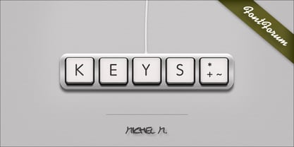
- Kari by Positype,
$39.00 Kari is a complete redraw and expansion of the award-winning typeface originally released in 2005. Featuring both upright and ‘italic’ styles, this soft and curvy script is perfect for packaging, expressive headlines, and fun settings. Feature-rich and flexible, Kari is stocked full of alternate characters, swashes, titling options, expanded numeral sets, new dingbats, and a lot more… and for the first time, the much-requested ‘Medium’ weight is now available.
 - Kris by Characters Font Foundry,
$25.00 Kris is a powerful typeface based on humanistic minuscule with a touch of Uncial script. An alphabet with an unusual appearance. It is based on the paradigm of classical handwriting. Kris is handwritten with a broad nib pen and ordinary black ink. The somewhat fanciful shapes are created by lifting the pen randomly left and right. This causes unpredictable frayed edges that make the typeface exciting. It bursts with character and is very versatile. Kris is written by the Dutch calligraphy artist Corrie Smetsers. Corrie threw all basic characters in a plastic bag and René Verkaart built the typeface and created all remaining characters. “Most special about this project was collaborating with Corrie. She's an expert in handwriting and has developed writing systems for the educational sector for decades”, René says.
 - Cayed by Allouse Studio,
$16.00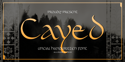 Proudly Presenting, Cayed a Uncial Handwritten Font that will bring an classic feel for your need. Cayed is perfect for any titles, logo, product packaging, branding project, megazine, social media, wedding, or just used to express words above the background. Cayed also come with Multi-Lingual Support. Enjoy the font, feel free to comment or feedback, send me PM or email. Thank You!
 - Kaine by The Northern Block,
$12.80 A bold slab-serif typeface influenced by Spagetti Western posters of the 1960s.
 - Koi by Talbot Type,
$19.50 Koi is a highly original, outline display font. Each character is represented by a single continuous line to create a fluid and rhythmic look. The result is something of a hybrid, sitting somewhere between an outline and an inline style, and with an asymmetrical look — something quite rare in a typeface. Many of the characters look like ready made logotypes. Further customisation is easily achieved by extending the end strokes of characters, possibly aligning them and joining them to others to create bespoke arrangements.
 - Klay by Olivetype,
$18.00 Klay is a stunning brush typeface. Its cool texture is carefully handcrafted to straight away grab the attention of the viewers. Suitable if use for logos, posters, headlines, brandings, apparel, etc. This font is supporting Multi-Languages, which include: Afrikaans Albanian Catalan Danish Dutch English Estonian Finnish French German Italian Norwegian Portuguese Spanish Swedish Zulu. You will get : Basic Latin A-Z & a-z Numbers, symbols, and punctuations Swashes Accented Characters : ÀÁÂÃÄÅÆÇÈÉÊËÌÍÎÏÑÒÓÔÕÖØŒŠÙÚÛÜŸÝŽàáâãäåæçèéêëìíîïñòóôõöøœšùúûüýÿžß Thank you
 - Kab by Typo5,
$16.95Kab has a big impact, is very legible and at the same time has plenty of details that makes it really unique. Perfect for headers and display, it also can be used at smaller sizes and even as a body text with great results. Complete character set. - Okay by Linotype,
$29.99 - Okay by URW Type Foundry,
$35.00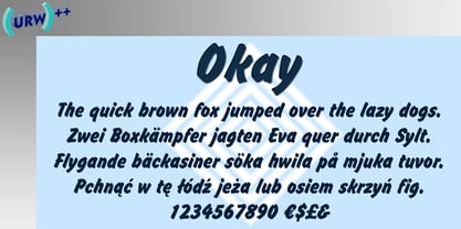
- Kaos by Wiescher Design,
$39.50 On a huge garbage bin in Lisbon I saw the sentence, “Perdidos no kaos”, which means lost in chaos and I really liked the rough stenciled lettering. Back home I designed a typeface that wasn't quite as chaotic as the lettering on the garbage container. Yours – always on the lookout for great typefaces – Gert Wiescher
 - KAH by MADType,
$21.00 KAH is a font which is based on a strict LCD-style grid. KAH is perfect for mocking up LCD screens or to create a technological/futuristic aesthetic in your design.
 - Ways by Fontfabric,
$30.00 Born at a crossroads, the collaborative sans family of 18 styles Ways is the latest arrival in our portfolio. The name is no coincidence, as Ways pulls out all the stops to bring you excellent legibility. Combined with brutal and elegant details for a distinct humanist flair, this sans offers perfect functionality across all weights. Visual compensations, extra white space, wider apexes, subtle tweaks, and moderate inktraps distinguish Ways among similar typefaces. Use over 690 glyphs, extended Latin and Cyrillic support, extensive OT features set, icon set of more than 60 navigation pictograms, and one variable style, to design full-fledged signage systems that get you from point A to point B without relying on G-Maps. Family overview: 9 weights (from Thin to Black) + italics Extended Latin Cyrillic 690+ glyphs languages 1 variable font (2 axes) 1 free font - Ways SemiBold OpenType Features: Localized Forms Standard Ligatures Contextual Alternates Lining Figures Tabular Figures Subscript Scientific inferiors Superscript (Superiors) Numerators Case-Sensitive Forms Standard and Discretionary Ligatures Stylistic Alternates Contextual Alternates
 - Katie by URW Type Foundry,
$39.99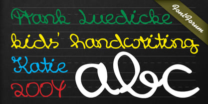
- Growing Script free - Personal use only

- SKETCHUP FREE TRIAL - Personal use only

- Octin Sports Free - 100% free

- Octin Prison Free - 100% free

- walker free style - Unknown license

- Octin College Free - 100% free

- Octin Vintage Free - 100% free

- Scooter Boy Free - Unknown license

- Sui Generis Free - Unknown license

- Neuropol X Free - Unknown license

- Octin Spraypaint Free - 100% free

- Fenwick Outline Free - Unknown license

- Fat Free Solid - Unknown license

- BoumBoum (Free version) - Unknown license

- Fancy Free JNL by Jeff Levine,
$29.00 Up until the late 1920s, it was a popular habit in American songwriting to use African Americans as the topic of compositions using denigrating themes, words and even exaggerated character illustrations on the covers of the published sheet music. One such example of what was considered "entertainment" for its time was a piece entitled "Little Black Me". While this now socially and morally unacceptable piece of forgettable tripe is collected by some only for the historical documentation of the times they reflected, one good "positive" came out of this negative chapter of our country's musical heritage: The beautiful floral ornamented letters in the song's title has yielded Fancy Free JNL. Originally hand-lettered on an arc, these spurred Roman letters have been re-drawn, and are offered in both the regular design and a companion version with the ornamentation removed for lettering that is less ornate.
 - Free Form Deco by Jeff Levine,
$29.00 Toward the end of the 1920s, Art Deco influences were starting to creep into modern design. The hand lettered title on the cover of the1928 sheet music for “Fascinatin’ Vamp” not only embraced the new Deco movement, but sent it on a wild typographic ride. Letters of mixed thicknesses and stylings made up the two word title, and this unusual group of letter shapes became the inspiration for Free Form Deco JNL, which is available in both regular and oblique versions.


