10,000 search results
(0.153 seconds)
- TOMO Acuario by TOMO Fonts,
$12.00 TOMO Acuario is a strong typeface with friendly forms. Very cool to speak to kids.
 - LD Verdant Leaves by Illustration Ink,
$3.00LD Verdant Leaves is a bold font with leafy designs sprouting from the thick lettering. - Overdrawn Account AOE by Astigmatic,
$19.95A typeface made from vintage typewriter samples and meticulously compiled into a complete character set. - Office Memorandum AOE by Astigmatic,
$19.95A typeface made from vintage typewriter samples and meticulously compiled into a complete character set. - Letterhead by Coffee Bin Fonts,
$20.00This font family was inspired by lettering found on old letterheads from the 19th century. - Urgent Telegram AOE by Astigmatic,
$19.95A typeface made from vintage typewriter samples and meticulously compiled into a complete character set. - Military Document AOE by Astigmatic,
$19.95A typeface made from vintage typewriter samples and meticulously compiled into a complete character set. - Supernett by FaceType,
$19.90 Supernett was originally created in 2013. Now we decided to upgrade it: more styles, more glyphs, more features, more everything. Have fun with Supernett 2019! Supernett 2019 super revised version Supernett is a versatile handmade text- and display-family and is perfect for space-saving headlines. All letters and numerics are available in three variants which alternate randomly with OpenType Contextual Alternates activated. One of Supernetts key features is Wiggling & jumping letters: letters jump around the baseline or tilt forward and backwards without a plan. Combine this with OpenType Contextual Alternates and let Supernett look truly hand-drawn with a maximum effect when applied to big typesetting. Further features include small caps, glyph alternates, case-sensitive forms, fractions, symbols and many more. Supernett is a hand-drawn / handmade / handdrawn Sans-Serif font-family. Supernett is available in three weights, two widths, Uprights and Italics. The handmade family is tailored for large font sizes but also impresses with seamless legibility in small type sizes. Due to its display origin and slightly condensed appearance, make sure to increase the spacing a little when used in text setting. The extensive character set supports 209 Central and Eastern European as well as Western European languages (for details, please see below). Supernett Font and Feature Guide Download it | View it online Supernett OpenType Features Alternating Letters Letters and numerics are available in three variants which alternate randomly → OpenType Contextual Alternates Small Caps Supernetts Small Caps mixes Upper- and Lowercase letter forms. Choose between »Small Caps« or »OpenType All Small Caps«. The latter replaces lower- AND uppercase letters, as well as the dotted i and activates punctuation to match the small caps’ height. Wiggling letters All glyphs tilt slightly and randomly forward and backwards → OpenType Swashes (or OpenType Stylistic Set 06) Jumping letters Each single glyph moves individually up or down → OpenType Titling Alternates (or OpenType Stylistic Set 07) → for a stronger effect, add OpenType Stylistic Set 08 (Jumping Baseline MORE) Case-Sensitive Forms This feature shifts various punctuation marks to a position that works better with all caps typography. → activated when an app’s all-caps styling is applied Slashed Zero Make clear what you’re talking about and work with a slashed zero → OpenType Zero with a Slash Fractions Figures separated by a slash are substituted by proper fraction glyphs. A date however, written like 10/12/2019 will remain unchanged. → OpenType Fractions Alternate Glyph Set 1 → OpenType Stylistic Set 01 Alternate Glyph Set 2 → OpenType Stylistic Set 02 Alternate Glyph Set 3 The default glyph set. Activate it to disable Alternating Letters within OpenType Contextual Alternates. → OpenType Stylistic Set 03 Y Alternate Choose between two different styles of Y → OpenType Stylistic Set 04 Underlined Uppercase O & ordinals → OpenType Stylistic Set 05 → activate OpenType Ordinals to substitute No. by № Uppercase I Alternate There’s an alternate for the isolated ›I‹ (I love you) → included in OpenType Contextual Alternates → or activate OpenType Positional Forms: Automatic Form → substitute every single ›I‹ with OpenType Stylistic Set 09 Bullet Alternate Choose between two different styles of bullet (•) → OpenType Stylistic Set 11 Squares and Circles Type a – z and out pop squares and circles. All symbols are PUA-encoded for easy copy and paste between different applications. → OpenType Stylistic Set 10 → or open your apps’ glyphs panel and double-click the desired symbols Supernett is an organic and decorative hand-drawn / handmade Sans Serif display-family for packaging, posters, book-covers, kids- (children-), food- and logo-design and will best stand out in huge grades. Its handmade / hand-drawn origin is subtle yet visible. Supernett supports 209 languages Abenaki, Afaan Oromo, Afar, Afrikaans, Albanian, Alsatian, Amis, Anuta, Aragonese, Aranese, Aromanian, Arrernte, Arvanitic, Asturian, Atayal, Aymara, Bashkir, Basque, Belarusian, Bemba, Bikol, Bislama, Bosnian, Breton, Cape Verdean, Catalan, Cebuano, Chamorro, Chavacano, Chichewa, Chickasaw, Cimbrian, Cofan, Corsican, Creek, Crimean Tatar, Croatian, Czech, Danish, Dawan, Delaware, Dholuo, Drehu, Dutch, English, Esperanto, Estonian, Faroese, Fijian, Filipino, Finnish, Folkspraak, French, Frisian, Friulian, Gagauz, Galician, Ganda, Genoese, German, Gikuyu, Gooniyandi, Greenlandic, Guadeloupean, Gwichin, Haitian Creole, Han, Hawaiian, Hiligaynon, Hopi, Hotcak, Hungarian, Icelandic, Ido, Ilocano, Indonesian, Interglossa, Interlingua, Irish, Istroromanian, Italian, Jamaican, Javanese, Jerriais, Kala Lagaw Ya, Kapampangan, Kaqchikel, Karakalpak, Karelian, Kashubian, Kikongo, Kinyarwanda, Kiribati, Kirundi, Klingon, Ladin, Latin, Latino Sine, Latvian, Lithuanian, Lojban, Lombard, Low Saxon, Luxembourgish, Maasai, Makhuwa, Malay, Maltese, Manx, Maori, Marquesan, Meglenoromanian, Meriam Mir, Mirandese, Mohawk, Moldovan, Montagnais, Montenegrin, Murrinhpatha, Nagamese Creole, Ndebele, Neapolitan, Ngiyambaa, Niuean, Noongar, Norwegian, Novial, Occidental, Occitan, Oshiwambo, Ossetian, Palauan, Papiamento, Piedmontese, Polish, Portuguese, Potawatomi, Qeqchi, Quechua, Rarotongan, Romanian, Romansh, Rotokas, Sami Inari, Sami Lule, Sami Northern, Sami Southern, Samoan, Sango, Saramaccan, Sardinian, Scottish Gaelic, Serbian, Seri, Seychellois, Shawnee, Shona, Sicilian, Silesian, Slovak, Slovenian, Slovio, Somali, Sorbian Lower, Sorbian Upper, Sotho Northern, Sotho Southern, Spanish, Sranan, Sundanese, Swahili, Swazi, Swedish, Tagalog, Tahitian, Tetum, Tok Pisin, Tokelauan, Tongan, Tshiluba, Tsonga, Tswana, Tumbuka, Turkish, Turkmen, Tuvaluan, Tzotzil, Ukrainian, Uzbek, Venetian, Vepsian, Volapuk, Voro, Wallisian, Walloon, Waraywaray, Warlpiri, Wayuu, Welsh, Wikmungkan, Wiradjuri, Wolof, Xavante, Xhosa, Yapese, Yindjibarndi, Zapotec, Zulu, Zuni View other fonts from Georg Herold-Wildfellner Sofa Serif | Sofa Sans | Mila Script Pro | Pinto | Supernett | Mr Moustache | Aeronaut | Ivory | Weingut
 - Grunge Formal by Scholtz Fonts,
$15.00 Grunge Formal started out as a more upright, formal version of one of my fonts, Figment. A most versatile contemporary typeface, Grunge Formal works equally well from funky to formal, from giant size headers to pint size body text, from movie posters to wedding invitations. If you've ever needed a font that has a grungy, deconstructed look but works well for all sizes, a font that you can use for funky, gritty designs, and also for formal wedding stationery, Grunge Formal is a perfect choice. From the formal viewpoint, the font presents as a regular serif typeface with deconstructed edges, giving the antique look popular in wedding stationery design. Here it can be used from header to body size. For in-your-face design, Grunge Formal, when oversized, is really powerful and its deconstructed outline provides a raw, rough contrast to your background images. Grunge Formal has all the features usually included in a fully professional font. Language support includes all European character sets, Greek symbols and all punctuation.
 - Absolutely, I'd be delighted to share a bit about ChopinScript with you! ChopinScript is a font that dances on the page, much like the compositions of the composer it's named after, Frédéric Chopin...
- Stencil Punch JNL by Jeff Levine,
$29.00Stencil Punch JNL is modeled from lettering examples made by a Diagraph stencil cutting machine. Diagraph was the first company to make the stencil punch machines used in industry and by the military. Thanks to Neal Haynes for his kindness and assistance in providing me with sample cuts direct from the company's machine testing department. - Ornata F by Wiescher Design,
$39.50 Ornata F is the sixth of a series of old ornaments that I am trying to save from oblivion. I am completely redesigning the ornaments from scratch. These ornaments have been designed around 1910, I could not find out by whom. This set is perfect to design flowery frames. Your digitizing typedesigning savior, Gert Wiescher
 - ITC Tiepolo by ITC,
$29.99ITC Tiepolo font is from the design team at AlphaOmega Typography and named after Italian artist Dominic Tiepolo. The designers describe it as a sans serif with serifs" and it has also been referred to as a calligraphic design. Similar to Asian calligraphy, ITC Tiepolo font has personality yet does not detract from the text." - Anivers by exljbris,
$- Anivers is robust and rigid, forgiving, flexible and elegant ... and also suitable for a broad use: from a stationery to a poster headline. From an intro in a magazine to a base for a logo. This OpenType font family comes in regular, italic, bold and small caps and offers supports CE languages and even esperanto.
 - Quitong by Arendxstudio,
$14.00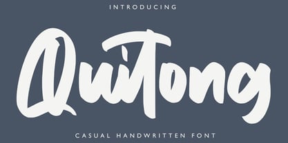 Quitong - Handwritten Font is a handwritten with a natural & stylish flow. This collection of scripts is perfect for personal branding. this works well for many applications. Everything from personal branding & wedding invitations to advertising could benefit from this collection of signature fonts Features : • Character Set A-Z • Numerals & Punctuations (OpenType Standard) • Accents (Multilingual characters) • Ligature
 - Agraham by Hishand Studio,
$15.00 Agraham is aesthetic serif font which the inspiration come from the unique Italy's vibes and some little touch from the beauty of Paris, France. It is so perfect for Logo brand, product packaging, advertisement, social media post, fashion brand, magazine headers and many more complete with ligatures alternates regular italic icon kerning multilingual support
 - Mother's Hand by Celebrity Fontz,
$19.99A down-to-earth font from the hand of a mother from a time when writing was something still done with accuracy and poise. This font evokes motherly memories that you cannot let die, memories of a woman who didn't have it easy, who never gave up, and who made sacrifices for her children. - Kid Captain PB by Pink Broccoli,
$19.00 A spunky slim typeface inspired by a 1958 Dell Comic, The Captain and the Kids featuring the Katzenjammer Kids as a spinoff from the original comic which was in turn inspired by the famous children's story from the 1860's, Max and Moritz. Fun, informal, and retro spunky, all balled up in a single typeface.
 - Easy Tiles by Intellecta Design,
$21.00 A nice mix of 62 decorative tile images. Designs are reminiscent of rubber stamps of architectural tiles found in historical homes and other buildings through the ages and printed devices from old catalogues. Generic enough to add interesting detail to just about any design. From invitations and greeting cards to book jackets, labels or fabric.
 - Grendel Regular by Robert Petrick,
$19.95 “Grendel Regular” Evolved out of a hand lettering piece I designed for a record album (Royal Crescent Mob). Inspired by old gothic forms, my intention was to create a playful letter form that could be used in an antique as well as a modern context such as food product packaging or fun video projects, etc.
 - Buratino by ParaType,
$25.00 Buratino font got its name from a title character of Russian fairy tale — a clone of Pinocchio. Initially font was cut from a log and then scanned and converted into outline format. The font contains just upper case characters. Can be used in advertising and display typography. Designer — Gennady Fridman. Released by ParaType in 2009.
 - Handy Dandies JNL by Jeff Levine,
$29.00 Handy Dandies JNL is a third collection from Jeff Levine Fonts of pointing hands along with a few card holders thrown in for good measure. The images were re-drawn from vintage source material and these embellishments (also known as "Printer's Fists" or "Bishop's Fists") will enhance wood type projects as well as contemporary designs.
 - Reading And Writing Doodles by Outside the Line,
$19.00Reading & Writing Doodles is just that. 27 low-tech illustrations of books, pens, pencils and paper. Along with some hand lettered phrases, "My Book", "Ex Libris" and "From The Desk Of:" A fresh approach for Save a Date Cards and From The Desk Of notepads. An absolute must for bookplates and your book club graphics. - Maverick's Luck by FontMesa,
$20.00 From a few letters found on an old bank document from 1876, Maverick's Luck was born, and born again to give your projects that old western appearance. Maverick's Luck comes with multiple fill fonts, you will need an application that works in layers in order to use the fill fonts that come with FontMesa fonts.
 - Doright Black NF by Nick's Fonts,
$10.00 This typeface takes its design cues from Dudley Upright, a Dan X. Solo find from the sixties. This version is considerably wider than the original, which increases its legibility while retaining its flower-power vibe. Both flavors of this font feature the 1252 Latin, 1250 Central European, 1254 Turkish and 1257 Baltic character sets.
 - Cherkessk by Arendxstudio,
$15.00 Cherkessk - Handwritten Font is a handwritten with a natural & stylish flow. This collection of scripts is perfect for personal branding. this works well for many applications. Everything from personal branding & wedding invitations to advertising could benefit from this collection of signature fonts Features : • Character Set A-Z • Numerals & Punctuations (OpenType Standard) • Accents (Multilingual characters) • Ligature
 - Hurstville by Arendxstudio,
$15.00 Hurstville - Brush Signature Font with a natural & stylish flow. This collection of scripts is perfect for personal branding. this works well for many applications. Everything from personal branding & wedding invitations to advertising could benefit from this collection of signature fonts Features : • Character Set A-Z • Numerals & Punctuations (OpenType Standard) • Accents (Multilingual characters) • Ligature • Swash
 - Benoa by Creativemedialab,
$20.00 Benoa is a versatile font family for your design, consist of 6 weights from thin to black with dozens of alternates. Benoa works well with any style of design concept, from branding to a nice bold modern look! Benoa also available in Variable format, multilingual support, numbers, and currency symbols, and dozens of alternates.
 - Komikaze - 100% free

- Ashemore by insigne,
$34.99 Ashemore developed as a result of my visits to Barcelona, Spain and to Germany, followed soon after by a visit to Asheville, North Carolina. Blending the styles of art and architecture from these three areas may seem initially to result in an unusual formula, but the distinct and flamboyant style of Art Nouveau and the Arts and Crafts style combined with the more strict rules of a sans serif transfer well into a beautiful and very usable blend of these individually eccentric forms. The resulting font retains the Art Nouveau and Craftsman style flavors, which shine through the typeface despite its geometric base. One of the font’s defining characteristics is the unique terminators of its C, G and S. This face’s texture and rhythm also moves well in longer texts. These and other features give Ashemore a restrained bohemian vibe that seems particularly appropriate for a coffee house or an art gallery. The Ashemore family has a full range of six weights from thin to black and includes condensed and extended options for a total of 36 fonts. The typeface also includes some unique OpenType alternates that make the superfamily even more versatile. Ashemore is equipped for complex professional typography, including alternates, small caps and many alternate characters. The face also has a number of numeral sets, including tabular figures, fractions, old-style, lining figures and superiors and inferiors. OpenType-capable applications such as Quark or the Adobe Suite can take full advantage of automatic ligatures and alternates. You can find these features demonstrated in the .pdf brochure. Ashemore also includes the glyphs to support a wide range of languages, including Central, Eastern and Western European languages. In all, Ashemore supports over 40 languages that use the extended Latin script, making the new addition a great choice for multi-lingual publications and packaging. Ashemore was designed by Jeremy Dooley with production assistance from Lucas Azevedo and Marcelo Magalhaes. Kerning assistance from iKern.
 - Hazel Script by Eclectotype,
$40.00 The design process of this font was rudely interrupted on August 11th, 2015, when my first child, Hazel, was born. Thinking up names for fonts can be tricky, as can thinking up names for babies, so when the font was finally finished, it seemed like a good idea to kill two birds with one stone, and here it is: Hazel Script. Hazel Script is a finely crafted, elegant, connecting script. I wanted to make something unique, and to this end, the contrast in the face is not based on any ductal logic, or the writing of some imagined tool. The thick parts of glyphs are purely aesthetic devices, placed to give the otherwise monoline font an interesting rhythm. The over-sized upper case letters follow a mid-century lettering skeleton, and swash forms can be used judiciously to add spice to the text. Hazel Script works "out of the box" but to really get the best out of it, use OpenType-savvy programs to unlock a world of swashes, alternates, ligatures and the like. In detail, the features are as follows: Swash - alternate forms for many glyphs Stylistic Sets - 1: script r, 2: alternate s, 3: script z, 4 and 5: more swash options, 4,5,6 and 7: access to alternate ampersands (the font boasts six to choose from!), 8: connecting forms for K, L, R, X and Z. Localised forms - ij digraphs for Dutch, and a script lslash for Polish. Standard ligatures - a mixture of ligatures, including the 'percent off' (just type "% off") and a heart that connects to the ends of words (type "<3") Automatic fractions Ordinals - a and o for Spanish etc. but also s,t,r,d,h and n for English 1st 2nd and 3rd etc. Contextual alternates - automatically places special start and end glyphs where necessary. Hazel Script would look great in glossy magazines set large, or would make a slightly unorthodox choice for wedding stationery, birth announcements, letterheads...
 - Dynatype by Alphabet Soup,
$60.00 Suddenly...it’s the World of Tomorrow! With the push of a button Dynatype automates your typesetting experience. Dynatype is actually Two fonts in One–without switching fonts you can instantly change from Dynatype’s “regular” style to its alternate connecting version with the simple push of a button. For more details download “The Dynatype Manual” from the Gallery Section. What is Dynatype? Dynatype is the upright, slightly more formal cousin of Dynascript. It shares many of the characteristics of it’s slightly older relation, but is drawn entirely from scratch and has it’s own unique character. Dynatype may be reminiscent of various mid-century neon signage, and of sign writing, Speedball alphabets and even baseball scripts. Its design also takes some cues from a historical typographic curiosity that began in Germany in the ‘20s and which lasted into the ‘60s—when Photo-Lettering gave it the name "Zip-Top". Basically it was believed to be the wave of the future—that by weighting an alphabet heavier in its top half, one could increase legibility and reading speed. The jury’s still out on whether or not there’s any validity to this notion, but I think you’ll agree that in the context of this design, the heavier weighting at the top of the letters helps to create some uniquely pleasing forms, and a font unlike any other. Typesetters across the planet will also be able to set copy in their language of choice. Dynatype’s 677 glyphs can be used to set copy in: Albanian, Basque, Catalan, Cornish, Croatian, Czech, Danish, Dutch, Esperanto, Estonian, Faroese, Finnish, French, Galician, German, Hungarian, Icelandic, Indonesian, Irish, Italian, Kalaallisut, Latvian, Lithuanian, Malay, Maltese, Manx, Norwegian Bokmål, Norwegian Nynorsk, Oromo, Polish, Portuguese, Slovak, Slovenian, Somali, Spanish, Swahili, Swedish, Turkish, and Welsh—and of course English. Sorry! Off-world languages not yet supported. PLEASE NOTE: When setting Dynatype one should ALWAYS select the “Standard Ligatures” and “Contextual Alternates” buttons in your OpenType palette. See the “Read Me First!” file in the Gallery section.
 - Schneidler Latein by Spirit & Bones,
$33.00 The Schneidler Latein is a sharp and elegant Antiqua based on the ductus of the broad edged pen with a strong character. Running perfectly in paragraph text giving it something quite special and being effortlessly legible at the same time, Schneidler Latein works great in headings as well. Each glyph is a piece of art ready to be used in branding and blowup combining beauty and personality in a kick-ass blend. It is absolutely new to the digital world as it never has been digitized before. This new version digitized, further developed and extended by artist and graphic designer Lena Schmidt comes in nine styles from which there are four application-related ones like Subtext and Display and five weight-related ones like Bold and Heavy. Each style contains 948 glyphs, variations of numbers, three stylistic sets one preserving the historic forms of changed characters, small caps, open type features and superior and inferior characters. Designed by F. H. Ernst Schneidler the Schneidler Latein was released in 1916, the bold version in 1920 and the italics in 1921. Schneidler was born in 1882 in Berlin. He studied at the school for applied arts in Düsseldorf with professor F. H. Ehmcke and P. Behrens. He was as a painter, graphic designer and illustrator. In 1920 he was appointed as teacher in the school for applied arts Stuttgart. His students were Albert Kapr, Imre Reiner and Lilo Rasch-Naegele among others. Further well-known fonts from his hands are for example Legende, Amalthea, Schneidler Mediävel and Schneidler Antiqua. Lena Schmidt was born 1981 in Bremen. She is a german painter, graphic designer and illustrator mostly known for her huge wood carving paintings. From 2003 to 2011 she studied Fine Arts in Hamburg with professor Matt Mullican. From 2015 to 2019 she studied graphic design with a focus on type design at HAW Hamburg Department Design with professor Jovica Veljović. She lives and works in Hamburg, Germany.
 - Dynascript by Alphabet Soup,
$60.00 Typography enters the Space Age! Dynascript brings the ease of “Pushbutton Automatic” to your typesetting experience. Dynascript is actually Two fonts in One–without switching fonts you can instantly change from Dynascript’s connecting font to the non-connecting italic with the simple push of a button. For more details download “The Dynascript Manual” from the Gallery Section. What is Dynascript? Dynascript is the slanted script cousin of Dynatype. It shares many of the characteristics of it’s sibling, but is drawn entirely from scratch and has it’s own unique character. To some it may be reminiscent of various mid-century neon signage, and of sign writing, Speedball alphabets and even baseball scripts. The design of Dynascript also takes some cues from a historical typographic curiosity that began in Germany in the ‘20s and which lasted into the ‘60s—when Photo-Lettering gave it the name "Zip-Top". Basically it was believed to be the wave of the future—that by weighting an alphabet heavier in its top half, one could increase legibility and reading speed. The jury’s still out on whether or not there’s any validity to this claim, but I think you’ll agree that in the context of this design, the heavier weighting at the top of the letters helps to create some uniquely pleasing forms, and a script unlike any other. Typesetters across the planet will also be able to set copy in their language of choice. Dynascript’s 694 glyphs can be used to set copy in: Albanian, Basque, Catalan, Cornish, Croatian, Czech, Danish, Dutch, Esperanto, Estonian, Faroese, Finnish, French, Galician, German, Hungarian, Icelandic, Indonesian, Irish, Italian, Kalaallisut, Latvian, Lithuanian, Malay, Maltese, Manx, Norwegian Bokmål, Norwegian Nynorsk, Oromo, Polish, Portuguese, Slovak, Slovenian, Somali, Spanish, Swahili, Swedish, Turkish, and Welsh—and of course English. Sorry! Off-world languages not yet supported. PLEASE NOTE: When setting Dynascript one should ALWAYS select the “Standard Ligatures" and “Contextual Alternates” buttons in your OpenType palette. See the “Read Me First!” file in the Gallery section.
 - Friendly by Positype,
$29.00 Friendly is an homage to Morris Fuller Benton's adorable Announcement typeface. It is not a strict interpretation, digital revival or reverent reproduction of the original letterforms… but I would be remiss and shady to not acknowledge the letterforms that inspired this typeface. If you are looking for a more accurate 'scanned revival' I would recommend searching "Announcement" on MyFonts. As stated earlier, it is an homage to the original letterforms of the typeface but takes a great bit of freedom tightening the construction up in order to loosen up the movement of the variant letterforms to allow a great deal of usable personality. I enjoy stating this dichotomy… "loosen up to tighten up the forms" and vice versa. It seems counterintuitive or silly but by allowing the letterforms to normalize, I felt more comfortable going back and adding rather indulgent personality. Infused with stylistic alternates, swashes, titling, many many contextual alternates, 9 stylistic sets and 2 stylistic sets with wordmarks, the typeface became far more 'friendly' for me… how could it not? With so many loops, swashes and typographic indulgences, it was bound to be fun. The more elaborate and 'overdone' Friendly got, the more I wanted to slant it. Here's where my thinking differs from MFB's original. I like slanted romans… especially ones with long ascenders, but I do not like much of a slant. It has to be the lettering person in me. It's hard for me to do a completely upright serif and not pair it with an angle, but I did not feel Announcement's 'Italic' offered much and the actual slant needed to be far less. If it's not an italic, I prefer the letters to slant with an angle equivalent to the thickness of the vertical stroke. The Slanted version of Friendly is set at 3.6 degrees, is quite subtle, and very fitting for me. You will find that most characters have a contextual, stylistic, swash and titling alternate assigned to them and some have an echoed alternate to the swash and titling options if the stylistic alt has been selected in tandem. Additionally, all of these are accessible in the glyph palette directly from the base glyph typed or through selecting options through the Stylistic Sets 1–9. Stylistic Sets 10 & 11 are a little different. They are actually configured as complex majuscule ligatures… a result of me getting carried away. Other features like a default old style numeral set and coordinating glyphs have been produced along with case support, ordinals, and more have been added to make it more relevant for contemporary use.
 - Optima Nova by Linotype,
$57.99 With the clear, simple elegance of its sans serif forms and the warmly human touches of its tapering stems, the Optima family has proved popular around the world. In 2002, when it was finally possible to produce digital alphabets without technical limitations and compromises, and more than fifty years after the first sketches, an expansion and redesign of the Optima family was completed and released as Optima nova. Hermann Zapf and Japanese type designer, Akira Kobayashi, collaborated on the project, which included re-working of the existing weights and the addition of several new weights: small caps, old style figures, light, heavy, and condensed. The original Optima was never manufactured with a real italic, only an oblique version of the roman. Optima nova has a complete range of beautifully designed real italics; the new italic forms, of the e, f and g are especially notable. The titling face includes capital letters with special and unusual letter combinations and ligatures, making it an excellent choice for headlines, logos and advertising purposes. Optima continues to be an all-purpose typeface; and Optima nova works for just about anything from book text to signage. Optima Nova® font field guide including best practices, font pairings and alternatives.
 - Linotype Ergo Paneuropean by Linotype,
$103.99Linotype Ergo was designed by American Gary Munch, and was a winner in Linotype's Second International Digital Design Contest in 1997. Conceived as a blend of traditional and modern type concepts, it works as a legible text family as well as a lively display or headline font. The word ergo means consequently," but it also comes from the Greek word "ergon" for "work." Consequently, Munch sees this family as full of energy -- an ideal font for working hard to make a point, and able to get it across with friendly vigor. The strokes of the characters are carefully designed to accommodate the tendency of the eye to enlarge horizontals and perceive verticals as lighter. The lowercase forms have open, friendly counters and are enhanced by small quirks, such as the slightly leaning s and the wide t. The deep branching of curves from main strokes helps this humanist sans to be very readable at smaller sizes. Linotype Ergo has four normal-width weights, five condensed weights, and two compressed weights - all with companion Italics! The family also includes a clever "Sketch" font for use in headlines, bringing the total number of font styles to 23. Ergo is available with Greek and Cyrillic and as W2G fonts with Hebrew." - Jazm by Arabetics,
$34.00 Jazm is an Arabetic typeface design with connected glyphs. Jazm was the earliest, pre-Islamic, script style of the modern Arabic script, before branching into Kufi and Naskh styles. The initial script had a lot less, position-dependent shapes and ligatures, and was not strictly connected. It occasionally included minuscule dots to distinguish identical shapes. This font family design is a modern visualization by the designer of the historical Jazm letter shapes following the guidelines of the Mutamathil Taqlidi type style with one glyph for every basic Arabic Unicode character or letter, as defined in Unicode Standards, and one additional final form glyph for each Arabic letter that can connect with other letters from both sides in traditional cursive Arabic strings. Jazm employs variable x-height values. It includes all required Lam-Alif ligatures and selected marks. Tatweel (or Kashida) glyph is a zero width space. Keying it before any glyph will display that glyph isolated form, if desired. Keying Tatweel before Alif Lam Lam Ha will display the Allah ligature. Jazm typeface family includes both Arabic and Arabic-Indic numerals; all required diacritic marks, in addition to Standard English keyboard punctuations and major currency symbols. Jazm is available in regular, bold, black, and corresponding italic (slated to the left) styles.
 - Aeroko Variable by Monotype,
$279.99 Meet Aeroko, a slick variable typeface that evokes grit and speed, a dynamic play, a future–present competitive edge that evokes motorsport and all progressive brand design. This is a robust type system that creates memorable brand headlines. Powered by four display weights and three widths. Turbo-charged by a two-axes variable font. High performance brands can expect Aeroko to out-pace in every graphic condition. Aeroko is bold and assertive, it moves fast in headlines, it flexes when and where you need it. The forms are boxed and solid from Condensed to Wide, and they provide a distinct contrast when paired with rounder text fonts. Aeroko’s secondary power unit is harnessed from the ever adaptable variable font format. Variable font technology enables vast levels of typographic scale and expression, furthermore it allows Aeroko to react instantly in any digital space to maximize results. Aeroko evokes confidence, this is a typeface that actively encourages you to be courageous and daring with type in your own way. Brands demand distinct and robust typography, much in the same way that drivers demand pace. Aeroko meets these demands with ease, delivering assurance and weight across a valiant aesthetic. Aeroko is designed by Krista Radoeva and the Monotype Studio.
 - Golften by Craft Supply Co,
$20.00 In the world of typography, Golften – Art Nouveau Serif Font stands as an epitome of elegance. It gracefully channels the beautiful and harmonious flow, drawing inspiration from the Art Nouveau style. Let’s delve into why Golften is an exceptional choice for those seeking refined and graceful design. Elegance at Its Core First and foremost, Golften exudes elegance through its graceful serifs and harmonious lines. It encapsulates the very essence of Art Nouveau. Moreover, its flowing curves and intricate details create a captivating visual experience, making it the ideal choice for designers aiming to create visually stunning projects. Versatile Beauty What sets Golften apart is its versatility, which knows no bounds. It seamlessly adapts to various design projects. Whether you’re crafting wedding invitations, establishing elegant branding, or designing artistic posters, Golften adds an exquisite touch that elevates your work. Furthermore, this font’s adaptability makes it suitable for a wide range of creative endeavors. Inspired by Art Nouveau Golften draws inspiration from the Art Nouveau movement, celebrated for its organic forms and ornate aesthetics. This font mirrors those principles, making it a perfect choice for projects aiming to capture the timeless allure of this influential style. With Golften, you can effortlessly infuse your designs with the spirit of Art Nouveau.
