10,000 search results
(0.25 seconds)
- Soleil by TypeTogether,
$49.00 Soleil, designed by Wolfgang Homola, is a geometric sans serif typeface. Unlike most existing geometric sans serif typefaces, it has asymmetrical counters, making it look fresher, more dynamic and more contemporary. Simple geometric forms – such as the circle or the square – played a certain role in the design of the letterforms, but in order to introduce more fluidity into the rather stiff and rigid concept of geometric sans serif typefaces, a lot of optical corrections were necessary. Soleil is based on the modernist ideas of simplicity, clarity and reduction to essential forms. Yet its letter shapes are not the result of geometric construction, but of a design process that brings together simplicity and fluidity, clarity and rhythm. Soleil has a rather large x-height, making it legible also in small sizes or from a bigger distance. The typeface family consists of six weights. The Opentype version also allows for the implementation of typographic features such as Small Caps, lining and old-style figures, both tabular and proportional, ligatures, alternate characters, case-sensitive variants and fractions. Soleil offers a wide range of potential applications: signage and wayfinding systems, book and magazine design, branding and corporate publications.
 - Petala Pro by Typefolio,
$39.00 Pétala Pro took its first steps almost ten years ago. Since then, the quest for perfection has forced several interruptions. It was necessary recalculate the route, tread other ways, discover new maps, and make easy curves. In the end, a new milestone on typeface design was reached. Pétala Pro combines readability with a gentle but strong personality. The smooth and balanced forms shares space with expressive ink traps. The 18 styles of the family – from Thin to Black – allow the flexibility needed to complex design briefs. When designing the different weights, rather than automated solutions, subtle adjustments were made to value the optical qualities of each style. Such care makes all the difference under extreme conditions. The wide variety of alternates makes Pétala Pro even more versatile. All the styles come with a lot of advanced OpenType features such as stylistics sets, localized forms, contextual alternates, ligatures, small caps, numbers, fractions and more. Pétala Pro brings your message with efficiency and personality for a multi-language environment and in any medium or support, such as video, mobile and computers screens. Pétala Pro is the ideal choice for editorial, advertising, branding and corporate identity.
 - FHA Condensed French by Fontry West,
$25.00 FHA Condensed French One could speculate that FHA Condensed French probably started life as wood type for displays, headlines and posters. The exaggerated sharp serifs and condensed forms were not uncommon for that period. At some point, sign painters picked up Condensed French added their own character. At the end of the nineteenth century, Frank H. Atkinson included Condensed French in his samples of lettering for his book, ”Sign Painting, A Complete Manual.” This book became one of the definitive guides for signwriting and hand lettering. In 1999, Mike Adkins digitized Condensed to add to our Atkinson collection. For its re-release, Condensed French has been updated with more language support, ligatures, and OpenType alternates. It has true vintage character but still plays well in more modern designs. A font for all seasons, the condensed forms and sharp serifs fit in every layout from wildwest days posters and creepy film credits to Christmas ads and Mother’s Day cards. While I can’t really see FHA Condensed French as the font for phone aps or video game text, it will provide impact to logos, branding, and product labeling.
 - Trapezoidal by Ingrimayne Type,
$9.00 The letters of Trapezoidal are like sheep: they do not like being alone but want to be part of a flock. Many of the individual letters of Trapezoidal look strange and unshapely in isolation because they are designed to fit into a pattern with other letters. That pattern is formed by alternating asymmetric trapezoids, with trapezoids that are wide at the top alternating with trapezoids that are wide at the bottom. The magic of the OpenType feature of contextual alternatives (calt) automatically alternates them. The fonts in the family are largely monospaced and have very tight letter spacing. (If for some reason one wants to use only one set of the letters, the letters will overlap unless one widens character spacing.) (If D and O are too similar, use the alternative versions of D.) The family has five weights and each weight has an italics formed by flipping the trapezoidal pattern over a vertical line. Like other alternating-character typeface families from IngrimayneType, this distinctive and visually-arresting family can be used for titles or advertising. (For another but very different typeface based on alternating trapezoids, see PoultrySign.)
 - Renouveau by Intellecta Design,
$25.00 Intellecta in partnership with Monocracy Types (Paulo W) presents “Renouveau”. Renouveau : taste the feeling of vintage typography. Inspired by the old letters at classic Victorian Era into the first decades of the XX century. This is a multi use typeface with over 600 glyphs which comes with wide variation of letters, accessible via OpenType features. A display typography in addition to your design arsenal. Suits for any project : labels, t-shirt design, typographic quotes, posters, packaging, wedding invitations, headlines, logo and branding, web, magazine covers, editorial design, print posters, signage, window shop design. It works beautifully for branding and advertising. Using the many ornamental forms and alternates you can create realistic headers. This display font has all standard character letters such as capital letters and lowercase letters, currency figures, numerals, punctuation. As well a complete multi-lingual support, to another languase systems from Europe and Asia countries. Althought a victorian style typeface, we keep simple the shape of the letters, to avoid the extravaganza from that epoch. You will get special capital letters and lowercases when you activate the alternate features or can choose alternatively manually on your software feature, like adobe illustrator, corel and others.
 - Ongunkan Linear B Syllabary by Runic World Tamgacı,
$100.00 This font is based on the Latin-based font for Linear B syllable writing. It contains all the characters. To see some full characters, you can use Turkish characters by selecting the font from the add character section of the word program. Linear B was a syllabic script that was used for writing in Mycenaean Greek, the earliest attested form of Greek. The script predates the Greek alphabet by several centuries. The oldest Mycenaean writing dates to about 1400 BC. It is descended from the older Linear A, an undeciphered earlier script used for writing the Minoan language, as is the later Cypriot syllabary, which also recorded Greek. Linear B, found mainly in the palace archives at Knossos, Cydonia, Pylos, Thebes and Mycenae, disappeared with the fall of Mycenaean civilization during the Late Bronze Age collapse. The succeeding period, known as the Greek Dark Ages, provides no evidence of the use of writing. Linear B, deciphered by English architect and self-taught linguist Michael Ventris based on the research of American classicist Alice Kober[5] is the only Bronze Age Aegean script to have thus far been deciphered.
 - Aprilis by Eurotypo,
$34.00 Are you looking for a new casual and organic script font? Please, take a look to the Aprilis! In times of early Roman calendar, "Aprilis" followed and preceded "Martius" "Maius" when spring came, was green nature and flowers burst into colours to greet the sun. And Aprilis font was conceived in April... The Aprilis font is the perfect blend of elegant and casual. (It is best used in OpenType-aware software). With the total number of 625 glyphs, is equipped with plenty of OpenType features. Uppercase letters can alternate between at least two different forms and lowercase letters have leastways four choices more to avoid repetition. These effects include start and end forms of lowercase letters, which are automatically substituted in at beginnings or ends of words. To activate the optional glyphs you may click on Swash, Contextual, Standard Ligatures, Stylistic or Discretionary Ligatures buttons in any OpenType savvy program or manually choose the characters from Glyph Palette. Also, there’s a set of 50 ornaments designed to support the font (access the ornaments through the Glyph Palette). The Aprilis font might be the choice to use on creating headlines, logos & posters for branding and packaging purposes. Hope you enjoy.
 - Ongunkan Varna Vinca by Runic World Tamgacı,
$50.00 The Vinča script is a cache of symbols found belonging to the Vinča culture of the central Balkans over 7000 years ago. The symbols have been a topic of debate amongst historians. The Tărtăria tablets are three tablets discovered in 1961 in the village of Tărtăria(Hungarian: Alsótatárlaka). This is about 30 km (19 mi) from Alba Iulia in Romania.The tablets, dated to around 5300 BC, have symbols inclay: the Vinča symbols. Some claim they are a yet undeciphered language. If this is so, they would be the earliest known form of writing. In 1908 similar symbols were found during excavations, by Miloje Vasić (1869–1956) in Vinča. This is a suburb of Belgrade (Serbia), some 300 km from Turdaș. Later, more were found in another part of Belgrade. Since 1875 over one hundred and fifty Vinča sites have been found in Serbia alone. Many, including Vinča itself, have not been fully excavated. The culture of the whole area is called the Vinča culture. Although some of these symbols look exactly the same as some letters in Etruscan, Greek, and Aramaic, they are generally regarded as a an original, independent development.
 - Primot by Plau,
$49.00 Primot is an upright script heavily influenced by italian gelaterias . After releasing 3 sans serifs , we were looking for an opportunity to design a display type with less constraints for legibility and expression. We started playing with brush lettering and looking into vintage scripts from different eras. Some cool things that made it into Primot were some unusual vertical connections and the sweet brush flairs in the letter endings. From that point on, we set out to create a beautiful looking vertical script – something we don’t see that often – in which each word set could would make a nice piece of graphic design (think logos, video game titles, shop windows etc.). We also made it smart by including hand-lettering inspired features such as initial and final forms for letters, contextual alternates and swashes. The result is a versatile 900+ glyphs display typeface, suitable for a wide range of applications. We hope you have as much fun with it as we had designing it! And while we’re here, you may like that it also pairs beautifully with our sturdy sans-serif family Motiva Sans .
 - MVB Solano Gothic by MVB,
$39.00MVB Solano Gothic Bold was originally designed as a display face for the City of Albany, California (located on the San Francisco Bay facing the Golden Gate Bridge and bordering Berkeley). Named for the City’s main street, the typeface needed to work on signage in proximity to early 20th Century buildings, and in contemporary settings. Rather than creating a neutered design to cover all bases, Mark van Bronkhorst chose to develop a simple, strong, condensed face that would offer flexibility of style by providing both retro and more contemporary forms. Solano Gothic has since been expanded to a family offering five weights from Light to Bold. The basic fonts provide upper- and lowercase forms, with figures designed to harmonize within upper- and lowercase settings (the standard figures are not full cap height). The same figures are provided with Small Caps, and align to small cap height. For all-cap settings requiring figures and monetary symbols of full-cap height, there are the “Cap” fonts. An alternate tabular “1” is provided in all fonts so that both fitted and tabular settings of figures are possible (access to alternate characters subject to system or application support). - Letrista Script by Estudio Calderon,
$69.99 Letrista Script is a product of observation and sensitivity of sign painter artists not only from United States but from other parts of the world, where the brushstrokes letters have reached a high level of importance in different context, where the writing makes fundamental part. With more than 1000 glyphs, this typography was created to achieve a unique texture without losing the legibility or force, to interact with the alternation of decorative characters and adornment that will surprise. After a year of working and checking with many artists, Letrista Script come up to the public with the guarantee of being an useful tool in your computer in the design time. When you know it, you surely won't stop using it, because of its beautiful characters and great texture. It is full of surprises and facilities for the users. Letrista Script includes standard ligatures, stylistics alternatives, discretionary ligatures, swashes, titling alternates and terminal forms, Stylistic Set 1, 2, 3 and 4, ornaments and a complete package of Catch Words. See specimen and samples here. Letrista Script was selected at the Bienal Tipos Latinos 2012. Check out some uses of this font here https://fontsinuse.com/uses/20207/ica-beverages
 - Neue Frutiger Tamil by Linotype,
$99.00 Neue Frutiger Tamil was created by Pria Ravichandran and a team of designers and font engineers from the Monotype Studio, under the direction of Monotype type director Akira Kobayashi. The family is available in 5 weights from Light to Bold to support the Tamil script. The typographic forms of Neue Frutiger Tamil are familiar and friendly. The Tamil shows traces of elements that is reminiscent of the calligraphic influences found in the 20th-century designs. Reflecting the modern typographic needs of the Tamil script, this type family is in the upright style. These two factors ensure that the two scripts, Tamil, and Latin pair elegantly. The result, Neue Frutiger Tamil, is an eclectic contemporary type family that bridges the past and the present. Neue Frutiger Tamil embodies the same warmth and clarity as Adrian Frutiger's original design, but allows brands to maintain their visual identity, and communicate with a consistent tone of voice, regardless of the language. It is part of the Neue Frutiger World collection, offering linguistic versatility across environments – suited to branding and corporate identity, advertising, signage, wayfinding, print, and digital environments.
 - Hand Shop Pack by Fontscafe,
$29.00 We’re really excited to unveil our all-new line of ‘HAND SHOP FONTS’. As the name suggests, these are fonts that have a hand-made or hand-typography feel reminiscent of shop signboards from the past with an attentive focus by the shop owners, always looking to discover exciting and unique ways to promote their products or services. While for decades typography has strived hard for perfection, one of the routes taken by the typography world as a whole has been to eliminate any form of ‘human imperfection’ in the typesets, but what about the times when you DO want to send across emotions of a personal human touch through your fonts? We did a step back...these fonts will give your shop-signs a personal touch, telling your buyers that they will get personalized attention, be it through an online or an offline business…We hope you love them as much as we do. The “Hand Shop EXTENDED Pack” containing a total of 14 fonts from the “Hand Shop Banners & Elements Pack” (3 fonts) , the “Hand Shop Typography Pack 01” (8 fonts) and the “Hand Shop Typography Pack 02” (3 fonts)
 - MVB Diazo by MVB,
$59.00 Mundane information—the sort you might ignore—often appears in the form of very simple, utilitarian lettering, devoid of personality, the sort of industrial lettering you find on old blueprints, park restrooms, and electrical boxes. MVB Diazo is such a thing. It looks like lettering done earnestly with a plastic template. The monoline caps—constructed from straight lines and simple curves—have rounded details as if rendered by a blunt pen on a topographical survey or by a router on a rustic campground sign. The MVB Diazo fonts are compact, available in two widths: Condensed and Extra Condensed. Each width offers four weights from Light to Black. The fonts are perfect for wherever plain and boring letterforms are required. All widths and weights are also available in two distressed textures (#1 and #2) that accentuate the industrial character of the design. Rough #1 is gritty, with finer texture for use at larger sizes. Rough #2 exhibits more damage, the roughness apparent when used at smaller sizes. The Rough fonts include alternates of a number of glyphs so that variation of texture is possible when letters repeat in a word.
 - Uniform Italic by Miller Type Foundry,
$25.99 Now Uniform comes in Italics! Uniform is a multi-width geometric type family designed around the circle. The O of the Regular width is based on a circle, the O of the Condensed width is based on 1.5 circles stacked (with straight sides) and the O of the Extra Condensed width is based on two circles stacked with straight sides as well, and all other characters are derived from this initial concept. This unique idea creates a remarkably fresh type family that bridges the gap between circular geometric typefaces and condensed straight-sided typefaces. Uniform also includes many opentype features like Old Style Figures, Tabular Lining Figures, Alternate characters, Ligatures and more. Uniform was first drawn starting with the Black weight. This careful process allows each character to look consistent and balanced through all weights. As a result, the typeface does not ‘break down’ or lose its form in the boldest weights like many typefaces do. The three widths of Uniform Italic make an ideal type family for a host of various uses. From branding to web design, book covers to signage, Uniform is a very versatile solution to complex typographic needs.
 - Alkes by Fontfabric,
$35.00Features: Over 1200 gyphs in 14 styles; True form of italics; Humanist character and proportions; Extended Latin, Extended Cyrillic & Greek scripts; For more than 130 languages Moderate contrast; Perfect for text, headlines and web; Coverage of many OpenType features Ligatures, Small Caps, Case sensitive forms, OldStyle figures, Tabular figures, Fractions Named after a star and inspired by the cosmos, Alkes traveled a long way from a graduation project to a published multiscript serif type family. Designed with the intention of harmonising between three scripts - Latin, Cyrillic and Greek, the contemporary, yet well defined humanist serif combines the best out of the digital and analog worlds. Featuring a generous x-height, wide letter spacing, large open counters and angled stress contrast, Alkes is highly effective for editorials and publishing, where long texts and legibility are the key forces. Its attractive details, calligraphic structure and asymmetrical serifs shine through in the larger sizes and make Alkes suitable for headlines. Alkes has a pull with editorial designers, graphic designers and publishers who aim for a clear structure, hierarchy and coherent non-Latin scripts for both print and on-screen environments, in order to achieve otherworldly designs - Rodia by Monotype,
$25.00 Rodia is an Oddball Geometric Sans Typeface consisting of nine weights in both roman and oblique. It’s a geometric sans with a twist that’s perfect for branding and identity projects – it will also give your body text a unique voice. Inspiration came from the iconic “RADIO” signage that was once in place at 5041, Pico Boulevard, Los Angeles in 1985 (documented at https://tinyurl.com/y2krt2ox). With its distinctive leg, the /R/ provides a personality trait to define the style of the character set. You can clearly see how this characteristic separates Rodia from other geometric sans families – the /k/v/w/x/y/K/R/V/W/X/Y/ glyphs all display the distinctive ‘feet’ and ‘hands’ as terminals to legs and arms. Then there is the /A/ with its triangular crossbar – this triangular motif has been used to embellish alternates in Stylistic Set 1 for /A/E/F/G/H/Q/S/ glyphs. These will add another layer of versatility for your typographic projects. Rodia features an extensive character set covering all Latin European languages. Key features: 9 weights in Roman and Oblique Full European character set (Latin only) 400+ glyphs per font.
 - Densit by Adtypo,
$32.00 Densit is a display mega black typeface, containing 6 styles. It aims for a ultimate density with a maximum weight on a minimum place. Glyphs therefore balances on a slim border of touch. The typeface is designed for expressive and short texts at big sizes and is suitable for photography or other visual materials underlaying. The 3 basic styles parodies ordinary type styles. They only differents from each other lays in the lenght of straight thin lines. The stencil style without these lines is intended especially for spray stencils, the sans style is imitating linear sans types and the serif style having stronger contrast and indicated serifs. The typeface contains a large set of special ligatures for playing with aesthetic qualities of text and obtain maximum space saving. Densit contains 34 special forms for members and frequently used short words in various languages. Very short terminals offer compact setting of multi-lines captions. Densit can be used for music posters, eye-catching headlines of art articles and everything in which is possible graphic impression from legibility prefered. • 6 styles (2 alternatives, 3 kinds) • 12 OT features • 1313 glyphs • sophisticated system of ligatures • support of latin languages
 - Uniform by Miller Type Foundry,
$25.99 Uniform is a multi-width geometric type family designed around the circle. The O of the Regular width is based on a circle, the O of the Condensed width is based on 1.5 circles stacked (with straight sides) and the O of the Extra Condensed width is based on two circles stacked with straight sides as well, and all other characters are derived from this initial concept. This unique idea creates a remarkably fresh type family that bridges the gap between circular geometric typefaces and condensed straight-sided typefaces. Uniform also includes many opentype features like Old Style Figures, Tabular Lining Figures, Alternate characters, Ligatures and more. Uniform was first drawn starting with the Black weight. This careful process allows each character to look consistent and balanced through all weights. As a result, the typeface does not ‘break down’ or lose its form in the boldest weights like many typefaces do. The three widths of Uniform make an ideal type family for a host of various uses. From branding to web design, book covers to signage, Uniform is a very versatile solution to complex typographic needs.
 - Cavole Slab by insigne,
$22.00 Cavole Slab is a new slab serif, designed in early 2011, that has a strong influence from Dutch typography. The name is an altered form of the Portuguese word for feather, emphasizing the typefaceís soft and friendly character. Slab serifs give this face plenty of impact and make it an excellent choice for contemporary designers. The font family includes a very dark and powerful black all the way down to a hairline thin weight, giving a tremendous versatility. The family also features dynamic italics that add plenty of emphasis and momentum. Cavole Slab is suitable for both headline and text settings and should easily find its place in a number of different settings, from corporate identity to magazine body copy. There are six weights that come with complementary italics, and each font includes over 450 characters and extended Latin-based language support. The typeface family comes in OpenType format, and OpenType alternates are easily accessible through OpenType enabled applications such as the Adobe suite or Quark. Please see the informative .pdf brochure to see what OpenType features are available and to see them in action.
 - Felfel Arabic by Boharat Cairo,
$20.00 Felfel is an Arabic typeface inspired by the rich history of the Arabic Ruq’ah, one of the most widely used Arabic calligraphy styles, but with a modern pinch influenced by the visual identity of Egyptian streets. Born from the fundamental need in the Arabic design scene, Felfel is made to celebrate the elegance and timeliness of Arabic calligraphy while solving the problem of the cascading nature of Ruq’ah that results in increased line spacing. Felfel is space-friendly, perfect for headlines and quotes. Felfel supports major Arabic-script-based languages and covers Arabic, Hindu, and Farsi numbers. Like Traditional Ruq'a, Felfel works with the same context, but it adjusts to your needs without the rigidity of Ruqa’ah’s slanted baseline to give you the flow, beauty, and richness of the Arabic calligraphy with a modern feel. Felfel is dynamic. A substantial part of the font is based on versatile components, that minimizes characters and maximizes possibilities. the dots are in motion! They rotate from and to horizontal and vertical form, based on the word to match the calligraphy and the context, also the dots and marks move up and down, left and right to prevent all kinds of overlapping.
 - Diphthong by Diphthong Type Foundry,
$10.00 The challenge was to create a single typeface weight that was versatile enough without a large font family, and could be put to use with a variety of media formats, from book text to advertising spreads, all while remaining legible and delightful to read. Originally designed between the years 2002 and 2004, the inspiration for the design originated from the concepts of Stefano Giovannoni's uber-contemporary industrial designs and architecture. Where to start with such a font design was obvious to Diphthong Regular's designer, Max Hancock; to create a transitional, slab serif form that was corky and serious, interchangeably. The characteristics of the font followed a postmodern playfulness, popular in many sub-cultures looking for an alternative to the harsher, cut-shape, deconstructivist styles. And, the unique objective behind the design was to make it so that the usual difficult combination of the t and h (hth) in language was legible as well as pleasant to look at, thus the reason for the name. The soft, subtle roundings add a flair of utilitarianism while the cut edge ascenders help to blur the line between cute and diametrical mannerisms.
 - Layal by Arabetics,
$39.00 Layal is an Arabetic type design with a calligraphic flavor. It follows the guidelines of the Mutamathil Taqlidi type style with one glyph for every basic Arabic Unicode character or letter, as defined in Unicode Standards version 5.1, and one additional, final-position, glyph for each Arabic letter that is normally connected with other letters from both sides in traditional cursive Arabic strings. Layal employs variable x-height values. It includes all required Lam-Alif ligatures and uses ligature substitutions and selected marks positioning but it does not use any other glyph substitutions or forming. Text strings composed using types of this family are non-cursive with stand-alone isolated glyphs. Tatweel (or Kashida) glyph is a zero width space. Keying it before any glyph will display that glyph isolated form. Keying Tatweel before Alif Lam Lam Ha will display the Allah ligature. Layal family includes both Arabic and Arabic-Indic numerals; all required diacritic marks, Allah ligature, in addition to standard English keyboard punctuations and major currency symbols. Layal is available in normal, bold, black, light, and extra light, each both in regular and italic styles.
 - Zulia Pro by Sudtipos,
$59.00 Zulia is located in the west of Venezuela and it is the state in where Joluvian grew up. It is a region of sunshine, high temperatures, oil and cheerful people, although we choose the name to honor his mother who is from there (zuliana) and who is proud of her land and everything that it represents the area. Zulia is also his first typographic project. It is based on two of his favourite calligraphic styles: italic and brush pen. He started with simple and contrasted strokes on paper with brush and marker. After that he developed the full alphabet and its various options for each letter, starting from a set of handmade forms that could be connected in different ways according to the user needs. What motivates him to involve this style was to create a differentiation with his daily work by generating a heavier type, contrasted and low rise. Zulia finally got life of its own with the participation of Alejandro Paul and a feedback of techniques and skills that were generated with the duo work. Zulia is not just a typeface, Zulia is his love of letters.
 - Walbaum by Monotype,
$50.99 First designed in the early 1800s, Walbaum never achieved the audience or acclaim it deserved – despite its easy elegance, and sophisticated persona. It’s been fully restored for this expansive family, which includes 32 weights including ornaments and two decorative cuts. Walbaum offers the kind of warmth that’s missing from comparable typefaces such as Bodoni or Didot, feeling effortlessly approachable and legible. Monotype team Carl Crossgrove, Charles Nix and Juan Villanueva have adhered to designer Justus Erich Walbaum’s original intentions, also incorporating work by the designer’s son into some of its more extreme display weights – pushing the possibilities of Walbaum without compromising on its spirit. Text weights work well for the demands of digital environments, while decorative and display weights offer more dramatic, sculptural forms. Unusually, the family also includes a generous range of ornaments. From massive billboards, to micro-type on e-readers, Walbaum has it covered. The family is available as OpenType OTF font format, and includes over 600 glyphs with OpenType typographic features including small capitals, old style and lining figures, proportional and tabular figures, fractions and ligatures. Featured in: Best Fonts for Logos
 - Futura Paneuropean by Linotype,
$65.00First presented by the Bauer Type Foundry in 1928, Futura is commonly considered the major typeface development to come out of the Constructivist orientation of the Bauhaus movement in Germany. Paul Renner (type designer, painter, author and teacher) sketched the original drawings and based them loosely on the simple forms of circle, triangle and square. The design office at Bauer assisted him in turning these geometric forms into a sturdy, functioning type family, and over time, Renner made changes to make the Futura fonts even more legible. Futura’s long ascenders and descenders benefit from generous line spacing. The range of weights and styles make it a versatile family. Futura is timelessly modern; in 1928 it was striking, tasteful, radical — and today it continues to be a popular typographic choice to express strength, elegance, and conceptual clarity. NEW: the new Futura W1G versions features a Pan-European character set for international communications. The W1G character set supports almost all the popular languages/writing systems in western, eastern, and central Europe based on the Latin alphabet including Vietnamese, and also several based on Cyrillic and Greek alphabets. - Rainmoney by Alit Design,
$18.00 “Rain Money” is a unique font designed with a concept of dark beauty and modern style. The font combines elements of both modern serif and blackletter styles, creating a striking and distinctive appearance. With a total of 717 glyph characters, including rare ligatures and swashes, this font is perfect for creating bold and impactful designs. The font also supports PUA unicode and multilingual characters, making it suitable for use in a variety of languages and settings. Whether you’re designing logos, posters, or other graphics, “Rain Money” is sure to make a lasting impression. Language Support : Latin, Basic, Western European, Central European, South European,Vietnamese. In order to use the beautiful swashes, you need a program that supports OpenType features such as Adobe Illustrator CS, Adobe Photoshop CC, Adobe Indesign and Corel Draw. but if your software doesn’t have Glyphs panel, you can install additional swashes font files.
 - Garibaldi by Harbor Type,
$50.00 🏆 Selected for Tipos Latinos 6. 🏆 Selected for the 12th Biennial of Brazilian Graphic Design. 🏆 Typographica Favorite Typefaces of 2015. Garibaldi is a text typeface based on humanist calligraphy. It has an organic look and feel, while preserves the traditional construction of roman typography. It all started with a desire to learn more about the origin of the strokes on humanist typefaces. To accomplish that, Garibaldi features a 20° axis, medium contrast based on translation and expansion, asymmetric serifs, and terminals related to the broad nib stroke. Garibaldi Regular was nominated for Tipos Latinos 2014. Since then, the family was expanded with more weights and matching italics, making it a solid choice for setting books, magazines and documents. Among many OpenType features, each font contains small caps, ligatures and contextual alternates, totalling more than 750 glyphs and supporting at least 80 languages.
 - Meckatler by LetterStock,
$23.00 **MeckatlerFont** This pair was inspired by the retro motorbike poster design that i saw on some coffee shop, It was crafted by hand specially to add natural handmade feeling in its brand identity than i make it clean with pentool. **Opentype features** Meckatler font has 210 character set included Meckatler Font is very good looking in logo, labels, t-shirt prints, product packaging, invitations, advertising and others. This fonts works with folowing languages: Afrikaans, Albanian, Asu, Basque, Bemba, Bena, Chiga, Cornish, Danish, English, Estonian, Filipino, Finnish, French, Friulian, Galician, German, Gusii, Indonesian, Irish, Italian, Kabuverdianu, Kalenjin, Kinyarwanda, Low German, Luo, Luxembourgish, Luyia, Machame, Makhuwa-Meetto, Makonde, Malagasy, Malay, Manx, Morisyen, North Ndebele, Norwegian Bokmål, Norwegian Nynorsk, Nyankole, Oromo, Portuguese, Romansh, Rombo, Rundi, Rwa, Samburu, Sango, Sangu, Scottish Gaelic, Sena, Shambala, Shona, Soga, Somali, Spanish, Swahili, Swedish, Swiss German, Taita, Teso, Vunjo, Zulu Thank you for using this font. LS
 - Quatre by Blank Is The New Black,
$15.00 Quatre is a clean, friendly, monoline display script with a number of subtle but significant features. Originally based on the style of cursive you may or may not have been taught in middle school, Quatre has a clean geometric flow to it while containing a robust set of OpenType features such as ligatures, swash capitals, and stylistic alternates that give it a unique look. With over 700 glyphs, coverage for over 30 languages, arbitrary fractions, contextual alternates and more, Quatre will have you covered for whatever situation you may run into. I mean, probably. I can’t know every single weird way you might be trying to use it. The point is, it’s got all of the bells and whistles you could reasonably hope for. Make sure you open up the OpenType panel in Illustrator, Photoshop, and InDesign to make use of all of those features.
 - Whiskey Tango by Missy Meyer,
$15.00 I've been in a vintage-meets-modern mood in my most recent font construction, and this is no exception. Whiskey Tango is a fun retro-style tall and narrow sans-serif font with a scoop of variety: it includes over 110 items in the Private Use Area, including small caps, alternates, ligatures, and ordinal indicators. There's just enough imbalance in stroke widths to make this font a little goofy and quirky, and really charming. All of the lines and curves are clean and sharp, making it great for text that's large, medium, or small. And it's great for crafting as well! As usual for me, this font contains over 300 extended Latin characters for language support, as well as full uppercase and lowercase sets of Greek and Cyrillic characters. And everything, as always, is fully PUA-encoded so all characters are easy to access, no matter what method you use.
 - Ritts Cursive by Eurotypo,
$59.00 The most notable characteristic of this typeface is that it has a compact and regular shape that is slightly condensed but fluidly connected. Its glyphs emulate the look of handwritten, inked characters. Their exuberant graphic strokes and sharp edges maintain the influences of printed types produced by mechanical processes. Unlike most of the italic type of today, the capital letters are as high as the ascending lower-case letters. The brush script style (Originally designed in 1942 by Robert E. Smith for the ATF) inspired many contemporary and beautiful typefaces, such as Wisdom Script, Mission Script, Marketing Script, Motion Picture, Thirsty Script, Lauren Script, Deftone Stylus and many others. This font has more than 700 glyphs, Central European languages support, including Open Type features, swashes, and contextual stylistic alternates. It also includes old-style figures, discretional and standard ligatures, is case-sensitive and has a set of tails and ornaments.
 - Beckmarine by LetterStock,
$23.00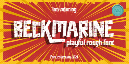 **Beckmarine Font** This pair was inspired by the retro cartoon with motorbike poster design that i saw on some coffee shop, It was crafted by hand specially to add natural handmade feeling in its brand identity than i make it clean with pentool. **Opentype features** Schoutler font has 210 character set included Schoutler Font is very good looking in logo, labels, product packaging, invitations, advertising and others. This fonts works with folowing languages: Afrikaans, Albanian, Asu, Basque, Bemba, Bena, Chiga, Cornish, Danish, English, Estonian, Filipino, Finnish, French, Friulian, Galician, German, Gusii, Indonesian, Irish, Italian, Kabuverdianu, Kalenjin, Kinyarwanda, Low German, Luo, Luxembourgish, Luyia, Machame, Makhuwa-Meetto, Makonde, Malagasy, Malay, Manx, Morisyen, North Ndebele, Norwegian Bokmål, Norwegian Nynorsk, Nyankole, Oromo, Portuguese, Romansh, Rombo, Rundi, Rwa, Samburu, Sango, Sangu, Scottish Gaelic, Sena, Shambala, Shona, Soga, Somali, Spanish, Swahili, Swedish, Swiss German, Taita, Teso, Vunjo, Zulu Thank you for using this font. LS
 - Toothless by LetterStock,
$20.00 **Toothless Font** This pair was inspired by the playful kids poster design that i saw on some coffee shop, It was crafted by hand specially to add natural handmade feeling in its brand identity than i make it clean with pentool. **Opentype features** Toothless font has 170 character set included Toothless Font is very good looking in logo, labels, product packaging, invitations, advertising and others. This fonts works with folowing languages: Afrikaans, Albanian, Asu, Basque, Bemba, Bena, Chiga, Cornish, Danish, English, Estonian, Filipino, Finnish, French, Friulian, Galician, German, Gusii, Indonesian, Irish, Italian, Kabuverdianu, Kalenjin, Kinyarwanda, Low German, Luo, Luxembourgish, Luyia, Machame, Makhuwa-Meetto, Makonde, Malagasy, Malay, Manx, Morisyen, North Ndebele, Norwegian Bokmål, Norwegian Nynorsk, Nyankole, Oromo, Portuguese, Romansh, Rombo, Rundi, Rwa, Samburu, Sango, Sangu, Scottish Gaelic, Sena, Shambala, Shona, Soga, Somali, Spanish, Swahili, Swedish, Swiss German, Taita, Teso, Vunjo, Zulu Thank you for using this font. LS
 - Plague Master by Hanoded,
$15.00 I admit: I had a bit of a crazy week when I thought up an drew this font. I broke my arm during kickboxing training on monday, leaving me in a cast - unable to do most everyday things, like getting a good night's sleep (try sleeping with a humongous cast on your arm). Thank goodness, it is my left arm, so I can still draw letters and use my laptop. So… this font has been made entirely using one arm! It is a bit of a horror font - it sort of sums up my mood right now. Glyphs have very little spacing, adding to the evil look of Plague Master. Comes with a lethal amount of diacritics.
 - P22 CoDependent by IHOF,
$24.95 P22 CoDependent is a revival of the Independant typeface from 1930 created by Dutch designer Johannes Nicolaas Coenraad Collette along with Jos Dufour from Belgium. Independant was released in metal by the Belgian division of the Amsterdam Type Foundry in commemoration of the 100th anniversary of the independence of Belgium from the Netherlands. Despite the name, the two fonts contained in the set, Regular and Shadow, are not codependent upon each other. They can be used alone, but together they can create a dynamic two-color option. There have been other fonts inspired by and revived directly from Independant, but this version adheres the original design with the added consideration of how the shadow version will overlap.
 - Videomax by PizzaDude.dk,
$16.00 Videomax looks like something from the future - perhaps even something from a future where the world lies in ruins and is about to be taken over by hostile aliens. The worn letters represent the decades of war against the computers...or the aliens...or maybe the letters comes from a sign of a computer company from the eighties, which was recently found in an abandoned place. The speculations are many, but one thing is definitely true: Videomax got that grungy / computer / worldwar feeling! Write your text, and watch how the randomness of letters make your text look really good. I've put it 4 different versions of each letter, which makes it look really nice and worn!
 - Aeonian by Adorae Types,
$40.00 Aeonian, designed by Emilia Adorno, was mostly inspired by the iconic morphology adopted by the arts of the 1920s. One hundred years later we can still see the resemblance between the wants and the needs of now and then to reach for the sky, to look ahead and enter the future in style. Now as then, we seek the right tools to do so, then once again, we embrace the rational, yet elegant and stylish forms of simplicity, geometry and symmetry. At the same time, there is a strong and growing need for a warmer approach to creating lovemarks. For that, Aeonian’s alternates hold attractive, soft and inviting shapes to an emotional appeal. Aeonian is a combination of all of them. A rational side entwined with an emotional one. Born a geometric sans, Aeonian ended up being a 2 in 1 font with a sans serif set and alternates reaching over 1200 glyphs. The entire family contains 6 weights, from thin to black, with its matching italics. It features a variety of ligatures to be used as connectors, specially for display. It also offers multilingual support, even for certain display ligatures. Later, Aeonian kept growing, with stylistic alternate sets of initial, mid and final glyphs. These are its arms to reach for infinity with a warm heart. The wide range of possibilities that Aeonian offers, makes it the best font for creating vast design systems with a rich visual language.
 - Monarchia - Personal use only

- Athletes - Unknown license


