10,000 search results
(0.08 seconds)
- Stamen by Wordshape,
$20.00 Stamen is the answer to a big question: What would happen if one tried to create a typeface that was ‘out of time’? If a type designer was to turn off the internet and put away the type specimens and just try to explore limbic, phantom history, what might that look like? No slavish explorations of the past. No gropings toward the future. No exhaustive core sample of the contemporary. Instead, using what one remembers of history and our collective vision of the future (usually a future imagined from the past) and channeling that into something that is, hopefully, new… The Bentons meet Frutiger for a Manhattan on a space station while Matthew Carter sways to the sweet sounds of the chorale that occasionally played through the halls of Stephenson Blake. This smear of implicit history expressed without explicit reference—this is Stamen: a family of 12 typefaces with a ton of alternate characters. The bold weight was designed for the LP “I Thought the Future Would Be Cooler” ( http://ittfwbc.com/ ) by the band YACHT in response to their request for a typeface that was ‘lost in time’, and refers to neither strict historical models nor purely futuristic forms. I built a small family out from there. It works well in text, but just as well for display setting. I think you’ll enjoy using it.
 - Scaffoldini by Funk King,
$10.00 The Scaffoldini Family provides four different isometric perspectives and is suitable in use in science, engineering and sci-fi themed projects or however you see fit. The lines are formed by bubbles (or circle bricks in Fontstruct) and appear smoother the smaller the size of the type. These are not straight line segments and the gylphs will appear bubbly (scalloped edges) at larger size. Please be aware of this feature of the font before you purchase.
 - Shiny Ink Display by Lloyd David Designs,
$14.99 Hi there, thanks for looking at my first typeface. It began as one of my original sketches back in 2019 as a freelance graphic designer trying to create unique letterforms that I could use for posters or websites with other possible use cases in mind for commercial use. The sketches were then passed on to and worked on with Vladimir Tsagolov who has more experience in creating professional typefaces, the experience for me was invaluable, and I have many more typefaces I'm now working on. Shiny Ink Display is a collection of hand drawn fonts based on the flow of reflective viscous ink with 7 styles, some styles can be interchangeable and used on top of each other. For example, Shiny Ink Display Plain, can be used with Shiny Ink Display Plain Lined to create shadows underneath it, at angles not available with the Shadow styles you'll see in the font collection. Shiny Ink Display has various use cases, maybe even infinite, but more specifically for posters or websites with large text, though it bodes quite well at smaller sizes, and is visually appealing to its viewers as long as it's at a legible font size. When it comes to font pairing, Shiny Ink Display works especially well with Monospace and sans-serif fonts. You can check the poster examples on this page to help you imagine what you could do with the font styles. I also had in mind manufactured products, but I could leave that to you to create your ideas with the available font styles. In regards to languages or typing on a keyboard, most of the English/European latin or cyrillic language keys are supported, so you'll have lots of glyph characters to play with for a number of ideas you may have. All the best with your projects using my fonts, if there are any issues, don't hesitate to contact me for support: lloyddaviddesigns.co.uk - Lloyd David
 - PF DIN Mono by Parachute,
$45.00 PF DIN Mono is the latest addition to the ever-growing set of DIN super-families by Parachute. It was based on its proportional counterpart DIN Text Pro but was completely redesigned to reflect its new identity. DIN Mono is a monospace typeface which is comprised of characters with fixed width. Traditionally, monospaced fonts have been used to create forms, tables and documents that require exact text line lengths and precise character alignment. DIN Mono, on the other hand, can prove to be more than a useful typeface for technical applications. In the world of proportionality, DIN Mono stands out as a fresh new alternative to the popular standard, particularly for publishing and branding applications. Additional care was given to the aesthetic form and its pleasing characteristics. The spacing attributes of the glyphs were redefined and legibility was further improved by revising or changing the shape of the letterforms. Furthermore, kerning was not included in order to preserve the monospace nature of this typeface. The family consists of 12 weights including true-italics. Currently, it supports Latin, Eastern European, Turkish and Baltic.
 - Catenary by Active Depth,
$6.00 The Catenary typeface was designed with the goal of creating an extremely-readable sans-serif font that could weather the future. Inspired by the beauty of the catenary curve, it's a blend of the transitional and the geometric that allows it to be readable while keeping its forms precise and consistent. Every character in its set is unique, leaving no confusion between similar letter forms. Sixes and nines can be distinguished even when they're upside down or sideways. The number one, the lowercase-L, and the uppercase-I can never be confused with one another, even without context. Throw b, d, g, p, and q into a jumble and the challenge of distinguishing the characters can easily be overcome. The Catenary family consists of eight fonts, six of which, the standard light/italic, regular/italic, and bold/italic, work as both excellent text fonts and exceptional display fonts. The two bonus fonts, a stencil and a guerrilla grunge style, make for great additional display font choices. The Catenary family is extremely versatile and ready for your toughest design work.
 - Glyphic Neue by Typeco,
$29.00Glyphic Neue was inspired by the Op Art style of lettering in the United States that ran rampant in many photo type houses in the 1960's and 1970's. The Glyphic Series from the Franklin Photolettering group was an influence and spring board for this family of fonts, hence it's name. But Glyphic Neue departs from its unicase Franklin influence in several ways. Firstly the designer created both upper and lower case forms. The lowercase has been designed with barley protruding ascenders and descenders and with an x-height equivalent to the cap height, so that upper and lower can be exchanged indiscriminately for a quirky effect. Some of the letters take a cue from the original Glyphic series but many have been redesigned entirely to fit the designers vision. The italic forms differ enough from the upright version making it almost an entirely different display alphabet. Glyphic Neue is a versatile family of 6 fonts -- 3 widths, each with an accompanying italic that look equally at home when used on a party flier or a sports team visual identity. - Lilium Star by Krafted,
$10.00 “The modest Rose puts forth a Thorn. The humble Sheep a threat’ning Horn. While Lily white shall in love delight. Nor a Thorn nor a threat stain her beauty bright.” ― William Blake Are you looking for a way to enhance your copy? Introducing Lilium Star - A Modern Handwritten Font. With every hand-drawn stroke and curve, Lilium Star will delight and add brightness, modernity and elegance to wherever it is placed. Impress your wedding guests with gorgeous invitations using Lilium Star. Why not create more engaging content and inspire your audience and clients? This Modern Handwritten font is also perfect for headings, logos, business cards, printed quotes, cards, packaging, and your website or social media branding. What you’ll get: Multilingual & Ligature Support Full sets of Punctuation and Numerals Compatible with: Adobe Suite Microsoft Office KeyNote Pages Software Requirements: The fonts that you’ll receive in the pack are widely supported by most software. In order to get the full functionality of the selection of standard ligatures (custom created letters) in the script font, any software that can read OpenType fonts will work.
 - Backstroke by Eclectotype,
$50.00 Normal and upright italic script fonts line a well-trodden path; left-leaning fonts (or "rightalics" as they're confusingly called), on the other hand, are a rarity. Here at Eclectotype Fonts we don't like to do things too conventionally, so here's Backstroke, a laid back script with a unique voice. With contextual alternates for start and end forms of certain characters, swash versions of L, Q and Z (surely the most used initial caps!), and a handful of stylistic sets, Backstroke is a restrained script. Stylistic sets are: 1. the start forms of i, j, m, n, and p are used always instead of only at word starts. 2. lower case ascenders get a whole lot loopier. 3. alternate versions of G, N and Y. 4. swash L, Q and Z. 5. swaps the default Polish script lslash for a more familiar version While fonts that lean the wrong way may be a bit more difficult to fit into your layouts than boring old regular italics, they will reward you with their individuality. Why not give it a go?
 - Betthofen Script by Ferry Ardana Putra,
$12.00 Betthofen |Handwriting Bouncy Script font manufactured by Ferry Ardana Putra, this typeface support OpenType features and includes numeral, punctuation, ligatures and it also supports multi-languages. Combine this bouncy font with its ligature and ton of ornaments that you can freely choose for your precious project! This font is perfect for branding projects, wedding designs, advertisements, product packaging, product designs, label, photography, invitation, quotes and any project spiced up! Betthofen features: A full set of upper & lowercase characters Numbers & punctuation Multilingual language support PUA Encoded Characters +350 Glyph Ligatures Swashes Ornaments OpenType Features ——— ⚠️To enable the OpenType Stylistic alternates, you need a program that supports OpenType features such as Adobe Illustrator CS, Adobe InDesign & CorelDraw X6-X7, Microsoft Word 2010 or later versions. There are additional ways to access alternates/swashes, using Character Map (Windows), Nexus Font (Windows), Font Book (Mac) or a software program such as Pop Char (for Windows and Mac). ⚠️For more information about accessing alternative, you can see this link: http://adobe.ly/1m1fn4Y ——— 🔑Important tutorial from the author: Tutorial for Mollusca font trio: https://lnkd.in/d984CQD6 How to use Midway | Retro Script Font on illustrator: https://lnkd.in/eusbZd7s How to use Midway | Retro Script Font on Photoshop: https://lnkd.in/evsYrwgs ——— ❤️Get in touch with the author: Instagram: https://www.instagram.com/ardana619 Behance: https://www.behance.net/ardana619 ——— 📢Shout out to: https://unsplash.com (for awesome photos) https://graphicburger.com (for outstanding mockups) ——— 🔥Thankyou for purchasing our product, hope you like and have fun with our product. If you have any queries, questions or issues, please don't hesitate to contact us directly. If you satisfied with our product, please give 5 stars rating. ——— Happy Designing...😊
 - JMTF Robin by John Moore Type Foundry,
$55.00 JMTF Robin is a new post-modernist typeface in the spirit of Art & Crafts, born as a concept of a reformulation of a Gothic traditional building structure. Interestingly medieval structural architectural rescue form is for creating a font of traits absolutely contemporary without losing its artisan flavor. JMTF Robin is then a modular typography with very specific characteristics that provides an innovative texts while an appearance of great personality. Early versions of Robin was winners in Letras Latinas 2006. JMTF Robin representing a before and after in terms of contemporary texts composition. JMTF Robin is a typeface family that is presented in a wide variety of forms, from JMTF Robin in condensed forms to other roman proportions like Robin9, ideal for text, also JMTF Robin comes in Shadow and Double Outline. I dedicate this letter to creative genius William Morris father of modernism.
 - Bertoni by Greater Albion Typefounders,
$12.00 Bertoni is a high contrast Didone family of twenty faces, which combines extreme legibility with distinctive character. It is able to hold its own in modern usage while having features rooted in a deep period charm. The family includes two widths as well as two weights. Bertoni regular, bold and wide are small capitals faces ideal for posters, book covers, packaging and signage. The text faces are body faces which form the ideal accompaniment. For more distinctive features, the Title, Capitals (all capitals, but in two forms) and Flamboyant faces are ideal. Bertoni offers a blend of the modern with classical revivalist charm which makes it up to the minute and never out of place. The family is extensive enough to form the foundation of a commercial house style, but can also lend an element of character in single usage.
 - Vintage Melody Personal Use - Personal use only

- Milky Matcha Personal Use - Personal use only

- Blueheria by Letterhend,
$19.00 Blueheria is bold script which looks great for vintage and adventure theme! This font is also suitable to be applied especially in logo, and the other various formal forms such as invitations, labels, logos, magazines, books, greeting / wedding cards, packaging, fashion, make up, stationery, novels, labels or any type of advertising purpose. Features : Uppercase & lowercase Numbers and punctuation Multilingual Alternate Character PUA encoded We highly recommend using a program that supports OpenType features and Glyphs panels like many of Adobe apps and Corel Draw, so you can see and access all Glyph variations.
 - Stroma by Tokotype,
$39.00 Stroma is a serif display faces with moderate contrast and quirky cuts. Intended to use it on headlines in the editorial design environment or big type style graphics, The function of this typeface allows it to use on larger and compact text for any graphical elements that need special treatment. The details interpreted from the straight axis pointed into flourish calligraphic serif, the shape of the letter contains straight details and cuts, this gives them a rich and fine looks. The Stroma family includes four weights, ranging from Light to Bold with italic uprights.
 - Linotype Compendio by Linotype,
$40.99Linotype Compendio is a part of the Take Type Library, chosen from the contestants of the International Digital Type Design Contests from 1994 and 1997. Christian Bauer designed this font based on the basic forms of Transitional faces of the 17th century. The outer contours of the letters are purposely raw and irregular, much like alphabets printed on low-quality paper. The legibility of the font is thus reduced, making it necessary to use this font only for shorter texts or headlines, but it is exactly this characteristic which lends Linotype Compendio its distinctiveness. - Galigo by Grontype,
$12.00 Galigo is a captivating hand-drawn font that seamlessly blends artistic flair with versatile functionality. This unique typeface showcases a delightful variety with both light and regular forms, allowing you to effortlessly convey different moods and styles in your projects. Whether you're designing invitations, posters, branding materials, or any other creative endeavor, Galigo provides the versatility to express your ideas with finesse. Features: Regular & Light Uppercase & Lowercase Basic Latin Glyphs Multilingual Support Numeral and Punctuation Ligatures & Alternates Thankyou for picking up this font, hope you enjoy it. Regard. Grontype
 - 1751 GLC Copperplate by GLC,
$38.00 This family was inspired by an engraved plate from Diderot & Dalembert's Encyclopedia (publication beginning in 1751), illustrating the chapter devoted to letter engraving techniques. The plate bears two engravers names : "Aubin" (may be one of the four St Aubin brothers ?)and "Benard" ( which name is present below all plates of the Encyclopedia printed in Geneva ). It seems to be a transitional type, but different from Fournier or Grandjean. Small caps are included in fonts for TTF and OTF version, separate files are included in the family sets of the Mac TT version.
 - Blantika by Letterhend,
$19.00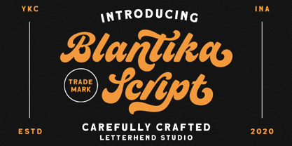 Introducing, Blantika Script - a bold script which is purposely made for logotype. This type of font perfectly made to be applied especially in logo, and the other various formal forms such as invitations, labels, logos, magazines, books, greeting / wedding cards, packaging, fashion, make up, stationery, novels, labels or any type of advertising purpose. Features : uppercase & lowercase numbers and punctuation multilingual alternates and ligatures PUA encoded We highly recommend using a program that supports OpenType features and Glyphs panels like many of Adobe apps and Corel Draw, so you can see and access all Glyph variations.
 - Petroglyph by ParaType,
$25.00PT Petroglyph™ was designed by Ekaterina Kulagina and licensed by ParaType in 2002. The type was created on the basis of petroglyphs (rock-carvings) that are known in 77 countries. They remained in a form of geometrical drawings in the caves of North Spain and France. Scientists claim that the radial spread-out of circles or center-pointed circles that are usually depicted show the development of solar symbolism at that period of time. We know for sure that such mysterious signs as drawings carved on rocks already existed 40 centuries ago. - Linotype Sunburst by Linotype,
$29.99Linotype Sunburst is part of the Take Type Library, chosen from the contestants of Linotype’s International Digital Type Design Contests of 1994 and 1997. Designed by British artist Ed Bugg, Linotype Sunburst is a font which consistently avoids all that is round. The forms are angular and pointed with triangular serifs which seem almost like flags waving from the paper. This playful font could easily be associated with sun, sand and vacation. Linotype Sunburst is intended for headlines in large point sizes or short texts with medium point sizes, if used carefully. - Tjempaka by IKIIKOWRK,
$17.00 Introducing Tjempaka - Classy Type, created by ikiiko. Tjempaka is a modern condensed serif type with a elegant style. This font shape is simple form character with vintage touch. This typeface is perfect for an brand logo, magazine design, travel design layout, wedding invitation, flyer design, poster design, inspirational quotes, photography layout, or simply as a stylish text overlay to any background image. What's included? Uppercase & Lowercase Number & Punctuation Multilingual Support Works on PC & Mac Enjoy our font and if you have any questions, you can contact us by email : ikiikowrk@gmail.com
 - Anicon Slab by NREY,
$79.00 Anicon Slab font consist of 18 weight: from Thin to Black with each weight paired by italic. Also including Latin & Cyrillic language support with more than 35 languages. Anicon is a fonts superfamily, semicondensed sans serif and slab serif with humanistic forms of characters. This font was crafted with the intention to present a clean, legible, multipurpose font family that is easy to read wether it's on screen or print. Fit for all purposes; text, display, headline, print, corporate identity, logo, branding, product, infographic, photography and other application and medium.
 - Linotype Charon by Linotype,
$29.99Linotype Charon is the work of Renate Weise. Linotype Charon is a typeface with two sides to it: both objective and classic, it is neither neutral, nor an everyday typeface. Charon is modern and animated; its curving letters seek to touch the reader. Linotype Charon is named after the ferryman of Greek mythology who brought the souls of the dead across the River Acheron into the Underworld, connecting living and the dead. Linotype Charon, with its light swing and script character, can be used for either short texts or headlines. - Ryo Text PlusN by Adobe,
$79.00Ryo is a Japanese kana typeface design composed of hiragana, katakana and some punctuation marks. Available in four weights--extra light, light, regular and medium, Ryo Text has been specifically designed for use when producing text settings. Supplied in the cross-platform OpenType format, this special kana font can be used to supplement or replace the existing kana designs in existing Japanese fonts that contain full character sets. Creative professionals using the Japanese version of Adobe InDesign may use that program's Composite Font tool to easily combine Ryo Text with other typefaces. - Sogate by Letterhend,
$19.00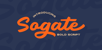 Introducing, Sogate - a bold script which is purposely made for logotype. This type of font perfectly made to be applied especially in logo, and the other various formal forms such as invitations, labels, logos, magazines, books, greeting / wedding cards, packaging, fashion, make up, stationery, novels, labels or any type of advertising purpose. Features : uppercase & lowercase numbers and punctuation multilingual alternates and ligatures PUA encoded We highly recommend using a program that supports OpenType features and Glyphs panels like many of Adobe apps and Corel Draw, so you can see and access all Glyph variations.
 - Davenvale by Letterhend,
$19.00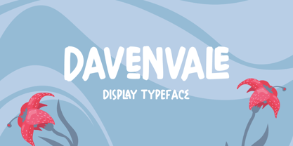 Introducing, Davenvale Display Typeface. This font looks great and standout for tittle, headline, logo, etc. Perfectly to be applied to the other various formal forms such as invitations, labels, logos, magazines, books, greeting / wedding cards, packaging, fashion, make up, stationery, novels, labels or any type of advertising purpose. Features : uppercase & lowercase numbers and punctuation multilingual alternates & ligatures PUA encoded We highly recommend using a program that supports OpenType features and Glyphs panels like many of Adobe apps and Corel Draw, so you can see and access all Glyph variations.
 - Cailyne by Reyrey Blue Std,
$18.00 Introducing, Cailyne Typeface. A modern and elegant San serif with an italic version. It is designed with a touch of modern look and feel, making it ideal for projects that demand a touch of class. This type of font is perfectly made to be applied especially in logos, headlines, signage, and the other various formal forms such as invitations, labels, logos, magazines, books, greeting/wedding cards, packaging, fashion, makeup, stationery, novels, labels or any advertising purpose. Features : All Uppercase and Lowercase Number & Symbol Supported Languages Ligatures PUA Encoded Hope you enjoy our font!
 - Zigzag by Volcano Type,
$60.00 ZIGZAG is a funny font family whose letters have four varieties each in order to multiply expressions and attract the eye by breaking the rhythm of reading. There are two styles available Rounded and Not Rounded. The variations oscillate between a hand-drawn design and a geometric or imaginative drawing. Opentype’s function lets you choose between different variations of each glyph and contextual variables allow to mix the styles. Benoît Bodhuin designed ZIGZAG Rounded in 2011/12 for the theatre Vivat. In 2013 ZIGZAG Rounded was supplemented by ZIGZAG Not Rounded.
 - Bellasmith by Abbasy Studio,
$15.00 Bellasmith, is a pair of bold sans and monoline script with a touch of vintage look. This script font comes with multiple alternates that will make your words look like a custom lettering. With additional sans font you will be able to create the beautiful combination. This type of font perfectly suitable for made to be applied especially in logo, and the other various formal forms such as invitations, labels, logos, magazines, books, greeting / wedding cards, packaging, fashion, make up, stationery, novels, labels or any type of advertising purpose.
 - Thirtylane Script by Letterhend,
$19.00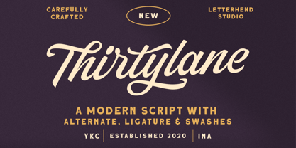 Introducing, Thirtylane - a bold script which is purposely made for logotype. This type of font perfectly made to be applied especially in logo, and the other various formal forms such as invitations, labels, logos, magazines, books, greeting / wedding cards, packaging, fashion, make up, stationery, novels, labels or any type of advertising purpose. Features : uppercase & lowercase numbers and punctuation multilingual alternates and ligatures PUA encoded We highly recommend using a program that supports OpenType features and Glyphs panels like many of Adobe apps and Corel Draw, so you can see and access all Glyph variations.
 - Monodia by Posterizer KG,
$19.00 In few words, Monodia is a small but widely applicable slab serif (nearly monoweight) font family with only two weight and one cut effect version. To those who agree with the fact that less is actually more, three fonts should be sufficient for branding, headlines and other display uses. With that reason regular and bold weights are designed with huge contrast. In order to avoid clogging of certain (especially Cyrillic) letters in the text, some serifs are atypically modified or allowed. Unlike uppercase letters and numbers, lowercase letters don’t have forked serifs. Еnjoy!
 - Klex Plus by Ingo,
$42.00 A calligraphic alphabet in bold/light brushstrokes Actually, a typeface like this one should be written with a wide brush; this one was written with a thick, pointed brush. Thus were created the round or misshapen ends of the stems, and the sometimes excessively pointed ends of the hairlines. For each character of KLEX, the large brush was dipped in the ink anew. Using this method, the forms turned out very soft, in spite of their geometrical rigidity. The individual characters are heavy, simple, and monumental, so that they are also suitable as initials.
 - Agency Gothic CT by CastleType,
$59.00 Originally designed by American type designer Morris Fuller Benton in 1933, Agency Gothic is a wonderful, narrow, squarish art deco typeface. I was commissioned by Publish magazine to create digital versions of Agency Gothic Open and Agency Gothic Condensed for a redesign in 1990. Since then, I have added four other styles. Agency Gothic CT is uppercase only and supports most European languages that use the Latin or Cyrillic alphabets. The Agency Gothic CT family is available in six weights/styles: Light, Medium, Bold, Condensed, Inline, and Open.
 - Digideco by astroluxtype,
$20.00 Retro-futuristic robot terminal type. The 1930s Moderne Streamline decade meets the digital domain in this weird font. Use it in an ad for Ford Tri-Motor Airplane or a story about an out of control 1980s computer monster. Which? Help it find its place- as it is lost in time. Digideco is a minimal font set that includes upper and lowercase letterforms which can be used at various sizes but, we consider it a headline/display font, best applied larger than 36 points in size. Shall we play a game?
 - Argus by Red Rooster Collection,
$45.00 Designed by Les Usherwood. Argus is a flared serif font family. Its analog form was designed by Les Usherwood (Typsettra) in the 1980’s, and Paul Hickson (P&P Hickson) and Steve Jackaman (ITF) designed the digital version exclusively for the Red Rooster Collection in 1992. Argus is an expressive, graceful typeface that was inspired by Baroque typography. Its diamond-shaped punctuation shares similarities with other glyphic typefaces, such as Arthur Baker’s ‘Baker Signet.’ The font family gives a beautiful gravitas to any project, whether it be packaging, motion picture, or magazines.
 - Anicon Sans by NREY,
$19.00 Anicon Sans font family consist of 18 weight: from Thin to Black, each weight paired by italic. Also including Latin & Cyrillic language support with more than 35 languages. Anicon is a superfamily, semi condensed sans serif and slab serif with humanistic forms in the characters. This font was crafted with the intention to present clean, legible, multipurpose characters that are easy to read wether it's on screen or print. Fit for all purposes; text, display, headline, print, corporate identity, logo, branding, product, infographic, photography and other applications and medium.
 - Scriptina Pro - 100% free

- Istanbul Type by Bülent Yüksel,
$19.00 "Istanbul Type" has a modern streak which is the result of a harmonization of width and height especially in the lowercase letters to support legibility. "Istanbul City" has the modernity of the west and the orientalist texture of the east as the city that unites the Asian and European continents. "Istanbul Type" also includes these features. It is a unique character that reflects the spirit of "Istanbul City". Many letter alternatives prepared with care have been created for all letters. You can make dozens of combinations from a word using these alternative letters. "Istanbul Type" is an effective set for creating identities for branding, posters, book covers, headlines, logotypes, restaurants, menu cards, wedding invitations and so on. "Istanbul Type" provides advanced typographical support for Latin-based languages. An extended character set, supporting Central, Western and Eastern European languages, rounds up the family. The designation “Istanbul Type 500 Regular” forms the central point. The first figure of the number describes the stroke thickness: 100 Thin to 900 Bold. "Istanbul Type" 5 weights and italics total 10 types. The family contains a set of 2.200+ characters. Case-Sensitive Forms, Classes and Features, Fractions, Superior, Inferior, Denominator, Numerator, Old Style Figures just one touch easy In all graphic programs. Attention! "Typography Line" is not suitable for use. When using it for special effects, it may be necessary to "Convert / Create Outlines" it first and then "Pathfinder Unite" it. You might have a crush on this typeface :) Do not hesitate to consult me for information about fonts before, during and after purchasing. You can contact me at "buyuksel@hotmail.com". Enjoy using it.
 - Istanbul Type Variable by Bülent Yüksel,
$69.00 "Istanbul Type Variable" has a modern streak which is the result of a harmonization of width and height especially in the lowercase letters to support legibility. "Istanbul City" has the modernity of the west and the orientalist texture of the east as the city that unites the Asian and European continents. "Istanbul Type Variable" also includes these features. It is a unique character that reflects the spirit of "Istanbul City". Many letter alternatives prepared with care have been created for all letters. You can make dozens of combinations from a word using these alternative letters. "Istanbul Type Variable" is an effective set for creating identities for branding, posters, book covers, headlines, logotypes, restaurants, menu cards, wedding invitations and so on. "Istanbul Type Variable" provides advanced typographical support for Latin-based languages. An extended character set, supporting Central, Western and Eastern European languages, rounds up the family. The designation “Istanbul Type Variable 500 Regular” forms the central point. The first figure of the number describes the stroke thickness: 100 Thin to 900 Bold. "Istanbul Type Variable" 5 weights and italics total 10 types. The family contains a set of 2.200+ characters. Case-Sensitive Forms, Classes and Features, Fractions, Superior, Inferior, Denominator, Numerator, Old Style Figures just one touch easy In all graphic programs. Attention! "Typography Line" is not suitable for use. When using it for special effects, it may be necessary to "Convert / Create Outlines" it first and then "Pathfinder Unite" it. You might have a crush on this typeface :) Do not hesitate to consult me for information about fonts before, during and after purchasing. You can contact me at "buyuksel@hotmail.com". Enjoy using it.


