10,000 search results
(0.045 seconds)
- The Blackmore by Letterhend,
$19.00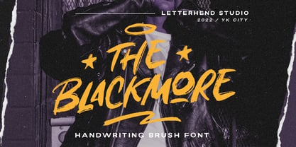 The Blackmore is a bold hand drawn brush script which is purposely made for headline, display or logotype, and signature which need a standout appearing. This font is also suitable to be applied especially in logo, and the other various formal forms such as invitations, labels, logos, magazines, books, greeting / wedding cards, packaging, fashion, make up, stationery, novels, labels or any type of advertising purpose. Features : uppercase & lowercase numbers and punctuation multilingual PUA encoded We highly recommend using a program that supports OpenType features and Glyphs panels like many of Adobe apps and Corel Draw, so you can see and access all Glyph variations.
 - Koruption by Typogama,
$59.00 Koruption is a neo-grotesque typeface family that allows the user to control the amount of distortion in the letters. Thanks to variable axises, this typeface can range from a clean form to a glitched, deformed letter style. To further the effect, these fonts employ further opentype features to alternate the letters, mimicking the real randomness that can arise from distorted letters. With a full character set and some additional symbols and arrows, Koruption aims to be a versatile display solution, for use in headlines or logos, but it’s variable axis can also be employed as a real time animation in videos or digital applications.
 - Perola by IKIIKOWRK,
$17.00 Introducing Perola - Fancy Type, created by ikiiko. Perola means "pearl" and comes from spanish language. This letter has a distinctive feature on its hook, which is in the form of a unique and dynamic curve. This letter is suitable if you want to show a cheerful impression or playful design with solid color. This typeface is perfect for an cute branding, pop art design, packaging product, food & beverages, quotes, or simply as a stylish text overlay to any background image. What's included? Uppercase & Lowercase Number & Punctuation Multilingual Support Works on PC & Mac Enjoy our font and if you have any questions, you can contact us by email : ikiikowrk@gmail.com
 - Morytone by Letterhend,
$18.00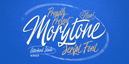 Morytone is a hand drawn brush script which is purposely made for headline, display or logotype, and signature which need a standout appearing. This font is also suitable to be applied especially in logo, and the other various formal forms such as invitations, labels, logos, magazines, books, greeting / wedding cards, packaging, fashion, make up, stationery, novels, labels or any type of advertising purpose. Features : Uppercase & lowercase Numbers and punctuation Swash, ligatures & alternates Multilingual PUA encoded We highly recommend using a program that supports OpenType features and Glyphs panels like many of Adobe apps and Corel Draw, so you can see and access all Glyph variations.
 - Peroba Rosa by Yahya Type,
$16.00 Peroba rosa is a modern sans serif type family featuring a blend of modern, classical, and playful characteristics. The simple, clean forms and classically inspired proportions give it a timeless quality and interesting visual rhythm. Peroba rosa is perfect for logo design, magazine headers, product packaging, branding projects, clothing or simply as a stylish text overlay to any images or websites. WHAT’S INCLUDED? • Comes with regular, thin, light, italic, bold, thin italic, light italic, bold italic and bold italic font styles. Uppercase & lowercase letters. numbers. punctuation Ligature & Huge Stylistic alternate. Multilingual support. Still got a question? Send me a message and I’ll be happy to answer! qura.yahya@gmail.com
 - Astropicks by Letterhend,
$19.00 Astropicks is a modern and playful typeface which is purposely made for headline, display or logotype. This type of font perfectly made to be applied especially in logo, and the other various formal forms such as invitations, labels, logos, magazines, books, greeting / wedding cards, packaging, fashion, make up, stationery, novels, labels or any type of advertising purpose. Features : uppercase & lowercase numbers and punctuation multilingual alternates & ligatures PUA encoded We highly recommend using a program that supports OpenType features and Glyphs panels like many of Adobe apps and Corel Draw, so you can see and access all Glyph variations. How to access opentype feature : letterhend.com/tutorials/using-opentype-feature-in-any-software/
 - Slanted ITALIC Shift by TypoGraphicDesign,
$19.00 CONCEPT/CHARACTERISTICS The constructed, clear and modern character of the typeface based on the basic form of the triangle. The motto is geometrically and italic. APPLICATION AREA The modern, futuristic and constructed font „slanted ITALIC shift“ would look good at display size for poster, flyer, comics and graphic novel lettering and logos. Headlines in magazines or websites, packaging, music covers or webbanner etc. TECHNICAL SPECIFICATIONS Headline Font | Display Font | Geometric Font „slanted ITALIC shift“ OpenType Font with & 308 glyphs & 6 styles (thin, light, regular, medium, bold, black). Alternative letters, symbols and ligatures (with accents & €) FONT IN USE www.typographicdesign.de/font-in-use-slanted-italic-shift/
 - Haystack by Letterhend,
$19.00 Haystack is a handwritten script with many . You can use also for headline or signature. This type of font perfectly made to be applied especially in logo, and the other various formal forms such as invitations, labels, logos, magazines, books, greeting / wedding cards, packaging, fashion, make up, stationery, novels, labels or any type of advertising purpose. Features : uppercase & lowercase numbers and punctuation multilingual alternates and ligatures PUA encoded We highly recommend using a program that supports OpenType features and Glyphs panels like many of Adobe apps and Corel Draw, so you can see and access all Glyph variations. How to access opentype feature : letterhend.com/tutorials/using-opentype-feature-in-any-software/
 - The Crafty by Gilar Studio,
$16.00 The Crafty ! a Handwritten Display Font With 3 Style (Regular,Outline and Shadow) You Can Mix And Match for Your Awesome Project This fonts is ideal for crafting, branding and decorate your any project. This fonts are perfect for wedding invitation or your blog. Also with their help, you can create a logo or beautiful frame for your home. Or just use for your business, book covers, stationery, marketing, magazines and more. FEATURES : Uppercase & Lowercase Number & Punctuation More than 242 of glyphs Multilingual Language PUA Encode 25 Ligatures Alternate The alternative characters were divided into several Open Type features can be accessed by using Open Type savvy programs such as Adobe Illustrator, Adobe InDesign, Adobe Photoshop Corel Draw X version, And Microsoft Word. And this Font has given PUA unicode (specially coded fonts). so that all the alternate characters can easily be accessed in full by a craftsman or designer. If you don't have a program that supports OpenType features such as Adobe Illustrator and CorelDraw X Versions, you can access all the alternate glyphs using Font Book (Mac) or Character Map (Windows). To Access Alternate Characters Click The Link Below: Adobe illustrator CS https://www.youtube.com/watch?v=geL0Ye02Ryk Adobe illustrator CC https://www.youtube.com/watch?v=V25yiUh8BcE Ms Word https://www.youtube.com/watch?v=HxkhZiCuwEw Coreldraw X7 https://www.youtube.com/watch?v=UBVsufJjons Adobe Photoshop CC https://www.youtube.com/watch?v=BYKXl58AdNY Indesign CS https://www.youtube.com/watch?v=HgZTCxKG14Q Check my other Font here : https://gilarstudio.com/
 - Ikan Salmon by Gilar Studio,
$16.00 Ikan Salmon Ikan Salmon a Handwritten Display Font With 3 Style (Regular,Outline and Shadow) You Can Mix And Match for Your Awesome Project This fonts is ideal for crafting, branding and decorate your any project. This fonts are perfect for wedding invitation or your blog. Also with their help, you can create a logo or beautiful frame for your home. Or just use for your business, book covers, stationery, marketing, magazines and more. FEATURES : Uppercase & Lowercase Number & Punctuation More than 254 of glyphs Multilingual Language PUA Encode 27 Ligatures Alternate The alternative characters were divided into several Open Type features can be accessed by using Open Type savvy programs such as Adobe Illustrator, Adobe InDesign, Adobe Photoshop Corel Draw X version, And Microsoft Word. And this Font has given PUA unicode (specially coded fonts). so that all the alternate characters can easily be accessed in full by a craftsman or designer. If you don't have a program that supports OpenType features such as Adobe Illustrator and CorelDraw X Versions, you can access all the alternate glyphs using Font Book (Mac) or Character Map (Windows). To Access Alternate Characters Click The Link Below: Adobe illustrator CS https://www.youtube.com/watch?v=geL0Ye02Ryk Adobe illustrator CC https://www.youtube.com/watch?v=V25yiUh8BcE Ms Word https://www.youtube.com/watch?v=HxkhZiCuwEw Coreldraw X7 https://www.youtube.com/watch?v=UBVsufJjons Adobe Photoshop CC https://www.youtube.com/watch?v=BYKXl58AdNY Indesign CS https://www.youtube.com/watch?v=HgZTCxKG14Q Check my other Font here : https://gilarstudio.com/
 - Cameta Cuttes by Gilar Studio,
$16.00 New Font : Cameta Cuttes - Beautiful Script Cameta Cuttes - Beautiful Script will work perfectly for fashion, e-commerce brands, trend blogs, wedding boutiques or any business that wants to appear upscale and chic. Cameta Cuttes - Beautiful Script also Suitable for Logo, greeting cards, quotes, posters, branding, name card, stationary, design title, blog header, art quote, typography, art, modern envelope lettering or book design, happening style like handdrawn design or watercolor design theme, craft design, book title, or any purpose to make your art/design project look pretty and trendy. Features : Uppercase & Lowercase Numerals & Punctuations (OpenType Standard) Accents/Multilingual characters PUA Encoded Ligature Stylistic Set Alternate Check my other Font here : https://gilarstudio.com/
 - Abril by TypeTogether,
$39.00 Conceived specifically for intensive editorial use, whether it is in newspapers, magazines or digital media, Abril is a font family of two worlds. The titling weights, based on a contemporary revamp of classic Didone styles, display both neutrality and strong presence on the page, attracting the reader’s attention with measured tension in its curves, good color and high contrast. It also features typographic niceties such as ornaments, borders, special dingbats and alternate letters and numbers that propose a broad palette of tools to the designer. The text weights are more closely inspired by both, 19th century slab serifs and scotch roman types. They maintain consistency with the headline styles, and at first glance may appear to have the same shapes only with lower contrast. However, in reality the letter forms of Abril Text were engineered from scratch to achieve a color, texture and overall width that allow using the font comfortably in the most challenging environments for continuous reading, such as newspapers. This also makes it a great font family for pocketbooks and magazines. Abril competes, in terms of economy of space, head to head with some newspaper classics such as Utopia or Nimrod, but featuring a more contemporary look and feel; and unlike them, includes a full set of small caps with numbers and punctuation. The four main text weights of Abril Text were also manually hinted which grants the possibility of a smooth transition from printed media to web platform. Abril consists of 8 text styles and 12 display styles, all of them containing the standard TypeTogether character set that supports over 50 languages including those from Central and Northern Europe.
 - Santa Rita by Eurotypo,
$42.00 Santa Rita is a new casual and modern script. This brush style typeface is the perfect blend of elegance and spontaneity. With the total number of 752 glyphs, is equipped with plenty of OpenType features. Uppercase letters can alternate between at least three different forms that can be combined with some ornaments and lowercase letters have leastways five choices more to avoid repetition. These effects include start and end forms of lowercase letters. To activate the optional glyphs you may click on Swash, Contextual or Stylistics Alternates, Standard or Discretionary Ligatures buttons in any OpenType savvy program or manually choose the characters from Glyph Palette. Also, there’s a set of 60 ornaments designed to support the font (access the ornaments through the Glyph Palette) and an important set of catchwords. The Santa Rita font might be the choice to use on creating headlines, logos & posters for branding and packaging purposes. Hope you enjoy!
 - MVB Embarcadero by MVB,
$79.00 MVB Embarcadero lies in a space between grotesque sans serifs and the vernacular signage lettering drawn by engineers. It’s a style that happens to convey credibility and forthrightness without pretense—it’s anti-style, actually. All of this makes for the most versatile of typefaces, capable of delivering any kind of message while staying out of the way. As is often the case with a type design that develops over several years, Embarcadero isn’t the realization of a specific concept. In the ’90s Mark van Bronkhorst began digitizing a blocky slab serif from the Victorian era, which was then set aside for many years. He later revisited the design, paring it down to its bare essentials, and as more time passed, it evolved from a grid-based outline to curves that echoed the rigid skeleton of the original. Eventually it became a complete family with all the readability requirements of a text sans serif, yet maintaining the subtle eccentricities of its inspiration. Functionally, the Embarcadero family is as adaptable as its design. The OpenType Pro set of 20 fonts contains two widths and five weights, each with italics, small caps, a full set of figures, bullets and arrows, and support for most Latin-based languages. In all, Embarcadero is suitable for headlines or text. And—thanks to its simple, square form—it’s ideal for type on screen too.
 - Decade by Grype,
$16.00 Straying outside of our usual logo driven typestyles, but remaining within typographic styles that have a strong brandable vibe to them comes our Decade font. Spawned from the 1938 book "Letters and Lettering" by Paul Carlyle and Guy Oring, this display style has been fleshed out into a full blown typeface, rich with a personality that evokes Art Deco and Jazz sensibility yet rooted in Russian Avant Garde Constructivism. Decade has a constructivist feel, yet contains letterforms that take take its appeal to album covers, holiday cards, minimalist corporate branding, and beyond. It adopts a sturdy yet approachable style with its geometric forms and curves, creating a straightforward, powerful presence that creates a solid foundation for designers and design trends. Here's what's included with the Decade typeface: - 368 glyphs per style - including All Capitals, Numerals, Punctuation and an extensive character set that covers multilingual support of latin based languages. (see the 5th graphic for a preview of the characters included) Here's why Decade is right for you: - You're in need of geometric typestyle evocative of the Jazz Era - You love that Constructivist look, but are seeking something "different" - You're looking for an Art Deco Showcard style typeface. - You're looking for a typeface with letter minimalist styled geometry. - You just like to collect quality fonts to add to your design arsenal
 - ALS SyysScript by Art. Lebedev Studio,
$63.00 Handwriting of a strong Carelian personality revived: It’s autumn time once again, harvesting season, mushroom & berry time – the favourite season of my Karelian aunt Katri. A postcard she sent me more than twenty years ago had inspired me to SyysScript, “Script of Autumn” in Finnish. Katri had a very kind but also energetic personality, and I always thought her handwriting was a mirror of it. By making SyysScript I felt I could revive some of her unforgettable character. My Finnish autumn font has by now become a favourite for many and is branding fine food in both the Eastern and the Western hemisphere – even far beyond the arctic circle. “SyysScript“ is actually a growing family. For enhanced functionality in small sizes I added “SyysScript Eco” a year ago, a style with shortened extensions and simplified letterforms especially suited for packaging. And this autumn, a special one for Finland which is celebrating its 99th birthday, SyysScript grew again: Two long awaited newcomers, “SyysScript FeltTip” and “SyysScript FeltTip Eco” joined the family. They are bolder and softer than the previous styles but keep their positive, lighthearted feel. Use them to make a powerful individual mark on any background. – They are equally well suited for paper, packaging, a screen or even a concrete wall! Language support: Western and Central European, Extended Cyrillic.
 - Comenia Sans by Suitcase Type Foundry,
$75.00Comenia Sans was designed in the framework of a unique typographic project for all types of schools. It is a complementary face for Comenia Serif, released by our friends at Storm Type Foundry. Comenia Sans has a lot in common with its serif sister: the height of both upper and lower case, the length of ascenders and descenders, and the general weight. This makes the two perfect partners which work well even when set side by side in a single line of text. Comenia Sans does, however, lack all serifs, ornamental elements and stroke stress variation. All these elements freshen up the feel of long texts, but for shorter texts use, they are not necessary. Despite that, Comenia Sans retains the soft, friendly character of its big sister, as well as a few tiny details which lend it its unique character without compromising legibility or utility. Open counters give all letters an airy feel and permit enough variation in construction. This is why the face works well even in multiple-page texts. All its letters are easily distinguished from each other, so the reader's eyes are not strained. Diacritics and punctuation harmonize with both upper and lower case. As usually, all diacritical marks fully respect conventional shapes of accents and they are perfectly suitable for Czech, Slovak, Polish and other Central European languages, where a lot of diacritics abounds. Similarly to the renaissance italics which refers to the cursive forms, Comenia Sans introduces novel shapes of some characters drawing from the hand-written heritage. This is most apparent in the single-bellied a, the simplified g, and the stem of f which crosses the baseline and ends with a distinct terminal. In the text, emphasized words are thus distinguished not only by the slant of letters, but also by the shapes of the letters themselves. All twelve styles contain set of small caps, suitable for the names, in the indexes or the headlines in longer texts. Legibility in small sizes under 10 points was at the center of designers' attention, too. This is why the counters of a, e and g are large enough to prevent ink spread in small sizes, both on-screen and in print. After all, the font was specifically optimized for screen use: its sober, simple forms are perfectly fit to be displayed on the computer screen and in other low-resolution devices. When used in the context of architecture, the smoothness of all contours stands out, permitting to enlarge the letters almost without limit. A standard at the Suitcase Type Foundry, each style of Comenia Sans boasts a number of ligatures, an automatic replacement of small caps and caps punctuation, a collection of mathematical symbols, and several types of numerals which make it easy to set academic and other texts in an organised, well-arranged way. For the same purpose, fractions may come in handy, too. Apart from the standard emphasis styles, the family also contains six condensed cuts (each set has the same number of characters), designated for situations where space is limited or the need for striking, poster-like effect arises. Comenia Sans is the ideal choice for the setting of magazines, picture books, and navigation systems alike. Its excellent legibility and soft, fine details will be appreciated both in micro-typography and in poster sizes. Although it was designed as a member of a compact system, it will work equally well on its own or in combination with other high-quality typefaces. - Zambeza by Putracetol,
$28.00 Introducing Zambeza, a modern display font that draws inspiration from vintage posters and combines it with elegant typography styles. With Zambeza, you can create unique letter combinations for lettering with a wide range of options. The font comes with open type features, including alternate glyphs and end swashes, providing you with creative freedom for your lettering designs. Zambeza is perfect for various design applications, such as logotypes, headings, covers, posters, logos, quotes, product packaging, headers, merchandise, social media graphics, greeting cards, and more. Its versatile design makes it suitable for different creative projects, adding a touch of modernity and vintage charm. To access the alternate glyphs, you will need a software program that supports OpenType features, such as Adobe Illustrator CS, Adobe Photoshop CC, Adobe InDesign, or Corel Draw. This allows you to fully utilize the font's design possibilities and create unique compositions. Your zip package will include the Zambeza font files in otf, ttf, and woff formats, providing compatibility for different design projects. The font includes uppercase and lowercase letters, numerals, punctuation, and symbols, giving you all the essential elements for your designs. Zambeza also supports multilanguage characters, making it suitable for designing in various languages. Whether you're creating designs in English, Spanish, French, or any other language, Zambeza has you covered. In summary, Zambeza is a modern display font that combines vintage inspiration with elegant typography styles. With its open type features, multilanguage support, and versatile design applications, Zambeza is a great choice for your creative projects. Thank you for choosing Zambeza from our collection. Happy designing!
 - Wolfers by Salamahtype,
$21.00 Wolfers is a great vintage-looking font for your brand logo or any other type of creative project that requires a vintage or classic look like magazines, banners, headlines, or other corporate graphic design needs. Features: – 6 Font styles – Uppercase and lowercase – Alternate characters – Regular and Stamp or grunge style – Symbol and punctuation – Multilingual support
 - ITC Cerigo by ITC,
$29.99ITC Cerigo is the result of a challenge which designer Jean-Renaud Cuaz set for himself: to create a typeface with the grace of Renaissance calligraphy but different from the numerous Chancery scripts. He calls Cerigo a 'vertical italic' and based it on 15th century calligraphic forms. The weights are carefully designed to complement each other and are made more flexible by a number of italic swash capitals. The flexible ITC Cerigo is suitable for both text and display. - Agis by Cloud9 Type Dept,
$40.00 Agis is a modern geometric sans-serif family by Cloud9 Type Dept's Jani Paavola. The whole family consists of 5 weights from ExtraLight to Bold. The range of styles provides legit options for title, headline and body text. Suitable for branding of any form. Agis fonts have an extended character set to support Central and Eastern European as well as Western European languages, as well as OpenType features such as small caps, fractions, oldstyle numerals and ligatures.
 - Whisky Fudge by Braw Type,
$16.00 Whisky fudge is a tasty handmade font! With its smooth edges and fun style Whisky Fudge will make your creative projects look simply delicious! Giving your design ideas a more personal touch, it’s a great choice for gift tags, greeting cards and invitations. The font comes with a set of standard ligatures (including double letters) and 5 final form characters to add extra flavour to your words. Uppercase letters also look great on their own for added creativity. Enjoy!
 - Moire by Microsoft Corporation,
$39.00Moire™ Regular is a block-style sans serif font designed by Jim Ford in the spirit of typefaces popular during the 1950's. The Moire Regular font is slightly more streamlined for a more contemporary voice than its predecessors. Moire Regular is useful for all modern display settings in signs, publications, reports and presentations. The Moire Regular font will also reproduce well in on-screen uses from User Interfaces to web graphics. Character set: Latin 1. - Spinnenkop by Hanoded,
$15.00 Spinnenkop is an old Dutch word which means both ‘spider’ and (in dialect) cobweb. The word forms the basis for that English word: cobweb. Spinnenkop is a magical font. I didn’t use witchcraft to create it, but when it was finished, it reminded me of old fairytales, spell-books and potion recipes. Use it for anything you like, but book covers, product packaging and posters come to mind. Comes with a few swashed letters and a weird alternate g.
 - Freehand 471 by ParaType,
$30.00 Freehand 471 is the Bitstream version of Cascade Script by Matthew Carter. Released by Mergenthaler Linotype in 1965, this design is based on an earlier type by the Ludlow foundry. It's a dark, disconnected script with angular forms. It seems written by heavy marker and thus suitable for informal posters and signage and for advertising and display typography as well. Central European, Cyrillic, and Greek Monotonic characters were designed by Oleg Karpinsky. Released by ParaType in 2011.
 - Creighton Pro by Red Rooster Collection,
$60.00 Steve Jackaman and Ashley Muir. It was our initial intention to develop a suitable lowercase for Les Usherwood's 'Elston' typeface, based on a few characters from an old German typeface called Hermes Grotesque (Woellmer, Berlin). However, the new design quickly took on a life of its own, and we decided to call it ‘Creighton’. Originally released as a four font family, we have now added eight more weights and made the entire family into 'Pro' versions for good measure.
 - Modesto by Parkinson,
$25.00 Modesto is a loose-knit family based on a signpainters lettering style popular in the late-19th and early-20th centuries. It evolved from the lettering I used for the Ringling Bros. and Barnum & Bailey Circus Logo. The Modesto family was not planned. It just happened, a few fonts at a time over about fifteen years. In 2014 four new Italic fonts were added. There is a downloadable MODESTO USER MANUAL PDF in the Gallery section for this family.
 - Lotus Grove by Fenotype,
$25.00 Utilize the elegance of Art Nouveau in modern form with Lotus Grove. Lotus Grove is a high-contrast serif typeface with deep roots in Art Nouveau aesthetics. In contrast to its archetypal models, Lotus Grove boasts a clean-cut and smooth design, perfectly suited for modern requirements. It is a fancy typeface that suits any kind of display use. Lotus Grove is equipped with Stylistic Alternates for letters G, E, K, R, S, T and ampersand.
 - Aliykit Open by John Moore Type Foundry,
$35.00 Aliykit Open a decorative OpenType font generated from geometry with parallel lines of open and closed forms, by the way they can fit inside the Art Deco style but is part of the design influence of Venezuela in the area of art and cinetic art, his set of characters includes letters for western and eastern European languages and Cyrillic, also provides several ligatures that link between them. It is ideal for decorative display headlines to large sizes.
 - Shows Gracious by Jafar07,
$17.00 Shows Gracious is taken from the word luxury that underlies this font, a classic theme with a subtle touch in every node of the alphabet, although classic, this font is highly recommended for designers, because of the classic design trend but not too far from ancient when used today. has several ligatures and alternatives that can add to the uniqueness of your design, very suitable for use as logos, branding, headlines, magazines, wedding cards, and others.
 - Tazugane Gothic Variable by Monotype,
$1,049.99 Tazugane Gothic is a Japanese typeface family developed by the Monotype Studio. The project began as a companion Japanese typeface for the famous Neue Frutiger. The goal for Tazugane Gothic was a humanist sans serif face with a clear and legible forms, and nearly unlimited applicability in a broad range of uses, from signage and publishing to advertising and websites. The Tazugane Gothic font family is extremely versatile with ten different weights from Ultra Light to Extra Black.
 - CCS Palmore by Creative Corner Studio,
$29.00 CCS Palmore is a vintage retro condensed display typeface combined with rounded proportions letters forms. The combination of condensed glyphs with large-rounded O and C as well as the few alternates available give the font a strong rhythm, perfectly fit for headline and titles. If you're into classic/vintage letter designs, then this typeface suits best for you. Packed with 300+ glyphs , now it’s your time to go crazy and explore the uniqueness of this typeface!
 - Bogart by Zetafonts,
$39.00 All the nine weights of Bogart, as well the matching true italics forms, feature an extended charset of over 1600 glyphs, covering 219 languages using latin, cyrillic and greek alphabets, and sporting a complete set of Open type features. To add flexibility for editorial usage, a text-oriented Bogart Alternate set of nine weights was added to the family keeping the design more similar to its modern old style model and allowing for a heavy readable mid-weight range.
 - Quan Geometric by Typesketchbook,
$55.00 Quan Geometric is an altered modified from the form of the original Quan Pro typeface. Designed to be more Corporate, the font family has flat terminals that harmonizes with sharp corners. With all of these features, “Kelpt Sans” is a prominent, eye-catching and unique typeface. It comes with 8 weights with slim option in order to suit for a multifunctional usage, especially for cooperative work, such as website, magazine, editorial, publishing, as well as packaging.
 - Kuroneko by Hanoded,
$15.00 Kuroneko in Japanese means ‘ Black Cat’. I was working on a Japan itinerary for a friend and I told him about the luggage forwarding service by a company with a black cat in its logo. Wait: Black Cat? What’s that in Japanese? Cool name for a font! Kuroneko font will not forward your luggage, nor was it made in Japan. But it IS a very versatile font family - even if you’re more of a dog person.
 - Somehand by PintassilgoPrints,
$24.00 Handsome in its own way, More versatile than one could say. Four alternates to each letter, Because in this family Spontaneity do matter. (And just in case someone wonders, Yes, there are alternates for numbers!) Seven cuts the family holds. Six of them Are for saying with words. And the very last, (Before someone asks) Holds some very cool dingbats. Books, apps, mags, To just name a few, Now go with Somehand And try something new :)
 - Mandarin by Linotype,
$29.99Mandarin font first appeared with the Type Founders of Chicago and is an interpretation of artistically drawn Asian brush calligraphy. The stylized Asian atmosphere is not created only by the forms of the figures but also by the very name of the typeface. A mandarin was a high official of the ancient Chinese empire. Alphabets like Mandarin font are often used for the menus, signs and advertisements of Asian restaurants as well as for businesses with Asian products. - LTC Forum Title by Lanston Type Co.,
$24.95 Forum Title was originally designed by Frederic Goudy in 1911. It was intended to be the heading font used for a book set in Kennerley. Based on inscriptional Roman stone cut capitals, this face is true to the early Roman forms which did not have a lower case. Forum exemplifies the classic Roman letterform at its finest. If a lower case were desired, Forum Title can be paired with Goudy Oldstyle for a harmonious hybrid font.
 - Arkwright by Greater Albion Typefounders,
$11.95 Arkwright, named for a well known fictional shopkeeper who kept his shop open all hours is inspired by traditional British (and transatlantic) shop signage. It is a spiritual companion and ideal companion to our more elaborate Granville family. Arkwright is offered in Regular and bold weights and a more decorative 'Grand' form. These faces are especially suitable for posters, period advertising, Chapter headings and signage. Arkwright and Granville are also offered together in a value pack.
 - BR Firma by Brink,
$30.00 BR Firma is a geometric sans serif consisting of 8 weights ranging from Thin to Black with matching italics. It supports an ‘Extended Latin’ character set that covers over 200 latin based languages. BR Firma provides advanced typographic support with features such as case sensitive forms, fractions and slashed zeros. It comes with multiple figure sets and is ideal for print, advertising, publishing, branding, software and gaming as well as being optimised for web and screen design.