10,000 search results
(0.039 seconds)
- Choco Bro by Sipanji21,
$18.00 "Choco Bro" is a cute and chubby display font characterized by truncated or shortened characters. Fonts with truncated characters often feature letterforms where certain parts are cut off or abbreviated, giving them a unique and distinctive appearance. This font can be a delightful choice for various design projects, especially those targeting children's themes or playful designs. The truncated characters add a quirky and playful touch to the font, making it suitable for posters, invitations, children's books, or any project that aims for a fun and whimsical typographic style.
 - Harmonics by Deniart Systems,
$20.00 ADD A LITTLE ZIG AND ZAG with Harmonics - a bold and angular font great for short texts and headlines. Create different affects by toggling between lowercase and uppercase letters - use lowercase for top-heavy triangular text, use uppercase for bottom-heavy triangular text, or mix upper & lower for a zig-zag affect. A great addition to any library.
 - Pomegranate NF by Nick's Fonts,
$10.00A 1931 travel poster for Pommern, Germany, designed by Willy Dzubas provided the inspiration for this charming typeface. Sets tight, large or small. Both versions contain the complete Unicode 1252 (Latin) and Unicode 1250 (Central European) character sets, with localization for Romanian and Moldovan. - IM FELL French Canon - Unknown license

- Banknote 1948 by Ingo,
$39.00 A very expanded sans serif font in capital letters inspired by the inscription on a bank note Old bank notes tend to have a very typical typography. Usually they carry decorative and elaborately designed markings. For one thing, they must be practically impossible to forge and for another, they should make a respectable and legitimate impression. And in the days of copper and steel engravings, that meant nothing less than creating ornate, shaded or otherwise complicated scripts. Designing the appropriate script was literally in the hands of the engraver. That’s why I noticed this bank note from 1948. It is the first 20 mark bill in the then newly created currency ”Deutsche Mark.“ All other bank notes of the 1948 series show daintier forms of typography with an obvious tendency toward modern face. The 1949 series which followed shortly thereafter reveals the more complicated script as well. For whatever reason, only this 20 mark bill displays this extremely expanded sans serif variation of the otherwise Roman form applied. This peculiarity led me in the year 2010 to create a complete font from the single word ”Banknote.“ Back to those days in the 40’s, the initial edition of DM bank notes was carried out by a special US-American printer who was under pressure of completing on time and whose engravers not only engraved but also designed. So that’s why the bank notes resemble dollars and don’t even look like European currency. That also explains some of the uniquely designed characters when looked at in detail. Especially the almost serif type form on the letters C, G, S and Z, but also L and T owe their look to the ”American touch.“ The ingoFont Banknote 1948 comprises all characters of the Latin typeface according to ISO 8859 for all European languages including Turkish and Baltic languages. In order to maintain the character of the original, the ”creation“ of lower case letters was waived. This factor doesn’t contribute to legibility, but this kind of type is not intended for long texts anyway; rather, it unfolds its entire attraction when used as a display font, for example on posters. Banknote 1948 is also very suitable for distortion and other alien techniques, without too much harm being done to the characteristic forms. With Banknote 1948 ingoFonts discloses a font like scripts which were used in advertising of the 1940’s and 50’s and were popular around the world. But even today the use of this kind of font can be expedient, especially considering how Banknote 1948, for its time of origin, impresses with amazingly modern detail.
 - Show Card Elite JNL by Jeff Levine,
$29.00 One example in the 1919 instructional book “One Hundred Alphabets for the Show Card Writer” was for an elegant sans serif with a subtle Art Nouveau style to the letter forms. This is now available digitally as Show Card Elite JNL in both regular and oblique versions.
 - We Love Nature Forest by kapitza,
$79.00 We Love Nature Forest is inspired by long walks in the woods and features decorative wintery pine needles, fir branches and cones. Perfect for designing your seasonal cards. It consists of 52 highly detailed, hand drawn illustrations. The illustrations can be used on their own to create beautiful designs, or in combination with other illustrations in the We Love Nature font collection.
 - Goethe Fraktur by RMU,
$25.00 First released by the Woellmer Foundry, Berlin, in 1910, Goethe Fraktur is a strong and legible blackletter font which has been now revived and carefully extended for modern use. To get access to all ligatures, it is recommended to activate both standard and discretionary ligatures. You will find the longs by typing option + b or by using the OT feature historical forms.
 - Bageurville by Alvian Hasby,
$9.00 Bageurville is a modern serif inspired by a transitional style. Built with curved characters and rounded shapes on the ears and terminals that are formed based on circles, making them have kindness and historical touch. Bageurville has more than 250 glyphs, basic ligatures, and support multilingual. Nicely suitable for title or body purposes such as books, editorials, invitations, greeting cards, and branding.
 - Stop by Linotype,
$29.99Stop is a heavy futuristic sans serif display font, designed by the famed Italian type designer Aldo Novarese. Stop's forms are vaguely stencil-like, and some of them only read as letters when used in combination with each other. Nevertheless, Stop has a real computer-technology" feel to its design. It should be used exclusively for headlines or logo work." - Alight Slab by Eclectotype,
$40.00 Alight Slab is, wait for it... A light slab! Designed to be set large, in headlines or subheads and (very) short paragraphs of running text. It has slightly super-eliptical forms and crisp details, giving it a contemporary look. Alight Slab features automatic fractions, a discretionary ct ligature, and a capital sharp s. Anultra Slab is an ultra bold accompanying typeface.
 - Chacks by 3Wprotype,
$10.00 Introducing, CHACKS Display Font. Concise typeface is fun, and relaxed with natural handwriting. This type of font is very suitable to be applied especially for the needs of letters and quotes, as well as various other formal forms such as invitations, labels, magazines, books, greeting/wedding cards, packaging, fashion, make up, stationery, novels, labels or all kinds of advertising purposes.
 - Boinger by Letterhend,
$19.00 Introducing, Boinger - An Expanded Typeface. This font looks great and standout for tittle, headline, logo, etc. Perfectly to be applied to the other various formal forms such as invitations, labels, logos, magazines, books, greeting / wedding cards, packaging, fashion, make up, stationery, novels, labels or any type of advertising purpose. Features : - uppercase & lowercase - numbers and punctuation - multilingual - alternates & ligatures - PUA encoded
 - Huggy by Typogama,
$19.00 Huggy is a display typeface designed by Michael Parson and inspired by the work of Heinrich Heinz. Full of Art Nouveau flair, this two weight typeface is bold forceful but full of subtle features that give the design a unique personality. With a narrow width and tall aspect, it is perfect for setting text in tight spaces like posters or other titling situations.
 - Ginolac by Avortic Type Studio,
$25.00 Ginolac is a unique, and creative font made by Avortic. Wrapped in a unique concept, this font is feasible and suitable for testing on several works in the form of posters, advertisements, crafts, and others. Don't forget that this font is already available in Russian, making this font not only usable by British or American people but also by Russians and surrounding areas.
 - SK Akademkniga by Shriftovik,
$32.00 SK Akademkniga is a monumental classic sans serif with medium contrast. Its strict form emphasizes the uniqueness of each symbol. The typeface supports many languages, including Cyrillic and extended Latin. SK Akademkniga is great for poster design, titles and texts. It also has a versatile geometry, which makes it a great help in work, whether it is graphic design or web design.
 - Policy Gothic by E-phemera,
$20.00 Policy Gothic is derived from the boilerplate on a vintage insurance policy, and in a former life may have been Engraver's Gothic or something like it. A rough all-caps sans serif, it's great for designing forms and other "official" paperwork with a vintage feel. The font features a full international character set including various currency and other commercial symbols
 - Desira by Sarid Ezra,
$15.00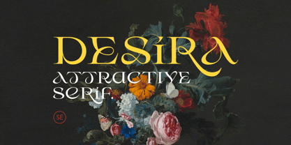 Desira is an attractive and modern serif that comes with stylish shape. With unique uppercase and lowercase, this fonts will make your presentation, poster, or logo even more stunning and stand out! You can mix and match the uppercase and lowercase for unlimited form. This fonts support Multi Language. Features Uppercase with unique lowercase Number & Symbol Multi language Happy Creating!
 - Pardon Me Boy! by Greater Albion Typefounders,
$8.00 Pardon me boy, is that the Chattanooga Choo-choo? Well, not quite, but "Pardon Me Boy!" is a set of silhouette based ornaments capturing railway locomotives and rolling stock from around the world. Use it to form up trains to make suitable themed rules and borders, or just for fun anywhere a bit of locomotive power will add life and movement!
 - Chewbrio by Samuelstype,
$24.00 Imagine shaping letterforms and messages from dough or chewed gum. This is Chewbrio in essence; No straight lines, no closed shapes and no sharp corners. Chewbrio is a fresh take on stencil. Four sets of all basic characters make for a very large number of combinations, and a hoard of ligatures will further your ability to surprise. Designed by Hans Samuelson in 2023.
 - Funky Flamingo by Hanoded,
$15.00 I really can’t tell you why I called this font Funky Flamingo. Normally I name fonts after something I see or do, but I don’t have a special thing for flamingoes, nor do I keep them in my backyard. Funky Flamingo is a happy handmade serif with a retro look. It comes in regular and bold styles, each style with its own Italic.
 - Howdy by Ben Buysse,
$45.00 Howdy is a modern French Clarendon revival typeface inspired by late 19th-century woodblock type and sign painting. Its ties to the American West evoke a distinctive western and retro flair. It was designed with flexibility in mind. Intended for use as a display type, its reverse contrast forms make an impact from tall or wide headlines and anything in between.
 - Praysire by Letterhend,
$19.00 Praysire is a sophisticated sans serif with beautiful swashes. It has many alternates which you can play around to match your project, whether for a standout headline, or for a tagline, you name it. The unique letterform makes this font one of a kind! Perfectly to be applied to the other various formal forms such as invitations, labels, logos, magazines, books, greeting / wedding cards, packaging, fashion, make up, stationery, novels, labels or any type of advertising purpose. Features : uppercase & lowercase numbers and punctuation multilingual alternates & ligatures PUA encoded We highly recommend using a program that supports OpenType features and Glyphs panels like many of Adobe apps and Corel Draw, so you can see and access all Glyph variations.
 - The Bradlens by Letterhend,
$17.00 The Bradlens is a sophisticated modern display font. This typeface has been made carefully to make sure its premium quality and luxury feel. This typeface has can be used for modern theme or vintage looks. Very suitable for logo, headline, tittle, and the other various formal forms such as invitations, labels, logos, magazines, books, greeting / wedding cards, packaging, fashion, make up, stationery, novels, labels or any type of advertising purpose. Features : Uppercase and lowercase Numbers and punctuation Multilingual Ligatures Alternates PUA encoded We highly recommend using a program that supports OpenType features and Glyphs panels like many of Adobe apps and Corel Draw, so you can see and access all Glyph variations.
 - Novalion by Letterhend,
$17.00 Novalion s a condensed variable sans serif font with with many weight you can choose. It has 8 weight styles which you can play around to match your project, whether for a standout headline, or for a tagline, you name it. Perfect to be applied to the other various formal forms such as invitations, labels, logos, magazines, books, greeting / wedding cards, packaging, fashion, make up, stationery, novels, labels or any type of advertising purpose. Features : variable font with 8 weight style uppercase & lowercase numbers and punctuation multilingual PUA encoded We highly recommend using a program that supports OpenType features and Glyphs panels like many of Adobe apps and Corel Draw, so you can see and access all Glyph variations.
 - Fresh Press by Fenotype,
$30.00 Fresh Press is a pack of handmade goodness - a visual delight in the form of a beautiful and strong script family. Fress Press consists of Regular, Bold, Caps and Ornaments that all play smoothly together. If Fresh Press feels too clean, there’s a Printed version of the whole family with a rough outline and texture. Fresh Press is equipped with Standard Ligatures and Contextual Alternates that maintain a smooth text flow. If that isn’t enough, try Swash, Stylistic or Titling Alternates in any OpenType-savvy program, or manually look for alternates from character map. Fresh Press is a clear and strong choice for any display use from branding to packaging and online to print.
 - Binerka by Letterhend,
$19.00 Binerka is a stylish modern serif font. This typeface has can be used for modern theme or vintage looks with ligatures & alternates. Very suitable for logo, headline, tittle, and the other various formal forms such as invitations, labels, logos, magazines, books, greeting / wedding cards, packaging, fashion, make up, stationery, novels, labels or any type of advertising purpose. Features : uppercase and lowercase numbers and punctuation multilingual ligatures alternates PUA encoded We highly recommend using a program that supports OpenType features and Glyphs panels like many of Adobe apps and Corel Draw, so you can see and access all Glyph variations. How to access opentype feature : letterhend.com/tutorials/using-opentype-feature-in-any-software/
 - Justone by Omotu,
$19.00 Justone! A handwritten signature textured font, all caps. Justone font is suitable for branding, whether in the form of logo text, text on social media posts, text on offline and digital advertising, apparel, product packaging, editorial features, signature logo, etc. Whats Include? Opentype support Multilingual support PUA encoded Features: Uppercase, lowercase, numerals, punctuations, alternates, and ligatures Accessible in the Adobe Illustrator Glyphs panel, or under Stylistic Alternates in the Adobe Photoshop OpenType menu, Adobe InDesign, Corel Draw, even work on Microsoft Word Please message me if you're unsure of any language support. Thanks for looking, and I hope you enjoy it! Please don't hesitate to drop me a message if you have any issues or queries.
 - Jumble by Laura Worthington,
$29.00 Jumble is friendly and cute treat for the eyes. Jumble draws you in with its thick, curvy strokes, jaunty counters, and a whimsical variety of counterforms with no two alike. For even more variety, Jumble includes 104 alternates for plus a handful of ligatures. Jumble conveys humor and warmth without being silly; its lack of straight lines and sharp edges makes it perfect for evoking tasty treats like frosted cakes or pies, or child-friendly toys and games. See what’s included! http://bit.ly/1RDnJjY This font has been specially coded for access of all the swashes, alternates and ornaments without the need for professional design software! Info and instructions here: http://lauraworthingtontype.com/faqs/
 - Aure Nox by Aure Font Design,
$23.00 Aure Nox inspires the chill whimsy of a haunted forest. The roughhewn forms of this decorative, sans-serif font engage the reader with a subtext of rakish charm. Surprisingly legible, Nox adds a bit of rebelious sass to text and titles, and a daring stance to astrological expressions and chartwheels. Nox is an original design developed by Aurora Isaac. After more than a decade in development, 2018 marks the first release of the CJ and KB glyphsets in regular, italic, bold, and bold-italic. The CJ glyphset is a full text font supporting a variety of European languages. A matching set of small-caps complements the extended lowercase and uppercase glyphsets. Supporting glyphs include standard ligatures, four variations of the ampersand, and check-mark and happy-face with their companions x-mark and grumpy-face. Numbers are available in lining, oldstyle, and small versions with numerators and denominators for forming fractions. Companion glyphs include Roman numerals, specialized glyphs for indicating ordinals, and a variety of mathematical symbols and operators. The CJ glyphset also includes an extended set of glyphs for typesetting Western Astrology. These glyphs are also available separately in the KB glyphset: a symbol font re-coded to allow easy keyboard access for the most commonly used glyphs. Though Nox stands well on its own as a text font, the more traditional sans-serif forms of Aure Jane pair well as an innocuous foil to Nox's brazen presence. Give Aure Nox a trial run! You may discover a permanent place for this font family in your typographic palette. AureFontDesign.com
 - Valor by Tim Rolands,
$29.00Valor is a display face inspired by uncial forms seen through a modern roman lens. The result is a type with strong contrast between thick and thin strokes and a highly geometrical construction that even so retains a hint of the charm of hand-written uncial letters. A number of alternate forms and ligatures add to the personality of the face and offer flexibility in usage. Best suited for large titling work such as in posters or book and magazine covers. - Gmuender Kanzlei by RMU,
$25.00 Inspired by some handwritten letter forms originally made by Hermann Zapf for his 1949 book "Pen and Graver", the drawings and designs finally became an entire font. It is an ideal companion to create diplomas, certificates and any other vintage projects. Take advantage of the long s which can be reached when you change the round s by the historical OpenType feature or when you simply type the integral sign [ ∫]. This font contains also swash forms of d, g, and v.
 - My Sweet Farmhouse by Mozatype,
$17.00 My Sweet Farmhouse is a sweet and quirky handwritten font. Its natural and unique style makes it incredibly fitting to a large pool of designs. Use this font for any crafting project that requires a personalized look! It is PUA encoded which means you can access all of the glyphs and swashes with ease! This font is ideal for crafting, branding, and decorates your any project. This font is perfect for wedding invitations or your blog. Also with their help, you can create a logo or beautiful frame for your home. Or just use it for your business, book covers, stationery, marketing, magazines, and more. Fall in love with its incredibly versatile style and use it to create spectacular designs! The only limit is your imagination! Thank you for purchasing this font. Please appreciate, if you like this. ENJOY it :)
 - Frigate Katakana - Light - Unknown license

- Frigate Katakana - 3D - Unknown license

- Frigate Katakana - Cond - Unknown license

- Sugar Flash by Bogstav,
$16.00 Sugar Flash is my grungy comic handmade font: I suggest that you use it for something that has to do with a partyinvitation or maybe products for kids...and sweets!
 - Rival Slab by Mostardesign,
$25.00 A touch of modernism for all kinds of projects Like the rest of the family (Rival Sans and Rival Serif), Rival slab has round shapes with bevelled endings on certain letters such as G, Q or Z. These are the characteristics that make Rival Slab a contemporary cast iron for all kinds of projects. It provides advanced typographical support with features such as case sensitive forms, small caps, ligatures, alternate characters, fractions, slashed zero, circled, pro kerning…It comes also with a complete range of figure set options It comes in 16 weights with corresponding italics and it’s suited for multiple purposes including editorial use, web font, apps, digital ads, ebook, and also for advertising, long text, packaging and branding. As a modern sans serif font family, Rival Sans has true italics to give more style in long texts.
 - Abominio by Unio Creative Solutions,
$9.00 Abominio is a captivating display typeface featuring an innovative design of recurring chiseled forms. This font aims to capture the spirit of maximalism culture, offering a valuable asset for consumer-oriented designs, allowing them to stand out in a in a sea of competitors. With its bold and experimental appearance, Abominio remains true to the letters of the Latin alphabet. This unique characteristic is well-suited to capture and hold the attention of easily distracted viewers, extending their focus for a few more vital seconds. Designers now have the opportunity to explore their creativity, creating both refined and daring combinations for eye-catching headlines, titles, or graphic design projects that aim to convey strength and artistic innovation. Specifications: - Included: Abominio Regular, Abominio Oblique, Abominio Variable - Multi language support (Central, Eastern, Western European Languages) - OpenType Features Thanks for viewing, Unio.
 - Seol Sans Variable by Monotype,
$1,049.99The Seol Sans design offers a fresh palette for designers working with the Korean alphabet, particularly those looking to pair Latin and Korean alphabet (or Hangul) forms without creating typographic friction. The choices for Hangul fonts that work well with humanist Latin typefaces are limited. As Monotype’s first original Korean design, the Seol Sans typeface is a humanist take on the traditional rigid and hard designs of Hangul characters. The Seol Sans design more closely resembles the natural curve of hand-written characters. Seol Sans features Neue Frutiger for its Latin glyphs, and works harmoniously with Neue Frutiger World and Monotype’s CJK typefaces Tazugane Info (Japanese) and M XiangHe Hei (Chinese). Seol Sans is a great choice for global brands using a Sans Serif design looking to maintain their visual identity, and communicate with a consistent tone of voice in the Korean market.


