10,000 search results
(0.058 seconds)
- Boscribe by Monotype,
$29.99Bo Berndal's handwriting was terrible in his younger days, and he could not even read his own notes. When he started out as an apprentice in a printing shop, he started to copy Garamond italic and formed his own style of writing. Later he was inspired by both Alfred Fairbanks and his reform-writing and by Paul Standard in the U.S.A and created the Boscribe font. - Beagley by Seniors Studio,
$35.00 Beagley Display is a contemporary serif typeface, special designed for printing and advertising. With deliberately tight kerning. Beagley provides a warm and friendly atmosphere. Suitable for logotypes, brands, magazines and editorial. The font contains 6 styles from condensed, normal and expanded, plus matching italics. 250 glyphs include ligatures, discretionary ligatures and a wide range of flexibility for Latin language support for every typographical needs.
 - Fino by TypeTogether,
$35.00 Tall, stately, and refined, with a showy contrast between thick and thin, a certain kind of titling Didone has become synonymous with fashion. Ermin Međedović’s latest type system amplifies the most theatrical aspects of this genre while bringing an uncommon flexibility of style and variation to any type palette — particularly those required for editorial design. Fino is a Rational (or Modern) display serif with sharp details. Its fairly Title proportions produce a regular beat of bold stems at frequent intervals. One can add an unexpected twist to this plot line by introducing the alternate ‘C, D, G, O, and Q’ (found in the uppercase); these replace the standard, Title oval shapes with big, full, show-stopping round ones. Other alternate forms, along with a grand ensemble cast of ligatures, lets the director continually flip the script. This stage is set in three acts: Fino, Fino, and Fino Stencil. Each of these offer six weights and italics, and each actor is comfortable speaking any Latin-based language, from standard Hollywood English to the many accents of Eastern Europe. Finally, every style comes in two optical sizes, with Title having the finest hairlines for the biggest parts. This lets you put Fino to work in a variety of productions, from short texts (24pt–48pt settings) to epic titles. The complete Fino family, along with our entire catalogue, has been optimised for today’s varied screen uses. All these talents let Fino perform a range of roles far broader than your typical Bodoni or Didot.
 - Fino Sans by TypeTogether,
$35.00 Tall, stately, and refined, with a showy contrast between thick and thin, a certain kind of titling Didone has become synonymous with fashion. Ermin Međedović’s latest type system amplifies the most theatrical aspects of this genre while bringing an uncommon flexibility of style and variation to any type palette — particularly those required for editorial design. Fino Sans is a Rational (or Modern) display serif with sharp details. Its fairly Title proportions produce a regular beat of bold stems at frequent intervals. One can add an unexpected twist to this plot line by introducing the alternate ‘C, D, G, O, and Q’ (found in the uppercase); these replace the standard, Title oval shapes with big, full, show-stopping round ones. Other alternate forms, along with a grand ensemble cast of ligatures, lets the director continually flip the script. This stage is set in three acts: Fino Sans, Fino Sans, and Fino Sans Stencil. Each of these offer six weights and italics, and each actor is comfortable speaking any Latin-based language, from standard Hollywood English to the many accents of Eastern Europe. Finally, every style comes in two optical sizes, with Title having the finest hairlines for the biggest parts. This lets you put Fino Sans to work in a variety of productions, from short texts (24pt–48pt settings) to epic titles. The complete Fino Sans family, along with our entire catalogue, has been optimised for today’s varied screen uses. All these talents let Fino Sans perform a range of roles far broader than your typical Bodoni or Didot.
 - Fino Stencil by TypeTogether,
$35.00 Tall, stately, and refined, with a showy contrast between thick and thin, a certain kind of titling Didone has become synonymous with fashion. Ermin Međedović’s latest type system amplifies the most theatrical aspects of this genre while bringing an uncommon flexibility of style and variation to any type palette — particularly those required for editorial design. Fino Stencil is a Rational (or Modern) display serif with sharp details. Its fairly Title proportions produce a regular beat of bold stems at frequent intervals. One can add an unexpected twist to this plot line by introducing the alternate ‘C, D, G, O, and Q’ (found in the uppercase); these replace the standard, Title oval shapes with big, full, show-stopping round ones. Other alternate forms, along with a grand ensemble cast of ligatures, lets the director continually flip the script. This stage is set in three acts: Fino Stencil, Fino Stencil, and Fino Stencil Stencil. Each of these offer six weights and italics, and each actor is comfortable speaking any Latin-based language, from standard Hollywood English to the many accents of Eastern Europe. Finally, every style comes in two optical sizes, with Title having the finest hairlines for the biggest parts. This lets you put Fino Stencil to work in a variety of productions, from short texts (24pt–48pt settings) to epic titles. The complete Fino Stencil family, along with our entire catalogue, has been optimized for today’s varied screen uses. All these talents let Fino Stencil perform a range of roles far broader than your typical Bodoni or Didot.
 - Beauty Dina by Aldedesign,
$19.00 Beauty Dina // Playful Script Font is a stunning font with a stylish and lovely font that features a varying baseline, smooth line, modern, and with a depth of love. For those of you who need a touch of love and modernity for your designs or branding, it can be used for various purposes such as headings, weddings, invitations, signatures, logos, branding, t-shirt, letterhead, signage, labels, news, posters, badges, etc. We have a special font namely "Beauty Dina // Playful Script Font ". The font design looks simple without losing its elegance and warmness. The function of the font is to show that you have a modern spirit to serve high-quality products and services. We design this font with Open Type features to give an artistic touch to it. This font is also applicable for numbers, punctuation, and other languages. It is also a multi-functions font where you can use for a business logo, branding, wedding invitation, and anything you want. We have more great and artistic fonts. Just check my font collection by visiting Our Profile. Then, pick your most favorite font and use it to reach your goals.
 - Kimilove by Aldedesign,
$17.00 Kimilove // Monogram Script font is a stunning font with a stylish and lovely font that features a varying baseline, smooth line, modern, and with a depth love. For those of you who need a touch of love and modernity for your designs or branding, it can be used for various purposes such as headings, wedding, invitation, signature, logos, branding, t-shirt, letterhead, signage, labels, news, posters, badges, etc. We have a special font namely "Kimilove // Monogram Script font". The font design looks simple without losing its elegance and warmness. The function of the font is to show that you have a modern spirit to serve high-quality products and services. We design this font with Open Type features to give an artistic touch on it. This font is also applicable for numbers, punctuation, and other languages. It is also a multi-functions font where you can use for a business logo, branding, wedding invitation, and anything you want. We have more great and artistic fonts. Just check my font collection by visiting Our Profile. Then, pick your most favorite font and use it to reach your goals.
 - Salden by Canada Type,
$40.00 The Salden fonts are our tribute to the man who was dubbed the face of the Dutch book, and whose work is considered essential in 20th century Dutch design history. Helmut Salden’s exquisite book cover designs were the gold standard in the Netherlands for more than four decades. His influence over Dutch lettering artists and book designers ranges far and wide, and his work continues to be used commercially and exhibited to this very day. At the root of Salden’s design work was a unique eye for counter space and incredible lettering skills that never failed to awe, regardless of category or genre. This made our attention to his lettering all the more focused within our appreciation to his overall aesthetic. Though Salden never designed alphabets to be turned into typefaces (he drew sets of letters which he sometimes recycled and modified to fit various projects), we thought there was enough there to deduce what a few different typefaces by Salden would have looked like. The man was prolific, so there were certainly enough forms to guide us, and enough variation in style to push our excitement even further. And so we contacted the right people, obtained access to the relevant material, and had a lot of fun from there. This set covers the gamut of Salden’s lettering talents. Included are his famous caps, his untamed, chunky flare sans serif in two widths, his unique Roman letters and an italic companion and, most recognizable of all, his one-of-a-kind scripty upright italic lowercase shapes, which he used alongside Roman caps drawn specifically for that kind of combination titling. All the fonts in this set include Pan-European glyph sets. They’re also loaded with extras. Salden Roman (908 glyphs) and Salden Italic (976 glyphs) each come with built-in small caps (and caps-to-small-caps), quite a few ligatures, and two different sets of alternates. Salden Black and Salden Black Condensed (636 glyphs each) come with a set of alternates, and both lining and oldstyle figures. Salden Caps (597 glyphs) comes with a set of alternates, and Salden Titling (886 glyphs) comes with a quite a lot of swashed forms and alternates (including as many six variants for some forms), a few discretionary ligatures, and two sets of figures. There are also some form alternates for the Cyrillic and Greek sets included in all six fonts. These alphabets were enjoyably studied and meticulously developed over the past ten years or so. We consider ourselves very fortunate to be the ones bringing them to the world as our contribution to maintaining the legacy of a legendary talent and a great designer. The majority of the work was based on Salden’s original drawings, access to which was graciously provided by Museum Meermanno in The Hague. The Salden fonts were done in agreement with Stichting 1940-1945, and their sale will in part benefit Museum Meermanno.
 - Chub by Chank,
$39.95Chub was inspired by and dedicated to: Jimmy Dean Pork Sausage, J Otto, Ben & Jerry, Spunk, Chuck Jones, Run DMC, those teenage kids with their big baggy pants, French Market coffee, George Clinton, Bill Clinton, Chistina Ricci, Sesame Street and the letter C. God bless all those big, fat, fun things that make life grand. - Rainy Candy by Illushvara,
$14.00 Hello, We are so excited to announce our new fonts "Rainy Candy" is unique display font. Use it to make your ideas even more realistic like a kids, sweet packaging, merchandise and create spectacular the Christmas designs! Features : Uppercase and lowercase Numbers Symbols Multilingual Accent What you get : Rainy Candy. OTF If you have any question, don’t hesitate to contact me. Happy Designing !!! Thank You, Bayu Suwirya
 - Masthina by Sibelumpagi,
$16.00 Masthina is a lovely calligraphy typeface with a modern bouncy style. It comes with a natural flow that looks like a handwritten letter and also we added some swashes and alternates to make the font more elegant. Masthina is perfect for many different projects such as logos & branding, invitation, stationery, wedding designs, social media posts, advertisements, product packaging, product designs, label, photography, watermark, special events or anything.
 - Mogena by Kulokale,
$20.00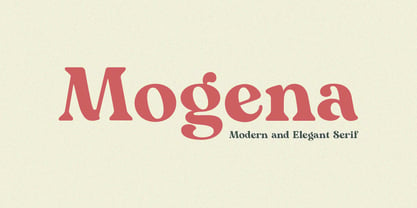 Mogena is a modern and elegant serif. It has a unique and different style and will give your design a friendly and expressive look. Mogena is perfect for many different projects such as logos and branding, invitation, stationery, wedding designs, social media posts, advertisements, product packaging, product designs, label, photography, watermark, special events or anything. We hope you enjoy the font and have fun! Thank You.
 - Massiva GrotesQ by Dawnland,
$13.00 A massive grotesque in four weights + obliques! Perfect for your massive poster or news paper headlines as well as your massive text chunks. The four weights elegantly complete each other as the obliques add tension to your work. Each font consists of a 241 glyph character set with beautiful ligatures for ff ffi ffl fi fl st ts es tt ST ET TT and ES.
 - Sedhayu by Kulokale,
$19.00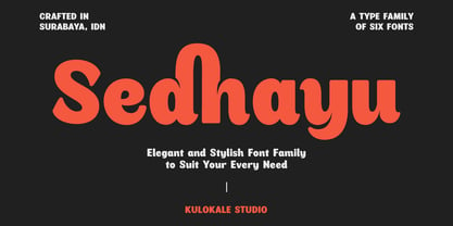 Sedhayu is a modern and bold sans serif font. It has a unique style and will give your design a friendly and expressive look. Sedhayu is perfect for many different projects such as logos and branding, invitation, stationery, wedding designs, social media posts, advertisements, product packaging, product designs, labels, photography, watermark, special events or anything. We hope you enjoy the font and have fun! Thank You.
 - Blazer by Liartgraphic,
$22.00 Hi guys! How are you guys? I bet it's great! Introducing our latest product, we call this product the Blazer display font Blazer is a monoline display type font With a unique and firm touch Blazer font is great to use on: fashion magazines, logos, photography, landing pages, flyers, social media and so on What's included - multilingual support - alternatives - ligatures Thank you, best regards Liarttyype
 - Michegar by Kulokale,
$19.00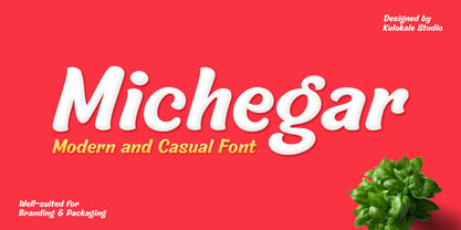 Michegar is a modern and casual display font. It has a unique style and will give your design a friendly and expressive look. Michegar is perfect for many different projects such as logos and branding, invitation, stationery, wedding designs, social media posts, advertisements, product packaging, product designs, labels, photography, watermark, special events or anything. We hope you enjoy the font and have fun! Thank You.
 - Jakarta by Cititype,
$19.00 The overall look of this font shows the very deep psyche in the work, the ink hand and the pen have a soul moving in a rhythm. We named it 'Jakarta.' It is a stylish modern calligraphy font with casual chic flair. It is perfect for branding, wedding invites and cards. All lowercase letters include beginning and ending swashes, giving realistic hand-lettered style.
 - 1585 Flowery by GLC,
$20.00 This set of initial letters was inspired from French renaissance decorated letters. Unfortunately, we don't know where they were in use, or who was the punchcutter, our models were coming from a late XIXth century copy. Note: The letters I and J, U and V are not different. It is not a mistake, but it is the exact reflection of what was customary during the period.
 - Ranuka by Liartgraphic,
$22.00 Hi guys! How are you guys? I bet it's great! Introducing our latest product, we call this product the Ranuka font Ranuka hight is a retro type font With a unique and firm touch Ranuka font is great to use on: fashion magazines, logos, photography, landing pages, flyers, social media and so on What's included - multilingual support - alternatives - ligatures Thank you, best regards Liarttyype
 - Flipboard JNL by Jeff Levine,
$29.00 You've seen them all around -- on alarm clocks, tote boards, scoreboards and in many other venues we take for granted in our daily lives -- displays with letters and numbers that flip down to reveal other letters or numbers. Flipboard JNL is a digital recreation of these mechanical sign displays. There is a limited character set, and a blank panel is located on the equal sign keystroke.
 - Benedetta by Designova,
$23.00 Benedetta is a beautiful and lovely handwritten font for luxury / signature / branding / logotype / personal invites / greeting cards / promotional graphics. Benedetta is completely handmade with perfection and aesthetics at its level best. Advanced Kerning & Essential Ligatures: We have performed advanced, in-depth kerning to make sure the font looks amazing on all possible letter combinations. The font includes extended language support including Western European & Central European sets.
 - Dog Friendly by PizzaDude.dk,
$17.00 If it's dog friendly, it must be something good! Actually, I was never really into dogs, not until me and my wife decided to get a dog. We got a French Bulldog and life hasn't been the same since! I found out that I love dogs, and especially French Bulldogs! This font is a kind of tribute to everything good that has to do with dogs! :)
 - Bugleboy by Stiggy & Sands,
$29.00 Bugleboy started as a digitized version of "Wood Grotesk," a 1970s film typeface by LetterGraphics. It started with a bare bones character set which we added swash alternates for Capitals, Stylistic Alternates for a Unicase look, and crafted a Sans version without serifs. The Sans style lacks swashes but keeps Stylistic Alternate Unicase forms. See the last graphic for a comprehensive character map preview.
 - Bourton Text by Kimmy Design,
$25.00 Bourton Text is a modern sans-serif typeface family perfect for both text type settings and display purposes. While it’s not a layering type family like its brother, Bourton, it come packed with features, extras and over 2,000 characters that make it stand on its own. HISTORY Bourton Text is a new take of the Bourton family that was one of the best-selling and favorite fonts of 2016. After countless requests for lowercase alphabet, or suggestions for a font pairing with Bourton, this new text setting family is based on the original shapes of Bourton. DESIGN & CREATION In taking Bourton Base was the starting point as they narrowest width and boldest weight. From there, lowercase shapes were designed that matched the aesthetic and details of the popular capitals. As Bourton was a heavy display font, some small tweaks were done to make it more fitting for smaller text settings, including reducing the letter-spacing and reworking some counters. Some areas needed complete reconstruction, such as the figures. The design of those began anew with a style that worked with the capitals and lowercase but also as a standalone set. Currency shapes were updated to match the numerals. Punctuation was also reimagined to work better in smaller type settings. Diacritics and extended language support was also updated and expanded to include full Latin plus language support for 219 latin based language spoken in 212 countries. Once the basic alphabet for Bourton Text Bold Narrow was formed, the font was expanded in both weight and width. Taking the weight from Bold down to Hairline, it allowed for more range in use. The typeface needed to be expanded in order to reach better as a book weight and width, in addition to a regular width, a wider version was create as well. FEATURES Once the extremes were set in place, small capital forms were designed for text and display purposes. These also allow for nested capital letters, lifted small caps and other display features offered in the typeface. One of the most popular fonts in the Bourton layering font family is Bourton Line. This led to an experimentation with rounded Bourton Text completely and thus a complete set of duplicated characters with rounded terminals. By using the Opentype Panel, a rounded font is a single click away. Every feature has been carefully thought out and updated across the entire font. In total, Bourton boasts over 2,300 glyphs, 42 font files with 3 widths and 7 weights in upright and italic.
 - Wiggles - Unknown license

- Wobbles - Unknown license

- Wibbles - Unknown license

- Stright Brush by MJB Letters,
$17.00 The Introducing ‘Stright Brush‘ is a thick brush font with a natural texture, this font is suitable to use as a logotype, product designs, label, watermark, social media posts, apparel, invitation, signboard, sports club, special events, or anything that need handwriting taste. I highly recommend using a program that supports OpenType features and Glyphs panels such as Adobe Illustrator, Adobe Photoshop CC, Adobe InDesign, or CorelDraw, so you can see and access all Glyph variations. This font is encoded with Unicode PUA, which allows full access to all additional characters without having special design software. Mac users can use Font Book, and Windows users can use Character Map to view and copy one of the extra characters to paste into your favorite text editor/application. We hope you enjoy the font, please feel free to comment if you have any thoughts or feedback. Or simply send me a PM or email me. Thanks for purchasing and have fun!
 - Haydes by YdhraStudio,
$20.00 Haydes is a hand brush typeface with authentic clean brush imperfections. Haydes includes many different alternates for each lowercase and uppercase letter. It's extremely fun to use as each word can be transformed to your liking. We also include a bonus swash weight to make your design look more awesome. Haydes also has a standard Multilingual Support. Haydes is great for Branding Design, Logo Design, Digital Lettering Arts, Poster, T-Shirt/Apparel, Magazine, Quotes, Signs, Instagram Designs, Advertising Design, and any other type design needs. You can access all those alternate characters by using a program that supports OpenType features such as Adobe Illustrator CS, Adobe Indesign & CorelDraw X6-X7. Guides to access all alternates glyphs : http://adobe.ly/1m1fn4Y Mix and match the alternate characters to add an attractive message to your design. Need help? Please, Feel free to contact me by e-mail yyudhara@gmail.com for any question about my font, Extended License document and more. Good Luck and Have fun ! YdhraStudio
 - Blangkon Script by Kotak Kuning Studio,
$15.00 Blangkon Script is a bold modern script and combination with Hand Lettering style which gives more personal touch and makes the font looks being customized. This font is suitable to use as a logotype, product designs, label, watermark, social media posts, apparel, invitation, signboard, sport club, motor / car, special events or anything that need handwriting taste. What's Included : - The ton of glyphs (include Uppercase, Lowercase, Numerals & Punctuations, Ligature, Alternate, and Swashes) - Works on PC & Mac - Simple installations - Accessible in the Adobe Illustrator, Adobe Photoshop, Adobe InDesign, even work on Microsoft Word. - PUA Encoded Characters - Fully accessible without additional design software. - Fonts include Multilingual Support for: Afrikaans, Albanian, Danish, Dutch, Estonian, Finnish, German, Icelandic, Italian, Norwegian, Portugese, Spanisch, Swedish, Zulu We hope you enjoy the font, please feel free to comment if you have any thoughts or feedback. Or simply send me a PM or email me at kotakkuningstudio@gmail.com. Thanks for purchasing and have fun!
 - Arbus by Popskraft,
$18.00 When we think of a child's font, random scribbles often come to mind, but I thought, why not make a child's font fun, spontaneous, and at the same time simple and readable. This is how the Arbus font was born. This font is perfect for anyone looking for a light, free-style font that will last a long time. In addition, the font has a number of undeniable advantages: The Arbus font is perfectly balanced, which allows you to use it both in headings and for large amounts of text. Thus, you can completely design your products with one font family. The Arbus font family has nine font weights. The font supports all European languages and of course the Latin alphabet. Works on PC & Mac This beautiful Arbus font can be installed on any operating system, it can also be used in professional programs like Figma or Addobe Crative Cloud, as well as in other simpler software like Canva.
 - Kis Classico by Linotype,
$29.99Kis Classico™ is named after the Hungarian monk Miklós Kis who traveled to Amsterdam at the end of the seventeenth century to learn the art of printing. Amsterdam was a center of printing and punchcutting, and Kis cut his own type there in about 1685. For centuries, Kis's type was wrongly attributed to Anton Janson, a Dutch punchcutter who worked in Leipzig in the seventeenth century. Most versions of this type still go by the name Janson. In 1993, the Italian/Swedish type designer Franko Luin completed Kis Classico, his own contemporary interpretation of the Kis types. About the Kis/Janson story, Luin says: If you understand Hungarian I recommend you read the monograph, 'Tótfalusi Kis Miklós' by György Haiman, published in 1972 by Magyar Helikon. It has hundreds of reproductions from his Amsterdam period and from the time when he was an established printer in Kolozsvár (today's Cluj in Romania)." Kis Classico has five weights, and is an admirable version of this classic type. - Pewter by KC Fonts,
$14.00 KC Fonts would like to present its latest creation: Pewter. Pewter is a three weight font (including italics) with four grungy family members (also with italics) for a total of 14 OpenType/TrueType fonts. The Pewter family allows you to freely mix and match between the weights and the grunge variants as it’s not just the same erosion over and over. The Original Trio: Regular, Bold & Black - they're perfect for your more front page useage and anywhere you need a more traditional look. The Grunge Family: each is different from one another - there is Corroded for the caked on dirty look, Scuffed for a mild abrasion with a worn and washed feel, Stamped for printing press & your rubber stamp effect and Trashed for a destroyed (but not over the top) look to your work. It looks great in all cases: UPPERCASE, lowercase, Title Case & MiXeDcAsE, whether it’s printed LARGE or small it will look great!
 - Academica by Storm Type Foundry,
$44.00 Josef Týfa first published the Academia typeface in 1967-68. It was the winning design from competition aimed at new typeface for scientific texts, announced by Grafotechna. It was cut and cast in metal in 1968 in 8 and 10 point sizes of plain, italic and semi-bold designs. In 2003 Josef Týfa with František Štorm began to work on its digital version. During 2004 Týfa approved certain differences from the original drawings in order to bring more original and timeless feeling to this successful typeface. Vertical stem outlines are no more straight, but softly slendered in the middle, italics were quietened, uppercase proportions brought closer to antique principle. Light and Black designs served (as usual) as starting points for interpolation of remainig weights. The new name Academica distinguishes the present digital transcription from the original idea. It comprises Týfa’s rational concept for scientific application with versatility to other genres of literature.
 - Cumhuriyet Pro by Fontuma,
$28.00 Cumhuriyet is an Arabic concept that means "the form of government in which the nation holds the sovereignty and uses it through the deputies elected for certain periods". The reason why I gave this name to the font is that 2023 is the centennial anniversary of the Republic of Turkey, which was founded by Atatürk. This typeface, which is sans serif, consists of three families: ▪ Cumhuriyet: Font family with Latin letters ▪ Cumhuriyet Pro: Font family including Latin, Arabic and Hebrew alphabets ▪ Cumhuriyet World: Font family including Latin, Cyrillic, Greek, Arabic and Hebrew alphabets Cumhuriyet Pro is a family of multi-purpose typefaces designed in a geometric style. This font is an extremely useful font for media and digital media as well as for printed products. In this respect, the Cumhuriyet font can be used as a text and title font in publishing and printing areas, magazines, newspapers, books, banner and poster designs, and websites.
 - Cumhuriyet by Fontuma,
$24.00 About the font family Cumhuriyet is an Arabic concept that means "the form of government in which the nation holds the sovereignty and uses it through the deputies elected for certain periods". The reason why I gave this name to the font is that 2023 is the centennial anniversary of the Republic of Turkey, which was founded by Atatürk. This typeface, which is sans serif, consists of three families: ▪ Cumhuriyet: Font family with Latin letters ▪ Cumhuriyet Pro: Font family including Latin, Arabic and Hebrew alphabets ▪ Cumhuriyet World: Font family including Latin, Cyrillic, Greek, Arabic and Hebrew alphabets Cumhuriyet is a family of multi-purpose typefaces designed in a geometric style. This font is an extremely useful font for media and digital media as well as for printed products. In this respect, the Cumhuriyet font can be used as a text and title font in publishing and printing areas, magazines, newspapers, books, banner and poster designs, and websites.
 - Linotype Projekt by Linotype,
$29.99Linotype Projekt was created by German type designer Andreas Koch with both a well-defined inspiration and goal. It occurred to me that typefaces like Helvetica and Univers seemed to have a higher quality in hot-metal composition as with modern digital typesetting. They are stronger and livelier. This is in part due to the printing process, which presses the characters onto paper, and in part to the forms of the letters, which differ from the PostScript version of the same typeface. An important aspect of printing is the slight increase in character width resulting from the pressure which also serves as an optical correction to the forms. (True exact squares appear slightly barrel-formed to the eye.) I wanted to revive this peculiarity, not because of a nostalgic feeling, rather just because it is more attractive." The result is Linotype Projekt, a text font which is harmonious, clear and extremely legible. Koch lives in Bielefeld, Germany, and is a freelance book and type designer." - Linotype Textra by Linotype,
$40.99Linotype Textra is a clever twist on the sans serif genre, designed by Jochen Schuss and Jörg Herz in 2002. Schuss says this about Linotype Textra: "Two in one! The same Linotype Textra, which is so neutral and practical for long text passages turns into an eye-catching headline type when used in larger point sizes. The trick? It's all in the details. The type's clear, robust forms give it a high degree of legibility when used in smaller point sizes for texts. When used in larger sizes, the angular, slightly irregular forms that give the type its strong character become apparent. Hence the name Linotype Textra: pure text with a little something extra!" With 15 weights, the Linotype Textra family provides graphic designers with a good basis for almost any type of work. The five regular weights have matching true italics and old style figures, and the five small cap weights include tabular figures. - Sansduski Mono by Ingrimayne Type,
$9.00 SansduskiMono is a sans-serif decorative/display family that is monospaced. Its very high x-height and tight spacing make it more suitable for use at large point sizes than small point sizes. (There are better options if one wants a readable text font.) The letter O is a rectangle with rounded corners and this shape motif is carried over to other characters that are usually rounded. The origin of this face is in a previous typeface, BigStripesMono. That family was designed to use the OpenType feature Contextual Alternatives (calt) to put stripes on letters. It had only upper-case letters in one weight. SansduskiMono adds lower-case letters and eight more weights plus italics and outline styles for the black weights. For a proportional rather than monospaced version of this design idea, see Sansduski. SansduskiMono is appropriate for titles, posters, advertising, and other uses that benefit from simple letter forms that are geometric and clean.
 - Olyford Variable by NicolassFonts,
$148.99 Olyford Variable font is a contemporary sans serif typeface that is derived from the Olyford font family. It features a range of weights and italics. OpenType features: Access All Alternates, Stylistic Alternates (Alternative n, m, p, q, r, u), Stylistic Set 1 (Alternative K, k), Stylistic Set 2 (Alternative W), Stylistic Set 3 (Alternative t), Stylistic Set 4 (Alternative w), Stylistic Set 5 (Alternative 5), Stylistic Set 6 (Alternative ¢, $, €, ₽, ¥), Stylistic Set 7 (Alternative Đ, Ħ, Ð, ≠, ∫), Standard Ligatures, Discretionary Ligatures, Proportional Figures, Tabular Figures, Case-Sensitive Forms, Fractions, Kerning, Denominators, Numerators, Scientific Inferiors, Subscript, Superscript, Ordinals, Localized Forms.


