10,000 search results
(0.048 seconds)
- Gallardo by Motokiwo,
$23.00 Gallardo is custom brush lettering font with tons of alternates. It's clean, strong, and elegant script that very useful for various projects. It's great for urban style and also for vintage. You can easily customize your words with Gallardo because this font has been PUA Encoded and also support special characters for multilingual. You will also get the Prototype Version, a rough version of Gallardo. Features: Stylistic Alternates Stylistic Sets (ss01, ss02, ss03, ss04, ss05, ss06, ss07, ss08, ss09, ss10) Swash Access All Alternates PUA Encoded
 - Sunbathe by Java Pep,
$13.00 Introducing an elegant script font called Sunbathe, every shape of this font is made by the natural strike. To customize, Sunbathe comes with some features like alternate and ligature. It's perfect for branding, magazines, greeting card, wedding invitation, social media stories, etc. What you will get : - Opentype features - Multilingual, support 16 languages ( Afrikaans, Albanian, Catalan, Danish, Dutch, English, Estonian, Finnish, French, German, Icelandic, Italian, Norwegian, Portuguese, Spanisch, Swedish, Zulu ) If you have any questions or need technical support, don't hesitate to comment, message or contact java.indonesian@yahoo.com.
 - Methalia by Romie Creative,
$15.00 Methalia modern script typeface. Contains a complete set of lowercase, uppercase, alternative, ligatures, punctuation, numbers and multilingual support. Work in sync with Methalia to create awesome calligraphic creations. You can use it for a variety of purposes: logos, wedding invitations, titles, signatures, t-shirts, letterheads, signage, labels, posters, etc. How to access all alternative characters, using the Windows Character Map with Photoshop: https://www.youtube.com/watch?v=Go9vacoYmBw How to access all alternative characters using Adobe Illustrator: https://www.youtube.com/watch?v=XzwjMkbB-wQ thank you
 - Fathoni by Letterfreshstudio,
$14.00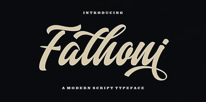 Fathoni is a modern handwritten calligraphy script. It contains the complete set of lowercase, uppercase, alternative, ligature, punctuation, numbers, and multilingual support. Work in harmony with Fathoni to create extraordinary calligraphy creations. You are welcome to use it for various purposes: logos, wedding invitations, titles, signatures, t-shirts, letterheads, nameplates, labels, posters, and more. How to access all alternative characters, using Windows Character Map with Photoshop https://www.youtube.com/watch?v=Go9vacoYmBw How to access all alternative characters using Adobe Illustrator: https://www.youtube.com/watch?v=XzwjMkbB-wQ
 - Hi Virginia by Good Java Studio,
$23.00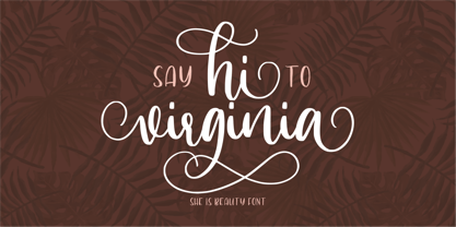 Hi Virginia handlettering font is a beauty & modern handlettering font. It's perfect for logo, invitation, stationery, wedding designs, social media posts, advertisements, product packaging, product designs, label, photography, watermark, crafting, special events or anything. This font include : Hi Virginia OTF, Standar Ligatures, Stylistic Sets, and also Multilingual support. Very simple installation PUA Encoded open Very great for branding, logotype, handletteing, invitations, or fashion branding. Multilingual Support Support for Adobe Illustrator, Corel Draw, Indesign, Adobe Photoshop or Procreate 4.3 (Updated) Support for MAC or WINDOWS
 - Battur by YonTypeStudio Co,
$12.00 Battur is the perfect handwritten font for logos, posters, watermarks, and more! This is best used for logos, wedding stationery, social media, and quotes. Test in the box above to see how your next project will be! Battur Signature handwritten font comes with alternative characters (OpenType features). Sharing end ending swashes With multilingual support, this font is also suitable to be combined with san-serif fonts to get amazing results for your design project. Features: Begining & ending swashes ligature Multilingual Alternate Character Uppercase and Lowercase Encode PUA
 - Moving Formula by Supfonts,
$10.00 Moving Formula Funny Sans Moving Formula is a cute handwritten font with multilingual support. It is perfect for branding, wedding invitations, menu design, YouTube covers and many more Font includes a full set of gorgeous uppercase and lowercase letters, numbers, a large selection of punctuation marks & multilingual support Test it out below to see how it could look for your next project! Includes: Regular Script Latin languages support Uppercase and lowercase Numbers and punctuation Check out my blog: https://www.instagram.com/superdizigner https://pinterest.com/dmitriychirkov7
 - Herlyon by Cooldesignlab,
$12.00 Herlyon is a serif font with an elegant and classy look. Each Herlyon glyph font is designed with natural and beautiful curves. Herlyon typography can help you complete various projects such as luxury brand logos, journals, business cards, titles, products, social media posts, web and much more. If you're involved in a project that requires beautiful, professional writing, the Herlyon font is perfect to help you get it done. Herlyon font features open type, kerning, ligature. Herlyon fonts include uppercase, lowercase, numbers, punctuation and multilingual support.
 - Herra Maddison by Jinan Studio,
$20.00 Herra Maddison is the embodiment of modern elegance, offering you an exquisite script font with exceptional swashes and multilingual support. Whether you’re a designer working on wedding themes, branding, or promotional materials, this font will elevate your work, infusing it with a timeless and stylish charm that captivates the eye and the heart. Make Herra Maddison your choice for sophisticated, elegant designs that leave a lasting impression. Features A set of uppercase and lowercase glyphs Number, symbol, and punctuation Multilingual Support Alternates and ligatures PUA encoded
 - Cowboy Junk by PizzaDude.dk,
$15.00 Cowboy Junk is my loose handmade impression of what would happen if the wild west crashed into grafitti! The letters are loose and jumpy and the terminals are kind of exaggerated to give that firce impression of handcraft! So, better get up early and leave this town, 'cos there’s only room for one sheriff in this here town, and that is Cowboy Junk! Comes with contextual alternates, which means that the font will automatically cycle through the 5 different versions AS YOU TYPE! Yieeehaaar!
 - Realtime Text Rounded by Juri Zaech,
$30.00 Realtime Text Rounded is the proportional alternative to the monospaced Realtime type family. Nevertheless Realtime Text Rounded includes a monospaced design already built into the font. It is employable through OpenType by activating alternate characters. Realtime Text Rounded is a technical yet friendly design with details that serve function and visual impact alike and lends itself to tabular designs, sturdy columns and tidy layouts. It comes in five weights, from light to black, and with a character set that covers over 200 latin languages.
 - Cartographer by Hipopotam Studio,
$25.00 Cartographer by Hipopotam Studio is a hand drawn serif typeface designed for our book Maps. Drawn with a 0.1 mm tip pen in a very small scale. It has only uppercase characters but each has alternate glyphs. It also has a lot of very useful features including multi-language support (with Cyrillic), discretionary ligatures, stylistic alternates, fractions, ordinals and contextual alternates that will automatically set alternate glyphs depending on frequency of appearance of the same character (even in web font but only in HTML5 browsers).
 - Ranger Script by Letterfreshstudio,
$12.00 Ranger Script is a modern handwriting calligraphy script. Contains a complete set of lowercase, uppercase, alternative, ligature, punctuation, numbers, and multilingual support. Works in harmony with Ranger Script to create awesome calligraphy creations. You are welcome to use it for various purposes: logos, wedding invitations, titles, signatures, t-shirts, letterheads, signboards, labels, posters etc. How to access all alternative characters, using Windows Character Map with Photoshop: https://www.youtube.com/watch?v=Go9vacoYmBw How to access all alternative characters using Adobe Illustrator: https://www.youtube.com/watch?v=XzwjMkbB-wQ
 - Calligri by SummitType,
$25.00 Someday, as computers become the new medium for writing, the art of cursive handwriting will slowly become a lost art. Calligri seeks to preserve this endangered style with tastefully drawn letters that connect with each other in classical artistry. Calligri includes a full character set (UPPER and lower case), all punctuation, all special characters, Euro symbol, and all Latin Extended-A characters, making this font a perfect match for any project including personal messages or notes, holiday cards and newsletters, and wedding invitations and announcements.
 - Spaza by Scholtz Fonts,
$15.00In parts of Africa, in the poorer, rural and peri-urban areas there are many small shops or convenience stores which are called "Spaza" shops. The owners of these shops often don't have access to commercial signwriting and write their signs themselves. The font "Spaza" is based on these hand-lettered signs. This lettering has a refreshing simplicity and spontaneity, yet retains great legibility. In the font "Spaza", there are three styles: - Spaza Regular - with normal upper and lower case; - Spaza Small Caps - in which the lower case is a true "small caps" and not a shrunken version of the upper case (generated by the operating system); - Spaza Double Caps - in which the lower case characters have been replaced by an alternate set of capital letters. The font thus contains two sets of differing upper case characters. You can use characters from both these sets to give a true feeling of randomness because if the same character occurs twice in a word, different versions of the character can be used. Spaza can be used with great effect in a great variety of applications such as advertisements, flyers, posters and in magazine pages. Spaza contains a full character set and has been carefully spaced and kerned. - Webdings Windows compatible by Microsoft Corporation,Webdings™ is a symbol font designed in 1997 as a response to the need of Web designers for a fast and easy method of incorporating graphics in their pages. Webdings contains a wide variety of Web-related images of the kind found in common use across the Web, as well as some more unusual drawings. User Interface icons suitable for creating page navigation elements are also included. Webdings is ideal for enriching the appearance of a Web page. Because it is a font, it can be installed on the user's system, (or embedded in the document itself) is fully scaleable and quick to render. It's a perfect way of including graphics on your site without making users wait for lots of graphic files to download. Each Webding has been fine-tuned to ensure high quality and clarity on the screen, regardless of the complexity of the individual symbol. Character Set: Picture/Symbol This version of Webdings is the licensable equivalent to the font versions coming preinstalled with Microsoft Windows® since version 8. It is identical regarding font name, language coverage and other font behaviour and is perfect for document exchange with machines that are not running the Windows® operating system.
- Pocketknife by Blank Is The New Black,
$13.00 Pocketknife is a simple grid-based titling font on it’s surface, but it has a surprisingly prolific set of features under the surface. The most notable of these features is an abundant set of ligatures that give Pocketknife it’s unique look. There are very few kerning pairs contained within Pocketwatch, and these ligatures fill in most gaps that could be created by letters with more empty space, such as L and T, and also give a more playful look to an otherwise sharp-edged typeface. Pocketknife also contains with 2 full sets of alternate characters, one pairing with the uppercase set and one pairing with the lowercase—available as OpenType stylistic alternates or individually in the Glyphs panel. Pocketknife Regular is designed to be used on it’s own, while the Inline and Base fonts are designed to be used as a simple layered combination. The Base font is nearly identical to Regular, but contains a few specially adjusted characters that better accommodate the Inline style. Pocketknife Outline is a combination of the Inline/Base styles, to be used individually. Pocketknife is sharp, but playful. Simple, but sophisticated. Sporty, technical, and aggressive, yet elegant and fun. Pocketknife, while simple at first glance, is a deceivingly versatile typeface.
 - Lopsickles by Ingrimayne Type,
$7.00 Lopsickles is a family in which the letters are based on lopsided, distorted ellipses. The family has four sets of letters that are combined in six different ways, yielding six fonts. Four of these fonts (styles AB, Ad, Bc, and cd) use the OpenType feature Contextual Alternatives (calt) to alternate letter sets so that top-heavy characters alternate with bottom-heavy characters. The spacing in these fonts is designed for alternating characters and will result in overlap if the characters do not alternate. The other two styles (Ac and Bd) are spaced normally. Style Ac contains the two character sets that are top heavy and style Bd has the two character sets that are bottom heavy. The Ac and Bd fonts have italics and backslanted styles that may be useful to suggest speed. Each of these ten fonts has an inset style designed to be used in a layer above the base font. This layering can be used to give the effect of hollow letters or to add a colored interior. Lopsickles joins several other alternating-characters families in the IngrimayneType library including Snuggels, CloseTogether, and Caltic, but is visually very different from them. It is a strange, unusual family that will get noticed.
 - Grauna by Typeóca,
$40.00 Graúna is Typeóca’s first ‘serious typeface’. The idea was to produce a revival of Block Heavy, removing the ‘rough’ texture from its outline. Though other revivals existed, most of them approached the Block family as a whole, leaving aside the idiosyncrasies that make the Heavy weight so unique. In the early stages of its development, however, we realized that a lot of its quirkiness is only possible precisely because of the ‘rough’ texture we were trying to remove. That way, we started going further and further away from the original model, and thinking about the typeface in its own terms, resulting in an impactful yet friendly sans serif, ideal for logos and short titles.
 - Armin Soft by W Type Foundry,
$25.00 As a graphic designer, sometimes it’s impossible not to be inspired by the Swiss Style, specifically the work of Armin Hofmann, who is one of its best exponents. Grids and grotesk and neo-grotesk typefaces are a fundamental part of the tools that make this aesthetic possible. A visual language that has caused full admiration since we were students. Therefore, we decided to design Armin as an homage to Hofmann’s work. Technically, we added stylistic sets applied to the letters –G, R, a, g, h, l, m, n, r, t, u, y– to make Armin more eclectic and suitable for the creation of any visual language. Armin Soft is the softest version of Armin Grotesk with its Variable file.
 - Thwaites by Eyad Al-Samman,
$20.00 ‘Thwaites’ typeface is fully dedicated to one of my best Canadian friends who I do cherish and value highly. This great and industrious Canadian friend is ‘James Douglas Thwaites’ who lives along with his good-natured family in British Columbia, Canada. For me, James is like a source of inspiration and I do consider him as an ideal in my life. Our strong friendship has started since 1999 and I hope that it will endure just to the last moment of my life. Sometimes I see him as the writer and poet that I learn a lot from, sometimes I see him as a devoted religious minister that I try to understand more about his teachings, and other times I see him as the educator that I strive to imitate verbatim in my life. When I want to talk more about this Canadian friend, I will not be able to give him his due in full. Thus, I will instead mention some excerpts of his biography that he wrote himself saying that: “James D. Thwaites is a self-accomplished man. Having worked in various fields including restaurant management and cleaning, he has achieved his goals of being a full-time teacher, past-time writer, and volunteer religious minister for the Christian Congregation of Jehovah's Witnesses. His personal and academic pursuits have led him to be published in various magazines, newspapers, self-published books, and websites, including his now defunct ‘poetryofthemonth.com’ website. He continues to learn and augment the craft of writing while working primarily in early literacy and delayed literacy learners, teaching reading and literature to a wide age range of students. He views his religious endeavors as an extension of his academic ones. He teaches others both as a public speaker and in one-on-one situations, teaching about the benefits of submission to God and to His teachings. His future goals include expanding his ministry and continuing his writing.” The name ‘Thwaites’ itself comes from Great Britain and originated from the last Viking raids upon England, being an Anglicized version of a Scandinavian term meaning—depending on the source material—either "a place that is difficult to approach" or "a small thicket of trees." Another recitation mentions that ‘Thwaites’ can be described also as an English surname but one of pre 7th century Norse-Viking origins. It may be either topographical or locational, and is derived from the word "thveit", meaning a clearing or farm. As a locational surname it originates from any one of the various places called "Thwaite", found in several parts of Northern England and East Anglia to the south. The various modern spelling forms include Thwaite, Thwaites, Thwaytes, Thoytes, Twaite, Twatt, Twaites, Tweats and Twite. The name, although often appearing unique to outsiders, can often be found within other famous names like Braithwaite, Goldthwaites, or Misslethwaites. With various spellings, some families not including the ‘e’ or the ‘s’ at the end, Thwaites and its derivations—although not exceedingly common—is a name found worldwide. ‘Thwaites’ typeface is simply a sans-serif streamlined, stylish, and versatile font. It is designed using a combination of thick and thin strokes for its +585 characters. Its character set supports nearly most of the Central, Eastern, and Western European languages using Latin scripts including the Irish language. The typeface is appropriate for any type of typographic and graphic designs in web, print, and other media. It is also absolutely preferable to be used in the wide fields related to publication, press, services, and production industries. It can create a very impressive impact when used in headlines, posters, titles, products’ surfaces, logos, medical packages, product and corporate branding, and also signage. It has also both of lining and old-style numerals which makes it more suitable for any printing or designing purposes. ‘Thwaites’ typeface is really the cannot-miss choice for anyone who wants to possess unique artistic and modern designs produced using this streamlined typeface.
 - Brother Dreams by Ditatype,
$29.00 Brother Dreams is a captivating brush font that exudes a raw and artistic vibe. With its bold capitalized letterforms and ragged edges, this typeface brings a unique and rebellious touch to your designs. The defining feature of Brother Dreams lies in its rugged and ragged edges, giving the font a handcrafted and slightly distressed appearance. This font is designed with expressive brush strokes, capturing the essence of brush calligraphy. The bold capitalized letterforms command attention, making a powerful statement with their unconventional and untamed style. Inspired by the untamed spirit of artistic expression, Brother Dreams embodies a sense of creativity and authenticity. The rough and ragged edges add a touch of uniqueness and individuality to each letter, as if they were painted with passion and emotion. This font embraces imperfection and celebrates the beauty of artistic spontaneity. Each letter of Brother Dreams is meticulously crafted to maintain its boldness and legibility while embracing the rugged and ragged edges. The resulting composition is a balance of artistic expression and readability. This font allows your message to stand out with its raw energy and rebellious charm. Enjoy the various features available in this font. Features: Multilingual Supports PUA Encoded Numerals and Punctuations Brother Dreams is ideal for headlines, titles, logos, and any design that requires a lively and energetic display. Whether you're working on posters, packaging, branding materials, or any project that needs a touch of liveliness, this font will bring a contagious sense of cheer. Find out more ways to use this font by taking a look at the font preview. Thanks for purchasing our fonts. Hopefully, you have a great time using our font. Feel free to contact us anytime for further information or when you have trouble with the font. Thanks a lot and happy designing.
 - The font "Soul Handwriting" free version, crafted by the creative minds at Fonts Cafe, exudes a deeply personal and authentic touch, reminiscent of a handwritten note from a cherished friend. In a di...
- DaisyBell - Unknown license

- Silk Script by Canada Type,
$29.95Silk Script is a revival and elaborate expansion of a 1956 Helmut Matheis script called Primadonna, which strangely remained a metal face and never made the leap into the film age. Silk Script has the unmistakable high contrast and elegance of formal scripts, yet both its majuscules and minuscules show much more complex and visually appealing art than traditional copperplate or Spencerian calligraphy. When set properly, it adds just the needed extra touch of artistic flair to designs that are not visually satisfying with the usual high-contrast elegant scripts. Silk Script comes in two styles, with the Alt font containing form variations on almost every letter, allowing for flexibility and precision in choice typesetting. Plenty of more alternates are available throughout the character sets of both fonts. Both styles also boast expanded character sets that include support for Central and Eastern European languages, as well as Baltic, Celtic, Esperanto, Maltese and Turkish. Silk Script Pro unifies both styles in one font, for 550 characters of sheer elegance and handy OpenType features including stylistic alternates, discretionary ligatures and class-based kerning. - Astrum by Fontex,
$40.00 Astrum is a very decorative script font using elegant caligraphic handwritten letters that are all mutually interconnected, creating a unique look & feel of a personalized human handwritting. Its clean and prefined lines makes Astrum very appealing and modern, although being very classical in its core essence. The idea for the creation of this font had originally came up from the need to create a beautiful design for Weddings, wedding occasions, etc., but none of the existing fonts were satisfactory - so I decided to create a new and unique typeface to fill this need. Letters and other characters are recognizeable by prefined ornaments, incorporated in a very subtle way. Whitespace between capital letters, lower-case letters, numbers and other characters are done in a way to minimize the need for kerning. The font Astrum, besides being a celebration of class and exclusivity, is a very luxurious and elegant handwritten font perfectly suited for Wedding cards. The character set for this font contains all western, central-european latin and cyrillic characters.
 - Margot by Eclectotype,
$36.00 Like a lovechild of American Typewriter and Cooper Black, typewritten in melted chocolate, this is Margot. A bold single weight display typeface in roman and italic styles, Margot is boisterous but cuddly; warm but impactful. Margot comes fully loaded with a bunch of esoteric dingbats (grouped in the ornament feature), four figure styles (proportional- and tabular- lining, and proportional- and tabular- oldstyle), a spattering of swash capitals (K, Q and R), stylistic alternates and one discretionary gi ligature in the Roman. Stylistic alternates are split into stylistic sets thus: SS01 - alternate forms for ampersand and asterisk, and # changes to an attractive numero symbol. SS02 - in the Roman, a and g change to single storey versions; in the italic, the ae digraph changes to a less ambiguous double storey version. SS03 - the lining figure 3 gets changed to its alternate form. SS04 - the lining figure 4 gets changed to its alternate form. Margot is perfect for friendly headlines, logos, T-shirts (I love New York, perhaps?), food packaging and videogame apps. Margot gets its name from my equally boisterous and cuddly cat. Enjoy!
 - South Rose by The Ocean Studio,
$15.00 South Rose is modern sweet Calligraphy South Rose is such the perfect typeface for any kind of your project, such as advertisements, branding, graphic design, quotes, wedding design, logo for online or offline business, photography, and others. Make your business more beautiful! Note : this helps you to use all of our font functions To get Special Characters like Our Preview Image · Adobe Photoshop go to Window - glyphs · Adobe Illustrator go to Type - glyphs You can get special characters by access Character Map for Windows user, and Font Book for MAC user. Download tutorial below : How to Access special characters, You can Download the link for Support you http://www.mediafire.com/file/o3sml68hxp6h6yd/Access_Spesial_Characters.pdf/file This is information and tutorial how to use ligatures in Adobe Illustrator, Adobe Photoshop, Microsoft Word (Windows and Mac). And Enable alternates characters in other apps. Download the guide here : http://www.mediafire.com/file/edm9sjjwx9g1vi2/How_to_Active_Ligature.pdf/file if you get a trouble on our font kerning : http://www.mediafire.com/file/9e0q5sjzx97e06m/how_to_slove_trouble_kerning.pdf/file Includes · Beginning and Ending Characters · Ligatures · Numbers + punctuation · International Languange
 - Foverdis by insigne,
$22.00 Foverdis is a versatile and powerful ornate script face. Foverdis features flowing hand lettering with tall and graceful ascenders. The face offers a wide array of weights, from the powerful Black weight to the graceful Thin to unique Hairline. Foverdis can get the job done for many unique design tasks. Its wide range of weights at a great price, and OpenType alternates make it a very valuable font for your design toolbox. Foverdis OpenType features include a set of non-connecting alternates, 20 ligatures, and two types of ending letterforms. OpenType features include ornaments, a full set of swashes, swash endings, ending contextual alternates, discretionary ligatures, ligatures and twelve different stylistic sets filled with alternates. In total, there are over 150 alternate letterforms and ornaments. Please see the sample .pdf to see these features in action. OpenType capable applications such as Quark or the Adobe suite can take full advantage of the automatically replacing ligatures and alternates. This family also includes the glyphs to support a wide range of languages. Foverdis is great for a professional designer that wants to maximize design capabilities.
 - Jingo by Canada Type,
$39.95 This is the digital makeover and major expansion of a one-of-a-kind melting pot experiment done by VGC and released under the name Mardi Gras in the early 1960s. It is an unexpected jambalaya of Art Nouveau, Tuscan, wedge serifs, curlycues, ball endings, wood type spurs and swashes, geometry and ornamental elements that on the surface seem to be completely unrelated. But the totality works in a surprisingly loud and playful way that really defies categorization. Jingo is really five fonts in one: Over 1000 glyphs, four character sets, ornaments, swashes and ligatures. The forms are interchangeable in uppercase, lowercase and unicase settings. There is nothing low-key about this typeface. It is well suited for use on posters and book covers that require happy weirdness. But most of all it's great for those who like to fiddle with their type setting until amazingly conicidental pleasantnesses ensue. If you're that kind of designer and you know what you're doing, get Jingo, start up that glyph palette, and play away.
 - Wien Pro by Wannatype,
$36.00 Wien Pro, the sans serif by Ekke Wolf. Typeface lovers looking for a modern, well-developed sans serif font with a touch of retro and warm, individual lettering will get excited about a new addition to the font market. The more than complete Wien Pro front comes in three styles and four different weights. In addition to the upright Wien Pro there is the Wien Pro Oblique with a moderate 6° slant and the Wien Pro Superoblique with an 18° slant. Available weights are light, regular, medium, bold and black. These fonts are equipped with extended Latin alphabet for Central and Eastern Europe and also Cyrillic and Greek alphabet. The set of characters includes nine different sets of numbers, plus its own set for the small caps, as well as alternative characters and groovy ligatures. In addition, all Wien Pro styles are also available as unicase with upper case and lower case x-height alignment. The style, metrics and proportions of Wien Pro combine perfectly with the Liebelei Pro and the script fonts of the Calafati Pro.
 - Delphi by Positype,
$22.00 Delphi grew from a logotype Lily Feinberg produced using Greek-column-inspired letterforms. As that concept expanded to include more and more letters, the typeface had its beginnings. Intertwined, kinetic, and deliberate, Delphi carves itself onto the page and screen, encouraging variation and experimentation. The letterforms’ unique construction and predispostion for experimentation inspired two varying sets: Delphi Dio, comprised of two-line strokes, and Delphi Tria, built of both 2- and 3-line strokes. With a design as elaborate, yet tightly tuned as this, the desire to add more and more was irresistible—you'll see a number of stylistic, swash, and titling alternates (and even more hidden away in further stylistic sets). Because Dio and Tria could only hold so much, alternate cuts were produced to better organize your options: the Delphi Alt fonts feature certain letter styles and stylistic alternate sets distinct from those in Delphi. Delphi’s sophisticated, striking letterforms make it an ideal display face for use at large sizes, and with so many unique details and alternate letterforms, it’s simply fun to use.
 - Debacle by Reserves,
$39.99 Debacle is a super bold contrastive display face built upon pure geometric shapes. Sharp, angular lines are countered against obtuse rounded forms creating a striking visual discord. Select inner corners are rounded, giving characters dual attributes, while linear round-end counters simultaneously contrast and compliment the square-ended punctuation and symbols. Stylistically, Debacle’s prominent letterforms effortlessly create type-as-image text settings. Its style relates to the lush display typefaces from the seventies, yet is highly contemporary in its refinement and finish. Features include: Precision kerning Basic Ligature set including ‘f’ ligatures (ae, oe, fi, fl, ffi, ffl, ff, fh, fj, ft, tt, th, ct, st, la, aj, fa, ls, es, ev, ew, tz, lv, lw, ti, it, ea, kv, ka, ky, yx, xy, yy, km, yw, wy, yv, vy, kw) Alternate characters (O, Q, _, $, ®, •) Slashed zero Full set of numerators/denominators Automatic fraction feature (supports any fraction combination) Extended language support (Latin-1 and Latin Extended-A) *Requires an application with OpenType and/or Unicode support.
 - Alchemila by Heyfonts,
$18.00 Alchemila "UNIQUE serif modern font" likely refers to a typeface that combines elements of traditional serif design with contemporary and distinctive features. Serif fonts have small lines or strokes attached to the ends of characters, which can contribute to a more formal or traditional appearance. The term "modern" in this context typically implies a contemporary or updated style. Here's an explanation of the characteristics and significance of a UNIQUE serif modern font: -Serif Elements: Serifs are the small lines or strokes at the ends of characters, and they are a hallmark of traditional typography. In a UNIQUE serif modern font, these serif elements are likely to be present but may have a distinctive shape or style that sets them apart from more conventional serif fonts. -Contemporary Design: The "modern" aspect of the font suggests a contemporary or updated design. This may involve a departure from the more classical serif styles seen in traditional typefaces, incorporating modern design principles, cleaner lines, and a more minimalist aesthetic. -Distinctive Characters: A UNIQUE serif modern font is likely to feature characters with unique and individual design elements. This could include unconventional serifs, letter shapes, or other stylistic details that make the font stand out and contribute to its uniqueness. -Versatility: While serif fonts are often associated with formality and readability, a UNIQUE serif modern font may offer versatility suitable for a range of design applications. It could be used in both traditional and modern contexts, providing flexibility for various design projects. -Applicability to Branding: Fonts play a crucial role in branding, and a UNIQUE serif modern font could be an excellent choice for businesses or projects that want to convey a sense of tradition and reliability while maintaining a contemporary and innovative image. -Digital and Print Design: Modern serif fonts are often designed with both digital and print applications in mind. The clarity of the typeface, even at smaller sizes, and its aesthetic appeal make it suitable for a variety of design projects, from websites and apps to print materials like brochures and posters. -Attention to Detail: The uniqueness of the font may be reflected in the careful attention to detail in each character. This could include refined curves, balanced proportions, and other design elements that contribute to the overall visual appeal and readability of the font. -Available Features: Unique serif modern fonts may come with additional features, such as alternative characters, ligatures, or stylistic sets, allowing designers to customize the appearance of the text for specific design needs. When selecting or working with a UNIQUE serif modern font, designers should consider the overall design goals, the intended audience, and the context in which the font will be used
 - Treasury Pro by Canada Type,
$79.95 The Treasury script waited over 130 years to be digitized, and the Canada Type crew is very proud to have done the honors. And then some. After seven months of meticulous work on some of the most fascinating letter forms ever made, we can easily say that Treasury is the most ambitious, educational and enjoyable type journey we've embarked upon, and we're certain you will be quite happy with the results. Treasury goes beyond being a mere revival of a typeface. Though the original Treasury script is quite breathtaking in its own right, we decided to bring it into the computer age with much more style and functionality than just another lost script becoming digital. The Treasury System is an intuitive set of fonts that takes advantage of the most commonly used feature of today's design software: Layering. Please do help yourself to the PDF and images in the MyFonts gallery for a quick look at the some of the limitless possibilities Treasury has to offer, from simple attractive elegance expressed in the main script, all the way into mysteriously magnificent calligraphic plates. To date in digital type history, this is the most comprehensive and versatile work of its kind. Every designer loves many options to experiment. Experimentation has never been as much fun and productive as it is with Treasury. If you're "compudling" your initial ideas for a layout, or you're just an alphabet fan who loves spending time with letters, working with Treasury is very inspiring and fulfilling. Some of Treasury's features are: - No more endless searching for initial caps that fit your project. The Treasury System lets you build your own initial caps, in any combination of colors, fills, linings or dimensions you like, with a few simple clicks of the mouse. - With two base styles and nine layer fonts, the Treasury System set helps you produce endless possibilities of alternation and variation in dimension, color, and calligraphic combinations to fit your layout's exact needs, down to the very last detail. - 12 pre-combined Treasury fonts are also there to help and inspire layout artists who love shortcuts and don't want to fiddle with too many layers in their layout. Available in small packages on their own, or as part of the complete Treasury package, these 12 fonts can start you up on your way to discovering the perfect fit for your layout. - Every single letter in the Treasury System comes with at least one alternative. Some characters have even three or four alternates. Although the main character set is an authentic rendition of Ihlenburg's 1874 classic, we made sure to include a treasure trove of alternates for maximum usability. - The most gorgeous set of numerals we have seen in a long, long time. The Treasury numbers are what really turned us onto this project in the first place. - Treasury Pro, the incredibly sophisticated OpenType version, combines the complete Treasury System into a single font, programmed for compatibility with Adobe's latest CS and CS2 software programs. Over 2000 characters in one font, for thousands of possibilities. Setting the ideal elegant wordmark, logotype, intitial cap, or headline, no matter how simple or complex, is as easy as taking a minute or two to push a few buttons in Illustrator, Photoshop, or InDesign. We can go on endlessly about the beauty and functionality of this Treasury set, but we really cannot do it justice with words. So try Treasury for yourself and see the amazing possibilities of fun and creativity it has. It can be used pretty much anywhere - signs, book covers, certificates, music inserts, movie posters, greeting cards, invitations, etc. Much thanks are due to the generous and considerable help Canada Type received from the Harvard Library in Boston, Klingspor Museum in Frankfurt, and many type hobbyists and researchers in Canada, England, Germany, the Netherlands, and the United States. Without them it would was near-impossible to track down the lost history of Hermann Ihlenburg, the most prolific German/American type designer and punch cutter of the 19th century. We hope Mr. Ihlenburg is proudly smiling down on us from type designer heaven.
 - Violety Dreams by Nathatype,
$29.00 Violety Dreams is a serene and elegant serif font that will transport your designs to a realm of beauty and sophistication. With its timeless letterforms and delicate swinging strokes on select letters, this typeface evokes a sense of tranquility and grace. This serif uniqueness in its graceful swinging strokes, which adorn certain letters, adding a touch of whimsy and charm. These elegant extensions create a sense of movement and fluidity, capturing the essence of grace and elegance. Inspired by the ethereal nature of dreams and the delicate beauty of violet flowers, Violety Dreams embodies a sense of tranquility and enchantment. The serif letterforms are meticulously crafted to exude elegance and sophistication, while the swinging strokes add a unique touch of whimsicality. This font strikes a perfect balance between classic charm and imaginative flair. The letterforms are designed with precision and clarity, ensuring legibility and readability. Each letter retains its distinctive shape, while the swinging strokes create a visual interest and draw the eye. You can use it in big text sizes to be greatly legible and enjoy the available features here. Features: Stylistic Sets Multilingual Supports PUA Encoded Numerals and Punctuations Violety Dreams is well-suited for headings, titles, invitations, wedding stationery, luxury branding, editorial layouts, branding materials, and any design project that calls for an elegant and dreamy typography. Find out more ways to use this font by taking a look at the font preview. Thanks for purchasing our fonts. Hopefully, you have a great time using our font. Feel free to contact us anytime for further information or when you have trouble with the font. Thanks a lot and happy designing
 - Comenia Sans by Suitcase Type Foundry,
$75.00Comenia Sans was designed in the framework of a unique typographic project for all types of schools. It is a complementary face for Comenia Serif, released by our friends at Storm Type Foundry. Comenia Sans has a lot in common with its serif sister: the height of both upper and lower case, the length of ascenders and descenders, and the general weight. This makes the two perfect partners which work well even when set side by side in a single line of text. Comenia Sans does, however, lack all serifs, ornamental elements and stroke stress variation. All these elements freshen up the feel of long texts, but for shorter texts use, they are not necessary. Despite that, Comenia Sans retains the soft, friendly character of its big sister, as well as a few tiny details which lend it its unique character without compromising legibility or utility. Open counters give all letters an airy feel and permit enough variation in construction. This is why the face works well even in multiple-page texts. All its letters are easily distinguished from each other, so the reader's eyes are not strained. Diacritics and punctuation harmonize with both upper and lower case. As usually, all diacritical marks fully respect conventional shapes of accents and they are perfectly suitable for Czech, Slovak, Polish and other Central European languages, where a lot of diacritics abounds. Similarly to the renaissance italics which refers to the cursive forms, Comenia Sans introduces novel shapes of some characters drawing from the hand-written heritage. This is most apparent in the single-bellied a, the simplified g, and the stem of f which crosses the baseline and ends with a distinct terminal. In the text, emphasized words are thus distinguished not only by the slant of letters, but also by the shapes of the letters themselves. All twelve styles contain set of small caps, suitable for the names, in the indexes or the headlines in longer texts. Legibility in small sizes under 10 points was at the center of designers' attention, too. This is why the counters of a, e and g are large enough to prevent ink spread in small sizes, both on-screen and in print. After all, the font was specifically optimized for screen use: its sober, simple forms are perfectly fit to be displayed on the computer screen and in other low-resolution devices. When used in the context of architecture, the smoothness of all contours stands out, permitting to enlarge the letters almost without limit. A standard at the Suitcase Type Foundry, each style of Comenia Sans boasts a number of ligatures, an automatic replacement of small caps and caps punctuation, a collection of mathematical symbols, and several types of numerals which make it easy to set academic and other texts in an organised, well-arranged way. For the same purpose, fractions may come in handy, too. Apart from the standard emphasis styles, the family also contains six condensed cuts (each set has the same number of characters), designated for situations where space is limited or the need for striking, poster-like effect arises. Comenia Sans is the ideal choice for the setting of magazines, picture books, and navigation systems alike. Its excellent legibility and soft, fine details will be appreciated both in micro-typography and in poster sizes. Although it was designed as a member of a compact system, it will work equally well on its own or in combination with other high-quality typefaces. - Ghoust by Cititype,
$12.00 Ghoust is a graffiti style handwritten font. It includes three variations to give you the ultimate package. You can mix these three styles to create an authentic graffiti look. Please see this tutorial: https://youtu.be/vLS1BDq3rTQ The Solid version has revised kerning to be used as single layer text, working well for crafting designs. If you use the Outline version you have to set glyph tracking. We make tutorial for this setting: Adobe Illustrator: https://youtu.be/-CeXXEEXaaA Word: https://youtu.be/dMcHIaNE-Vw This makes a great addition to your collection of handwriting and display fonts. You can use it for posters, celebration, fun events and cute crafts.
 - Party Toast by Bogstav,
$12.00 This is my first fontrelease in 2021, and it's one of those "things will get better soon" kinda fonts (Here I am thinking about 2020, which was a year I am glad we just left!) Anyway, the first thing I ate in 2021 (not counting the "kransekage" after midnight) was a delicious and lovely tuna sandwich - or as I called it: Party Toast! Heh-heh! :) Well, it is a playful font with it's jumpy and slightly quirky letters. I've added 5 different versions of each letter and they automatically cycles as you type. I cross my fingers for a 2021 where everything gets back to normal!
 - Carissa by Just My Type,
$20.00 Everyone likes getting a handwritten letter. At least, they would if anyone still hand wrote letters. We heard a story about a type designer who gets a Christmas card from his niece. He’s been out of touch with her for years and is both delighted and surprised to receive a handwritten note. His first thought is “How sweet; how very nice to hear from her.” His second thought is,”Great font potential; I could use this.” And he did. Carissa has a fresh, spontaneous feel, with a wonderful use of uppercase letters (B and R, etc.) within the lower case. Useful as a personal font or for an off-beat menu...
