10,000 search results
(0.075 seconds)
- Ranger by Letterena Studios,
$10.00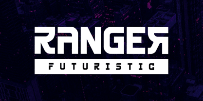 Ranger is a modern and classy sans-serif font with a futuristic style and fancy look. This typeface is perfect for an elegant & luxury logo, book or movie title design, fashion brand, magazine, clothes, lettering, quotes, and so much more. This font is PUA encoded, which means you can access all of the glyphs and swashes with ease! **Uppercase
 - Grand Scoth by Rhd Studio,
$11.00 Introducing, Grand Scoth - The Essential Duo Font Collection Grand Scoth is the perfect and essential combination of a duo of fonts including , round sans and authentic signature. This font duo also supports multilingual, numeric and symbol. You can use this font for any purpose. The best part is, you don't have to look for a partner Thank you....
 - Orplid Pro by RMU,
$40.00 Hans Bohn’s Orplid, a shadowed sans serif font strongly influenced by the then prevailing Bauhaus style, and released by Klingspor in 1929, was revived and vastly extended for multilingual use. In addition, a filling style was made to easily accomplish colorful headlines, ads and posters. Both styles come with alternatives for A, M, N and W.
 - Romantis Natalies Duo by Rastype Studio,
$12.00 Romantis Natalies Script and Sans are beautiful and romantic writing fonts. Looks amazing on wedding invitations, thank you cards, quotes, greeting cards, logos, business cards and any other design. This font is PUA encoded which means you can access all glyphs and swashes with ease! The font includes OpenType features with alternative styles, ligatures, and multiple language support.
 - Facility Signage JNL by Jeff Levine,
$29.00 A famous 1971 photo shows boxing champ Muhammad Ali making faces through a window at Joe Frazier at the challenger’s training facility. A small sign sits in the window that says “Joe Frazier Training Headquarters” and is lettered in a simple sans serif condensed typeface. This is now available as Facility Signage JNL in both regular and oblique versions.
 - Open Range by FontMesa,
$20.00 Open Range is a new font design based on an old classics sans serif font from the 1800s. Some may say that this font looks like a western version of the more modern Benguiat but samples of lettering from the 1800s show a similar design to Benguiat and may have been the inspiration for that font.
 - Norma by Linotype,
$29.99Norma was my second sans serif. You can find a few details in common with Dialog, but the graphic impression of Norma is totally different.Every typeface has some characters that are the favourites. In Norma I simply love the lowercase roman a. Don't you, too, think that it is perfection itself? Norma was released in 1994. - COCOTA by Top Type,
$9.00 Cocota is a sans serif/display font. This font has a gentle and authoritative character. You can use this font to make banners, advertisements, websites, business cards, quotes, and more. The advantages of this font include features such as : Regular, Italic, All Caps, Stylistic Alternate. Cocota is the best choice for you. Don't hesitate to own it.
 - Kopi Senja by Orenari,
$10.00 Kopi means coffee, and Senja means sunset. The inspiration of Kopi Senja Font Duo is indie music fans. Every curves of the character is originaly drawn by my hand with heart. Kopi Senja has sans and script version, mix and match it with your own imagination. Be creative and make your project stand out with Kopi Senja.
 - KNF Damryl by Kenan Nasibov Fonts,
$29.00 KNF Damryl is a monospaced display font that can also be described as a modern geometric sans serif. Inspired by geometrics and postmodernist typefaces like Gridnik and FRAC, KNF Damryl is most suitable for headlines, posters, magazines, and logos. KNF Damryl has a bold presence and an artfully utilitarian feel, making it an incredible addition to your typeface library.
 - Ravager by Rillatype,
$15.00 Ravager is an organic typeface that consist of 10 fonts that you can choose. With Sans and Serif combo to make your project more stand out! Suitable for branding logo, hand lettering, or apparel design. this font also support multilingual. We hope you enjoy the font, please hit us if you have any question Rillatype@gmail.com
 - Hotel District JNL by Jeff Levine,
$29.00 The sans serif type style for the specialty font Nameplate JNL was given a serif treatment and is now Hotel District JNL complete with a full character set. Originally inspired by two Art Deco-era metal door signs saying "Men" and "Ladies", the thin lettering lends itself well to period pieces as well as contemporary design work.
 - QSansPro by Fontop,
$11.00 Create bold headlines and elegant designs with a versatile QSansPro font family. Excellent for large type as well as logos, quotes, advertisements and more. QSansPro is a strong and sophisticated sans serif, yet classic and you'll keep coming back to it again. Each font in this family is full of character and can stand on its own.
 - Formetic by Bülent Yüksel,
$19.00 The Formetic family can be used for logos, advertising slogans, posters and banners,etc. Designed for use in many different kinds of materials. The design is Sans-serif, modern, geometric and I created digital fonts when designing this first for numbers and players names for a football team. Formetic comes in 6 styles, 3 weighted with corresponding Oblique versions.
 - Roxon by Fo Da,
$7.00 Roxon is a sans serif typeface of 4 weights from Extra Light to Bold and can be used as both a headline and text face. Roxon is recommended for using in long-form writing and articles, since a serif is far more readable for longer passages of text. The typeface has a carefully crafted weight range, with ligatures.
 - Poster Linear by Jehansyah,
$9.00 Poster Linear Natural sans serif font is simple but looks very futuristic and very stylish, it adds to your confidence to make your designs look bolder and modern. Perfect for stickers, media posts, social media statuses, magazines, books, covers, game covers, banners, wall magazines, sports shades, and more, plus a few families you can incorporate into your designs.
 - Marthiline by Motokiwo,
$15.00 Introducing Marthiline: a sweet beauty handwritten font that is perfect for beauty branding, book covers, posters, magazines, or quotes. Marthiline is packed with uppercase, lowercase, numeral & punctuation, multilingual and ligature that already PUA encoded. With its real brush texture and natural stroke gesture you can use this font stand alone or combine it with a thin sans serif.
 - IngrianaCasual by Ingrimayne Type,
$9.95 IngrianaCasual features a hand-drawn sans-serif family with an italics that has semi-script lower-case letters. The five upright weights are relaxed and informal and the five italics styles are decorative and elegant. The family is very legible and can be be used for many purposes including brochures and advertising, though probably not for book text.
 - Magnox Display by Eliezer Grawe,
$9.00 Magnox Display is a family of geometric and expanded display fonts. It brings impact and strength to titles and can be combined with many other sans serif types. It has smallcaps glyphs, alternates and rounded variation and their oblique versions. In 1.1 version you now have a variable version that has two axes: inclination and rounded edges.
 - Golred by Canden Meutuah,
$15.00 Introducing Golred is a simple, minimalist and neat sans serif font. It can be easily adapted to a very large range of projects, such as advertising, titles, blogs, logos, branding, invitations, business cards and more! So add it to your creative ideas and watch how it makes it stand out! you will not be disappointed with the results.
 - Ghakity by Letterena Studios,
$17.00 Ghakity is a modern and classic sans serif font with a unique style and modern look. This typeface is perfect for an elegant & luxury logo, book or movie title design, fashion brand, magazine, clothes, lettering, quotes, and so much more. This font is PUA encoded, which means you can access all of the glyphs and swashes with ease!
 - Deco Power JNL by Jeff Levine,
$29.00 A June 18, 1929 issue of the Hollywood trade paper “The Film Daily” ran an ad for a film called “The Power House”. The film’s title was hand lettered in an extra bold sans serif design with strong Art Deco influences. This is now available digitally as Deco Power JNL in both regular and oblique versions.
 - Charpentier Renaissance Pro by Ingo,
$42.00 A very legible Renaissance Antiqua This typeface is based on the desire to create an Antiqua like those which might have existed at the beginning of the »printing age« — the basic form oriented on the classical Roman and early Middle Ages models, the ductus defined completely by writing with a wide pen and much individual expression in detail. In the spring of 2005 I had the opportunity to closely examine a few pages in the famous book »Hypnerotomachia Poliphili« from 1499. The script used here from Aldus Manutius is exemplary. Most of the book, however, is not very carefully printed. The characters do not stay on the line; the print is at times too strong and at times much too weak. And on these imperfect pages the true character of the letters is recognizable; that is, that they are cut with lively detail which is a result of the patterns provided by full-time writers. After all, around 1499 script was written as a rule and the printed type was oriented on this pattern. I prefer the typeface on the lightly printed pages. The characters are not placed neatly on the line, but the distinct and emerging lively ductus of the individual characters automatically presents harmonious word formations in the eye of the beholder, with the non-perfect line stepping into the background. Also in Charpentier Renaissance, the strokes of the wide pen are still noticeable. The font has very defined softly bent serifs. The forms are powerful and stand solidly on the baseline. Charpentier Renaissance is very legible and yields a solid and yet still lively line formation. The accompanying italic, like its historical models, has almost no inclination. The lower case characters of Charpentier Renaissance Oblique have such idiosyncratic figures that they can also form a font of their own. Please visit www.ingofonts.com
 - Fluire by Lián Types,
$37.00 MAS AMOR POR FAVOR (1) (more love, please) Fluire means -to flow- in Italian and that’s what this font is all about. The story began when a friend of mine asked for a tattoo with the word -Fluir- (to flow in Spanish). She didn't want a tattoo full of swashes and swirls, like I'm used to doing, but something more fluent, soft and minimal. My very first attempts were more related to copperplate calligraphy but I wasn't even close: I discovered that I needed to forget a little bit about the classic contrast and speed of the engrosser's nib and started playing with a tiny flat metal nib. Letters started to flow, and I immediately thought of turning them into a font. Inspired by the tattoo I created and by other tattoos I saw, I started the journey of what would be a very fun process. The result is a very cute, almost monoline font with a wide range of uses. USES If not used for a tattoo (my first ‘target’), the font delivers amazing results in combination with Fluire Caps: These two need each other, they go together, they talk. I designed Fluire Caps Down and Fluire Caps Up so it’s easier to manage their colors. Also there’s Fluire Caps Down Lines, which has a decorative thin line to add yet another dimension. Use the fonts in magazines, book covers, posters, greeting cards, weddings, lettered walls, storefronts! TIPS Since the font is Open-Type programmed, I strongly recommend using it in applications that support that feature. Also, the font looks way better when -contextual alternates- are activated, but it’s your choice :) Try Fluire, and keep flowing. NOTES (1) The phrase alludes to maybe the most tattooed phrase in Latin America.
 - Dropsomaniacal by Proportional Lime,
$9.99 Drop Caps happen. They started off life as decorated initials way back when in the days of illuminated manuscripts. Then printing came and they became the work of the rubricators and then somewhere soon after printing began, at least by the 1490’s, they were printed directly into the text. This then is a collection of over a hundred glyphs from that closing decade of the Incunabula period. All of them are based on examples found in the works printed by Michael Wenssler in Basel. This font also contains a few useful pointing hands and a set of spacing characters.
 - Alea by astype,
$28.00 Alea is based on the drawings of Maria Balle. The floral, organic look of these bastard script initials will play well together with nearly all Didone designs and will give them a special note. Alea works perfectly with the Adana fonts also available from astype. The Opentype features Superior, Inferior & Numerator will activate the filling objects. Use these features on a new layer and choose your color to get up to three color layers.
 - Star Crystals by Deniart Systems,
$20.00 Star bright tonight! Deniart’s StarCrystals typeface is an original design featuring 62 unique snowflake symbols. These geometric starburst snow crystals are sure to add elegance to all your winter designs. This font comes with a PDF guide to put all these special characters right to your fingertips! TIP: pair this one up with our SnowChrystals typeface for an even greater winter snow experience - a virtual snow storm of crystals for all your decorative needs.
 - MTC Quinnie by Martype co,
$15.00 MTC Quinnie a condensed serif typeface with many alternates and ligature features good choice for designers and editorials. The use of many alternates and ligatures in these fonts adds visual interest and variety, allowing designers to create unique and customized typography. One notable aspect of these fonts is the smoothness of their serifs. The serifs, or small decorative flourishes at the ends of letter strokes, are an essential part of serif typefaces.
 - Insigne Abstractions by insigne,
$21.99Insigne Abstractions is a break from working with letterforms and a chance to play with pure abstraction. These ornaments are purely nonrepresentational, and are not letterforms. The abstractions are organic, and some would describe them as magnifications of microorganisms in black and white. There are 72 different ornaments this package. Some potential uses for these ornaments include alien alphabets, navigation buttons for a website, decorative elements, inspiration for logos or background textures. - YT Steel Latin by Yangtype,
$9.00 The concept of this letter is a tall, well-dressed man with moderate muscles, decent appearance, and manners. We are always impatient. I miss someone who can give me some space. This letter gives you some leeway that you can rely on for a moment.
 - Gutenberg A by Alter Littera,
$- This is a free abridged edition of the full-featured Gutenberg B and Gutenberg C fonts. Although (as the name suggests) it was originally conceived as the first release in the B42-type series, it actually represents the colophon to this series. In addition to having a narrower scope, the font differs from its full-featured predecesors in both letter and word spacing, as well as in glyph design, using exclusively straight lines for every glyph and providing a significantly rough appearance at medium to large point sizes. The font includes the usual standard characters for typesetting modern texts, as well as a few special characters, alternates and ligatures that can be used for typesetting nearly as in Johann Gutenberg’s 42-line Bible and later incunabula. Please note that the use of this free font is subject to the same terms and conditions as those for Alter Littera’s pay fonts. Specimen, detailed character map, OpenType features, and font samples available at Alter Littera’s The Oldtype “Gutenberg A” Font Page.
 - Klainy by Identity Letters,
$29.00 An unadorned Grotesque with a refreshingly personal touch. If “Grotesque” mainly means “industrial, mechanical, anonymous typeface” to you, Klainy might redefine your image of the genre. Yes, it’s a Grotesque—but with a contemporary look and a lot of personality. Klainy’s apertures are more closed at the top and more open at the bottom, creating an informal rhythm that sets Klainy apart: a confident, optimistic voice with a clean appearance. Terminals are subtly back-bent: these quaint “hooks” make Klainy a bit more personal, a bit friendlier. (You can find them in the a, c, f, and r.) Just like its old-style Grotesque ancestors, Klainy is optimized for display sizes and short texts. There, its unobtrusive quirks can be wholly appreciated. However, the familiar Grotesque appearance makes sure that the typeface is comfortable to read in smaller sizes, as well. Use Klainy whenever a basically classic sans-serif typeface with a modern and individual twist is called for. This font family comes in eight weights ranging from Thin to Black, each with a matching italic style. More than 500 glyphs and a bunch of Open Type Features make it a reliable companion for all of your projects. You can fine-tune the flavor of Klainy with Stylistic Alternates such as a one-story a and a two-story g. Their simple construction blends perfectly with the design concept of this typeface. Klainy is a seasoned blue-collar worker that surprises you with wit and team spirit. It’ll be a great addition to your font library.
 - Ice Creamery by FontMesa,
$29.00Ice Creamery is a new variation of our Saloon Girl font family complete with italics and fill fonts which may be used to layer different colors into the open parts of each glyph. We don’t recommend using the fill fonts for Ice Creamery as stand alone solid fonts, Ice Creamery Chocolate was designed as a the stand alone solid font for this font family. Fill fonts go back to the 1850's where they would design matched sets of printing blocks and the layering of colors took place on the printing press, they would print a page in black then on a second printing they would print a solid letter in red or blue over the letters with open spaces to fill them in. Most of the time the second printing didn't line up exactly to the open faced font and it created a misprinted look. With the fill fonts in Ice Creamery and other FontMesa fonts you have the option to perfectly align the fill fonts with the open faced fonts or shift it a little to create a misprinted look which looks pretty cool in some projects such as t-shirt designs. I have some ice cream making history in my family, my Grandfather Fred Hagemann was the manager of the ice cream plant for thirty years at Cock Robin Ice Cream and Burgers in Naperville IL. In the images above I've included an old 1960's photo of the Cock Robin Naperville location, the ice cream plant was behind the restaurant as seen by the chimney stack which was part of the plant. If you were to travel 2000 feet directly behind the Cock Robin sign in the photo, that's where I started the FontMesa type foundry at my home in Naperville. My favorite ice cream flavor was their green pistachio ice cream with black cherries, they called it Spumoni even though it wasn't a true Spumoni recipe. Their butter pecan ice cream was also incredibly good, the pecans were super fresh, their Tin Roof Sundae ice cream was chocolate fudge, caramel and peanuts swirled into vanilla ice cream. One unique thing about Cock Robin and Prince Castle was they used a square ice cream scoop for their sundaes. - Mak by Tkachenko design,
$21.00 Mak is a display font with a Ukrainian feeling inspired by Ukrainian music. This is a big update of the first free two styles of Mak (SemiBold High & Black High) that were created in 2019 and become widespread among free display fonts. The big update wasn't been only adding more weights and contrasts but also changing a lot of glyphs and adding new ones. Now Mak supports all Latin-based languages and European Cyrillic. Experiments with historical forms, contrasts, and daring shapes to create a new image of Ukrainian Cyrillic and Latin based on it.
 - Cartograph CF by Connary Fagen,
$35.00 Cartograph® CF is a handsome monospaced font family featuring lush italics, code-friendly ligatures, and a proportional set accessible via OpenType. With warmth and character, Cartograph excels in both code and prose. Also includes Powerline symbols and Greek, Cyrillic, and Japanese Katakana scripts. Cartograph® CF is designed to stand on its own, but will also pair well with contrasting typefaces, particularly text-friendly typefaces like Artifex CF, Artifex Hand CF, and Addington CF. All typefaces from Connary Fagen include free updates, including new features, and free technical support.
 - Manifold CF by Connary Fagen,
$35.00 Manifold® CF is a utilitarian typeface inspired by the precision of a computer terminal, softened by contemporary design and rounded corners. Manifold's unified letterforms and tall x-height are great for user interfaces, or track it out for a sophisticated look. Manifold also offers wide language support, including Cyrillic script, Vietnamese, and Pinyin Romanization. Manifold® CF excels as a headline or display typeface, and pairs well with contrasting simple serifs like Artifex CF and Artifex Hand CF. All typefaces from Connary Fagen include free updates, including new features, and free technical support.
 - Azalleia by Intellecta Design,
$26.90 Azalleia is a new exaggerated flourished caps typeface. Well elaborated and unusual design, inspired by old cross-stitch and craft books. Works great when used for display artworks. Entirely designed by hand, without use of auto-tracing and available in two different designs. Buying the two fonts pack you get free the exclusive collection of Azalleia native colored eps vectors, zipped with the font and ready to use. Take a look at the banners in the gallery section to see samples of this nice collection of eps free vectors.
 - LDJ Squirrel Tracks by Illustration Ink,
$3.00If squirrels could write, chances are they would love to use this perky new font from Jillustration. - Tobacco by Suomi,
$29.00 Tobacco came about from the drawing programs and the way they display a line with control points.
 - Muttung by Haksen,
$12.00 Dear Font Lovers, I really glad to inform You and of course introduce my New Collection Font with the name "Muttung" "Muttung" is beauty font script with more than 40 glyps of alternate to provide beauty types. In this chance I would like to give You 2 variations of this font, what's the variation? You will get : Muttung Solid Muttung with Rustic effect What's the different of couple these font? Muttung Solid is designed for anything brand with beauty type in many alternate to provide your requirement. Muttung with Rustic effect is designed for beauty type with vintage sensation but still looks beautiful. With these fonts I'm hope You will get satisfaction for everything of Your projects or anything for You works. These fonts are support with many software such as : Adobe Photoshop CC, Adobe illustrator CC, Coreldraw, also many more. Finally, I hope with these fonts You will get everything your requirement and get satisfaction. Thanks for Your visit and attention. Success is always for You. Best Regards, Haksen