10,000 search results
(0.066 seconds)
- Dancing Brothers by Balpirick,
$15.00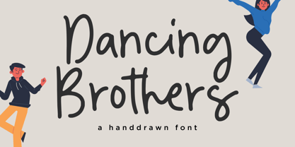 Dancing Brothers - a Handdrawn that's clean, elegant and perfect for a range of design projects! With its smooth, effortless lines and understated sophistication, this font is the perfect choice for those who want a modern look that's still timeless in its appeal. Crafted with precision and care, this font is incredibly versatile and can be used for a range of design projects, including logos, branding, invitations, packaging, and more. With its simple yet refined aesthetic, it's sure to make a lasting impression on anyone who sees it. - also multilingual support Enjoy the font! Feel free to comment or feedback! Thank you!
 - Star Candy 3d Display by Sipanji21,
$15.00 "Star Candy" is a display font with cute and thin characters. Fonts like this are often used in designs that aim to convey a charming and adorable feel. The thin and cute letterforms give a cheerful and enchanting appearance, making it suitable for a variety of design projects that want to emphasize a sense of cuteness, such as children's designs, greeting cards, decorations, or products that want to attract attention with their adorable appeal. If you have further questions about using this font or need assistance in a specific design context, please feel free to ask!
 - Heliuk by Fateh.Lab,
$10.00 Heliuk is a condensed type of font that has a different character from the previous condensed font, Heliuk has a strong but soft character, with a cheerful and fresh theme, supported by 4 choices of font types, Heliuk is able to answer your current needs who are designing something great. and what's even more interesting you get a very cool free vector bonus. Its weight is superior in posters, social media, headlines, magazine titles, clothing, large print formats - and wherever you want to see it. Inspired by the design styles that are currently popular, let's make your imagination come true with heliuk.
 - Magenta Basket by Balpirick,
$15.00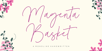 Magenta Basket - a Monoline Handwritten that's clean, elegant and perfect for a range of design projects! With its smooth, effortless lines and understated sophistication, this font is the perfect choice for those who want a modern look that's still timeless in its appeal. Crafted with precision and care, this font is incredibly versatile and can be used for a range of design projects, including logos, branding, invitations, packaging, and more. With its simple yet refined aesthetic, it's sure to make a lasting impression on anyone who sees it. - also multilingual support Enjoy the font! Feel free to comment or feedback! Thank you!
 - Roseline by Balpirick,
$15.00 Roseline - a Monoline Handwritten that's clean, elegant and perfect for a range of design projects! With its smooth, effortless lines and understated sophistication, this font is the perfect choice for those who want a modern look that's still timeless in its appeal. Crafted with precision and care, this font is incredibly versatile and can be used for a range of design projects, including logos, branding, invitations, packaging, and more. With its simple yet refined aesthetic, it's sure to make a lasting impression on anyone who sees it. - also multilingual support Enjoy the font! Feel free to comment or feedback! Thank you!
 - Rovey by Craft Supply Co,
$15.00 Rovey is an all caps handwritten serif font. It can be used to create almost all types of design projects like print materials. Just use your imagination and some graphic design set in Extras and your project will become more alive and look greater than ever with Rovey. You want to make a greeting card or a package design, or even a brand identity, craft design, any DIY project, book title, wedding font, pop vintage design, retro design or any purpose to make your art / design project look pretty and trendy? Feel free to play with this fonts!
 - Brother Home by Letteralle,
$18.00 Brother Home is a charming handwritten brush font that will bring an attractive feel to your designs. Brother Home includes 2 fonts : - Brother Home Regular: The main font with uppercase, lowercase, numbers, punctuation, and also multi-lingual support. - Brother Home Alternate: You can access alternative characters from the Regular weight via OpenType in your application, or you can also install this alternative weight. Brother Home Alternate will give you alternative characters, which will add a natural impression. That’s it! Please do let me know what you think, feel free to comment if there are issues or queries. Happy designing, Thank You!
 - Wildfire Dreams by Balpirick,
$15.00 Wildfire Dreams - a monoline calligraphy that's clean, elegant and perfect for a range of design projects! With its smooth, effortless lines and understated sophistication, this font is the perfect choice for those who want a modern look that's still timeless in its appeal. Crafted with precision and care, this font is incredibly versatile and can be used for a range of design projects, including logos, branding, invitations, packaging, and more. With its simple yet refined aesthetic, it's sure to make a lasting impression on anyone who sees it. - also multilingual support Enjoy the font! Feel free to comment or feedback! Thank you!
 - AZ Dramamine by Artist of Design,
$20.00 AZ Dramamine font has some inspiration from A&F tee-shirts, but mostly it is completely original script. This font was designed for use as a worn and antiqued headline.
 - Brusttine by Rockboys Studio,
$23.00 Austtone is a unique brush font, perfect for use in modern design projects. This font has a slightly aggressive edge, and works well in displays for use in digital media.
 - Reskova by Rockboys Studio,
$24.00 Reskova is a unique brush font, perfect for use in modern design projects. This font has a slightly aggressive edge, and works well in displays for use in digital media.
 - The Beast by Ronin Design,
$15.00 The Beast is a modern display font, featuring ligature and alternate will make your design look stunning. This font will work perfect for logo, poster, business card and cover design.
 - Ongunkan Greek Hollow Script by Runic World Tamgacı,
$75.00 I added the hollow model of the font he developed by taking an example from the ancient Greek inscriptions found in Turkey to my fonts. Use it in good works.
 - Bejraby by Phoenix Group,
$13.00 Bejraby is a handwritten font, which cultivates love, and attracts all the beautiful things in the world. This font was created with the theme of beauty and freedom in love.
 - Arvada JNL by Jeff Levine,
$29.00Arvada JNL is Jeff Levine's interpretation of a classic wood type font. Bold, brash and best at large point sizes, this font design also blends well with sports-themed projects. - Alphayouth by Rockboys Studio,
$23.00 Alphayouth is a unique brush font, perfect for use in modern design projects. This font has a slightly aggressive edge, and works well in displays for use in digital media.
 - Minty March by Angele Kamp,
$24.00 Minty March is an adorable handwritten font that is perfect for cards, invites, birthday invitations and more. This condensed, serif also works well when combining it with a script font.
 - Martian Grotesk by Martian Fonts,
$35.00 Martian Grotesk is a large typeface family originally designed for the screen which consists of a variable font with 2 axes of variation and 63 styles: Condensed to Ultra Wide, Thin to Ultra Black. Aesthetics The font style is characterized by some brutality and assertiveness. Overhanging terminals, a closed aperture, and an almost complete lack of contrast lead to this effect. Additionally, some elements of the letters are especially enlarged. This font gives any text the impression of being a “signature” style. Nevertheless, we still maintain the golden mean between its rebellious nature and readability. Perfect for web development We created Martian Grotesk for the web and digital project world. When laying out web pages, frontend developers are constantly faced with the fact that uneven metrics do not allow text to be evenly placed on some design element, for example, on a button. Instead, they have to compensate in some way, like making the top padding smaller and the bottom padding larger in CSS. This little deal really hurts. Also, if your project adheres to design system principles, you might be unable to stand a lack of systematic approach when working with fonts. We researched and calculated vertical metrics and set them up in a way that guarantees equal space above the cap height and under the baseline. This enables the text labels to be evenly placed on buttons, inputs, lists, and forms. In addition, we found a proper ratio of the letter heights, so, with commonly used font sizes—10, 15, and 20 pixels—the glyph heights stick to the pixel grid. As a result, the letter shapes become sharper, which reduces the load on the reader's eyes and simply looks much better. The typeface also comes equipped with OpenType and TrueType hinting, and Martian Grotesk appears legible on most platforms, even when being rendered in small sizes. When coupled together, all the above features make Martian Grotesk a reasonable choice for any user interface design. Roadmap Martian Grotesk right now is a work-in-progress product. The font is completely ready for professional use, however, many great features are still ahead! For example, support for Extended Cyrillic characters, and italics. Pricing Purchasing an early version of the font presents the opportunity to get it at a very attractive price! That’s because with every new version, costs will go up to reflect the additional value that comes with every release. But after purchasing Martian Grotesk, all its future updates are included for free!
 - Ubicada - Personal use only

- Tall & Lean - Personal use only

- Amaris by Craft Supply Co,
$15.00 Amaris is a nostalgic serif fonts features high contrast between thick and thin strokes, and traditional letterforms. They evoke elegance, sophistication, and tradition. Ideal for formal designs and branding. You want to make a greeting card or a package design, or even a brand identity, craft design, any DIY project, book title, poster, pop vintage design, retro design or any purpose to make your art/design project look pretty and trendy? Feel free to play with this typeface!
 - Scansky by Satori TF,
$20.80 Scansky is a carefully crafted contemporary modern sans serif typeface. It comes with 28 fonts, regular and condensed sub-families, and matching italics. Scansky was designed to give a distinct, corporative look to your artwork, suited for signage, web, and corporate print material. It is equipped with an extended character set to support Central, Eastern and Western European languages. And the good news is that the SemiBold weights are free of charge so you can try it. :)
 - Bariyet by Ironbird Creative,
$22.00 The Bariyet is an organic hand drawn script. This script typeface gives a feel of vintage, classic, old, handmade looked like.This typefaces is perfect for people looking for vintage aesthetic. Suitable for any graphic designs such as branding materials, t-shirt, print, business cards, logo, poster, t-shirt, photography, quotes .etc We hope you enjoy the font, please feel free to comment if you have any thoughts or feedback. Thanks for purchasing and have fun! Regards, Ironbird Creative
 - Sometimes by Almarkha Type,
$30.00 Sometimes is a fancy signature font with 2 styles: regular and slant. It is inspired by luxury and branded items. It is perfect for logos, branding, photography, invitations, watermarks, advertisements, product designs, stationery, wedding designs, labels, product packaging, special events or anything that need hand-writting taste. Thanks for checking it out, and feel free to drop me a message if you had any queries! Oh, and come and say hello over at email : almarkhatype@gmail.com ~ Almarkha Type
 - Victory History by madeDeduk,
$15.00 Introducing Victory History is a Modern Sans, use this font for any branding, product packaging, invitation, quotes, t-shirt, label, poster, logo etc. Feature otf. and ttf. file Uppercase & Lowercase Number & Symbol International Glyphs Multilingual support Alternative Ligature Feel free to drop us a message any time and follow my shop for upcoming updates Shoot me on email at: dedukvic@gmail.com and find more previews on my Instagram here : https://www.instagram.com/acekelgondolayu/?hl=en Hope you enjoy it.
 - Kendrew by madeDeduk,
$16.00 Introducing The Kendrew is a kids handwriten playful font and will be perfect for book, title branding, product packaging, invitation, quotes, t-shirt, label, poster, logo etc. Feature Uppercase & Lowercase Number & Symbol International Glyphs Multilingual support Feel free to drop us a message any time and follow my shop for upcoming updates Shoot me on email at: dedukvic@gmail.com and find more previews on my Instagram here : https://www.instagram.com/acekelgondolayu/?hl=en Hope you enjoy it.
 - The Royalheat by Ironbird Creative,
$15.00 The Royalheat is a organic display typeface inspired by vintage type with handdrawn feel. Comes with regular, stamp, slanted and slanted stamp styles. This typefaces is perfect for people looking for vintage aesthetic. Suitable for any graphic designs such as branding materials, t-shirt, print, logo, poster, t-shirt, quotes .etc We hope you enjoy the font, please feel free to comment if you have any thoughts or feedback. Thanks for purchasing and have fun! Regards, Ironbird Creative
 - strokeWeight by Schriftlabor,
$29.00 strokeWeight is inspired by the aesthetics of computer vector graphics. strokeWeight is the name of a processing programming function to set the thickness of a stroke. The single bezier curve that describes a stem as a centerline with a particular stem thickness represents the basic idea of this typeface. The unconventional corners and stem endings derive from the concept. If you buy the complete strokeWeight family you will get a strokeWeight variable font file for free!
 - Warheim by Ironbird Creative,
$15.00 Warheim is a organic display typeface with handdrawn feel. Comes with regular, stamp, spurs and spurs stamp styles. This typefaces is perfect for people looking for vintage aesthetic and organic feel. Suitable for any graphic designs such as branding materials, t-shirt, print, logo, poster, t-shirt, quotes .etc We hope you enjoy the font, please feel free to comment if you have any thoughts or feedback. Thanks for purchasing and have fun! Regards, Ironbird Creative
 - Caudia Xovier by madeDeduk,
$16.00 Introducing Caudia Xovier is a natural handwritten font come with alternative and ligature and will be perfect for book, title branding, product packaging, invitation, quotes, label, poster, logo etc. Feature Uppercase & Lowercase Number & Symbol International Glyphs Multilingual support Alternative Ligature Thanks so much for checking out my shop and feel free to drop us a message any time and follow my shop for upcoming updates or Shoot me on email at dedukvic@gmail.com Hope you enjoy it.
 - Hunitek by Gatype,
$15.00 The Hunitek Display is stylish with extreme cuts, sharp corners and interactive straps. Characters that seem solid are spread across each replacement letter, with different styles and maximum personality. Bold character separation and considered binding standards create a type that is sturdy, modern and attractive. suitable for logos, emblems, magazines, quotes etc. Hunitek is a modern Display font, each letter is carefully crafted to make your text look unique. Feel free to message me if you have any questions!
 - Mollinder by TypeClassHeroes,
$17.00 Mollinder is a Aesthetic script come with retro and refined style, you can explore and combine creating rhythm for comfortable reading. This font perfect for any projects, such logotype, stickers, greeting / wedding cards, packaging design, headlines, brand identity, t-shirt, posters, magazines, books, Instagram, websites, and many more. Feature Uppercase & Lowercase Number & Symbol International Glyphs Multilingual support Alternative Ligature Feel free to drop us a message any time and follow my shop for upcoming updates. Hope you enjoy it.
 - Organic Tuesday by Bogstav,
$15.00 Sometimes you need things organised in a neat way. Organic Tuesday has that, but also a will to break free at the same time. Years ago I was at a restaurant where the menu was handwritten with a clumsy, but characteristic and charming, monospaced font. I must have focused so much on these letters that I can’t recall what I actually ate. But what I do remember is that it was a Tuesday, and the restaurant was organic!
 - The Warlock by Rillatype,
$15.00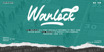 Introducing, our latest font The Warlock! The Warlock is a font that specially designed to meet your design needs. The Warlock is perfect for branding, packaging, logo, etc. to access the underline swash simply type underscore + number 1-4 in the middle of your word. example, War_1lock, War_2lock, War_3lock, War_4lock. Features : lowercase and uppercase numbers and punctuation swash multilingual PUA encoded stylistic alternates character
 - Katzenjammer by Hanoded,
$15.00 Katzenjammer is a German word meaning 'Cat's Wail' - it is used to describe a hangover. Katzenjammer font is a slightly eroded, squarish typeface, which would be ideal for headlines, packaging, posters and websites. This all caps font comes with different upper and lower case glyphs and a non-eroded set of alternates for the lower case - for those who like their alphabet nice and neat.
 - Filet by Emily Lime,
$24.00 This font is big on 2 things: Class & Quirk. Inspired by hand-scripted menus. This modern hand-calligraphy font isn't just for one or two-word logos. Designed to make a statement when used in large amounts. Great in large & small doses alike. Slightly irregular texture for that perfect hand-lettering touch on the page. Beautiful Duo for your next event or project! Multilingual support.
 - Power Talks by Essqué Productions,
$35.00 Inspired by fonts used in financial and law arenas. Bold style reminiscent of 1920s deco era. Great font for play cash or Monopoly-themed party invitations. Vibes of Wall Street movers and shakers. Includes letters from Latin, Greek, Hebrew, and Cyrillic Alphabets - with some common diacritics. Also includes small caps and English feature words like "the", "of", "with", "and", etc. for marquee style accents.
 - Redmarch by BaronWNM,
$12.00 Redmarch is a monoline script font that gives a natural-looking impression that is perfect for those of you who want to use a signature font. Redmarch is very suitable for branding, advertising, name cards, product labels, printing t-shirts, greeting cards, invitation cards, etc. Redmarch has several ligatures, begining and anding swashes to give a sweet touch at the beginning and end of words.
 - NorB Casual by NorFonts,
$28.00 NorB Casual is a handwritten text font which my daily casual writing, it can be used with any word processing program for text and display use, print and web projects, apps and Comic Books, graphic identities, branding, editorial, advertising, scrapbooking, cards, and invitations or even just for fun. This font comes with 16 styles, Light, Normal Bold and Heavy each with their Italic and Condensed version.
 - Grosser by Leo Colalillo,
$35.00 The design of Grosser* is inspired by the northern european modern architecture with it's rational shapes. The font was born for posters and to be used on large formats, the geometric shapes and the solid structure makes it a very good choice to do posters and graphics where you need an extra bold font with sharp lines. *Grosser (Größer) is a german word, which means "bigger/larger".

