6,894 search results
(0.022 seconds)
- Fat Free Solid - Unknown license

- BoumBoum (Free version) - Unknown license

- Fancy Free JNL by Jeff Levine,
$29.00 Up until the late 1920s, it was a popular habit in American songwriting to use African Americans as the topic of compositions using denigrating themes, words and even exaggerated character illustrations on the covers of the published sheet music. One such example of what was considered "entertainment" for its time was a piece entitled "Little Black Me". While this now socially and morally unacceptable piece of forgettable tripe is collected by some only for the historical documentation of the times they reflected, one good "positive" came out of this negative chapter of our country's musical heritage: The beautiful floral ornamented letters in the song's title has yielded Fancy Free JNL. Originally hand-lettered on an arc, these spurred Roman letters have been re-drawn, and are offered in both the regular design and a companion version with the ornamentation removed for lettering that is less ornate.
 - Free Form Deco by Jeff Levine,
$29.00 Toward the end of the 1920s, Art Deco influences were starting to creep into modern design. The hand lettered title on the cover of the1928 sheet music for “Fascinatin’ Vamp” not only embraced the new Deco movement, but sent it on a wild typographic ride. Letters of mixed thicknesses and stylings made up the two word title, and this unusual group of letter shapes became the inspiration for Free Form Deco JNL, which is available in both regular and oblique versions.
 - Sultan Free Bold by Sultan Fonts,
$19.99 Sultan free is an Arabic text typeface for desktop applications. Sultan free is a freestyle script. It is available in One style, calligraphic, and very dynamic. This makes it suitable for large display sizes, especially in the area of advertising, while still functioning well as a text face. The font includes a support for Arabic, Persian, and Urdu. Sultan free typeface comes with many opentype features.
 - Two Beers Free by SynFonts,
$39.00 - Indi Kazka 4F by 4th february,
$25.00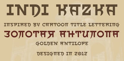
- KR Trees - Unknown license

- Christmas Tree - Unknown license

- Doodolonomy Fred - Unknown license

- Bujardet Freres - Unknown license

- Snow Freeze by Putracetol,
$18.00 Snow Freeze a quirky playful font with 7 different style of the font. Each style has a difference in the decoration of the ornaments. This font is a winter theme font, so all the decorations are winter-related, such as: snow, snow cap, snowman, snow frezze, melt ice, snow pile and sparkle. With these decorations, this font will be perfect for your winter-themed projects. This font is also suitable for logos, branding, quotes, posters, stickers, greeting cards, invitation cards, birthday cards, quotes, crafting, svg, banners, movies, headlines and more. This font is also support multi language.
 - Swath Trees by Twinletter,
$15.00 Introducing Swath Trees, our newest font, a beautiful and appealing graffiti font with a modern and phenomenal style, designed with attention to each letter so that when used, it can create a blend of words that contain charming and striking artwork. Don’t hesitate to use this font for various project needs. This graffiti font is great for product logos, poster titles, headlines, packaging, film titles, logotypes, gorgeous writing, and trendy graffiti designs, among other things. Of course, if you utilize this font in your numerous creative projects, they will be perfect and outstanding. Use this typeface right away for your one-of-a-kind and remarkable projects.
 - Orchard Trees by Supfonts,
$15.00 Hello dears! I fulfilled my old dream and drew (wrote it to whom as you like :) a font in the Modern Calligraphy style. Also I added Ligatures and Swashes, have fun :) Orchard Trees will look beautiful on holiday invitations, wedding invites and stationery, logos, and more. Test it out below to see how it could look for your next project! Includes: Uppercase and lowercase Numbers and punctuation Foreign language support Check out my blog: https://www.instagram.com/zloillev pinterest.com/dmitriychirkov7
 - Frozen Tree by Epiclinez,
$18.00 Frozen Tree is a thick lettered yet friendly display font. Whether you are using it for cartoon-related designs, children's games, quotes, titles, brand names, book covers, posters, or just any creation that requires a touch of joy, this font is a great choice. So what's included : Basic Latin A-Z & a-z Numbers, symbols, and punctuations Accented Characters : ÀÁÂÃÄÅÆÇÈÉÊËÌÍÎÏÑÒÓÔÕÖØŒŠÙÚÛÜŸÝŽàáâãäåæçèéêëìíîïñòóôõöøœšùúûüýÿžß Thank you
 - Tree Cheska by MC Creative,
$11.00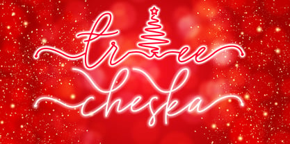 Tree Cheska monoline script font which natural movement and suitable for theme christmas and other. is perfect for branding projects, logo, wedding designs, social media posts, advertisements, product packaging, product designs, label, photography, watermark, invitation, stationery and any projects that need handwriting taste. What’s Included : Standard Glyphs Ligature & Swash Works on PC & Mac Simple installations Accessible in the Adobe Illustrator, Adobe Photoshop, Adobe InDesign, even work on Microsoft Word. PUA Encoded Characters – Fully accessible without additional design software. Fonts include multilingual support for; ä ö ü Ä Ö Ü ß ¿ ¡
 - Rustling Trees by Adam Fathony,
$15.00 Rustling Trees - Script Textured Fonts Brand new stylish textured fonts ! In collaborating with Albion Room. Fresh from the oven as inspired to create easy digital lettering for you. Flowing texture makes this fonts has a unique characteristic, also give you alternate characters lowercase and uppercase, alternate for the initial and terminal forms. It will be great for Logotypes, Posters, Digital Lettering Arts, Clean design, Branding Design, Sign, etc. Multiple Language available just check it out :) Features : Stylistic Alternates (up to 10 style in some letters) Initial & Terminal (also comes with alternate initial and terminal glyphs) Refined All caps (No more tail or swash when type in all caps)
 - Bree Serif by TypeTogether,
$-
- Tree Trunk by Mvmet,
$15.00 Tree Trunk is a bold display font with wood texture on it. You can use it for anything ranging from t-shirts and clothing, for your kids book designs, kids party needs, greeting cards, stickers, posters, banners, or anything that needs a bold and fun touch. Try it to create fabulous designs and feel the fun and cheering vibes with it!
 - Christmas Tree by Trim Studio,
$12.00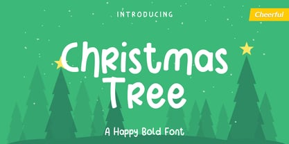 Christmas Tree is fun display font created to help spread holiday cheer. Get inspired by its charming appearance! Its perfectly suited for crafter and graphic artist to complete their design such as invitation, advertisement, poster, logo, birthday, product sign, and many more! Christmas Tree Font is also Lightweight and contains All Standard glyphs and punctuations and can be used beside any font.
 - Scorpion Tree by Scorpion Tree,
$9.99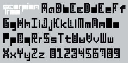
- Landscape-Trees by Scriptorium,
$12.00 - Subikto Tree by Subtitude,
$27.00 Subikto Tree is an ode to Mother Nature. This summer enjoy so many variety of trees in your design, be green and forget the blues.
 - Big Trees by A New Machine,
$19.00 Inspired by a trip to Sequoia National Park, this bold, all cap font is reminiscent of the great west and wide open spaces. Upper case letters are solid while lower case letters feature shadow lines. Great for titles, branding and logo work.
 - Tree Assortment by Gerald Gallo,
$20.00 An assortment of all types of trees from simple to complex.
 - Tonys Trees by Komet & Flicker,
$10.00 Tony’s Trees was inspired by the handmade signs down at the local Christmas tree lot. A fun-forest of typographic possibilities!
 - DB Trees by Illustration Ink,
$3.00DB Trees includes several familiar and not so familiar tree designs with plenty of room for creativity to grow. Makes fun additions to your creative projects. - KG Miss Kindy Collection by Kimberly Geswein,
$5.00 A collection to accompany KG Miss Kindergarten with various weights and fills.
 - Kruti Dev 010 - Unknown license

- HVD Edding 780 - Unknown license

- Yoon Gothic 700 by Yoon Design,
$400.00 YD Gothic 700 is a modern sans serif typeface consisting of 9 weights. It supports up to 13 different languages such as English in Latin and other scripts
 - Zapf Elliptical 711 by ParaType,
$30.00 The Bitstream version of Melior, a twentieth century modern face commissioned by Stempel and designed by Hermann Zapf in 1952. It is based on Zapf’s thoughts about the squared-off circle known as a super-ellipse. The type was originally intended as a newspaper text face by Linotype. Hermann Zapf’s Melior exhibits a robust character through classic and objective forms. Versatile and extremely legible, it can be used for a variety of texts and point sizes. Cyrillic version was developed by Natalya Vasilyeva and licensed by ParaType in 2002.
 - Zapf Elliptical 711 by Bitstream,
$29.99 - Geometric Slabserif 712 by ParaType,
$30.00 The Bitstream version of Monotype Rockwell, 1934. Twentieth-century design influence is revealed in strokes of more even weight than in the original nineteenth-century Egyptians or Slab Serifs. Rockwell is a prime example of this twentieth-century approach. It seems to be a simple Constructivist geometric sans with strong square slab serifs added to. Angular terminals make its sturdy design particular sparkling. It is a strong face for headlines and posters, and is legible in very short text blocks. Cyrillic version was developed at ParaType in 2000 by Isay Slutsker and Manvel Shmavonyan.
 - A10 STAR Black by Mogtahid,
$90.00 As a former typographer / lino and calligrapher, Abdallah NASRI had recourse to the nature of the idea of an "INTERCHANGEABLE" collection for types who in reality offer a police collar parallel to the complex typeface of the variable. Our fashion is outlined by a simple calculation defined by superimposed geometric circles where we used only its ¼ to fill the need for the angles of each of our letters. Always with the idea of having in the same allocated space, the same letter nested as many times as fat example from Hairline to Ultrabold. It was in this way that I was able to obtain a large number of styles, with a very interesting kerning which prompted me to extend the font to other languages with +1000 characters and +600 glyphs. I have always been treasured by the all in "1". I assure you that I sought to obtain the maximum of Visibility for a use S / Titling TV, WEB Pages and Typography Typo; once the difficult thing was done, I was rewarded by a font that has countless typographic openings for the world of graphics with 10 styles of weights in hand, and again I am happy to have personalized the charm of each letter by new details; I do not regret the time spent on thinking about it so that it is useful and at the same time pleasant as a working tool, finally profitable in all sectors and more multilingual, without forgetting that it is a family of inter change c ' is to say: All the types occupy the same height of the body and it is their fats which differs in the same space width of each of the letters, therefore no interference in spacing. Here, an additional alternative, a participation of a septuagenarian in the service of the love of modern digital typography. • TEST: At 50% screen in a body of 12 pixels, the A10 STAR Alphabet subjected to a test, has a clear Readability / Visibility. • P.S: A10 STAR integrates Diacriticism in all its forms. Texte d'origine : Abdallah NASRI a eu recours en étant ancien typographe/lino et calligraphe à la nature de l'idée d'une collection "INTERCHANGEABLE" pour les types qui en réalité offre un collier de police parallèle à la fonte complexe du variable. Notre mode est esquissé par un calcul simple défini par des ronds géométrique superposés où on a utilisé seulement son ¼ pour garnir le besoin des angles de chacune de nos lettres. Toujours dans l’idée à avoir dans le même espacement alloué, la même lettre imbriquée autant de fois de graisse exemple du Hairline à Ultrabold. C’est de cette manière que j’ai pu obtenir un grand nombre de styles, avec un crénage très intéressant ce qui m’a incité à étendre la police à d’autres langues avec +1000 caractères et +600 glyphes. J’ai toujours été prisé par le tout en « 1 ». Je vous assure que j’ai cherché à obtenir le maximum de Visibilité pour une utilisation S/Titrage TV, Pages WEB et Maquette typo ; une fois le difficile fait, j’ai été récompensé par une police qui possède d’innombrable ouverture typographique pour le monde du Graphisme avec comme atout en main 10 styles de graisses, et encore je suis content pour avoir personnalisé le charme de chaque lettre par des détails nouveaux ; je ne regrette pas le temps passé dessus à réfléchir pour qu’il soit utile et à la fois agréable comme outil de travail, enfin profitable tous secteurs confondus et en plus multilingue, sans oublié que c’est une famille d’inter change c’est-à-dire : Tous les types occupent la même hauteur du corps et c'est leurs graisses qui diffère dans un même espace largeur de chacune des lettres, donc aucune interférence dans l’espacement. Voilà, une alternative supplémentaire, une participation d’un septuagénaire au service de l’amour de la typographie numérique moderne. • TEST : A 50% d'écran dans un corps de 12 pixels, l'Alphabet A10 STAR soumise a un test, présente une nette Lisibilité / Visibilité. • P.S : A10 STAR intégre la Diacritique dans toutes ses formes.
 - MPI No. 510 by mpressInteractive,
$5.00 No. 510 is a friendly, slim gothic face. Strokes have a gentle inward curve at the median with the tops and bottoms of the letters slightly wider and thicker. The design was first introduced by William H. Page & Company around 1887.
 - Yoon Magazine 700 by Yoon Design,
$49.00 - Humanist Slabserif 712 by Bitstream,
$29.99 - 750 Latin Uncial by GLC,
$38.00 This font was inspired by the Latin script used in European monasteries from circa the 5th to 8th centuries, before the Carolingian “Caroline” (look at our 825 Karolus). It was a regular script, rounded, written slowly, used mainly for specially meticulous books, with a few ligatures, legible, but only with lowercase. The capitals consisted of enlarged lower cases, but here, we have preferred to use two slightly different patterns. Our lower cases are a synthesis from a lot of variants (mainly from the “First Bible” of Charles The Bald), the upper cases were mainly inspired from a 700’s manuscript from the abbey of Fécamp (France). We have adapted the font for contemporary users, differentiating between U and V, I and J, which has no relevance for ancient Latin scribes, and naturally with Thorn, Oslash, Lslash, K, W... punctuation and the usual accented characters which did not exist at the time. It can be used with 799 Insular Title.
 - Square Slabserif 711 by Bitstream,
$39.00A contemporary revival of early 20th century fonts, the Square Slabserif 711™ typeface family from the Bitstream library is perfect for contemporary print and interactive design projects. Its geometric structure of right angles and opposing round corners are ideally suited to current imaging devices. An added benefit is that they also give the design an enduring industrial strength demeanor. Available as three weights with relatively condensed proportions, the Square Slabserif 711 family will surely be a valuable addition to any professional collection of fonts.


