6,164 search results
(0.106 seconds)
- Scorpion Tree by Scorpion Tree,
$9.99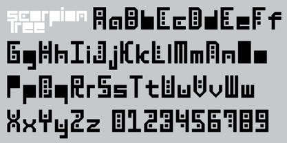
- Landscape-Trees by Scriptorium,
$12.00 - Subikto Tree by Subtitude,
$27.00 Subikto Tree is an ode to Mother Nature. This summer enjoy so many variety of trees in your design, be green and forget the blues.
 - Big Trees by A New Machine,
$19.00 Inspired by a trip to Sequoia National Park, this bold, all cap font is reminiscent of the great west and wide open spaces. Upper case letters are solid while lower case letters feature shadow lines. Great for titles, branding and logo work.
 - Tree Assortment by Gerald Gallo,
$20.00 An assortment of all types of trees from simple to complex.
 - Tonys Trees by Komet & Flicker,
$10.00 Tony’s Trees was inspired by the handmade signs down at the local Christmas tree lot. A fun-forest of typographic possibilities!
 - DB Trees by Illustration Ink,
$3.00DB Trees includes several familiar and not so familiar tree designs with plenty of room for creativity to grow. Makes fun additions to your creative projects. - KG Miss Kindy Collection by Kimberly Geswein,
$5.00 A collection to accompany KG Miss Kindergarten with various weights and fills.
 - K haus 105 by Talbot Type,
$19.50 K-haus 105 is inspired by the work of graphic designer and typographer, Herbert Bayer, during his time at the Bauhaus around 100 years ago — work that kick-started graphic design as we know it, to this day. It owes something to the simple geometry of Bayer’s hand-drawn, ‘universal typeface’, updated and expanded to deliver a clean, balanced, geometric sans for today. Also available as K-haus 205 , featuring a few, more 'daring' characters here and there, chiefly in the lower case set. Both variations include an extended character set, featuring accented characters for Central European languages.
 - Kaleko 105 Text by Talbot Type,
$19.50 Kaleko 105 Text is the text specific variation of stablemate, Kaleko 105 . With a shallower x-height and longer ascenders and descenders, its more traditional proportions make it more economical with space and better suited to continuous text. It's a well-balanced, versatile, modern sans, highly legible as a text font and with a clean, elegant look as a display font at larger sizes. The Kaleko 105 Text family comprises of four weights and includes old style non-aligning (lower case) numbers, both proportional and tabular as well as accented characters for Central European languages. It is closely related to Kaleko 205 Text , which offers variations in some characters, most notably a two-storey lower case a and g.
 - LTC Bodoni 175 by Lanston Type Co.,
$39.95 Giambattista Bodoni created this modern typeface in 1790 which served as the structural model for Sol Hess’s faithful rendition. Hess made necessary adjustments for mechanical typesetting on Lanston’s Monotype composition system. Remastered in 2006 by Paul Hunt.
 - Kessel 105 Text by Talbot Type,
$19.50 Kessel 105 Text is the text specific variation of stablemate, Kessel 105 . With a narrower x-height and longer ascenders and descenders, its more traditional proportions make it more economical with space and better suited to continuous text. It's a versatile, modern sans, highly legible as a text font and with a clean, elegant look as a display font at larger sizes. It has an art deco flavour with sharp points at the apex of many characters. The Kessel 105 Text family comprises of four weights and includes old style non-aligning (lower case) numbers, both proportional and tabular as well as accented characters for Central European languages.
 - 1695 Captain Flint by GLC,
$42.00 This rough font, was created inspired from a lot of various european documents dated from the end of 1600's. We were in search of a hand to accompany with "The Treasure Island" novel by R.L. Stevenson, and this seems to be the good one. It is a "Pro" font containing Western (including Celtic) and Northern European, Icelandic, Baltic, Eastern, Central European and Turquish diacritics. We have also included a few old English specific abbreviations. The numerous alternates (four sorts of standard lowercases and two sets of capitals) and numerous ligatures allow to made the font looking like a real various hand. Using an OTF software, the features allow to vary each character without anything to do but to select contextual alternates and standard ligatures and/or stylistic alternates options. The "Ru" version is a supplementary choice, offering Russian Cyrillics.
 - Kaleko 105 Round by Talbot Type,
$19.50 Kaleko 105 Round is a rounded variation of Talbot Type font Kaleko 105. It's a well-balanced, versatile, modern sans, highly legible as a text font and with a clean, elegant look as a display font at larger sizes. The rounded terminals give it a friendly, approachable look. The Kaleko 105 Round family comprises of six weights and is closely related to Kaleko 205 Round. The most notable differences between the two variations are the single-storey lower case a and g in Kaleko 105 Round, where they are two-storey in Kaleko 205 Round.
 - Karben 105 Stencil by Talbot Type,
$19.50 Karben 105 Stencil is a contemporary stencil font. The stencil breaks in the letters are applied in a way that is sensitive to the forms of the character in pursuit of a more elegant stencil. Karben 105 Stencil is available in a family of three weights. Karben 105 Stencil is closely related to Karben 105 and Karben 205 . All of the Karben fonts feature an extended character set, including accented characters for Central European languages.
 - Karben 105 Mono by Talbot Type,
$19.50 Karben 105 Mono is a monospaced variation of Karben 105. The clean and pure geometry of Karben 105 makes it highly suitable for adaptation to this monospaced variant. It has an even look and retains its legibility at very small sizes. Karben 105 Mono is available in a family of five weights and includes an extended character set to include accents for Central European languages. Karben 205 Mono is also available as a monospaced variant of Karben 205. There is also a stencil version of Karben 105 available.
 - Kessel 105 Remix by Talbot Type,
$19.50 A remixed variation, available in three weights, of the popular Talbot Type geometric sans Kessel 105 . The addition of occasional flourishes at the intersections of strokes, in both upper and lower case, adds character charm, making the font a perfect titling font to accompany Kessel 105, or a display font in its own right. Kessel 105 Remix features a comprehensive glyph set including a number of discretionary ligatures and accented characters for central European languages.
 - Klamp 105 Mono by Talbot Type,
$19.50 Talbot Type Klamp 105 Mono is a monospaced variation of Talbot Type Klamp 105. The clean and pure geometry of Klamp 105 makes it highly suitable for adaptation to this monospaced variant. It has an even look and retains its legibility at very small sizes. Klamp 105 Mono is available in a family of four weights and features an extended character set to include accents for Central European languages. Klamp 205 Mono, with some character variations, is also available as a monospaced variant of Klamp 205.
 - Kaleko 105 Remix by Talbot Type,
$19.50 A remixed variation, available in three weights, of the popular Talbot Type geometric sans Kaleko 105 . The addition of occasional flourishes at the intersections of strokes, in both upper and lower case, adds character charm, making the font a perfect titling font to accompany Kaleko 105, or a display font in its own right. Kaleko 105 Remix features a comprehensive glyph set including accented characters for central European languages.
 - Kamerik 105 Text by Talbot Type,
$19.50 Kamerik 105 Text is the text specific variation of stablemate, Kamerik 105. With a shallower x-height and longer ascenders and descenders, its more traditional proportions make it more economical with space and better suited to continuous text. It's a well-balanced, versatile, modern sans, highly legible as a text font and with a clean, elegant look as a display font at larger sizes. The Kamerik 105 Text family comprises of four weights and includes old style non-aligning (lower case) numbers, both proportional and tabular as well as accented characters for Central European languages. It is closely related to Kamerik 205 Text, which offers variations in some characters, most notably a two-storey lower case a and g.
 - 1654 Brown Street by Fonts of Chaos,
$10.00 1654 Brown Street, from the street to our font library it's only one step. This font is inspired by the street typography, the radius of the font is the same than the street marker.
 - Kamerik 105 Cyrillic by Talbot Type,
$19.50 Based on the popular Talbot Type Kamerik 105 , this Cyrillic variation is now available for the first time. Kamerik 105 is inspired by the classic, geometric sans-serifs such as Futura and Avant Garde, but has shallower ascenders and descenders for a more compact look. It's a versatile, modern sans, highly legible as a text font and with a clean, elegant look as a display font at larger sizes. The Kamerik 105 Cyrillic family comprises of five weights.
 - Janda Closer To Free - Personal use only

- SPARKS Free for All - Unknown license

- Free Form Retro JNL by Jeff Levine,
$29.00 The titles and credits from the 1960 French film “Le Passage Du Rhin” (English release title: “Tomorrow is My Turn”)” are hand made in a free form bold alphabet resembling both cut paper and quickly sketched lettering. This avant garde style inspired the digital type revival, which is available in both regular and oblique versions.
 - Free Form Showcard JNL by Jeff Levine,
$29.00 One of the examples in the 1916 publication “Baker’s Showcard Book” [an early 20th Century instructional book on sign lettering] was simply called “Plain Poster”. Somewhat Art Nouveau in style, but with many ‘nonconforming’ character shapes and widths, this novelty design is available digitally as Free Form Showcard JNL in both regular and oblique versions.
 - Janda Closer To Free by Kimberly Geswein,
$5.00 This chunky serif handwriting is fun but still completely legible for children.
 - Bodoni Classic Free Style by Wiescher Design,
$39.50 Bodoni Classic Free Style is my really fat, high contrast free flowing, liberated designed, script-like non-script extension to my ever expanding Bodoni Classic family.
 - Pervitina Dex - Personal use only

- Dem Bones - Personal use only

- Alan Den - Unknown license

- Covington Rev - Unknown license

- Plasmatica Rev - Unknown license

- der Dämonschriftkegel - Unknown license

- Plasmatica Rev - Unknown license

- Covington Rev - Unknown license

- Dez Squeeze by Dezcom,
$29.00 When you don't want to speak softly, Squeeze can shout above the crowd. Say it loudly and proudly, this face does not have a weight problem. The Dez Squeeze Pro Family is also now available from Dezcom in seven widths. http://www.myfonts.com/fonts/dezcom/dez-squeeze-pro/ Dez Squeeze has 483 glyphs with uppercase, lowercase, proportional lining figures, unicase, stylistic sets, alternates, ordinals, and case specific punctuation. It has a full range of diacritics and covers all European languages using the Latin script.
 - Lev Serif by TypeFaith Fonts,
$15.00 Lev is a slab serif font, the rectangular serifs and the straight angled shoulders and links contrasting the curves and loops. Lev Serif is characterized by thick, block-like serifs. Lev contains 12 high quality fonts.
 - Dex Gothic by Linotype,
$29.99Dex Gothic is another sort of stencil type. Instead of the "normal" routine of blocked-out horizontal or vertical areas, Dex Gothic creates its stencil appearance through the unique placement of diagonals. The result is a technical-like appearance, which bears some resemblance to 1980s technology products. Dex Gothic should be used large in headlines or logos. - Dem Bones by Greater Albion Typefounders,
$3.50 Dem Bones is a bit of fun-display alphabet (capitals), numbers and punctuation assembled out of the sort of knobbly ended bones that dogs used to gnaw on in all the best childrens cartoons and comics. Thing Gnasher and Gnipper or Spike and Tyke. Dem Bones is particularly apt at Halloween, but can introduce some un at any time of the year...


