9,447 search results
(0.02 seconds)
- Linotte by JCFonts,
$30.00 Linotte is a rounded sans in 7 styles designed by Joël Carrouché. Small irregularities give the typeface a warm and naive look, while the simple geometric construction provides good legibility in long texts and small sizes. Linotte is an ideal choice for food or kids related products, or anything that needs to convey a human and friendly feeling. Originally released in 2014, Linotte was updated in 2021 with Greek and Cyrillic support, two new styles, and other small additions. Linotte Semibold is 100% free for personal and commercial use. The fonts, provided in OpenType format, include diacritics for most European languages, a set of arrows & icons, and a variety of advanced features like stylistic alternates, case-sensitive forms, sub and superscript, automatic fractions, etc.
 - Sinkin Sans Narrow by K-Type,
$20.00 Sinkin Sans Narrow is a simple, pleasantly proportioned and easy to read sans-serif, available in all 9 standard web weights, 100 to 900, plus italics, so the face is a comprehensive illustration of the CSS web font numerical scale. Sinkin Sans fonts are designed with tiny, inconspicuous notches that sink into verticals at the intersections of strokes, adding highlights to congested corners. The incisions make right angles appear sharper and improve definition in more intricate characters. Sinkin Sans Narrow inherits the enviable clarity and readability of the luxuriously wide original family. The Narrow typeface, however, is designed to economise on space within busy web pages and has been sensitively condensed for maximum legibility. Each weight of Sinkin Sans Narrow is supplied with a free Italic.
 - One United Font by TypoGraphicDesign,
$9.00 The typeface One United Font is designed from 2020 for the font foundry Typo Graphic Design by mäd • madeleine maros × Manuel Viergutz as a political statement #leavenoonebehind The display font is inspired in the past and present. 3 font-styles (Bubble, Bubble Behind, Outline) + 1 icon-style with 390 glyphs (Adobe Latin 1) incl. 100+ decorative extras like icons, arrows, dingbats, emojis, symbols, geometric shapes (type the word #LOVE for ❤ or #SMILE for ☺ as OpenType-Feature dlig) and stylistic alternates (3 stylistic sets). For use in logos, magazines, posters, advertisement plus as webfont for decorative headlines. The font works best for display size. Have fun with this font & use the DEMO-FONT (with reduced glyph-set) FOR FREE!
 - American Donuts - Unknown license

- Altemus Suns by Altemus Creative,
$11.00 A collection of 174 sun designs.
 - Altemus Rounds by Altemus Creative,
$11.00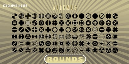 A collection of 174 round designs.
 - Altemus Squares by Altemus Creative,
$11.00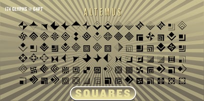 A collection of 174 square designs.
 - Altemus Spirals by Altemus Creative,
$11.00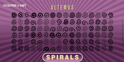 A collection of 174 spiral designs.
 - Bisaya 1880 - Unknown license

- FishyPrint AOE - Unknown license

- Futhark AOE - Unknown license

- Seaweed Fire AOE - Unknown license

- Buddy jim - Unknown license

- 99 Names of ALLAH Compact by Islamic Calligraphy75,
$12.00 We have transformed the “99 names of ALLAH” into a font. That means each key on your keyboard represents 1 of the 99 names of ALLAH Aaza Wajal. The fonts work with both the English and Arabic Keyboards. We call this Calligraphy "Compact" because as you can see everything is very close and decorative symbols are at a maximum. The first "alef" has neither a "hamzit wasel" nor a "fatha", this indicates to skip that first alef so instead of saying "AR-RAHMAAN" you say "R-RAHMAAN". (in the zip file you will find a pdf file explaining the differences in the "harakat", pronunciation and spelling according to the Holy Quran). The calligraphy is anything but traditional & we have used all the decorative letters except for the "Ye". In other calligraphy you don't usually find the decorative letters: "Dal, Ra & Ye" but we like them and we use them, the important thing is that they don't change the pronunciation or the meaning. Decorative letters used in this calligraphy: "Mim, Aain, Sin, HHe, He, Kaf, Alef, Ta, Dal, Ra & Saad". Purpose & use: - Writers: Highlight the names in your texts in beautiful Islamic calligraphy. - Editors: Use with kinetic typography templates (AE) & editing software. - Designers: The very small details in the names does not affect the quality. Rest assured it is flawless. The MOST IMPORTANT THING about this list is that all the names are 100% ERROR FREE, and you can USE THEM WITH YOUR EYES CLOSED. All the “Tachkilat” are 100% ERROR FREE, all the "Spelling" is 100% ERROR FREE, and they all have been written in accordance with the Holy Quran. No names are missing and no names are duplicated. The list is complete "99 names +1". The +1 is the name “ALLAH” 'Aza wajal. Another important thing is how we use the decorative letters. In every font you will see small decorative letters, these letters are used only in accordance with their respective letters to indicate pronunciation & we don't include them randomly. That means "mim" on top or below the letter "mim", "sin" on top or below the letter "sin", and so on and so forth. Included: Pdf file telling you which key is associated with which name. In that same file we have included the transliteration and explication of all 99 names. Pdf file explaining the differences in the harakat and pronunciation according to the Holy Quran. Here is a link to all the extra files you will need: https://drive.google.com/drive/folders/1Xj2Q8hhmfKD7stY6RILhKPiPfePpI9U4?usp=sharing
 - 99 Names of ALLAH Complete by Islamic Calligraphy75,
$12.00 We have transformed the “99 names of ALLAH” into a font. That means each key on your keyboard represents 1 of the 99 names of ALLAH Aaza Wajal. The fonts work with both the English and Arabic Keyboards. We call this Calligraphy "complete" because this is the only calligraphy where the complete set of decorative letters have been used. The calligraphy is more on the traditional side, letters don't overlap, the "ye" at the end of the names doesn't have the two dots, and a decorative "ye" has been included. The first "Alef" doesn't have a "hamzit wasel" nor a "fatha", this indicates to skip the pronunciation of that first letter. So instead of saying "AR-RAHMAAN" you say "R-RAHMAN". (in the zip file you will find a pdf file explaining the differences in the "harakat", pronunciation and spelling according to the Holy Quran). In other calligraphy you don't usually find the decorative letters: "Dal, Ra & Ye" but we like them and we use them. Decorative letters used in this calligraphy: "Mim, Aain, Sin, HHe, He, Kaf, Tah, Dal, Ra, Alef, Ye & Saad". Purpose & use: - Writers: Highlight the names in your texts in beautiful Islamic calligraphy. - Editors: Use with kinetic typography templates (AE) & editing software. - Designers: The very small details in the names does not affect the quality. Rest assured it is flawless. The MOST IMPORTANT THING about this list is that all the names are 100% ERROR FREE and you can USE THEM WITH YOUR EYES CLOSED. All the “Tachkilat” are 100% ERROR FREE, all the "Spelling" is 100% ERROR FREE, and they all have been written in accordance with the Holy Quran. No names are missing and no names are duplicated. The list is complete "99 names +1". The +1 is the name “ALLAH” 'Aza wajal. Another important thing is how we use the decorative letters. In every font you will see small decorative letters, these letters are used only in accordance with their respective letters to indicate pronunciation & we don't include them randomly. That means "mim" on top or below the letter "mim", "sin" on top or below the letter "sin", and so on and so forth. Included: Pdf file telling you which key is associated with which name. In that same file we have included the transliteration and explication of all 99 names. Pdf file explaining the differences in the harakat and pronunciation according to the Holy Quran. Here is a link to all the extra files you will need: https://drive.google.com/drive/folders/1Xj2Q8hhmfKD7stY6RILhKPiPfePpI9U4?usp=sharing
 - KING ARTHUR - Personal use only

- TOYZARUX - Personal use only

- Lewis hand - Unknown license

- Phoenix Arise - Unknown license

- Web-o-Mints GD by Galapagos,
$19.00George Ryan’s font of typographic ornaments and borders, available as a free download from Galápagos. - Brassens by Typorium,
$53.00 Le Typorium présente une nouvelle famille de caractères calligraphiques basés sur une écriture étudiée à travers les manuscrits et autographes de Georges Brassens, poète et musicien (1921-1981). Son tracé, rigoureux et appliqué, souvent minutieux, est à l’image d’une œuvre unique et singulière, immédiatement reconnaissable. Le script Brassens offre des fonctionnalités OpenType telles que des caractères alternatifs pour les majuscules et les minuscules afin de renforcer la fluidité d’une écriture manuelle, des chiffres alternatifs, des fractions et un jeu de caractères accentués étendu pour prendre en charge de nombreuses langues étrangères. Trois graisses ont été créées afin d’offrir une large palette de possibilités graphiques. 60 images d’un poète qui a cassé sa pipe à l’âge de 60 ans., classées en trois séries de vignettes (pictogrammes, symboles, portraits), elles illustrent l’univers imagé et la richesse symbolique de la poésie de Georges Brassens où les représentations mythologiques et allégoriques y tiennent une part importante. Georges Brassens est un poète, auteur-compositeur-interprète né à Sète le 22 octobre 1921, mort à Saint-Gély-du-Fesc le 29 octobre 1981 et enterré au cimetière Le Py de Sète. Auteur de plus de deux cents chansons populaires, il met en musique et interprète ses poèmes en s’accompagnant à la guitare. Outre ses propres textes, il met également en musique des poèmes de François Villon, Victor Hugo, Paul Verlaine, Paul Fort, Antoine Pol, ou encore Louis Aragon. Il reçoit le Grand Prix de Poésie de l’Académie Française e 1967. Un grand nombre d’écoles, salles de spectacle, voies, parcs et jardins portent également son nom, dont à Paris le parc Georges-Brassens, tout proche de l’impasse Florimont où il vécut ses premières années parisiennes, de sa maison de la rue Santos-Dumont et du café Les Sportifs Réunis – Chez Walczak – rue Brancion qui lui inspira « Le Bistrot ». À Sète, l’Espace Georges Brassens ainsi que de nombreux festivals et associations redonnent vie au poète et à son œuvre. The Typorium presents a new calligraphic typeface family based on a writing studied through the manuscripts and autographs of Georges Brassens, poet and musician (1921-1981). Its layout, rigorous and applied, often meticulous, is in the image of a unique and singular work, immediately recognizable. Brassens script offers OpenType features such as alternate characters for upper and lower case to enhance the fluency of handwriting, alternate numbers, fractions and an extended accented character set to support many foreign languages. Three weights have been created to offer a wide range of graphic possibilities. 60 images of a poet who broke his pipe (French expression for passing away) at the age of 60, classified into three series of vignettes (pictograms, symbols, portraits), they illustrate the imagery world and the symbolic richness of Georges Brassens poetry where mythological and allegorical representations hold an important part. Georges Brassens is a poet, singer-songwriter born in Sète on October 22, 1921, died in Saint-Gély-du-Fesc on October 29, 1981 and buried in Le Py cemetery of Sète. Author of more than two hundred popular songs, he sets to music and performs his poems, accompanying himself on the guitar. In addition to his own texts, he also sets to music poems by François Villon, Victor Hugo, Paul Verlaine, Paul Fort, Antoine Pol, or Louis Aragon. He received the Grand Prix of Poetry from the Académie Française in 1967. A large number of schools, theaters, streets, parks and gardens also bear his name, including in Paris the Georges-Brassens park, very close to the impasse Florimont where he lived his first years in Paris, his house in the rue Santos-Dumont and the café Les Sportifs Réunis - Chez Walczak - rue Brancion which inspired "Le Bistrot". In Sète, the Espace Georges Brassens as well as numerous festivals and associations bring the poet and his work back to life.
 - Mojacalo AH - Unknown license

- Butterfly Chromosome - Unknown license

- Schrill AOE - Unknown license

- AntiChrist SuperstarSW - Unknown license

- Mysterio SWTrial - Unknown license

- Scrawn AOE - Unknown license

- Electric Hermes - Unknown license

- ID SupernovaSW - Unknown license

- Rusted MachineSW - Unknown license

- Jambetica - Personal use only

- 1726 Real Española by GLC,
$42.00 This family was inspired from the set of fontfaces used by Francisco Del Hierro, to print in 1726 the first Spanish language Dictionary from the Spanish Royal Academy (Real Academia Española, Diccionario de Autoridades). These two Transitional styles are said to have been the first set of official typeface in Spain, like the French “Reale” (take a look at our "[/fonts/glc/1790-royal-printing/ 1790 Royale Printing)". In our two styles (Regular & Italic), fontfaces, kernings and spaces are as closely as possible the same as in the original. This Pro font is covering Western, Eastern and Central European, Baltic and Turkish languages, with standard and “s long” ligatures and twin letters in each of the two styles and a few Italic swashes inspired from the font used in 1746 by the same printer for another edition from the Royal Academy.
 - Rusch by Proportional Lime,
$9.99 Adolf Rusch von Ingweiler, was in the 19 th century known mysteriously as the “R'' printer. He was the first printer North of the Alps to introduce the new Roman style of type known now as Antiqua. He was active in the city of Strasbourg from around the early 1460's to 1489. One wonders if the unusual form of “R'' was a personal conceit. This font is, therefore, an Antiqua style font and has over a 1000 defined glyphs with wide support for medieval characters that have since fallen out of use. The baseline was slightly tidied up in order to give the printed text an even cleaner look than the original. The letters are very close approximations of the original type catalogued by the “Veröffentlichungen der Gesellschaft für Typenkunde des 15. Jahrhunderts” as Typ.1:103R GfT1197.
 - Dreaming Outloud by My Creative Land,
$15.00 Say hello to a casual handwritten font family - Dreaming OutLoud. 8 handwritten typefaces made to complement each other in the best possible way. They are easy to use and perfect for expressing your thoughts, posting quotes and simple daily updates on social media. The font package is complemented by more than a 100 transparent background marker lines (easy to change color!) - to emphasise what you are saying :) - and dingbats & doodles font. Two sub-packages included: Elementary package. Use this one if you primarily work in Canva/Cricut and similar applications and don’t want to deal with OpenType features of the PRO fonts. To access alternates - simply change the font to it’s ALT version. Voilà. You can use these fonts on your iPad in Procreate app! Charged package. You need this one if you feel comfortable with OpenType features, if you work in Adobe Suite and similar applications that have OpenType panel to access OT features. You can use these fonts in Canva-like applications as well - they are fully unicode mapped. Contact me with your MyFonts order # to get a free bonus - more than a 100 "Marker selection lines" in png and psd
 - Christmas Cove by Factory738,
$15.00 When the air becomes crisply chilly and we start thinking of festive projects in time for Christmas, it's time to celebrate. Christmas Cove, A classic Christmas typeface for sleigh rides and carol singing. Included are all of the necessary elements, such as numbers, punctuation, and multilingual letters. These ligatures will come in useful no matter what your imagination conjures up. 10 Styles Basic Latin A-Z and a-z Numerals & Punctuation Stylistic Ligatures Multilingual Support for ä ö ü Ä Ö Ü ... Free updates and feature additions Thanks for looking, and I hope you enjoy it.
 - Marguerite - Personal use only

- Indoctrine - Personal use only

- Quintus 'StainedCameo' - Unknown license

- Effluence - Unknown license

- BN Year 2000 - Unknown license


