5,991 search results
(0.031 seconds)
- Dino Moose by madeDeduk,
$12.00 Introducing Dino Moose is a playful font and will be perfect for book, titlebranding, product packaging, invitation, quotes, t-shirt, label, poster, logo etc. Feature 3 font files Uppercase & Lowercase Number & Symbol International Glyphs Multilingual support Feel free to drop us a message any time and follow my shop for upcoming updates Shoot me on email at: dedukvic@gmail.com if you have any questions Hope you enjoy it.
 - Roller Hesoon by TypeClassHeroes,
$16.00 Retro and refined you can explore and combine creating rhythm for comfortable reading. Roller Hesoon supports more than 100 Latin-based languages and has extensive Cyrillic and Greek support for languages like Russian, Bulgarian, Ukrainian, and many more. Feature Uppercase & Lowercase Number & Symbol International Glyphs Multilingual support Alternative Ligature Cyrillic & Greek Feel free to drop us a message any time and follow my shop for upcoming updates. Hope you enjoy it.
 - Charm Mirage by Issam Type,
$22.00 CHARM Mirage is a serif typeface comes with joining ligatures that give it a fancy and unique style. This awesome font is perfect for branding, logos, invitation, watermark and so much more. CHARM Mirage typeface comes with regular, italic, Condensed and Condensed italic font styles. Uppercase & lowercase letters, numbers, punctuation, ligatures, alternates and multilingual support. If you have any questions, please feel free to get in touch. Thank you
 - Jester Script by Paul O'Connell,
$9.95This comical styled Jester Script font was created to suit various design applications within the typeface market and is aimed at people looking for a clown styled brush script typeface that is very unconventional indeed. Designed and produced by Paul O'Connell of POCT, it is a distinct styled font script, loosely drawn with irregular rounded edges and curves to create a free flowing handwritten font that will appeal to everyone. - Teja by Eurotypo,
$59.00 “Teja” font was inspired in the lettering styles printed on enamel advertising signs. The enameled iron signs were, from 1880s until the 1950s, amongst the most striking features of streets and railway stations in most towns and villages around the world. “Teja” was designed specially for use in logotypes, advertising and packaging. It is interesting to note the use of free-flowing lettering to perform its own eye-catching.
 - Molaste by madeDeduk,
$14.00 Molaste is a retro font come with 80's retro style serif. You can explore and combine creating rhythm for comfortable reading. Vintage and refined use this font for any branding, product packaging, invitation, quotes, headline, label, poster, logo etc. Feature Uppercase & Lowercase Number & Symbol International Glyphs Multilingual support Alternative Ligature Feel free to drop us a message any time and follow my shop for upcoming updates Hope you enjoy it.
 - AT Move Quipo by André Toet Design,
$39.95 QUIPO is a typeface based on my recent survey (Freeflow) on hand drawn logotypes used by American and English pop groups in the 60-70s. We thought it an interesting project and a free flow exercise to design this particular font just in capitals and well... yes it’s rather ‘bulky’. Needless to say it comes with numbers and the normal punctuations ! Concept/Art Direction/Design: André Toet © 2017
 - Benton Modern by Font Bureau,
$40.00 Benton Modern was first prepared as a text face by Font Bureau for the Boston Globe and the Detroit Free Press. Design and proportions were taken from Morris Fuller Benton’s turn-of-the-century Century Expanded, drawn for ATF, faithfully reviving this epoch-making magazine and news text roman. The italic was based on Century Schoolbook. These display cuttings were prepared by Dyana Weissman and Richard Lipton; FB 2008
 - Slack 01 by Fateh.Lab,
$10.00 Hello, Introducing our newest font Slack 01, Slack 01 has a character with a fun, happy, colorful, and very modern style, this is good news for those of you who are thinking of ideas and making something great, and Slack 01 is the answer for that all, with vector illustration support that you will get for free, so what are you waiting for, get Slack 01 right away
 - Baguede by Craft Supply Co,
$15.00 Introducing Baguede, a post modern grotesque typeface with Fancy and catchy touch to maintain a sophisticated feel for the purpose of display. You want to make a greeting card or a package design, or even a brand identity, craft design, any DIY project, book title, poster, pop vintage design, retro design or any purpose to make your art / design project look pretty and trendy? Feel free to play with this typeface!
 - Ralline by Pen Culture,
$10.00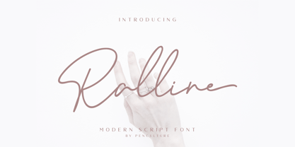 Introducing the new "Ralline - Modern Signature Font" a natural and fashionable script font with complete features that will be very pleasant. This font easy to use and perfect for logo design / branding, watermark photos, product packaging, and much more. Feature and what inside: uppercase and lowercase number and punctuation ligature Swashes Multilingual support Please fell free to contact me on Hipenculture@gmail.com if you have any question Thank you
 - Ferguson Hunter by Balpirick,
$15.00 Ferguson Hunter is a Modern Calligraphy Font. Ferguson Hunter is a lovely script font featuring charming, playful characters that seem to dance along the baseline. Whatever the topic, this font will be a wonderful asset to your font library, as it has the potential to enhance any creation. Ferguson Hunter also multilingual support. Enjoy the font, feel free to comment or feedback, send me PM or email. Thank you!
 - Lattih Tiny by Javanice Studio,
$16.00 Introducing Lattih Tiny by Javanice Studio Lattih Tiny is A Handwritten Script Font Lattih Tiny is perfect for branding project, apparel, labels, magazines, books, greeting / wedding cards, packaging, fashion, make up, stationery, and any type of advertising purpose or just used to express words above the background. This font includes Lattih Tiny also multilingual support. Enjoy the font, feel free to comment or feedback, send me PM or email.
 - Erangle by Gatype,
$14.00 Erangle is an elegant serif typeface inspired by a vintage type specimen I found recently at an art fair. Thin to thick contrasting lines and elegant curves make Beginta the perfect font for this type of logo and display purposes. Hope you enjoy it Feel free to contact you with any questions or concerns you may have and I will get back to you as soon as I can.
 - Kikola Nafi by Javanice Studio,
$16.00 Introducing Kikola Nafi by Javanice Studio Kikola Nafi is A Urban Brush Font Kikola Nafi is perfect for branding project, apparel, labels, magazines, books, greeting / wedding cards, packaging, fashion, make up, stationery, and any type of advertising purpose or just used to express words above the background. This font includes Kikola Nafi also multilingual support. Enjoy the font, feel free to comment or feedback, send me PM or email.
 - Air Factory by Khaito Gengo,
$22.00 Air Factory was originally designed for a merchandise company, and ordered to design iconic but plain forms. Air Factory is a very simple and modern sans-serif font inspired by early 1900’s typefaces, like Futura, and consisting of 5 weights and stencil type(free). This contemporary typeface would be good used for restaurant, retail, book, poster etc. Air Factory also features various ligatures, stylistic alternates, fractions, and languages as well.
 - Agreable Modern Script Font by sizimon,
$20.00 Hello thanks for visiting our font Agreable Script! Since the font made it on the scent of luxury. Suitable to create beautiful hand-made typography in an instant. It is free-flowing & bouncy curves. Agreable is perfect for logos, printed quotes, invitations, cards, product packaging, headers and whatever your imagination holds. Agreable Includes: Uppercase,lowercase,numeral,punctuation & Symbol Multilingual support Stylistic alternates PUA Encoded Characters Fully accessible without additional design software.
 - Navila Mandres by madeDeduk,
$16.00 Navila Mandres is a realistic hand drawn font come with alternative and ligature and will be perfect for book, title branding, product packaging, invitation, quotes, label, poster, logo etc. Feature Uppercase & Lowercase Number & Symbol International Glyphs Multilingual support Alternative Ligature Thanks so much for checking out my shop and feel free to drop us a message any time and follow my shop for upcoming updates Hope you enjoy it.
 - Buddy Slender by Hackberry Font Foundry,
$24.95 Buddy Slender is the narrower version of the companion sans for Contenu, the book font family designed for a book on book family design called Practical Font Design. It's a loose, free, easy to read sans, so when my wife suggested Buddy, it clicked. This is the 2-font Buddy Slender family of Regular & Bold. I made a new more limited feature set for these fonts due to their designed usage.
 - Kaluna Script by Rillatype,
$15.00 Kaluna Script is a lovely font with tons of swashes! Kaluna is perfect for headlines, logotypes, clothing, invitations, branding, packaging, advertising, and more. This typeface comes in uppercase, lowercase, with punctuation, symbols, numerals, stylistic set alternate, ligatures, etc also multi-lingual support. Type _1, _2, _3 to access the underline, example : Kaluna_1, Kaluna_2, Kaluna_3 If you have any question, feel free to PM us or reach us Rillatype@gmail.com
 - Emosia by Gatype,
$14.00 Emosia is an elegant serif typeface inspired by a vintage type specimen I found recently at an art fair. Thin to thick contrasting lines and elegant curves make Beginta the perfect font for this type of logo and display purposes. Hope you enjoy it Feel free to contact you with any questions or concerns you may have and I will get back to you as soon as I can.
 - Edicia by Tour De Force,
$- Edicia is modern serif family with 5 weights and matching Italics. Distinctive and recognizable, Edicia stands out clearly with charming details. Characterized by asymmetric serifs, Edicia is designed with special care for ink-traps. Contains extended Latin and Cyrillic character set equipped with left & right side Borders, Localised Forms, Denominator & Numerator, OldStyle Figures, Tabular Figures, Tabular OldStyle Figures, Superscript, Subscript, Stylistic Alternates. Thin weight is available for free.
 - Energetica by Balpirick,
$15.00 Energetica is a Modern Handwritten Font. Energetica is a delicate, elegant and flowing handwritten font. It has beautiful and well balanced characters and as a result, it matches a wide pool of designs. Add it to your most creative ideas and notice how it makes them come alive! Energetica also multilingual support. Enjoy the font, feel free to comment or feedback, send me PM or email. Thank you!
 - Alevia by Scratch Design,
$12.00 Alevia is a modern display sans serif with a clean and minimalist touch. It has a sophisticated, and elegant typeface design. This beautiful font has been designed for projects which are suitable for modern & elegant design, such as branding, packaging, magazines, logos, social media, websites, headers, and many more. Alevia includes: Letters Numbers Symbols & Punctuation Multilingual Support Beautiful Ligatures If you have any questions, please feel free to contact us. Thanks!
 - Basgem by Issam Type,
$23.00 Basgem is a modern classy ligature serif typeface comes with joining ligatures that give it a fancy and unique style. This awesome font is perfect for branding, logos, invitation, watermark and so much more. Basgem typeface comes with regular, italic, Condensed and Condensed italic font styles. Uppercase & lowercase letters, numbers, punctuation, ligatures, alternates and multilingual support. If you have any questions, please feel free to get in touch. Thank you
 - Bomiro by Issam Type,
$22.00 Bomiro is a modern classy ligature serif typeface comes with joining ligatures that give it a fancy and unique style. This awesome font is perfect for branding, logos, invitation, watermark and so much more. Bomiro typeface comes with regular, italic, Thin and Thin Italic font styles. Uppercase & lowercase letters, numbers, punctuation, ligatures, alternates and multilingual support. If you have any questions, please feel free to get in touch. Thank you
 - Mythring by Ditatype,
$29.00 Myhtring is a spine-chilling display font that will cast a spell of fear on your designs. Designed in uppercase and with a bold weight, this typeface demands attention and exudes an aura of darkness and mystery. Each letter is meticulously crafted with details resembling menacing plant roots with sharp edges, adding an eerie and sinister touch to the font. With its bold weight and uppercase design, this font creates a powerful and impactful presence. The root-like details in each letter of Myhtring give the font an organic and unsettling appearance, as if the letters are entangled with malevolent and ancient roots. These haunting details add a sense of otherworldly energy and create an atmosphere of foreboding and suspense. The combination of bold weight and sharp-edged root details gives this font a sinister and enigmatic look, evoking images of dark and sinister forces lurking in the shadows. The letters seem to possess an aura of malevolence, making it an ideal choice for projects that delve into the horror and the supernatural. For the best legibility you can use this font in the bigger text sizes. Enjoy the available features here. Features: Alternates Multilingual Supports PUA Encoded Numerals and Punctuations Mythring fits in headlines, logos, movie posters, flyers, invitations, branding materials, print media, editorial layouts, headers, and any horror-themed project. Find out more ways to use this font by taking a look at the font preview. Thanks for purchasing our fonts. Hopefully, you have a great time using our font. Feel free to contact us anytime for further information or when you have trouble with the font. Thanks a lot and happy designing.
 - IM FELL French Canon - Unknown license

- Techari by Letterjuice,
$35.00 Techarí comes from a commission in which the brief consisted of the creation of a typeface family to be used for the design of the third disc of the band called Ojos de Brujo based in Barcelona. This disc was called Techarí, which means “free” in Caló, the language of the Spanish gypsies. The starting point of the design was the music of this band, the meaning of the disc 's name, and three words given by the band as key concepts: ethnic, baroque and graffiti. Techarí is a mixture of lots of influences, which give it its unique personality. From its technical viewpoint designing Techarí was a challenge, on the one hand it had to have lots of personality, and on the other it had to work in text at 9 or 10 pt size. Its goal is precisely that, while keeping a strong personality it works in text size. The typeface also contains a Stencil version for use in display sizes which keeps Techarí's innovative spirit. The way it has been “cut" is unconventional, it has been carefully done to keep the freshness of the typeface by taking advantage of the letterforms' flow. Techarí extra complements the typeface by taking a classical typographic form, the ornament, and making it a contemporary graphic tool, vindicating this wonderful typographic element.
 - High Society NF by Nick's Fonts,
$10.00 Blandford Press strikes again, with a delightful, delicious, de-lovely offering from their 1946 tome, Lettering for the Commercial Artist. The editor, A. H. Hunter, called this one simply "The Elegant Alphabet" and cautioned that it, "being neither quick nor easy, needs to be used with discrimination." Or not...
 - RMU Herkules by RMU,
$25.00 At the end of the 19th century, the fin de siècle, both Bauer and Berthold released ‚Herkules‘, a heavy Art Nouveau font for ads and posters. This font was carefully redesigned and makes it a great font in Jugendstil surroundings and a splendid partner of the Carlsbad font family.
 - Ornate Deco by Jeff Levine,
$29.00 Ornate Deco JNL is a thick-and-thin Art Deco serif typeface with diamond shapes inside the thicker parts of the characters. It is based on an alphabet example found in the 1949 French lettering book “Album de Lettres Arti”, and is available in both regular and oblique versions.
 - Affiche by RMU,
$35.00 Based on the fin-de-siècle Helios Reklameschrift of the Klinkhardt foundry, Leipzig, Affiche preserves the beautiful art nouveau character of its hot-metal forerunner and was carefully extended to make it multilingual. For more historical authenticity, you can use the long s by typing [alt] and [b].
 - Fancy Deco JNL by Jeff Levine,
$29.00 This decorative, scalloped thick-and-thin Art Deco type design is one of the many inspirations found within the pages of the 1934 French lettering book “L'Art du Tracé Rationnel de la Lettre”. Now in digital format, Fancy Deco JNL is available in both regular and oblique versions.
 - Handmade Nouveau JNL by Jeff Levine,
$29.00 An example of Art Nouveau lettering (complete with its unusual characters and varying shape widths) was found in a sample from the vintage publication "Modeles de Lettres Artistiques" ("Models of Artistic Letters"). This classic design is now available digitally as Handmade Nouveau JNL, in both regular and oblique versions.
 - Roc Grotesk by Kostic,
$40.00 Roc is a sans serif grotesk inspired by American wood types from the end of the 19th century. With nine weights in five widths, this family contains 45 fonts in total. The character set supports Western and Central European languages, as well as Turkish. Roc Grotesk comes in a range of five widths: Compressed, Condensed, Normal, Wide and ExtraWide, in order to cover a wide scope of applications. Although the styles at both ends of each range are made in their most pronounced form in terms of width and weight, they are not taken to such extremes as to become absurd, and are quite usable in display settings. The Normal width keeps all its nine styles in proportionally similar widths. The Compressed width, however, is deliberately made to be disproportionate, so that every style takes the least possible horizontal space. That is why the contrast between Compressed Thin and Compressed Heavy style is substantial. As the weights progress from Thin to Heavy, the stroke contrast becomes more prominent. It is intentionally exaggerated in heavier weights, which is particularly apparent in the uppercase E and R of the Black and Heavy style. Roc has a large x-height and relatively short descenders and ascenders. No uppercase letter descends below the baseline, so the lines of an all-caps text can be packed tightly on a poster or a headline. The Regular style is somewhat generously spaced, as it is most likely to be used for setting longer passages of text. Its Bold counterpart is spaced in such a way that the width of the text column will be similar to the text set in Regular. Tabular figures in these two styles have exact matching widths, so for example, you could emphasize one row of numbers in a data column without visually disrupting the vertical order of the table. The lowercase g and r have alternatives to accommodate what most designers expect from a typical Grotesk typeface. The single-story g and the cut-off r are accessible via the OpenType feature.
 - Reina by Lián Types,
$37.00ATTENTION! See the newest version of Reina here. Reina Neue is now a family of 45 styles and it's also a Variable Font! Have a look. For the traditional version of Reina, you may stay here ;) --- Reina is Sproviero’s didone of the year. We recommend seeing its user’s guide . Inspired in the sweet letters of calligraphy and typography masters of our past; such as Didot, Bodoni and the incredible Herb Lubalin, its aim was to incorporate the decorative accolades from blackletter and copperplate styles of calligraphy into a Modern Roman typeface. Reina reflects sovereignty due to the enveloping atmosphere and the sensation of greatness that can be felt when using it. It has an unique way of standing over paper and screen, being its swashes responsible of an extreme elegance. Similar to what Lian did in his last font Breathe , Reina was designed to be playful yet formal: While none of its alternates are activated it can be useful for short to medium length texts; and when the user chooses to make use of its open-type decorative glyphs, it can be useful for headlines with dazzling results. TECHNICAL Reina is a family with many members. In order to achieve better results when printing, Lian took his time to design the necessary styles: Reina 72 Pro, prepared for display sizes; Reina 36 Pro, for medium sizes; and Reina 12 Pro, the best for text or decorative words in small size. Each of these members have variants inside, which are open-type programmed: The user decides which glyph to alternate, equalizing the amount of decoration wanted. Reina Engraved Pro has the same features than the variants mentioned above. The family also contains variants which were made exclusively for decoration. These are: Reina Words, a set of the most common words used in english, german, italian, french and spanish; Reina Capitals, which consists in a big set of ornamented capitals; and Reina Fleurons, those little friends which always help to embellish our work. - Offroad by Grype,
$16.00 Geometric typefaces can harken back and visually tie themselves to so many genres, from constructivist posters, to techno club flyers, to raw industrial era power. The Offroad family finds its origin of inspiration in the O’Neal MX logo for their motocross division, represented in its truest form in the MX styles of this family, and expanded to a type megafamily. Offroad grabs hold of that unique pseudo-unicase style and runs with it to create a range of widths and weights that are perfect for historical through modern use. It embodies the hardcore motocross rigidity from the limited inspiration of the original logotype and expands to include a full and expansive glyphset, and a comprehensive range of widths and weights, creating a straightforward, uncompromising collection of typefaces that lend a solid foundation and a broad range of expression for designers. Here's what's included with the Offroad Collection bundle: 382 glyphs per style - including Capitals, Lowercase (Unicase Style), Numerals, Punctuation and an extensive character set that covers multilingual support of latin based languages. (see the 6th graphic for a preview of the characters included) 45 fonts in 6 width subfamilies: Extra Condensed, Condensed, Standard, Expanded, & Wide. 5 weights per subfamily with obliques: Light, Book, Regular, Bold, & Black. Fonts are provided in TTF & OTF formats. The TTF format is the standard go to for most users, although the OTF and TTF function exactly the same. Here's why the Offroad Collection is for you: You're in need of a geometric pseudo-unicase family with a big range of weights and widths You're a die-hard motocross fan, and want to design anything within that genre You're a club flyer designer, and need a kick-ass techno style font family You're totally into constructivist design, and want to create designs within that genre You just like to collect quality fonts to add to your design arsenal
 - Tati by Wiescher Design,
$33.33I only had this bouncy curve and a photograph of a daily menu (Truite Meunière) I took outside an obscure Paris restaurant when starting the design of this font. But while working on it I suddenly started thinking about Jacques Tati the famous but almost forgotten french director of Les Vacances de Monsieur Hulot, Jour des Fêtes, Mon Oncle, Playtime, Trafic etc. I thought about his bouncy walk and his hilarious ideas. The memories never left me while working on the font, so I decided to name the font after this great French moviemaker who gave me so many happy hours. Since Tati was a very funny character, I gave my characters a funny price. Thank you Jacques Tati, yours Gert Wiescher - Closet Skeleton by Hanoded,
$20.00 Some time ago I stumbled upon a little book called 'De Sprookjeshoorn' ('Horn of Fairy Tales') by Anton Eijkens (1920 - 2012). It was published in 1946 and contains several authentic and unique fairy tales - unfortunately unreadable to modern children, as the language used is out of date. What caught my eye was the handwritten font on the cover of the booklet. Closet Skeleton is a fairytale font inspired by the one I found on the cover of De Sprookjeshoorn. It comes with several curly alternates and some end-ligatures as well. I added an 'old fashioned' ampersand and a modern one, so you can choose which one to use. Apart from that, Closet Skeleton comes with a closet choc-a-block full of diacritics.
