10,000 search results
(0.05 seconds)
- Vintage Machine by Balpirick,
$15.00 Vintage Machine is a Typewritter Typeface Font. This font captures the essence of vintage typewriters, with a distinct and easily recognizable aesthetic. This font is perfect for projects that require a vintage touch, such as vintage-inspired branding, editorial designs, and book covers. Embrace the nostalgia of analog writing with our typewriter fonts, a tribute to the timeless art of typography. - also multilingual support Enjoy the font! Feel free to comment or feedback! Thank you!
 - Hintdake by Edignwn Type,
$21.00 Hintdake is more than just a font; it's your ticket to a tattoo font collection. Featuring three styles (regular, rough, and stamp) and 26 bonus tattoo illustrations. Hintdake is your secret weapon for standout logos, branding, and apparel designs. Dive into the world of blackletter fonts and make your creative mark with this exceptional collection. Hintdake font features : - 3 style typefaces (regular, rough and stamp) - Uppercase, lowercase, numeral, symbol, punctuation and ligature in blackletter font - All-caps, numeral, symbol and punctuation in sans serif font - Multilingual - PUA Encoded Hintdake includes : - 8 fonts (blackletter, sans serif and dingbat) - 26 tattoo illustrations in dingbat
 - Chalk Cowboys by Learning Kiddos,
$18.99 Chalk Cowboys is a vintage chalk font, handwritten by me. It has a real chalkboard feel and is a: textured font handwriting font has bonus shape elements and full Latin support As a bonus you will get real chalkboard shapes (as seen in preview pic three). Get creative and use this retro font for: a menu food branding as a display font for invites chalk lettering (of course =)) shirt designs magazine layout Instagram posts or any Social Media posts, really This font also works great as a running text, too. =) Don't forget to check out my two other fonts: Casual Crew Signsurfers Script
 - Platipus Script by Areatype,
$15.00 Platipus Script A sweet handlettered font, casual and dynamic with a dancing baseline.. all to add an authentic touch to your designs. perfect for Branding, Logos, Greeting Cards, Wedding Stationery, Quotes etc. It comes with a handy set of Opentype Stylistic Alternates, Ligatures and multiple language support. To enable the OpenType Stylistic alternates, you need a program that supports OpenType features such as Adobe Illustrator CS, Adobe Indesign & CorelDraw X6-X7, Microsoft Word 2010 or later versions. Files included: These coded with PUA Unicode. Mac users can use Font Book and Windows users can use Character Map to view and copy any of the extra characters to paste into your favourite text editor/app. How to access all alternative characters, using Windows Character Map with Photoshop: https://www.youtube.com/watch?v=Go9vacoYmBw How to access all alternative characters using Adobe Illustrator: http://youtu.be/iptSFA7feQ0nn Thanks so much for looking, I really hope you enjoy it and please don't hesitate to drop me a message if you have any issues or queries :)
 - Achtung by Mikołaj Grabowski,
$39.00 This is an extension of Mikolaj's Grabowski first typeface. Formerly known as EPILEPSJA, now coming as ACHTUNG. Adding lowercase and small caps, as well as additional language support including Cyrillic script and some dingbats. ACHTUNG Color Type Family has a range of application from warnings and safety signage to propaganda posters and anarchist graffiti. Every place where you need an indisputable message, be it in headlines or titles, this font comes in handy. It’s a stencil, it’s layered and impossibly dimensional. Download the specimen HERE. I advise you to do so in order to being aware of how the layers work and how to use color fonts. Total of 1020 glyphs. Languages: Afrikaans, Albanian, Bosnian, Bulgarian, Catalan, Croatian, Czech, Danish, Dutch, English, Estonian, Finnish, French, German, Hungarian, Icelandic, Italian, Latvian, Lithuanian, Macedonian, Maltese, Norwegian, Polish, Portuguese, Romanian, Russian, Serbian, Slovak, Slovenian, Spanish, Swedish, Turkish, Ukrainian, Vietnamese, Zulu. OpenType features: small caps, localizations, superscript, fractions, ordinals, proportional and tabular figures, case sensitive forms, stylistic alternates, contextual alternates, and proper mark attachment.
 - Mythring by Ditatype,
$29.00 Myhtring is a spine-chilling display font that will cast a spell of fear on your designs. Designed in uppercase and with a bold weight, this typeface demands attention and exudes an aura of darkness and mystery. Each letter is meticulously crafted with details resembling menacing plant roots with sharp edges, adding an eerie and sinister touch to the font. With its bold weight and uppercase design, this font creates a powerful and impactful presence. The root-like details in each letter of Myhtring give the font an organic and unsettling appearance, as if the letters are entangled with malevolent and ancient roots. These haunting details add a sense of otherworldly energy and create an atmosphere of foreboding and suspense. The combination of bold weight and sharp-edged root details gives this font a sinister and enigmatic look, evoking images of dark and sinister forces lurking in the shadows. The letters seem to possess an aura of malevolence, making it an ideal choice for projects that delve into the horror and the supernatural. For the best legibility you can use this font in the bigger text sizes. Enjoy the available features here. Features: Alternates Multilingual Supports PUA Encoded Numerals and Punctuations Mythring fits in headlines, logos, movie posters, flyers, invitations, branding materials, print media, editorial layouts, headers, and any horror-themed project. Find out more ways to use this font by taking a look at the font preview. Thanks for purchasing our fonts. Hopefully, you have a great time using our font. Feel free to contact us anytime for further information or when you have trouble with the font. Thanks a lot and happy designing.
 - VAG-HandWritten - 100% free

- Greycliff Thai CF by Connary Fagen,
$35.00 Greycliff Thai CF adapts Greycliff's popular soft, geometric design to the Thai script. Both Latin and Thai scripts are included, allowing for visually cohesive multiple-script applications. Greycliff Thai CF includes nine weights, obliques, and full Thai diacritics. Greycliff Thai CF works as a complete, self-contained type system, with both Latin and Thai scripts included and designed to compliment one another. All typefaces from Connary Fagen include free updates, new features, and free technical support.
 - Crawling by Mevstory Studio,
$25.00 Crawling Chic & Moderf Serif. Crawling is a modern and chic typeface, best used as a display for headings, logos, branding, magazines, product packaging and invitations. Crawling come with clean lines and smooth curves give any project an extra touch of class. If there's anything else you are unsure of feel free to pop me a message :) That's it! Have fun using Crawling Typeface!!! Feel free to follow, like and share. Thanks so much for checking out my shop!
 - Argent CF by Connary Fagen,
$35.00 Argent is dashing and expressive, with a pronounced x-height and evocative, flowing letterforms. Featuring charming italics, a special superbold weight, and wide language support, Argent excels in display settings like headlines, titles, and logos. As an expressive and detailed typeface, Argent pairs nicely with clean typefaces that provide contrast, such as a sans serif like Greycliff CF, Artifex Hand CF, and Articulat CF. All typefaces from Connary Fagen include free updates, including new features, and free technical support.
 - DS Hiline - Unknown license

- Runaround Sue NF by Nick's Fonts,
$10.00In his book Brushstroke and Free-Style Alphabets, Dan X. Solo called this typeface "Tamarind Script" but, whatever its name, this sparkly little gem will add rollicking retro charm to any project it graces. The Opentype version of this font supports Unicode 1250 (Central European) languages, as well as Unicode 1252 (Latin) languages. - Jadibeken by Allouse Studio,
$16.00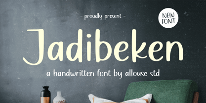 Proudly Presenting, Jadibeken A Quirky Handwritten. Jadibeken is perfect for any titles, logo, product packaging, branding project, megazine, social media, wedding, or just used to express words above the background. Jadibeken also come with Multi-Lingual Support. Enjoy the font, feel free to comment or feedback, send me PM or email. Thank You!
 - Simply Paranoid by Pen Culture,
$15.00 Simply Paranoid is elegant monoline font that comes with various kinds of alternate that will make design very awesome and elegant Feature and what will you get: Uppercase and lowercase Number Punctuation Multilingual support Beautiful alternate Please fell free to contact me on Hipenculture@gmail.com if you have any question Thank you
 - Deathridge by Allouse Studio,
$16.00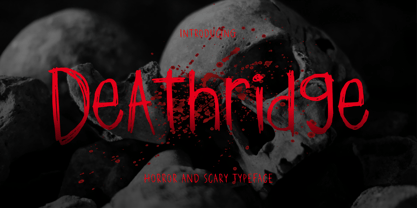 Proudly Presenting, Deathridge a Horror and Scary Typeface. Deathridge is perfect for product packaging, branding project, megazine, social media, wedding, or just used to express words above the background. Deathridge also come with Multi-Lingual Support. Enjoy the font, feel free to comment or feedback, send me PM or email. Thank You!
 - Somuch Fabrica by Allouse Studio,
$16.00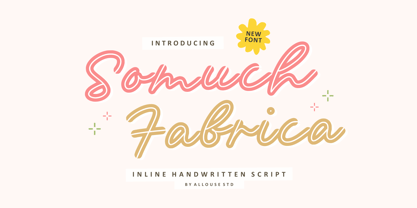 A Inline Handwritten Script. Somuch Fabrica is perfect for any titles, logo, product packaging, branding project, megazine, social media, wedding, or just used to express words above the background. Somuch Fabrica also come with Multi-Lingual Support. Enjoy the font, feel free to comment or feedback, send me PM or email. Thank You!
 - Welanger Kesley by madeDeduk,
$16.00 Introducing Welanger Kesley is a Display Sans, use this font for any branding, product packaging, invitation, quotes, label, poster, logo etc. Feature Uppercase & Lowercase Number & Symbol International Glyphs Multilingual support Alternative Ligature Feel free to drop us a message any time and follow my shop for upcoming updates Hope you enjoy it.
 - Salernomi J - Unknown license

- AB One by AB Studio,
$23.99 AB One is a captivating sans-serif font family that effortlessly blends modern aesthetics with a dynamic, fluid formality inspired by the world of architecture. This versatile typeface offers three distinct weights, each carefully crafted to cater to a range of design needs. Key Features: Dynamic Fluidity: AB One embodies the dynamic essence of architectural forms, showcasing a graceful flow and a sense of movement. The font's letterforms possess an inherent flexibility that adds a touch of vibrancy to your designs, making it an excellent choice for contemporary projects that demand energy and liveliness. Sleek and Modern: The light weight of AB One radiates a modern, minimalist charm, perfect for creating a sleek and refined impression in your design projects. Its clean lines and well-balanced proportions ensure readability while evoking a sense of cutting-edge sophistication. Three Distinct Weights: The AB One font family offers three carefully crafted weights to provide versatility in your design work. Sans-Serif Elegance: As a sans-serif typeface, AB One represents a harmonious marriage of legibility and style. Its straightforward, elegant letterforms make it suitable for a wide range of applications, including branding, advertising, editorial design, and web interfaces. Inspired by Architecture: Drawing inspiration from the world of architecture, AB One captures the essence of structural elegance and sophistication. This font is an ideal choice for projects that require a touch of architectural finesse. Versatile Application: AB One's adaptability allows it to excel in a variety of design contexts. It seamlessly integrates with other design elements, providing a harmonious and engaging visual experience. AB One is a typeface that thrives on the principles of sleek modernity and architectural inspiration, making it a go-to choice for designers who seek to infuse their projects with a touch of dynamic fluid formality.
 - Schism One by Alias,
$55.00 Schism is a modulated sans-serif, originally developed from our Alias Didot typeface, as a serif-less version of the same design. It was expanded to three sub-families, with the thin stroke getting progressively heavier from Schism One to Schism Three. The different versions explore how this change in contrast between thick and thin strokes changes the character of the letterforms. The shape is maintained, but the emphasis shifts from rounded to angular, elegant to incised. Schism One has high contrast, and the same weight of thin stroke from Light to Black. Letter endings are at horizontal or vertical, giving a pinched, constricted shape for characters such as a, c, e and s. The h, m, n and u have a sharp connection between curve and vertical, and are high shouldered, giving a slightly square shape. The r and y have a thick stress at their horizontal endings, which makes them impactful and striking at bolder weights. Though derived from an elegant, classic form, Schism feels austere rather than flowery. It doesn’t have the flourishes of other modulated sans typefaces, its aesthetic more a kind of graphic-tinged utility. While in Schism Two and Three the thin stroke gets progressively heavier, the connections between vertical and curves — in a, b, n etc — remain cut to an incised point throughout. The effect is that Schism looks chiselled and textural across all weights. Forms maintain a clear, defined shape even in Bold and Black, and don’t have the bloated, wide and heavy appearance heavy weights can have. The change in the thickness of the thin stroke in different versions of the same weight of a typeface is called grading. This is often used when the types are to used in problematic print surfaces such as newsprint, or at small sizes — where thin strokes might bleed, and counters fill in and lose clarity, or detail might be lost or be too thin to register. The different gradings are incremental and can be quite subtle. In Schism it is extreme, and used as a design device, giving three connected but separate styles, from Sans-Didot to almost-Grotesk. The name Schism suggests the differences in shape and style in Schism One, Two and Three. Three styles with distinct differences, from the same start point.
 - Schism Two by Alias,
$55.00 Schism is a modulated sans-serif, originally developed from our Alias Didot typeface, as a serif-less version of the same design. It was expanded to three sub-families, with the thin stroke getting progressively heavier from Schism One to Schism Three. The different versions explore how this change in contrast between thick and thin strokes changes the character of the letterforms. The shape is maintained, but the emphasis shifts from rounded to angular, elegant to incised. Schism One has high contrast, and the same weight of thin stroke from Light to Black. Letter endings are at horizontal or vertical, giving a pinched, constricted shape for characters such as a, c, e and s. The h, m, n and u have a sharp connection between curve and vertical, and are high shouldered, giving a slightly square shape. The r and y have a thick stress at their horizontal endings, which makes them impactful and striking at bolder weights. Though derived from an elegant, classic form, Schism feels austere rather than flowery. It doesn’t have the flourishes of other modulated sans typefaces, its aesthetic more a kind of graphic-tinged utility. While in Schism Two and Three the thin stroke gets progressively heavier, the connections between vertical and curves — in a, b, n etc — remain cut to an incised point throughout. The effect is that Schism looks chiselled and textural across all weights. Forms maintain a clear, defined shape even in Bold and Black, and don’t have the bloated, wide and heavy appearance heavy weights can have. The change in the thickness of the thin stroke in different versions of the same weight of a typeface is called grading. This is often used when the types are to used in problematic print surfaces such as newsprint, or at small sizes — where thin strokes might bleed, and counters fill in and lose clarity, or detail might be lost or be too thin to register. The different gradings are incremental and can be quite subtle. In Schism it is extreme, and used as a design device, giving three connected but separate styles, from Sans-Didot to almost-Grotesk. The name Schism suggests the differences in shape and style in Schism One, Two and Three. Three styles with distinct differences, from the same start point.
 - Boho by Latinotype,
$39.00 Boho is inspired by a bohemian girl who is a free soul and creative spirit. She is a city girl, but she loves spending a lot of time outdoors and being close to nature. She loves art and going to the antiques and organic food markets. She is a wild and free spirit who knows no bounds. Boho is Coto Mendoza’s first Script font family, which is based on gestual calligraphy with Cola pen. A first exposure to gestual strokes applied to font design can be seen in her previous work, Macarons. Boho consists of 4 subfamilies: Script, Line, Sans and Serif. Each subfamily comes in 4 weights: Regular, Bold, Italic and Bold Italic. Script and Line versions include a teardrop terminal variant. Dingbats and ornaments are also included. Boho. Love and creative spirit!
 - Tom's Handwriting - Unknown license

- Fishbowl - Unknown license

- Jellodings by Jelloween,
$-Jelloding contains 32 funny & cute dingbats. Comes in TTF, OTF and Windows Postscript format to suit your every need. You gotta love 'em, and they're free too! - Mr Lucky by Hipopotam Studio,
$22.00 Mr Lucky is Mr Happy's slab brother and a hand-drawn narrow typeface designed for one of our books. You can layer different styles over the background style to achieve lots of colorful effects. Use just one style to get a single color letter or set Fill over Background or Stripped Background to get a two color mode. Mr Lucky has upper and lowercase characters with up to three alternate glyphs and special alternate uppercase diacritics. Build in OpenType Contextual Alternates feature will automatically set alternate glyphs depending on frequency of appearance of the same character (even in web font but only in HTML5 browsers). The script doesn’t throw random glyphs. For example in the word “HIPPOPOTAMUS” you will automatically get three different “P” glyphs and two “O” glyphs. It really works great but of course you can always fine tune it by hand.
 - Shelley Script Cyrillic by Linotype,
$67.99Matthew Carter designed the Shelley family 1972 for Mergenthaler Linotype to be used as a new script face for the photo typesetting machines. The basic idea was to create one script face that would offer dfferent elegant letterforms. Matthew designed Shelley in three different versions, Allegro which is in the style of Kuenstler Schreibschrift, Andante where the caps are less flowrish and wide and Volante where the letters have its most expressive and wide forms and the lowercase z in this font is in the french anglian double stacked form. All three versions can be easily mixed to give the text a more individual calligraphic look Besides Shelley Linotype Zapfino from Hermann Zapf shows similar basics, but in a totally different letterform. In Linotype Zapfino the individual lowercase letters from the four different versions have different letterforms which gives the text an even more individual touch. - Cantarell - 100% free

- Linoblox by Ana's Fonts,
$12.00 Linoblox is a sans and ornaments font family made using hand-carved linoleum, based on my Bloxhall art deco font. This collection has a quirky handmade look, but can also be used in retro and vintage designs, such as collages. The fonts have a realistic ink stamp texture that will look great in logos, notes and quotes, social media posts, and branding and packaging. Linoblox includes: Linoblox font in three variations: regular, jumpy and underlined An ornaments font, with doodles, swashes, smudges and frames (Please note: this is the same set of ornaments as the Notes From Home serif font)
 - Porchlight by Ana's Fonts,
$15.00 Porchlight is a soft serif font inspired by vintage French typography. It includes three weights: regular, semi bold and bold, with matching italics. It also includes bonus ornaments that complement the font beautifully, for elegant and easy designs. Included in this trendy font family: 6 fonts: regular, semibold and bold, plus italics, with over 300 glyps each, including small caps and lots of ligatures. ornaments font with 52 ornaments (13 different designs, mirrorred horizontally and vertically). borders font, with borders with different thickness. Use Porchlight in print layouts, logotype design, social media posts, branding and packaging.
 - Sergury by Ingrimayne Type,
$5.00 Sergury is an ultra-bold typeface formed by cutting circular elements from rectangular blocks. It is caps only and is so bold that it is almost unreadable. The three tall styles were added in 2021. Sergury is a variation of Porker, another experimental typeface.
 - Fajowy by Edyta Demurat,
$22.00 Fajowy is a hand drawn typeface. The family is available in 12 weights. Fajowy has only upper characters with up to three alternate glyphs. Build in OpenType Contextual Alternates feature will automatically set alternate glyphs depending on frequency of appearance of the same character.
 - EF Kaffeesatz by Elsner+Flake,
$35.00 The Kaffeesatz EF typeface was designed in 1993 by Ralf Borowiak in three weights: “Schwarz”, “Weiß” and „Süß“ (“Black“, “White” and “Sweet”). Since it is experiencing ever increasing popularity, the Elsner+Flake Designstudios augmented the “Schwarz“ and “Weiß“ versions with a complement of Cyrillic characters.
 - Linex Sweet by Monotype,
$29.99Linex Sweet was designed by Albert Boton in the late 1990s. It's a smallish family of three weights; the middle weight has an italic companion face. With its soft corners and slightly quirky head-serifs, Linex Sweet is a friendly design that sees much use. - Fajny by Edyta Demurat,
$22.00 Fajny is a hand drawn typeface. The family is available in 12 weights. Fajny has upper and lowercase characters with up to three alternate glyphs. Build in OpenType Contextual Alternates feature will automatically set alternate glyphs depending on frequency of appearance of the same character.
 - Brilliant by FaceType,
$35.00 Brilliant is a modern antiqua typeface that includes three weights. It is both very readable and easy to cut. The corners in the typeface makes it easy to cut, but doesn’t disturb the readability. Brilliant is perfect for big sizes, headlines and characterful sublines.
 - Zesty Lime by Hanoded,
$15.00 Zesty Lime is a condensed typeface, hand made with a small brush and China ink. Zesty would look good on book covers, posters and packaging - but I guess you're not limited to those three options. Just enjoy! Comes with a generous squeeze of diacritics.
 - Mensa by AVP,
$19.00 A large x-height, open forms and colorful weight variations make Mensa an extremely legible body face particularly where space is at a premium. The three widths and six weights together with italics provide plenty of options for setting magazines, books and web pages.
 - Retail Script by ITC,
$29.00Retail Script was designed by Vince Whitlock in 1987. It is a font with strong, dynamic base forms and very small ascenders and descenders, which makes a closed, solid overall image. The fine white lines which are traced within the figures make the font a bit more cheerful and the shading makes the figures look three dimensional. The energetic Retail Script is best used in headlines in larger point sizes in order to preserve the look of its fine details. - Yassitf by Ingrimayne Type,
$6.00 Yet another san serif typeface, Yassitf is a generic sans, a font meant to blend in rather than stand out. It has little contrast and is almost monoline. It includes three widths: condensed, narrow, and regular. The widths have four to six weights: ultra thin, thin, light, plain, bold, and extra bold. Further, each width and weight combination has both upright and italics styles. The thirty fonts in the family contain several open-type features, including both proportional and tabular (monospaced) numbers.


