10,000 search results
(0.047 seconds)
- Pliser by Luxfont,
$30.00 Get inspired by the world of painting with unique Daub Paint SVG raster font. This font is a real work of art, where each letter is created from strokes of paint, creating a bewitching color. Features: - Ability to adapt letters to other languages - Transparency & Texture - Kerning IMPORTANT: - Check the glyphs in the font before buying! - SVG fonts contain raster letters. - Check it www.colorfonts.wtf - Try a FREE DEMO version before buying. ld.luxfont@gmail.com
 - Alphard by BonjourType,
$12.00 The Alphard font is a cute script font designed by my daughter inspired by the name of the luxury vehicle she dreams of. Suitable for making packaging products, motivational quotes, social media, marriage, or simply used to reveal the words above background. Featured font: Uppercase, lowercase, digits, symbols, accents, and Alternative Style also supports multilingual Enjoy the font, feel free to leave a comment or feedback, send me a PM or an email. Thank you!
 - Dropex by Product Type,
$18.00 Dropex Racing Font is a bold, strong, and uniquely shaped font, masculine, and easy to read. This font was designed with attention to detail to make your design project stand out from the rest. Regular Style has been used in my free and premium products. comes in 4 slightly different styles, making it easy for you to choose according to your choice, using this font will definitely spice up any design project.
 - Mutable by Paulo Goode,
$35.00 Mutable is as flamboyant and changeable as its name suggests. These characterful fonts were designed specifically for display purposes. It’s an exuberant type family that’s jam-packed with alternates and bestowed with a loud personality. This typeface is defined by its barbed serifs and elegantly curved terminals, or “foxtails” as they are sometimes known. An extremely large x-height amplifies the friendliness and buoyancy of the lowercase glyphs. These qualities give Mutable a unique aesthetic that will undoubtedly give your logotypes, headlines, and titles a distinctive appeal. Mutable has a strong Art Nouveau influence and was mainly inspired by Ed Benguiat’s Tiffany and the mysterious Pretorian typeface accredited to P.M. Shanks and Sons of London. Special OpenType features include 523 alternates that will make each word resonate beautifully when used in titling and branding situations. With so many alternates available, you may find it difficult to stop playing and settle on a selection... but that’s a good thing, right? Small Caps are also included (along with their matching diacritics and alternates) – these are designed to harmonise with regular lowercase forms making unicase-style typography a cinch. Mutable has a total glyph count of over 2,400 characters. There are 9 weights across 2 widths, ranging from a delicate and wispy Narrow Thin to a chunky and imposing Ultra. And... it’s variable! This allows you to select any width or weight in between, making Mutable even more... erm... mutable! This type family has an extensive character set that covers all Latin European languages. Finally, you can test drive Mutable immediately as the Regular weight is offered as a free download. Key features: 9 Weights 2 Widths Variable Small Caps 500+ Alternates Old Style Figures European Language Support (Latin) 2400+ Glyphs per font
 - Smiling Quotes - Personal use only

- UniLeaf - 100% free

- Aunchanted Elite by Typotheticals,
$5.00 Originally released free as Aunchanted, but completely redrawn with gentler curves to give a softer feel to the face. Aunchanted Elite has been expanded and updated in 2022
 - Omekashi Emoji by Norio Kanisawa,
$12.00 This is Emoji font(Dingbat), contains many cute motif like animals, heart, ribbon, foods, fashion goods. I think you can use it for decorate contents for children, and use web font as icon. You can use as it is, I think that you can paint the color inside. It might be interesting even if you hang a hat or put on a ribbon by combining several characters like a sample. I make it will be cute, and you use it with happy feeling, I will be happy if you think so. <「omekashiemoji」紹介文> 動物やハートやリボン、食べ物、ファッション小物などかわいいモチーフがたっぷりな絵文字フォントです。 子供向けコンテンツの装飾に使ったり、webフォントをアイコンとして使ってもいいんじゃないかなと思います。 そのまま使ってもいいですし、中に色を塗ってもいいと思います。サンプルのように数文字組み合わせて帽子を被せたり、リボンをつけたりしても面白いかもしれないです。 かわいくなるように、使って楽しい気分になれるようにとの思いを込めて作りました。 その思いが少しでも伝われば幸いです。 <スタイルカテゴリー> 絵文字、Dingbat <価格> 税抜1200円
 - Victoria Serif - Personal use only

- Pinstripe Limo - Personal use only

- MONACO - Personal use only

- MythBusters - Personal use only

- Futurex Voyager - Unknown license

- Humblegirl by Allouse Studio,
$16.00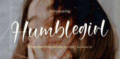 Proudly Presenting, Humblegirl A Modern Handwritten Script. Humblegirl is perfect for any titles, logo, product packaging, branding project, megazine, social media, wedding, or just used to express words above the background. Humblegirl also come with Multi-Lingual Support. Enjoy the font, feel free to comment or feedback, send me PM or email. Thank You!
 - Tiger Chest by Four Lines Std,
$15.00 Introducing "Tiger Chest" - Unleash Your Creativity with Urban Pop Vibes! With Tiger Chest, your creativity knows no bounds. Break free from the mundane and explore the wild side of design. Whether you're crafting social media graphics, YouTube thumbnails, event posters, or comic book covers, this font will give your projects the urban edge they deserve.
 - Balcon by Tour De Force,
$25.00 Balcon is condensed sans family designed to be your first web font choice. Contains 5 weights: Light, Regular, Bold, ExtraBold and Black, it fits perfect into any project, from editorial editions to packages, labels, posters. If you're looking for a bit decorative version of this family, feel free to check Balcon Round sans family.
 - Brushwork by Celebrity Fontz,
$24.99 Brushwork is a free-flowing brush font that combines a modern aesthetic with a very unique style. Some have suggested that Brushwork looks like a cross between Roman and Japanese characters but most agree it evokes total freedom of expression. Includes a full set of accented characters to accommodate most of the Romance languages.
 - Bordershine Script by CBRTEXT Studio,
$15.00 Bordershine Script is a beautiful and elegant modern calligraphy font. It's perfect for branding, wedding invitations, photography, bloggers, logos, content, greeting cards and more. Bordershine script calligraphy has beautiful uppercase and lowercase letters, numbers, and ligatures. If you have any questions, before or after purchase, please feel free to get in touch. Thank You.
 - Hewy by Kaer,
$19.00 HEWY is an elegant sans serif font family in Scandinavian design style. Simple line letters will add a touch of style to your projects. What you will get: Line and regular styles Uppercase and lowercase glyphs Numbers and symbols Multilingual support Ligatures Please feel free to request to add characters you need: kaer.pro@gmail.com
 - Highstuffy by Allouse Studio,
$16.00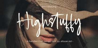 Proudly Presenting, Highstuffy A Fancy Handwritten Script. Highstuffy is perfect for any titles, logo, product packaging, branding project, megazine, social media, wedding, or just used to express words above the background. Highstuffy also come with Multi-Lingual Support. Enjoy the font, feel free to comment or feedback, send me PM or email. Thank You!
 - Wide Plump by Kaer,
$19.00 Wide Plump is a bold Stylish Stencil Font. Most of the glyphs are without any holes, it's provide powerful impact. You can use it in fashion magazines covers, short advertise slogan and so on. * Uppercase and some lowercase * Numbers * Symbols * Multilingual support Please feel free to request to add characters you need: kaer.pro@gmail.com
 - Speed Test by Kaer,
$20.00 Hey! I'm happy to introduce to you my new font in fast speed style. Dry brush stroke with grunge lines and dots. Perfect for Taxi logo, Race poster, Sport identity, etc. You’ll get: * Uppercase (lowercase glyphs are the same) * Numbers * Symbols Please feel free to request any help you need: kaer.pro@gmail.com Best, Roman.
 - Lupina by Craft Supply Co,
$15.00 Introducing Lupina, where modern simplicity meets timeless sophistication. This sleek sans-serif grotesque font effortlessly enhances your projects with a clean, contemporary vibe. This typeface is ideal for greeting card, packaging, brand identity, poster, or any purpose to make your design project look eye catching and trendy. Feel free to play with this typeface!
 - Brskovo by TypeClassHeroes,
$14.00 Introducing Brskovo is a modern uppercase serif, use this font for any branding, product packaging, invitation, quotes, t-shirt, label, poster, logo etc. Feature - Uppercase & Lowercase - Number & Symbol - International Glyphs - Multilingual support - Alternative - Ligature Feel free to drop us a message any time and follow my shop for upcoming updates Hope you enjoy it.
 - Bleakfall by Allouse Studio,
$16.00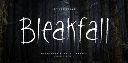 Proudly Present, Bleakfall a Handdrawn Horror Typeface. Bleakfall is perfect for any titles, logo, product packaging, branding project, megazine, social media, wedding, or just used to express words above the background. Bleakfall also come with Multi-Lingual Support. Enjoy the font, feel free to comment or feedback, send me PM or email. Thank You!
 - Dupliciter by JAF 34,
$9.90 DUPLICITER is an experimental display sans serif font which has two typefaces for comfortable and experimental use. DUPLICITER is a (latest) part of new school in type design that could be called like mind-free and geometric direction in the world. Sans serif, condensed, sharp edges, geometric, experimental, these are the main attributes of DUPLICITER.
 - Bemsod Decker by madeDeduk,
$14.00 Introducing Bemsod Decker is a casual handwritten font and will be perfect for book, title branding, product packaging, invitation, quotes, label, poster, logo etc. Feature Uppercase & Lowercase Number & Symbol International Glyphs Multilingual support Alternative Ligature Feel free to drop us a message any time and follow my shop for upcoming updates Hope you enjoy it.
 - Hooking by Canden Meutuah,
$20.00 is a beautiful handwritten font. this font is so simple that i write very carefully. Even though it looks simple, this font still looks cool and stylish. Handwritten script font. This Fonts are perfect for: logos, branding, wedding invitations, business cards, greeting cards, posters, magazines, social media, proliferate fonts, planner prints and websites. Get creative with their unique fun, and use them to brighten up any craft project! Get this font now and boost your creativity with it! If you have any questions, before or after your purchase, don't hesitate to contact us. Thank You
 - My Hero Father by Putracetol,
$18.00 My Hero Father is a quirky playful font with father's day theme. This font has 7 variations of fonts, each variation has a different decoration. The decorations are items that a father often wears, such as: cigarettes, glasses, hats, mustaches, ribbons and crowns. I made this font specifically for the Father's Day theme, but other than that this font can also be used for other projects. This font is suitable for logos, crafting, greeting cards, invitation cards, social media, products, stickers, headings, quotes and more. This font is also support multi language.
 - Play Kids by Canden Meutuah,
$20.00 is a beautiful handwritten font. this font is so simple that i write very carefully. Even though it looks simple, this font still looks cool and stylish. Handwritten script font. This Fonts are perfect for: logos, branding, wedding invitations, business cards, greeting cards, posters, magazines, social media, proliferate fonts, planner prints and websites. Get creative with their unique fun, and use them to brighten up any craft project! Get this font now and boost your creativity with it! If you have any questions, before or after your purchase, don't hesitate to contact us. Thank You
 - Euphoria Party by Putracetol,
$36.00 Euphoria Party is a psychedelic style font. This font is inspired by vintage albums and posters from 1960s music bands. The classic, fun and groovy impression is very visible. But in this font I combine several variations such as the ligature. It makes this font even more unique and different. Euphoria Party is also great for any kind of display purpose from album, cover,poster, label, tshirt, apparel, signage, quote, logo, greeting card,logotype and many more. This font is also support multi language.
 - Spooky Monsta by Putracetol,
$28.00 Spooky Monsta is a spider web display font. This font is inspired by an old embossed nameplate with cobwebs in it. So I made it a font. This font has an uppercase and lowercase version that doesn't have a cobweb, so you can be more creative. In addition, this font has a ligature feature that makes the cobwebs of each word cooler. Spooky Monsta would be perfect for Logo, title, logotype, cover, headline, apparel, comic, cover books, cards, posters, or anything that requires a horrror or scarylook!
 - Happy Christmas Party by Putracetol,
$28.00 Happy Christmas Party is a playful and quirky display font. I made this font especially for Christmas and holidays. This font has 5 decoration versions: regular, decor, deer, snow and star. These decorations are related to Christmas decorations, making this font the perfect fit for any Christmas-themed activity / project. Happy Christmas Party perfect for crafter, gift, tshirt, card event, anniversary, birthday,greeting cards, logotype, branding, poster, packaging, stationery, website, and any other projects requiring a handwritten and luxurious touch. This font is also support multi language.
 - Fairland Script by Subectype,
$14.00 Twinkling Stars is a duo-styled Display font and monoline script font, that feels equally charming and delicate. This font is PUA encoded which means you can access all of the glyphs and swashes with ease! This font perfect for Crafting, DIY, Silhouette, Cricut, apparel, Fashion and many more. What's Included : - Twinkling Stars (Script and Sans) - Multilingual Support - Alternate Letter for script I hope you enjoy this font. If you have any questions please don't hesitate to drop me a message :) Thank You, Subectype
 - Catchland by Mans Greback,
$59.00 Catchland is a swashy script typeface. Drawn and created by Mans Greback in 2021, this baseball lettering has a vivid personality and a soft, curly style. With the appearance of a hand-painted calligraphic illustration, the font works great for creating a truly professional graphic or logotype in a vintage form. Use underscores _ to make a swash. Example: Brooklyn____ Use multiple underscores to make swashes of different lengths. Example: Dodgers________ (Download required.) Catchland is built with advanced OpenType functionality and has a guaranteed top-notch quality, containing stylistic and contextual alternates, ligatures and more features; all to give you full control and customizability. It has extensive lingual support, covering all Latin-based languages, from Scandinavia to the Canaries, from America to South-East Asia. It contains all characters and symbols you'll ever need, including all punctuation and numbers.
 - Blestive Script by Mans Greback,
$59.00 Blestive Script is a cool calligraphy typeface. This marker lettering is provided in Regular, Italic, Bold and Bold Italic. Perfect for a logotype or headline, use this handwritten type to express life and optimism. Use underscore _ anywhere in a word to make a swash underline. Example: Won_der Use # after any word to make a swash letter. Example: Cute# Use multiple underscores after any word to make swashes of different length. Example: Weat___her (Download required.) The font is built with advanced OpenType functionality and has a guaranteed top-notch quality, containing stylistic and contextual alternates, ligatures and more features; all to give you full control and customizability. It has extensive lingual support, covering all Latin-based languages, from Northern Europe to South Africa, from America to South-East Asia. It contains all characters and symbols you'll ever need, including all punctuation and numbers.
 - Simplo by Durotype,
$49.00 Simplo: the ‘Italian Futura’. Simplo is a geometric sans serif typeface, built in sixteen styles. It is a tribute to the 1930s typeface Semplicità, designed by Nebiolo’s Alessandro Butti. Although many details of Simplo differ from Semplicità, it preserves the spirit of the original. Simplo is ideal for use in display sizes. It is also quite legible in text, and is well suited for graphic design and corporate identity design. Simplo has sixteen styles, extensive language support, eight different kinds of figures, sophisticated OpenType features — so it’s ready for advanced typographic projects. The most notable characteristics of this typeface are the ‘t’ and the ‘f’. The ‘t’ is the culmination of simplicity: a vertical line with just a simple right-side crossbar. The ‘f’ also has just a right-side crossbar, and is really tall: it reaches both the highest and lowest vertical position of the typeface. The top of the distinctive ‘s’, is much narrower than its bottom. The ‘a’, ‘b’, ‘d’, ‘g’, ‘p’, ‘q’, and ‘u’ are spurless, and show a family resemblance with Hans Reichel’s 1990s typeface Dax. However, these letters are rounder and more geometric than Dax’s counterparts, because of Dax’s higher x-height and narrower design. In Paul Shaw’s Imprint article about typefaces that have been overlooked and/or underappreciated, “Overlooked Typefaces”, he concluded his discussion of Semplicità as follows: “These idiosyncrasies suggest that Semplicità might find a warm reception today, given the current love affair with Gotham, Neutraface and Proxima—and the resurgence of ITC Avant-Garde Gothic.” Free demo font available. For more information about Simplo, download the PDF Specimen Manual.
 - Slight by Up Up Creative,
$29.00 Introducing Slight, an elegant, full-featured script font with tons of alternate characters and OpenType features. Hand-lettered with a heavy right slant, Slight is particularly well-suited for invitations, branding, and editorial design. Slight comes with more than 1000 glyphs! Specific OpenType features include contextual alternates, stylistic alternates, initial and final forms, multiple alternate glyphs for many letters (accessed through the glyphs panel), multilingual support (including multiple currency symbols), ligatures, standard numbers, and six ampersand styles. Perhaps the most fun thing about Slight is that it includes multiple versions of all ascending and descending letters, making it lots of fun to play with in your layouts and compositions. The OpenType features can be very easily accessed by using OpenType-savvy programs such as Adobe Illustrator and Adobe InDesign. (To access these awesome features in Microsoft Word, you'll need to get comfortable with the advanced tab of Word's font menu. If you need help with this, ask me!) Files included: Slight-Regular.otf Mail support : julie@upupcreative.com --- Find inspiration (and sneak peeks at my next font-in-progress) on - Instagram: http://instagram.com/julieatupupcreative - Facebook : https://www.facebook.com/upupcreative - Pinterest: https://www.pinterest.com/upupcreative - My website: http://upupcreative.com --- PLEASE ENJOY! I can't wait to see what you make with Slight! Feel free to use the #upupcreative and #slightscriptfont tags to show me what you've been up to!
 - Shocka Family by Skinny Type,
$23.00 Shocka Family is a confident serif. Designed to reflect nature, it creates a sense of softness and natural expression. We pushed the concept in a usability-focused direction, to work as a bold tool and a beautiful communicator. Variable Shocka enables fluid design in 9 weights, italics and 2 styles with major latin based languages. The right slant advances aesthetics, brings energy and makes it suitable for modern designs. The type family blends organic curves and soft repetition into strong and harmonious types. At large dot sizes you can appreciate the shape of the letters, while the same control and focus creates an even texture for small dot sizes and long reads. Fonts extend their use by giving weights ranging from light to black. The natural curve, a swollen and sloping stem, grows in character as the font gains weight. While the thinner weight has lowered contrast and optical correction to create a warm and soft look. The Shocka Family character set combines additional symbols, style alternatives, unique binding, and case sensitive punctuation - resulting in a stable, hard-working family ready to tackle projects of any size. I can't wait to see what you do with Shocka Family! Feel free to use the #Skinny_Type and #Shocka Family font tags to show what you've done visit my Instagram : https://www.instagram.com/skinny.type/ Thank you!
 - MFC Botanical Borders by Monogram Fonts Co.,
$19.95 The inspiration source for MFC Botanical Borders is a collection of border treatments from the 1886 “Spécimens de caractères d'imprimerie” by E. Houpied a Paris. This collection of elegant floral and foliage borders has been put together with their original decorated rules, as well as alternate matching precision rules for added versatility. You can start with a new document or work on a new layer within an existing document. Select MFC Botanical Borders from the font menu. (Some users may have font previewing enabled in the font menu which will cause the font name to appear as border elements, disable this option in order to choose the name) Make certain that the point size of the font is the same as the leading being applied to the font so the borders will meet up properly. While we’ve adjusted this within the font, your program may override these settings. For instance a 12 point font should have 12 points of leading. A PDF guidebook for MFC Botanical Borders is included in the font package. Download and view the MFC Botanical Borders Guidebook if you would like to learn a little more.


