10,000 search results
(0.043 seconds)
- Summerville JNL by Jeff Levine,
$29.00 Summerville JNL is a condensed Art Nouveau slab serif design inspired by a typeface called “Superior” [found in the Barnhart Brothers & Spindler type specimen book circa 1897], and is available in both regular and oblique versions.
 - Esok Pagi by Maulana Creative,
$14.00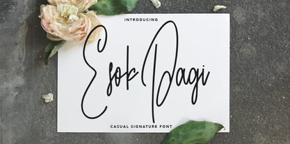 Give your designs an authentic handcrafted feel. "Esok Pagi" is perfectly suited to signature, stationery, logo, typography quotes, magazine or book cover, website header, clothing, branding, packaging design and more. Thanks for use this font. MaulanaCreative
 - Kyouking by Seventh Imperium,
$25.00 The Kyouking design is basically the structural century blend with a modern feel approach to make it a flexible and epic, effective font for the creation of ambitious poster headlines, Book covers, logos and so on.
 - La Quinta by Jonahfonts,
$42.00La Quinta is a display font for some small text and logo applications as well as branding, invitations, stationery, packaging, fliers, gaming texts and book jackets. Plus many other applications at the discretion of the designer. - Dederon Serif by Suitcase Type Foundry,
$75.00Dederon Serif has been specifically designed for book setting. Preliminary sketches were drawn in 2004. Its inspiration – particularly its weight and width proportions – can be traced to the Liberta typeface from the TypoArt type foundry in former Eastern Germany. After a careful study of the model, the design of Dederon branched off into its own direction, finding its distinctive voice and becoming a wholly original type family. Dederon Serif kept most of the elements typical for the Old Style Roman lettering, such as the angle of the stress, the medium x-height, and lower contrast. In large sizes, the typical shapes of the letters stand out – the calligraphic feel characteristic for the Czech typefaces by Oldrich Menhart, the unusual serifs hinting at the angle of the pen, the shapes of the stems, or the terminals of dots and ears. Upon finishing the serif version, a Serif-serif variant called Dederon Serif was added. The construction principles are also derived from the Old Style Roman model, which lends the lettering its open, humanist feel. Yet the design also conforms to the rules of the modern Serif serif. Most characteristics of Dederon Serif match the serif version – the weight of individual cuts, the width proportions, x-height, ascenders' and descenders' length, and the slope of the italics. Each version of Dederon Open Type Std contains the standard Western Latin character set and the Central European characters; a number of basic and accented ligatures, small caps; old style, small caps and caps, table, fraction and superscript numerals; expert glyphs and alternative characters. This brings the total to a comfortable 820 glyphs per weight, permitting truly professional use in the most demanding projects. - Dederon Sans by Suitcase Type Foundry,
$75.00Dederon Serif has been specifically designed for book setting. Preliminary sketches were drawn in 2004. Its inspiration — particularly its weight and width proportions — can be traced to the Liberta typeface from the TypoArt type foundry in former Eastern Germany. After a careful study of the model, the design of Dederon branched off into its own direction, finding its distinctive voice and becoming a wholly original type family. Dederon Serif kept most of the elements typical for the Old Style Roman lettering, such as the angle of the stress, the medium x-height, and lower contrast. In large sizes, the typical shapes of the letters stand out — the calligraphic feel characteristic for the Czech typefaces by Oldrich Menhart, the unusual serifs hinting at the angle of the pen, the shapes of the stems, or the terminals of dots and ears. Upon finishing the serif version, a sans-serif variant called Dederon Sans was added. The construction principles are also derived from the Old Style Roman model, which lends the lettering its open, humanist feel. Yet the design also conforms to the rules of the modern sans serif. Most characteristics of Dederon Sans match the serif version — the weight of individual cuts, the width proportions, x-height, ascenders' and descenders' length, and the slope of the italics. Each version of Dederon Open Type Std contains the standard Western Latin character set and the Central European characters; a number of basic and accented ligatures, small caps; old style, small caps and caps, table, fraction and superscript numerals; expert glyphs and alternative characters. This brings the total to a comfortable 820 glyphs per weight - Moskau Pattern by Letter Edit,
$49.00 The design of the typeface Moskau Grotesk and Moskau Pattern is based on the signage created for the Café Moskau in Berlin by the graphic artist Klaus Wittkugel in the beginning of the 1960s. The Café Moskau, across from the Kino International on Karl-Marx-Allee in Berlin Mitte was one of the prestige edifices of the former DDR (German Democratic Republic). Built in the early 1960s, it advanced over the years and changing social developments to a trademark building of the capital. The lettering display on the roof was created by the graphic artist Klaus Wittkugel (October 17, 1910 – September 19, 1985). He had been Professor at the School for Applied Arts in Berlin, and, in addition to the creation of many posters, book covers and postage stamps, he was responsible for the signage of the Kino International as well as for the complete graphic treatment for the Palace of the Republik. The signage for the Café Moskau with the words »RESTAURANT«, »CAFÉ«, »KONZERT« and »MOCKBA« set in capital letters, becomes the basis for the Moskau Grotesk which was developed by Björn Gogalla in 2013. This face should not be seen as an imitation. A few shortcomings were »fixed«. In favor of maintaining the core characteristics some unique features were, however, not relinquished. Lower case letters and the missing capital letters were designed from scratch. It is not surprising that the plain, unassuming geometrical direction of the basic character style forms a bridge to the architecture of the 1960s. Inspired by the then favored, diverse possibilities inherent in the architectural example and wall reliefs, two complimentary pattern fonts emerged.
 - Moskau Grotesk by Letter Edit,
$39.00 The design of the typeface Moskau Grotesk is based on the signage created for the Café Moskau in Berlin by the graphic artist Klaus Wittkugel in the beginning of the 1960s. The Café Moskau, across from the Kino International on Karl-Marx-Allee in Berlin Mitte was one of the prestige edifices of the former DDR (German Democratic Republic). Built in the early 1960s, it advanced over the years and changing social developments to a trademark building of the capital. The lettering display on the roof was created by the graphic artist Klaus Wittkugel (October 17, 1910 – September 19, 1985). He had been Professor at the School for Applied Arts in Berlin, and, in addition to the creation of many posters, book covers and postage stamps, he was responsible for the signage of the Kino International as well as for the complete graphic treatment for the Palace of the Republik. The signage for the Café Moskau with the words »RESTAURANT«, »CAFÉ«, »KONZERT« and »MOCKBA« set in capital letters, becomes the basis for the Moskau Grotesk which was developed by Björn Gogalla in 2013. This face should not be seen as an imitation. A few shortcomings were »fixed«. In favor of maintaining the core characteristics some unique features were, however, not relinquished. Lower case letters and the missing capital letters were designed from scratch. It is not surprising that the plain, unassuming geometrical direction of the basic character style forms a bridge to the architecture of the 1960s. Inspired by the then favored, diverse possibilities inherent in the architectural example and wall reliefs, two complementary pattern fonts emerged.
 - Goxac by Twinletter,
$17.00 Introducing Goxac is a boldly shaped font that gives any project a cutting-edge, futuristic feel. Goxac’s slick lines and distinctive letterforms give your text a contemporary appearance, making it ideal for designs with a science fiction or technological theme. Goxac is the perfect tool for designing eye-catching headlines, posters, and social media graphics because of its bold aesthetic and futuristic theme. They are ideal for branding projects, packaging designs, book covers, and more due to their distinctive letter shapes. With a complete set of punctuation and numbers, Goxac is available in both upper- and lowercase letters. This multipurpose font is ideal for designers, marketers, and anyone looking to add a touch of futurism to their work because it has four different variants. With the Goxac font, rest assured that your designs will look unique, stylish, and futuristic. This font is perfect for those who want to stand out in the modern era, and for those who want to give their designs a touch of innovation. Goxac is a must-have for anyone looking to create a plan that really stands out. So don’t wait, make Goxac your font of choice today, and take your design to the next level! What’s Included : - File font - All glyphs Iso Latin 1 - Alternate, Ligature - Simple installations - We highly recommend using a program that supports OpenType features and Glyphs panels like many Adobe apps and Corel Draw so that you can see and access all Glyph variations. - PUA Encoded Characters – Fully accessible without additional design software. - Fonts include Multilingual support
 - Ever Looser by Azetype,
$12.00 Presenting Ever Looser! A Wild Brush Font with a distinct texture. You can type by Mix & Match to get a unique combination. It looks original and can be used for all your project needs. Each glyph has its own uniqueness and when meeting with others will provide dynamic and pleasing proximity. This font can be used at any time and any project. As you can see in the presentation pictures above, Ever Looser looks 'wild' on design projects. So, Ever Looser can't wait to give its touch to all your design projects such as environmental campaigns, quotes, poster design, book cover design, promotional materials, t-shirt, hoodie, product packaging, simply as a text overlay to any background image, etc. Besides that, Ever Looser also has some ligature that gives a surprise when you type certain characters combinations. The ligatures are TT, LL, ll, oo, and rr. What's Included? 1. Ever Looser • Comes with uppercase, lowercase (small caps), ligatures, numeral, punctuation, symbols, and multilingual support (Afrikaans, Albanian, Catalan, Danish, Dutch, Estonian, English, Finnish, German, Icelandic, Indonesian, Italian, Malay, Norwegian, Portuguese, Spanish, Swedish, Zulu, and Many More). 2. Ever Looser Untextured • It's a clean version and comes with uppercase, lowercase (small caps), ligatures, numeral, punctuation, symbols, and multilingual support (Afrikaans, Albanian, Catalan, Danish, Dutch, Estonian, English, Finnish, German, Icelandic, Indonesian, Italian, Malay, Norwegian, Portuguese, Spanish, Swedish, Zulu, and Many More). 3. Extra Swashes • 7 'wild' swashes (every version) that make your design looks natural. Just type S_1 S_2 S_3 S_4 S_5 S_6 S_7 to feature it. We really hope you enjoy it!
 - Mohair Sam NF by Nick's Fonts,
$10.00A collision between some stylin' caps from legendary lettering artist Samuel Welo and a lowercase loosely based on ATF’s Romany Script yields this curious little wonder. Named after a 70s song which averred that all it took to be “the coolest guy what is what am” is to talk fast, walk slow and look good wearing that 'hair. Please note that, due to the exaggerated overhang of the many of the uppercase characters, this font has been optimized for upper- and lowercase uses. Both versions of this font contain the Unicode 1252 (Latin) and Unicode 1250 (Central European) character sets, with localization for Romanian and Moldovan. - CoolWool by Linotype,
$29.99Linotype CoolWool is part of the Take Type Library, featuring winners of Linotype’s International Digital Type Design Contest. This font was designed by A. Leonardi and P. Wollein, who took their inspiration from clothing labels and care instructions. CoolWool is designed to look like it was stitched, a style of typeface which goes back to the hand embroidery of the time of Biedermeier. CoolWool, however, is a distinctly modern font with a technical feel. The font is not suited for longer texts, but CoolWool is good for shorter texts and headlines, especially because of the possibilities allowed by its three different styles, regular, stone washed (bold) and Cotton Club (outline). - Reservation Wide by TypeTrust,
$30.00Reservation Wide is intended for headlines with its relatively snug letterspacing and extended forms. Its simplicity will accommodate smaller sizes and lower resolution displays. OpenType Stylistic Alternates for characters 'a', 'g' and 't' lend an even simpler finish. The hand-drawn curves and angled stroke endings temper the otherwise rigid proportions of the family. This painterly tendency becomes more apparent in the heavier weights keeping them from looking too imposing. The design first took shape as a custom font named Majestos for the cable channel The Food Network . It can be found in their growing online and printed presence in addition to their broadcast identity for which it was developed. - Charlies BarBQ JNL by Jeff Levine,
$29.00If one were to be visiting Dania Beach in South Florida, they would find on the West side of US 1 just North of Sheridan Street a Bar-B-Q joint located smack dab between a McDonald’s and an all-you-can-eat buffet that took over a closed down Pizza Hut. Charlie’s BarBQ JNL is Jeff Levine’s homage to some great Texas Bar-B-Q - cooked by a Cuban immigrant - served in South Florida... A true American success story, but with a sad ending. Charlie's closed because the landlord wanted the property. for his own use. Charlie now resides in Leon, Nicaragua and runs some successful business ventures there. - Bottled Moon by Tour De Force,
$29.00 Bottled Moon is display serif typeface full of possibility. It is lively family containing Regular and Italic styles. By it's design, Bottled Moon took inspiration from vintage typefaces and their specific charm, with catchy details like curly terminals and gently curved sharp serifs. All characteristics of Bottled Moon together give combination with dose of calligraphy, working horse serif typeface and display OpenType features. Works pretty well in small sizes, keeping it's uniqueness and legibility. Whether you're looking for typeface for whiskey label, wedding invitation, restaurant branding or parfume package, Bottled Moon recommends itself with original Initials, shadowed Stylistic Set and pack of adjustable Borders together with classical Fractions.
 - Belphebe by Scriptorium,
$18.00Someone recently pointed out that May and June are the wedding season months, and that while we have some excellent fonts for non-traditional weddings (celtic and renaissance styles work well), we don't have a straightforward, elegant engraver style font. That's the kind of shortcoming we can remedy, hence our Belphebe font, which is in the tradition of popular wedding invitation fonts like Rook, but has some antique characteristics which are in the Scriptorium tradition. The kerning on this font was a real challenge, because we wanted all the characters to fit together for a flowing, hand-lettered look, but the results are worth it. - Fielding by AVP,
$25.00 Characterized by generous unstressed curves, subtley waisted stems and asymmetric serifs, Fielding is a great choice for sure-footed stylish text and elegant headlines. Its warm classical forms resolve into highly readable text at any size both on paper and on screen. Six weights and corresponding italics provide a choice of styles while small capitals, superscript, subscript, fractions, a range of ligatures and cameo capitals will add refinement to the most demanding of layouts. Default numerals are of uniform height, a little smaller than capitals and are proportional: not 'old style' in the traditional sense, they nevertheless sit comfortably in general text. Tabular numerals and lining numerals are also available. Italic styles are lighter in weight and freer in form, skipping alongside their upright counterparts to provide pleasing emphasis or variation. The comprehensive latin character set includes eastern European, Baltic and Turkish languages. First designed for a quarterly magazine, Fielding can be used wherever a modern interpretation of tradition is required including branding and packaging, websites, news media, books, general publicity and smart documentation.
 - Ubicada - Personal use only

- LT Anomaly - 100% free

- Tall & Lean - Personal use only

- screenfox9 - Unknown license

- Grandfami by UlianaShabanova,
$10.00 Welcome to the new font! An elegant slim handwritten font created from childhood memory. This is how my grandfather wrote. He seemed very beautiful to me when he was little and I really wanted to write "when I grow up" too:) Perfect for captions in photo albums, on photos, birthday invitations, calendars, magazines, Instagram posts and more! A vector font is composed of uppercase and lowercase letters. Feel free to email me shabanovasprt@gmail.com if you have any questions. :)
 - Amerta Misty by Letterhend,
$16.00 Introducing, Amerta Misty, a modern calligraphic font with tons of swashes! They works perfect for you who needs a typeface for headline, logotype, apparel, invitation, branding, packaging, advertising etc. This typeface comes with uppercase, lowercase, punctuation, symbols, numerals, stylistic set alternate, ligatures, etc also multilingual support. We hope you enjoy Amerta Misty. Please feel free to comment if you have any thoughts or feedback. Or simply send me a PM or email me at letterhend@gmail.com
 - Civons by Genetype,
$23.00 Introducing Civons Serif Display Font A perfect fusion of classic charm and modern allure. Ideal for branding and editorial projects, it effortlessly combines traditional serifs with a contemporary touch, radiating sophistication and uniqueness. So why stop at classic and boring serif fonts when you can add fun and uniqueness with this serif display font? give it a try and you'll love it! Enjoy the font, feel free to comment or feedback, send me PM or email. Thank you!
 - Dia De Los Muertos by Intellecta Design,
$21.90 Dia de los Muertos is a colorful collection of skulls based on the lively Mexican fiesta celebration where skulls are used as humorous epitaphs of people still alive, besides being a symbol of celebration. A work of Iza W that can be used for children in arts, arts crafts, among other applications. Buying "Dia de los Muertos" you get FREE a amazing set of eps vectors : 39 naive, intrincated and colored funny skulls, ready to use."
 - Frudis by Luxfont,
$38.00 Unique family of color realistic fonts Frudis. Trick is to have two fonts - bold and thin. Each one can serve individually, but the real magic begins when you stack them in different colors, creating unique play of textures and colors. Features: - Duo Font - Ability to adapt letters to other languages - Kerning IMPORTANT: - Check the glyphs in the font before buying! - SVG fonts contain raster letters. - Check it www.colorfonts.wtf - Try a FREE DEMO version before buying. ld.luxfont@gmail.com
 - Midon by Khoir,
$15.00 Midon font type is a thick serif with an elegant appearance. Having a personality that dares to create feelings and expressions that are firm but gentle so that they can be used as work tools so that the communication conveyed will easily feel beautiful. Midon Uppercase 75+ Language Alternate & Ligature So what are you waiting for? immediately purchase this font, feel free to comment, or send me my PM or email at khoirtypework@gmail.com Thank you for seeing
 - Chatter Pro by Jonahfonts,
$35.00 Chatter Pro is a handwritten unconnected script face in four styles: Light, Regular, Semibold and Bold with Small-Caps. Chatter Pro is a Pro-version of my previous font 'Chatter'. A free style specifically designed for Packaging but still works well for Greeting cards, Magazines, Posters and Advertising Ads. Invoking the OpenType CONTEXTUAL ALTERNATIVE variant. A space after any lower-case glyph will produce the word terminal. (Opentype variants may only be accessible via Opentype-Aware applications.)
 - ND Gambit by NeueDeutsche,
$9.00 ND Gambit is a quirky sans serif with an unusual variation between back slant and upright glyph by glyph. It comes in 9 weights. Watch out, the regular weight is free of charge, so you can use it to your heart’s content. Each weight includes extended language support (Latin + Cyrillic + Greek), arrows, fractions, old-style figures, ligatures, and more. It is perfectly suited for graphic design and will work for web, corporate as well as for editorial design.
 - Repra by Khoir,
$15.00 The Repra font creates a vintage feel by adding alternative glyphs that create a retro style, ideal for those of you who want to bring a retro style to your work, with unique alternative glyphs that are perfect for posters, packaging projects, flayers or branding with a retro feel. Repra Uppercase Lowercase 75+ Language Alternate & Ligature So what are you waiting for? immediately purchase this font, feel free to comment, or send me my PM. Thank you for seeing
 - Morge Knight by TypeClassHeroes,
$14.00 Morge Knight is a retro font come with curly and rounded old 80's retro style serif. You can explore and combine creating rhythm for comfortable reading. Vintage and refined use this font for any branding, product packaging, invitation, quotes, headline, label, poster, logo etc. Feature Uppercase & Lowercase Number & Symbol International Glyphs Multilingual support Alternative Ligature Feel free to drop us a message any time and follow my shop for upcoming updates Hope you enjoy it.
 - Sometimes by Almarkha Type,
$30.00 Sometimes is a fancy signature font with 2 styles: regular and slant. It is inspired by luxury and branded items. It is perfect for logos, branding, photography, invitations, watermarks, advertisements, product designs, stationery, wedding designs, labels, product packaging, special events or anything that need hand-writting taste. Thanks for checking it out, and feel free to drop me a message if you had any queries! Oh, and come and say hello over at email : almarkhatype@gmail.com ~ Almarkha Type
 - Monatta by Pen Culture,
$17.00 Monatta is a luxury signature font. Created carefully with specific OpenType features include all caps, multilingual support (including currency symbols), 94 ligatures, standard numbers, and many others. this font perfect for any purpose, and very easy to use. Features : Uppercase and Lowercase Letter Number and Punctuation Stylistic Alternate Multilingual Accent : ÀÁÂÃÄÅÆÇÈÉÊËÌÍÎÏÐÑÒÓÔÕÖØÙÚÛÜÝßàáâãäåæçèéêëìíîïðñòóôõöøùúûüýÿ Pua Encode Guides to access all alternates glyphs : http://adobe.ly/1m1fn4Y Please fell free to contact me on Hipenculture@gmail.com if you have any question Thank you
 - Revivalisem by Creative17studio,
$10.00 Revivalisem is a sans serif font with a modern style that is very luxurious, seen from its luxurious character. Revivalisem comes with complete upper and lowercase letters, numbers, punctuation marks, ligatures, alternative letters and supports multiple languages to make it easier for you to convey something through this writing font. This font is very versatile for the use of a variety of design projects. especially for fashion branding and editorial design. Any question? Just ask. Free update.
 - SYN Nova by Borutta Group,
$- SYN NOVA is a digitisation project of SYN – futuristic typeface designed by Wojeciech Freudenreich, famous polish graphic designer. Our concept, besides giving it a digital form, was to expand the character set, design minuscule and opentype features for the typeface. Together with Wojciech Freudenreich we created 4 new weights. The complete family (5 styles & Variable Font Version) is distributed under open and free font license. Subsidised by the National Centre for Culture under the programme Kultura w sieci
 - Victory History by madeDeduk,
$15.00 Introducing Victory History is a Modern Sans, use this font for any branding, product packaging, invitation, quotes, t-shirt, label, poster, logo etc. Feature otf. and ttf. file Uppercase & Lowercase Number & Symbol International Glyphs Multilingual support Alternative Ligature Feel free to drop us a message any time and follow my shop for upcoming updates Shoot me on email at: dedukvic@gmail.com and find more previews on my Instagram here : https://www.instagram.com/acekelgondolayu/?hl=en Hope you enjoy it.
 - Denmark by Letteralle,
$16.00 Denmark is a brush font that is modern and elegant. The imperfectionist form brings a natural impression. Denmark is handmade which is equipped with an alternative glyphs set (uppercase & lowercase), numeral, punctuation, and also multilingual supports. This font is suitable for your design needs such as product packaging, merchandise, social media design, T-shirts, Logotype, and more. Enjoy the font, feel free to comment or feedback, send me PM or email at letteralle@gmail.com. Thank You!
 - Funky Nouveau JNL by Jeff Levine,
$29.00 The free-form Art Nouveau hand lettering for the 1905 song "Will You Love Me in December as You Do in May" was the design model for Funky Nouveau JNL, which is available in both regular and oblique versions. Since the 1960s hippie counterculture embraced elements of the Art Nouveau period in their art and design, it seemed only fitting to use the term "Funky Nouveau" in the fontís name as an homage to both eras.
 - Snoodle Toons NF by Nick's Fonts,
$10.00Lettering on a menu from a Pennsylvania hotel, circa 1930, provided the inspiration for this happy-go-lucky take on the alphabet. Lowercase letters are variants of the uppercase and kerning has been applied to every possible letter combination, so feel free to double-clutch the shift key to create a truly handlettered feel with this font. Both versions of this font include the complete Latin 1252 and CE 1250 character sets, with localization for Romanian and Moldovan. - Avilock by Namara Creative Studio,
$10.00 Avilock is powerful bold display font Perfect for typography purposes that require a strong but subtle identity. Avaialble in all caps character, works great in any branding, logos, magazines and films. Features : - 6 Variant of Avilock Display (Included : Regular, Italic, Bold, Bold Italic, Rounded, Outline) - Multilingual Support and Punctuations Character. Feel free to message me if you have any questions or any requests. I will be happy to help you as much as possible, Thank You.


