8,530 search results
(0.032 seconds)
- Anordighos by Kotak Kuning Studio,
$15.00 Introducing my new font Anordighos, a casual script font to give your design a more personal touch and makes the font looks being customized. This font is suitable to use for logotypes, product design, labels, watermark, social media posts, apparel, invitations, signboards, sport club, motor/car, special events or anything that need handwriting feeling. What you get: - Anordighos includes capital and lowercase letters, Alternates, and Ligatures - Numbers + punctuation - Foreign language support I highly recommend using a program that supports OpenType features and Glyphs panels such as Adobe Illustrator, Adobe Photoshop CC, Adobe InDesign, or CorelDraw, so you can see and access all Glyph variations. Anordighos is encoded with Unicode PUA, which allows full access to all additional characters without having special design software. Mac users can use Font Book, and Windows users can use Character Map to view and copy one of the extra characters to paste into your favorite text editor / application. We hope you enjoy the font, please feel free to comment if you have any thoughts or feedback. Or simply send a PM or email to kotakkuningstudio@gmail.com. Thanks for purchasing and have fun! Note: The shadow effect is not included in the font, it's only for this presentation purpose.
 - Voguish by Redy Studio,
$19.00 Voguish – Sophisticated Calligraphy Are you looking for an outstanding and unique font? Do you want to add some fun and playfulness to your creations? Then this is the font that you need! Say hello to Voguish – the new, exclusive, and elegant font! Voguish is a sophisticated font ideally crafted to easily create amazing results with a minimum of fuss. Voguish is a perfectly balanced font with unique, stylish letter shapes that have been combined with a sophisticated contemporary touch. Being a perfectly multifunctional font, it is the ideal fit for new season designs. It’s perfect for all those luxurious projects or designs that you want to stand out from the crowd! Download it now and make all your dreams come true! It’s so unique and elegant in look, that it will be the talk of your town! Voguish features: A full set of upper & lowercase characters Numbers & punctuation Gorgeous ligatures A full set of alternate upper & lowercase characters Uppercase beginning swashes Lowercase ending swashes Lowercase alternates characters Multilingual symbols PUA Encoded Characters – Fully accessible without additional design software. Feel free to give me a message if you have a problem or question. Thank you so much for taking the time to look at one of our products.
 - Seafont by VP Creative Shop,
$10.00 Introducing Seafont - serif typeface , 24 fonts + 26 swashes Seafont is elegant and timeless typeface loaded with 24 font styles (narrower, narrow, regular, wide, wider, widest) 26 swashes, 87 languages support and ligature glyphs to make you typography truly unique! Language Support : Afrikaans, Albanian, Asu, Basque, Bemba, Bena, Breton, Chiga, Colognian, Cornish, Czech, Danish, Dutch, Embu, English, Estonian, Faroese, Filipino, Finnish, French, Friulian, Galician, Ganda, German, Gusi,i Hungarian, Indonesian, Irish, Italian, Jola-Fonyi, Kabuverdianu, Kalenjin, Kamba, Kikuyu, Kinyarwanda, Latvian, Lithuanian, Lower Sorbian, Luo, Luxembourgish, Luyia, Machame, Makhuwa-Meetto, Makonde, Malagasy, Maltese, Manx, Meru, Morisyen, North Ndebele, Norwegian, Bokmål, Norwegian, Nynorsk, Nyankole, Oromo, Polish, Portuguese, Quechua, Romanian, Romansh, Rombo, Rundi, Rwa, Samburu, Sango, Sangu, Scottish, Gaelic, Sena, Shambala, Shona, Slovak, Soga, Somali, Spanish, Swahili, Swedish, Swiss, German, Taita, Teso, Turkish, Upper, Sorbian, Uzbek (Latin), Volapük, Vunjo, Walser, Welsh, Western Frisian, Zulu FEATURES Uppercase, lowercase, numeral, punctuation & Symbol ligature glyphs Narrower - 4 weights Narrow - 4 weights Regular - 4 weights Wide - 4 weights Wider - 4 weights Widest - 4 weights Multilingual support - 87 languages No special software is required to type out the standard characters of the Typeface. Feel free to contact me if you have any questions! Mock ups and backgrounds used are not included. Thank you! Enjoy!
 - Blessed Dreams by Yumna Type,
$15.00 It could be such frustrating work to find an attractive display font in accordance with your design project. Moreover, a wrong display font will only result in the failure of your design leaving your customers uninterested. However, you should feel no worry as we have the best answer to your problems. Blessed Dreams is a visually attractive display font with soft, gentle nuances caused by the swinging end of the wipes and curves. Each of the letters is interconnected as in the cursive font and the proportions are relatively similar for a legibility reason. Furthermore, you can apply this font, which also provides you with a clipart as a bonus, for big text sizes to be legible. In addition, you may make use of the available features here. Features: Multilingual Supports PUA Encoded Numerals and Punctuations Blessed Dreams fits best for various design projects, such as brandings, posters, banners, headings, magazine covers, quotes, printed products, merchandise, social media, etc. Find out more ways to use this font by taking a look at the font preview. Thanks for purchasing our fonts. Hopefully, you have a great time using our font. Feel free to contact us anytime for further information or when you have trouble with the font. Thanks a lot and happy designing.
 - Nortnoh by Alit Design,
$21.00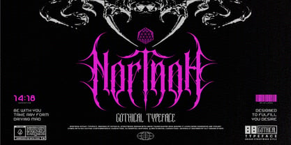 Introducing the "Northnoh Metal Modern Typeface" – where the raw power of brutalism meets the modern edge of dead metal aesthetics. Unleash the untamed spirit of your designs with this bold and brave font that boasts a prickly character, exuding strength and attitude. Designed for those who dare to be different, this typeface is a true representation of fearless creativity. With 862 meticulously crafted glyphs, the "Northnoh Metal Modern Typeface" ensures a comprehensive arsenal for your typographic adventures. Explore a world of possibilities with included ligatures and alternatives, allowing you to customize and enhance your text with a touch of unique flair. The font's distinctive personality is perfect for projects that demand an unconventional and daring approach. Whether you're working on album covers, posters, branding, or any other design where a fierce statement is required, the "Northnoh Metal Modern Typeface" rises to the occasion. Embrace the rebellious spirit of dead metal while enjoying the ease of use and versatility this typeface offers. Its multilingual support broadens the horizons of your creativity, making it a global tool for expression. Unleash the brutal beauty of "Northnoh Metal Modern Typeface" and let your designs scream with individuality. Elevate your projects to new heights with a font that challenges the norm and breaks free from the conventional boundaries of typography.
 - Tumbasan by Look Minus Today,
$16.00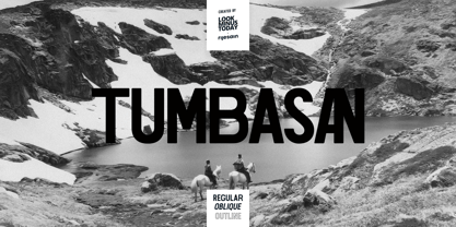 Introducing Tumbasan - Modern Minimalist Sans Serif by Look Minus Today. Tumbasan is designed with a modern and minimalist aesthetic in mind. This versatile font is perfect for all design needs, from print materials to digital media. Geometric shapes give it a contemporary feel that will add a touch of sophistication to any project. The font's design is based on a simple and legible sans serif style, with just the right balance of thickness and spacing to ensure clarity and ease of reading. Its simple, elegant lines and smooth curves make it a great choice for a variety of design applications, including branding, advertising, packaging, and editorial design. Our modern and minimalist sans serif font is a versatile and stylish choice for any design project. Its clean lines, geometric shapes, and legibility make it an excellent choice for a wide range of applications, while its modern aesthetic ensures it will stand out and make a bold statement in any design. Features: - Uppercase - Lowercase - Alternates & Ligatures - Numerals & Punctuation - Multilingual & Symbol - HOW TO ACCESS ALTERNATE CHARACTERS - Open glyphs panel: In Adobe Illustrator go to Window - Type – glyphs In Adobe Photoshop go to Window – glyphs For any further questions or assistance, please feel free to contact us at look.minus.today@gmail.com Thank you and have a nice day!
 - Syakila Script by madjack.font,
$14.00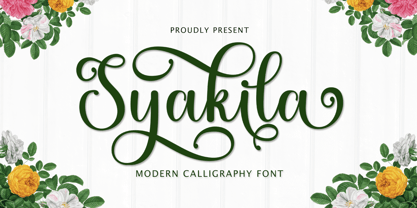 -INTRODUCE- Syakila Script is a modern calligraphy font. Here you will find beautiful script fonts. This font is available with several modern swirls that can make your work look elegant, sweet and flawless. It can be used for various purposes such as headings, signatures, logos, wedding invitations, t-shirts, letterheads, signage, labels, news, posters, badges etc. Syakila Script features alternatives to OpenType styles, binders, and International support for most of the included Western Languages. To activate the OpenType Stylistic alternative, you need a program that supports OpenType features such as Adobe Illustrator CS, Adobe Indesign & CorelDraw X6-X7, Microsoft Word 2010 or a later version. How to access all alternative characters using Adobe Illustrator: https://www.youtube.com/watch?v=XzwjMkbB-wQ Syakila Script is coded with PUA Unicode, which allows full access to all additional characters without having to design special software. Mac users can use Font Book, and Windows users can use Character Map to view and copy additional characters for pasting into your favorite text editor / application. How to access all alternative characters, using the Windows Character Map with Photoshop: https://www.youtube.com/watch?v=Go9vacoYmBw If you have any questions, feel free to contact me. Thank you very much for viewing and Enjoying it!
 - Florako by Nathatype,
$29.00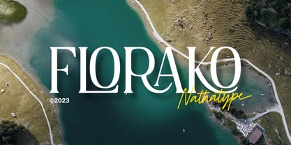 Florako is a mesmerizing serif font designed with an elegant and modern touch. With its lightweight, this typeface exudes a sense of delicacy and refinement, adding a touch of sophistication to your creative projects. The slender letterforms with precise lines and graceful curves embodies the perfect balance between elegance and modernity. The clean and refined serifs lend a classic touch to the font, while the contemporary styling infuses it with a fresh and current vibe. This harmonious fusion creates a captivating aesthetic that is both timeless and on-trend. The light weight of Florako adds to its graceful and delicate appearance, making it ideal for projects that require a subtle and refined typography while maintaining its legibility. You can also enjoy the available features here. Features: Alternates Ligatures Stylistic Sets Multilingual Supports PUA Encoded Numerals and Punctuations Florako fits in headlines, logos, posters, titles, invitations, branding materials, print media, editorial layouts, website headers, and many more. Find out more ways to use this font by taking a look at the font preview. Thanks for purchasing our fonts. Hopefully, you have a great time using our font. Feel free to contact us anytime for further information or when you have trouble with the font. Thanks a lot and happy designing.
 - Bestiario by Intellecta Design,
$27.50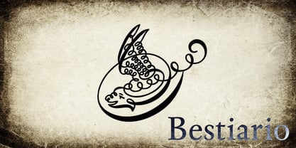 John Seddon (1644-1700), was a famous english writing master, the leading calligrapher of his time, and master of Sir John Johnson’s Free Writing School in Priest’s Court, Foster Lane. His portrait was drawn by William Faithorne and was engraved by John Sturt as the frontispiece for his copy-books, such as ‘The Ingenious youth’s companion’ of c.1690 and 'The pen-man’s paradise' of c.1695. These were engraved after his work by others. Your extra-rare book - "The Pen-mans Paradise Both pleasent & Profitable OR Examples of all ye usuall hands of this Kingdome. Adorn'd with variety of ffigures an Flourishes done by Command of hand. Each ffigure being one continued & entire Track of the pen most where of may be struck as well Reverse (or to answer bothwayes) as Forward", London (1965). - YES (that is the title of the book) was the starting point to these new extra accurated works of Iza W, a series of revivals of the penmanship Seddon’s artworks, animal and human kingdon inspired penmanship forms in the Bestiario font. On the other hand, his highly ornamented animal kingdon inspired capitals and alphabets in the Seddon Penmans Paradise Capitals typeface. The “SeddonsFleurons” completes the collection. Fantastic choice to elaborated barocque/renaissance inspired and historical accurated layouts.
 - Senada by Haksen,
$14.00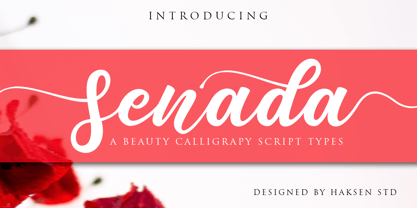 Senada is a lovely bouncy script font with a natural & stylish flow. Perfect for making elegant stylish statements - or adding a touch of class to your designs. This script has a multitude of lovely alternates character in its OpenType features - making the font look a beautiful Senada is perfect for many different projects such as logos & branding, invitation, stationery, wedding designs, social media posts, advertisements, product packaging, product designs, label, photography, watermark, special events or anything. What you get: Senada includes capital and lowercase letters, alternates, and Ligatures Numbers + punctuation Foreign language support I highly recommend using a program that supports OpenType features and Glyphs panels such as Adobe Illustrator, Adobe Photoshop CC, Adobe InDesign, or CorelDraw, so you can see and access all Glyph variations. Senada is encoded with Unicode PUA, which allows full access to all additional characters without having special design software. Mac users can use Font Book, and Windows users can use Character Map to view and copy one of the extra characters to paste into your favorite text editor/application. I hope you enjoy the font, please feel free to comment if you have any thoughts or feedback. Or simply send me a PM or email me.
 - Parkour by Resistenza,
$39.00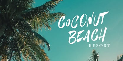 Parkour Brush Font takes the repertoire of moves and free spirit of this modern sport and bring it to a graphic definition. Handwritten with authentic dry brush imperfections and a bouncy baseline to evoke the energy of this urban sport discipline which emphasizes the athlete to be strong and flexible as to be able to move quickly and efficiently through any given environment. Sounds like a fun game, right? This font comes with a full set of upper and lower case characters - giving you the extra freedom to turn your text into authentic custom-made hand lettering. Parkour Marker font Includes a large range of glyphs including numerals, punctuation & multilingual support. It comes with a perfectly paired handy set of bonus Swashes and extras perfect to complete and customize your layout. Perfect for branding, social media, stationery, advertising, logos, handwritten quotes, product packaging, header, poster, merchandise & greeting cards. Features: - OTF Font file - Punctuation & numbers - Splashes & Splatters - Alternate letters - Uppercase letters - Multi Language To enable the OpenType Stylistic alternates, you need a program that supports OpenType features such as Adobe Illustrator CS, Adobe Indesign & CorelDraw X6-X7. There are additional ways to access alternates, using Character Map (Windows), Nexus Font (Windows), Font Book (Mac) or a software program such as PopChar (for Windows and Mac).
 - Austral Slab by Antipixel,
$15.00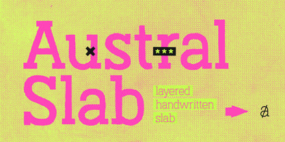 Austral Slab is a hand-drawn layered font designed by Antipixel, with unique textures & styles that combine giving your work a distinctive impression. This font comes in three weights, Regular, Light & Thin, with irregular outlines and uneven/crooked strokes, giving your work more personality and making it exclusive and powerful. For this same reason it can be used in a vast variety of projects, such as logos & branding, stationery, book covers, magazine design, clothing prints & tags, packaging, animated videos, and many more! Austral Slab has three sets of alphabets in uppercase and lowercase to avoid repeating the same character pattern, and giving the font a more natural handwritten feel. This is included in the Open-Type Contextual Alternates, which applies an automatic substitution of glyphs as long as the Open-Type features are activated. Also, Austral Slab offers other Open-Type features such as Stylistic Alternates, Ligatures, Discretionary Ligatures, Fractions, Superscript, Subscript, Denominator, Numerator, Scientific Inferiors & Kerning. This font has a very large glyph coverage and can be used in a wide range of languages, including English, Spanish, Italian, French, German, Polish, Czech, Vietnamese, Finnish, Icelandic, among many others. The style Maplines Thin is offered Free for commercial & personal use!
 - Duepuntozero Pro by Zetafonts,
$39.00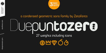 Created as a logo typeface in 2004 by Francesco Canovaro, Duepuntozero is one of Zetafonts classic typefaces. A monolinear sans serif typeface with rounded corners and condensed proportions, strictly based on modular geometric design, it was at first designed in five weights to be used as a condensed companion typeface to the rounded display family Arista. In 2019 the family was completely redesigned by the Zetafonts Team, expanding the original character set to include cyrillic and greek glyphs and adding four extra weights and italics to the original weight range. This restored and revamped version, named Duepuntozero Pro, also includes full Open Type features for positional figures, fractions and Small Caps. With his rounded, minimal aesthetic, Duepuntozero embodies the desire for simplicity and playfulness of contemporary mobile applications, making it a perfect choice for gaming and app interface design. Its compact design allow for maximum space saving on mobile screens when used as a text typeface, while the strictly geometric design and the extreme range of weights (including thin and black) make it excel in display, logo and editorial use. A complementary set of free icons in the same range of weights of the font is provided to help designers build consistent branding through pictograms in infographics, interfaces and editorial products.
 - Rough Hearts by Nathatype,
$29.00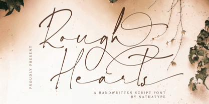 Do you want a handwriting style font in consistent, professional displays? Well, finding such fonts can be tough and time-consuming work. Therefore, Rough Hearts is here for your perfect choice. Rough Hearts is a font in a handwriting style with different, more natural shapes looking like spontaneously written letters. Each letter detail is made in swinging styles and this font also has high letter contrast, which means the thickness and thinness differences of the lines on each letter can be clearly seen. This font produces personal and creative impressions resulting in its legibility and attractiveness to apply for simply interesting design projects. You can use this font for big text sizes to be greatly legible and also enjoy the available features here. Features: Alternates Ligatures Stylistic Sets Multilingual Supports PUA Encoded Numerals and Punctuations Rough Hearts fits best for various design projects, such as brandings, headings, magazine covers, quotes, printed products, invitations, greeting cards, name cards, merchandise, social media, etc. Find out more ways to use this font by taking a look at the font preview. Thanks for purchasing our fonts. Hopefully, you have a great time using our font. Feel free to contact us anytime for further information or when you have trouble with the font. Thanks a lot and happy designing.
 - Lido STF by Storm Type Foundry,
$39.00Times with a Human Face: In my article of the same name which appeared in the magazine Font, volume 2000 I described the long and trying story of an order for a typeface for the Czech periodical Lidové noviny (People’s Newspaper). My task was to design a modification of the existing Times. The work, however, finally resulted in the complete re-drawing of the typeface. The assignment, which was on the whole wisely formulated, was to design a typeface which would enable “a smooth flow of information in the reader’s eye”, therefore a typeface without any artistic ambitions, from which everything which obstructs legibility would be eliminated. A year later Lidové noviny had a different manager who in the spring of 2001 decided to resume the cooperation. The typeface itself definitely profited from this; I simplified everything which could be simplified, but it still was not “it”, because the other, and obviously more important, requirement of the investor held: “the typeface must look like Times”. And that is why the above-mentioned daily will continue to be printed by a system version of Times, negligently adjusted to local conditions, which is unfortunately a far cry from the original Times New Roman of Stanley Morison. When I was designing Lido, the cooperation with the head of production of Lidové noviny was of great use to me. Many tests were carried out directly on the newspaper rotary press during which numerous weak points of the earliest versions were revealed. The printing tests have proved that the basic design of this typeface is even more legible and economical than that of Times. The final appearance of Lido STF was, however, tuned up without regard to the original assignment – the merrier-looking italics and the more daring modelling of bold lower case letters have been retained. The typeface is suitable for all periodicals wishing to abandon inconspicuously the hideous system typefaces with their even more hideous accents and to change over to the contemporary level of graphic design. It is also most convenient for everyday work in text editors and office applications. It has a fairly large x-height of lower case letters, shortened serifs and simplified endings of rounded strokes. This is typical of the typefaces designed for use in small sizes. Our typeface, however, can sustain enlargement even to the size appropriate for a poster, an information table or a billboard, as it is not trite and at the same time is moderate in expression. Its three supplementary condensed designs correspond to approximately 80% compression and have been, of course, drawn quite separately. The intention to create condensed italics was abandoned; in the case of serif typefaces they always seem to be slightly strained. I named the typeface dutifully "Lido" (after the name of the newspaper) and included it in the retail catalog of my type foundry. In order to prevent being suspected of additionally turning a rejected work into cash, Lido STF in six designs is available free of charge. I should not like it if the issuing of this typeface were understood as an “act out of spite” aimed against the venerable Times. It is rather meant as a reminder that there really are now alternatives to all fonts in all price categories. - EG Dragon Caps - 100% free

- Throrian Formal - 100% free

- Throrian Commonface - 100% free

- Node Display by Spilled Ink,
$9.00 Designed in The Hague amongst the canals and flowering lime trees, Node Display represents the best of organic curves with sharp modern edges. Sophisticated and edgy, it's everything you want out of a display font. It looks amazing at large sizes and, also, small sizes. 16 Fonts. Extra Light, Extra Light Italic, Light, Light Italic, Regular, Regular Italic, Medium, Medium Italic, Semi Bold, Semi Bold Italic, Bold, Bold Italic, Extra Bold, Extra Bold Italic, Outline, Outline Italic. 17 Languages. Basque, Catalan, Danish, Dutch, English, Estonian, Finnish, French, Frisian, Galician, German, Irish, Italian, Norwegian, Portuguese, Spanish and Swedish. 185 Glyphs. 36 Punctuation Marks, 57 Uppercase Letters, 60 Lowercase Letters, Full Number Set. Looks great packaged on wrapping, bottles and jars or digitally on websites, social and apps or printed on newspapers, magazines and flyers.
 - Christmas Chances by Putracetol,
$16.00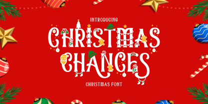 Christmas Chances - Christmas Font is a captivating display typeface designed to evoke the festive spirit of Christmas. With its elegant serif letterforms, this font adds a touch of sophistication to your holiday-themed designs. It comes with ligatures and six unique alternative decorations, including Santa hats, Christmas trees, Santa Claus, festive ornaments, Christmas cakes, and more. These decorative elements allow you to infuse the holiday spirit into your projects, making it perfect for various Christmas-themed designs. This font is specifically crafted for Christmas-themed projects, making it a versatile choice for a wide range of applications, including t-shirt designs, invitation cards, greeting cards, mugs, gift designs, Christmas ornaments, and much more. Christmas Chances - Christmas Font is your go-to choice for spreading holiday cheer and warmth in your creative endeavors.
 - Pulp Display by Spilled Ink,
$9.00 Designed in Spain amongst the orange trees, Pulp Display represents the best of modern circular aesthetic with an air of friendliness. Wholesome, full and juicy, it's everything you want out of a display font. It looks amazing at large sizes and, also, small sizes. 16 Fonts. Extra Light, Extra Light Italic, Light, Light Italic, Regular, Regular Italic, Medium, Medium Italic, Semi Bold, Semi Bold Italic, Bold, Bold Italic, Extra Bold, Extra Bold Italic, Outline, Outline Italic. 17 Languages. Basque, Catalan, Danish, Dutch, English, Estonian, Finnish, French, Frisian, Galician, German, Irish, Italian, Norwegian, Portuguese, Spanish and Swedish. 185 Glyphs. 36 Punctuation Marks, 57 Uppercase Letters, 60 Lowercase Letters, Full Number Set. Looks great packaged on wrapping, bottles and jars or digitally on websites, social and apps or printed on newspapers, magazines and flyers.
 - Killegar by Tony Fahy Font Foundry,
$20.00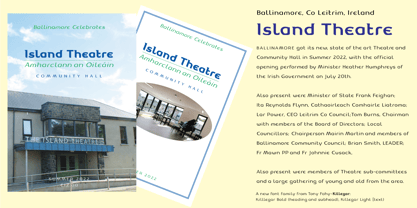 The Killegar family is inspired by one of the great houses of Ireland...Killegar—which is on the grand Estate of Killegar. I lived there for many years. It is a quiet and peaceful place surrounded by lakes and trees and is inspirational in so many ways. All of my creative talents were boosted by this amazing two hundred year old building with all of it's secrets and heritage. Time stood still in Killegar....except for me and my modern day computers, cell phones and fax machines. This twist of fate, with me living both a rural and hi-tech life, living in an environment of the early 18th century, with the friendliest local people on the Earth, played it's part in the origin of the Killegar family of fonts. Tony Fahy
 - Tropical by Sudtipos,
$49.00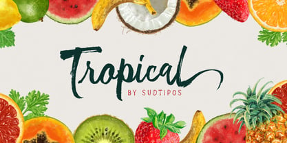 The single-named, multi-talented designer Joluvian now lives in Madrid. But he grew up in the “Caribe” of Venezuela, where thick jungles meet endless beaches, and fecund trees bear juicy fruit – a tropical paradise where music and dance vibrate in the humid air. The Tropical pack, designed by Joluvian and digitized by Ale Paul, echoes the spirit of his birthplace. Its three faces are casually stylish – a bold, wet-looking display script, an inky, textured brush script, and hand-penned capitals with a felt-tip look. Like a fruit cocktail, each ingredient is tasty on its own, but they combine even more deliciously. Sprinkle the included catchwords, shapes, and bursts in your layout to complete the easygoing, Carribbean vibe. Each face includes alternates and support for multiple Latin languages.
 - Komikaze - 100% free

- Beauty Style by Cultivated Mind,
$14.00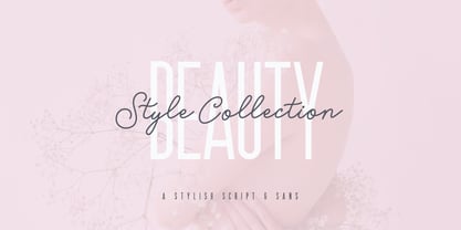 Beauty Style is a luxurious font collection that includes both a signature script and a sans serif typeface. Beauty Style scripts come in four weights including 12 alternates and 56 ligatures. Programming has been added to the scripts for flow and elegance. Use Beauty Style for sophisticated designing. Fonts designed by Cindy Kinash. See font details below. SANS FEATURES: All caps letters Condensed Sans OpenType Common ff fi fl ffi ffl ligatures Available in Extended Latin Pro (Standard) or American (US) version. SCRIPT FEATURES: Signature style OpenType Common ff fi fl ffi ffl ligatures Available in Extended Latin Pro (Standard) or American (US) version. 12 alternates and 56 ligatures Programmed ligature feature for optimization. Every time you type specific pairs, ligatures are programmed to pop up to avoid letter pair collisions. Programming ligatures gives the script a more elegant and pretty flow. Make sure to turn on the feature in your preferred program that supports ligatures. FREE WORDS FEATURES: 52 free words useful for beauty and sales promoting. Keyword examples include you, sale, and beautiful. Intended use for beauty, fashion, newsletters, websites, magazines, sales, commercials and packaging. VERSIONS: American and Extended Latin Pro AMERICAN (US) Shorter version 12 alternates and 56 ligatures (scripts only) Common ff fi fl ffi ffl ligatures OpenType Includes the common alphabet, numbers, American symbols and punctuation. EXTENDED LATIN PRO (Standard) Extended version of the American. 12 alternates and 56 ligatures (scripts only) Common ff fi fl ffi ffl ligatures OpenType Includes characters for Albanian, Basque, Catalan, Cornish, Croatian, Czech, Danish, Dutch, English, Esperanto, Estonian, Feroese, Finnish Scots, French, Gaelic, Galician, German, Greek Transliterated, Hawaiian, Hungarian, Icelandic, Indonesian, Irish, Italian, Latvian, Lithuanian, Maltese, Nynorsk Bokmal Norwegian, Polish, Portuguese, Romanian, Slovak, Slovenian, Spanish, Swedish, Turkish, Welsh. TIPS: Try the OpenType ligatures by turning on the feature in your preferred program that supports ligatures. FONT LAYERING — Layer the script over the sans to give a cool retro effect. There are so many fun and creative possibilities. FONT CONNECTING — Interconnect the sans and script letters together creating TYPE ART. All you need to do is convert the font into an object and have fun! (Watch the upcoming tutorials on the cultivatedmindtype Instagram) SANS — When sans text is small, widen the text tracking for legibility and style variety. Sans is diverse and can work as tight or loose tracking. Use Beauty and Style for type art, beauty marketing, fashion, apparel, product design, music, websites, promotions and film. Last tip…Always have fun when creating. This isn’t a race. Creating should always be enjoyed. TUTORIALS: For more Beauty Style font tips including font layering, vlogs and tutorials, check out @cultivatedmindtype on Instagram.
 - Prillwitz Pro by preussTYPE,
$49.00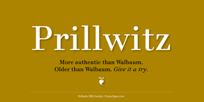 Johann Carl Ludwig Prillwitz, the German punch cutter and type founder, cut the first classic Didot letters even earlier than Walbaum. The earliest proof of so-called Prillwitz letters is dated 12 April 1790. Inspired by the big discoveries of archaeology and through the translations of classical authors, the bourgeoisie was enthused about the Greek and Roman ideal of aesthetics. The enthusiasm for the Greek and Roman experienced a revival and was also shared by Goethe and contemporaries. »Seeking the country of Greece with one’s soul«. All Literates who are considered nowadays as German Classics of that time kept coming back to the Greek topics, thinking of Schiller and Wieland. The works of Wieland were published in Leipzig by Göschen. Göschen used typefaces which had been produced by until then unknown punch cutter. This punch cutter from Jena created with these typefaces master works of classicist German typography. They can stand without any exaggeration on the same level as that of Didot and Bodoni. This unknown gentleman was known as Johann Carl Ludwig Prillwitz. Prillwitz published his typefaces on 12th April 1790 for the first time. This date is significant because this happened ten years before Walbaum. Prillwitz was an owner of a very successful foundry. When the last of his 7 children died shortly before reaching adulthood his hope of his works was destroyed, Prillwitz lost his will to live. He died six months later. His wife followed him shortly after. The typeface Prillwitz as a digital font was created in three optical styles (Normal, Book and Display). The typeface Prillwitz Press was created especially for a printing in small sizes for newspapers. »Prillwitz Press« combines aesthetic and functional attributes which make written text highly readable. It was originally designed for a newspaper with medium contrast to withstand harsh printing conditions. Its structure is quite narrow which makes this typeface ideal for body text and headlines where space is at premium. For the Normal – even more for the Book – a soft and reader-friendly outline was created through a so-called »Schmitz« and optimized in numerous test prints. The arris character and the common maximal stroke width contrast of the known classicist typefaces (Didot/Bodoni) were edited by the study of the original prints. This was also done in order to reach a very good readability in small type sizes. This typeface is perfectly suited to scientific and belletristic works. Accordingly it has three styles: Regular, Bold and Italic as Highlighting (1). The typeface Prillwitz is a complete new interpretation and continuing development of the conservated originals from 1790. They have been kept in the German Library in Leipzig. It was always given the priority to keep the strong roughness and at the same time optimizing the readability of this striking font. The type family has all important characters for an efficient and typographic high quality work. ----------- (1) Accentuation of particular words or word orders (e.g. proper names, terms etc.). Typographic means for Highlighting could be Italic, SmallCaps or semi-bold.
 - As of my last update in early 2023, the specific font named "Cartoo Nature" by Tokokoo may not be widely recognized or might be an emerging or niche font in the vast landscape of typography. However,...
- Hydrogen - Unknown license

- Zinc Boomerang - Unknown license

- May Queen - Unknown license

- Aillek by Twinletter,
$18.00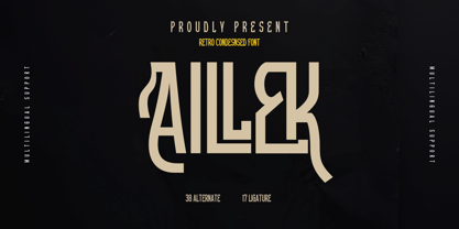 Introducing Aillek, a retro-condensed font with multilingual support and a distinctive look that will enhance any project. Aillek lends a touch of retro charm to any design with its lofty letterforms and alternate characters. Your design becomes more dynamic and interesting thanks to its ligatures options. Aillek is ideal for producing vintage flyers, logos in retro style, nostalgic social media graphics, and more. It is perfect for branding initiatives, packaging design, book covers, and more due to its condensed letterforms. It is adaptable for any project that needs to reach a large audience thanks to its multilingual support. Aillek is a must-have for any designer, marketer, or anyone looking to add a dash of nostalgia to their work because of its distinctive design and features. It’s ideal for those who want to add a touch of nostalgia to their designs as well as for those who want to create designs that evoke nostalgia and vintage aesthetics. Make Aillek your go-to font for all your retro-condensed design needs by taking advantage of this opportunity. Don’t wait, get this special font right away, and start making designs that will be remembered. What’s Included : - File font - All glyphs Iso Latin 1 - Alternate, Ligature - Simple installations - We highly recommend using a program that supports OpenType features and Glyphs panels like many Adobe apps and Corel Draw so that you can see and access all Glyph variations. - PUA Encoded Characters – Fully accessible without additional design software. - Fonts include Multilingual support
 - C-Nation by URW Type Foundry,
$39.99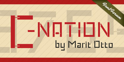 Marit Otto about C-Nation: The building typeface. Although the 70ties were very liberating and progressive, still girls played mainly with dolls and sweet things and boys with all kinds of challenging stuff. They did all sorts of basic scientific experiments in mini labs and of course built cool things with Meccano building sets. As a girl I was perfectly happy with the toys I had access to. But at the same time I was very curious about all the adventure toys and discoveries my brother did. It also made me wonder why the grown up people thought that our world could be separated so easily by separating our toys in pink and blue sections. At this day of age Meccano is probably hopelessly old fashioned and far to manual. Children of today are fed by fast images and cool animations on screen, they learn, play, communicate and relax in the same space, the digital space. The special feature of Meccano was that even though it was very basic there was the promise you could create anything. It might even contribute to a logical mind. The typeface I designed refers to the Meccano feel. It is a creative typeface. A bit masculine and bold looking perhaps but after the first impression a subtle and refined female touch is revealed. It has links to architecture and associations with metal constructions like ‘The Eiffel Tower’ and (old railway) bridges. I am convinced that we all think of that as very charming man-made objects.
 - ITC Astro by ITC,
$29.99ITC Astro is the typeface that proves you can get your work done while watching cartoons. “It all started as a series of doodles while I was watching The Jetsons,” recalls Sasa Petricic. “The show's impossibly simplistic vision of the twenty-first century cried out for a font that fit into that world -- a world where everyday objects can carry far more fun and personality than they should.” ITC Astro is the first commercial typeface design from Petricic, whose “day job” is working as a reporter for the Canadian Broadcasting Corporation. Petricic has filed stories from across Canada and around the world for CBC's flagship evening newscast, The National. His reports have also appeared on CNN and BBC Television. Petricic's work as a correspondent and video journalist have taken him to six continents, covering everything from famine and genocide in Africa to the war in Iraq. With such serious matters filling the hours of Petricic's day as a journalist, it's not hard to see why he conceived Astro as a welcome blast of whimsy. “As I began to draw the design,” he says, “I decided that every part of Astro should be a cartoon character unto itself.” Each character has its own baseline shadow (or coaster, or circular antigravity generator, depending on how you look at things). The angular caps dance jauntily, rocking from left to right, while a suite of companion small caps provide backup. The end result is a design quite unlike any other, with surprising charm and versatility. ITC Astro comes in a two-weight family of White and Black. - Morvifun by Alit Design,
$20.00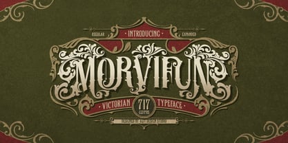 Introducing "Morvifun" - a captivating font that combines the elegance of Victorian aesthetics with ornamental details. This classic serif typeface showcases the timeless charm of Gothic styles, resulting in a visually stunning and versatile product. With a total of 717 meticulously crafted glyphs, Morvifun offers an extensive character set that enables you to express your creativity and bring your designs to life. From uppercase and lowercase letters to numerals, punctuation marks, and special symbols, this font provides a comprehensive range of options to suit your design needs. The Morvifun font's classic serif style adds a touch of sophistication and refinement to any project. The carefully designed letterforms exude an air of elegance, making it ideal for invitations, formal correspondence, branding materials, book covers, signage, and more. Whether you're aiming for a vintage-inspired design or a contemporary piece with a hint of nostalgia, Morvifun is a reliable choice. Unlock the enchanting world of Victorian aesthetics with Morvifun. Its fusion of ornamental intricacy, extensive glyph set, PUA Unicode support, and classic serif style make it a versatile font that captures the essence of Gothic beauty. Let Morvifun elevate your designs and transport viewers to a bygone era of grace and allure. Language Support : Latin, Basic, Western European, Central European, South European,Vietnamese. In order to use the beautiful swashes, you need a program that supports OpenType features such as Adobe Illustrator CS, Adobe Photoshop CC, Adobe Indesign and Corel Draw. but if your software doesn't have Glyphs panel, you can install additional swashes font files.
 - Chubs by Type.p,
$24.00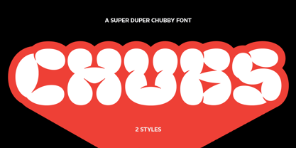 "Chubs," a typeface specifically designed for large display sizes, perfect for making a bold statement. Each letter in Chubs has been meticulously crafted to possess a thick and prominent appearance, ensuring that your designs leave a lasting impact on viewers. Chubs's distinctive weight and blackness make it an ideal choice for a wide range of applications, including posters, packaging, and logos. Whether you want to create eye-catching promotional materials or design a powerful brand identity, Chubs has got you covered. Within the Chubs typeface family, you'll find two distinct styles, each with its own personality and visual appeal. The first style, "Chubs Black," features letters with a captivating slit, reminiscent of a belly that overlaps. This distinctive groove adds an extra layer of visual interest and uniqueness to your designs. On the other hand, "Chubs Filled" offers a solid and plump appearance, without the characteristic slit. This style amplifies the chubby nature of the letters, resulting in a bold and impactful display. To further enhance your creative options, both styles within the Chubs family include an alternate character set featuring a wink shadow in every letter. These additional characters provide a touch of fanciness and playfulness, allowing you to experiment and add unique elements to your designs. Choose "Chubs" for your next big project, and witness the boldness and charm that sets your designs apart from the rest. Let Chubs bring your ideas to life and make a powerful visual statement that captures attention and leaves a lasting impression.
 - Soft Mouth by Alit Design,
$20.00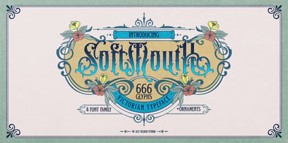 Introducing the stunning "Soft Mouth Victorian Typeface," a font that encapsulates the essence of Victorian elegance. This font style exudes an air of refinement and opulence, perfect for adding a touch of grandeur to your design projects. The "Soft Mouth Victorian Typeface" offers a versatile range of options with its four font families: Regular, Hole, Ornament, and Serif. The "Regular" font family serves as a reliable choice for everyday text, providing legibility and clarity. The "Hole" font family adds a unique twist, featuring intricate designs with hollowed-out letterforms, creating an intriguing visual effect. The "Ornament" font family boasts exquisite decorative elements, allowing you to embellish your designs with ornate flourishes. Lastly, the "Serif" font family offers a classic and refined aesthetic, perfect for evoking a sense of tradition and sophistication. This typeface includes a comprehensive set of ligatures and alternates, enabling seamless connections between letters and enhancing the overall flow and visual harmony of your text. With an impressive collection of 666 glyphs, you'll have an extensive range of characters and symbols at your disposal, allowing you to unleash your creativity and experiment with various typographic compositions. Whether you're working on elegant invitations, branding projects that require a touch of vintage sophistication, or creating elaborate typographic artworks, the "Soft Mouth Victorian Typeface" is a must-have resource. Its Victorian elegance, extensive features such as ligatures and alternates, a rich collection of 666 glyphs, and the added bonus of frames and floral embellishments, make it an invaluable asset for bringing a sense of timeless charm to your creative endeavors.
 - Cooker Cake by Sabrcreative,
$25.00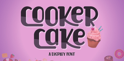 Elevate your design projects with Cooker Cake, a vibrant and playful sans serif display font. With its charismatic style and versatile nature, this font adds a touch of excitement and creativity to any typography-based endeavor. Whether you're designing logos, posters, headers, or website elements, Cooker Cake will captivate your audience and make your text pop. Cooker Cake features all capital letters, giving your designs a bold and impactful appearance. The font also includes a wide range of numbers and punctuation, ensuring that your compositions are complete and functional. Its multilingual support allows you to incorporate various languages seamlessly, making it ideal for global projects. One of the standout features of Cooker Cake is its PUA (Private Use Area) encoding. This means that you have access to additional special characters, glyphs, and ligatures, expanding your creative possibilities and enabling you to add unique flourishes to your designs. Let your imagination run wild as you explore the various alternates and stylistic options available in this font. With its sans-serif style, Cooker Cake strikes the perfect balance between modern aesthetics and a playful vibe. It works harmoniously in both digital and print formats, making it suitable for a wide range of applications. From branding and packaging to social media graphics and advertising campaigns, this font will bring a sense of joy and energy to your projects. Experience the versatility and captivating charm of Cooker Cake Sans Serif Display Font. Let its playful and dynamic personality infuse your typography with excitement.
 - Aure Nox by Aure Font Design,
$23.00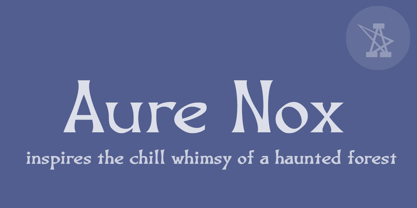 Aure Nox inspires the chill whimsy of a haunted forest. The roughhewn forms of this decorative, sans-serif font engage the reader with a subtext of rakish charm. Surprisingly legible, Nox adds a bit of rebelious sass to text and titles, and a daring stance to astrological expressions and chartwheels. Nox is an original design developed by Aurora Isaac. After more than a decade in development, 2018 marks the first release of the CJ and KB glyphsets in regular, italic, bold, and bold-italic. The CJ glyphset is a full text font supporting a variety of European languages. A matching set of small-caps complements the extended lowercase and uppercase glyphsets. Supporting glyphs include standard ligatures, four variations of the ampersand, and check-mark and happy-face with their companions x-mark and grumpy-face. Numbers are available in lining, oldstyle, and small versions with numerators and denominators for forming fractions. Companion glyphs include Roman numerals, specialized glyphs for indicating ordinals, and a variety of mathematical symbols and operators. The CJ glyphset also includes an extended set of glyphs for typesetting Western Astrology. These glyphs are also available separately in the KB glyphset: a symbol font re-coded to allow easy keyboard access for the most commonly used glyphs. Though Nox stands well on its own as a text font, the more traditional sans-serif forms of Aure Jane pair well as an innocuous foil to Nox's brazen presence. Give Aure Nox a trial run! You may discover a permanent place for this font family in your typographic palette. AureFontDesign.com
 - Rolie Twily by Jolicia Type,
$25.00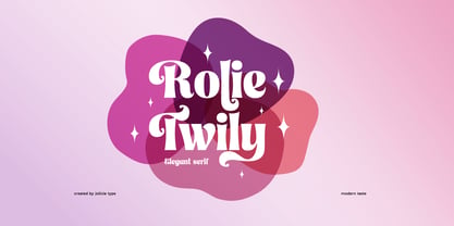 Introducing Rolie Twily, a font that effortlessly combines the elements of display and decorative styles to bring you a unique typographic experience. This font exudes an aura of Curly Elegant Modernity that is sure to make your designs stand out and leave a lasting impression. Key Features: Display and Decorative Fusion: Rolie Twily seamlessly blends the characteristics of display and decorative fonts, resulting in a versatile typeface that can be used for a wide range of creative projects. Curly Elegance: The graceful and whimsical curls in Rolie Twily's letterforms add a touch of sophistication and elegance to your text, making it perfect for invitations, posters, and branding materials where a touch of luxury is desired. Modern Aesthetic: While rooted in tradition, Rolie Twily maintains a contemporary edge, making it ideal for modern design trends. Its clean design ensure that your message remains clear and stylish. Versatile Usage: Whether you're designing wedding invitations, packaging, social media graphics, or any creative project, Rolie Twily brings a sense of charm and refinement to your typography. Attention-Grabbing: The unique and eye-catching nature of Rolie Twily ensures that your content won't go unnoticed. It's a font that demands attention and leaves a lasting impression. Rolie Twily is the perfect choice when you want to infuse your designs with a touch of Curly Elegant Modernity. Elevate your creative projects and make them truly memorable with this exceptional font. Download Rolie Twily today and watch your designs flourish with a newfound sense of style and sophistication.
 - Gineso by insigne,
$-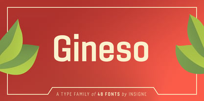 Michaelangelo. da Vinci. Bellini. Rafael. Masters of Italian art whose names have dwarfed those of many other great Italian artists. Yet relics from these other artists remain, though often unnoticed because of their practical nature. These unknowns are the Italian Masters of vernacular sign painting, and insigne now gives a nod to their work with its new sans serif, Gineso. Based on its inspiration, Gineso was created for posters, headlines and logotypes. (It does well in apps, too, though the sign painters probably weren’t thinking about that at the time.) Aesthetically remedied, yet still with an uncut charm, Gineso’s condensed qualities make it especially nice for signs and titling where horizontal space is at a premium. The tight, narrow forms of its geometric design leave you with a robust flavor that will remind you of mamma’s spaghetti. But don’t worry; the font’s ample counters ensure your audience won’t be reading through a bowl of pasta. These condensed forms look great on their own or when their seven different weights and matching italics are utilized together. With the included OpenType features, fractions and superior/inferior positions are also available to broaden your palette. Even more, this font is ready for complex, professional typography with OpenType features like alternate letters and a large character set including Central and Eastern European Languages. So when you find yourself (or your project) in a tight space, stir in Gineso to get the right taste for your copy. It may just make all the difference.


