10,000 search results
(0.033 seconds)
- Privilege Sign Two JNL by Jeff Levine,
$29.00 Unique and decorative signage for many drive-ins, motels, food stores and other businesses of the 1940s had what was referred to as “privilege signs” provided by one of the major cola brands. Consisting of the brand’s emblem on a decorative panel, the remainder of the sign would carry the desired message of the storekeeper (such as “Drive-In”) in prismatic, embossed metal letters. Inspired by the Art Deco sans serif style of those vintage signs, Privilege Sign Two JNL recreates the type design in both regular and oblique versions. The typefaces are solid black, but adding a selected color and a prismatic effect from your favorite graphics program can reproduce the look and feel of those old businesses. This is a companion font to Privilege Sign JNL, which recreates the condensed sans serif lettering of other privilege signs from the 1950s and early 1960s.
 - Business Helpers JNL by Jeff Levine,
$29.00 Duluth, Minnesota's Horace P. Brouillet Syndicate (later known as Syndicuts, Inc.) was one of a number of stock cuts providers to the letterpress trade in the decades preceding paper, then electronic clip art. Brouillet's "Typeps" catalogs offered a wide range of images covering numerous subjects, as well as cartoons, catch words and automotive logos. Many of these images have been reproduced in a number of royalty-free clip art publications over the years. Twenty-Six of these newly-redrawn catch words are found within Business Helpers JNL in two styles. On the capital keys are the original white-on-black designs, modeled from the vintage source material. The lower case keys have the phrases separated from the decorative ovals and are in black type.
 - SpideRaY - Personal use only

- Newston by Arterfak Project,
$11.00 Newston is a minimalist, elegant serif font. It is beautiful and playful with 4 styles available. It is made with a medium contrast of the strokes that allow you to create more than a headline. The spacing is adjusted a bit tight that possible to fill empty space on your modern or typographic design. Newston also complete with some stylistic alternates that allow you to create the more beautiful design. Inspired by minimalist and decorative style, Newston has expanded to 4 styles : - Regular : Recommended for magazine cover, poster, flyer or website header. - Italic : Looks good to maximize the foreign language, verbal or motion effect. - Outline : Very good to combine with Regular to get some joyful effect. - Inline : The strong strokes and empty space, gives the art deco style. Good for a logo. Overall, Newston is flexible to apply in many styles such as minimalist, decorative, hipster, luxury, vintage and editorial. You can use this font for a t-shirt, corporate identity, magazine, banner, billboard, or storefront.
 - Overline Stencil by WAP Type,
$15.00 Overline Stencil font is perfect for your up coming projects. Such as logo branding, editorial design, fashion, stationery design, sport design, blog design, modern advertising design, card invitation, art quote, home decor, book/cover title, special events and any more.
 - Beluga Road by Sipanji21,
$15.00 Beluga Road is a spectacular decorative font with a graffiti style. It will elevate a wide range of design projects to the highest level, be it branding, headings, wedding designs, invitations, signatures, logotype, wall art illustration, apparel, labels, and much more!
 - Stencil Army by WAP Type,
$15.00 stencil army font is perfect for your up coming projects. Such as logo branding, editorial design, fashion, stationery design, sport design, blog design, modern advertising design, card invitation, art quote, home decor, book/cover title, special events and any more.
 - Wushand Graffiti by Sipanji21,
$10.00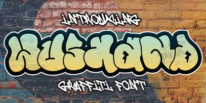 Wushand is a spectacular decorative font with a graffiti style. It will elevate a wide range of design projects to the highest level, be it branding, headings, wedding designs, invitations, signatures, logotype, wall art illustration, apparel, labels, and much more!
 - Derans Vandals by Sipanji21,
$18.00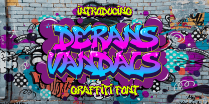 Derans Vandals is a spectacular decorative font with a graffiti style. It will elevate a wide range of design projects to the highest level, be it branding, headings, wedding designs, invitations, signatures, logotype, wall art illustration, apparel, labels, and much more!
 - Super Little Shadow by Sipanji21,
$12.00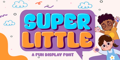 Super Little - A Fun Display Font With Shadow Decoration inside. It will elevate a wide range of design projects to the highest level, be it branding, headings, wedding designs, invitations, signatures, logotype, wall art illustration, apparel, labels, and much more!
 - Notress Graffiti by Sipanji21,
$15.00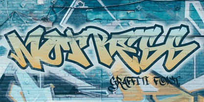 Notress Graffiti is a spectacular decorative font with a graffiti style. It will elevate a wide range of design projects to the highest level, be it branding, headings, wedding designs, invitations, signatures, logotype, wall art illustration, apparel, labels, and much more!
 - Alien Hunter by Sipanji21,
$18.00 Alien Hunter - A Fun Display Font With Shadow Decoration inside. It will elevate a wide range of design projects to the highest level, be it branding, headings, wedding designs, invitations, signatures, logotype, wall art illustration, apparel, labels, and much more!
 - Musical Number JNL by Jeff Levine,
$29.00 In the MGM musical "Broadway Melody of 1940", a new stage production has its gala opening at the fictitious Lafayette Theater on the Great White Way. The front of the theater is resplendent with classic neon signage, and the theater's name is in an interesting Art Deco design. Musical Number JNL recreates this lettering in digital form.
 - Dufour by Scholtz Fonts,
$19.00 Dufour was named in honor of an art deco font called "Independent" designed in the 1930s by Collette and Dufour. "Dufour" is influenced by the original font, however, there are substantial differences: instead of small caps, a true lower case was created, the upper case character proportions and shapes have been greatly modified, and all missing characters have been created to make a truly modern font which nevertheless has all of the panache of the original. A related font is Collette, designed by Anton Scholtz, however, Dufour has a softer feel that is more true to the original art deco period. Dufour comes in four styles: Dufour Regular, Dufour Regular Outline, Dufour Condensed, and Dufour Condensed Outline. The font has been carefully kerned and best results are obtained if kerning is switched on. (All-caps passages work well.) It is best used to create a retro feel and in headings, subheads and in short passages of text. Very effective in marketing for products for children.
 - Rosa by Pelavin Fonts,
$25.00 Inspired by Art Deco packaging, Rosa fits comfortably into that classic genre. It’s namesake in the collection of La Sociéte Parisienne de Savons is described thusly: In mythological legend, Chloris, the goddess of Spring flowers transformed the body of a nymph into the first Rose. Aphrodite gave her beauty. Dionysus, the god of wine gave her a sweet fragrance and the Three Graces, charm, joy and radiance. Equally compatible with Machine Age, Streamline, Moderne and even Memphis design motifs, it presents the unique option of serving as both the typographic and decorative components of a design. Use Rosa to evoke a sense of elegance, high style and historical context.
 - Hamptons BF by Bomparte's Fonts,
$40.00 Hamptons BF is a beautiful, elegant sans serif with dramatic individuality. A font that steps out in Art Deco style. As a design movement Art Deco came into prominence during the 1920s and 30s when forms were typically sleek, symmetrical, geometric or highly stylized. Today the influence of this enduring style can be clearly seen in architecture, industrial design, fashion, art, graphic design, and yes, even type design. Art Deco style exemplifies luxury, glamour and modernity. I believe Hamptons BF captures something of that retro look in a nod to the past without ever looking dated, all the while retaining a contemporary flair. Named after the well-known New York resorts synonymous with style and elegance, this gothic or sans serif type is based upon University Roman, an early 1970s serif design which in turn was influenced by yet another serif design called Forum Flair (late 1960s); and that in turn owes its pedigree to the late 1930s’ Stunt Roman, which is the original source of inspiration for all of these. Quite a family tree! There’s dynamic interplay between certain wide, full-round letters such as C, D, G, O, P, Q, R, S and narrow ones like A, E, F, H, K, L, M, N, U, etc. This contrast repeats throughout certain lower case letters and serves to create a unique look of distinction. Light and Regular weights communicate a romantic, feminine appeal while the Bold offers a complementary emphasis. The font is somewhat versatile as in addition to its primary purpose for display, Hamptons BF also succeeds in settings containing short blocks of large text. It’s right at home in a variety of typographic environments: branding, packaging, signage logos, magazine headlines, invitations, menus, trendy cafes and more. Among the included OpenType features are Stylistic Alternates, Automatic Ligatures and Fractions. There is extended language support for Western, Central and Eastern Europe and Turkish.
 - Qi by Cory Maylett Design,
$14.98 Qi is a display sans-serif inspired, in part, by the art deco typefaces sometimes seen on old signs along rural American backroads. Unlike these signs, Qi is new, fresh, a little bit quirky, and not at all in need of repair or a fresh coat of paint. The family is comprised of six distinct fonts with more on the way. With an entire set of Central and Western European (and, of course, American) glyphs, plus a bunch of alternates and ligatures, Qi could be the perfect display face for your next sign, poster, newsletter, headline or, well, most anything else. Hey, the lowercase alone makes these fonts well worth the price.
 - Island Time JNL by Jeff Levine,
$29.00 Island Time JNL is based on the hand-lettered title from a piece of 1940s sheet music called "An Island Melody". This Art Deco typeface is perfect for projects where a clean, yet attractive headline font is needed. The font's name is based on the euphamism popular amongst Caribbean Islanders that when someone is excessively late for an appointment, date or event they are running on "island time".
 - PLAKAT Wood by TypoGraphicDesign,
$19.00 The typeface PLAKAT Wood is designed from 2021 for the font foundry Typo Graphic Design by Manuel Viergutz. The display font based on the original wood letter from Paul Renners typeface Plak Schmalfette and is inspired in the past and present. The font started from 80 wood letters (analog) and was finally digitalize and extended to 640 glyphs (digital). 3 font-styles (Rough, Rough Mix, Rough Invert) + 1 icon-style with 640 glyphs (Adobe Latin 2) incl. 100+ decorative extras like icons, arrows, catch words, dingbats, emojis, symbols, geometric shapes (type the word #LOVE for ❤ or #SMILE for ☺ as OpenType-Feature dlig) and stylistic alternates (7 stylistic sets). For use in logos, magazines, posters, advertisement plus as webfont for decorative headlines. The font works best for display size. Have fun with this font & use the DEMO-FONT (with reduced glyph-set) FOR FREE! ■ Font Category: Display for headline size ■ Glyph Set: 640 glyphs (Adobe Latin 2) incl. 100+ decorative extras like icons
 - VVDS London Oatmeal by Vintage Voyage Design Supply,
$15.00 London Oatmeal - a new stylish font duo, an elegant modern art-deco inspired sans with a lot of ligatures with retro look stylish brush script. It's nice font pair for use it in blogs, posters, magazines, logo’s or greeting/wedding cards. The sans has caps lowercase, so you can combine them in many ways. More than 100 OpenType features as Alternates, Swashes and Ligatures.
 - Skyline Hotel by Open Window,
$19.95 Skyline Hotel is a brand new hand painted font from Dathan Boardman of Open Window. It utilizes Art Deco structures but is greatly amplified by organic paint brush strokes. The font would be best used in designs that require an organic degraded look and feel. Skyline Hotel… optimal for back alley graffiti mural or a poster to begin a political revolution. Geometric essentials betrayed by fluid expression.
 - Constellation Pro by Tilde,
$39.75 Constellation started with a simple geometric concept in the manner of Art Deco which gradually developed to a complete typeface, both upright and italic, total of seven weights. The concept allowed the font to be designed from Ultra Light in both very light and quite black styles. This Pro font is packed with all European and Cyrillic alphabets, small caps, variable figure sets and features .
 - Ferocious by Arendxstudio,
$15.00 Predator - Brush Font is a free style font that has the characteristics of street art that shows freedom and is filled with unique characters Features : • Character Set A-Z • Numerals & Punctuations (OpenType Standard) • Accents (Multilingual characters) • Ligature • Alternate There it is! I really hope you enjoy it
 - Periodical JNL by Jeff Levine,
$29.00 Periodical JNL is based on one the many stylized titles from the cover of the 1920s Spanish magazine "Nuevo Mundo" (New World). Each cover displayed a beautiful piece of period artwork along with the magazine's name in different lettering styles of the time (Art Nouveau and early Art Deco). The original design features an "engraved" look and now has an oblique counterpart. Also available are solid versions (without the inside lines) in both regular and oblique styles.
 - Weekend Plans JNL by Jeff Levine,
$29.00 A piece of vintage British sheet music from 1941 entitled “That Lovely Week-End” featured the song’s name in a bold Art Deco sans serif with rounded edges. This lettering design is now the digital type face Weekend Plans JNL, which is available in both regular and oblique versions.
 - Outdoor Cafe JNL by Jeff Levine,
$29.00 The movie poster for the 1937 film “Cafe Metropole” served as the basis for Outdoor Cafe JNL, which is available in both regular and oblique versions. The extra bold, stylized letter forms with their rounded corners typify the wide variety of typographic styles the Art Deco period offered.
 - Foreign Tourist JNL by Jeff Levine,
$29.00 A 1929 German travel poster had the caption “Wer schlafwagen reist spart zdeit und geld” (“Whoever travels in a sleeping car saves time and money”) hand lettered in an Art Deco sans serif style. This is now available as Foreign Tourist JNL, in both regular and oblique versions.
 - Nadsat by Typogama,
$19.00 Nadsat is a unicase display typefaces with a condensed, art deco styling. Best suited for short texts or display settings, the lowercase and capital letters can be combined to offer more layout possibilities. The typeface also includes a series of ligatures and alternate characters for even more layout options.
 - PiS Penny Serenade by PiS,
$38.00 PiS Penny Serenade is an elegant all caps high-contrast sans with some serif-y elements in the caps, inspired by the handwritten titles of the 1941 melodrama movie of the same name. Be sure to use the art deco style alternate glyph set for more 1920s vintageness!
 - Second Guess JNL by Jeff Levine,
$29.00 The cover of the 1934 sheet music for "Your Guess Is Just as Good as Mine" offers up another hand lettered Art Deco sans with a classic period look. The square-ish lettering with rounded corners of Second Guess JNL is available in both regular and oblique versions.
 - Common Area JNL by Jeff Levine,
$29.00 The unusual hybrid of square letter forms mixed with Art Deco-influenced ones in the digital typeface Common Area JNL is brought to you by the hand lettering found on a vintage piece of sheet music for "William Tell". The typeface is available in both regular and oblique versions.
 - Social Club JNL by Jeff Levine,
$29.00 The movie poster for the 1934 comedy/crime drama “Jimmy the Gent” (starring James Cagney) featured the title hand lettered in an ultra-bold Art Deco sans serif style. This type design has been turned into Social Club JNL, and is available in both regular and oblique versions.
 - Movie Set JNL by Jeff Levine,
$29.00 The hand lettered title on the poster for the 1929 film comedy “Why Leave Home?” inspired Movie Set JNL, which is available in both regular and oblique versions. A classic “thick-and-thin” design with early Art Deco influences, this condensed typeface is perfect for any period projects.
 - Society Dame JNL by Jeff Levine,
$29.00Society Dame JNL is a stripped-down version of Jeff Levine's Florida JNL without all of the extra embellishments. Retaining all of the same characteristics, this solid letter typeface is a perfect compliment to the original, or as a stand-alone design that fully embodies the Art Deco period. - Junior Detective JNL by Jeff Levine,
$29.00 A 1930s kids' premium booklet from Post cereals called "Inspector Post's Junior Detective Corps Manual #2" offered up some great hand lettering in an Art Deco sans serif style. Bold, authoritative and perfect for headlines or titling, Junior Detective JNL now recreates this hand lettering in digital form.
 - Travel Poster JNL by Jeff Levine,
$29.00 A 1927 travel poster for visiting what was then Palestine and Near East was hand lettered in an early Art Deco thick-and-thin type face. The lettering was redrawn digitally, and is now available as the aptly-named Travel Poster JNL, in both regular and oblique versions.
 - Formal Dance JNL by Jeff Levine,
$29.00 A vintage Canadian-published music book circa the 1940s had the title "Strauss Waltzes" hand lettered in a bold Art Deco sans serif that featured block style letters with rounded corners. This was the working model for Formal Dance JNL, which is available in both regular and oblique versions.
 - Travel Brochure JNL by Jeff Levine,
$29.00 A vintage booklet from the Japan Tourist Bureau entitled "How to See Matsushima and Environs" had the title hand lettered in the Art Deco style which is the basis for Travel Brochure JNL. For those who prefer a more traditional 'E', it is located on the broken bar keystroke.
 - Swonderful by The Ampersand Forest,
$19.00 Everyone loves an Art Deco typeface. And there are hundreds of similarly-designed deco faces out there! But not one of them seems to have every form of every character that you want or need at any given moment. That’s why Swonderful was created! It has more letterform variations than you can shake a stick at (if you're inclined to shake sticks at things). With four variations of every uppercase form, two variations of every lowercase form (plus diacritical characters for the standard set), you’re bound to find the character you need for any given project, whether the style is French Art Deco, American Streamline Moderne, or Jazzy Midcentury Gaspipe. Just switch between stylistic sets! And you’ll find all those characters in three standard weights: Light, Regular, and Bold. They’re designed as a unicase, so they’re all height-compatible, and every set works with every other set, so you can mix and match to your heart’s delight!
 - Kirschwasser NF by Nick's Fonts,
$10.00An unannotated photocopy tucked inside the leaves of an old lettering book yielded this unusual and exuberant Art Deco face. The caps feature a simple “bubbly” pattern that makes this offering pack a punch, not unlike the German cherry brandy for which it is named. Both versions of the font include 1252 Latin, 1250 CE (with localization for Romanian and Moldovan).
