6,800 search results
(0.036 seconds)
- Asher Punk by Allouse Studio,
$16.00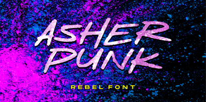 Proudly Presenting, Asher Punk a Rebel Handwritten Font. Asher Punk is perfect for any tittles, logo, product packaging, branding project, megazine, social media, wedding, or just used to express words above the background. Asher Punk also come with Multi-Lingual support. We highly recommend using a program that supports OpenType features and Glyphs panels like many of Adobe apps and Corel Draw, so you can see and access all Glyph variations. Enjoy the font, feel free to comment or feedback, send me PM or email. Thank You!
 - Partake by pentagonistudio,
$19.00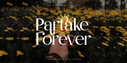 Partake Is A Classic Serif Fonts Inspired By Modern and Ligature Characters. SOFTWARE REQUIREMENTS : Fonts and alternate : No special software required they may be used in any basic program /website apps that allows standard fonts That's it folks! You can go ahead and get cracking :) Follow My Shop For Upcoming Updates Including Additional Glyphs And Language Support. And Please Message Me If You Want Your Language Included or If There Are Any Features or Glyph Requests, Feel Free to Send me A Message. Have a Good Day !
 - Bazar by Linotype,
$29.99German Designer Klaus Sutter digitized Bazar, a brush script typeface from the 1950s originally drawn by Imre Reiner (1900-1987) and published in 1956 by D. Stempel AG. Bazar is a calligraphic brush type free from accurate horizontal and vertical strokes and a contrast to the objective body type. It has a more static character and could be perfectly applied in headlines or as a figurative word mark. Like tradional chinese calligraphers, Imre Reiner was also a painter; this is reflected in the glyphs of Bazar. - Salvador History by Balpirick,
$15.00 Introducing by Balpirick Studio. Salvador History is a Handbrushed Script Font that's perfect for adding touch to your design projects! With its natural, organic feel and unique character. Crafted with care and attention to detail, this font is incredibly versatile and can be used for a range of design projects, including logos, branding, invitations, and more. Its modern, handwritten style gives it a unique character that's sure to make an impact. - also multilingual support Enjoy the font! Feel free to comment or feedback! Thank you!
 - Halimun Script Style by Creatype Studio,
$23.00 Halimun Script Style – a new modern & fresh script with a handwritten and script style makes this font looks elegant, natural, stylish, and perfect for any awesome projects that need handwriting taste. This font is perfect for photography, watermark, social media posts, advertisements, logos & branding, invitation, product designs, label, stationery, wedding designs, product packaging, special events, or anything that needs handwriting taste. Thanks for checking it out, and feel free to message me if you have any questions! say hello by e-mail: creatypestudioco@gmail.com
 - Margareth Rosinante by Creative17studio,
$12.00 Introducing "Margareth Rosinante" is a modern serif font family. With luxury and sophistication that are consistent with one another. Margareth Rosinante is designed for an epic comparison between serif and script styles. The stark contrast between the Margaret Rosinante serif and the script makes this font family always suitable to be paired with in any design. Features: - Two different font types (serif and script style) -Standard basic characters -Multilingual support -Numeral and punctuation -Many ligatures (serif) -Beginning and ending swashes (script) Any questions? Jus ask. Free updates,
 - Naofumi by Allouse Studio,
$16.00 Proudly Present, Naoufumi a Rough Brush Font. Naofumi come along with Multi-Lingual Support to fulfill your need. We highly recommend using a program that supports OpenType features and Glyphs panels like many of Adobe apps and Corel Draw, so you can see and access all Glyph variations. Naoufumi is perfect for any tittle, product packaging, branding project, megazine, social media, wedding, or just used to express words above the background. Enjoy the font, feel free to comment or feedback, send me PM or email. Thank You!
 - Magical by Zeenesia Studio,
$17.00 Introducing Marginal Marginal is a elegant display font with serif style. It's modern and classic font with a unique and deference look . Perfect if you need a dose of fun in your project. Perfect for editorial projects, Logo design, web font, clothing branding, product packaging, magazine headers, or simply as a stylish text overlay to any background image. We hope you enjoy the font, please feel free to comment if you have any thoughts or feedback. Thanks for purchasing and glad to help you!
 - Moglan by pentagonistudio,
$19.00 Moglan Is An Modern Ligature Serif Font Inspired By Modern Serif Typeface. SOFTWARE REQUIREMENTS : Fonts and alternate : No special software required they may be used in any basic program /website apps that allows standard fonts That's it folks! You can go ahead and get cracking :) Follow My Shop For Upcoming Updates Including Additional Glyphs And Language Support. And Please Message Me If You Want Your Language Included or If There Are Any Features or Glyph Requests, Feel Free to Send me A Message. Have a Good Day !
 - Kavo Sans by VP Creative Shop,
$20.00 Introducing Kavo Sans Serif typeface - 4 weights Kavo is clean, modern typeface with 4 weight, ligatures and multilingual support. It's a very versatile font that works great in large and small sizes. Kavo is perfect for branding projects, home-ware designs, product packaging, magazine headers - or simply as a stylish text overlay to any background image. Uppercase, numeral, punctuation & Symbol Light Regular Bold Black Multilingual support Feel free to contact me if you have any questions! Mock ups and backgrounds used are not included. Thank you! Enjoy!
 - Bloody Road by pentagonistudio,
$19.00 Bloody Road Is Brush Display Typeface Inspired By Modern and Bold Style. SOFTWARE REQUIREMENTS : Fonts and alternate : No special software required they may be used in any basic program /website apps that allows standard fonts That's it folks! You can go ahead and get cracking :) Follow My Shop For Upcoming Updates Including Additional Glyphs And Language Support. And Please Message Me If You Want Your Language Included or If There Are Any Features or Glyph Requests, Feel Free to Send me A Message. Have a Good Day !
 - Glafton PS by pentagonistudio,
$19.00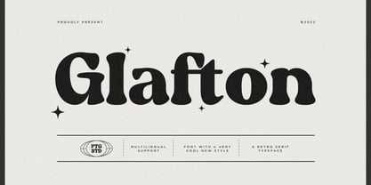 Glafton Is A Retro Serif Typeface Inspired By Retro and Vintage Style. SOFTWARE REQUIREMENTS : Fonts and alternate : No special software required they may be used in any basic program /website apps that allows standard fonts That's it folks! You can go ahead and get cracking :) Follow My Shop For Upcoming Updates Including Additional Glyphs And Language Support. And Please Message Me If You Want Your Language Included or If There Are Any Features or Glyph Requests, Feel Free to Send me A Message. Have a Good Day !
 - Brogi by Factory738,
$15.00 Brogi is a stylish sans serif font designed specifically for logo and brand designs. Brogi exuded a sense of boldness and sophistication despite his menacing styles. Ligature fonts can be used for almost any purpose you can imagine. 10 Weights (Light, Regular, Medium, Bold and Black) 2 Styles (Regular & Italic) Basic Latin A-Z and a-z Numerals & Punctuation Stylistic Ligatures Multilingual Support for ä ö ü Ä Ö Ü ... Free updates and feature additions Thanks for looking, and I hope you enjoy it.
 - Simplify by pentagonistudio,
$19.00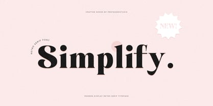 Simplify Is A Modern Display Character Inspired By Stylish and Cheek Style. SOFTWARE REQUIREMENTS : Fonts and alternate : No special software required they may be used in any basic program /website apps that allows standard fonts That's it folks! You can go ahead and get cracking :) Follow My Shop For Upcoming Updates Including Additional Glyphs And Language Support. And Please Message Me If You Want Your Language Included or If There Are Any Features or Glyph Requests, Feel Free to Send me A Message. Have a Good Day !
 - Evoria by pentagonistudio,
$19.00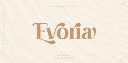 Evoria Is An Modern Stylish Font Inspired By Elegant Modern Stylish Serif. SOFTWARE REQUIREMENTS : Fonts and alternate : No special software required they may be used in any basic program /website apps that allows standard fonts That's it folks! You can go ahead and get cracking :) Follow My Shop For Upcoming Updates Including Additional Glyphs And Language Support. And Please Message Me If You Want Your Language Included or If There Are Any Features or Glyph Requests, Feel Free to Send me A Message. Have a Good Day !
 - Letterature by Kaer,
$21.00 Letterature is an elegant serif. I designed old-fashioned letters with playful ligatures. The font may be used for creating classical printing, logo design, clothing embroidery, product packaging, vintage header, luxury identity, etc. What you will get: * Uppercase and lowercase * Ligatures * Multilingual support * Numbers * Symbols * Punctuation To have a look at all the ligatures in the font you may open the glyphs panel: In Photoshop go to Window - glyphs In Illustrator go to Type - glyphs Please feel free to request to add characters you need: kaer.pro@gmail.com
 - Robuka PS by pentagonistudio,
$14.00 Robuka Is A Modern Serif Font with Stylistic Alternates and Ligatures. SOFTWARE REQUIREMENTS : Fonts and alternate: No special software is required they may be used in any basic program /website app that allows standard fonts That's it, folks! You can go ahead and get cracking :) Follow My Shop For Upcoming Updates Including Additional Glyphs And Language Support. And Please Message Me If You Want Your Language Included or If There Are Any Features or Glyph Requests, Feel Free to Send me A Message. Have a Good Day!
 - Noble Criatura by pentagonistudio,
$19.00 Noble Criatura Is A Display Font Combinated with Sans/Serif Typefaces. SOFTWARE REQUIREMENTS : Fonts and alternate : No special software required they may be used in any basic program /website apps that allows standard fonts That's it folks! You can go ahead and get cracking :) Follow My Shop For Upcoming Updates Including Additional Glyphs And Language Support. And Please Message Me If You Want Your Language Included or If There Are Any Features or Glyph Requests, Feel Free to Send me A Message. Have a Good Day !
 - The Buntro by Ironbird Creative,
$15.00 The Buntro is a Display Typeface designed with carefully crafted. Comes with 2 Styles, Regular and Outline. This is a simple yet refined All-Caps Typeface. Also suitable for Branding & Packaging, Poster Design, T-shirt, Tattoo Design, Logotype, and any project. Support multilingual, number and symbol, alternates, and already PUA Encoded. What's inculded? The Buntro Regular The Buntro Outline Multilingual Support many different languages. Included AÀÁÂÃÄÅCÇDÐEÈÉÊËIÌÍÎÏNÑOØÒÓÔÕÖUÙÜÚÛWYÝiŸỲŸÆŒßÞþ We hope you enjoy the font, please feel free to comment if you have any thoughts or feedback.
 - Cryachy by pentagonistudio,
$19.00 Cryachy Is A Modern Display Character Inspired By Stylish and Edge Style. SOFTWARE RQUIREMENTS : Fonts and alternate : No special software required they may be used in any basic program /website apps that allows standard fonts That's it folks! You can go ahead and get cracking :) Follow My Shop For Upcoming Updates Including Additional Glyphs And Language Support. And Please Message Me If You Want Your Language Included or If There Are Any Features or Glyph Requests, Feel Free to Send me A Message. Have a Good Day !
 - Smalkis by Gatype,
$14.00 Smalkis This beautiful script is for those who need elegance and style for their designs and is perfect for wedding invitations, save the date cards and feminine branding. Smalkis includes a full set of Basic Uppercase and Lowercase Characters, Numbers and Punctuation. Also contains ligatures and many stylistic alternatives to perfectly recreate natural calligraphy (check the preview to see all of them) What will you get? Smalkis (OTF) If you have any questions about my products, feel free to write a message on the side.
 - Chavak by pentagonistudio,
$19.00 Chavak Is A Modern Serif Font Inspired By Sleek and Exotic Style. SOFTWARE REQUIREMENTS : Fonts and alternate : No special software required they may be used in any basic program /website apps that allows standard fonts That's it folks! You can go ahead and get cracking :) Follow My Shop For Upcoming Updates Including Additional Glyphs And Language Support. And Please Message Me If You Want Your Language Included or If There Are Any Features or Glyph Requests, Feel Free to Send me A Message. Have a Good Day !
 - Astrena by pentagonistudio,
$19.00 Astrena Is An Victorian Vintage Display Typeface Inspired By Nostalgic Characters. SOFTWARE REQUIREMENTS : Fonts and alternate : No special software required they may be used in any basic program /website apps that allows standard fonts That's it folks! You can go ahead and get cracking :) Follow My Shop For Upcoming Updates Including Additional Glyphs And Language Support. And Please Message Me If You Want Your Language Included or If There Are Any Features or Glyph Requests, Feel Free to Send me A Message. Have a Good Day !
 - Mentone by Paragraph,
$18.00 Mentone is a new general purpose typeface, an attempt at extending the line of the great sans-serifs of the previous century, Frutiger - Stone Sans - Myriad. The font has round corners and subtle chamfers, which are all but invisible at text sizes, but add an upbeat, irreverent expression at display sizes. The typeface is named after the beautiful bayside suburb of Melbourne, Australia, where the designer lives. This new version (2.01) was spaced and kerned by Igino Marini of iKern. The semibold cuts are now free!
 - Blistering by Olivetype,
$18.00 Say hello to Blistering, a cool and versatile brush typeface that can make any design stand out. With its scratchy texture and care free feel, this font can be used for any design style or project. Whether you need an energetic typeface for logos, a hipster font for a clothing line, or a retro brush font for branding. Blistering has the personality to fit any style. So what’s included : Basic Latin Uppercase and Lowercase Numbers, symbols, and punctuations Ligatures Multilingual Support Simple Installations Works on PC & Mac
 - Arayara by SemutHitam,
$15.00 Introducing Arayara Script Font. Arayara Script is modern and elegant font script. Comes with many opentype feature, upper and lower case standard character, punctuation and numerals, multilingual characters, ligatures, stylistic alternates, beginning and ending, and many more glyph. Perfect for personal and commercial use your company logo, branding, poster, flyers, greetings, invitation, book cover, quotes, and many more. We hope you enjoy with Arayara Script. Feel free to comment and give any feedback to build more good font. Thanks for your purchasing, and Happy creating... :)
 - Crust and Crumbs Brush by Redy Studio,
$10.00 Discover the perfect pairing for your culinary creations with the Crust and Crumbs Foodie Font Duo, featuring a harmonious blend of rounded sans-serif and expressive brush fonts. Whether you're a food blogger, restaurant owner, or a passionate home cook, this font duo is designed to add a delectable touch to your food-related designs. Feel free to give me a message if you have a problem or question. Thank you so much for taking the time to look at one of our products. ~Redy
 - Mockgent by pentagonistudio,
$19.00 Mockgent Is A Blackletter Font Inspired By Sleek and Gothic Style. SOFTWARE REQUIREMENTS : Fonts and alternate: No special software is required they may be used in any basic program /website apps that allows standard fonts That's it folks! You can go ahead and get cracking :) Follow My Shop For Upcoming Updates Including Additional Glyphs And Language Support. And Please Message Me If You Want Your Language Included or If There Are Any Features or Glyph Requests, Feel Free to Send me A Message. Have a Good Day!
 - The FD Deer Deer font, crafted by Font Duster, is an artistic typeface that beautifully captures the essence of spontaneity and creativity. Its design is characterized by free-flowing and loosely str...
- Delirium by PizzaDude is a font that encapsulates a playful, whimsical essence, embodying a sense of free-spiritedness and spontaneity. True to its name, Delirium engulfs the viewer in a feverish dre...
- Winter Claus by Yoga Letter,
$14.00 "Winter Claus" is a unique display font decorated with Christmas hats, Christmas trees and churches. This font is perfect for Christmas, winter, and more. Equipped with uppercase, lowercase, uppercase alternates, swash, titling, lowercase alternates, numeral, punctuation and multilingual support.
 - This free pocket calculator font looks very clean and useful. I really like how it supports numbers, symbols, and many special characters, which makes it perfect for calculator apps, math tools, or d...
- Areplos by Storm Type Foundry,
$53.00To design a text typeface "at the top with, at the bottom without" serifs was an idea which crossed my mind at the end of the sixties. I started from the fact that what one reads in the Latin alphabet is mainly the upper half of the letters, where good distinguishableness of the individual signs, and therefore, also good legibility, is aided by serifs. The first tests of the design, by which I checked up whether the basic principle could be used also for the then current technology of setting - for double-sign matrices -, were carried out in 1970. During the first half of the seventies I created first the basic design, then also the slanted Roman and the medium types. These drawings were not very successful. My greatest concern during this initial phase was the upper case A. I had to design it in such a way that the basic principle should be adhered to and the new alphabet, at the same time, should not look too complicated. The necessary prerequisite for a design of a new alphabet for double-sign matrices, i.e. to draw each letter of all the three fonts to the same width, did not agree with this typeface. What came to the greatest harm were the two styles used for emphasis: the italics even more than the medium type. That is why I fundamentally remodelled the basic design in 1980. In the course of this work I tried to forget about the previous technological limitations and to respect only the requirements then placed on typefaces intended for photosetting. As a matter of fact, this was not very difficult; this typeface was from the very beginning conceived in such a way as to have a large x-height of lower-case letters and upper serifs that could be joined without any problems in condensed setting. I gave much more thought to the proportional relations of the individual letters, the continuity of their outer and inner silhouettes, than to the requirements of their production. The greatest number of problems arose in the colour balancing of the individual signs, as it was necessary to achieve that the upper half of each letter should have a visual counterbalance in its lower, simpler half. Specifically, this meant to find the correct shape and degree of thickening of the lower parts of the letters. These had to counterbalance the upper parts of the letters emphasized by serifs, yet they should not look too romantic or decorative, for otherwise the typeface might lose its sober character. Also the shape, length and thickness of the upper serifs had to be resolved differently than in the previous design. In the seventies and at the beginning of the eighties a typeface conceived in this way, let alone one intended for setting of common texts in magazines and books, was to all intents and purposes an experiment with an uncertain end. At this time, before typographic postmodernism, it was not the custom to abandon in such typefaces the clear-cut formal categories, let alone to attempt to combine the serif and sans serif principles in a single design. I had already designed the basic, starting, alphabets of lower case and upper case letters with the intention to derive further styles from them, differing in colour and proportions. These fonts were not to serve merely for emphasis in the context of the basic design, but were to function, especially the bold versions, also as independent display alphabets. At this stage of my work it was, for a change, the upper case L that presented the greatest problem. Its lower left part had to counterbalance the symmetrical two-sided serif in the upper half of the letter. The ITC Company submitted this design to text tests, which, in their view, were successful. The director of this company Aaron Burns then invited me to add further styles, in order to create an entire, extensive typeface family. At that time, without the possibility to use a computer and given my other considerable workload, this was a task I could not manage. I tried to come back to this, by then already very large project, several times, but every time some other, at the moment very urgent, work diverted me from it. At the beginning of the nineties several alphabets appeared which were based on the same principle. It seemed to me that to continue working on my semi-finished designs was pointless. They were, therefore, abandoned until the spring of 2005, when František Štorm digitalized the basic design. František gave the typeface the working title Areplos and this name stuck. Then he made me add small capitals and the entire bold type, inducing me at the same time to consider what to do with the italics in order that they might be at least a little italic in character, and not merely slanted Roman alphabets, as was my original intention. In the course of the subsequent summer holidays, when the weather was bad, we met in his little cottage in South Bohemia, between two ponds, and resuscitated this more than twenty-five-years-old typeface. It was like this: We were drinking good tea, František worked on the computer, added accents and some remaining signs, inclined and interpolated, while I was looking over his shoulder. There is hardly any typeface that originated in a more harmonious setting. Solpera, summer 2005 I first encountered this typeface at the exhibition of Contemporary Czech Type Design in 1982. It was there, in the Portheim Summer Palace in Prague, that I, at the age of sixteen, decided to become a typographer. Having no knowledge about the technologies, the rules of construction of an alphabet or about cultural connections, I perceived Jan Solpera's typeface as the acme of excellence. Now, many years after, replete with experience of revitalization of typefaces of both living and deceased Czech type designers, I am able to compare their differing approaches. Jan Solpera put up a fight against the digital technology and exerted creative pressure to counteract my rather loose approach. Jan prepared dozens of fresh pencil drawings on thin sketching paper in which he elaborated in detail all the style-creating elements of the alphabet. I can say with full responsibility that I have never worked on anything as meticulous as the design of the Areplos typeface. I did not invent this name; it is the name of Jan Solpera's miniature publishing house, in which he issued for example an enchanting series of memoirs of a certain shopkeeper of Jindrichuv Hradec. The idea that the publishing house and the typeface might have the same name crossed my mind instinctively as a symbol of the original designation of Areplos - to serve for text setting. What you can see here originated in Trebon and in a cottage outside the village of Domanín - I even wanted to rename my firm to The Trebon Type Foundry. When mists enfold the pond and gloom pervades one's soul, the so-called typographic weather sets in - the time to sit, peer at the monitor and click the mouse, as also our students who were present would attest. Areplos is reminiscent of the essential inspirational period of a whole generation of Czech type designers - of the seventies and eighties, which were, however, at the same time the incubation period of my generation. I believe that this typeface will be received favourably, for it represents the better aspect of the eighties. Today, at the time when the infection by ITC typefaces has not been quite cured yet, it does absolutely no harm to remind ourselves of the high quality and timeless typefaces designed then in this country.In technical terms, this family consists of two times four OpenType designs, with five types of figures, ligatures and small capitals as well as an extensive assortment of both eastern and western diacritics. I can see as a basic text typeface of smaller periodicals and informative job-prints, a typeface usable for posters and programmes of various events, but also for corporate identity. Štorm, summer 2005 - ITC Novarese by ITC,
$40.99 Novarese font is the work of designer Aldo Novarese. He created 218 typeface cuts but as he was writing his book, Alfabeta, he decided to include only those he considered indispensable. He divided his fonts into 4 categories and in the designing of Novarese, took the best characteristics of each group and combined them into this font. In the style of Latin stone scripts of the second century BC. Novarese is a well-balanced and relatively wide text font with classic forms. ITC Novarese™ font field guide including best practices, font pairings and alternatives.
 - Woodland Doodles by Outside the Line,
$19.00 An eye-pleasing collection of 31 Woodland Doodles. Illustrations of 11 trees--traditional and contemporary. A branch, animals, cabin, acorn, flower, leaves, mushrooms, bird’s nest, pine cone and birds on a branch. Coordinating nicely with Lake Vacation Doodles or Farm Doodles .
 - Nawin Latin by Letterjuice,
$66.00 Nawin is an informal Arabic typeface inspired by handwriting. The idea behind this design is to create a type family attractive and ownable for children but at the same time a design that keeps excellent letter recognition for reading. Handwriting has been a great source of inspiration in this particular typeface. By emulating the movements of the pen, we have obtained letter shapes that express spontaneity. A bright group of letters create a lively and beautiful paragraph of text. To get closer to handwriting and the variety of letter shapes that we draw while writing, this typeface offers a large number of alternative characters, which differ slightly from the default ones. Because we have programed the «Contextual Alternate» feature in the fonts, these alternate characters appear automatically as you set a text on your computer. For instance, in the Arabic variability on vertical proportions between letters Alef and initial Lam, create movement in text and avoid the cold mechanical feel of repetition. In the case of the Latin a part from having an entire alternate basic alphabet, there are also different letterforms for characters with diacritics, this way variability becomes even greater. Nawin is quirky and elegant at the same time. Letter recognition is relevant when reading continuous text. For this reason, in the Arabic, we have added another contextual alternate feature with alternate characters that help to avoid confusion when letters with similar or the same shape repeat inside one word. This is the case of medial «beh and Yeh» repeated three times continuously in the same word. The alternate characters change in shape and length, facilitating distinction to the reader. Since this typeface is inspired by handwriting and the free movement of the hand while writing, we considered ligatures a good asset for this design. The Arabic has a wide range of ligatures that enhance movement and fluidity in text making look text alive, while the Latin achieves this same effect via contextual alternates.
 - Nawin Arabic Ltn by Letterjuice,
$107.00 Nawin is an informal Arabic typeface inspired by handwriting. The idea behind this design is to create a type family attractive and ownable for children but at the same time a design that keeps excellent letter recognition for reading. Handwriting has been a great source of inspiration in this particular typeface. By emulating the movements of the pen, we have obtained letter shapes that express spontaneity. A bright group of letters create a lively and beautiful paragraph of text. To get closer to handwriting and the variety of letter shapes that we draw while writing, this typeface offers a large number of alternative characters, which differ slightly from the default ones. Because we have programed the «Contextual Alternate» feature in the fonts, these alternate characters appear automatically as you set a text on your computer. For instance, in the Arabic variability on vertical proportions between letters Alef and initial Lam, create movement in text and avoid the cold mechanical feel of repetition. In the case of the Latin a part from having an entire alternate basic alphabet, there are also different letterforms for characters with diacritics, this way variability becomes even greater. Nawin is quirky and elegant at the same time. Letter recognition is relevant when reading continuous text. For this reason, in the Arabic, we have added another contextual alternate feature with alternate characters that help to avoid confusion when letters with similar or the same shape repeat inside one word. This is the case of medial «beh and Yeh» repeated three times continuously in the same word. The alternate characters change in shape and length, facilitating distinction to the reader. Since this typeface is inspired by handwriting and the free movement of the hand while writing, we considered ligatures a good asset for this design. The Arabic has a wide range of ligatures that enhance movement and fluidity in text making look text alive, while the Latin achieves this same effect via contextual alternates.
 - Calevor by DM Studio,
$15.00 The Calevor Elegant Font is a sophisticated and refined typeface that embodies timeless beauty and a touch of class. With its graceful letterforms and stylish design, this font adds an air of elegance and professionalism to your branding, invitations, editorials, and various design projects. Features: Elegant and Timeless Style: The Calevor Elegant Font exudes a timeless and sophisticated aesthetic. Its graceful letterforms, balanced proportions, and stylish design create an atmosphere of refined elegance, making it perfect for projects that demand a touch of class and sophistication. Refined Design: The font's design is characterized by its clean lines and harmonious curves. It's meticulously crafted to ensure every detail reflects the epitome of elegance, making it suitable for projects that require a polished and professional look. Versatile Application: This font is versatile and well-suited for a wide range of design projects where an elegant and timeless typeface is needed. Use it in branding, invitations, editorial design, luxury packaging, and more to add an element of sophistication and class to your designs. Uppercase and Lowercase Letters: The font includes both uppercase and lowercase letters, providing flexibility and creative freedom in your designs. Mix and match the cases to create visually appealing and balanced typography. Punctuation and Symbols: In addition to the alphabet, the Calevor Elegant Font includes a comprehensive set of punctuation marks, numerals, and common symbols. This ensures consistency and ease of use when incorporating the font into your design projects. Easy to Use: Installing and utilizing the Calevor Elegant Font is hassle-free. It is compatible with both Windows and Mac operating systems and seamlessly integrates into popular design software such as Adobe Photoshop, Illustrator, and InDesign. This ensures a smooth and efficient design workflow. Elevate your designs with the timeless elegance of the Calevor Elegant Font. Let its graceful letterforms and refined design add an air of sophistication and professionalism to your branding, invitations, and various design projects. Embrace the classic beauty of this font and create designs that exude elegance and style.
 - Odile by Kontour Type,
$50.00 Odile is a text typeface with bracketed head and bracket-free bottom lower case serifs, a quality that counters rigidness most traditional slab serif typefaces possess. This contemporary design draws inspiration from an experimental typeface named Charter originally designed by the American book and type designer William Addision Dwiggins. It consisted of an informal lowercase alphabet, a narrow seemingly non-inclined vertical letter with script attributes, featuring non-joining letterforms. Dwiggins’ contemplated Charter as the italic companion to Arcadia, Experimental No. 221. The Charter project progressed sporadic stalled during the Second World War and came to a halt in 1955. Charter remained incomplete and was never commercially released. Assessing Charter’s whimsical design, its fragments were rethought and developed into a comprehensive text family. Odile Upright Italic reveals recognizable similarities shared by Dwiggin’s Charter and defines the design approach for the family. The steep calligraphic outstroke and low junctions off the stem as in the upright italic “n” or “r”, for example, are gradually lessened in the italic and moved up for the roman weights. The six optically balanced weights range from the delicate Light to stark Black, accompanied by display variants with feminine flair and ardent Ornaments. Two sorts of Initials, one amplified with interweaving swashes, the other more restrained, both are clearly derived from the Upright Italic. This mid-contrast serif offers a wide range of tools for text and display typographies with a palette of strict to playful. This family shines in magazine, book and display use. The graceful serifed type harmonizes perfectly with Elido, Odile’s sans companion. Sans and serif share the family array and OpenType features in perfect tune. Odile offers an extensive character set, numerous OT features including roman and italic Small Caps, five sets of numerals, alluring ligatures, and many more. OT stylistic variants (with accents) offer a one-story “a” for the roman weights, alternate “g” and “s” designs for the italics, and a variant “s” for the Upright Italic.
 - Honey Florist - Personal Use - Personal use only

