6,800 search results
(0.018 seconds)
- Alien Alphabet by ParaType,
$25.00Alien Alphabet is inspired by the ideas of change, transformation, creative deconstruction and mutual penetration of various cultures, languages, and opposing cognitive systems, which seem to be prevalent in our 'globalized' civilization. It appears as various visual constructs -- archetypal symbolism, pieces of the world alphabets, socio-cultural icons, mathematical formulae, etc., -- broke down into pieces and were reassembled in a way that carried traces of previous meanings. However, this contradictory mutation invokes enigmatic meanings and emotions begging for further definition and interpretation. Alien Alphabet shapes arranged in linear sequential manner tend to evoke a sense of written language. The fact that a message cannot be understood does not really change its emotional appeal. Moreover, the less message can be deciphered, the more seems to be the appeal -- for it triggers our imagination. In fact, we may not want to know the actual meaning because deep inside we are afraid that this might be just another alien dry-cleaning receipt. - Fry's Alphabet by Intellecta Design,
$25.90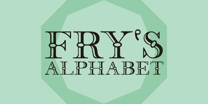
- Bree - Personal use only

- Freeze! - Unknown license

- Fred by E-phemera,
$20.00The Fred family is based on the casual hand lettering of Fred G. Cooper: cover artist, cartoonist, and letterer for Life magazine in the 1920s and '30s. His relaxed style captures the flavor of the Roaring Twenties, and the digital font was developed for use in the credits and title cards for a 1920s-style silent movie, The Call of Cthulhu. In an effort to keep the hand-lettered look, the OpenType font has numerous discretionary ligatures and contextual alternates, along with fleurons and ornaments. - Dree by VP Creative Shop,
$14.00 Introducing Dree - typeface - 6 serif and display fonts Dree is creative and minimal typeface loaded with 6 fonts and multilingual support. It's a very versatile font that works great in large and small sizes. This font is perfect for branding projects, home-ware designs, product packaging, magazine headers - or simply as a stylish text overlay to any background image. FEATURES Uppercase, lowercase, numeral, punctuation & Symbol Serif and Display Alternate Italics Multilingual support No special software is required to type out the standard characters of the Typeface. Canva friendly Feel free to contact me if you have any questions! Mock ups and backgrounds used are not included. Thank you! Enjoy!
 - Bree by TypeTogether,
$37.50 The Bree font family is a spry sans serif by Veronika Burian and José Scaglione that delivers a spirited look and feel for branding and headline usage. As an upright italic, Bree shows a pleasant mix of rather unobtrusive capitals with more vivid lowercase letters, giving text a lively appearance. Bree is clearly influenced by handwriting. As such, some of its most characteristic features are the single-story ‘a’, the cursive ‘e’, the outstroke curves of ‘v’ and ‘w’, the flourished ‘Q’, and the fluid shapes of ‘g’, ‘y’, and ‘z’. Alternates of these letters are available when a more neutral look is desired. Bree has a touch of cheekiness, a wide stance for each character, and an extra-large x-height. All this adds up to a big personality, so even when set in small text there is no skimming past the words Bree voices. In 2019, the Bree font family got a huge update. A few shapes were updated or added (the ‘k’ and German capital ‘ß’), two entirely new weights were added (Book and Book Italic), and spacing was perfected. More than that, Vietnamese support was added to Bree Latin, and the Bree Greek and Bree Cyrillic scripts were designed from scratch to parallel the Latin’s tone. Additionally, Bree was designed in variable font format for those who want complete control over the font’s appearance while simultaneously saving digital weight in the form of kilobytes and megabytes. Bree is in the perfect position for the next digital revolution. The complete Bree font family, along with our entire catalogue, has been optimised for today’s varied screen uses. Bree has been chosen for such wide-ranging uses as Breast Cancer Awareness Month in the US, the branding for the country of Peru, and numerous layouts including mobile apps, magazines, newspapers, and books. Awards – Tipos Latinos exhibition 2008 – Several best-of-the-year typeface lists of 2008 MyFonts Top 10 Fonts of 2008 Smashing Magazine: 60 Brilliant Typefaces For Corporate Design https://www.smashingmagazine.com/2008/03/60-brilliant-typefaces-for-corporate-design/ Die besten Schriften 2008 http://www.fontwerk.com/619/die-besten-schriften-2008/ – Selected for Typographica’s Best Typefaces of 2008 – Won Bronze for Original Typeface in the 2009 European Design Awards
 - Xree by Katatrad,
$22.00 - Linotype Alphabat by Linotype,
$29.99Jan Tomáš studied at the Universität der Künste, Berlin. He is a multi-talent – the author of many ideas, a font creator, designer, modeller, technician and web designer. In 2011, he founded Future Typo, the first web portal for advanced typography with original design typefaces and 3D typefaces. When you look closely to Linotype Alphabat, the figures start to change from letters into flying bats and scary faces. Linotype Alphabat can be used for very short texts however it is particularly effective for headlines in larger point sizes so that its details are emphasized. - Growing Script free - Personal use only

- SKETCHUP FREE TRIAL - Personal use only

- Octin Sports Free - 100% free

- Octin Prison Free - 100% free

- walker free style - Unknown license

- Octin College Free - 100% free

- Octin Vintage Free - 100% free

- Scooter Boy Free - Unknown license

- Sui Generis Free - Unknown license

- Neuropol X Free - Unknown license

- Octin Spraypaint Free - 100% free

- Chinese Rocks Free - Unknown license

- Fenwick Outline Free - Unknown license

- Fat Free Solid - Unknown license

- BoumBoum (Free version) - Unknown license

- Fancy Free JNL by Jeff Levine,
$29.00 Up until the late 1920s, it was a popular habit in American songwriting to use African Americans as the topic of compositions using denigrating themes, words and even exaggerated character illustrations on the covers of the published sheet music. One such example of what was considered "entertainment" for its time was a piece entitled "Little Black Me". While this now socially and morally unacceptable piece of forgettable tripe is collected by some only for the historical documentation of the times they reflected, one good "positive" came out of this negative chapter of our country's musical heritage: The beautiful floral ornamented letters in the song's title has yielded Fancy Free JNL. Originally hand-lettered on an arc, these spurred Roman letters have been re-drawn, and are offered in both the regular design and a companion version with the ornamentation removed for lettering that is less ornate.
 - Free Form Deco by Jeff Levine,
$29.00 Toward the end of the 1920s, Art Deco influences were starting to creep into modern design. The hand lettered title on the cover of the1928 sheet music for “Fascinatin’ Vamp” not only embraced the new Deco movement, but sent it on a wild typographic ride. Letters of mixed thicknesses and stylings made up the two word title, and this unusual group of letter shapes became the inspiration for Free Form Deco JNL, which is available in both regular and oblique versions.
 - Sultan Free Bold by Sultan Fonts,
$19.99 Sultan free is an Arabic text typeface for desktop applications. Sultan free is a freestyle script. It is available in One style, calligraphic, and very dynamic. This makes it suitable for large display sizes, especially in the area of advertising, while still functioning well as a text face. The font includes a support for Arabic, Persian, and Urdu. Sultan free typeface comes with many opentype features.
 - Two Beers Free by SynFonts,
$39.00 - a picture alphabet - Unknown license

- D3 Mouldism Alphabet - Unknown license

- D3 Factorism Alphabet - Unknown license

- D3 Skullism Alphabet - Unknown license

- Victorian Alphabets W by Intellecta Design,
$20.00 Victorian Alphabets is a incoming family of complete victorian style alphabets, researched and developed upon a comprehensive number of vintage books, magazines and catalogues from XIX century. The "Victorian Alphabets W" font has just W' designs, performing 52 different W's to your use. Here at MyFonts you can get more TWENTY fonts of this family, wih a very and atractive array of alphabets and letters to complete your artwork
 - Cinzeled Victorian Alphabet by Intellecta Design,
$28.90 Cinzeled Victorian Alphabets is a bold and imposing display font. Add it to your creative ideas and notice how it makes them stand out! Letters crafted to obtain the cinzeled style from the press works from XVIII and XIX centurys.
 - Alphabet Of Death by Celebrity Fontz,
$24.99The Alphabet of Death font is inspired by the work of Hans Holbein the Younger. This series of Northern-Renaissance-style woodcut letters shows the figure of Death in many disguises, confronting individuals from all walks of life and intervening directly in scenes of everyday life. As depicted in this detailed alphabet, Death is sometimes the dispenser of justice, denouncing greed and the abuse of power. At other times, Death plays the role of a friend or a servant. This unique font includes one set of A-Z ornamental initials conveniently assigned to both the upper- and lower-case alphabet characters and is perfect for starting off the beginning of paragraphs in artistic publications, storybooks, fairy tales, biblical texts, and any written work conveying the expressive style of typography in the 1500s. - Victorian Alphabets I by Intellecta Design,
$20.00 Victorian Alphabets I is an incredibly cool and classic display font. Elegant and distinct, this font will most certainly elevate your creations. Add it confidently to your projects, and you will love the results. You have a great set of letters "I" using the uppercases, lowercases and numbers keys on the keyboard.
 - Alphabet Soup Pro by Red Rooster Collection,
$60.00 Steve Jackaman. In the early 1980's, Steve worked at Typographic House in Boston, Massachusetts. At the time, 'Typo' House, as it was affectionately known, was the largest type house in New England. This font was designed and produced during his tenure. The design was so popular that it became available commercially through VGC, and was known as TH Alphabet Soup. Completely redrawn and remastered, Alphabet Soup Pro contains all the high-end features expected in a quality OpenType Pro font.
 - American Sign Alphabet by Deniart Systems,
$10.00 This font can be used as a play'n learn tool to teach the meaning of these modern day communication symbols. Each alphabetical character can be printed with or without the corresponding roman symbols. NOTE: comes with an interpretation guide in pdf format.
 - Doodles the Alphabet by Outside the Line,
$19.00 Doodles the Alphabet was designed to coordinate with Doodles the picture font. Doodles received honorable mention in U&lc’s First Annual Type Design Competition in the Picture Category.
 - Kate Greenaway's Alphabet by Wiescher Design,
$49.50 Some time ago I bought my smallest book ever: Kate Greenaway’s Alphabet* 57 x 72 mm. I thought it was the sweetest little book I had ever seen. Not knowing about the fame of the designer Kate Greenaway (1846-1901), I put it in some dark drawer and looked at it from time to time. Kate’s books were all outstanding successes in English publishing history; she was an icon of the Victorian era. Some of those books are still being reprinted today. This little gem I had accidentally acquired has become very rare and I have not found any reprints yet. So I thought maybe I could adapt her drawings for use on today’s computers. I ventured to redraw her delicate illustrations, blowing them up 300 percent, being forced to simplify them without losing her touch. It took quite some time! While redrawing them, I discovered that she most certainly drew them in at least three different sessions as well. Then I scanned my drawings and put them in a font. To make the font more usable, I added the ten numerals in Kate’s style; the original does not have those. I hope she would have liked my adaptations. Yours in a very preserving mood, Gert Wiescher. * Kate Greenaway’s Alphabet, edited by George Rutledge & Sons, London and New York, ca. 1885.


