10,000 search results
(0.047 seconds)
- Beach Party by Cititype,
$9.00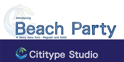 Beach Party is a cute and casual display font with an incredibly friendly feel. Whether you’re looking for fonts for Instagram or calligraphy scripts for DIY projects, this font will turn any creative idea into a true piece of art!
 - Abstract by Los Andes,
$29.00 Abstract is a contemporary and eclectic serif typeface inspired by today's life and created in times of pandemic. This family includes a true italic variant —that has its own personality— alternates, lining and old style figures, numerators and denominators & Cyrillic support.
 - The Comic Struves by Stringlabs Creative Studio,
$25.00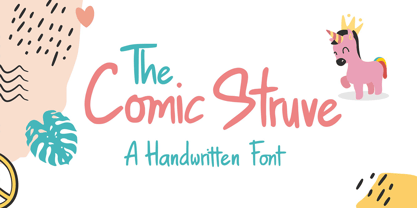 The Comic Struve is a cute and casual display font with an incredibly friendly feel. Whether you’re looking for fonts for Instagram or calligraphy scripts for DIY projects, this font will turn any creative idea into a true piece of art!
 - American Bulldog by Letterara,
$12.00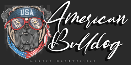 American Bulldog is a magical handwritten font carefully created with a touch of elegance. This enchanting font will turn any creative idea into a true standout. Get creative with its unique look, and use it to brighten up any crafting project.
 - Chivel Mind by Stringlabs Creative Studio,
$29.00 The Chivel Mind is a new vintage font. The combination of class and a nostalgic, retro feel make this font a true standout. It’s inspired by old-school caps and labels, and will turn any design project into a historical masterpiece.
 - Honey Jar by Typefactory,
$14.00 Honey Jar is a bold and modern display font, carefully handcrafted to become a true favorite. This font will look outstanding in any context, whether it’s being used on busy backgrounds or as a standalone headline, especially on natural farm theme !
 - The Kedleston by Putracetol,
$28.00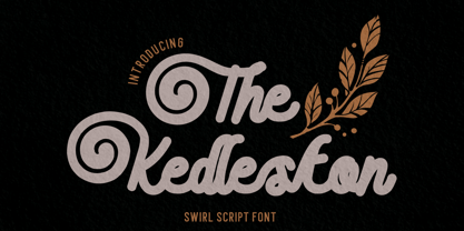 Introducing The Kedleston - Swirl Script Font, a monoline typeface that gracefully combines the elegance of script with unique swirling swashes. This font is a true testament to the beauty of simplicity and sophistication. With its alternative characters adorned with captivating swirls.
 - Tropica Script by ITC,
$29.00Tropica Script was designed by Vince Whitlock, a casual, lighthearted script typeface. The initial capitals are complemented by a lowercase that connects by overlapping the linking elements on the bottom right of each letter, creating the look of true script. - Demian by ITC,
$29.99Demian is the work of Dutch designer Jan Van Dijk. It is an informal script font whose capitals should serve as initials to the word settings of the lower case letters. Demian has the spontaneous, flowing look of true handwriting. - Lemon Rolls by Illushvara,
$12.00 Lemon Rolls is a cute and casual handwritten font with an incredibly friendly feel. Whether you’re looking for fonts for Instagram or calligraphy scripts for DIY projects, this font will turn any creative idea into a true piece of art!
 - Lenga by Eurotypo,
$29.90 Lenga is a kind of beech originally from South America. The explorers who discovered this beech in Tierra del Fuego, thought it looked like a tree from their home country and named it 'Lenga'. Like many of southern hemisphere beeches, the Lenga beech is fast growing and hardy, making it an ideal timber tree. It regenerates easily after fires. The wood has good quality, moderate durable, and easy to work. The Lenga fonts were inspired in the nobility, robustness and flexibility of those trees. They have a distinctive personality within contemporary atmosphere. These fonts are quite appropriate for headlines, subheadings and with its text flow works very well for long texts. Their legibility is suitable for editorial purposes mainly in newspapers and magazines. Lenga comes in 16 styles carefully done in OpenType format. All styles contain standard and discretional ligatures, proportional lining figures, lining old style figures, scientific superior/inferior figures. The complete set supports Western European, Central and Eastern European languages.
 - Lindau by SIAS,
$39.90 Lindau is a new take on the Jensonian Roman typeface genre. The idea was to combine the Venetian proportions with a conical shaping of the vertical parts. Lindau may be considered an alternative to fonts like Jenson, Centaur, Trump Medieval or Deepdene. Suitable for ads, stationary, branding and label design, headlines and short to medium-length text bodies. Lindau is layed out with comprehensive character support for every Euro-Latin language.
 - Deaffont by Kustomtype,
$25.00 Deaffont is an experimental font specially designed for a music video and album concept by the metal band Deafcon. The font is entirely hand-drawn and digitized. It means that Deaffont is a very user-friendly, complete and modern font, which you can use for all your graphic applications. Deaffont is a subculture font that blows you away, ideal for an eye-catching design. Trust me, Deaffont rocks!
 - Drimba by Andrew Tomson,
$10.00 Hey, friends! How often do you share your social media posts? Modern man is already so used to them that he shares his emotions and feelings in them without hiding anything. We have begun to trust them. How to show a good mood? Of course, with a photo with a smile and a signature. This font is great for expressing your emotions. Good luck and love to you!
 - Runway by Canada Type,
$24.95 Runway is the font that will satisfy the need for speed in your design. Simple lines and curves, a commanding slant, and big sturdy shapes made to cruise at any speed or altitude, through summer breeze or horrible snowstorms. Runway was designed to be tight like an engine chain, powerful like the hum of the engine itself, and simply the best choice when it comes to strength and velocity in design. Initially Runway was meant to be a single font. But during the spacing and kerning stages, Patrick noticed that most of the letters, especially the vowels and the s, can clasp stylishly with the L or the T to make some really funky combinations. That's how the Alternates font was born. After building a few alternates and about 40 "clasped" combinations around the L and the T, the decision was made to take Runway to the next level: OpenType. The OpenType version of Runway is a single font that contains some serious font magic. Some of the many features the font includes: Over 430 characters for that great character map utility you have, automatic to-and-fro small-capping, discretionary ligatures that call up some pretty funky combinations automatically as you type, and a lot of stylistic and contextual alternates for many characters, ligatures and composites. If your design program of choice supports the features of OpenType fonts (Illustrator CS, Photoshop CS, InDesign CS), then you're in for a lot of enjoyment playing with Runway. For those who don't fancy OpenType or can't handle it, Runway is also available (in Regular, Caps and Alt styles) in the usual font formats for both Mac and PC.
 - Mimix by FSdesign-Salmina,
$39.00 Mimix is designed especially for comic fans and all typographers who like to play. It’s ideal to express spontaneity and the joy of life. Where Mimix is used, there’s life. The characters are lined in a row, a face looks out from the page. Big ears surround an oval head. A mouse moves without haste, but dynamic and modern through the lines. Mimix skillfully combines the elegance of a modern roman with the spontaneity of a casual handwriting. The mouse shows its versatile character in its broad range of use. Without exaggeration, it’s always delicate and elegant. The quiet form and good readability is a result of its moderate inclination. Well developed, Mimix includes ten weights from Ultrathin through Black. The free trial pack includes two weights with a reduced number of glyphs. If you like it you will be then be able to buy the fonts itself complete with ligatures, special characters for Eastern European languages, uppercase, lining and old style figures as well as fractions and different Opentype features. Declare war on desert lead – with Mimix, those with charm. Download a free trial version of Mimix with a reduced character set. Check it out!
 - Jugendstil Initials by HiH,
$16.00 Jugendstil Initials were designed by Heinrich Vogeler around 1905, based on the German blackletter tradition. A similar set of initials by Vogeler, but based on roman letters was released by Rudhardsche Geisserei of Offenbach at about this time. I believe the originals were woodcuts. The backgrounds to the letterforms may be seen as examples of Heimatkunst, an art movement within Germany that drew deliberate inspiration from the rural countryside. Like the Arts and Crafts Movement in England a little earlier, Heimatkunst may be seen, in part, as a romantic rejection of urban industrialization, while at the same time representing a back-to-roots nationalism. Like any river, it was fed by many streams. Jugendstil Initials is an experiment with which I am most pleased. It is far and away the most complex font HiH has produced and I was uncertain whether or not it could be done successfully. To oversimplify, a font is produced by creating outlines of each character, using points along the outline to define the contour. A simple sans-serif letter A with crossbar can be created using as few as 10 points. We decided to make a comparison of the number of points we used to define the uppercase A in various fonts. Cori, Gaiety Girl and Page No 508 all use 12 points. Patent Reclame uses 39 and Publicity Headline uses 43. All the rest of the A’s, except the decorative initials, fall somewhere in between. The initial letters run from 48 points for Schnorr Initials to 255 for Morris Initials Two, with 150 being about average. Then there is a jump to 418 points for Morris Initials One and, finally, to 1626 points for Jugendstil Initials. And this was only after we selectively simplified the designs so our font creation software (Fontographer) could render them. The average was 1678, not including X and Y. There was no X and Y in the original design and we have provided simple stand-ins to fill out the alphabet, without trying to imitate the style of the orginal design. We did a lot of looking to find a compatible lower case. We decided that Morris Gothic from the same period was the best match in color, design and historical context. We felt so strongly about the choice that we decided to produce our Morris Gothic font for the purpose of providing a lower case for Jugendstil Initials. The long s, as well as the ligatures ch and ck are provided. at 181, 123 (leftbrace) and 125 (rightbrace) respectively. This font was a lot of work, but I think it was worth it. I hope you agree.
 - Onamura by Balibilly Design,
$22.00 Initially, letterform was inspired by the gothic style of Romance decorative letters in transitional art in the Middle Ages. The conservative type in the Gothic era, especially in decorative romance, has led to the Victorian style being embedded in several forms as accents related but not forced to be combined. Rounded serif seems conventional combined with historically relevant letterform to create a harmonious blend. The art nouveau style also inspires this typeface. Approach to architectural ornamentation from 1880 to 1915, adopting the dynamic lines and curves typical of the civilization of the time. Continue time travel; we also present a more modern form influenced by the digitalization of art nouveau derivatives, familiarly called the psychedelic style. Paying homage to predecessors, we presented The Onamura font in a Japanese Ukiyo-e style that influenced the fine arts movement that broke old conservative art in Europe. We designed this font carefully with the information about the Middle Ages, Ukiyo-E, & Art Nouveau that greatly influenced art worldwide. In this font family, there are collaboration vibes. Both are the basis of the phenomenal blend of idealism between western and Japanese artists. Consisting of 10 fonts in 10 weights, it features an extended charset of over 850 glyphs, covering multilingual support, including Western European, Central European, and Southeastern European. Complete with advanced open type features like stylistic alternates, discretionary ligatures, ordinals, small caps, fractions, and case-sensitive forms. The elegant and refined details seen in this font provide a new aesthetic input, satisfy contemporary style, and give a range of choices for luxury typographic projects. This font is perfectly suited for high-impact headlines. Advance open-type features are stunning on logos, branding, magazines, website, etc. Supports languages: Afrikaans, Albanian, Asu, Basque, Bemba, Bena, Bosnian, Catalan, Cebuano, Chiga, Colognian, Cornish, Corsican, Croatian, Czech, Danish, Dutch, English, Estonian, Faroese, Filipino, Finnish, French, Friulian, Galician, Ganda, German, Gusii, Hungarian, Icelandic, Ido, Inari Sami, Indonesian, Interlingua, Irish, Italian, Javanese, Jju, Jola-Fonyi, Kabuverdianu, Kalaallisut, Kalenjin, Kinyarwanda, Kurdish, Latvian, Lithuanian, Lojban, Low German, Lower Sorbian, Luo, Luxembourgish, Luyia, Machame, Makhuwa-Meetto, Makonde, Malagasy, Malay, Maltese, Manx, Maori, Morisyen, North Ndebele, Northern Sami, Northern Sotho, Norwegian Bokmål, Norwegian Nynorsk, Nyanja, Nyankole, Occitan, Oromo, Polish, Portuguese, Romanian, Romansh, Rombo, Rundi, Rwa, Samburu, Sango, Sangu, Sardinian, Scottish Gaelic, Sena, Shambala, Shona, Slovak, Slovenian, Soga, Somali, South Ndebele, Southern Sotho, Spanish, Swahili, Swati, Swedish, Swiss German, Taita, Taroko, Teso, Tsonga, Tswana, Turkish, Turkmen, Upper Sorbian, Vunjo, Walloon, Welsh, Western Frisian, Wolof, Xhosa, Zulu
 - Range Sans by Eclectotype,
$36.00 This is Range Sans, the sans-serif counterpart to Range Serif . It can be categorized as a grotesque, with the idiosyncratic angular details from the serif family making themselves known in the arches and bowls of the lower case. The range of weights is larger than Range Serif, with two more weights at the lighter end of the spectrum. The weights from light to black correspond to their seriffed sisters, so can be interchanged with them freely while maintaining a similar text color and vertical metrics. This is useful for adding emphasis; Range Sans is deliberately lacking an italic, but the italics from Range Serif work better than you might expect in running text, particularly for the light and regular weights. Range Sans has a contemporary, somewhat geometric look that lends itself to uses such as corporate identities, minimalist graphic design, and logos. The middle weights do work well in running text, however, with the angled details being less noticeable at small sizes. Designed for demanding typography, supporting most Latin-based languages, Range Sans is equipped with true small caps for all weights, an array of numeral styles (proportional- and tabular- lining and oldstyle figures, small cap figures, numerators, denominators, superscripts and subscripts/scientific inferiors), automatic fractions, a set of useful arrows, case-sensitive forms, and a range of currency symbols including recent additions: Turkish Lira, Indian Rupee and Russian Ruble.
 - Gradl Max by Fresh Air Fonts,
$14.00 Max J. Gradl was a German jewelry designer. A Web search today turns up several examples of his work from the turn of the 20th century. He seemed to favor green stones in silver metalwork. Gradl also did advertising work and co-authored a book on architectural design. Most important for our purposes, though, are the incredible hand lettered alphabets and monograms the man left behind. I’ve digitized one of those delightful alphabets and tried to keep it true to the original. Beyond the base character set of letters, numerals and basic punctuation, I had to extrapolate forms that, I hope, hold true to Gradl’s design. Enjoy!
 - Modum by The Northern Block,
$- A contemporary serif font family. The design takes influence from traditional serif forms to develop a precise, highly functional text face with a low contrast. Smooth radius details are blended with carefully drawn angles that give a crisp, distinctive aesthetic when used across body copy. Modum is a stylish modern day serif with great charm, harmony and practicality that is best suited for complex hierarchical projects, such as editorials, newspapers and text based books. Details include 8 weights and true italics, over 800 characters with alternative lowercase a, e, g and y. 7 variations of numerals, true small caps with accents, ligatures, manually edited kerning and Opentype features.
 - VVDS Hickory Dickory by Vintage Voyage Design Supply,
$15.00 Glad to introducing you Hickory Dickory - a stylish serif with an eighties mood. I really love this old advertising from those magazines. It was a new era of minimalism in photography and typographic design. The playful, stylish and modern. This font will fit perfectly not only this type of design - you may use the alternates characters and get a really playful typography at your project. Hickory Dickory has a lot of alternates, some letters have them up to 17. More than 620 glyphs total! Also, there is a true italic for perfect pairing. Normal & True Italic A lot of stylistic alternates 620+ Glyphs total Decimal and fraction figures
 - Ravenstonedale by Hanoded,
$15.00 Ravenstonedale is a village in Cumbria, England. There’s not much to see in this quaint village, but the landscape surrounding it is beautiful. This font was sort of based on a number of handwritten letters by English author D.H. Lawrence. It is not a true reflection of the man’s handwriting, though, as I had to design a lot of missing glyphs myself; it was merely an inspiration. Ravenstonedale comes in a slightly slanted ‘regular’ version and a more slanted ‘Italic’ version. In order to stay true to the handwritten nature of this script, I have added a lot of ligatures, plus all the diacritics you could hope for.
 - Cristal Text by Johannes Krenner,
$5.00 »Cristal Text« has nice to read lower case letters. It contains 636 letters per font style and some Open Type features: Different stylistic alternates and different sets of numerals. It is not monospaced: Therefor it stays not true to an underlying grid like it’s bigger brother »Cristal True«. But this offers a better legibility. The basis of this font is a Union-Jack or sixteen-segment display (SISD). I have found myself in the need of a precise and well-made font, that simulates the look of such a LCD display. Also it should offer enough letters and language support for the whole European region as well as different font styles.
 - MFC Hills Medieval by Monogram Fonts Co.,
$24.95 MFC Hills Medieval was developed from a unique historical Blackletter type specimen in the 1882 Hills Manual of Social and Business Forms. While you could use its ornate capitals to construct a monogram, this is not a monogram font, but a fully functional typeface for invitations and period lettering. From stylish and ornate capitals to a soft lowercase resembling bled ink, this period lettering style is a true eye-catcher. Because of some of the unique medieval letterforms, standardized letterforms were created as the default typeable letters while the true historical forms were setup as Stylistic Alternates. A sophisticated Blackletter for manuscripts and invitations alike.
 - Cora by TypeTogether,
$49.00 Cora is a sans serif with an experimental bent, offering a large x-height, some contrast of stroke weight, and capitals inspired by classical lettering. The large x-height gives it a voice with a little more volume so that those in the back of the room have no trouble hearing. Because the letters seem slightly large, Cora remains clear at smaller point sizes. It is a typeface intended to perform well on screen without losing its attraction in print and the nature of its shapes allows for condensation or expansion without becoming severely distorted. The uppercase exhibits classical proportions found in ancient Roman inscriptions, which provides opportunities for setting titles in all caps. Cora Opentype Pro has a full range of numerals for every use, small caps, the most common open type features and supports many languages that use the latin extended alphabet. It is available in a range of three weights plus Italics. CoraBasic is a reduced version of Cora. It is still an OT-font but without any particular features except of a set of ligatures, class-kerning and language support including CE and Baltic.
 - Sapha script by Tegaki,
$16.00 Presenting Sapha script, with stylish and modern handwritten characters. This font was PUA encoded. Sapha is a modern handwritten style that comes with Extended Latin Characters. Sapha works perfectly for logos, display, product branding, wedding invitation card, stationary, packaging, clothing, flyer, apparel, magazines, brochures, labels, posters, badges, etc. Sapha comes with 304 glyphs and 78 alternate characters contain with opentype features (supported with contextual alternates mode) and 15 extended ligatures that allow you to make design looks more exclusive and pro standard. You can access all those alternate characters by using OpenType savvy programs such as Adobe Illustrator, Adobe InDesign and CorelDraw X6-X7, Microsoft Word 2010 or later versions. There are additional ways to access alternates/swashes, using Character Map (Windows), Nexus Font (Windows), Font Book (Mac) or a software program such as PopChar (for Windows and Mac). For other programs that doesn't support OpenType features or Glyphs Panel such as Photoshop, you can use Character Map in Windows to access the alternate characters. If you need help or advice, please contact me by e-mail "tegakiscript@gmail.com" Thank you for your purchase!
 - Aeris by Linotype,
$29.99 Aeris™ typeface is a contemporary book face created by the American designer Tom Grace. It combines the proportions and rhythm of a sans serif font with the high contrasts and flexed strokes of script faces, while the open counters also ensure optimal legibility. Tom Grace focuses on providing subtle differentiations in his cuts and, as a consequence, this font family has its own individual structure: there are A and B variants of the basic forms regular, italic, bold and bold italic, and a display version for use in titles that also comes in A and B variants. It is advisable to use the A variant for larger font sizes, while the slightly more emphasized B variant can be recommended for smaller font sizes. Where the basic forms are to be mixed together in a work, it is important to use the corresponding A/B variants throughout as their designs have been carefully coordinated. Aeris is available in the OpenType Pro format and thus includes a wide range of different glyphs. The font family can be used in various environments, such as books, magazines, advertisements and promotional materials, but it is also the perfect choice for printed corporate documentation.
 - Humanista by KaiserType,
$30.00 "Humanista" is the name of a multilingual chancery script font by Bertram Kaiser. The idea in this long-term project was to blend the boundaries between analogue calligraphic handwriting and designing a font digitally, while using all technical possibilities of modern type design. All glyphs were originally written with a broadnib and then carefully vectorized, creating a human charme inside the font. In this design you will find influences from great calligraphy masters like Hermann Zapf or Werner Schneider. The pro version comes along with a big variety of alternate glyphs, initial and terminal forms, swash capitals and ligatures, which gives you the possibility of designing individual text layouts. Inside the font you will also find a set of italic roman capitals plus fitting numerals and interpunction, which can be treated like a font itself. You can activate them through the Open-Type menue (stylistic-set 4) or set manually via the glyphs window (ADOBE applications). When using the feature "swashletters" make sure to also activate the feature "contextual alternates" to get an appealing textdesign with alternating swashletters. This font can be used for display sizes as well as for smaller textsizes like on Invitationcards or in magazines.
 - Salome by Canada Type,
$24.95 Salome is a revival, normalization and elaborate expansion of a 1972 film face called Cantini. The original film type, released by a tiny independent outfit called Letter Graphics, looked like it was hand drawn with little consideration for consistency in essential lettering flow measurements, like angles, stroke widths, and vertical metrics. All these issues have been resolved in this digital version, and the original character set, including the whole lot of alternates, was entirely redrawn and expanded to include even more alternates and many useful ligatures, as well as extended support for Latin-based languages. Combining elements of early 20th century art nouveau with common 1960s and 1970s signage and poster lettering flair, Salome uses curls and curves to wave its fantastic shapes in a most hypnotic dance. Salome simply cannot be unseen. Just like its namesake, the female seduction icon, it does not hesitate to put all of its natural beauty and energy on display in order to get what it wants. Salome comes in all popular font formats. The OpenType version, Salome Pro, combines the main font with the alternates one, and contains convenient features for push-button alternation and ligature substitution in supporting software programs.
 - Festive by TypeSETit,
$49.95 It's Festive! But don't let the name fool you... It's a fun script font (plus a Roman) accompanied by an assortment of exciting ornamental dingbats. In fact, it's the ornamentals that make this font so much fun! At first glance, Festive appears to be suited only for the Christmas holiday season. But wait… you can use the ornamental dingbats for any occasion where festivities abound— New Years, Valentines, St. Patty's Day, Back to School, Graduation, Baby & Wedding Showers, Halloween, Thanksgiving, and much more— even Sports. The base font works well with bodies of copy, while the alternate fonts can be used to swap out individual characters to give a custom, hand written look. Be sure to scroll thru to see all 14 fonts in this package—especially the fun ornamental dingbats. Festive Regular is included with all the alternate fonts (Festive One thru Ten) which are sold as two font sets. The PRO version contains all the glyphs of the family plus OpenType programming to easily access alternates. The Festive family of fonts are PUA encoded, so you can access them easily. So, get in the mood and have FESTIVE fun!
 - Romp by Positype,
$30.00 With all ego aside, Romp was designed and influenced by my daughter, Angel. For some time now, she has wanted me to design a font based on her handwriting. But each time I sit down to do it, I run into more that she needs to do and redo. On a recent attempt, I ran into the same situation again. Instead of moving on to something else, I decided to whip out a sumi brush and start making letters...for me, type design is something a little ‘serious’ and never a time to just have fun. This typeface proved that notion wrong—it really was fun. As a result, each letter encouraged another and the design grew...and grew! The happy result spawned 3 separate sets of letters & numerals (small caps and some ligatures too!). Using the beauty of OpenType, these 3 sets have been fused into one, randomly generating font set. If you are using any type of OpenType enabled application, then the Romp Pro typeface is the way to go. They include everything found in the 3 separate variants for each style as well as entirely expanding offering of additional small cap and ligature sets.
 - Sagrantino by Monotype,
$50.99 Sagrantino™ shines at large sizes – and in vibrant colors. Think big posters, commanding headlines, massive banners and oversized packaging. Set headlines in the Highlight or Shadow designs and running copy in the Regular – all on the same page! Sagrantino could be called the Lava Lamp of fonts. It’s slick, glossy, retro and futuristic. Somehow, it’s fresh and quirky-classic at the same time. This is a design that challenges you to think outside the text box. In fact, Sagrantino is so lively, it took three Monotype typeface designers, Karl Leuthold, Juan Villanueva and Carl Crossgrove, to draw it. Because it’s a script, Sagrantino pairs perfectly with just about any other design – except another script. Maintain the futuristic retro vibe by combining Sagrantino with a typeface like Biome™ or Neo™ Tech. Looking for a counterpoint? Try a cool sans like Avenir® Next or Univers® Next. OpenType® Pro fonts of Sagrantino enable automatic insertions from a crowd of fancy ligatures and delightful alternate characters – in addition to offering an extended character set supporting most Central European and many Eastern European languages.
 - Blanchard by Canada Type,
$39.95 Blanchard is a revival and elaborate extension of Muriel, a 1950 metal face made by Joan Trochut-Blanchard for the Fonderie Typographique Française, that was published simultaneously by the Spanish Gans foundry under the name Juventud. Blanchard is a script that embodies the post-war narrow decorative aesthetic that would become the instantly recognizable feature of that era’s design. Its high ascenders corners make it the tuxedo of fonts, with slight and casual angles gradually revealing a trustworthy confidante, and sharp corners signaling a most expressive ally. Font. James Font. This digital version updates the original metal shapes to work within today’s design tools and designer needs. Some of the questionable metal shapes were optimized, plenty of alternates were added, and as many as five ending forms were built for most lowercase letters. Overall, this is one of the most useful packages for book cover, magazine and packaging design. Blanchard is available in all popular formats. Blanchard Pro combines all five fonts into a single one that makes use of OpenType’s cross-platform compatibility and programs that support OT’s fine typography features, like recent versions of Adobe InDesign and QuarkXpress.
 - Maressy by Tegaki,
$16.00 Hi all, Maressy created with stylish and modern brush characters. Maressy is a modern brush script font that comes with Extended Latin Characters. This font was PUA encoded. Maressy works perfectly for logos, display, product branding, wedding invitation card, stationary, packaging, clothing, flyer, apparel, magazines, brochures, lable, posters, badges, etc. Maressy comes with 241 glyphs and 26 alternate characters contain with opentype features. Maressy also comes with 10 standard ligatures that allowing you to make stuff looks more exclusive and pro standard. You can access all those alternate characters by using OpenType savvy programs such as Adobe Illustrator, Adobe InDesign and CorelDraw X6-X7, Microsoft Word 2010 or later versions. There are additional ways to access alternates/swashes, using Character Map (Windows), Nexus Font (Windows), Font Book (Mac) or a software program such as PopChar (for Windows and Mac). For other programs that doesn't support OpenType features or Glyphs Panel such as Photoshop, you can use Character Map in Windows to access the alternate characters. If you need help or advice, please contact me by e-mail "tegakiscript@gmail.com" Thank you for your purchase!
 - Quijote Sauvage by Lián Types,
$45.00 It was in the beginning of 2008 when I designed a font named Quijote, its predecessor. In the middle of 2009, I looked at it again and thought it could be a good idea to make an update of it. Variables and Features: Quijote Sauvage Pro is the most complete variable. It includes all the ligatures, alternates and swashes. It has the OpenType function in order to alternate glyphs easily when running applications which support this. The font is also offered separately. Quijote Sauvage Standard has the right glyphs to get an equilibrium between wildness and softness. It includes standard and discretionary ligatures. Quijote Sauvage Stylistic has the sharpest glyphs. Its decorative traces are discreet in order not to have problems as regards legibility. Its upper case are less wild than the other variables. Quijote Sauvage Text is the most discreet of its partners. This one was thought in order to improve legibility. Its ascenders and descenders are shorter, so the words are easier to read in small sizes. Quijote Sauvage Contextual, Swash and Titling, are the ones with wonderful terminals. They decorate words, adding a wonderful look of wildness or passion.
 - Salamat by Sudtipos,
$59.00 Since the release of his first typeface, Zulia Pro, Joluvian has spent his time dedicatedly experimenting with an array of calligraphic styles and typography, before starting on his second typeface, Salamat. The journey began on a trip to Asia, where Joluvian was inspired by his time in the Philippines. After a series of discarded type sketches, the first stroke of what is now Salamat was then born. What at first was a quick sketch, over time, evolved into a stylized typography; that lends to humanistic-expressive calligraphy, optimized with wide variety of swash capitals, contextuals ligatures, ascending and descending, starting and ending letters and a wide range of characters for each glyph. Salamat provides the user absolute freedom to play, create words, sentences and even very stylized paragraphs. Giving one the freedom with type, the way the Philippines gave Joluvian the freedom to explore calligraphy and typography. Joluvian considers Salamat a new benchmark in his career. He now possesses more typography maturity, and a refined focus to put into practice all the knowledge acquired in his recent years of study, for this and much more salamat ('thank you' in Tagalog) to the Philippines.
 - New Yorker Type Classic by Wiescher Design,
$45.00 New-Yorker-Type was one of the first typefaces I tried my hand at in 1985. I meant it as a revival of the typeface used by the New Yorker magazine. I did not scan it. I just looked at the type and redrew it completely by hand. Only much later did I come to know, that there is a bundle of similar typefaces of that period. Rea Irvin's design for New-Yorker magazine was just one of them, maybe the best. In the next step I repaired some of the mistakes that I made more than thirty years ago. Now on the eve of 2020 I gave the font a complete overhaul and added a set of Swash Initials, Cyrillic and Greek glyphs and many ligatures. The font now has 1075 glyphs and is all set for most latin writing systems. On top of that I made two versions, a Classic one with rounded corners and a pointed Pro version for a more up-to-date look. Take your pick. Yours sincerely, honoring Rea Irvin a great type- and magazine-designer, Gert Wiescher
 - Schnebel Sans ME by URW Type Foundry,
$35.99 It took me 12 years to bring this extensive font family to completion. A lot has been changed, transformed, peeled and developed in all those years. For many of my projects I used it as my quarry and so it might have become something like a synthesis of all my imaginations and experiences. To me »Schnebel Sans« represents the optimal design of a contemporary grotesque that perfectly unites dynamics with statics. For copy text the typefaces are very legible, neutrally and remain in the background, but despite this generate the necessary tension when set as headlines. »Schnebel Sans« is available in 48 different styles. It is available as a Pro Font, containing West, East Greek, and Cyrillic or as the Schnebel Sans ME, also containing Arabic and Hebrew. The scripts include small caps and various figure sets.This big range of styles from Thin to Black and from Compressed to Expanded offer many possibilities for design and fulfill all requirements for a professional use. Because of the supplement of several non-Latin character sets, the »Schnebel Sans« is perfectly suitable for global services too. Volker Schnebel, 2016
 - Digital tech - Personal use only

