10,000 search results
(0.024 seconds)
- Printing Set JNL by Jeff Levine,
$29.00Printing Set JNL by Jeff Levine comes from a toy rubber stamp printing set imported from Japan in the 1950s and 1960s that's been revived, but is now imported from China. The font has a serif letter so typical of import toys of the day, but actually reads quite nicely in short headlines and specialty ad copy. - Artful Nouveau JNL by Jeff Levine,
$29.00 Artful Nouveau JNL was modeled from the hand lettering on the sheet music cover for the 1910 song "Gee, But It's Great to Meet a Friend from Your Home Town".
 - Gans Blasones by Intellecta Design,
$27.00 GansBlasones images were selected from the vignettes catalog from Fundicion Gans published in 1920. Represents heraldry devices, Spanish city seals, world nations seals, coats of arms, helms, crowns, crests etc.
 - Party Noid by PizzaDude.dk,
$20.00Party Noids goes all the way - from cartoonish to romantic, from funny to serious. Write in all caps, all lowercase or mix upper and lowercase to create ounces of fun! - Spearhead by Solotype,
$19.95Once again we have added a lowercase to a caps-only type from late Victorian times. We made quite a few changes from the original to make words flow better. - Monadic by TEKNIKE,
$45.00 Monadic is a modern singular monospace display font. The typeface is made from groups of single basic triangular geometric units. Monadic is inspired by structured and organic geometry. The name is derived from the Ancient Greek μοναδικός (monadikós, “single”), from μονάς (monás, “a unit”); it is the adjective of monad, an elementary individual substance which reflects the order of the world and from which material properties are derived. Monadic is great for display work, logos, structures, architecture, technology, biology, sports, monograms, quotes, headings and posters.
 - Tritura by estudioCrop,
$19.90 Tritura is my personal take on textura fonts. Several methods of drawing were used, both analog and digital, to bring its overall rough feel. Each and every character was designed not from historical references, but from my view on this very peculiar typographic style. Instead of following established rules of character construction, I preferred to just keep in mind the mechanics of the pens used in textura drawings, as well as the little I already knew from the style, to create my own characters from there.
 - Givens Antiqua by Monotype,
$29.99Drawn by George Ryan and named after Robert Givens, the co-founder and first president of Monotype Imaging, the Givens Antiqua™ typeface speaks with elegance and subtle authority. The design's open proportions, generous x-height and soft serifs lend Givens Antiqua a gracious quality that invites reading. I didn't work from any single design model," Ryan recalls. "The face grew out of my experimenting with several characters from a hand-lettered headline in a magazine. I worked on the shapes and forms for some time before I put the drawings in a drawer." At that point Ryan had finished the basic alphabet in two weights, but had not yet tackled the italics. A new project came along that demanded his full attention, and it was two years before he revisited the drawings. He liked what he saw and decided to finish the job. "The italics were the most problematic designs in the family," says Ryan, "but once I had their basic shapes and proportions, the rest was basically a production project." Another year of sketching, testing, editing and reworking characters ensued before Givens Antiqua was ready for release. The result is a four-weight family of roman designs and small caps, with complementary italics for the lightest three weights and a suite of swash caps for the italic designs. Givens Antiqua and Givens Antiqua Light show a modest stroke weight stress and a light, even text color. Givens Antiqua Bold is an effective emphasizer for text copy and an authoritative communicator at display sizes. The Black weight performs best at large sizes and makes a powerful statement without shouting, while the italic swash capitals possess enough vitality to serve as standalone initial letters." - LiebeGerda by LiebeFonts,
$29.00 Go out into the wilderness. Cut down a tree. Stop and smell the roses. And then treat yourself with this unplugged, hand-lettered typeface. LiebeGerda is an effortless-but-refined, spontaneous-but-elegant brush font. She is ready for your next project, and she wants to add that little crafty something that makes the difference. Her natural breath of fresh air lets you escape those same old monotonous script fonts you’ve been using. After our successful first brush font, LiebeDoris, and our first interconnected script, LiebeLotte, we’re combining both genres and taking them to the next level: an interconnected brush script. OpenType magic varies LiebeGerda’s letterforms: Most characters have no less than three different variations that are automatically shuffled and inserted as you type. Plus, the “All-Caps” OpenType feature exchanges uppercase letters with less-swashy variants. Now you know why every one of the four styles contains more than 1,200 characters! Ulrike of LiebeFonts painted LiebeGerda’s four styles individually from scratch and carefully adjusted every detail by hand. Rather than being one typeface with different weights, LiebeGerda is a package of four individual fonts that go together really well. Ulrike’s high level of type-nerdy craftsmanship shows. When you use LiebeGerda, your designs will easily convince your audience that they’re looking at a hand-crafted piece of lettering. Feel free to add a few of the stacked ligatures like “the”, “for”, and “new” to round off the illusion. Last but not least, LiebeGerda has a lot more detail than most other brush fonts. That means there’s no ugly, lazy bézier artifacts in the brush traces. You can print words at billboard size, and people will still believe they smell the paint from your brush!
 - Bradstone-Parker Script by Intellecta Design,
$64.90 Iza and Paulo W (Intellecta Design) are proud to announce Bradstone-Parker script Script. A free interpretation of the golden age writing style from American classical penmanship. Inspired in Zaner and his contemporaries Bradstone-Parker has evocative (sometimes exaggerated) ligature forms and voluptuous forms. This enhanced OpenType version is a complete solution for producing documents and artworks with a evocative and voluptuous style of calligraphic script: - many stylistic alternates for each letter (upper- and lowercase), accessed with the glyph palette; - ornaments and tails (“rasgos”) in the typical style from the XIX to the first decades of the XX century writing style, all accessed with the glyph palette using the Ornaments feature; - an extensive set of ligatures (100s of contextual alternates ligatures) providing letterform variations that make your designs really special, resembling real handwriting on the page; - a tour-de-force kerning work: over 4600 kerning paris soft adjusted handly. In non-OpenType-savvy applications it works well as an unusual and beautiful script style font. Because of its high number of alternate letters and combinations (almost 700 glyphs), we suggest the use of the glyph palette to find ideal solutions to specific designs. The sample illustrations will give you an idea of the possibilities. You have full access to this amazing stuff using InDesign, Illustrator, QuarkXpress and similar software. However, we still recommend exploring what this font has to offer using the glyphs palette: principally to get all the power of the Contextual Alternates feature. You can get an idea of the power of this font looking at the “Bradstone-Parker Script Guide”, a pdf brochure in the Gallery section. Take a special look at the Bradstone-Parker Words (ready words). Bradstone-Parker Script has original letters designed by Iza W and overall creative direction plus core programming by Paulo W.
 - Materia Pro by Elsner+Flake,
$79.00 Minimal, modular, modern—at first glance, Materia shows a contemporary flair, combining pure, strong geometrical form with a subtle, distinct appearance. Actually, the design was inspired by lettering from the turn of the 19th to the 20th century that still can be found in the East of France. While its formal origins date back as far as this, revived e. g. by the constructivists into the nineteen twenties and later on by Dutch information designer Wim Crouwel in the nineteen-sixties, the visual language of Materia still speaks of the »future«. Following a minimalistic concept the font is formally built on a grid. Wherever optical curves are needed for a smoother, more comfortable shape of letters than a simple rectangular block, diagonals cut off the egdes – like a diamond is cut to achieve more beauty. Thus headlines and texts set in Materia are given a certain »egdy« feeling, whereas their tonality is still kept well-balanced, keeping concentation all on information in a nonconfomist way. Materia comes in eight styles, from elegant Thin to attention-forcing Ultra. Even a regular Italic is available, following the classic type-set-principle. Two of the styles are explicitly designed for display use, Shadow and Code. Both are ready for combinations with Bold or each other respectively, the layering of Shadow and Code e. g. allows astonishing effects or highlighting within the letters. For OpenType-users Materia is a real Pro, containing accented Latin letters for over 70 languages, small caps, old style, tabular and lining figures and special condensed titling all caps for cases in which space is all that counts. How useful all of the above mentioned is may be seen in the book David Lynch – Lithos, designed by Koma Amok, published in 2010 by item éditions, Paris, and Hatje Cantz, Germany, which was typeset completely in Materia.
 - Bobby Jones by Tom Chalky,
$19.00 Introducing The Loud & Proud Bobby Jones Font Collection Inside you'll find 16 quirky handcrafted fonts, oozing with personality, ripe and ready to take center stage within a variety of creative and fun design projects. If you're looking to grab eyeballs with an ad campaign, a logo design, apparel, printed stationery, and all that other good stuff, then worry not. Bobby has you covered. We all come with imperfections and Bobby is no exception! His outlines are slightly off, his corners are irregular, his straights aren't straight, but he's cool with it. In fact, he's too busy strutting his stuff. - What's Inside? Each of the fonts listed below boast multilingual glyph ranges and their own individually handcrafted outline style! (16 fonts in total!) - Bobby Jones - The original Bobby.J - Bobby Jones Soft - A rounded version of the above - Bobby Jones Condensed - The thinner and leaner sibling to Bobby Jones - Bobby Jones Condensed Soft - A rounded version of the above - Bobby Rough - A high-res textured version of the original - Bobby Rough Soft - A textured version of Bobby Jones Soft - Bobby Rough Condensed - A textured version of Bobby Jones Condensed - Bobby Rough Condensed Soft - A textured version of Bobby Jones Condensed Soft Designed a little over five years ago, the original Bobby Jones Font was my first ever product. This new and improved version has been entirely redesigned from bottom to top. Holding dearly to the punch that the original had, while adding a whole lot of extra power. I hope you enjoy the Bobby Jones Family as much as I do and have, and as always if you have any questions or comments, please do not hesitate to get in touch. I'd love to hear from you. (tom[at]tomchalky.com)
 - Flyswim by Typodermic,
$11.95 Introducing Flyswim, the font that’s as wild and rough as your message! This typeface was born to break the rules and stand out from the crowd, with its unique lackadaisical definition and pencil-drawn style. Flyswim is the perfect choice for anyone who wants to add a touch of raw, unpolished energy to their designs. But don’t let its casual tone fool you—Flyswim is packed with features that make it a versatile and professional font. In OpenType-aware apps, some letter combinations are automatically replaced with bespoke pairs, resulting in a more natural and organic appearance. And with its eraser-like texture, Flyswim adds a touch of handmade charm to any design. So whether you’re designing a poster, a website, or a product label, Flyswim is the font that will help you stand out from the pack. Download it today and unleash your wild side! Most Latin-based European writing systems are supported, including the following languages. Afaan Oromo, Afar, Afrikaans, Albanian, Alsatian, Aromanian, Aymara, Bashkir (Latin), Basque, Belarusian (Latin), Bemba, Bikol, Bosnian, Breton, Cape Verdean, Creole, Catalan, Cebuano, Chamorro, Chavacano, Chichewa, Crimean Tatar (Latin), Croatian, Czech, Danish, Dawan, Dholuo, Dutch, English, Estonian, Faroese, Fijian, Filipino, Finnish, French, Frisian, Friulian, Gagauz (Latin), Galician, Ganda, Genoese, German, Greenlandic, Guadeloupean Creole, Haitian Creole, Hawaiian, Hiligaynon, Hungarian, Icelandic, Ilocano, Indonesian, Irish, Italian, Jamaican, Kaqchikel, Karakalpak (Latin), Kashubian, Kikongo, Kinyarwanda, Kirundi, Kurdish (Latin), Latvian, Lithuanian, Lombard, Low Saxon, Luxembourgish, Maasai, Makhuwa, Malay, Maltese, Māori, Moldovan, Montenegrin, Ndebele, Neapolitan, Norwegian, Novial, Occitan, Ossetian (Latin), Papiamento, Piedmontese, Polish, Portuguese, Quechua, Rarotongan, Romanian, Romansh, Sami, Sango, Saramaccan, Sardinian, Scottish Gaelic, Serbian (Latin), Shona, Sicilian, Silesian, Slovak, Slovenian, Somali, Sorbian, Sotho, Spanish, Swahili, Swazi, Swedish, Tagalog, Tahitian, Tetum, Tongan, Tshiluba, Tsonga, Tswana, Tumbuka, Turkish, Turkmen (Latin), Tuvaluan, Uzbek (Latin), Venetian, Vepsian, Võro, Walloon, Waray-Waray, Wayuu, Welsh, Wolof, Xhosa, Yapese, Zapotec Zulu and Zuni.
 - ITC Sportbet by ITC,
$40.99Looking for something new for setting powerful headlines? Need a font that can create logos with ease? How about something masculine, a design with authority and panache? Then ITC’s newest typeface, ITC Sportbet™, may be the perfect choice. ITC Sportbet is a design that should be set tight, creating an arresting graphic image as well as words. Although a capital-only typeface, it benefits from a large suite of alternate characters that enable individual words and headlines to be customized with a distinctive personality. In addition to the obvious power of ITC Sportbet’s square-jawed character shapes, it’s fun to use. Exchange one or two letters with their alternative designs and a brand new headline or logo appears. ITC Sportbet was designed by Dane Wilson, the principal of the London-based design firm of Dane Design. Although this is his first commercial typeface design, Wilson has ample experience creating logos and custom typefaces for corporate branding. In fact, Sportbet grew out of such a project. “The idea initially came from wanting to provide a client with a stylish, modern and graphically impactful corporate identity logo font,” recalls Wilson. “Although the first sketches looked promising as a typeface, because of time and budget constraints, developing an entire alphabet would be overambitious.” Not to be deterred, Wilson continued to work on the design when time permitted. He eventually completed the font and started final application tests. The results looked good to Wilson, but he felt that the design was missing something. “I hit upon the idea of breaking out the left side of all the closed counters,” Wilson wrote about the design. “This simple device gave Sportbet the kick it needed.” Although one weight and a capital-only typeface, Wilson’s ITC Sportbet should prove to be a powerful and versatile communicator. - Aerolite Pro by CheapProFonts,
$10.00 The history of Aerolite, from Jan Paul: "The Aerolite fonts are essentially stripped down versions of a complex outline typeface I designed for the first Midnight Oil album in 1978, affectionately known as "The Blue Meanie". Many years later I saw the font "powderworks" and asked Brian Kent if he would be interested in digitizing Aerolite. Brian is a font (!) of knowledge and was of invaluable help by getting Aerolite to where it is today. Special care was taken in keeping the distinct character while as Aerolite Regular also providing a legible, thouroughly kerned body type which can be used in all sizes for large volume text." For the Pro version the kerning has been tweaked further, and the character set completed and expanded - and the alternate uppercase A (also with accents) is available as OpenType stylistic alternates. It is now ready for your next international science or sci-fi project. ALL fonts from CheapProFonts have very extensive language support: They contain some unusual diacritic letters (some of which are contained in the Latin Extended-B Unicode block) supporting: Cornish, Filipino (Tagalog), Guarani, Luxembourgian, Malagasy, Romanian, Ulithian and Welsh. They also contain all glyphs in the Latin Extended-A Unicode block (which among others cover the Central European and Baltic areas) supporting: Afrikaans, Belarusian (Lacinka), Bosnian, Catalan, Chichewa, Croatian, Czech, Dutch, Esperanto, Greenlandic, Hungarian, Kashubian, Kurdish (Kurmanji), Latvian, Lithuanian, Maltese, Maori, Polish, Saami (Inari), Saami (North), Serbian (latin), Slovak(ian), Slovene, Sorbian (Lower), Sorbian (Upper), Turkish and Turkmen. And they of course contain all the usual "western" glyphs supporting: Albanian, Basque, Breton, Chamorro, Danish, Estonian, Faroese, Finnish, French, Frisian, Galican, German, Icelandic, Indonesian, Irish (Gaelic), Italian, Northern Sotho, Norwegian, Occitan, Portuguese, Rhaeto-Romance, Sami (Lule), Sami (South), Scots (Gaelic), Spanish, Swedish, Tswana, Walloon and Yapese.
 - Modern Love by Resistenza,
$39.00 Breaking from our catalog of typefaces to create a new handwritten font family, Modern Love was born out of our desire to see what would happen if we took a step back from the norm. We weren’t looking for the perfection of the many calligraphy techniques, but more of a natural way of writing with the same tools. Our escapist experiment into casual lettering culminated into 4 fonts: Modern Love Regular, Grunge, Rough and Caps. Modern Love Regular is a hand-painted script, each glyph individually designed with a pointed brush and walnut ink. The aim was to create an effortless hand-drawn feel while keeping the contrast high density. Playful, yet polished, this font works very well when accentuated with the family’s two distinctive styles: Modern Love Grunge, simulating a washed-out effect, perfect to add a vintage look to your projects; and Modern Love Rough, with its crunchy borders, makes letters visibly rough-around-the edges and gives large letters an unmistakeable pop. All three fonts include a hand-painted set of ornaments, swashes and alternates to limitlessly customize and decorate your texts, accessible through Opentype features. Modern Love Caps is the fourth font, a handwritten Sans Serif that ties the family together with its simplicity and readability. Designed with a pointed nib and Indian ink, this font boasts a different style that perfectly complements Modern Love Regular, Grunge and Rough. The result is a fresh font family perfect to create headlines, posters, DIY hand-lettered artwork, books, holiday cards, wrapping paper, invitations, T-shirts, labels, packaging for cosmetics, fashion supplies, food products, artisanal goods, and an endless array of options for your projects. Modern Love…when brush meets passion. Check out also ‘Modern Love Slanted’ Turquoise Nautica
 - Australian Sunrise - Unknown license

- Rubbish JNL by Jeff Levine,
$29.00Rubbish JNL from Jeff Levine is simply letters scribbled from an old stencil as if made by a child... But the look takes on a form of "stencil grunge" as well! - EB Vintage Future by Erik Bertell,
$9.95 Cryptic font from space.
 - The Vector Battle font by Freaky Fonts is a unique and striking typeface that draws heavy inspiration from the retro video gaming universe, particularly the arcade games of the 1980s. This font seems...
- Mechanical Stencil JNL by Jeff Levine,
$29.00 For well over a century, stencil machines allowed manufacturers, shippers and even the military to quickly mark and identify objects. Mechanical Stencil JNL was created from examples from one of these machines.
 - Sign Vendor JNL by Jeff Levine,
$29.00 Sign Vendor JNL is a simple sans modeled from hand-lettering with a touch of Art Deco influence. The design is from a 1930s poster promoting winter activities in New York State.
 - Chamferwood JNL by Jeff Levine,
$29.00 Chamferwood JNL is another interpretation of the block lettering style most popular during the late 1800s and the early 1900s. The design was modeled from examples from a set of wood type.
 - Sales Slip JNL by Jeff Levine,
$29.00 Sales Slip JNL is derived from the core lettering of Sales Book JNL, an outline font with a cast shadow; modeled from wood type examples found in an old printer's supply catalog.
 - Charta by Studio K,
$45.00 The Charta family of fonts draws its inspiration from the letter styles used in early manuscripts and printed books. Charta is also remarkably versatile: it’s equally at home in a traditional or modern context and can be used for a wide range of applications from an automobile badge to a newspaper masthead and from a fashion label to a candy bar wrapper.
 - Industrialist JNL by Jeff Levine,
$29.00 The chamfered block style of lettering has been a workhorse for years. From the early signage of the 1800s to military markings to the techno fonts of the 1980s and beyond, its clean and simple look gets the message across easily and boldly. Industrialist JNL and its oblique partner were modeled from the title on a piece of sheet music from the 1940s.
 - Kinkajou Stew NF by Nick's Fonts,
$10.00This exuberant face was suggested by a piece of French sheet music from the 1930s for the song Sur un Air de Shimmy, The name comes from an Australian song from the 1950s about a noncompliant boomerang. Both versions of this font contain the Unicode 1252 (Latin) and Unicode 1250 (Central European) character sets, with localization for Romanian and Moldovan. - Vtg Stencil Marsh by astype,
$36.00 The Vtg Stencil fonts from astype are based on real world stencils from several countries. The Vtg Stencil Marsh design was derived from 1 inch stencils, cut by a Marsh R machine. Marsh produced stencil machines since 1922 and was one of the most important manufacturers for such marking machines. The design is part of the American industrial heritage. PDF Specimen
 - American Pi NF by Nick's Fonts,
$10.00 Here's a handy collection of 72 type adornments gleaned from American Type Foundry catalogs from 1913 to 1934, featuring little treasures from some of the early twentieth century's most respected designers, including Will Bradley, Frederic Goudy and George Trenholm. Among the goodies are fleurons, pilcrows, guidons, bishops fingers, mortised initial frames and several other useful elements to dress up your documents.
 - Vicentina by Eurotypo,
$39.00 Vicentina has been created starting from gothic cursive calligraphy, widely used in Italy during XIV century. The ductus of Vicentina has been derived from the documents redacted by Master Domenico Dominici from Vicenza, while most of the inspiration comes from books preserved in the archives of Orvieto Cathedral (Archivi dell'Opera del Duomo di Orvieto). As a result, Vicentina takes form with an elegant, but fast and simplified ductus respect to gothic graphs, rich in ligatures and with over 400 OpenType glyphs, in perfect harmony with the rules of readability of a modern typeface.
 - Picaflor by RodrigoTypo,
$29.00 Picaflor is a sans typeface family perfect for titles, it contains 6 weights from thin to Black in addition to Greek and cyrillic alphabet with many alternatives from ligatures and letters, enjoy it!
 - Fishhook by Ingrimayne Type,
$14.95 Fishhook is a letterbat font that makes letters from fishhooks and barbs. In the plain version the fishhooks look more realistic, but the bold version may be more satisfying from a typographical perspective.
 - Study Hall JNL by Jeff Levine,
$29.00A cardboard stencil toy for children from the late 1950's or early 1960's was the inspiration for Study Hall JNL, part of a series of stencil revival fonts from Jeff Levine. - Strong Stencil JNL by Jeff Levine,
$29.00 Strong Stencil JNL derives its name from its visual appeal. Strong, rugged, all-purpose; this type design (modeled from a set of brass stencils) can take on the toughest type chores and deliver.
 - Czech Stencil JNL by Jeff Levine,
$29.00 Czech Stencil JNL was modeled from examples of a 1930s-era typeface from Czechoslovokia called "Patrona Grotesk" as seen in the Steven Heller-Louise Fili book "Stencil Type" (published by Thames and Hudson).
 - American Advertise 005 by Intellecta Design,
$15.90a classic from american heritage - American Advertise 009 by Intellecta Design,
$26.90 from american wood type heritage
 - Habitatus by Bogstav,
$17.00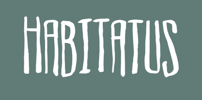 Another handmade font from Bogstav.com
 - Steel Grrrder by ULGA Type,
$9.00 Steel Grrrder is a robust, industrial-style stencil typeface family consisting of six weights, from light to black, with corresponding italics. Suitable for all kinds of display purposes including posters, film titles, book covers, magazines, advertising, logos, packaging, signage and games design, Steel Grrrder is especially useful where the message needs some serious geometric bite behind it. Steel Grrrder is best categorised as a constructivist sans family. The character shapes are sharp, angular and slightly condensed - it’s a rigid, no-frills, no-curves, mega-metallic design. Legible? Not really. Readable? I think not. In your faceable? Absolutely! This is a tough display typeface, designed to work in the most demanding typographic situations. It won’t buckle under pressure or wilt when the heat’s turned up. Forged from carbon steel and wrapped in a layer of Graphene, Steel Grrrder is unashamedly rugged, a rock-hard pound-for-pound boxer specialising in thumping knockouts. The Steel Grrrrder extended family also includes a six-weight joining script and two display fonts, Groove & Nutjob - all designed to work with each other.
 - Zekton by Typodermic,
$11.95 Welcome to the world of Zekton. This typeface is not for the faint of heart. With its square letterforms and sharp edges, Zekton brings a brave, industrial look to your designs. The uniform line widths and smooth curves give this typeface a serious and professional feel, perfect for the world of consumer electronics. When you use the Zekton typeface, you’ll bring a fresh and modern AM/FM portable stereo fragrance to your designs. It’s like having a pocketful of transistors at your fingertips, ready to power up your creativity. And with a twinkle in its eye, Zekton promises to add a touch of excitement to every project. Zekton is available in seven weights, two widths, and italics for a total of 42 styles. This versatility makes it easy to find the perfect fit for your project. Whether you’re designing a sleek product brochure, a cutting-edge website, or a tech manual, Zekton has the style and range to help you stand out. So if you’re ready to take your designs to the next level, give Zekton a try. It’s the typeface that’s built to handle the toughest industrial challenges, and it’s ready to help you make a bold statement in the world of consumer electronics. Most Latin-based European, and some Cyrillic-based writing systems are supported, including the following languages. A Afaan Oromo, Afar, Afrikaans, Albanian, Alsatian, Aromanian, Aymara, Bashkir (Latin), Basque, Belarusian (Latin), Bemba, Bikol, Bosnian, Breton, Bulgarian, Cape Verdean, Creole, Catalan, Cebuano, Chamorro, Chavacano, Chichewa, Crimean Tatar (Latin), Croatian, Czech, Danish, Dawan, Dholuo, Dutch, English, Estonian, Faroese, Fijian, Filipino, Finnish, French, Frisian, Friulian, Gagauz (Latin), Galician, Ganda, Genoese, German, Greenlandic, Guadeloupean Creole, Haitian Creole, Hawaiian, Hiligaynon, Hungarian, Icelandic, Ilocano, Indonesian, Irish, Italian, Jamaican, Kaqchikel, Karakalpak (Latin), Kashubian, Kikongo, Kinyarwanda, Kirundi, Komi-Permyak, Kurdish (Latin), Latvian, Lithuanian, Lombard, Low Saxon, Luxembourgish, Maasai, Macedonian, Makhuwa, Malay, Maltese, Māori, Moldovan, Montenegrin, Ndebele, Neapolitan, Norwegian, Novial, Occitan, Ossetian, Ossetian (Latin), Papiamento, Piedmontese, Polish, Portuguese, Quechua, Rarotongan, Romanian, Romansh, Russian, Sami, Sango, Saramaccan, Sardinian, Scottish Gaelic, Serbian, Serbian (Latin), Shona, Sicilian, Silesian, Slovak, Slovenian, Somali, Sorbian, Sotho, Spanish, Swahili, Swazi, Swedish, Tagalog, Tahitian, Tetum, Tongan, Tshiluba, Tsonga, Tswana, Tumbuka, Turkish, Turkmen (Latin), Tuvaluan, Uzbek (Latin), Venetian, Vepsian, Võro, Walloon, Waray-Waray, Wayuu, Welsh, Wolof, Xhosa, Yapese, Zapotec Zulu and Zuni.
