10,000 search results
(0.046 seconds)
- Wazoo - Unknown license

- Prospect by ParaType,
$25.00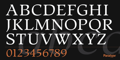 PT Prospect™. An original serif family designed in 1997-2001 by Natalia Vasilyeva and licensed by ParaType. A face of wide proportions and free lettershapes. The serifs have slanted edges. Based partially on the hand lettering of the author. For use in titling and display composition.
 - Pelin by Koray Özbey,
$9.00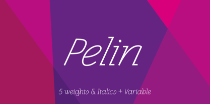 The design of Pelin, which began as an experiment, inspired by the harmony created by the contrast between the soft, flowing movements and sharp movements found in Circassian dances. To capture this harmony, both curved and sharp lines were used along with stems that contrasting angles.
 - Koehler Sans JNL by Jeff Levine,
$29.00Koehler Sans JNL was inspired by a set of cardboard sign kit letters made by the Koehler Sign Company of Missouri (presumably) in the late 1940s or early 1950s. Not much is known about them, other than the letters looked interesting enough to turn into a font. - Selectric Pyramid by Indian Summer Studio,
$45.00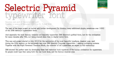 Selectric Pyramid is a typewriter font. Egyptian slab serif · Geometric slab serif Pyramid is version of Memphis (1929) by Dr. Rudolf Wolf. The part of the large project on revival and further development (by drawing many additional glyphs, sometimes over 1000) of the 20th century’s typewriters’ fonts.
 - Letter Gothic MT by Monotype,
$29.99Letter Gothic font was designed by Roger Roberson for IBM sometime between 1956 and 1962. Inspired by Optima, the typeface originally had flared stems. A monospaced sans serif font designed for use on an IBM Selectric typewriter, Letter Gothic font is a good choice for tabular material. - Hauslan by Álvaro Thomáz Fonts,
$15.00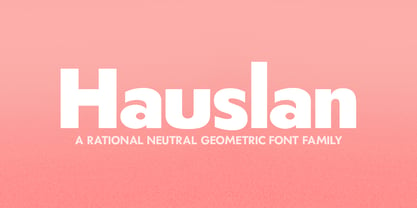 Hauslan is a simple, minimal and geometric type family inspired by the rationality presented by Bauhaus in 1920 which affected many areas such as architecture and graphic design. Following the concept of basic geometric shapes, Hauslan focuses on readability and versatility, either for small texts or headlines.
 - Vintage Poster JNL by Jeff Levine,
$29.00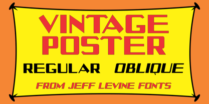 Modeled from an example in the book “Lettering” by Harry B. Wright (1950), the poster alphabet shown was reminiscent of the kind of style used in the early 1900s by sign painters and show card artists. Vintage Poster JNL is available in both regular and oblique versions.
 - Letter Gothic by Monotype,
$29.99Letter Gothic font was designed by Roger Roberson for IBM sometime between 1956 and 1962. Inspired by Optima, the typeface originally had flared stems. A monospaced sans serif font designed for use on an IBM Selectric typewriter, Letter Gothic font is a good choice for tabular material. - Apocrypha by Device,
$39.00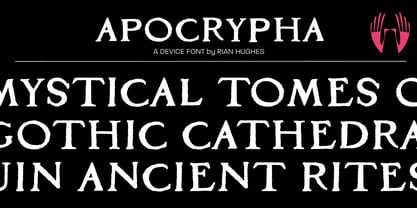 Inspired by an example of eroded Portuguese cast-iron ecclesiastical lettering mounted on marble, Apocrypha has been designed to evoke an age-worn imperfection; once elegant, but now eroded and distorted by time. Mix the characters in the upper and lower-case keystrokes for authentically uneven results.
 - Bobbin Cyrllic by Typoforge Studio,
$25.00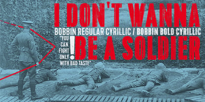 To design the font Bobbin Cyrillic I was inspired by the You And Me Monthly published by National Magazines Publisher RSW Prasa that appeared from Mai 1960 till December 1973 in Poland. In the Bobbin Cyrillic family, every variety contains 3 alternative characters with automatic replacement.
 - Streamlined Stencil JNL by Jeff Levine,
$29.00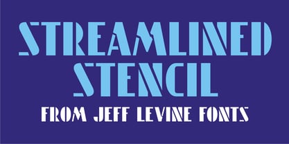 Streamlined Stencil JNL is based on a photo of an Art Deco era shipping stencil saying "With Care" which was heavily influenced by the Futura Black style of lettering. The image was seen in the Steven Heller-Louise Fili book "Stencil Type" (published by Thames and Hudson).
 - Ludema by JAM Type Design,
$18.00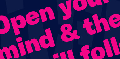 Ludema is a very informal and adventurous typeface designed by JAM Type and inspired by the many children’s books and the video games of our youth. Perfectly adaptable to be used in such designs as well on shop floors, Ludema is simply a bit of fun.
 - Sin Original by FontHaus,
$14.95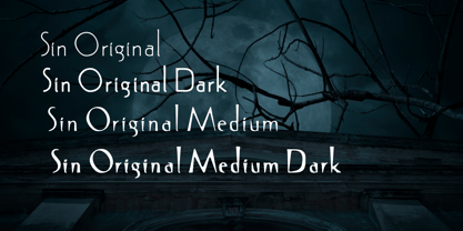 Loosely inspired by the designs of Rudolf Koch and his Koch Antiqua, Sin Original Dark by Mondrey Sin is a curious monoline display face with small x-heights, and large caps. The design almost looks 1920s vintage. Interesting for book Jackets, editorial, and as drop caps.
 - MBF Cafe Lumen by Moonbandit,
$19.00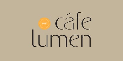 Moonbandit Font Foundry presents, Cafe Lumen. This elegant and unique typeface is inspired by the cool and relax atmosphere of an old vintage cafe luminated by an old dimmed lights and moon light. Cafe Lumen high contrast design fits well as a decorative and beautiful theme.
 - DAMAGEPLAN PERSONAL USE - Unknown license

- Kinghorn 105 by Talbot Type,
$19.50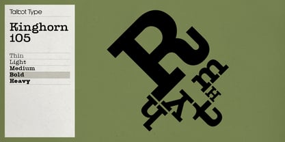 Kinghorn 105 is an Egyptian style slab-serif. The strokes are all of a roughly equal weight for an even, geometric look. Although original Egyptian slabs date from the early 19th century, the even look gives the font a balanced, contemporary look. It's intended mainly as a display font, but it's even strokes mean it remains legible even at smaller sizes. It's also available with some character variations as Kinghorn 205.
 - Kinghorn 205 by Talbot Type,
$19.50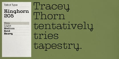 Kinghorn 205 is an Egyptian style slab-serif. The strokes are all of a roughly equal weight for an even, geometric look. Although original Egyptian slabs date from the early 19th century, the even look gives the font a balanced, contemporary look. It's intended mainly as a display font, but it's even strokes mean it remains legible even at smaller sizes. It's also available with some character variations as Kinghorn 105.
 - Flamenca by Eurotypo,
$28.00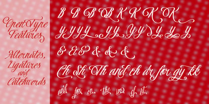 Flamenco is an Andalusian art. Who think in flamenco, think in Spain. Is the result of a cultural mix: Gypsies, Arabs, Jews and Christians mixed elements of their respective cultures with traditional Andalusian elements. It incorporate dance, song and guitar music. Known for its emotional intensity, flamenco is distinguished by the graceful arm movements, ferocious stomping’s flamenco dancer, deep groans and strumming guitar. Flamenco is an art of passion. Flamenca Regular and Flamenca Luz is a brush script inspired by the flamenco dance. Flamenca is an organic, modern and casual calligraphy family font that has preserved in its glyphs its original textured appearance for a more personalized effect even more authentic. As an exclusively Open Type release, with 747 glyphs, it has several special alternatives for all letters with lots of possibility an infinity of combinations. There are plenty of options to allow you to create something unique and special: standard and discretionary ligatures, several swashes, initial and terminal forms and stylistics alternates for each letter, catchwords, ornaments that can be added to the beginning or end of each letter, and much more. Ornaments has been created inspired in the bars of the Andalusian patios where flamenco is danced. These lovely fonts have already an extended character set to support Central and Eastern as well as Western European languages. As a whole, Flamenca was made to make your project more beautiful and attractive! Have fun with it! Flamenca is fancy, delicious & fresh!
 - HG Soei Kakupoptai by RICOH,
$199.00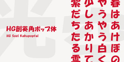 HG創英角ポップ体は、水本恵子氏がデザインした「創英ポップ体1」を字母とする書体です。店頭広告用文字のスタイルを模して作られた書体で、楽しく、軽快な書体です。極太角ゴシックのイメージをベースに作られていますが、それをやや崩し、柔らかさも取り入れ、フリーハンドで書いたイメージを残しています。見やすくするため、ふところは可能な限り大きくなっています。店頭のPOP、チラシ、看板などに最適の書体です。 HG Soei Kakupoptai is a typeface with a "fresh pop" designed by Mr. Mizumoto Keiko. It is a typeface made by mimicing the style of letters for party-style, fun and light typefaces. It is made on the basis of the image of thickSoei Kakugothic, but it breaks it open, and incorporates softness, leaving the font looking freehand. To make it easy to see, the boldness has become as thick as possible. It is a typeface best suited for store-front fun, leaflets, signboards and so on.
 - Technotyp by URW Type Foundry,
$39.99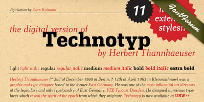 The digital font Technotyp is based on the hot metal typeface created by the German typographer and type designer Herbert Thannhaeuser (1898-1963) for the former East German type foundry Typoart in Dresden. In the typography book ‘Der Schriftsetzer’ (Fachbuchverlag, Leipzig, 1952), by Paul Fritzsche, this absolutely beautiful slab serif design is presented in all its variations. Fritzsche remarked that – because of its rather condensed form and its relatively long ascenders – the 'Werkschrift' of the Technotyp (comparable with our 'Regular') seemed to be very well suited to serve as a text face, and recommended for this purpose that the face be cut for the composing machine. However, this never happened and the entire Technotyp family was made available for hand composition only. This is finally changing and being remedied for good now: URW++ proudly presents the new digital version of this really charming font family with its distinct flavor of the 1950s, adding it to the other digital renditions of Herbert Thannhaeuser fonts at URW++, namely Garamond No. 4 and Magna. The original Typoart family had an italic style for the light version only. The new digital version of Technotyp includes italic styles for the regular, medium and bold weights as well, enhancing the family to meet today’s standards and requirements for professional type setting. To further increase its usefulness, Cyrillic faces were created, too. True to the standard for all digital fonts at URW++, the character set for Technotyp covers all West- and East European languages.
 - Gryffensee by Catharsis Fonts,
$30.00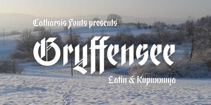 Gryffensee is designed to be the Futura of blackletter, combining the time-honored gravity and relentlessness of the Gothic script with the clean, contemporary freshness of the geometric sans. Built from a tightly controlled inventory of lines, arcs, sharp cuts, and OpenType features, Gryffensee was born and raised in the digital age, yet retains the powerful charisma and human warmth of its mediaeval blackletter ancestors. As a result, it excels in a wide range of display settings, logotypes, and short text. Unlike most conventional blackletters, it even handles all-caps usage with grace, and includes an extensive Cyrillic character set (in the Pro version). Apart from a generous range of automatic ligatures and contextual alternates, Gryffensee offers stylistic alternates that allow users to customize its appearance to their tastes. The capital letters |AGHIKZ| come in alternate cuts that trade traditional shapes for increased legibility, while the letter |s| appears in three cuts, each with a unique, distinct flavor. All these options are accessible through OpenType stylistic sets in the main Latin font, Gryffensee Eins. For easy use in applications without OpenType support, we provide two additional Latin fonts (Gryffensee Zwei and Drei) in which these options replace the default cuts. Finally, Gryffensee Pro offers all the functionality of Gryffensee Eins, plus Cyrillic support. My intention to devise a contemporary geometric blackletter was inspired by four hand-painted letters, |ABCD|, in Sasha Prood�s online portfolio. I later found out that he had, in turn, taken those letters from an existing font, Bastard, by Jonathan Barnbrook. Luckily, by that time my project had taken on a life of its own. Gryffensee is an original design that bears only the most superficial resemblance to Bastard. Gryffensee is a mediaeval spelling of the lake Greifensee near which I grew up. It is pronounced [?gri?f?n?se?], or "GRIEF-un-say" in English approximation. This font is dedicated to Simone.
 - Kindah by Eyad Al-Samman,
$30.00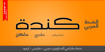 “Kindah” is a Yemeni ancient tribe with evidence of its existence going back to the second century B.C.E. The kings of Kindah exercised an influence over a number of associated tribes more by personal prestige than by coercive settled authority. The Kindites were polytheistic until the 6th century CE, with evidence of rituals dedicated to the gods Athtar and Kahil found in their ancient capital in south-central Arabia. It is not clear whether they converted to Judaism or remained pagan, but there is a strong archaeological evidence that they were among the tribes in Dhu Nuwas' forces during the Jewish king’s attempt to suppress Christianity in Yemen. They converted to Islam in the mid-7th century CE and played a crucial role during the Muslims' conquests of their surroundings. Among the most famous figures from Kindah known as Kindites are Imru' al-Qays (526-565?), al-Ash'ath ibn Qays (599-661), Hujr ibn 'Adi al-Kindi (?-660), al-Miqdad Ibn Aswad al-Kindi (589-653), and Abu Yusuf Yaíqub ibn Ishaq as-Sabbah al-Kindi (805-873) known as the Philosopher of the Arabs. "Kindah" font is a modern Kufic font comes in three weights (i.e., bold, regular, and thin) which is mainly designed to be used as a display Arabic font. The main feature of this typeface is the mixture of curves and rectangular shapes used in the designed Arabic characters. Kindah font was inspired by the design of the Yemeni modern windows of houses in which only top part of the arc is used for building such windows which reflects the originality of the architecture preserved in this part of the world. "Kindah" font is extremely outstanding when used in printed materials with big sizes especially for headline, titles, signs, and names of brands. Hence, it is suitable for books' covers, advertisement light boards, and titles in magazines and newspapers. It has also a Latin character set and it also supports several Arabic character sets which makes it proper for composing alphabetical and numerical words in Arabic, Urdu, and Persian.
 - Funtastic by Umka Type,
$19.00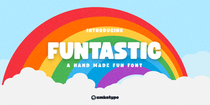 Funtastic is a carefully crafted fun font. Multilingual: It has Extended Latin and Extended Cyrillic letters. It's created for games, web design, branding and social media works.
 - Scalter by Dirtyline Studio,
$25.00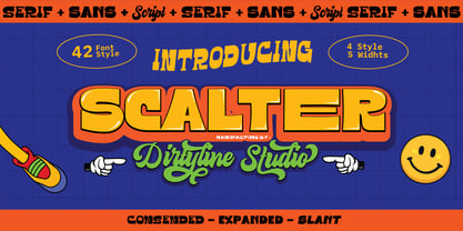 SCALTER was designed in the early April and published in July 2020. Scalter Serif is inspired by the characteristics American vintage sign then the sans serif it’s combination retro typeface. All shape of this typeface is make strong and more contrast, giving a more dynamic and retro feel. Scalter are available in 5 Widths (Condensed – SemiCondensed – Normal – SemiExpanded – Expanded) with matches 4 style (Serif – Semi Serif – Sans Bold- Sans Black - Script) with a total 42 Styles. Also includes support for 26+ Latin (Extended) Languages.
 - Fionas by Nasir Udin,
$25.00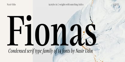 Fionas is a condensed serif typeface inspired by retro 80’s-magazines’ typography, mixed with modern appeal to blend with modern needs. Ranging from light to heavy with italics, Fionas offers many possibilities to be applied in many graphic or editorial projects. The lighter weights are suitable for short paragraph, and the heavier weights are perfect for headlines, perfectly suitable for display purpose such as book covers, web headlines, branding, editorial, etc. Fionas has extended latin character set that supports 200+ latin-based languages.
 - The Serif Hand by S&C Type,
$8.00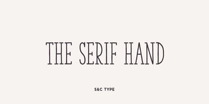 The Serif Hand is a handwritten font designed by Fanny Coulez and Julien Saurin in Paris. We wanted to create the most generic, readable and balanced serif handwritten font, to work well in every kind of design. It’s an all-caps font with 5 finely balanced weights with alternates: all the uppercase letters are a bit different from the lowercase letters. We also designed a playful dotted weight, to add a fancy touch if needed. We hope you will enjoy our work. Merci beaucoup!
 - Adventura by me55enjah,
$14.00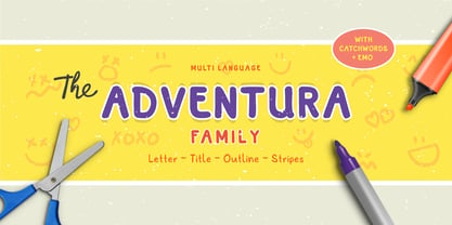 Handmade typeface inspired by permanent marker strokes. Simple, bold and casual shape strokes make this typeface easy to read event in a bunch of text. This can be useful for title, quotes, label, etc. Simple, casual and playful. All caps family comes with different style: Title, Outline and Stripes. Including handwritten style, Adventura Letter with uppercase & lowercase characters, make you have more option to create catchy design. All support basic multi language. Add Adventura Catchwords and Emo icons can gives more personal touch to your design.
 - Cressida NF by Nick's Fonts,
$10.00Here's a flashback to the sixties, which originally went by the rather unimaginative name of Triline. It's available in two versions: regular and swash caps. In the swash version, the uppercase Q is a "Qu" ligature; a plain Q is located in the ASCII circumflex position (SHIFT+6 on PC or Mac). Named for the heroine of a medieval romance. The Postscript and Truetype versions contain a complete Latin language character set (Unicode 1252); in addition, the Opentype version supports Unicode 1250 (Central European) languages as well. - Chipping by Greater Albion Typefounders,
$13.95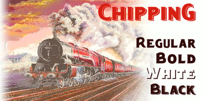 Chipping is a brand new face inspired by Edwardian and 1920s letterforms. It's good for clear and legible headings which need a gentle and unobtrusive period touch, and is the latest is Greater Albion's line of faces to explore the 'small capitals' idea. You will see a broad similarity with our Chipperly family, and the two work well together in combined projects. Four faces are offered: regular and bold, as well as Black with a heavy drop shadow and white which explores the idea of 'whitespace' design.
 - Doc Holliday by Type Innovations,
$39.00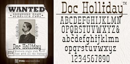 Doc Holliday is an original design by Alex Kaczun. It's a classic revival of a Western-style slab serif font extended to include Eastern European Latin and Baltic languages. Doc Holliday has a mid to late 1800s wood type feel, and one can envision a sign over the O.K. Corral in Tombstone, Arizona, and the legendary Gunfight between the three Earp brothers and "Doc" Holliday and the Claytons and McLaurys. This font can be applied to sports team promotions and other nostalgic projects. "Howdy pardiner!"
 - Might Makes Right Pro BB by Blambot,
$9.00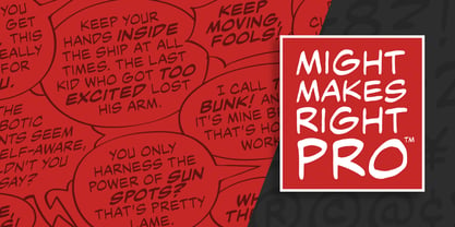 Might Makes Right Pro BB is an all-purpose comic book dialogue font inspired by Bronze Age comics. It’s designed to compliment a wide variety of art styles. The opentype version has autoligatures to swap out adjacent, identical letter pairs for a more organic look, and a wide variety of European characters are included. This Blambot classic comic book dialogue family has been updated with even more European characters, improved spacing and kerning, contextual alternate correction of errant serif-I, and a fourth weight, plain Bold.
 - Orange Baroon by Attype Studio,
$14.00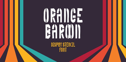 Orange Baroon - Inspired by typeface on 70s era, Orange Baroon has the vintage font & retro with stencil look. with 2 font style, It's super easy to use stencil effect with Orange Baroon family font. Two style Font: Regular & Display Orange Baroon is perfect for vintage & retro style product, branding, logo, invitation, stationery, product packaging, merchandise, monogram, blog design, game titles, cute style design, Book/Cover Title and more. Features : - Orange Baroon Family Font - Ligatures - Multilingual Support --- Hope you enjoy with our font! Attype Studio
 - Black Thone by Attype Studio,
$12.00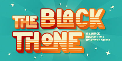 Introducing Black Thone - Inspired by typeface on 70s era, Black Thone has the vintage font & retro font style. with 3 font style, It's super easy to use 3D effect wint Black Thone family font. Three style Font: Regular, Display & Extruded Black Thone is perfect for children product, branding, logo, invitation, stationery, product packaging, merchandise, monogram, blog design, game titles, cute style design, Book/Cover Title and more. Features : - Black Thone.otf - Black Thone Extruded.otf - Black Thone Display.otf - Multilingual Support --- Hope you enjoy with our font! Attype Studio
 - PykesPeakZero - 100% free

- Aillek by Twinletter,
$18.00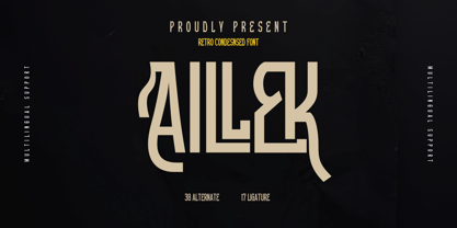 Introducing Aillek, a retro-condensed font with multilingual support and a distinctive look that will enhance any project. Aillek lends a touch of retro charm to any design with its lofty letterforms and alternate characters. Your design becomes more dynamic and interesting thanks to its ligatures options. Aillek is ideal for producing vintage flyers, logos in retro style, nostalgic social media graphics, and more. It is perfect for branding initiatives, packaging design, book covers, and more due to its condensed letterforms. It is adaptable for any project that needs to reach a large audience thanks to its multilingual support. Aillek is a must-have for any designer, marketer, or anyone looking to add a dash of nostalgia to their work because of its distinctive design and features. It’s ideal for those who want to add a touch of nostalgia to their designs as well as for those who want to create designs that evoke nostalgia and vintage aesthetics. Make Aillek your go-to font for all your retro-condensed design needs by taking advantage of this opportunity. Don’t wait, get this special font right away, and start making designs that will be remembered. What’s Included : - File font - All glyphs Iso Latin 1 - Alternate, Ligature - Simple installations - We highly recommend using a program that supports OpenType features and Glyphs panels like many Adobe apps and Corel Draw so that you can see and access all Glyph variations. - PUA Encoded Characters – Fully accessible without additional design software. - Fonts include Multilingual support
 - Everleigh Duo by Gleb Guralnyk,
$14.00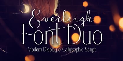 Everleigh Duo consists of two typefaces - thin serif font and calligraphic script font. Both of this fonts have an elegant thin shape with classic influences. This pair is created in one breath and they matches perfectly in lots of lettering composition. Everleigh Script - it's a connected script typeface that imitates handwritten pen calligraphy. It includes lots of ligatures and multilingual support. Everleigh Medium - it's a little modified version of my another font Everleigh. This typeface has a slightly thicker shape and slightly different serifs, which makes it more useful on dark backgrounds. It also has lots of ligatures and stylistic alternates.
 - Moonspace by Jafar07,
$17.00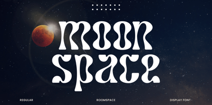 Moonspace is a unique display sans-serif font with a captivating wave-like character on each letter. Despite its slightly taller height, this font remains highly legible and suitable for a wide range of designs. With its distinctive design that sets it apart from other sans-serif fonts, Moonspace adds an artistic touch to your designs. It's perfect for use on posters, magazines, brochures, and other creative projects. Crafted with precision and balanced letter proportions, Moonspace delivers a professional and eye-catching look. It's suitable for use in a variety of designs, from modern to classic.
 - M Ling Wai F HK by Monotype HK,
$523.99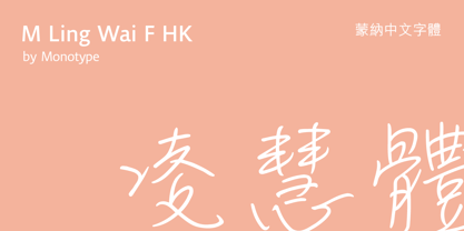 M Ling Wai is a humanistic script based on a real handwritten style. It has a feminine, urban and lively character filled with literate finesse. M Ling Wai was written with a thin ball pen by a young woman in a unique, personal, running writing style, such that it is real, natural and feminine. Contrast of strokes is low and the text is visible and eye-catching. Its light to medium stems (豎) make it suitable for small text and subheading with little conglutination. All strokes are highly irregular, inconsistent, irregularly oriented and tightly coupled or connected. Spatial distribution, positioning, size and relative proportion of radicals fully reflect a natural and personal favor. It is one of the first proportional width font in a full scale. It is best suited for casual lively text, illustrations, set upright (non-slanted), non-condensed.
 - M Ling Wai P HK by Monotype HK,
$523.99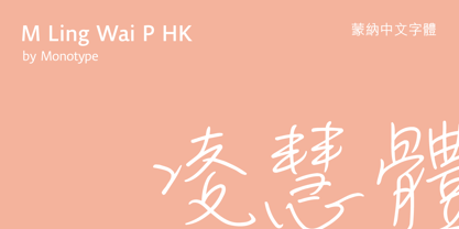 M Ling Wai is a humanistic script based on a real handwritten style. It has a feminine, urban and lively character filled with literate finesse. M Ling Wai was written with a thin ball pen by a young woman in a unique, personal, running writing style, such that it is real, natural and feminine. Contrast of strokes is low and the text is visible and eye-catching. Its light to medium stems (豎) make it suitable for small text and subheading with little conglutination. All strokes are highly irregular, inconsistent, irregularly oriented and tightly coupled or connected. Spatial distribution, positioning, size and relative proportion of radicals fully reflect a natural and personal favor. It is one of the first proportional width font in a full scale. It is best suited for casual lively text, illustrations, set upright (non-slanted), non-condensed.


