10,000 search results
(0.04 seconds)
- Lorida by Graptail,
$19.00 Lorida - Condensed Display is an Elegant Condensed serif with eye-catching ligatures for each letter combination. it is based on a compact solid font, by combining various styles. Perfect for Logos, greeting cards, quotes, posters, branding, business cards, postcards, movie titles, blog headers, art quotes, typography, magazines and more.
 - Metro Graffi 3d font by Sipanji21,
$15.00 "Metro Graffi" is a slightly bold graffiti font that comes in two styles: regular and shadow. By combining these styles, you can achieve a 3D effect that adds depth and dimension to your designs. With its urban and edgy style, "Metro Graffi" captures the essence of street art.
 - Azuree ND by Neufville Digital,
$45.25 Azuree is a typeface designed by Bauersche Giessere in 1908, simulating copperplate engraving, frequently used in cards. Today it is still an excellent choice for publishing projects, both for typographic compositions and for headlines, adding a romantic and rough touch at once. Azuree is a Trademark of BauerTypes SL
 - Christmas Energy by Rashatype,
$10.00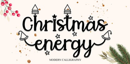 Christmas Energy is a whimsical script font with a relaxed theme, featuring a lovely style. This font is PUA encoded which means you can access all of the glyphs and swashes with ease! Add it confidently to your favorite creations and let yourself be amazed by the outcome generated.
 - Binghamton NF by Nick's Fonts,
$10.00This typeface gets its inspiration from a face designed by Vincent Pacella for PLINC named Bingham, and is evocative of steam locomotives and the Old West. Both versions of this font include the Unicode Latin 1252 and 1250 Central European character sets, with localization for Moldovan and Romanian. - Lie Detector by PizzaDude.dk,
$15.00A comic font with a twist of crunch! The Lie Detector font deserves headlines and comic lettering, but most of all it deserves long letters. Use Lie Detector next time you want to spice up your letter or invitation, and you'll be surprised by the powers in this font! - Shruti by Microsoft Corporation,
$49.00Shruti™ is an OpenType font for the Indic script Gujarati. It is based on Unicode, contains TrueType outlines and was designed by Raghunath Joshi (Type Director) Santosh Kshirsagar for use as a UI font. Copyright ™ 2001 Microsoft Corporation. All rights reserved. Character Set: Latin-1, Gujarati - Magestand by MJType,
$19.00 Introducing Magestand typeface is serif font this is inspired by chopper font relesed in August 9th 2021. magesta typeface support multilingual languages, unique uppercase and lowercase ligatures. Create unique & elegant logotype, use it as an elegant for your next project headlines, logotype designs, posters or t-shirts, business cards.
 - Hergon Grotesk by Katatrad,
$29.00 Straightforward tone resulting in a modernist, Hergon Grotesk is a family of modern sans-serif. This Typeface is characterized by Neo-Grotesque which gives it a strong character, perfectly suited for any visual communication application. The family has 10 fonts ranging from thin to extrabold with matching italics.
 - Ohio by Wiescher Design,
$39.50 OHIO is a rough headline type in the tradition of Louis Oppenheimer. It is closely related to Lo-Type from Berthold, redesigned in the 1980s by Erik Spiekermann. Matter of fact, I discovered Ohio while visiting Erik in Berlin, searching his endless archive. Your typeface-looter Gert Wiescher
 - Rumbler by Ramen,
$25.00 Rumbler is a typeface inspired by old school car lettering, while trying to push it in a unique direction. Reflecting the limitations and constraints of shaped metal, the letter forms twist and contort to create a readable font that can evoke motion and speed, strength, and a retro feel.
 - Detective Bureau JNL by Jeff Levine,
$29.00 Traditional stencil type faces have always projected images of strength, power, police, military or industry. The hand-lettered title card for 1951's "Detective Story" (directed by William Wyler) is a perfect example of this. A bold Roman letter style, it was the perfect inspiration for Detective Bureau JNL.
 - Ajuga by Daily Studio,
$14.00 Ajuga - a typeface designed by Daily Studio. This is a geometric type font. with smooth and rounded egde. You can enjoy and play with the uppercase or lowercase to make it more entertaining. Perfect for header, poster, title, and cards. Ajuga contains full uppercase, lowercase, punctuation, and multilingual letters.
 - The Hills by Mans Greback,
$59.00 The Hills is a script typeface, perfect for logotypes. Designed by Måns Grebäck during 2017, this high quality lettering brings you to the sunny fifties. It is well balanced and has a nice medium weight. The font contains 350 glyphs and has support for a wide range of languages.
 - Maxim by GroupType,
$19.00 Maxim was originally designed by Peter Schneidler in 1956 for the Bauer Type Foundry. This typeface is energetic and has the look and feel of a brush painted script. The FontHaus font studio released its revival version with added characters in 1994 and as an OpenType font in 2006.
 - Visage LP by LetterPerfect,
$39.00 Visage is a contemporary text family designed by Garrett Boge in 1988. Its delicate serifs, subtly tapered stems, and generous proportions offer both distinction and readability to the text at any size. The family consists of five weights - Light, Book, Medium, Bold and Black, with corresponding oblique styles.
 - Kryptic LP by LetterPerfect,
$39.00 Kryptic is based on a design for computer optical character recognition (OCR) from the 1960s developed by Epps & Evans at the National Physical Laboratory. Its pure geometric and elemental shapes create graphic patterns and visual puzzles that only secondarily communicate meaning. Not recommended for extended text, unless intentionally encrypting!
 - Gready by Mans Greback,
$59.00 Gready is a swirly brush typeface. With happy swashes and funny curves, this comic lettering has a flowing and soft character and a greedy, optimistic personality. Use it for a fresh, tasty ice cream or food store logo, a cartoon headline or any playful context speaking to the child within us. Drawn and created by Mans Greback, this modern paintbrush font family comes in four styles: Thin, Regular, Bold and the crazy Outline variety. Gready is built with advanced OpenType functionality and has a guaranteed top-notch quality, containing stylistic and contextual alternates, ligatures and more features; all to give you full control and customizability. It has extensive lingual support, covering all Latin-based languages, from North Europe to South Africa, from America to South-East Asia. It contains all characters and symbols you'll ever need, including all punctuation and numbers.
 - Century Gothic Paneuropean Variable by Monotype,
$209.99 Century Gothic™ is based on Monotype 20th Century, which was drawn by Sol Hess between 1936 and 1947. Century Gothic maintains the basic design of 20th Century but has an enlarged x-height and has been modified to ensure satisfactory output from modern digital systems. The design is influenced by the geometric style sans serif faces which were popular during the 1920s and 30s. The Century Gothic font family is useful for headlines and general display work and for small quantities of text, particularly in advertising. Century Gothic family has been extended to 14 weights in a Pan-European character set from Thin to Black and their corresponding Italics. The already existing 4 weights of Regular and Bold with their Italics are additionally still available in the STD character set. For international communication, the W1G versions offer the appropriate character set. They contain Latin, Greek and Cyrillic characters and thus support all languages and writing systems that are in official use in Western, Eastern and Central Europe. Century Gothic Variable is features two axes: Weight and Italic. The Weight axis has preset instances from Light to Black. The Italic axis is a switch between upright and italic. Looking for the perfect way to complete your project? Check out Aptifer™ Slab, ITC Berkeley Old Style®, FF Franziska™, Frutiger®, ITC Legacy® Square Serif or Plantin®.
 - Century Gothic Paneuropean by Monotype,
$50.99Century Gothic™ is based on Monotype 20th Century, which was drawn by Sol Hess between 1936 and 1947. Century Gothic maintains the basic design of 20th Century but has an enlarged x-height and has been modified to ensure satisfactory output from modern digital systems. The design is influenced by the geometric style sans serif faces which were popular during the 1920s and 30s. The Century Gothic font family is useful for headlines and general display work and for small quantities of text, particularly in advertising. Century Gothic family has been extended to 14 weights in a Pan-European character set from Thin to Black and their corresponding Italics. The already existing 4 weights of Regular and Bold with their Italics are additionally still available in the STD character set. For international communication, the W1G versions offer the appropriate character set. They contain Latin, Greek and Cyrillic characters and thus support all languages and writing systems that are in official use in Western, Eastern and Central Europe. Century Gothic Variable is features two axes: Weight and Italic. The Weight axis has preset instances from Light to Black. The Italic axis is a switch between upright and italic. Looking for the perfect way to complete your project? Check out Aptifer™ Slab, ITC Berkeley Old Style®, FF Franziska™, Frutiger®, ITC Legacy® Square Serif or Plantin®. - FS Brabo Paneuropean by Fontsmith,
$90.00Worldly Even though it’s a new arrival, FS Brabo has seen the world. Designed by a Brazilian working in London and studying in Belgium under a Dutchman, it’s certainly well-travelled. And it was inspired by the extraordinary archive of early book typefaces at the world-renowned Plantin-Moretus Museum in Antwerp, while Fernando Mello was attending Frank Blokland’s Expert class Type Design course at the Plantin Institute of Typography. It was there that Fernando became engrossed in the collection of early metal type, matrices, punches and type samples by figures such as Garamond and Granjon. So much so that he took on the mighty task of developing ‘a beautiful, functional, serifed text font’ of his own. Heroic FS Brabo’s journey from sketch to font family took an epic three years, starting in Antwerp, continuing at Fontsmith in London, and reaching its conclusion back in Fernando’s home city of São Paulo. No wonder Fernando was reminded of another titanic face-off: that of Antwerp’s Roman hero of legend, Silvius Brabo, and the evil ogre, Antigoon. Brabo came to the town’s rescue after the tyrannical giant had been charging ships’ captains extortionate taxes and chopping off the hands of those who refused to pay up. Having finally downed Antigoon after a long and terrible duel, Brabo cut off the giant’s own hand and threw it into the river Scheldt, unwittingly giving the town its name: the Dutch for ‘hand-throw’ is hand werpen. What better way for Fernando to name his literary typeface than after the hero of Antwerp’s oldest tale? The garalde factor FS Brabo is not a revival, but a very much a contemporary, personal interpretation of a garalde – a class of typeface originating in the 16th century that includes Bembo, Garamond and Plantin, with characteristically rounded serifs and moderate contrast between strokes. Brabo’s ‘ct’ and ‘st’ ligatures, upper-case italic swashes and contextual ending ligatures – ‘as’, ‘is’, ‘us’ – all preserve the beauty and character of traditional typefaces, but its serifs are chunkier than a garalde. Their sharp cuts and squared edges give them a crispness at text sizes, helping to bring a beautifully bookish personality to hardworking modern applications. A workhorse with pedigree It may give the appearance of a simple, four-weight typeface, but FS Brabo has hidden depths beneath its simplicity and beauty. OpenType features such as cap italic swashes, contextual ending swashes – programmed only to appear at the end of words – and stylistic alternatives make this a complete and well-equipped typeface. Comprehensive testing was carried out at text and display sizes, too, to prevent counters from filling in. All of which makes FS Brabo a very modern take on a traditional workhorse serif typeface: colourful and versatile enough to adorn not just editorial projects but also signage, advertising and logotypes. - FS Brabo by Fontsmith,
$80.00 Worldly Even though it’s a new arrival, FS Brabo has seen the world. Designed by a Brazilian working in London and studying in Belgium under a Dutchman, it’s certainly well-travelled. And it was inspired by the extraordinary archive of early book typefaces at the world-renowned Plantin-Moretus Museum in Antwerp, while Fernando Mello was attending Frank Blokland’s Expert class Type Design course at the Plantin Institute of Typography. It was there that Fernando became engrossed in the collection of early metal type, matrices, punches and type samples by figures such as Garamond and Granjon. So much so that he took on the mighty task of developing ‘a beautiful, functional, serifed text font’ of his own. Heroic FS Brabo’s journey from sketch to font family took an epic three years, starting in Antwerp, continuing at Fontsmith in London, and reaching its conclusion back in Fernando’s home city of São Paulo. No wonder Fernando was reminded of another titanic face-off: that of Antwerp’s Roman hero of legend, Silvius Brabo, and the evil ogre, Antigoon. Brabo came to the town’s rescue after the tyrannical giant had been charging ships’ captains extortionate taxes and chopping off the hands of those who refused to pay up. Having finally downed Antigoon after a long and terrible duel, Brabo cut off the giant’s own hand and threw it into the river Scheldt, unwittingly giving the town its name: the Dutch for ‘hand-throw’ is hand werpen. What better way for Fernando to name his literary typeface than after the hero of Antwerp’s oldest tale? The garalde factor FS Brabo is not a revival, but a very much a contemporary, personal interpretation of a garalde – a class of typeface originating in the 16th century that includes Bembo, Garamond and Plantin, with characteristically rounded serifs and moderate contrast between strokes. Brabo’s ‘ct’ and ‘st’ ligatures, upper-case italic swashes and contextual ending ligatures – ‘as’, ‘is’, ‘us’ – all preserve the beauty and character of traditional typefaces, but its serifs are chunkier than a garalde. Their sharp cuts and squared edges give them a crispness at text sizes, helping to bring a beautifully bookish personality to hardworking modern applications. A workhorse with pedigree It may give the appearance of a simple, four-weight typeface, but FS Brabo has hidden depths beneath its simplicity and beauty. OpenType features such as cap italic swashes, contextual ending swashes – programmed only to appear at the end of words – and stylistic alternatives make this a complete and well-equipped typeface. Comprehensive testing was carried out at text and display sizes, too, to prevent counters from filling in. All of which makes FS Brabo a very modern take on a traditional workhorse serif typeface: colourful and versatile enough to adorn not just editorial projects but also signage, advertising and logotypes.
 - Detective Client JNL by Jeff Levine,
$29.00 There is no doubt that the 1941 version of “The Maltese Falcon” was superior to the prior two attempts by Warner Brothers at filming Dashiell Hammett’s 1930 novel. Sam Spade was perfectly portrayed by Humphrey Bogart, and the supporting cast of Mary Astor, Peter Lorre, Sidney Greenstreet and Elisha Cook, Jr. rounded out the main players in a great suspense film that is considered to be the first (if not one of the first) of the film noir genre. The title cards for the production and cast credits were hand-lettered in a spurred serif type style strongly reminiscent of the Art Nouveau period, so instead of naming the digital version with some “tough guy detective” moniker, it was decided that Detective Client JNL was more appropriate. After all, this is a reasonably attractive font, and in this kind of film it’s usually the “attractive damsel in distress” [be she the victim or the actual perpetrator] that gets the story rolling… Detective Client JNL is available in both regular and oblique versions.
 - EraMax Radial by Our House Graphics,
$16.00 EraMax Radial is a geometric sans serif meant to be set BIG, for big statements. It's the perfect face for signage, packaging posters, branding and so on and on, where a strong voice is needed. It has a modern look that will work in a retro setting. Or, should that be a vintage look that will work in a modern setting. This is the first of what is to be a series to typefaces inspired by the original hand painted signage found in the TH&B train station in Hamilton Ontario. This classic Art Deco, Or, more precisely, Art Moderne building designed by the New York architectural firm of Fellheimer and Wagner and completed in 1933. The original lettering included about 75% of the uppercase letters only, so the balance of the uppercase and the lowercase plus all the other glyphs were extrapolated from the look and feel of the existing uppercase letters. Figures are based on the numerals on the station clock, with adjustments made to harmonised with the letters.
 - PB Beneventan XIc by Paweł Burgiel,
$32.00 PB Beneventan XIc is a font face designed for imitate Beneventan minuscule (also called Lombardic, Casinense, Langobarda, littera Longobarda, Longobardisca) from southern Italy found in 11th century manuscripts. All characters are handwritten by use ink and pen, scanned, digitized and optimized for best quality without lost its handwritten visual appearance. Character set support codepages: 1250 Central (Eastern) European, 1252 Western (ANSI), 1254 Turkish, 1257 Baltic. Include also additional characters for Cornish, Danish, Dutch and Welsh language, spaces (M/1, M/2, M/3, M/4, M/6, thin, hair, zero width space etc.) and historical characters (mediaeval abbreviations, ligatures, ancient punctuation). OpenType TrueType TTF (.ttf) font file include installed OpenType features: Access All Alternates, Localized Forms, Fractions, Alternative Fractions, Ordinals, Superscript, Tabular Figures, Proportional Figures, Case-Sensitive Forms, Stylistic Alternates, Contextual Alternates, Stylistic Set 1-14, Contextual Ligatures, Historical Ligatures, Standard Ligatures. Include also kerning as single 'kern' table for maximum possible backwards compatibility with older software. Additional glyphs are mapped to Private Use Area codepoints. OpenType features automatically exchange some default glyphs by stylistic alternates and create ligatures for better historical appearance.
 - Cinema Script by Eclectotype,
$40.00 The early Twentieth Century was a golden age for cinema, and for the artists who lettered the iconic title sequences. Cinema Script is inspired by this lettering style, but has departed substantially from the source material in an effort to be less retro and more in tune with today’s designers' needs. The font will work admirably ‘out of the box’ but to really shine use the advanced OpenType features. Contextual alternates and ligatures should be on by default for the best results. Discretionary ligatures are a little more out there, so use them, ahem, at your discretion. Cinema Script also boasts swash characters, optional oldstyle numerals, plenty of stylistic sets and a nice ordinal feature for 1st, 2nd, 3rd etc. For greater detail, check out the user guide in the gallery section. This is a versatile brush script style font. It seems familiar, with a similar vibe to other brush fonts but without the staid ubiquity. Cinema Script will look great on the big screen, or on your screen, on food packaging, t-shirts, blogs, photobooks, wedding stationery... You get the idea!
 - PF Isotext Pro by Parachute,
$79.00 This typeface is based on ISO 3098, a technical documentation issued in 1974 by ISO (International Organization for Standardization), which proposed a set of characters for use on technical drawings and associated documents. Isotext is based on the original standards but is completely redesigned to fit typographic requirements. This new ‘Pro’ version is further improved and now comes with a complete set of redesigned true-italics. Furthermore, the width of the glyphs has increased in order to establish a more balanced and readable text. The result is a contemporary font which works well in small sentences as well as long texts. Isotext Pro is loaded with all the good stuff a designer needs to create documents with attitude. It supports 19 special OpenType features like small caps, fractions, ordinals, etc. and offers multilingual support for all European languages including Greek and Cyrillic. Finally, every font in this family has been completed with 270 copyright-free symbols, some of which have been proposed by several international organizations for packaging, public areas, environment, transportation, computers, fabric care and urban life.
 - Sonny Gothic by W Type Foundry,
$25.00 Sonny Gothic is our most rational-geometric typefamily until so far. It’s inspired by the geometric style of the 70s, specifically by Herb Lubalin’s work. Since we were students, we have been gazing Lubalin’s logos, typefaces and magazines as inspiration that still lives in our subconscious. At first, we made a pure geometrical typeface with modern caps proportion, then we combine those proportions with the 70s traditional caps ligatures. It was at that point that we knew Sonny Gothic was ready to arise. Even though Chile is not the origin of a modern visual culture, for us geometric typefaces and Lubalin’s work are one of the most attractive aesthetics of the creative realm, and therefore, this is our homage. Designed with powerful opentype features, each weight includes alternate characters, ligatures, fractions, special numbers, arrows, extended language support and many more… Perfectly suited for the several areas of graphic design. Learn about upcoming releases, work in progress and get to know us better! On Instagram W Foundry On facebook W Foundry wtypefoundry.com
 - Arlonne Sans Pro by Sacha Rein,
$27.84 Arlonne Sans Pro was conceived by Sacha Rein between 2015 and 2019 with a comfortable reading experience in mind. It's a humanist sans with neoclassical influences. Arlonne is a comprehensive font family with four weights and matching italics. It has a character set of about 1800 glyphs, including extended latin, small capitals, Cyrillic (with Bulgarian, Serbian, Macedonian and Ukrainian) and Greek (with Archaic and Polytonic), math symbols, figure styles and automatic fractions, ligatures, stylistic alternates and many more OpenType features. The goal was to achieve simplicity without sacrificing personality. The generous x-height and the contrast of strokes are increasing as the font gets bolder, resulting in relatively open counters even at the heaviest weight. This makes the font especially suitable for body text, even though the carefully designed characters work well for display purposes. The name Arlonne is derived from the small city of Arlon, a Walloon municipality of Belgium located in and capital of the province of Luxembourg. Spacing and kerning have been taken care of by Igino Marini's amazing iKern service.
 - Lazurski by ParaType,
$30.00 Designed at Polygraphmash type design bureau in 1984 by Vladimir Yefimov, with the addition of demi and demi italic. Based on a hot-metal typeface (1962) by Moscow book designer Vadim Lazurski (1909–1994), inspired by the early 16th century typefaces of Italian Renaissance. The typeface is useful for text and display composition, in fiction and art books. An 'expert set' was added by ParaType (ParaGraph) in 1997.
 - Masiva by Graviton,
$24.00 Masiva font family has been designed for Graviton Font Foundry by Pablo Balcells in 2018. It is a geometric sans serif typeface with carefully crafted curves that provide a soft and pleasant appearance. Its universal shapes make it suitable for any kind of project, text length and size. It can be used as a powerful display typeface in big sizes. Also, thanks to its legibility, it can be used in long body texts in very small sizes and everything in between. It performs just as well in classic style projects as in contemporary or modern ones. Masiva consists of 12 styles, each containing small caps and glyph coverage for several languages.
 - Nophine by Mantype Studio,
$18.00 Nophine is a typeface conceived by Sulai Man specifically for intensive editorial use, mainly in newspapers, magazines, and online, its personality and flexibility make it a true multipurpose typeface. The intermediate weights deliver a neutral look when used in text sizes, providing the usual robustness expected in a newspaper font. The unobtrusive appearance, excellent texture, and slightly colour allow it to behave flawlessly in continuous text, even in the most unforgiving editorial applications. As it becomes larger in print,Nophine shows its personality through a series of measured particularities which make it easy to remember and identify. Its energetic character, becomes evident when used for subheadings and headlines.
 - Gerdika by Mantype Studio,
$22.00 Gerdika is a typeface conceived by Sulai Man specifically for intensive editorial use, mainly in newspapers, magazines, and online, its personality and flexibility make it a true multipurpose typeface. The intermediate weights deliver a neutral look when used in text sizes, providing the usual robustness expected in a newspaper font. The unobtrusive appearance, excellent texture, and slightly colour allow it to behave flawlessly in continuous text, even in the most unforgiving editorial applications. As it becomes larger in print,Gerdika shows its personality through a series of measured particularities which make it easy to remember and identify. Its energetic character, becomes evident when used for subheadings and headlines.
 - PF Das Grotesk Pro by Parachute,
$79.00 Das Grotesk was inspired by earlier nineteenth-century grotesques, but it is much more related to American gothic designs such as those by M.F. Benton. Due to their pure geometric structure, most grotesque typefaces tend to have a rather monotonous and lifeless appearance, thus failing to express the ideals of the modern creed. Das Grotesk on the other hand is a lively design with several distinguishable characteristics which attract attention when set at large sizes, whilst they become subtle and blend evenly at small sizes, fostering a neutral identity. This is a very legible and space-saving typeface with a narrow structure. It was designed with slanted curved ends and sheared terminals applied on several straight strokes. It has two-storey ‘a’ and ‘g’ but includes single-storey alternates. The family consists of 14 weights ranging from Extra Thin to Black (including true-italics). It provides simultaneous support for Latin, Cyrillic and Greek and is loaded with several advanced typographic features such as small caps. Download its complehensive PDF Specimen Manual for further details.
 - PF DIN Mono by Parachute,
$45.00 PF DIN Mono is the latest addition to the ever-growing set of DIN super-families by Parachute. It was based on its proportional counterpart DIN Text Pro but was completely redesigned to reflect its new identity. DIN Mono is a monospace typeface which is comprised of characters with fixed width. Traditionally, monospaced fonts have been used to create forms, tables and documents that require exact text line lengths and precise character alignment. DIN Mono, on the other hand, can prove to be more than a useful typeface for technical applications. In the world of proportionality, DIN Mono stands out as a fresh new alternative to the popular standard, particularly for publishing and branding applications. Additional care was given to the aesthetic form and its pleasing characteristics. The spacing attributes of the glyphs were redefined and legibility was further improved by revising or changing the shape of the letterforms. Furthermore, kerning was not included in order to preserve the monospace nature of this typeface. The family consists of 12 weights including true-italics. Currently, it supports Latin, Eastern European, Turkish and Baltic.
 - Ragazza Script by Latinotype,
$79.00 Ragazza Script isn’t just another display typeface. It honors the greatest handwriting skills but in a different way. Although It doesn't represent any traditional calligraphy style, it is still part of that expressive world. With more than 1000 glyphs, and taking advantage of the Opentype features, Ragazza is full of personality. When in use, it gives a feel very close to ornamental Copperplate mixed with some kind of modern 'high-contrast' typeface. Lots of alternates, swashes and initial capitals are the spine of this face, assuring almost infinite combination possibilities. The early forms that would eventually lead to what Ragazza is today, began as a college project –around 2006– in the context of the 'Hyperfuente' exercise developed during Typography 2, chair E. Longinotti, at the University of Buenos Aires. But that seed would never stop growing. Since then a lot of work had been made to take that initial project to a professional quality level. Ragazza Script is perfect for headlines and short phrases. It is the brand new modern script, designed by Guille Vizzari and published by Latinotype.
 - Skygirls by Typodermic,
$11.95 Picture it: a bustling city street in the 1920s, when the world was changing and women were fighting for their place in it. Billboards line the road, but one catches your eye—it’s Skygirls, a typeface that takes you back to a time when advertising was an art form. This typeface is no ordinary script. It’s a tightly wound, joined design that exudes elegance and urgency. Its steep angle draws the eye up, making your message impossible to miss. Skygirls is inspired by classic metal scripts like Herald, Signal, Hauser, Penflow, Veltro, Kurier, and Bison, so it’s no wonder it feels so timeless. With Skygirls, you’re not just writing a message—you’re making a statement. It’s the perfect typeface to convey the frantic, fast-paced style of the roaring twenties. Your words will flow seamlessly together, creating a sense of movement and momentum. And when you set it on an upward slope, it’s like your message is soaring to new heights. If you want to make an impression that lasts, Skygirls is the typeface for you. It’s a perfect fit for any project that requires a touch of vintage charm, and it will leave your audience with a lasting sense of style. So why settle for the ordinary when you can have something truly extraordinary? Choose Skygirls and let your message take flight. Most Latin-based European writing systems are supported, including the following languages. Afaan Oromo, Afar, Afrikaans, Albanian, Alsatian, Aromanian, Aymara, Bashkir (Latin), Basque, Belarusian (Latin), Bemba, Bikol, Bosnian, Breton, Cape Verdean, Creole, Catalan, Cebuano, Chamorro, Chavacano, Chichewa, Crimean Tatar (Latin), Croatian, Czech, Danish, Dawan, Dholuo, Dutch, English, Estonian, Faroese, Fijian, Filipino, Finnish, French, Frisian, Friulian, Gagauz (Latin), Galician, Ganda, Genoese, German, Greenlandic, Guadeloupean Creole, Haitian Creole, Hawaiian, Hiligaynon, Hungarian, Icelandic, Ilocano, Indonesian, Irish, Italian, Jamaican, Kaqchikel, Karakalpak (Latin), Kashubian, Kikongo, Kinyarwanda, Kirundi, Kurdish (Latin), Latvian, Lithuanian, Lombard, Low Saxon, Luxembourgish, Maasai, Makhuwa, Malay, Maltese, Māori, Moldovan, Montenegrin, Ndebele, Neapolitan, Norwegian, Novial, Occitan, Ossetian (Latin), Papiamento, Piedmontese, Polish, Portuguese, Quechua, Rarotongan, Romanian, Romansh, Sami, Sango, Saramaccan, Sardinian, Scottish Gaelic, Serbian (Latin), Shona, Sicilian, Silesian, Slovak, Slovenian, Somali, Sorbian, Sotho, Spanish, Swahili, Swazi, Swedish, Tagalog, Tahitian, Tetum, Tongan, Tshiluba, Tsonga, Tswana, Tumbuka, Turkish, Turkmen (Latin), Tuvaluan, Uzbek (Latin), Venetian, Vepsian, Võro, Walloon, Waray-Waray, Wayuu, Welsh, Wolof, Xhosa, Yapese, Zapotec Zulu and Zuni.
 - Honilad Script by Barland Studio,
$15.00 Honilad Script is a unique blend of classic and modern font. With an imperfect style up and down, like a dancing letters, smooth, clean and simple. Honilad Script perfect for wedding, event, invitation, escort card, table number, header menus, display, logos, slider blog, custom address, stamps, packaging, greeting card, etc. Honilad Script includes alternate glyph and beautiful swirl in a font including stylistic sets, Ligatures etc. The OpenType features can be accessed by using Open Type savvy programs such as Adobe Illustrator CS, Adobe Indesign & CorelDraw X6-X7 and Microsoft Word. And this Font has given PUA unicode (specially coded fonts). so that all the alternate characters can easily be accessed in full by a craftsman or designer. If you don't have a program that supports OpenType features such as Adobe Illustrator and CorelDraw X Versions, you can access all the alternate glyphs using Font Book (Mac) or Character Map (Windows). If you have any question, don't hesitate to contact me. Thank You!
 - Slighty Script by ijemrockart,
$15.00 Introducing my new font Slighty Script is a unique blend of classic and modern font. imperfect style ups and downs, like a dance letters, smooth, clean and simple. Perfect for wedding, event, invitation, escort card, table number, header menus, display, logos, slider blog, custom address, stamps, packaging, greeting card, etc. Slighty Script including alternate glyph and beautiful swirl in a font including stylistic sets, Ligatures etc. The Open Type features can be accessed by using Open Type savvy programs such as Adobe Illustrator CS, Adobe Indesign & CorelDraw X6-X7 and Microsoft Word. And this Font has given PUA unicode (specially coded fonts). so that all the alternate characters can easily be accessed in full by a craftsman or designer. If you don't have a program that supports OpenType features such as Adobe Illustrator and CorelDraw X Versions, you can access all the alternate glyphs using Font Book (Mac) or Character Map (Windows).
 - Wonderting Script by ijemrockart,
$15.00 Introduce my new font Wonderting Script is a unique blend of classic and modern font. imperfect style ups and downs, like a dance letters, smooth, clean and simple. Perfect for wedding, event, invitation, escort card, table number, header menus, display, logos, slider blog, custom address, stamps, packaging, greeting card, etc. Wonderting Script including alternate glyph and beautiful swirl in a font including stylistic sets, Ligatures etc. The Open Type features can be accessed by using Open Type savvy programs such as Adobe Illustrator CS, Adobe Indesign & CorelDraw X6-X7 and Microsoft Word. And this Font has given PUA unicode (specially coded fonts). so that all the alternate characters can easily be accessed in full by a craftsman or designer. If you don't have a program that supports OpenType features such as Adobe Illustrator and CorelDraw X Versions, you can access all the alternate glyphs using Font Book (Mac) or Character Map (Windows).