10,000 search results
(0.083 seconds)
- Vanilla Bubble by Insan Perkasya,
$12.00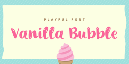 Introducing the "Vanilla Bubble" font, a fat handwriting font with a unique shape plus a few strokes to add a striped impression, this font is made directly by hand so it produces a cute and natural shape. This font is very suitable for all designs such as logos, wedding invitations, greeting cards and others, please try it. If you have any questions, don't hesitate to contact us.
 - Goudy Type by Matteson Typographics,
$19.95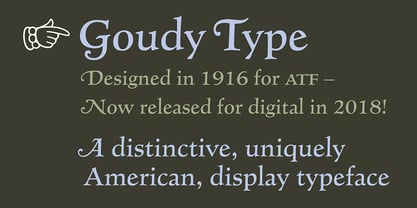 Goudy Type was designed by Frederic Goudy for ATF in 1916. He endeavored to create a lively design with some brush-lettering qualities. In his words, he believed he was still attempting to ‘find himself’ as a designer. Thirty years later he was shown the design and could hardly recollect its creation. Steve Matteson has digitized Goudy Type to preserve its place in typographic history.
 - Stratham by insigne,
$21.99Stratham is vigorous sans-serif inspired by the slab serif Clarendon. It is a heavy display face, and has a tangible modern British feel to it. The italic is especially dynamic and forward moving. Stratham includes OpenType titling and swash alternates, old style figures and small caps. Stratham is useful for headlines, highly legible signage or posters and works well in conjunction with the always popular Clarendon. - Kepler by Adobe,
$29.00Named after the German Renaissance astronomer, Kepler is a contemporary type family designed by Robert Slimbach in the tradition of classic modern 18th century typefaces. Modern typefaces are known for their cool intellectual quality, but Slimbach's Kepler multiple master captures the modern style in a humanistic manner. It is elegant and refined with a hint of Oldstyle proportion and calligraphic detailing that lends it warmth and energy. - Betm by Typesketchbook,
$39.00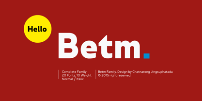 Betm is a geometric sans-serif font family created by Chatnarong Jingsuphatada (a Thai type designer) and published by Typesketchbook. Inspired by clean modern and, somewhat, mild geometric lines, Betm comes in 10 very useful weights along with complementary italics. You’ll love Betm!
 - VAG-HandWritten - 100% free

- Corsair PE by Rosetta,
$70.00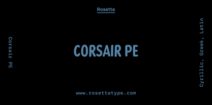 Corsair is a rugged font with a handcrafted touch. Familiar and easy to work with, it has a worn-in feel that slots right into your typographic toolkit like you’ve known it all along. Originally commissioned by Best Made Co., its functional beauty was shaped to mimic the idiosyncrasies of handwriting. Naturally randomised letterforms lend it authenticity, while weathered edges and subtle variations add a hospitable charm. The effect is an honest, approachable, and organic look that’s careful, but that doesn’t overthink it. Goes well with packaging, branding, and product lookbooks alike. Like a writer’s favorite pen, it gets even better with age.
 - Kinn by Stawix,
$30.00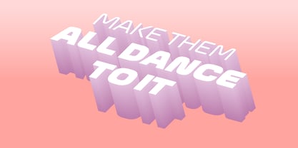 Kinn is an industrial san-serif typeface with an essence of squared structure inspired by a futuristic look. Kinn is robust but portray a friendly touch with a little roundness to its shape, it can also be very formal when it needs to but it is flexible and fun to use at the same time. Its wide proportion makes it ideally suited a wide range of modern applications and variety of usage from heavy display, headlines or even text. Kinn comes in 9 consecutive weights, each weight accompany with italics. Equipped with Alternates, Ligatures and 10 Cryptocurrency signs.
 - Minimalist by Ingrimayne Type,
$12.95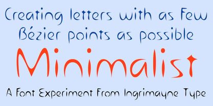 PostScript fonts are constructed by connecting dots, dots that have special attributes that control the shape of the connecting lines. In designing Minimalist, I wanted to see how few dots could be used to construct each letter. This is the source of the name--it is (or was) a minimum-point alphabet. I did not expect much from it, and was surprised that it turned out as well as it did. Since I originally drew it, I have added some points to some of the letters to get them to generate proper bitmaps, so it no longer has minimum points.
 - Pinch Remix by sugargliderz,
$15.00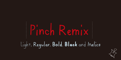 Pinch Remix is a recreated version of a typeface I made in 2007. The form hasn’t changed at all, but I composed the family by increasing the number of weights and revising the spacing and kerning. At first it was created from randomly drawing an alphabet offhand on paper with a drawing pen. Then I figured that perhaps it had the framework for a typeface. Originally because it was just a memo, I had already thrown in the trash once. Yet something about it caught me, and when I turned to look down at it, I couldn’t throw it away.
 - Surfinta Mars - Unknown license

- Vrindals Script by Pointlab,
$15.00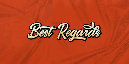 Vrindals Script is inspired by a retro style and combination with hand lettering style. It is made with personality in every single curve. I hope this will inspire you and your work. It can be perfectly paired with a marker font, and contains a super handy set of bonus swashes. It is ideal for logos, handwritten quotes, product packaging, header, poster, merchandise, social media & greeting cards. PUA Encoding and multi-language support included. To enable the OpenType stylistic alternates, you need a program that supports OpenType features such as Adobe Illustrator CS, Adobe Indesign & CorelDraw X6-X7. There are additional ways to access alternates, using Character Map (Windows), Nexus Font (Windows), Font Book (Mac) or a software program such as PopChar (for Windows and Mac). If you have any question, don't hesitate to contact me by email pointline23@gmail.com :)
 - Chaco by Tipo,
$69.00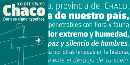 The idea behind the font called Chaco originated after testing the deficiency shown in road signs in Latin America. The design began after a long documenting period. Throughout the various stages of the work, there were several tests and checks conducted of the formal solutions implemented which, based on the results, would gradually be changed until we finally reached, in this way, its definite design. The original project for the font features three steps, namely: regular, light and bold, yet by making progress in the development, it was possible for us to perceive that by enlarging the black and thin variances, the family with 5 different weights could offer very good results in mass media, such as newspapers, magazines and television. In order to expand its possibilities of utilization, the set was completed with italics and small capitals.
 - Sunchilla by Hydric Design,
$8.00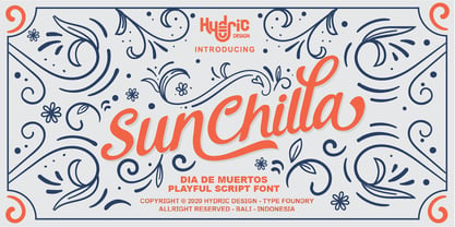 Hi there! Hydric Design proudly present the Sunchilla Script font, inspired by The Day of the Dead is a Mexican holiday celebrated throughout Mexico, in particular the Central and South regions, and by people of Mexican heritage elsewhere called "Dia De Muertos" design with a touch of Sweet, Unique and Fun style. Sunnchilla Script font is made in a handwriting style so it is suitable for use in product design and display titles. Sunchilla Script font are included in the display font category so can be used for any designs that have a cheerful, elegant and sweet impression. and also will be very suitable when used on titles, logos, product posters, websites, menu books, books, and many designs that can be explored using document fonts. it will looks very beautiful because it will easy to remember and very easy to use.
 - Bullmars by LetterStock,
$21.00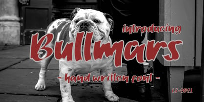 **Bullmars Font** This pair was inspired by playful poster design that i saw on some coffee shop, It was crafted by hand specially to add natural handmade feeling in its brand identity than i make it clean with pentool. **Opentype features** Bullmars Font is very good looking in logo, labels, product packaging, invitations, advertising and others. This fonts works with folowing languages: Afrikaans, Albanian, Asu, Basque, Bemba, Bena, Chiga, Cornish, Danish, English, Estonian, Filipino, Finnish, French, Friulian, Galician, German, Gusii, Indonesian, Irish, Italian, Kabuverdianu, Kalenjin, Kinyarwanda, Low German, Luo, Luxembourgish, Luyia, Machame, Makhuwa-Meetto, Makonde, Malagasy, Malay, Manx, Morisyen, North Ndebele, Norwegian Bokmål, Norwegian Nynorsk, Nyankole, Oromo, Portuguese, Romansh, Rombo, Rundi, Rwa, Samburu, Sango, Sangu, Scottish Gaelic, Sena, Shambala, Shona, Soga, Somali, Spanish, Swahili, Swedish, Swiss German, Taita, Teso, Vunjo, Zulu Thank you for using this font. LS
 - Livory by HVD Fonts,
$50.00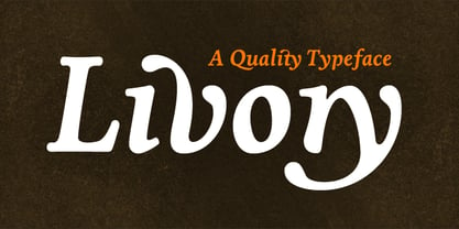 Livory is a serif type family of four fonts including small caps, 25 ornaments & 50 ligatures in each style. It was designed by Hannes von Döhren & Livius F. Dietzel between 2005 and 2010. Livory is influenced by the French Renaissance Antiquas from the 16th century. It has an organic look with a warm touch and was especially developed for long texts. With its melted corners and individual serifs, Livory has also a smooth and handcrafted appearance in display sizes. With almost 780 glyphs in each font, Livory is equipped for complex, professional typographic work. The OpenType fonts have an extended character set to support Central and Eastern European as well as Western European languages. Each font includes small caps, fractions, old style-, lining-, tabular numbers, scientific superior/inferior figures, ligatures, ornaments and a set of arrows.
 - Digofa by Twinletter,
$10.00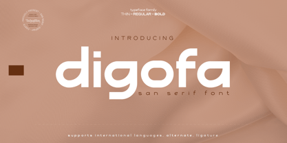 Introducing the Digofa sanserif font. is an aesthetic font, which in its use has a natural beauty and has a modern style. This clean font when you use it will create an elegant and beautiful impression. We designed this san serif family font by paying attention to the combination of each letter to create a beautiful impression and appearance, making it easier to answer your needs, both formal and non-formal needs. This font is perfect for a wide variety of design projects, sporting events, branding, banners, posters, movie titles, food and beverage, technology, quotes, clothing, logotypes, and more. Of course, by using this font your various design projects will be perfect and amazing, because this font comes with a family of fonts, both for titles and subtitles and sentence text, start using our fonts for your amazing projects.
 - Acton by Device,
$29.00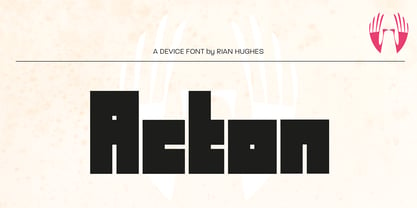 Acton is a deceptively simple, grid-based design. Though derived from a 2 by 3 arrangement of blocks, it uses white spaces to allow for more complex shapes – for example as the R – where the underlying 3 by 5 arrangement is apparent. It also departs from this strict grid-based logic for characters such as the the T, L, f and r, whose cross-bars are shorter than they would otherwise be in order to promote optical evenness. No elegant solution could be found for the V, which in geometric fonts can appear very similar to the U, lacking as it does the cross-bar that can differentiate a square A from the capital form of the n. However, the resultant diagonal retroactively proved useful on the lower-case e and a, characters that otherwise would have more uninteresting design solutions.
 - Bluset Now Mono by Elsner+Flake,
$35.00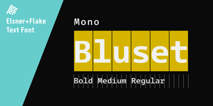 Bluset Monospaced enlarges the re-worked and expanded text- and headline typeface family Bluest Now with 6 new cuts. The concept for Bluest Now was based, in its original form, on a corporate design typeface by Elsner+Flake in 2004, ordered by the Landor Agency for a large German energy corporation. Regularly re-worked and brought up to modern standards, the typeface is still used to this day. Because of its large x-height and its well-balanced appearance, Bluset Now Mono is also excellent for use in small typesizes. The three Roman cuts, Regular, Medium and Bold, and the corresponding obliques, allow a clear differentiation of base- and display applications for every typesize. The character complement has been created for 72 Latin-based language areas and thus allows a neutral text exchange across language borders. Translation Inga Wennik
 - Piano Keybuild by Type Minds,
$5.00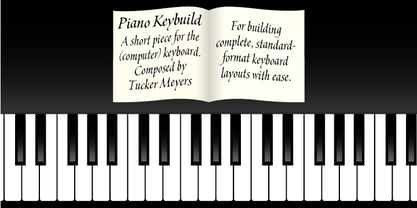 Piano Keybuild is a small font designed for creating piano keyboard layouts. It was inspired by my Yamaha CLP-840, a wonderful digital piano. The face consists entirely of keyboard keys that can be combined to form realistic keyboards. These keys come in four styles: basic outlined keys, filler keys (for adding a second color inside the outlines), keys with note names, and pre-made sets of keys. Keys of a given kind will kern with one another, but only in the order that they would naturally occur on a keyboard. (This makes it easier to spot incorrect key sequences.) It also includes digits 0 through 9 inspired by numerals used in traditional music notation. The user guide (PDF under Gallery tab) demonstrates the locations of all the glyphs as well as how to use them together effectively.
 - Sacramento Pro by Stiggy & Sands,
$39.00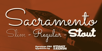 The Sacramento Pro family of typefaces was inspired by a monoline, semi-connected script from hand-lettering artist brochure work of the 1950's and 1960's. With its sophisticated upright stance, it stands on a thin line between formal and casual lettering styles, yet it has a commanding presence for headlines and titles. The Slim adds a fine pen-line style, while the Stout style expands the formal/casual dichotomy much further than the original weight. Opentype features include: - Contextual Alternates for initial and final forms. - Stylistic Alternates for an alternate lowercase t. - Discretionary Ligatures* for catch words like “and”, “at”, “by”, “for”, “of”, “or”, “the”, “to”, and “with”. - Full set of Inferiors and Superiors for limitless fractions. - Proportional and Oldstyle figure sets. * Discretionary Ligatures not included in the Stout style due to heavyweight nature.
 - Aldo Pro by Sacha Rein,
$21.17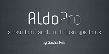 Aldo Pro is a contemporary sans serif OpenType font family designed by Sacha Rein. With 8 weights from hairline to black and an extended latin character set of 690 glyphs it is suitable for all typesetting needs, from advertising and branding to web and screen. Aldo Pro is the evolution of the free Aldo semi-bold font published on dafont.com in 2007, and which has been downloaded over 700.000 times. « I have gotten quite a lot of feedback on the original Aldo over the years and tried to integrate most of it into Aldo Pro. The x-height has been reduced to make for a less condensed, more legible font, which makes it more useful for body text than before. By popular demand the X glyphs have been changed to a more ‘classic’ shape. The font also contains some useful ligatures now. »
 - Rocketlers by LetterStock,
$23.00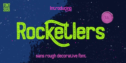 **Rocketlers Font** This pair was inspired by the retro motorbike poster design that i saw on some coffee shop, It was crafted by hand specially to add natural handmade feeling in its brand identity than i make it clean with pentool. **Opentype features** Rocketler Font is very good looking in logo, labels, product packaging, invitations, advertising and others. This fonts works with following languages: Afrikaans, Albanian, Asu, Basque, Bemba, Bena, Chiga, Cornish, Danish, English, Estonian, Filipino, Finnish, French, Friulian, Galician, German, Gusii, Indonesian, Irish, Italian, Kabuverdianu, Kalenjin, Kinyarwanda, Low German, Luo, Luxembourgish, Luyia, Machame, Makhuwa-Meetto, Makonde, Malagasy, Malay, Manx, Morisyen, North Ndebele, Norwegian Bokmål, Norwegian Nynorsk, Nyankole, Oromo, Portuguese, Romansh, Rombo, Rundi, Rwa, Samburu, Sango, Sangu, Scottish Gaelic, Sena, Shambala, Shona, Soga, Somali, Spanish, Swahili, Swedish, Swiss German, Taita, Teso, Vunjo, Zulu Thank you for using this font. LS
 - Larks Tongues by Hanoded,
$15.00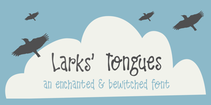 Larks' Tongues in Aspic is the fifth studio album (released in 1973) by the English progressive rock group King Crimson. I have always liked this name, as it reminded me of old stories in which witches threw all kinds of weird ingredients (larks’ tongues, bat wings and petrified dragon dung) into a big cauldron. When I created this font, it looked like the writing in an old book of spells, so I just had to call it Larks’ Tongues. Larks’ Tongues is a very lively headline font which would look good on (children’s) book covers, posters and product packaging. So, if you are about to write a book about witches, want to throw a halloween party or want to market your Larks’ Tongues in Aspic, then by all means, use this font! Comes with a magical amount of diacritics.
 - Atto Sans by Wilton Foundry,
$29.00I set out to design a contemporary font that is condensed with thick and thin strokes. The highly structured forms of this condensed font was made more interesting and softer by giving it a slightly calligraphic tone and by adding round corners. Atto's express purpose is to be both utilitarian, compact and technical but with a friendly face. The name "atto" was adopted since it refers to the measurement of "smallness" or detail. You will no doubt discover all the many pleasant nuances within Atto. Adopted in 1964, "atto" comes from the Danish "atten", meaning eighteen. Atto - (symbol a) a SI prefix to an unit and means that it is 10 to the power- 18 times this unit. Examples are one attosecond or one attometer/attometre. Atto is available in for Mac and Windows in Postscript, Truetype and Opentype. - Guenter by ParaType,
$25.00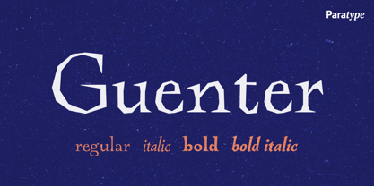 Guenter type got its name after Guenter Gnauck — the calligrapher from Eastern Germany whose works brought an inspiration and initial incitement for the design. But in contradiction to the calligraphic nature of the inspiration source Guenter has a specific construction that is built solely with straight stems. Like KvadratZ family Guenter belongs to so called 'in-one-touch' series. The first version in one basic style was developed by Zakhar Yaschin in 2001. In 2009 the font was redesigned with addition of 3 new styles and released by ParaType as a family.
 - Galagar by Jadatype,
$12.00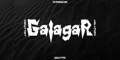 Galagar is a font with a strong look. The font is suitable for your branding name, poster title, event, or group name, supported by the font that gives a strong effect to the reader. has its own market and fans. can be used in adobe illustrator, photoshop, or microsoft word. By purchasing this font, you will get: - Uppercase and Lowercase letters - Alternates Characters - Ligatures - Numbering and Punctuations - Multilingual Support - Works on PC or Mac - Simple Installation - Support Adobe Illustrator, Adobe Photoshop, Adobe InDesign, also works on Microsoft Word. Thank you
 - Sambo Briliant by Gian Studio,
$10.00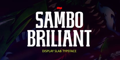 Brilliant Sambo Featuring Slab Serif totality and elegance. One of my most recent first releases, naturally drawn with pinpoint accuracy. Sambo Brilliant has the perfect amount of simplicity and subtlety for your next project. It perfectly represents the retro and vintage aesthetic. I recommend this font for your next logo, invitation, and home decor project that needs a succinct alternative combination touch! Sambo Brilliant appears with strong characters available: Get inspired by the image above and feel free to share with me what you get by using this font.
 - Forest Hill by PeachCreme,
$20.00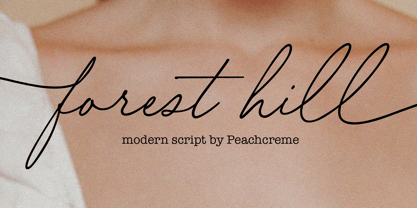 Meet our brand new script font - Forest Hill! It is a modern casual font with a full set of easygoing letters, numerals, and punctuation. The main feature of this font is that the letters are not separated. Just look how all the letters connect one by one and form one whole piece of writing. Featuring fabulous beginning and ending lowercase swashes, Forest Hill was inspired by clean handwriting with a natural flow and works well for various designs from wedding stationery to Instagram quotes, modern logos, packaging, websites, and many more.
 - Yorso Square JNL by Jeff Levine,
$29.00By any stretch of the imagination, Yorso Square JNL is an imperfect font...by design! Taking a page from the elementary school projects of years past, this sans serif face is square and blocky... looking as if it was manually constructed in haste with a ruler and pencil - just as a student might do for a book report cover, science fair project or class poster. If you need a type face that shows the innocence of youth, or possibly a bit of urban audacity - Yorso Square JNL is your choice of lettering! - Palaima by John Moore Type Foundry,
$19.00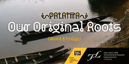 Palaima is a geometric display font, its name means word-image and is inspired by our aboriginal pictographs, Palaima was created to compose texts informal, where each character is an entertainment, featuring several variations of this font letters to make more enjoyable composition. Palaima has a set of characters that include swash, stylistic alternates, ligatures, fractions and twenty funny icons. Palaima was selected in the third Biennial of Latin American Typography "Tipos Latinos" also was honored by the Ruben Fontana's JournalTipográfica of Argentina "Best Latin American Typographic Creativity".
 - Alvarosa by Adam Fathony,
$12.00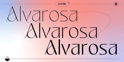 Alvarosa is a beautiful, elegant and thin display font. Incredibly trendy and versatile. Inspired by the trends of minimalist looking display fonts that shown on social media, I've made a uniqueness sans serif by adding the quirky elements on a basic letter-form but still easy to read. It can be used for various purposes such as logos, wedding invitations, headings, t-shirts, letterhead, signage, labels, news, posters, badges and so much more. Alvarosa comes with 3 different weight : Thin, Light, and Regular. More thin are for Larger text.
 - Horst by PintassilgoPrints,
$29.00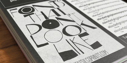 Inspired by Laatzen’s Bilderbogen etchings by the extraordinary artist and printmaker Horst Janssen, this font is packed with Open Type features that allow the creation of unique typographic pieces. Besides the set of automatic discretionary ligatures, this all-caps font also comes with two extra stylistic sets, so there are 4 versions for each letter (plus the variations contained in the ligatures). When working with ligatures turned on, the carefully handcrafted kerning table takes advantage of overlapping some ligatures with its neighbor letters, multiplying ligatures performance. An unmistakable original font to create outstanding design works!
 - Ballard by Proportional Lime,
$5.95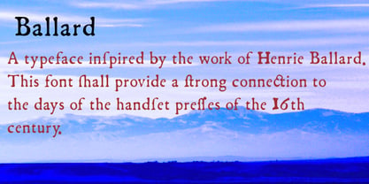 This typeface was inspired by a font used by Henrie Ballard. Ballard operated on Fleet Street at the Signe of the Bear in London, England. He was active in the industry from 1597-1608. The font is meant to capture the feel of the original typeface with the capability of reproducing the many ligatures that are part of what make that era's printing interesting. The Italic version has a dramatic feel that is almost handwritten in appearance. Every Proportional Lime font comes with a complete guide to its Unicode extended character set.
 - Ivory by FaceType,
$24.00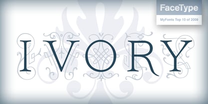 Ivory is inspired by a beautiful typeface used in an illustrated compendium about pomology from 1882. We separated the elegant “Swashes” from the letters – use it together with “NoSwashes” to get two-colored initials. Please note that the kerning of NoSwashes works only together with Swashes. To achieve the two tone effect shown in the samples, you need to use an application that supports layers. For example, Adobe Illustrator, Adobe InDesign, Adobe PhotoShop, CorelDRAW, and Quark. Some of the preview images were made by Arina Karen Renata Palilingan.
 - Reklame Script by HVD Fonts,
$30.00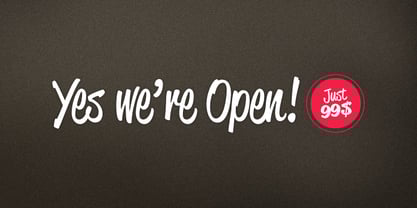 Reklame Script is a brush typefamily consisting of four weights. It was designed by Hannes von Döhren in 2010. This family is influenced by the handlettering of printed advertisements of the 1940s and 1950s. You can combine the four weights to gain a better emphasis – perfect for headlines, posters, and other display uses. Reklame Script is equipped for professional typography. The OpenType fonts have an extended character set to support Central and Eastern European as well as Western European languages. The fonts also contain double-letter ligatures to prevent repetition.
 - Neugen by Minor Praxis,
$20.00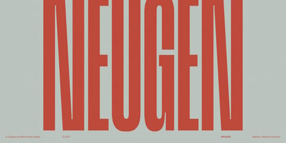 Inspired by retro movies and theatre display design. A very condensed font made by Minor Praxis. Perfect for headlines, tall-format prints, posters, and displays which can utilize space of a medium. Neugen is a condensed type of font with a very dense kern. Give a strong impression which can be matched with basic sans serif fonts as a body copy that can make it more casual and modern looks. Available in medium and medium-rounded style with multi languages support. Ligatures, alternates, and stuff like icons and symbols.
 - Niveau Serif by HVD Fonts,
$40.00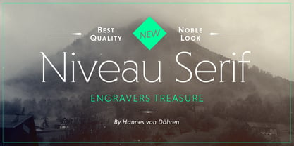 Niveau Serif - the companion of Niveau Grotesk - is a type family of six weights plus matching italics & small caps. It was designed by Hannes von Döhren in 2013. Influenced by classical nineteenth century engravers faces, the fonts are based on geometric forms. Niveau Serif has a contemporary feel and combines the clearness of a Sans with the elegance of a typeface with serifs. Niveau Serif is equipped for complex, professional typography with alternate letters, arrows, fractions and an extended character set to support Central and Eastern European as well as Western European Languages.
 - Charlemagne by Adobe,
$29.00The capital alphabet Charlemagne was designed in 1989 by Carol Twombly. The basic forms are modelled on those used in classical Roman engravings. They are distinguished by pointed serifs which sometimes extend beyond the bounds of the forms, for instance on the E, F and S. These serif forms have made other historial appearances, for example, in handwritten rectangular capitals of the 9th century. The serifs lend the typeface a light ornamental touch. Charlemagne is a typical titling typeface and is best used in large and very large point sizes to emphasize its classical elegance. - Hess Gothic Round NF by Nick's Fonts,
$10.00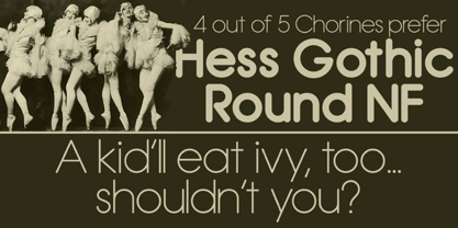 The family tree of this friendly face runs deep. Its primary inspiration is Twentieth Century, designed by Saul Hess as a monoline version of Paul Renner’s Futura. The design was reinterpreted by Herb Lubalin as Avant Garde in the 1970s. This version softens the harsh geometry of the original designs with rounded line endings: the result is a warm, inviting face that is elegant, confident and inviting. All versions of this font include the Unicode 1250 Central European character set in addition to the standard Unicode 1252 Latin set.

