10,000 search results (0.102 seconds)
  1. Transistor - Unknown license
  2. Velour - Unknown license
  3. ambulance shotgun - Unknown license
  4. Ellipsoideogram - Unknown license
  5. Misirlou Cyr - Unknown license
  6. American Donuts - Unknown license
  7. Cathzulu Extraz - Unknown license
  8. Independant - Unknown license
  9. Joint by PizzaDude - Unknown license
  10. FATSOcaps - Unknown license
  11. EMILKOZAK.COM | fartdeco - Unknown license
  12. Kremlin Georgian I 3D - Unknown license
  13. Futurex Slab - Unknown license
  14. Kiloton - Unknown license
  15. SF Archery Black Outline - Unknown license
  16. Degrading Morals - Unknown license
  17. Xtreme Chrome - Unknown license
  18. SF Collegiate - Unknown license
  19. Café Pop - Unknown license
  20. Poke - Unknown license
  21. Sujeta - Unknown license
  22. !Y2KBUG - Unknown license
  23. stamPete - Unknown license
  24. Abduction2000 - Unknown license
  25. Ren & Stimpy - Unknown license
  26. RoboKoz - Unknown license
  27. VTCKomixationSCBold - Unknown license
  28. VTC Tribal - 100% free
  29. Fudd - Unknown license
  30. Bulka - Unknown license
  31. Refrigeration - Unknown license
  32. ! Jamiroquai ! - Unknown license
  33. Psycnosis - Unknown license
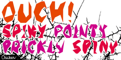
  34. Behrensschrift iF Plus by Ingo, $29.00
    Peter Behrens’ renowned art nouveau type from 1902 – with ornaments. Newly revised and neatly digitalized by Ingo Zimmermann In 1902, Peter Behrens (1869–1940), architect, designer and typographer, created a new ”German“ type which became very successful very quickly for the Rudhard’sche Gießerei (foundry which later became Gebr. Klingspor AG) in Offenbach am Main. It served, for example, as the official German type for the world expositions in 1904 and 1910. Behrens himself writes about the development of this type ”...For the actual form of my type, I took the technical principle of the Gothic script, the stroke of the quill feather. The proportions of height and width and the boldness of the strokes of the Gothic letters were also decisive for me in producing a German character. A cohesive character could be hoped for by avoiding all non-necessities and by strictly carrying out the design principle of holding the quill at an angle…“ By the way, when “long s” is activated, the typographically correct “round s” is automatically placed at the end of the word so that you need only pay attention to the correct s on syllable endings within words. When using “long s,” you must ensure the correct use of the rules for the Fraktur font: “round s” is always at the end of the word, also in compound words. For those of you who want to be even more correct, read the corresponding article in >> Wikipedia. Peter Behrens also drew matching ornaments for his typeface – we have likewise carefully revised these decorative touches and arranged them into a font. The "Behrens-Schrift" fits best on all topics that have something to do with art history or the time around 1900.
  35. ClerestorySSK - Unknown license
  36. Walk Da Walk One - Personal use only
  37. Canbera by Viswell, $19.00
    Canbera is an old style serif font, its funky, round, hight-contrast and bold shape with a retro touch is perfect for displayed, head text, logotype and many more.
  38. Garbancera by Rodrigo Navarro Bolado, $30.00
    Gothic fraktur inspired design, I wanted to resemble old german calligraphy but making it very geometric, so I used an isometric reticle during sketching. This is a display font, created for BIG sizes, non textual. I recommend it for branding, poster, logos or titles. Its very experimental -- it exists within the limits of legible and illegible reading. I choose the name “Garbancera” because gothic calligraphy has issues that are linked with dark, gloomy, lugubrious things or fear feelings, culturally in Mexico. I related this with death and for mexicans, death is something we celebrate and give us joy and happiness, annoying, the most representative Mexican characters, one of those is “La Calavera Garbancera” or better known as “La Catrina”, a clothes skeleton with only a hat. It was drawn this way to make a critic to all Mexicans at that time, that were poor but they wanted to represent a high lifestyle, “those that where to the bones, but with a French hat with ostrich feathers”. La Catrina was created by José Guadalupe Posada, a Mexican lithographer but also a newspaper illustrator. I think this is a beautiful font that can lead to great results, just use it wisely.
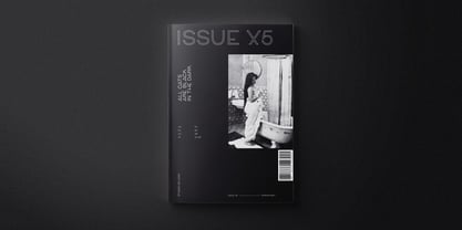
  39. Cervo Neue by Typoforge Studio, $29.00
    Cervo Neue is the new perfected and extended version of Cervo, containing 18 variants. It differs from the previous version with the higher accents over glyphs, enlarged punctuation, old-style numerals and the newly added varieties Semi Bold, Bold, Extra Bold and Black. Additionally, there is the variety of grotesque. Font Cervo is inspired by a “You And Me Monthly” published by National Magazines Publisher RSW „Prasa” that appeared from Mai 1960 till December 1973 in Poland.
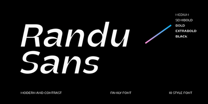
  40. Randu Sans by Yukita Creative, $14.00
    Randu Sans Serif Display Font Family is a sleek, modern font family with an elegant typography style. Created with clarity and boldness in mind, this font offers a variety of bold and italic styles, providing flexibility in its use. Whether used for titles, headings, or poster designs, the Candied Sans Serif Display Font Family provides the clarity and appeal needed to hold an audience's attention.
Looking for more fonts? Check out our New, Sans, Script, Handwriting fonts or Categories
abstract fontscontact usprivacy policyweb font generator
Processing