10,000 search results
(0.045 seconds)
- Outright Horror by Wing's Art Studio,
$10.00 This new addition to my Video Store font series takes a scratched lettering style and pairs it with a wildly spontaneous brush font with horrific effect! Given life by an unknowable hand, this font clawed into the misty midnight inspired by retro horror movies, ghost stories and unsettling fireside tales. A boiling pot of misspent youth reading Edgar Allen Poe, M.R. James and H.P. Lovecraft. Outright Horror comes with an all-caps scratched style font with a subtly controlled Art Deco feel and a contrasting brush font that ramps up the fear! Consider it’s Regular style the skeleton that holds the Bold creeping flesh, ready for some horrific Halloween designs! It also comes with numerals, punctuation, language support, custom underlines and automatic ligatures. Contents: Outright Horror Regular Outright Horror Bold Underlines
 - Dreadnought by Hanoded,
$15.00 With Dreadnought I go back to my roots: one of my very first fonts was a scary brush typeface called Face Your Fears - a very popular typeface with horror lovers, thrill seekers and gangsta rappers. Dreadnought was created using a stiff brush and some very high quality paint on textured paper. The result is a lively, scary and very legible font. Use it for your movie, book or album: you won't be disappointed!
 - Buco Nero by Dumadi,
$18.00 Buco Nero is a modern sensation brush font. Featuring bold in the dark, it offers All Caps font support and multilingual support, Buco Nero is perfect for Movie titles, thrilling titles, distro shirts, spooky content, media socials, and spooky graphic design. Compatible with such as Photoshop, Affinity Design, Adobe Illustrator or Silhouette design studios. Its makes it great for creative projects, whether it’s an inspiring wall poster or for communicating your brand.
 - Buck One by Inumocca,
$21.00 BuckOne is A Retro Display typeface. Reverse-Contrast letterform kinds unique shape,Retro vibe and psychedelic atmosphere. The Typeface comes with Stylistic Set and Ligature Exellent typeface to use for covering your Project, like Branding, Movie Title, Headline Letter, Bookcover or Book Content, Magazine cover, Poster, Quotes Lettering, Logos, and more your project design. - Unique glyphs - Multilingual Characters Support - UPPERCASE - Lowercase - Numeric - Symbol - Punctuation Character - Stylistic Set (ss01, ss02) - Ligature - PUA encoded inumoccatype
 - Lavah Pro Arabic by Protype,
$50.00 Lavah Pro is the upgrade from old version of Lava Arabic 1.0. It's Arabic condensed/narrow with grunge and rough style for vintage style posters, brands or ads maybe for food ads or movie poster. Lavah Pro is supported by OpenType Features with many Stylistic Alternates and Discretionary Ligatures and It's support Arabic, Persian, Urdu and Latin. Designed and Created by Ibrahim Hamdi Copyright © 2019 by Protype Foundry. All rights reserved.
 - Lovadelic by Aiyari,
$20.00 Introducing a new retro & groovy typeface called Lovadelic. Inspired from 70's script lettering combine with psychedelic balloon typography. Lovadelic comes with open type features such stylistic alternates, stylistic sets, contextual alternates & ligatures. The package also comes with extras graphic to help you make stunning design. Lovadelic typeface is best uses for headings, Logo type, quotes, apparel design, invitations, flyer, poster, greeting cards, product packaging, book cover, printed quotes, cover album, movie, etc
 - Moneer by Inumocca,
$15.00 Moneer is A Retro Display typeface. 70s style era, Simple, play full, Powerfull and unique Character font The Typeface comes with Stylistic Set and some family font Exellent typeface to use for covering your Project, like Branding, Movie Title, Headline Letter, Bookcover or Book Content, Magazine cover, Poster, Quotes Lettering, Logos, and more your project design. - Unique glyphs - Multilingual Characters Support - UPPERCASE - Lowercase - Numeric - Symbol - Punctuation Character - Stylistic Set (ss01, ss02) - PUA encoded inumocca type
 - Gothic Story by Mvmet,
$10.00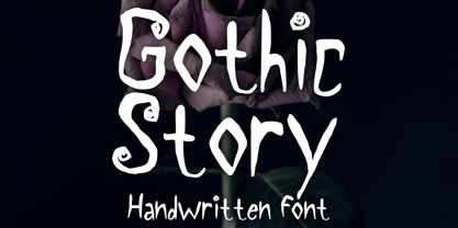 Gothic Story is a kid-friendly gothic handwritten display font, inspired by 90s gothic movies. It will be perfect for your gothic and Halloween-themed needs! You can use it for anything ranging from t-shirts and clothing, to your gothic book designs, Halloween party needs, greeting cards, stickers, posters, banners, or anything that needs a cool touch. Try it to create fabulous designs and feel the gothic and Halloween vibes with it!
 - Showra by Inumocca,
$20.00 Showra Modern Display Typeface, Bold and powerfull and I want to Presenting Modern and Classy tastes. The Typeface comes with Ligature Sets (more than 240) and alternates Exellent typeface to use for covering your Project, like Branding, Movie Title, Headline Letter, Bookcover or Book Content, Magazine cover, Poster, Quotes Lettering, Logos, and more your project design. - Unique glyphs - Multilingual Characters Support - UPPERCASE - Lowercase - Numeric - Symbol - Punctuation Character - More Than 240 Ligature Set - Stylistic Set
 - Redriver by Niznaztype,
$9.00 Redriver is a postmodern font in a futuristic graphic style, mixing characteristics from postmodern, contemporary and even older design styles. Redriver's strength will be the soul of your graphic designs. Redriver is perfect for futuristic and postmodern graphic art, editorial design, posters, t-shirts, book covers, headlines, advertising, branding, movies titling, and more. Redriver can be used for both short or long text in your designs and comes in 3 styles: thin, regular, and bold.
 - Grannys Greenhouse by Rocket Type,
$14.00 Granny's Greenhouse, a cute fun display font with tons of alternate characters. Granny's Greenhouse’s best uses are for headings, logotypes, quotes, apparel design, toy packaging, invites, flyers, posters, greeting cards, product packaging, book covers, printed quotes, cover albums, movies, etc. To access the alternate glyphs, you need a program that supports OpenType features such as Adobe Illustrator CS and Adobe Indesign. How to use OpenType features: https://helpx.adobe.com/illustrator/using/special-characters.html
 - Caupako by Trustha,
$17.00 Caupako is a display font. Inspired by the shape of the axe. Nostalgia on the legendary old action film. A young man armed with a deadly axe. Comes in two font styles, regular and oblique. Caupako comes with 400+ glyphs, which also include multilingual languages. It's perfect for headlines, branding, and many more.
 - Figment by Scholtz Fonts,
$10.00 Like a figment of the imagination, this very readable font wafts across the page, leading the reader into a world of enchantment. Ethereal and fluid, it is reminiscent of sorcerer's spells written on ancient parchment. It manages, by the distortion of its characters, to transform a simple serif font into something quite different. Wavy outlines and an uneven baseline create an impression of fluidity and magic, while retaining the essential clarity of the classic serif body font. Use Figment for: -- Children's books -- Halloween advertising media -- book covers -- movie titles -- swing tickets -- posters Figment is available in two styles, Figment Regular and Figment Force (a wider and bolder style) The font has been professionally letterspaced and kerned. All upper and lower case characters, punctuation, numerals and accented characters are present.
 - TG Haido Grotesk by Tegami Type,
$35.00 Haido is a new contemporary grotesk typeface influenced by post-modernism style. This typeface is has very neutral look, thus making this new typefaces has versatility for use in all kinds of modern design. Haido comes with 18 Styles including 9 Weight, italic and variables font. The small detail of inktrap in this typeface, making Haido is has high legibility in small size and very useful especially for printing needs. And last but not least, Haido has several alternates characters, ligatures and covered more than 100 languages including 2 script latin and cryllic.
 - ETIAW v3 - 100% free

- Cathzulu Extraz - Unknown license

- Kallamar Stout - 100% free

- Akademie Alte - 100% free

- Straight Fighter by Arterfak Project,
$16.00 Straight Fighter is a stencil font that exudes strength, masculinity, and bravery. Inspired by classic war posters, military style, and the punk scene. With the unique stencil cutting and letter shapes, this font features bold lettering that demands attention. It comes equipped with special characters and multilingual support, making it a versatile choice for a variety of design projects. Straight Fighter is particularly suitable for display, headlines, posters, editorials, patches, logotypes, branding, movies, flyers, and short quotes. If you want to convey a powerful message with your design, Straight Fighter is the perfect choice. Here’s what you’ll get : Uppercase Lowercase Numbers Symbols & punctuation Stylistic alternates Multilingual support. Thank you for your support!
 - Steampunk by Kustomtype,
$25.00 The Steampunk font is inspired on sixties hand lettered French movie poster of Charles Bronson. This style of type is instantly associated with advertising and design for high-end products with a touch of Arts & Crafts. Steampunk is carefully drawn for quality and readability. Steampunk is great for display, logos, branding, packaging, advertising, food, sports, titles, film, tv, and more. Steampunk comes in 2 styles witch match perfectly together. Steampunk is a great display family with roots in the past century advertising and sign painting industry, and no wits but smooth polished wit hall the features a good designer needs. Steampunk is designed by Coert De Decker in 2018 and published by Kustomtype Font Foundry.
 - Sienna by Monotype,
$40.00 Sienna is a soft serif typeface designed for both text and display purposes. Its soft and sharp structure creates an unusual, yet pleasing appearance. This leads to a comfortable reading experience with enough personality to create impactful titles and headlines, and Sienna will really shine in your branding projects. Variable versions of the fonts are available allowing you to fine tune the weight to your exact liking. Small Caps are included (along with their matching diacritics) – adding another layer of versatility to this typeface. Proportional Lining figures are an option if you prefer them to the default Old Style figures. A number of swash alternates enhance Sienna, giving you the opportunity to add more flair and personality to your title and branding designs. Simply activate Stylistic Sets to start adding flourishes to your typography. There are 14 fonts altogether, with 7 weights in roman and italic from Thin to Black styles. Sienna has an extensive character set (800+ glyphs) that covers every Latin European language. Key features: 7 weights in both roman and italic Variable fonts included with full family 59 Alternates 8 Ligatures Small Caps Full European character set (Latin only) 800+ glyphs per font.
 - Populaire by PintassilgoPrints,
$29.00 Populaire is a hand-drawn font that mimics true handcrafted lettering. Counting 4 glyphs for each letter, the laborious kerning table ensures that the glyphs are really exchangeable. Yet, there’s a cool set of ornaments and a kind-of-magic OpenType feature. When the Populaire font is used in OpenType-savvy applications, its Contextual Alternates feature produce a striking random-like effect on glyphs distribution, achieved by cycling through alternates. When not using the Contextual Alternates feature, you can still pick the alternates in the Glyphs palette or use the alternates available from the keyboard upper and lower case.. Inspired by the electrifying posters from May 1968 by Atelier Populaire, this dynamic font is flexible enough to bring freshness and energy to a wide range of design applications. Used in the titles for the 2012 movie Life of Pi.
 - Vallocka by Keristyper Studio,
$14.00 Introducing of our new font Vallocka, digitised from hand painted characters with brush markers. This font is good for logo design, social media, movie titles, book titles, short text (and even long) text, letters, and a good choice when combined with other script, sans, or serif fonts as secondary text font. Featured: Standard Uppercase & Lowercase Numeral & Punctuation Multilingual : ä ö ü Ä Ö Ü ß ¿ ¡ Alternate & Ligature PUA encoded We recommend programs that fully support OpenType features and have a Glyphs panel such as Adobe applications or Corel Draw for you Ito make use of all the variations of the glyphs. Hope you enjoy our fonts!
 - Foxes Storm by Sipanji21,
$25.00 "Foxes Storm" is a black metal-themed font with a menacing and scary look, making it perfect for a wide range of dark and horror-themed design projects. Whether you're designing a metal band's album cover, a horror movie poster or logo, or any other project that requires a dark and edgy aesthetic, "Foxes Storm" is the font you need. Its sharp and jagged letterforms, combined with the bold and intense appearance, make this font perfect for designs that require a powerful and impactful look. With "Foxes Storm," you can create designs that are both memorable and terrifying, bringing your dark and metal-inspired visions to life.
 - Branlerst by Uncurve,
$25.00 Branlerst is an aesthetic vintage typography font, inspired from the past, elegant signage, gold leaf , sign painting and old label product. Branlerst comes with alternates characters to make more eye cacthy . It is suitable for authentic logos, headings, sign painting, posters, letterhead, branding, magazines, album covers, book covers, movies, apparel design, flyers, greeting cards, product packaging, and more. You just cobine with the another font like script , serif or san serif font and adding some effect finally BOOM..!! you get a great design for your project.
 - Kiddy Sans by TypoGraphicDesign,
$19.00 CONCEPT/CHARACTERISTICS What is a childlike, naive writing, acting not boring static, has enough personality/character and yet is easy to read? › Oversized points › Slightly curved, warm and friendly bars › Open, friendly forms › Organic, lightly battered forms APPLICATION AREA The friendly, playful and warm character of the font »Kiddy Sans« would look good at display size for party flyer & movie poster, music covers or headlines in magazines or websites… TECHNICAL SPECIFICATIONS Headline Font | Display Font | Sans Serif Font »kiddy Sans« with 8 styles & 366 glyphs, inkl. accents & €
 - Autoray by PizzaDude.dk,
$16.00 Usually fonts that are related to computers, space, future are not handmade, but rather digital made. Autoray is 100% handmade, and I am not sure which category it fits in. It has this futuristic and intergalactic look, but at the same time the handmade details are pointing in a more grafitti and comic way. I will let you decide where to go with Autoray! I have added 5 different versions of each letter, and they automatically changes as you type - and of course, there's multilingual support - and even intergalactic gravity! :)
 - Rasane by Locomotype,
$20.00 Rasane font has a distinct personality where the curved geometric shapes give a friendly face to various uses. At the same time, the pointed end of the stem gives a dynamic feel. This font comes with over 400 characters, making it possible to use fonts in many different languages. The family consists of 14 fonts of 7 weights plus matching italics. Rasane font works well on display and small sizes. Rasane is the perfect choice for headlines, packaging, posters, logotypes, signs, websites, brands and more!
 - Hype vol 3 by Positype,
$20.00 Hype lives up to its name. An energetic attempt to blow past previous sans’ descriptive words of massive, large, extensive, super and others. Hype transcends the everyday marketing terms and rests solely atop them all with a jaw-dropping current offering of 432 fonts that spans 18 widths and 12 weights. Insert a long pause and mic drop here, because nothing compares. Hype Volume 3 includes 6 of the 18 subfamilies that comprise the full Hype Collection. Each of these subfamilies represent 1 of the 18 available widths and each width contains 12 weights and matching italics. Volume 3 contains 144 fonts. Families included in Volume 3: Hype 0300, Hype 0600, Hype 0900, Hype 1200, Hype 1500, and Hype 1800. If you would like to complete your collection be sure to view and purchase Hype vol 1 and Hype vol 2. Hype’s bombastic approach meant supplying everything it could within each typeface: including small caps, yes small caps, a full numeral set that includes inferiors and superiors, super- and subscripts, full fraction support, case-sensitive forms, stylistic alternate letterforms, and more while touting a full Western, Central and South Eastern European character support. Embracing a Univers-esque bravado and a willingness to push the envelope, Hype leaves even more room to grow. No corners were cut, no shortcuts taken with a focus on sensible, efficient letter construction and functional reliability that ignores any one classification and instead looks to form an amalgam of classic sans styles influenced by wood type, movie showcards, and urban industrial letterforms.
 - Hype Vol 1 by Positype,
$20.00 Hype lives up to its name. An energetic attempt to blow past previous sans’ descriptive words of massive, large, extensive, super and others. Hype transcends the everyday marketing terms and rests solely atop them all with a jaw-dropping current offering of 432 fonts that spans 18 widths and 12 weights. Insert a long pause and mic drop here, because nothing compares. Hype Volume 1 includes 6 of the 18 subfamilies that comprise the full Hype Collection. Each of these subfamilies represent 1 of the 18 available widths and each width contains 12 weights and matching italics. Volume 1 contains 144 fonts. Families included in Volume 1: Hype 0100, Hype 0400, Hype 0700, Hype 1000, Hype 1300, and Hype 1600. If you would like to complete your collection be sure to view and purchase Hype vol 2 and Hype vol 3. Hype’s bombastic approach meant supplying everything it could within each typeface: including small caps, yes small caps, a full numeral set that includes inferiors and superiors, super- and subscripts, full fraction support, case-sensitive forms, stylistic alternate letterforms, and more while touting a full Western, Central and South Eastern European character support. Embracing a Univers-esque bravado and a willingness to push the envelope, Hype leaves even more room to grow. No corners were cut, no shortcuts taken with a focus on sensible, efficient letter construction and functional reliability that ignores any one classification and instead looks to form an amalgam of classic sans styles influenced by wood type, movie showcards, and urban industrial letterforms.
 - Shahrazed 2.0 by GrafikarFonts,
$49.00 Shahrazed 2.0 is an arabic and latin typeface. Shahrazed, Arabic glyphs are based on calligraphic writing inspired by Naskh and Maghrabi. (1366 Glyphs) It has more than 400 ligatures which add an aesthetic advantage in the connections of the glyphs. Also, stylistic set and variations that enrich the aesthetic aspect and the composition and layout needs.
 - Schoonheid by Fauzistudio,
$12.00 Schoonheid is based on the thick and thin Gothic typeface that was popular in the US during the first half of the 20th century. Schoonheid Contextual Capitals has more than 100 ligatures, alternatives, and special characters consisting of uppercase letters. Implementing alternative Contextual features makes it easier for all people to use. Hope you enjoy. Intuisi Creative
 - Redoneta Display by Rafael Jordan,
$20.00 Redoneta Display is a bonus subfamily of the geometric Redoneta Trilogy (Sans, Sans Rounded, and Slab) with extra bold trendy forms. It contains a display style for each style. Expressivity and efficiency: Redoneta Display has the same OpenType features as the rest of the Redoneta family, 100 icons & emojis plus, and a unique personality for each style.
 - Satsuma by Hanoded,
$20.00 Satsuma. It used to be only a Japanese orange, but now it's a typeface as well. A rather unusual typeface. Satsuma is rough around the edges, squarish and playful. It is handmade and comes with over 400 interlocking ligatures. If that ain't fun, I don't know what is! Of course, Satsuma comes with extensive language support AND accented ligatures! Due to the complexity of this font, it only comes as TTF.
 - Aeda Rift by ZP Fonts,
$20.00 Aeda Rift is a high-contrast display typeface characterized by its sharp serifs and graceful contours, mirroring the elegance and hostility of the desert landscape. Consisting of nearly 400 glyphs, this font includes a full upper and lower case Latin-based alphabet, punctuation, symbols, diacritics, and ligatures—all together supporting over 82 languages. Perfect for headlines, pull quotes, and intro decks, Aeda Rift is carefully kerned and primed for creativity.
 - Al Baratheon by Aluyeah Studio,
$125.00 Hello Aluyeaholics! Be the King or Queen of your project with Baratheon. This display font is inspired by Medieval Knights and crafted with attention to detail. Feel like a Lord or Lady and show your inner King or Queen with Baratheon. Coming with 200+ stunning and super easy to use alternates and ligatures with quick access. To get results like the preview just type B.2a.7r.ath.17eo.2n.14
 - Epistula by JOEBOB graphics,
$30.00 Containing over 100 ligatures, Epistula is a loosely written font, resembling my own natural way of writing. It has a nice flow and the pointy tail-ends give it a certain speed. Creating Epistula has been a long process, but returning to the drawing board a few times has – in my humble opinion – paid off. This font comes in two weights: regular and medium. Because sometimes one flavour just isn’t enough…
 - Linea 72 by OLOF Type Foundry,
$25.00 Linea 72 is a typical seventies display typeface that was designed by Roland Hirter back in the phototypesetting days, when typefaces were really drawn by hand. In this static environment each work step took its time. With the decision to digitize this typeface his son Thomas Hirter also chose to develop it further with todays technical possibilities. That’s why the font now includes over 600 glyphs and ten stylistic sets, offering different stylistic alternates of several letters. Linea 72 comes in the two original styles Regular and Kontur.
 - Martin Luther by Harald Geisler,
$59.00 ❧ Useful links: Luther’s Manuscripts at the UNESCO Memory of the World at Google Arts and Culture Martin Luther font on Kickstarter (with Film about the creation) Each letter of the Martin Luther font is strictly based on original samples found in Martin Luther’s 500 year old handwritten manuscripts. Letters that occur more often for example vowels have two or more different versions stored in the font. (➶ Figure 4) These alternative forms are exchanged automatically by the font as you type, and create a vivid look that comes close to actual handwriting. The font avoids that two identical letters are placed next to each other like, for example the two “o” in the word “look”. ➸ What Historic Sources is the Font based on? Two historic documents were used to base the font on. The notes Luther took before giving his speech in Worms in 1521 and a 6 page letter he wrote immediately after to Emperor Charles V., summarising his speech (➶ Figure 2). Both documents have been added to the UNESCO “Memory of the World” and can be seen at the Google Arts and Culture website. ➸ The Creation of a Handwriting Font The creation of a handwriting font is very different from the creation of a regular font. Harald Geisler has specialised in recreating handwriting in preceding projects with Albert Einstein’s, Sigmund Freud’s and his own handwriting. His experience working with Archives and Museums has gone into this project. First Geisler analyses the movement in the writing to understand how each letter is drawn. This involves partially learning how to write like a person. In this process not the outlines of the sample are reproduced but the original movement path of the handwriting (➶ Figure 3). In a second step width and contrast is added to reproduce Martin Luther’s characteristic impetus and the writing tools used at the time. (Link: Youtube Playlist showcasing the creation of individual letters) How about signs that can’t be found in archives? Some Glyphs can not be found in 500 year old manuscripts, for example the @-sign. Towards the end of the creation one collects a profund amount of details about how a writer moves on paper and addresses certain tasks moving the pen. Keeping this knowledge in mind an improvisation can be based on similar letter forms. For example the @ sign is based on of the movement of a lowercase a and parenthesis. ➸ Features of the Martin Luther font ❶ Extensive Documentation of the creation of the font, including high quality reproduction of the used manuscripts. ❷ Additional texts from Historian Dr. Henning Jürgens and Palaeographer (and Luther handwriting expert) Prof. Ulrich Bubenheimer ❸ Alternating Letters - in handwriting every word looks a bit different. To avoid that two identical letterforms are placed next to each other (for example in the word look) the font actively changes between different versions of letters as you type. ❹ Ligatures - characteristic writing forms when two letters are combined (for example “ct”) (➶ Figure 5) ❺ Terminal Letterforms - renders a special letterform when letter is at the end of a word. (➶ Figure 8) ❻ ‘’’Initial and Medial Letterforms''' - some letterforms are different when placed in the beginning or middle of a word, for example the lowercase s. ❼ Luther Rose - is a seal Luther used to authorise his correspondence. Today it is a widely recognized symbol for Luther. When you enter the numbers of Luthers year of birth and death 14831546 using the Martin Luther PRO font, it will render a stylised version of the Luther Rose. (➶ Figure 7) ❽ Historic letter-forms - letter-forms that are specific to medieval writing around 1500. For example the long-s or h with a loop at the bottom. (➶ Figure 6) ⚑ Multi language support - see the technical information tab for a full list of supported languages. (➶ Figure 11) ➸ The different Styles explained ❋ Martin Luther PRO - this includes all features listed above and is geared towards writing texts that are more readable today. It features alternating letters to create a natural handwriting look as well as two stylistic sets accessible through the OpenType menu. Historic forms are available through the glyph picker. ❋ Martin Luther Historic - this font creates a historically correct reproduction (i.e. with long-s) of Luther’s medieval latin handwriting. It features alternating letters to create a natural handwriting look as well as two stylistic sets accessible through the OpenType menu. ❋ Martin Luther Expert-1 - Dedicated access to the first set of letters only. ❋ Martin Luther Expert-2 - Dedicated access to the second set of letters only. ❈❈❈ Family Pack - recieve all fonts at a discounted price. ❈❈❈ ➸ Kickstarter The creation and development of the Martin Luther font was financed by 500 supporters on ➸Kickstarter.
 - Black Magica by Designova,
$15.00 BLACK - A typeface born at midnight. A typeface that crawls to the darkness. A typeface with split-personality. A typeface that can conjure the UNKNWN. BLACK is a hybrid / mysterious typeface with a true uniqueness of it's own. This all caps typeface has two different nature: the uppercase is defined by rare dimensions while the lowercase is purely simple & minimal. This typeface is perfectly suitable for anything that needs to stand out from crowd, be it some Ultra Modern Branding, Techno or Cosmic Themed Designs, Haunted Movie Posters, Mysterious Arts and even the Minimal Stuffs. The typeface could be perfect choice for logo / logotype design, branding, marketing graphics, banners, posters, signage, corporate identities as well as for editorial design that can bring uniqueness. Please see the examples shown above to get an idea about the capability of this typeface. Handcrafted and designed with powerful OpenType features in mind, each weight includes extended language support including Western European & Central European sets.


