2,632 search results
(0.022 seconds)
- Pristinia Duo by Prestige Artsy Studio,
$15.00 Pristinia Duo is a powerful fancy and impactful bold mono-lined script font that comes in with a clean all-caps sans serif font that makes a great harmonious pair. The monolined script comes in with a large number of ligatures providing you with several options for your designs. Pristinia Duo is supporting western, southern, southern american and south eastern european. Pristinia Duo is perfect for branding, web headings, logos, quotes, movie titles and more... Promote your next project today with this great duo and set your message apart from others. I am eager and elated to see what you can do with Pristinia Duo!
 - Arabic Ramadan Style by Sensatype Studio,
$15.00 Arabic Ramadan Font is a fancy, unique, and versatile arabic font, that you can combine to get any variations and unique shapes easily just in seconds with choose alternates of them. It is a serif display font with moderate contrast that perfect for moslem branding projects, logo, wedding designs, social media posts, advertisements, product packaging, product designs, label, photography, watermark, invitation, stationery, and any projects, it makes with a high level of legibility. What's Included: Character set A-Z Uppercase & Lowercase Numerals & Punctuation Accented Characters (West Europe) Stylistic alternates Works on PC & Mac Recommended using Adobe Illustrator or Adobe Photoshop. Wish you enjoy our font. :)
 - Smart Chameleon by Cititype,
$17.00 We are pleased to offer a unique typewriter font. Consists of two versions, namely regular and italic, Smart Chameleon has more than 650 glyphs and can be used in more than 150 languages. We present it in a handwritten version with untidy curve that makes you even more exasperated. Smart Chameleon has a vintage style that is packaged in the current version. Suitable for all styles, you only need to replace the color and background of the design and the appearance will totally change, from children's style to fancy, retro or modern youth style. Just like a chameleon that changes according to the conditions. Enjoy.
 - Alga by Nova Type Foundry,
$42.00 Alga is a high contrast modern typeface with a contemporary look. It has subtle details that make it appealing for big sizes and headlines. It is a lively and charming serif typeface with lots of fancy curves. It is a serif typeface that will shine in headlines and short pieces of text. It also works in smaller sizes, but it is not for the tiny text sizes. Alga started from an exploration of the thinner weight with this idea of a tall and elegant serif typeface with low contrast. Then it evolved to be a high contrast font in the bold weight. But always keeping its style and personality.
 - Blue Village by Issam Type,
$18.00 Blue Village – A Two-faced Modern or Vintage Serif Font with a fancy, playful, unique, and versatile vintage style. It looks amazing at display sizes and is easily readable in text size. This font also have a lot of unique alternate and ligature that will create amazing design projects. Blue Village with it’s vintage / retro style work well for branding projects, logo, wedding designs, social media posts, advertisements, product packaging, product designs, label, photography, watermark, invitation, or whatever project you’re working on. What’s Included? Uppercase & lowercase letters, numbers, punctuation Ligature & Huge Stylistic alternate Multilingual support If you have any questions, please feel free to get in touch. Thank you
 - Abigral by Arterfak Project,
$18.00 Abigral is a minimalist sans serif font, created with geometric shapes and fancy double-strokes letterforms. Abigral is designed in normal letterspacing that looks versatile to be used as a display, logotype, or body-text. This font is compliment with the beauty alternates characters and stylish ligatures that make your design more conceptual. This font is flexible for many styles of graphic design. You can use Abigral for minimalist themes, feminine, masculine, or luxurious. Perfect for logo, headline, magazine, body text, quotes, and more. Here's what you'll get : Uppercase Lowercase Numbers & punctuation Accented characters Stylistic set 01-04 Ligatures Thank you for your support and happy designing!
 - Valonik by Twinletter,
$15.00 Valonik, our newest font family, is now available! We invite you to use this fancy font for your various design projects. This comprehensive collection includes 18 different styles, making them ideal for a variety of different uses. Each style is built from the ground up to optimize beauty and personality. Let this font create stunning graphics, banners, posters, and texts for you to enjoy. of course, your various design projects will be perfect and extraordinary if you use this font because this font is equipped with a font family, both for titles and subtitles and sentence text, start using our fonts for your extraordinary projects.
 - Malfin by Sensatype Studio,
$15.00 A Luxury Cursive Serif font that special for show the display or headline with love and fancy style will be ready to add value of your brand. It so nice to leverage designer or product owner that need solutions to make their design look more stylish and modern. And specially for Malfin font, We prepared any characters to help you create unlimited variations for your creative needs. Malfin Love Luxury Cursive Serif Font ready with: Unique Luxury and Cursive Characters Preview as a inspirations that you can do with Malfin font Ready with Lowercase and Uppercase characters Wish you enjoy our font. :) Item tags
 - Margaret by Sensatype Studio,
$15.00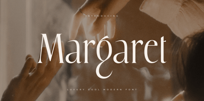 Margaret is Modern Luxury Unique Serif Font is a well-balanced contemporary font with a fancy, unique, and versatile Luxury serif, font that you can combine to get any variations and unique shapes easily just in seconds with choose alternates of them. It is a serif display font with moderate contrast that perfect for branding projects, logo, wedding designs, social media posts, advertisements, product packaging, product designs, label, photography, watermark, invitation, stationery, and any projects, it makes with a high level of legibility. What's Included: Character set A-Z Numerals & Punctuation Accented Characters (West Europe) Works on PC & Mac Recommended using Adobe Illustrator or Adobe Photoshop. Wish you enjoy our font. :)
 - Yanking by Sensatype Studio,
$15.00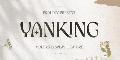 YANKING is Modern Display Ligature Font is a well-balanced contemporary font with a fancy, unique, and versatile Luxury serif, font that you can combine to get any variations and unique shapes easily just in seconds with choose alternates of them. It is a serif display font with moderate contrast that perfect for branding projects, logo, wedding designs, social media posts, advertisements, product packaging, product designs, label, photography, watermark, invitation, stationery, and any projects, it makes with a high level of legibility. What's Included: Character set A-Z Numerals & Punctuation Accented Characters (West Europe) Works on PC & Mac Recommended using Adobe Illustrator or Adobe Photoshop. Wish you enjoy our font. :)
 - Shelottra by Keristyper Studio,
$14.00 Shelottra is an elegant beauty fancy display font with expressive shapes and characteristics to bring magical imagination in your design. This font is good for logo design, Social media, Movie Titles, Books Titles, short text even long text letters, and good for your secondary text font with the script, sans, or serif. Featured: Standard Uppercase & Lowercase Numeral & Punctuation Multilingual : ä ö ü Ä Ö Ü ß ¿ ¡ Alternate & Ligature PUA encoded We recommend programs that support the OpenType feature and the Glyphs panel such as Adobe applications or Corel Draw. so you can use all the variations of the glyphs. Hope you enjoy our fonts!
 - Manila Style by Sensatype Studio,
$15.00 Manila- Modern Elegant Serif Font Manila font is a modern Elegant Serif font with a Elegant , fancy, playful, unique, and versatile vintage sans serif that you can combine to get a beautiful typography. It is a Serif font with moderate contrast that perfect for branding projects, logo, wedding designs, social media posts, advertisements, product packaging, product designs, label, photography, watermark, invitation, stationery, and any projects, it makes with a high level of legibility. What's Included: Ready 9 Weight (Thin, Extralight, Light, Regular, Medium, SemiBold, Bold, ExtraBold, Black) Character set A-Z Alternative Uppercase & Lowercase Numerals & Punctuation Accented Characters (West Europe) Works on PC & Mac Wish you enjoy our font. :)
 - Perola by IKIIKOWRK,
$17.00 Introducing Perola - Fancy Type, created by ikiiko. Perola means "pearl" and comes from spanish language. This letter has a distinctive feature on its hook, which is in the form of a unique and dynamic curve. This letter is suitable if you want to show a cheerful impression or playful design with solid color. This typeface is perfect for an cute branding, pop art design, packaging product, food & beverages, quotes, or simply as a stylish text overlay to any background image. What's included? Uppercase & Lowercase Number & Punctuation Multilingual Support Works on PC & Mac Enjoy our font and if you have any questions, you can contact us by email : ikiikowrk@gmail.com
 - Lemon Flower by chicken,
$17.00 A flower became crushed in the door frame of the studio (a fancy shed at the end of an overgrown garden)... pretty pale yellow stamens scattered on the floor... I sprinkled some on the scanner and arranged them into a light and airy font for springtime. There are two alphabets, both uppercase, but one with doubled uprights for variety, and to provide a hint of extra weight. I didn't want to distort the natural shapes, or make up any of my own, so some letterforms are pretty quirky, and some characters just weren't possible... but there's a hidden bunch of flowery and grassy ornaments.
 - Cratch SS by Sensatype Studio,
$15.00 Cratch Vintage font is a well-balanced contemporary font with a fancy, unique, and versatile heritage vintage serif font that you can combine to get any variations and unique shapes easily just in seconds. It is a serif display font with moderate contrast that perfect for branding projects, logo, wedding designs, social media posts, advertisements, product packaging, product designs, label, photography, watermark, invitation, stationery, and any projects, it makes with a high level of legibility. What's Included: 4 Styles Fonts Character set A-Z Uppercase & Lowercase Numerals & Punctuation Accented Characters (West Europe) Stylistic alternates Works on PC & Mac Recommended using Adobe Illustrator or Adobe Photoshop. Wish you enjoy our font. :)
 - Halibu by Sensatype Studio,
$15.00 Malibu font is a well-balanced contemporary font with a fancy, playful, unique, and versatile vintage serif with 165+ alternates that you can combine to get curves and beautiful shapes easily just in seconds. It is a display font with moderate contrast that perfect for branding projects, logo, wedding designs, social media posts, advertisements, product packaging, product designs, label, photography, watermark, invitation, stationery, and any projects, it makes with a high level of legibility. What's Included: Character set A-Z Uppercase & Lowercase Numerals & Punctuation Accented Characters (West Europe) Ligature & Huge Stylistic alternate Works on PC & Mac Recommended using Adobe Illustrator or Adobe Photoshop. Wish you enjoy our font. :)
 - Parisian Style by Sensatype Studio,
$15.00 Parisian is Modern Elegant Luxury Serif Font is a well-balanced contemporary font with a fancy, unique, and versatile Luxury serif, font that you can combine to get any variations and unique shapes easily just in seconds with choose alternates of them. It is a serif display font with moderate contrast that perfect for branding projects, logo, wedding designs, social media posts, advertisements, product packaging, product designs, label, photography, watermark, invitation, stationery, and any projects, it makes with a high level of legibility. What's Included: Character set A-Z Numerals & Punctuation Accented Characters (West Europe) Works on PC & Mac Recommended using Adobe Illustrator or Adobe Photoshop. Wish you enjoy our font. :)
 - Khalifah Script by Solidtype,
$15.00 Khalifah Script is a calligraphy script font that comes with very beautiful changing characters, a kind of classic decorative copper script with a modern touch, designed with high detail to bring stylish elegance. Khalifah Script is attractive as a typeface that is smooth, clean, feminine, sensual, glamorous, simple and very easy to read, because there are many fancy letter connections. I also offer a number of viable style alternatives for many letters. The classic style is perfect to be applied in various formal forms such as invitations, labels, restaurant menus, logos, fashion, make up, stationery, novels, magazines, books, greeting / wedding cards, packaging, labels or any type of advertising purpose.
 - Coo Coo by chicken,
$23.00 So I made five rather odd characters for a logo for a friend… Then I thought I'd fill a couple of spare hours expanding it to a single alphabet… And some considerable time later I ended up with a whole font with full punctuation, a bunch of alternates, pretty broad international support and some OpenType features to keep things varied… There are elements of Art Deco, Art Nouveau, Lego, circuit boards and Ceefax, Memphis lamps and lab clamps, hieroglyphs, googly eyes and who knows what else… Intricate, insane, highly irregular, but somehow it hangs together… Throw down a few letters nice and big when the fancy takes you…
 - Antura Script by Solidtype,
$18.00 Antura Script is a calligraphic script font that comes with very beautiful changing characters, a kind of classic decorative copper script with a modern touch, designed with high detail to bring stylish elegance. Antura Script is an attractive typeface that is smooth, clean, feminine, sensual, glamorous, simple and very easy to read because there are many fancy letter connections. I also offer a number of viable style alternatives for many letters. The classic style is perfect to be applied in various formal forms such as invitations, labels, restaurant menus, logos, fashion, make up, stationery, novels, magazines, books, greeting/wedding cards, packaging, labels or any type of advertising purpose.
 - Fallery Script by Zane Studio,
$15.00 Fallery Script is a calligraphy script font that comes with exquisite character changes, a kind of classic decorative copper script with a modern twist, designed with high detail for an elegant style. Fallery Script is interesting because it is smooth, clean, feminine, sensual, glamorous, simple and very easy to read, because of its many fancy letter relationships. I also offer a decent number of stylistic alternatives for some of the letters. Classic style is very suitable to be applied in various formal forms such as invitations, labels, restaurant menus, logos, fashion, make up, stationery, novels, magazines, books, greeting/wedding cards, packaging, labels or all kinds of advertising purposes.
 - Al Britania Ligatura by Aluyeah Studio,
$99.00 Britania Ligatura, a Ligature Addict Display Font Coming to you with 170+ stunning alternate and ligature to create a perfectly fashionable, beautiful, fancy, and elegant design. Features: OpenType support Multilingual support (15 languages) PUA Encoded Super Easy to Use alternates - It's OpenType support but you can easily call alternates character using special combination like A.2 B.2 a.2 b.2 etc. so you don't need special software. For special ligature you can use combination like a.n a.m u.b d.h etc To get results like the preview just type B.4r.ita.ni.2a.2 Liga.tur.a Thanks for checking out my font. I really hope you enjoy using it!
 - Tokyo Olive by Dharma Type,
$14.99 Tokyo Olive was designed as an homage to nostalgic display types and advertisements in the mid-late 80s. The mid-late 80s was the era of the post-modernism and fancy-decorative design especially in Japan In other words, it was the mixture of superficial form-operation and girly taste. This curious design movement vanished without a trace in the 90s, but it had its moments. Tokyo Olive has voluminous and simple geometric skeleton (for post-modern) with rounded and craft-style stencil joints (for fancy decoration). We added a classic open style as a little spice. The mixture of those essences makes new impression we have never seen before. Tokyo Olive family consists of 5 styles for stacking color font. Please use Photoshop or Illustrator, or your favorite graphic design apps that can handle layers. Layers are the printing plates of wood type. You should be able to change text color for each layer. Tokyo Olive "Standard" style is the base of this font family. You can add open effect by stacking "Fill" layers over the Standard layer. Instruction 1. Type your text as you like. 2. Set font-name "Tokyo Olive" and font-style "Standard". 3. Set color of "Standard" layer. 4. Duplicate the "Standard" layer to make "Fill" layer. 5. Set font-style "Half Fill" or "Full Fill" and new color of upper layer. Tokyo Olive Standard, Half Open, and Full Open style can be used solely.
 - Albion Signature by TofinoType,
$90.00 Albion Signature is a value packed font of exceptional character, with lots of old world charm to make your next project personal and special. Containing over 2,200 glyphs, it’s large enough to handle any demanding project, big or small. It also contains over 400 flourishes in three sections (dingbats, geometric shapes, and misc. geometric shapes) in numerous styles, that can be used in endless combinations. It’s like several fonts in one. Everything you need to do a stellar project is included. A script font that lines up perfectly with a few extra endings and hidden treasures spread throughout. It also contains a complete easy to use PDF index, so you will be able to find exactly the glyph you are looking for fast. This font can only enhance the fonts that you already own, making them more versatile and useful. On its own, it is a very elegant calligraphy script, that will make every project you create look great. The capital letters overlap and intertwine just like in days gone by, for a unique style. Also included are tools that can give you very precise spacing, right inside a word processor. Usage: Photoshop styles, InDesign, personal promotion logos, monograms & signatures.... That’s where it shines, yet it’s still great for art, cards, fancy documents, really fancy labels & even notes to Mom. Imagine, most people used to write letters like these at one time. Now you too can have documents that look like the work of a studied penman.
 - Hazelton by Type Royal,
$61.00 Hazelton is a neo-humanist typeface inspired by the explorations and development of early British sans-serif typography. Six weight have been developed for Hazelton. The lighter weights are loosely inspired by Edward Johnston’s Underground typeface. The heavier weights glean inspiration from Stephenson Blake’s Granby. Sharp, pointed terminals that are indicative of British typography have been omitted in favour of a more modern sensibility. Subtle humanist characteristics become more exaggerated as the typeface increases in weight, making the lighter weights practical for text purposes and the heavier weights ideal for display use. A unique set of numerals have been developed to infuse them with a humanist quality that is often lacking when typesetting technical data. The result is a diverse typeface that is as powerful as it is beautiful.
 - One Night Stand by T4 Foundry,
$21.00Torbjörn Olsson's experimental type One Night Stand deserves a longer relation. Use it for drop caps or quotes, to add drama in dull surroundings and to spice up bland editorial content. One Night stand is also the perfect way to seduce readers of advertisments, as well as delivering contrast in headlines. Do you want to show the world in stark black and white? The One Night Stand is for you! One Night Stand is an OpenType typeface for both PC and Mac. Swedish type foundry T4 releases new fonts every month. One Night Stand is our twelfth introduction. Note: The underlying sans-serif font for One Night Stand is Esans Bold, also designed by Torbjörn Olsson. Esans is a fine sans, excellent for headline use, inspired by Granby, Tempo, Gill and others. - Daft Script by Hanoded,
$15.00 I really like creating script fonts. Why, I hear you say? Well, creating script fonts lets me be me. I am not trying to create classy, connected fonts for you to write love letters with: there are already too many of those available and quite frankly, I just don't like them. I prefer the messy script fonts - uneven, no real baseline and with a bit of splatter or rough edges for good measure. Daft script is one of these messy script fonts: it was handmade and it comes with two alternates for the lower case glyphs that cycle as you type. This is an all-caps font, so that means you have 4 options per letter! I also love languages (I speak 6), so Daft Script comes with fantastic language support, including Vietnamese and Sami.
 - Nutshell Crew by IKIIKOWRK,
$19.00 Proudly present Nutshell Crew - Street Brush Type, created by ikiiko. Nutshell Crew is a rough handwriting type inspired by hand-drawn street brushes. A type of decorative font that features bold, brush-like strokes, often resembling calligraphy, graffiti, or hand-painted lettering. This font features a rough and edgy style, making it ideal for any urban-inspired design project with a blend of grungy and hand-drawn lines will give your words a distinctive and rebellious character, setting you apart from the crowd. The perfect one for the modern-day hipster! This type is very suitable for making a streetwear brand, poster or magazine layout, posters, album covers, quotes, or simply as a stylish text overlay to any background image. What's Included? Uppercase & Lowercase Numbers & Punctuation Alternates Multilingual Support Works on PC & Mac
 - Not My Type by It's me Simon,
$14.00 If you want your design to have that nostalgic typewriter effect, Not my Type would be perfect. It's old-fashioned and retro—letters are worn and grungy like it needs a new ink ribbon. Some of the letters are misaligned—just like a real old typewriter. It is best used at smaller sizes, perfect for logos, headlines, covers and any design where you want that vintage look and feel. Each letter has two alternatives, making three in total. Using the alternative letters, you can make your type layouts look more random, like a real typewriter. You can manually set the alternatives via the glyphs panel in your design software or you can enable them automatically. If you enable contextual alternatives in your design application, the letters will change automatically as you type.
 - Soto by Thinkdust,
$10.00 A grungy, blocky, sans-serif font, Soto has one goal: get the message across. Saying it plain and simple, in a way that no-one can misunderstand, Soto’s very slight angles and thick style carry a weight and impact that make it stand out. With the textured finish it even jumps out from the backgrounds it’s placed on, so you can make use of the contrast to draw people in. Soto is best used in headlines and announcements that want to get their message across in an interesting and quick way. Stand out from the crowd and make people want to read what you’re writing by using a font like Soho to shout it out. If you like Soto but you're not feeling the grunge texture, then check out Ebisu.
 - Gia by XO Type Co,
$40.00 Gia is 7 weights, true small caps and unicase options, designed after iconic letterforms of the 1960’s to 1980’s. In the early years of the American tech revolution, when Silicon Valley was more closely identified with Dallas, Texas, a curious type of letterform began to appear—strict in geometry, and curiously minimal in geometry and stroke, making it easier to be read by machine-readers, and people more used to reading machine-generated typography. Coders! As the years went on, this kind of sinewy, curved letterform began popping up in logotypes and music videos and upright video games: NASA, The Buggles, Atari, Pong, Sega, Namco, Stern, Devo, Apple. Gia pays homage to that letterform, and is named after Gia Carangi, the iconic face of early 1980’s pop fashion.
 - Salo by Borutta Group,
$39.00 SALO – is a hybrid of two Italian typographic worlds. The serif version refers to the beautiful and sophisticated typefaces found on the signs of cafes, restaurants, and fashionable boutiques. Its complemented by the sans variant, inspired by Italian modernism and road signage. All styles are based on the same core but with a totally different expressions. The biggest challenge during the project was designing all of the glyphs compatible to work as a 100% variable font. In the OTF version, SALO has 4 varieties: Serif, Semi Serif, Semi Sans and Sans. The family of these typefaces is suitable both for posters, magazine headlines, and branding purposes where the character will count. It is worth experimenting and combining different varieties with each other. (This font cannot be used to create a logo with the phrase "FRANCO").
 - Fleursdumal by Letterhead Studio-YG,
$40.00 How should an authentic baudelairean type look like? Aesthetically beautiful, that’s for sure. Intellectual, neurotic. Uptight — oh, the conventions of the time. Easily readable — still 20 years to go until the age of art nouveau with its outrage of typefaces. It may have a vibe of a Paris salon - salute to the Parnassiens. Such a modern-class (don’t mix it with the modern-styled) pharmaceutical Antiqua. Contrasts, thin serifs, the integrity of the operating theatre. But Baudelaire is not Heredia. «Une charogne» is not that much a vivid metaphor as a drawing from nature. The baudelairean typeface should have its cavern, flow, dark side. Not to demonstrate the fragile romantic profile of a cursed poet, as Baudelaire was seen 130 years ago, but to express the real pain. A true, unattractive, egoistic, suicidal passion.
 - Typewriter DirtY by Matthias Luh,
$32.00 Typewriter DirtY is related to the Typewriter BasiX and Typewriter Revo fonts. While Revo has a very clean and simple outline, BasiX is a bit washed out and looks worn. DirtY goes a step further and has a very dirty, worn, fuzzy, grungy vintage look – even more so than BasiX. Typewriter DirtY is especially suitable for headlines, logos, covers, slogans and much more. BasiX and Revo are recommended for longer texts. Although Typewriter DirtY looks good even in small font size, it is a bit more complex to render because of its detailed outlines. Typewriter Revo, BasiX and Dirty are monospaced typewriter fonts, which are matched to each other. They have the same dimensions and generally somewhat similar contours. Therefore, they can be perfectly mixed and matched with each other.
 - Edith by Dominik Krotscheck,
$12.00 Edith is a handmade serif typeface that can be used for long texts. To make it even better suitable, it is equipped with all the major features you’d expect from a traditional text-font, such as case sensitive forms, old style figures (lining figures are accessible via an opentype feature), fractions and good kerning. To keep up the handwritten appearance, two versions of each letter (A-Z & a-z with diacritics) and number are available and substituted automatically if the same ones meet. Edith is also nice to look at in larger sizes and therefore a great fit for any packaging, advertisement or headline. Edith is for you, if you plan on doing childish things, DIY things, traditional things, illustrated things, nautical things, grungy things or any handmade related things.
 - Odense by Linotype,
$40.99Franko Luin, Odense's designer, on this typeface: With Odense I entered the field where Optima reigns in royal majesty. The first question I received was, in fact, why I designed another Optima. Look closely: Odense has as much in common with Optima as Garamond with Baskerville. Am I right? Odense Neon is a special variant that can be used for logos or single words. I had the idea for it when I noticed that the neon tubes in a sign over a store only partially followed the characters. The name comes from the Danish town Odense, the town of the famous storyteller Hans Christian Andersen, author of, e.g., 'The Little Mermaid.' Odense is also the place where the first book in the Nordic countries was printed, the 'Breviarium Ottoniense', in 1482. - Dulcet by Dawnland,
$33.00 Dulcet is a hand lettered, rough binding script with high ascenders & low-descenders. It is both elegant and grungy and will work wonders on your invitations or love letters, make beautiful posters, frightening t-shirt designs or logotypes. It is equipped with OpenType features such as common ligatures, double letter ligatures, contextual and stylistic alternates for a varied and hand drawn look. Access alternates by using the glyph panel in Illustrator and InDesign. Dulcet comes with several initial & terminal swashes that can be added to the beginning and/or end of any lowercase letter as well as different swashes for the upper case letters. For initials/beginnings, write _ (underscore) + digit 0 to 9 For terminals/endings, write digit 0 to 9 + _ (underscore) For start swashes, - (hyphen) + digit 0 to 9. Enjoy!
 - Anisette Std by Typofonderie,
$59.00 A geometric Art Déco multi-widths type family Anisette has sprouted as a way to test some ideas of designs. It has started with a simple line construction (not outlines as usual) that can be easily expanded and condensed in its width in Illustrator. Subsequently, this principle of multiple widths and extreme weights permitted to Jean François Porchez to have a better understanding with the limitations associated with the use of MultipleMaster to create intermediate font weights. Anisette is built around the idea of two widths capitals can be described as a geometric sanserif typeface influenced by the 30s and the Art Deco movement. Its design relies on multiple sources, from Banjo through Cassandre posters, but especially lettering of Paul Iribe. In France, at that time, the Art Déco spirit is mainly capitals. Gérard Blanchard has pointed to Jean François that Art Nouveau typefaces designed by Bellery-Desfontaines was featured before the Banjo with this principle of two widths capitals. A simple sentence will be as diverse in its representations, as the number of Anisette variables available to the user. With Anisette, typography becomes a game, as to design any title page as flamboyant as if it has been specially drawn for it. Two typefaces, many possibilities The complementarity between the two typefaces are these wide capitals mixed with narrow capitals for the Anisette while the Anisette Petite – in its latest version proposes capitals on a square proportions, intermediate between the two others sets. Anisette Petite proposes capitals in a square proportion, intermediate between the two other sets, all of which are interchangeable. In addition, Anisette Petite also includes a set of lowercase letters. Its style references shop signs present in our cities throughout the twentieth century. Anisette, an Art Déco typeface Anisette: Reveal your typographic expertise Club des directeurs artistiques, 46e palmarès Bukva:raz 2001 Slanted: Contemporary Typefaces #24
 - Parisine Std by Typofonderie,
$59.00 Ultra legible forceful sanserif in 32 fonts Parisine was born as official parisian métro signage typeface. This family of typefaces has become over years one of the symbols of Paris the Johnston for the London Underground or the Helvetica for the New York Subway. The Parisine was created to accompany travelers in their daily use: ultra-readable, friendly, human while the context is a priori hostile. Meanwhile, Parisine is now a workhorse and economical sanserif font family, highly legible, who can be considered as a more human alternative to the industrial-mechanical Din typeface family. More human, but not fancy: No strange “swashy” f, or cursive v, w etc. on the italics, to keep certain expected regularity, important for information design, signages, and any subjects where legibility, sobriety came first. Born as signage typeface family, the various widths and weights permit a wider range of applications. In editorial projects, the Compress version will enhances your headlines, banners, allowing ultra large settings on pages. The Narrow version will be useful as direct compagnon mixed to standard width version when the space is limited. The various Parisine typeface subfamilies Parisine is organised in various widths and subsets, from the original family Parisine, Parisine Gris featuring lighter versions of the usual weights and italics, Parisine Clair featuring extra light styles, to Parisine Sombre with his darker and extremly black weights as we can seen in Frutiger Black or Antique Olive Nord. Many years of adjustments were necessary to refine this complex family. Initially, Parisine was designed by Jean François Porchez in 1996 for Ratp to solely fulfil the unique needs of signage legibility. Parisine remain the official corporate typeface of the public transport in Paris, the worldwide capital for tourism, and now integral part of the French touch. Directly related, Parisine Office was initially created for Ratp’s internal and external communication, Parisine Office is available at Typofonderie too. Not connected with Ratp and public transports, Parisine Plus was created as an informal version of Parisine. Parisine: Introducing narrow and compressed families About Parisine Parisine helps Parisians catch the right bus Observateur du design star of 2007
 - Pascual Ferry by Comicraft,
$39.00 The slick and sexy letterforms of Ace ACTION COMICS artist, Pascual Ferry, are the latest to join our MASTERS OF COMIC BOOK ART font line. Pascual's work on the SUPERGIRLS storyline in ACTION made us want to lick each page -- but, y'know, not when anyone was looking... we know they're just comic book characters, they're not REAL and we don't fancy them or anything -- Uhhh... so we were delighted when Pascual invited us to create this stylin' sans souciant family of fonts for him. All we asked for in return was this smokin' alternate cover for the next issue of HIP FLASK... Hey, don't lick your monitor, you might get an electric shock...