3,902 search results
(0.016 seconds)
- Hot Mess by Set Sail Studios,
$18.99 It’s bold, brazen, and irresistibly fun – it’s Hot Mess! A super realistic hand brushed font just raring to get the party started. It’s guaranteed to leave a vibrant, long lasting impression on social media posts, advertisements, posters, products packaging & more. Ligatures • Hot Mess includes 17 ligatures built in to the font. These letter pairs help to create authentic, naturally flowing hand-lettering. Ligatures are supported by most desktop graphics & text software (not just the fancy ones!), including Photoshop, Illustrator, InDesign, Word, Pages & Keynote. Ligatures will automatically be switched on when using supported software. Language Support • English, French, Italian, Spanish, Portuguese, German, Swedish, Norwegian, Danish, Dutch, Finnish, Indonesian, Malay, Hungarian, Polish, Croatian, Turkish, Romanian, Czech, Latvian, Lithuanian, Slovak, Slovenian. Swashes • Hot Mess includes 4 swashes; use these to underline your script text and add a stylish finishing touch. Simply type any of the square brackets to generate a swash [ ] { }
 - ITC Garamond Handtooled by ITC,
$34.99Claude Garamond (ca. 1480-1561) cut types for the Parisian scholar-printer Robert Estienne in the first part of the sixteenth century, basing his romans on the types cut by Francesco Griffo for Venetian printer Aldus Manutius in 1495. Garamond refined his romans in later versions, adding his own concepts as he developed his skills as a punchcutter. After his death in 1561, the Garamond punches made their way to the printing office of Christoph Plantin in Antwerp, where they were used by Plantin for many decades, and still exist in the Plantin-Moretus museum. Other Garamond punches went to the Frankfurt foundry of Egenolff-Berner, who issued a specimen in 1592 that became an important source of information about the Garamond types for later scholars and designers. In 1621, sixty years after Garamond's death, the French printer Jean Jannon (1580-1635) issued a specimen of typefaces that had some characteristics similar to the Garamond designs, though his letters were more asymmetrical and irregular in slope and axis. Jannon's types disappeared from use for about two hundred years, but were re-discovered in the French national printing office in 1825, when they were wrongly attributed to Claude Garamond. Their true origin was not to be revealed until the 1927 research of Beatrice Warde. In the early 1900s, Jannon's types were used to print a history of printing in France, which brought new attention to French typography and the Garamond" types. This sparked the beginning of modern revivals; some based on the mistaken model from Jannon's types, and others on the original Garamond types. Italics for Garamond fonts have sometimes been based on those cut by Robert Granjon (1513-1589), who worked for Plantin and whose types are also on the Egenolff-Berner specimen. Linotype has several versions of the Garamond typefaces. Though they vary in design and model of origin, they are all considered to be distinctive representations of French Renaissance style; easily recognizable by their elegance and readability. ITC Garamond? was designed in 1977 by Tony Stan. Loosely based on the forms of the original sixteenth-century Garamond, this version has a taller x-height and tighter letterspacing. These modern characteristics make it very suitable for advertising or packaging, and it also works well for manuals and handbooks. Legible and versatile, ITC Garamond? has eight regular weights from light to ultra, plus eight condensed weights. Ed Benguiat designed the four stylish handtooled weights in 1992." In 1993 Ed Benguiat has designed Handtooled versions. - Cartelle Inline by Stereo Type Haus,
$30.00 Cartelle is a sexy small caps bitmap design characterized by it's whimsical curls and ornate flourishes. It's inspiration came from a French poster design from the early 1900's.
 - VLNL Bint by VetteLetters,
$35.00 Kornelis de Vries, a headmaster from the Dutch province of Friesland, cultivated new potato breeds that he named after pupils in his school. In the early 1900s he came up with the tasty Bintje (a Frisian girl’s name) and it became a big success – in Belgium and France it has remained the most popular potato for french fries to this day, more than a century since its introduction. Donald Roos took 10 kilos of fresh Bintje potatoes and cut the Bint typeface by hand with a short, sharp knife. He then inked each character once and printed it twice; the second, lighter printing is accommodated in the lower case alphabet. The Bint family offers a script to make the letters bounce up and down the baseline; with OpenType functionality the font randomly chooses each character from the upper- or lowercase alphabet. ‘Tabular lining figures’ will activate a series of negative numerals in boxes; ‘Discretionary ligatures’ activates specially designed letter combinations like ‘www’ as well as arrows and stars. Bint has a distinct, slightly rough handmade appearance, making it useful for a wide range of designs.
 - Colorado by Juliasys,
$- Nature is fond of stripes. Animals have them, plants have them and the rainbow has them. Besides being beautiful, stripes in nature have various origins and functions. But only Homo sapiens gave them symbolic meaning. In the American flag, the 13 stripes symbolize the 13 colonies that declared independence from Britain. In the French “Tricolour” flag, they represent Paris and the king of France. And in Russia’s “Georgiyevskaya lenta,” they symbolize the death and resurrection of St. George, the dragon-slayer. The font family COLORADO , named after the beautifully striped Colorado potato beetle, can be used to construct all kinds of symbolic or just beautiful messages. And thankfully, you need no OpenType diploma to do this. To get your texts multi-striped and multicolored, follow this simple procedure: Write the message with one of the COLORADO fonts and apply a color. Then copy and paste in place, and apply a second font and color. Repeat this again if wanted – and the masterpiece is done. COLORADO ’s language support covers about 100 languages. It has a Western European, a Central European and an Extended Cyrillic character set.
 - Gusto Black by BA Graphics,
$45.00A real heavy weight, a chunky sans serif that packs some real Punch. No fancy frills here. - Sagebrush JNL by Jeff Levine,
$29.00 Sagebrush JNL was modeled from examples of a vintage French Clarendon wood type in which many of the characters had rounded parts rather than the traditional all-slab serif approach.
 - Maitre d Stencil JNL by Jeff Levine,
$29.00 Maître d' Stencil JNL is based on an alphabet example found in the 1949 French lettering book “Album de Lettres Arti”, and is available in both regular and oblique versions.
 - Pantoufle by Kitchen Table Type Foundry,
$16.00 Pantoufle is French for slipper. Not the flipflop variety (or thongs if you’re from Australia), but the one you wear indoors when it’s cold. I have some too; Spanish ones, made from recycled PET bottles. Here in Holland, we call them ‘Pantoffels’ and you don’t have to be a language expert to see the resemblance between the French and the Dutch word. That is because the French are probably more savvy when it comes to keeping your feet warm and the Dutch just borrowed the word, pronunciation and all! Pantoufle is a font I made with a big fat marker pen. My kids had used it to decorate some gifts for Sinterklaas (if you want to know what Sinterklaas is, look it up). Pantoufle comes with extensive language support and a full set of alternates for the lower case glyphs. Enjoy!
 - Chanson De Paris JNL by Jeff Levine,
$29.00 A couple of pieces of sheet music from France [circa 1925] offered the inspiration for Chanson De Paris JNL (Song of Paris), which is available in both regular and oblique versions. This hand lettered Art Nouveau style features a unique take on thick-and-thin lettering which foreshadows the Art Deco typefaces to come during the 1930s.
 - Burdigala X Sans by Asgeir Pedersen,
$24.99 Burdigala X Sans is an open and spacious typeface, ideal for larger amounts of (printed) texts in brochures, magazines and books. Being wider than usual, it works especially well in media intended for on-screen reading, such as in Pdf-documents, e-books, applications and so on. Burdigala is the ancient Roman name of the city of Bordeaux France.
 - Sylphide by Scriptorium,
$24.00Sylphide is based on poster lettering from France in the 1890s. It has a very authentic Art Nouveau look with some unusual features, including the decorative-initial style capital letters and the cut-out look of the standard characters. It's an excellent and unusual font for uses like restaurant menu titles, poster designs or other decorative purposes. - Chartreux by TEKNIKE,
$45.00 Chartreux is a geometric monospaced display sans typeface which has a distinct uppercase style and is inspired by the early Twentieth-Century era. The Chartreux name is derived from a rare breed of domestic cats, descending from the Chartreuse Mountains in France. Chartreux is recommended for luxury brands, logos, fashion, cinema, architecture, invitations, display work, posters and headings.
 - FrankieDos by Type-Ø-Tones,
$40.00 Following in the footsteps of his brother Frankie, FrankieDos entered our catalogue a few years later. FrankieDos follows the same pattern: how to imitate analogic features in a vector-based typeface.
 - Blackburn by E-phemera,
$20.00Blackburn is a distressed text font designed to capture the look of old printing at small sizes. Based on a 19th century French type specimen, it contains a complete international character set. - Bamboo by Komet & Flicker,
$10.00 Crack open another coconut! With Bamboo, you can almost hear the waves and feel the warm tropical island breeze.
 - New Lobster by Etewut,
$30.00 New lobster makes your text look fancy. • alternative packs 1 and 2 • extended latin • connected script and disconnected italic
 - Bell by URW Type Foundry,
$35.99 Bell is a facsimile of the typeface cut originally for John Bell by Richard Austin in 1788~ using as a basis the matrices in the possession of Stephenson Blake & Co. Used in Bells newspaper~ The Oracle~ it was regarded by Stanley Morison as the first English Modern face. Although inspired by French punchcutters of the time~ with a vertical stress and fine hairlines~ Bell is less severe than the French models and is now classified as Transitional. Essentially a text face~ the Bell font family can be used for books~ magazines~ long articles~ etc.
 - Royal Bavarian by Wiescher Design,
$39.50 RoyalBavarian was comissioned by King Ludwig the First of Bavaria about 1834. He was probably the greatest king Bavaria ever had, but he fell in disgrace for a short affair with the infamous Lola Montez and subsequently had to resign. He died in 1868, peaceful and happy in Nice on the French Riviera. I happened on an original etching of his type-guidelines for official writers of those days about 20 years ago. I always thought it was a very nice Fraktur (Blackletter), not a sturdy militaristic one as most of them are. Being me, I started with first tests immediately and then just forgot the font on my computer. When I was sorting out old stuff a couple of months ago I happened on the etchings once again and kept on working intermittently on the letters. The Plain cut is pretty much like the king wanted it. The Fancy cut is more to my liking and very decorative. Yours in a royal mood, Gert Wiescher.
 - Lonely Heart by Black Studio,
$19.00 Lonely Heart Font Duo is a fancy font. which comes with a combination of modern and elegant fonts, namely Script and Sans style. You can combine them to create beautiful typography. This handmade style makes it perfect to use in all your design projects be it logos, labels, packaging designs, blog titles, posters, wedding designs, social media posts, Instagram designs, invitation cards, art quotes, home decor, book covers/titles , etc. Here's what's included: Lonely Heart Regular / Bold Script • Elegant and realistic Script font contains 108+ ligatures and substitutes, lowercase, uppercase, all punctuation & numbers. Regular / Thick Lonely Heart • Sans font with upper and lower case, all punctuation marks, numbers and Language support Language support • Lonely Heart supports the following languages; English, French, Italian, Spanish, Portuguese, German, Swedish, Norwegian, Danish, Dutch, Finnish, Indonesian, Malay, Hungarian, Polish, Croatian, Turkish, Romanian, Czech, Latvian, Lithuanian, Slovak, Slovenian. I hope you enjoy this font. If you have any questions, feel free to message me :)
 - Hello Girlfriend by Black Studio,
$19.00 Hello Girlfriend Font Duo is a fancy font. which comes with a combination of modern and elegant fonts, namely Script and Sans style. You can combine them to create beautiful typography. This handmade style makes it perfect to use in all your design projects be it logos, labels, packaging designs, blog titles, posters, wedding designs, social media posts, Instagram designs, invitation cards, quote art, home decor, book covers/titles , etc. Here's what's included: Hello Regular Girlfriend / Bold Script • Elegant and realistic Script font contains 108+ ligatures and substitutes, lowercase, uppercase, all punctuation & numbers. Regular / Bold Hello Boyfriend • Sans font with upper and lower case, all punctuation marks, numbers and Language support Language support • Hello Girlfriend supports the following languages; English, French, Italian, Spanish, Portuguese, German, Swedish, Norwegian, Danish, Dutch, Finnish, Indonesian, Malay, Hungarian, Polish, Croatian, Turkish, Romanian, Czech, Latvian, Lithuanian, Slovak, Slovenian. I hope you enjoy this font. If you have any questions, feel free to message me :)
 - Anisette Std by Typofonderie,
$59.00 A geometric Art Déco multi-widths type family Anisette has sprouted as a way to test some ideas of designs. It has started with a simple line construction (not outlines as usual) that can be easily expanded and condensed in its width in Illustrator. Subsequently, this principle of multiple widths and extreme weights permitted to Jean François Porchez to have a better understanding with the limitations associated with the use of MultipleMaster to create intermediate font weights. Anisette is built around the idea of two widths capitals can be described as a geometric sanserif typeface influenced by the 30s and the Art Deco movement. Its design relies on multiple sources, from Banjo through Cassandre posters, but especially lettering of Paul Iribe. In France, at that time, the Art Déco spirit is mainly capitals. Gérard Blanchard has pointed to Jean François that Art Nouveau typefaces designed by Bellery-Desfontaines was featured before the Banjo with this principle of two widths capitals. A simple sentence will be as diverse in its representations, as the number of Anisette variables available to the user. With Anisette, typography becomes a game, as to design any title page as flamboyant as if it has been specially drawn for it. Two typefaces, many possibilities The complementarity between the two typefaces are these wide capitals mixed with narrow capitals for the Anisette while the Anisette Petite – in its latest version proposes capitals on a square proportions, intermediate between the two others sets. Anisette Petite proposes capitals in a square proportion, intermediate between the two other sets, all of which are interchangeable. In addition, Anisette Petite also includes a set of lowercase letters. Its style references shop signs present in our cities throughout the twentieth century. Anisette, an Art Déco typeface Anisette: Reveal your typographic expertise Club des directeurs artistiques, 46e palmarès Bukva:raz 2001 Slanted: Contemporary Typefaces #24
 - Cinema Serif JNL by Jeff Levine,
$29.00 Advertisements in the September, 1936 French movie publication “La Cinématographie Française” featured a hand lettered slab serif type design that is now available as Cinema Serif JNL in both regular and oblique versions.
 - Rococo Titling by Three Islands Press,
$15.00Rococo Titling is a set of ornate titling caps based on work done by Jacques-Francois Rosart (1714-1777) and Pierre Simon Fournier (1712-1768) during the middle decades of the 18th century. - Annecy by Luke Thompson,
$25.00 A font family inspired by France's Lake Annecy, vintage travel posters, stamps, bars, and restaurants. Decorative enough to feel special, bold and simple enough to be suitable for a wide variety of applications.
 - RM Serifancy by Ray Meadows,
$19.00 A bit Circus ... a bit Showbiz ... a bit Western ... but completely FANCY Includes: Western European, Central European, Baltic & Turkish sets
 - Mas dAsil by ParaType,
$25.00 The typeface was designed for ParaType in 2002 by Dmitry Kirsanov. Based on the Mesolithic images on stones were discovered in a prehistoric cave of Mas d’Asil, France. There is a great number of hypotheses explaining the function of the mysterious stones. They have been considered as vessels of souls, computation tools, fortune-telling and magic symbols, relics of prehistoric writing system.
 - FF Instanter by FontFont,
$30.99 German type designer Frank Heine created this display FontFont in 1994. The family contains 2 weights: Light and Bold and is ideally suited for festive occasions, editorial and publishing, poster and billboards as well as software and gaming. FF Instanter provides advanced typographical support with features such as ligatures and case-sensitive forms. It comes with proportional lining and proportional oldstyle figures.
 - Caslon1821 by Apostrof,
$50.00 Caslon1821 is a revived "Italian" typeface of foundry Caslon & Livermore, 1821. The typeface quickly extended across Europe and America. It came to Russia and became very popular from France in the 30s of the XIX century. It's Cyrillic versions were offered by typefoundries of Revillion and Co., Pluchard, Semen, etc. In our version we also added support for Hebrew (with vowels).
 - Milden by Youthlabs,
$21.00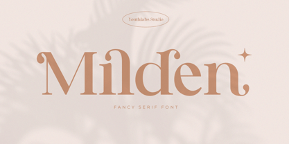 Introducing MILDEN fancy serif font. MILDEN is a serif font that gives fancy touch on your design. It looks so good for fashion brand logo. With many alternative fonts, MILDEN will make it easier for you to use various design functions, be it for logos, typography, magazine, fashion, branding, advertising, and more. What's the Feature ? Uppercase and Lowercase Alternate Ligatures Multilinguals Support Up to 450 Glyphs
 - Zedou by Kvant,
$59.00 Zedou was inspired by old Art Deco flavoured signage from the former French colony of Madagascar. It has a mechanical yet organic feel to it, and consists of four display weights covering Latin Pro.
 - Crayon En Folie by Hanoded,
$15.00 Crayon En Folie ('Pencil Madness' in French) is a straightforward pencil font, created with an extra thick black pencil. Use it for books, posters and packaging. Comes with a coloring box full of diacritics.
 - Melina BT by Bitstream,
$50.99Melina Plain and Melina Fancy are characterized by graceful lines, strong contrast and nostalgic overtones. These typefaces are patterned after two members of a type family named Greco, released by Fundición Tipográfica Richard Gans of Madrid, Spain, in the 1920s. Melina Plain is a refined version of Greco Bold, and Melina Fancy is based on Greco Adornado, with the notable addition of a lowercase, which was not a part of the original design. Melina is based on two typefaces (ca. 1920) from the Fundición Tipográfica Richard Gans in Madrid, Spain. Nick Curtis first found Greco Adornado in a type specimen at the Library of Congress. It was a cap only design. He made a cut of the original (Melina Fancy) and created his own lowercase, and many other characters to support contemporary character sets. Later he came across Greco Bold, which had a lowercase, but he chose not to use it and instead, adapted his Melina Fancy to create Melina Plain. - Filature by JBFoundry,
$16.00 Filature is a fully connected typeface with open type features. Use Filature any time you want fancy, legible, and original text.
 - Vendome by Linotype,
$40.99One of the most famous modern Old Face fonts, designer Francois Ganeua developed Vendome with the special features and extravagance typical of such forms. Strong and lively, such details give Vendome its unmistakeable, unique appearance. - Theatrics JNL by Jeff Levine,
$29.00Theatrics JNL gives a rounded corner treatment to Prismatiq JNL; which in turn was modeled from lettering found in an early 1900s French lettering book displayed at an online image sharing site. Limited character set. - Jerkoff - Unknown license

- Bruce Flourished by Intellecta Design,
$24.90a fanciful version of an old font by George Bruce and Sons Typefoundry, a historical USA deceased foundry from the victorian era... - Souplesse by Hanoded,
$15.00 Souplesse (flexibility in French) is a nice, uncomplicated typeface; happy beyond words, yet with a bit of a bite. The glyphs have a rough edge, yet remain very legible. Souplesse comes with a bagful of diacritics.
 - Faux Decaux JNL by Jeff Levine,
$29.00Faux is false or phony in French and Decaux is a spoof spelling of Deco, thus "False Deco". Faux Decaux JNL will still fit your Art Deco revival project and blends well with complimentary font designs.
