8,980 search results
(0.046 seconds)
- Ikhsani Grotesk by Makarsih Studio,
$9.00 Ikhsani Grotesk is a modern, contemporary font that offers an elegant and stylish look. It's perfect for any project that requires a bold yet sophisticated style. The font features strong lines and curves with sharp edges to create a unique visual effect. Its clean design makes it easy to read on both digital platforms as well as in print materials, making it ideal for logos, branding projects, websites or other graphic designs. With its versatile nature and timeless appeal, Ikhsani Grotesk is the perfect choice when you need something special yet classic!
 - Ravera by Putracetol,
$24.00 Revera is a font inspired european style and the only fonts with shapes and styles that exactly resemble the european characters & Revera is easy to read and can be applied to all media and all can use this font without exception Revera is suitable for your projects such as logo, wedding invitations, branding, landing pages, apparel, posters, headlines, greeting cards, invitation cards, social media, crafting, quote and more. Revera can be used and supported in various programs and OS, such as procreate, cricut, windows, macOS and others. This font is also support multi language.
 - Revoxa by Almarkha Type,
$29.00 Revoxa – Modern Sans, Display Sans made specifically developed for contemporary design styles, made with three styles; Regular- Cut – line. These styles have been carefully designed to coat each other, creating an alternative third style. This feature allows you to adjust opacity and blending modes and different color settings, giving various possible results. very good for combining your design work with a clear line and a circle with several different weights that are very comfortable in the design area you are easy to read and as a title on a blog or magazine page
 - Stencil Creek by Resistenza,
$39.00 Stencil Creek font family is a rounded stencil typeface that comes in eight weights and two rough versions. It is inspired by classic sans serifs and influenced by street signs of the North West Pacific. You can also overlap some of the weights and get an extra inline font. Stencil Creek is a legible typeface family designed for contemporary typography, especially for use in headlines, but also for reading purposes, includes extensive language support and many more OpenType features. This font contains, different swashes and alternates. Check out also ‘Orbita’
 - Big Top by Comicraft,
$19.00 Step Right Up, Step Right Up, the Font Circus is in town and ready to reveal our stupendous new tent-pole feature! Step inside for the best seat in the house. Ringmaster Roshell Beauregard dons his Big Top Hat especially for this occasion and promises us that Clowntime ain't over until the Bearded Lady takes a custard pie in the face. Our Big Top Bonanza performance begins with sideshow attractions and distractions, high-wire acrobats and low-cost rubber band guns. Can you smell the greasepaint and hear the roar of the crowd already...?
 - Contax by Type Innovations,
$39.00 In the advertising industry, I was often asked to supply the art directors with ideas for a san serif type design that was not the standard Helvetica or Univers. They wanted a fresh new approach, something with generous proportion, like Avant Garde perhaps, but not as uniform in proportions. A font that would lend itself well to wide and long columns of text with lots of leading. So, I rolled up my sleeves and designed a font that meet all their criteria. Contax is the new 'Univers' for the 21st century.
 - Moon Chief by pentagonistudio,
$19.00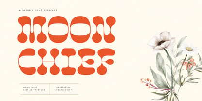 Moon Chief Is A Groovy Display Typeface Inspired By Retro and Vintage Style. SOFTWARE REQUIREMENTS : Fonts and alternate : No special software required they may be used in any basic program /website apps that allows standard fonts That's it folks! You can go ahead and get cracking :) Follow My Shop For Upcoming Updates Including Additional Glyphs And Language Support. And Please Message Me If You Want Your Language Included or If There Are Any Features or Glyph Requests, Feel Free to Send me A Message. Have a Good Day !
 - Righteous by Arendxstudio,
$19.00 Righteous is a font with distinctive handwritten characters, perfect for branding projects, logos, wedding designs, media posts, advertisements, product packaging, product designs, labels, photography, watermarks, invitations, stationery, and any project that needs a handwritten touch. Features : • Character Set A-Z • Numerals & Punctuations (OpenType Standard) • Accents (Multi-lingual characters) • Ligatures • Alternates • Swashes There it is! I really hope you enjoy it - comments & likes are always welcome and accepted. More importantly, don't hesitate to send a message if you have a problem or question.Now just read this, go there and make it happen.
 - Crazy Fever by PizzaDude.dk,
$18.00 Is it snow? Is it water? Is it slime? Is it from this earth? The questions are many - one thing is certain - with this font you can create cool effects by mixing the layers - and in the end, you decide whether the result is going to be scary, delicious or somewhere in between! Use the different layers and your favourite color scheme and just type ahead - the contextual alternates (with 4 different versions of each letter) automatically cycles the letters and make your text look more lively - or maybe even scary!
 - Santis by Latinotype,
$45.00 Santis is a multiface type, special for logos, brands, magazines and editorial world. Especially for setting trends in fashion and design. The particularity of this font is that you can easily read it, even when applying swash type letters. It is a Didot based font. Santis versatility can harmoniously display a word or phrase. Santis has 1017 glyphs with alternate characters, numbers and ligatures ornaments specially created for a better design. For best results use with Open Type. Designed by Enrique Hernandez with technical support of Daniel Hernández.
 - Matthias by Arendxstudio,
$16.00 Matthias is a brush script font with distinctive handwritten characters perfect for branding projects, logos, wedding designs, media posts, advertisements, product packaging, product designs, labels, photography, watermarks, invitations, stationery, and any project who need handwritten dishes. Features : • Character Set A-Z • Numerals & Punctuations (OpenType Standard) • Accents (Multilingual characters) • Ligature • Swash There it is! I really hope you enjoy it - comments & likes are always welcome and accepted. More importantly, don't hesitate to send a message if you have a problem or question. Now just read this, go there and make it happen :)
 - Matter Sculpit by pentagonistudio,
$15.00 Matter Sculpsit Is A Classic Serif Fonts Inspired By Modern and Ligature Characters. SOFTWARE REQUIREMENTS : Fonts and alternate : No special software required they may be used in any basic program /website apps that allows standard fonts That's it folks! You can go ahead and get cracking :) Follow My Shop For Upcoming Updates Including Additional Glyphs And Language Support. And Please Message Me If You Want Your Language Included or If There Are Any Features or Glyph Requests, Feel Free to Send me A Message. Have a Good Day !
 - Funks Bosko by Genesislab,
$18.00 Funks Bosko is a sharp and bold display font, a trendy font that is very unique with a blend of modern character ligatures, and in my opinion, this product matches the theme of the teaser display in every headline design, business card, leaflet, magazine, children's event, and brand screen printing. Available Fonts: Let's take a look and be happy to hear the reviews. If you have any suggestions about this product, tell your work environment if this product is good for them. Thank you so much for all!!
 - Orbit Gate by pentagonistudio,
$19.00 Orbit Gate Is Modern Display Sans Serif Typeface with Variable Style Condensed and Extended. SOFTWARE REQUIREMENTS : Fonts and alternate : No special software required they may be used in any basic program /website apps that allows standard fonts That's it folks! You can go ahead and get cracking :) Follow My Shop For Upcoming Updates Including Additional Glyphs And Language Support. And Please Message Me If You Want Your Language Included or If There Are Any Features or Glyph Requests, Feel Free to Send me A Message. Have a Good Day !
 - Sketchley BT by Bitstream,
$50.99Ronna Penner's Sketchley is a 2001 winner of ATypI's bukva:raz! design competition, held recently in Moscow. Inspired by handwriting samples and unable to find a typeface to satisfy her needs, Ms. Penner decided to create her own. The result is this warm, casual script. The compliment of characters demanded the creation of two fonts. Sketchley is considered the base font and should be used for basic layouts. Sketchley Swash has numerous initial, medial and final swash characters that, when used thoughtfully with Sketchley, can recreate the look of hand drawn calligraphy. - Creating Balance by pentagonistudio,
$17.00 Creating Balance Is A Modern Serif Font Including Regular and Italic versions. SOFTWARE REQUIREMENTS : Fonts and alternate: No special software is required they may be used in any basic program /website apps that allow standard fonts That's it folks! You can go ahead and get cracking :) Follow My Shop For Upcoming Updates Including Additional Glyphs And Language Support. And Please Message Me If You Want Your Language Included or If There Are Any Features or Glyph Requests, Feel Free to Send me A Message. Have a Good Day!
 - Nouveau Techno JNL by Jeff Levine,
$29.00 The French publication “La Lettre Dans le Decor et La Publicite Modernes” (“The Letter in the Modern Décor and Advertising”) was a 24-page booklet showcasing the then-current trends of the time (circa late 1930s-early 1940s). On one page was found a squared, extra bold sans serif alphabet set with strong Art Nouveau influences, yet it was ahead of its time by taking on the look and feel of 1980s techno typography. They say “everything old is new again”, and Nouveau Techno JNL is now available digitally in both regular and oblique versions.
 - Anicon Sans by NREY,
$19.00 Anicon Sans font family consist of 18 weight: from Thin to Black, each weight paired by italic. Also including Latin & Cyrillic language support with more than 35 languages. Anicon is a superfamily, semi condensed sans serif and slab serif with humanistic forms in the characters. This font was crafted with the intention to present clean, legible, multipurpose characters that are easy to read wether it's on screen or print. Fit for all purposes; text, display, headline, print, corporate identity, logo, branding, product, infographic, photography and other applications and medium.
 - Romes by PeachCreme,
$16.00 Hi, peaches! Glad to introduce to you our latest “Romes” font duo that combines classy serif and cute script fonts. The exquisite curves of the serif font and natural beautiful flow of the script font can give your projects a voguish and elegant touch! Romes Script is a lovely and at the same time clear and easy-to-read handwriting font. Romes is a moderately bold font that blends traditional influences into a contemporary aesthetic. This font duo works well for branding, weddings, social media, product design, stationery, advertising, and many more.
 - Guttie by Yukita Creative,
$14.00 Guttie Display Typeface says something about graphics and usability. People tell stories for a reason. We want to convey certain information, change a reader's opinion or make them feel something; Guttie Display Typeface helps you to do all this easily. --- It's all about visuals and functionality. For example, people will use words to convey information, convince readers of something specific, or share emotions they are feeling right now. --- - Fonts can be read from a much larger distance than regular fonts - Elegant letters give the impression of luxury - Smooth curves for elegant typography
 - Vergilia by Attract Studio,
$18.00 Vergilia - Modern Bold Serif Font is a stylish font It has a modern and retro look that is easy to read. Vergilia also comes with an outline style to help with your designs. Great for creating logos, quotes, posts, branding projects, magazine imagery, wedding invitations, even long text and much more. Vergilia Features: Multi language PUA Encoded Alternates Ligatures. To be able to access alternative fonts, make sure the software you use can support opentype features such as Microsoft Word, Paint, Adobe, Corel draw, Cricut and other applications.
 - Qibtiyah by Arendxstudio,
$16.00 Qibtiyah is a brush script font with distinctive handwritten characters perfect for branding projects, logos, wedding designs, media posts, advertisements, product packaging, product designs, labels, photography, watermarks, invitations, stationery, and any project who need handwritten designs. Features : • Character Set A-Z • Numerals & Punctuations (OpenType Standard) • Accents (Multilingual characters) • Ligature • Swash There it is! I really hope you enjoy it - comments & likes are always welcome and accepted. More importantly, don't hesitate to send a message if you have a problem or question. Now just read this, go there and make it happen :)
 - Vanilla Ravioli by pentagonistudio,
$19.00 Vanilla Ravioli Is A Chic Serif Fonts Inspired By Modern and Ligature Characters. SOFTWARE REQUIREMENTS : Fonts and alternate : No special software required they may be used in any basic program /website apps that allows standard fonts That's it folks! You can go ahead and get cracking :) Follow My Shop For Upcoming Updates Including Additional Glyphs And Language Support. And Please Message Me If You Want Your Language Included or If There Are Any Features or Glyph Requests, Feel Free to Send me A Message. Have a Good Day !
 - Creme Pastry by pentagonistudio,
$19.00 Creme Pastry Is A Modern Display Character Inspired By Stylish and Cheek Style. SOFTWARE REQUIREMENTS : Fonts and alternate : No special software required they may be used in any basic program /website apps that allows standard fonts That's it folks! You can go ahead and get cracking :) Follow My Shop For Upcoming Updates Including Additional Glyphs And Language Support. And Please Message Me If You Want Your Language Included or If There Are Any Features or Glyph Requests, Feel Free to Send me A Message. Have a Good Day !
 - Bearskin by Hanoded,
$15.00 NO! I don’t have a bearskin rug, nor a fur collar on my jacket. I believe fur should only be worn by its first owner. I have no idea why I called this font Bearskin: maybe I was influenced by one of the Viking novels I am reading - they’re full of Berserkers - but that name was already taken. Anyhoo, Bearskin font is a nice handmade all caps font. A little rough here and there, but with a lot of character as well. Bearskin comes with swashes, so you can have a ball!
 - Gazeta by Vanarchiv,
$21.00 This typeface was designed for editorial purposes (text sizes), where the letterforms contain short serifs (more economical). This font family contains different weights (from Extra Light until to Extra Bold) to create an simple and sequential typographic hierarchy scale. There are two different weights and options designed specifically for text sizes (Regular and Text). The design is classical but contain some contemporary details, which are not distractive for reading, it's simple and clean at small sizes. This font family include italics, small caps, ligatures, old style and tabular figures.
 - 36 Dope by Power Type,
$- 36Dope is a display typeface with an experimental serif design. It draws from the event ’36DaysOfType’ held in 2023. Created as part of the ’36DaysOfPower’ theme, this font showcases unique and unconventional serifs, reflecting the creative and powerful spirit of the event. With its bold and experimental look, 36dope is well-suited for attention-grabbing headlines, titles, or graphic design projects that aim to convey a sense of strength and artistic innovation. This font is intended for eye-catching headlines, titles, or other graphic design projects that require a bold and experimental look.
 - Haarlemmer by Monotype,
$29.00 Haarlemmer is a recreation of a never-produced Jan Van Krimpen typeface that goes one step beyond authentic: it shows how he wanted it to be designed in the first place. The original, drawn in the late 1930s, was created for the Dutch Society for the Art of Printing and Books and was to be used to set a new edition of the Bible, using Monotype typesetting. Hence the problem: fonts for metal typesetting machines like the Linotype and Monotype had to be created within a crude system of predetermined character width values. Every letter had to fit within and have its spacing determined by a grid of only 18 units. Often, the italic characters had to share the same widths as those in the roman design. Van Krimpen believed this severely impaired the design process. The invasion of Holland in World War II halted all work on the Bible project, and the original Haarlemmer never went into production. Flash forward about sixty years. Frank E. Blokland, of The Dutch Type Library, wanted to revive the original Haarlemmer, but this time as Van Krimpen would have intended. Blokland reinterpreted the original drawings and created a typeface that matched, as much as possible, Van Krimpen's initial concept. While Van Krimpen's hand could no longer be on the tiller, a thorough study of his work made up for his absence. The result is an exceptional text family of three weights, with complementary italic designs and a full suite of small caps and old style figures. Van Krimpen would be proud.
 - Loraine by Homelessfonts,
$49.00 Homelessfonts is an initiative by the Arrels foundation to support, raise awareness and bring some dignity to the life of homeless people in Barcelona Spain. Each of the fonts was carefully digitized from the handwriting of different homeless people who agreed to participate in this initiative. MyFonts is pleased to donate all revenue from the sales of Homelessfonts to the Arrels foundation in support of their mission to provide the homeless people in Barcelona with a path to independence with accommodations, food, social and health care. Loraine was born in London. She was an ordinary, hardworking family person, with nothing to worry about beyond paying the rent at the end of the month or keeping the fridge full. Until in 2009 she came to Barcelona on holiday. Soon after she arrived her passport was stolen from her and she had a series of problems with the British embassy. Somebody had made illegal use of her passport. So Loraine found herself in a strange place, unable to get home. She didn’t know anyone there and her circumstances meant she couldn’t ask for help from England, either. She had to sell all her possessions and, in time, learn to speak Spanish. “Living in the street is a wonderful adventure,” she says. In the street she discovered a new city, a new country and a new culture. “There are lots of people who prefer to sleep under the stars.” She also made lots of friends who helped her in a completely unfamiliar world.
 - Ysobel by Monotype,
$29.99 The Ysobel™ typeface family is not only elegant; it is also exceptionally legible and space economical. A collaborative design effort between Robin Nicholas, as lead designer and project director, Delve Withrington and Alice Savoie of Monotype Imaging, the project had the primary design goal of creating a typeface family for setting text in newspapers and periodicals. The result, however, is also ideal for any application that requires quick and easy assimilation of text. According to Nicholas, “The idea for the design started when I was asked to develop a custom version of Century Schoolbook. I wanted to give the design a more contemporary feel, although the client ultimately decided to keep their typeface closer to the original. The project nevertheless gave me ideas for a new design. Since designing Nimrod, some 30 years ago, I had wanted to make a more modern typeface family for newspapers and magazines – this seemed the ideal candidate.” Ysobel (pronounced “Isabel”) has the soft, inviting letter shapes of Century Schoolbook but contrasts these with more incised serifs and terminals. Its capitals are also narrower than those of Century Schoolbook, and care was taken to ensure that they harmonize perfectly with the lowercase. Ysobel’s x-height is full-bodied without disrupting lowercase proportions. In addition, curved terminals, such as those in the “C,” “c” and “e,” were drawn more open as an aid to legibility and readability in text copy. Weight stress is near vertical, and hairlines are robust to ensure character fidelity in small point sizes. Development began with the text version of the family, which has four weights, each with an italic companion. All weights feature lining and old style numerals, fractions, superiors and extended Latin language coverage. Small caps are also available in the Roman Regular design. Ysobel Display is a completely redrawn version of the typeface; it is narrower, and has a slightly smaller x-height, thinner hairlines and subtle design changes to improve its appearance when set at large sizes. The Display Italic received particular attention to make it ideal for setting headlines, subheads and short blocks of copy. Changes include a slightly greater italic angle and more cursive treatment of some letter shapes. Alternative styles of capital “J” and “Q,” to provide variation, are available in all weights.
 - Fontenay Fancy - Personal use only

- Skolar PE by Rosetta,
$70.00 Originally developed for academic publishing, Skolar asserts credibility and sustains comfortable reading. It has established itself as a go-to choice for all kinds of scholarly texts, no matter the field or school of thought: it handles the minutiae of linguistic, scientific, and editorial typography with ease. A classic with a twist, Skolar brings a trace of human touch to serious typography. Thanks to this knack for subtlety, it is also successfully used in other genres from branding to children’s literature. Skolar PE has a vast character set that caters to nearly four hundred languages and transliteration systems (Pinyin, IAST/Sanskrit) using Latin, Cyrillic, and Greek (including polytonic). Its larger x-height, robust serifs, low contrast, and its deft italic make it a pleasure to read even at small sizes. With Skolar, footnotes and bibliography become readers’ best friends. The OpenType feature set is engineered for the most rigorous editorial settings. Tabular, proportional, old-style, and lining figures as well as a full set of fractions, ordinals, and scientific superiors and inferiors will stand up to any conjectural challenge. Language-sensitive forms and compound diacritics will handle the demands of many linguistic texts. The companion families Skolar Gujarati, Skolar Devanagari, Skolar Sans PE, and Skolar Sans Arabic expand its typographic and semantic potential even further.
 - Wild Flowers by Jafar07,
$19.00 Wild Flowers is a unique and modern bold serif font that seamlessly blends traditional elements with contemporary style. Its bold and confident lines give it a strong presence, while the decorative serifs add a touch of elegance and sophistication. This font is perfect for a wide range of design projects, including branding, editorial, packaging, and headlines. Its versatility allows it to work well in both print and digital mediums, making it an ideal choice for both body text and larger display uses. One of the key benefits of "Wild Flowers" is its legibility. The clear, well-defined letterforms make it easy to read, even at smaller sizes, while its boldness and character make it ideal for designers looking to make an impact with their typography. In summary, "Wild Flowers" is a modern and unique serif font that will add a touch of sophistication and style to any design. Its blend of traditional and modern styles makes it a versatile font that will work well in a wide range of projects, and its legibility ensures that it will be easy to read no matter the application. What are you getting? - Special Ligatures & Alternates - Numbers & Punctuation - Multilingual Support Works onMac PC & Mobile - Simple Installations
 - Leo by Canada Type,
$29.95 Leo is an economic magazine and book face meant for use in sizes suitable for immersive reading, with different cuts optimized for different body copy size ranges, like footnotes and legal text. Designed with the explicit intent of relaying information without calling attention to itself, this typeface places itself squarely on the "function" side of the eternal debate about form versus content. The roman Leo fonts were built with as little ornamentation as possible, with wedge serifs, a high x-height and a skeleton somehwat rooted in the designers' reflections on the modern, post-war Dutch archetype. Rather than follow traditional models with entirely different forms, contracted widths and steep slants, the Leo italics deliver naturally subtle emphasis in reading by closely relating to the forms, stance and rhythm of their roman counterparts. The 12 Leo fonts contain over 700 glyphs each, and include support for the vast majority of Latin languages. Included OpenType features are built-in small caps, lining and oldstyle figures in both proportional and tabular sets, superiors, numerators, denominators inferiors, ordinals, automatic fractions, ligatures, and optional long descenders for optimal counterspace management in book and magazine text layout. For more information on Leo's character set, features and some print tests, please consult the PDF in the gallery section of this page.
 - Nortnoh by Alit Design,
$21.00 Introducing the "Northnoh Metal Modern Typeface" – where the raw power of brutalism meets the modern edge of dead metal aesthetics. Unleash the untamed spirit of your designs with this bold and brave font that boasts a prickly character, exuding strength and attitude. Designed for those who dare to be different, this typeface is a true representation of fearless creativity. With 862 meticulously crafted glyphs, the "Northnoh Metal Modern Typeface" ensures a comprehensive arsenal for your typographic adventures. Explore a world of possibilities with included ligatures and alternatives, allowing you to customize and enhance your text with a touch of unique flair. The font's distinctive personality is perfect for projects that demand an unconventional and daring approach. Whether you're working on album covers, posters, branding, or any other design where a fierce statement is required, the "Northnoh Metal Modern Typeface" rises to the occasion. Embrace the rebellious spirit of dead metal while enjoying the ease of use and versatility this typeface offers. Its multilingual support broadens the horizons of your creativity, making it a global tool for expression. Unleash the brutal beauty of "Northnoh Metal Modern Typeface" and let your designs scream with individuality. Elevate your projects to new heights with a font that challenges the norm and breaks free from the conventional boundaries of typography.
 - Pobla by Tipo Pèpel,
$22.00 Optimum readability in small bodies with scarce interlining, under poor printing conditions such as in newspapers, where velocity and bad quality’s irregular surface papers, truly distort strokes was the challenge taken. Pobla was designed with this in mind, hence Patau present a hybrid between the conventional strokes of a serif’s classical roman type and markedly “fractured” forms inside, providing a unique personality to this typographic family, where calligraphic’s humanistic axis is visibly broken with the straight axis of the fabricated letters. Subtle details in the serifs, give it a modern look to a classic skeleton. Very pronounced ink traps get the shapes rounded in the printed product to artificially increase the average medium-eye and promote reading in the small sizes it was designed for. An absolutely handwriting look for the italics, where the rupture of the stroke marks a white’s subtle change to only whisper in the printing surface a slight difference, but without fuss and so not to break the rhythm of reading. And as we are used to, a complete set of OpenType features, where you will find small caps, fractions, ligatures, old numerals and tabular, discretionary ligatures and support for 220 languages; and all available in twelve weights to meet the needs of any newspaper printing.
 - Etrusco Now by Italiantype,
$39.00 Etrusco Now is the revival of a lead typeface originally cast in lead by Italian foundry Nebiolo in the early 1920s. Heavily inspired by the design of the Medium weight of Schelter & Giesecke's Grotesk, Etrusco was, like Cairoli, an early precursor of the modernist grotesque superfamilies: a solid, multi-purpose "work-horse" typeface family that could solve a wide range of design problems with its range of widths and weights. When designing the new incarnation of Nebiolo's Etrusco, the Italiantype team directed by Cosimo Lorenzo Pancini and Mario de Libero decided to extend the original weight and width range to keep this "superfamily" approach. Etrusco Now has twenty-one styles widths in three widths of seven weights each, with matching italics; the original weights for the typeface have been collected in the Etrusco Classic subfamily. Etrusco Now new widths allowed the team to include in the design many nods and homages to other vintage classics of Nebiolo. The lighter weights of the normal width have been heavily influenced by the modernist look of Recta, while the heavy condensed and compressed widths refer to the black vertical texture of Aldo Novarese's Metropol. This infuses the typeface with a slightly vintage mood, making Etrusco at the same time warmly familiar and unexpected to eyes accustomed to the formal and cold look of late modernist grotesques like Helvetica. Contemporary but rich in slight historical quirks, Etrusco Now is perfect for any editorial and branding project that aims to be different in a subtle way. Etrusco Now's deviations from the norm are small enough to give it personality without affecting readability, while its wide range of open type features (alternates, stylistic sets, positional numbers) and language coverage make it a problem solver for any situation. Like its cousin Cairoli, Etrusco is born out of love for lost letterforms and stands like its lead ancestor from a century ago, at the crossroads between artsy craftsmanship and industrial needs.
 - Kiperman by Harbor Type,
$29.00 🏆 Selected for Tipos Latinos 9. 🏆 Selected for the 13th Biennial of Brazilian Graphic Design. 🏆 Hiii Typography 2018 Merit Award. Kiperman is a text typeface designed in honor of Henrique Leão Kiperman, founder of the publishing house Artmed, now Grupo A. Its forms are simple and straightforward, with no unnecessary embellishments that could disturb the reading. The fonts are slightly narrower than normal, which yields higher efficiency without compromising reading comfort. Besides that, its italics are not just a slanted version of the romans, but rather a separate drawing. With a slope of 8°, its calligraphic structure provides the right amount of emphasis when necessary. The Kiperman typeface works best when setting books, magazines, ebooks and websites. It will also work very well in branding and packaging projects where a sober typeface is needed. The inspiration for the design came from the personality of the honoree. Just as Henrique always wanted to stay away from spotlights, the Kiperman typeface was designed so that it would not call attention to itself or impose any obstacles in the understanding of the text. In this way, the fonts revere Henrique’s legacy by respecting and honoring the published content. Henrique Leão Kiperman began his career in 1958, selling medical books in travels through the interior of the Brazilian states of Paraná and Santa Catarina. In 1973, he opened a bookstore in downtown Porto Alegre, the Artes Médicas Sul, and a few years later edited his first book. Since then, his company has grown to become one of the most important publishers in Brazil in the area of scientific, technical and professional books, with more than 2400 active titles distributed among the McGraw Hill, Bookman, Artmed, Penso and Artes Médicas imprints. Henrique passed away in 2017 at the age of 79. The Kiperman type family has been commissioned by Grupo A and is available for licensing. This was the way found for the fonts to be read by more people, spreading some of his spirit around the world.
 - Mr Eaves Modern by Emigre,
$59.00 Mr Eaves is the often requested and finally finished sans-serif companion to Mrs Eaves, one of Emigre’s classic typeface designs. Created by Zuzana Licko, this 2009 addition to the Emigre Type Library expands the versatility of the original Mrs Eaves with two complimentary families: Mr Eaves Sans and Mr Eaves Modern. Mr Eaves was based on the proportions of Mrs Eaves, but Licko took some liberty with its design. One of the main concerns was to avoid creating a typeface that looked like it simply had its serifs cut off. And while it matches Mrs Eaves in weight, color, and armature, Mr Eaves stands as its own typeface with many unique characteristics. The Sans version relates most directly to the original serif version, noticeably in the roman lower case letters a, e, and g, as well as in subtle details such as the angled lead in strokes, the counter forms of the b, d, p, and q, and the flared leg of the capital R, the tail of the Q. The distinctly loose-fitting letter spacing of Mrs Eaves was applied also to the Sans version. This, together with generous built-in line spacing due to a small x-height and extended ascenders and descenders, renders the same kind of lightness and airiness when setting text that is so characteristic of Mrs Eaves. Deviations from the original Mrs Eaves are evident in the overall decrease of contrast, as well as in details such as the flag and tail of the f and j, and the finial of the t, which were shortened to maintain a cleaner, sans serif look. And the lower case c had to be balanced out differently after it lost its top ball terminal. And with the loss of serifs, Mr Eaves set width is slightly narrower. Mr Eaves Italic also carries over many forms from its Mrs Eaves model, most notably the v, w, and z, which are unusually flamboyant for a sans italic design. It also utilizes lead in and terminal tails that are reminiscent of the serif italic. The biggest departure here is the width of the characters. The extra narrow gauge and delicate features seemed more appropriate for the Serif than the Sans. To allow for a comfortable fit, Mr Eaves Italic has a more robust design and wider character width. Meanwhile, the Modern family provides an overall less humanistic look, with simpler and more geometric-looking shapes, most noticeably in the squared-off terminals and symmetric lower case counters. This family has moved furthest from its roots, yet still contains some of Mrs Eaves’ DNA. The Modern Italic is free of tails, and overall the Modern exhibits more repetition of forms, projecting a cleaner look. This provides stronger differentiation from the serif version whenever a more contrasting look is desired. Each version (Sans and Modern) contains its own set of alternates providing unique options for applications such as headlines, word logos, letterheads, pull quotes, and other short text settings. Both the Sans and Modern come in six weights. The simpler forms of a sans-serif provide the opportunity of more weights than do serif letter forms, which are more complex in structure, making it difficult to accommodate additional weight without distortions. Regular and Bold match the original Mrs Eaves weights, while the Heavy provides an additional weight for extra emphasis.
 - Mr Eaves Sans by Emigre,
$59.00 Mr Eaves is the sans-serif companion to Mrs Eaves, one of Emigre’s classic typeface designs. Created by Zuzana Licko, this 2009 addition to the Emigre Type Library expands the versatility of the original Mrs Eaves with two complementary families: Mr Eaves Sans and Mr Eaves Modern. Mr Eaves was based on the proportions of Mrs Eaves, but Licko took some liberty with its design. One of the main concerns was to avoid creating a typeface that looked like it simply had its serifs cut off. And while it matches Mrs Eaves in weight, color, and armature, Mr Eaves stands as its own typeface with many unique characteristics. The Sans version relates most directly to the original serif version, noticeably in the roman lower case letters a, e, and g, as well as in subtle details such as the angled lead in strokes, the counter forms of the b, d, p, and q, and the flared leg of the capital R, the tail of the Q. The distinctly loose-fitting letter spacing of Mrs Eaves was applied also to the Sans version. This, together with generous built-in line spacing due to a small x-height and extended ascenders and descenders, renders the same kind of lightness and airiness when setting text that is so characteristic of Mrs Eaves. Deviations from the original Mrs Eaves are evident in the overall decrease of contrast, as well as in details such as the flag and tail of the f and j, and the finial of the t, which were shortened to maintain a cleaner, sans serif look. And the lower case c had to be balanced out differently after it lost its top ball terminal. And with the loss of serifs, Mr Eaves set width is slightly narrower. Mr Eaves Italic also carries over many forms from its Mrs Eaves model, most notably the v, w, and z, which are unusually flamboyant for a sans italic design. It also utilizes lead in and terminal tails that are reminiscent of the serif italic. The biggest departure here is the width of the characters. The extra narrow gauge and delicate features seemed more appropriate for the Serif than the Sans. To allow for a comfortable fit, Mr Eaves Italic has a more robust design and wider character width. Meanwhile, the Modern family provides an overall less humanistic look, with simpler and more geometric-looking shapes, most noticeably in the squared-off terminals and symmetric lower case counters. This family has moved furthest from its roots, yet still contains some of Mrs Eaves' DNA. The Modern Italic is free of tails, and overall the Modern exhibits more repetition of forms, projecting a cleaner look. This provides stronger differentiation from the serif version whenever a more contrasting look is desired. Each version (Sans and Modern) contains its own set of alternates providing unique options for applications such as headlines, word logos, letterheads, pull quotes, and other short text settings. Both the Sans and Modern come in three weights. The simpler forms of a sans-serif provide the opportunity of more weights than do serif letter forms, which are more complex in structure, making it difficult to accommodate additional weight without distortions. Regular and Bold match the original Mrs Eaves weights, while the Heavy provides an additional weight for extra emphasis.
